Positioning in CSS môn Lập trình Windows | Trường Đại học Sư phạm Thành phố Hồ Chí Minh
For a non-root element whose position value is relative or static, its containing block is formed by the content edge of the nearest block-level, table-cell, or inline-block ancestor box. Tài liệu được sưu tầm gồn 57 trang, giúp cho các bạn học sinh, sinh viên ôn luyện và phục vụ cho việc học tập tốt. Mời các bạn đón xem!
Môn: Lập trình Windows (SPHCM) 14 tài liệu
Trường: Đại học Sư phạm Thành phố Hồ Chí Minh 681 tài liệu
Tác giả:


Preview text:
lOMoAR cPSD| 22014077 Eric A. Meyer lOMoAR cPSD| 22014077 lOMoAR cPSD| 22014077 Positioning in CSS
Layout Enhancements for the Web Eric A. Meyer Positioning in CSS by Eric A. Meyer
Copyright © 2016 Eric A. Meyer. All rights reserved. lOMoAR cPSD| 22014077
Printed in the United States of America.
Published by O’Reilly Media, Inc., 1005 Gravenstein Highway North, Sebastopol, CA 95472.
O’Reilly books may be purchased for educational, business, or sales promotional use. Online editions are
also available for most titles (http://safaribooksonline.com). For more information, contact our
corporate/ institutional sales department: 800-998-9938 or corporate@oreilly.com. Editor: Meg Foley
Interior Designer: David
Production Editor: Colleen Lobner Futato
Copyeditor: Amanda Kersey
Cover Designer: Ellie Volckhausen
Proofreader: Molly Ives Brower
Illustrator: Rebecca Demarest April 2016: First Edition
Revision History for the First Edition 2016-04-11: First Release
See http://oreilly.com/catalog/errata.csp?isbn=9781491930373 for release details.
The O’Reilly logo is a registered trademark of O’Reilly Media, Inc. Positioning in CSS, the cover image of
salmon, and related trade dress are trademarks of O’Reilly Media, Inc.
While the publisher and the author have used good faith efforts to ensure that the information and
instructions contained in this work are accurate, the publisher and the author disclaim all responsibility
for errors or omissions, including without limitation responsibility for damages resulting from the use of
or reliance on this work. Use of the information and instructions contained in this work is at your own
risk. If any code samples or other technology this work contains or describes is subject to open source
licenses or the intellectual property rights of others, it is your responsibility to ensure that your use
thereof complies with such licenses and/or rights. 978-1-491-93037-3 [LSI] Table of Contents lOMoAR cPSD| 22014077
Preface. . . . . . . . . . . . . . . . . . . . . . . . . . . . . . . . . . . . . . . . . . . . . . . . . . . . . . .
. . . . . . . . . . . . . . . . . v Positioning 1 Basic Concepts 1 Types of Positioning 1 The Containing Block 3 Offset Properties 4 Width and Height 7 Setting Width and Height 7 Limiting Width and Height 9 Content Overflow and Clipping 12 Overflow 13 Element Visibility 15 Absolute Positioning 18
Containing Blocks and Absolutely Positioned Elements 18
Placement and Sizing of Absolutely Positioned Elements 21 Auto-edges 22
Placing and Sizing Nonreplaced Elements 24
Placing and Sizing Replaced Elements 28 Placement on the z-axis 32 Fixed Positioning 37 Relative Positioning 39 Sticky Positioning 42 Summary 47 iii lOMoAR cPSD| 22014077 Preface
Conventions Used in This Book
The following typographical conventions are used in this book: Italic
Indicates new terms, URLs, email addresses, filenames, and file extensions. Constant width
Used for program listings, as well as within paragraphs to refer to program
elements such as variable or function names, databases, data types,
environment variables, statements, and keywords. Constant width bold
Shows commands or other text that should be typed literally by the user. Constant width italic
Shows text that should be replaced with user-supplied values or by values determined by context.
This element signifies a general note.
This element indicates a warning or caution. lOMoAR cPSD| 22014077 v lOMoAR cPSD| 22014077 Safari® Books Online
Safari Books Online is an on-demand digital library that
delivers expert content in both book and video form from the
world’s leading authors in technology and business.
Technology professionals, software developers, web designers, and business and
creative professionals use Safari Books Online as their primary resource for research,
problem solving, learning, and certification training.
Safari Books Online offers a range of plans and pricing for enterprise, government, education, and individuals.
Members have access to thousands of books, training videos, and prepublication
manuscripts in one fully searchable database from publishers like O’Reilly Media,
Prentice Hall Professional, Addison-Wesley Professional, Microsoft Press, Sams, Que,
Peachpit Press, Focal Press, Cisco Press, John Wiley & Sons, Syngress, Morgan
Kaufmann, IBM Redbooks, Packt, Adobe Press, FT Press, Apress, Manning, New
Riders, McGraw-Hill, Jones & Bartlett, Course Technology, and hundreds more. For
more information about Safari Books Online, please visit us online. How to Contact Us
Please address comments and questions concerning this book to the publisher: O’Reilly Media, Inc.
1005 Gravenstein Highway North Sebastopol, CA 95472
800-998-9938 (in the United States or Canada)
707-829-0515 (international or local) 707-829-0104 (fax)
We have a web page for this book, where we list errata, examples, and any additional
information. You can access this page at http://bit.ly/positioning-in-css.
To comment or ask technical questions about this book, send email to
bookquestions@oreilly.com.
For more information about our books, courses, conferences, and news, see our
website at http://www.oreilly.com.
Find us on Facebook: http://facebook.com/oreilly lOMoAR cPSD| 22014077
Follow us on Twitter: http://twitter.com/oreillymedia Watch us on YouTube:
http://www.youtube.com/oreillymedia vi Preface Positioning
The idea behind positioning is fairly simple. It allows you to define exactly where
element boxes will appear relative to where they would ordinarily be—or position
them in relation to a parent element, another element, or even to the viewport (e.g., the browser window) itself. Basic Concepts
Before we delve into the various kinds of positioning, it’s a good idea to look at what
types exist and how they differ. We’ll also need to define some basic ideas that are
fundamental to understanding how positioning works.
Types of Positioning
You can choose one of five different types of positioning, which affect how the
element’s box is generated, by using the position property. position Values:
static | relative | sticky | absolute | fixed | inherit Initial value: static Applies to: All elements lOMoAR cPSD| 22014077 Inherited: No Computed As specified value:
The values of position have the following meanings: static
The element’s box is generated as normal. Block-level elements generate a
rectangular box that is part of the document’s flow, and inline-level boxes cause
the creation of one or more line boxes that are flowed within their parent element. relative
The element’s box is offset by some distance. The element retains the shape it
would have had were it not positioned, and the space that the element would
ordinarily have occupied is preserved. absolute
The element’s box is completely removed from the flow of the document and
positioned with respect to its containing block, which may be another element
in the document or the initial containing block (described in the next section).
Whatever space the element might have occupied in the normal document flow
is closed up, as though the element did not exist. The positioned element
generates a block-level box, regardless of the type of box it would have
generated if it were in the normal flow. fixed
The element’s box behaves as though it was set to absolute, but its containing block is the viewport itself. sticky
The element is left in the normal flow until the conditions that trigger its
stickiness come to pass, at which point it is removed from the normal flow but
its original space in the normal flow is preserved. It will then act as if absolutely
positioned with respect to its containing block. Once the conditions to enforce
stickiness are no longer met, the element is returned to the normal flow in its original space.
Don’t worry so much about the details right now, as we’ll look at each of these kinds
of positioning later. Before we do that, we need to discuss containing blocks. lOMoAR cPSD| 22014077
The Containing Block
In general terms, a containing block is the box that contains another element. As an
example, in the normal-flow case, the root element (html in HTML) is the containing
block for the body element, which is in turn the containing block for all its children,
and so on. When it comes to positioning, the containing block depends entirely on the type of positioning. lOMoAR cPSD| 22014077
For a non-root element whose position value is relative or static, its
containing block is formed by the content edge of the nearest block-level, table-cell, or inlineblock ancestor box.
For a non-root element that has a position value of absolute, its containing
block is set to the nearest ancestor (of any kind) that has a position value other
than static. This happens as follows:
• If the ancestor is block-level, the containing block is set to be that element’s
padding edge; in other words, the area that would be bounded by a border.
• If the ancestor is inline-level, the containing block is set to the content edge of
theancestor. In left-to-right languages, the top and left of the containing block
are the top and left content edges of the first box in the ancestor, and the bottom
and right edges are the bottom and right content edges of the last box. In right-
to-left languages, the right edge of the containing block corresponds to the right
content edge of the first box, and the left is taken from the last box. The top and bottom are the same.
• If there are no ancestors, then the element’s containing block is defined to be the initial containing block.
There’s an interesting variant to the containing-block rules when it comes to
stickypositioned elements, which is that a rectangle is defined in relation to the
containing block called the sticky-constraint rectangle. This rectangle has everything
to do with how sticky positioning works, and will be explained in full later, in Positioning= on page 36.
An important point: positioned elements can be positioned outside of their
containing block. This is very similar to the way in which floated elements can use
negative margins to float outside of their parent’s content area. It also suggests that
the term specification uses Really!) Ofset Properties
Four of the positioning schemes described in the previous section—relative,
absolute, sticky, and fixed—use four distinct properties to describe the offset of a
positioned element’s sides with respect to its containing block. These four properties,
which are referred to as the offset properties, are a big part of what makes positioning work. lOMoAR cPSD| 22014077 Ofset Properties
top, right, bottom, left Values: | | auto | inherit Initial value: auto Applies to: Positioned elements Inherited: No Percentages:
Refer to the height of the containing block for top and bottom, and
the width of the containing block for right and left Computed
For relative or sticky-positioned elements, see the sections value:
on those positioning types. For static elements, auto; for length
values, the corresponding absolute length; for percentage values,
the specified value; otherwise, auto
These properties describe an offset from the nearest side of the containing block
(thus the term offset properties). For example, top describes how far the top margin
edge of the positioned element should be placed from the top of its containing block.
In the case of top, positive values move the top margin edge of the positioned
element downward, while negative values move it above the top of its containing
block. Similarly, left describes how far to the right (for positive values) or left (for
negative values) the left margin edge of the positioned element is from the left edge
of the containing block. Positive values will shift the margin edge of the positioned
element to the right, and negative values will move it to the left.
Another way to look at it is that positive values cause inward offsets, moving the
edges toward the center of the containing block, and negative values cause outward offsets.
The implication of offsetting the margin edges of a positioned element is that
everything about an element—margins, borders, padding, and content—is moved in
the process[ of positioning the element. Thus, it is possible to set margins, borders,
and padding for a positioned element; these will be preserved and kept with the
positioned element, and they will be contained within the area defined by the offset properties. lOMoAR cPSD| 22014077
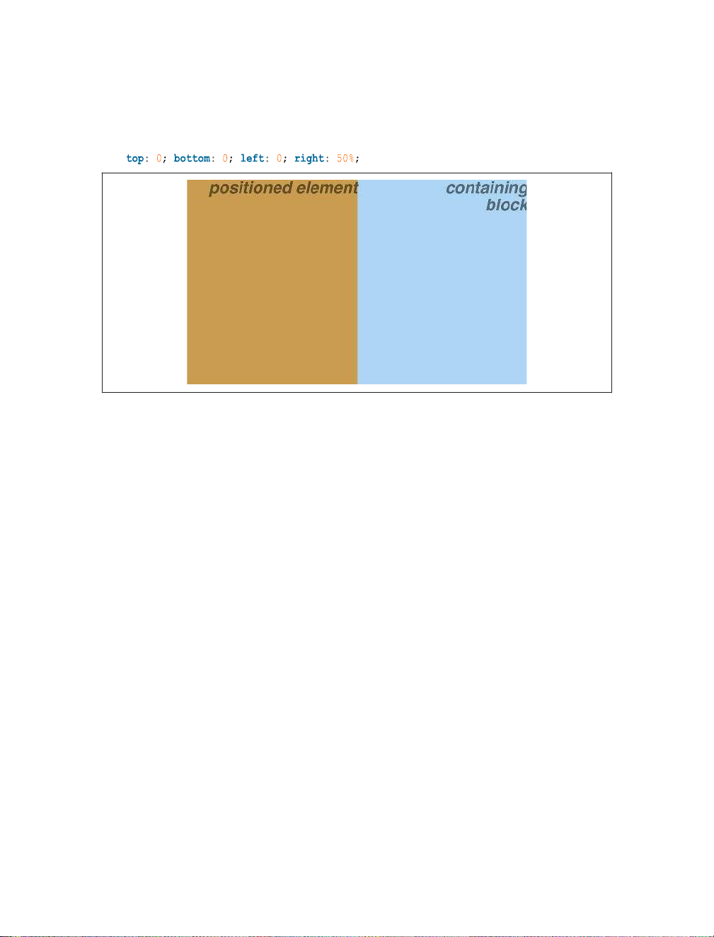
It is important to remember that the offset properties define an offset from the
analogous side (e.g., left defines the offset from the left side) of the containing
block, not from the upper-left corner of the containing block. This is why, for
example, one way to fill up the lower-right corner of a containing block is to use these values:
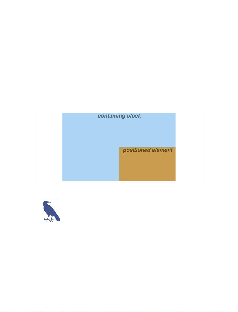
top: 50%; bottom: 0; left: 50%; right: 0;
In this example, the outer-left edge of the positioned element is placed halfway
across the containing block. This is its offset from the left edge of the containing
block. The outer-right edge of the positioned element, however, is not offset from
the right edge of the containing block, so the two are coincident. Similar reasoning
holds true for the top and bottom of the positioned element: the outer-top edge is
placed halfway down the containing block, but the outer-bottom edge is not moved
up from the bottom. This leads to what’s shown in Figure 1.
Figure 1. Filling the lower-right quarter of the containing block
What’s depicted in Figure 1, and in most of the examples in this
chapter, is based around absolute positioning. Since absolute
positioning is the simplest scheme in which to demonstrate how
top, right, bottom, and left work, we’ll stick to that for now.
Note the background area of the positioned element. In Figure 1, it has no margins,
but if it did, they would create blank space between the borders and the offset edges.
This would make the positioned element appear as though it did not completely fill
the lower-right quarter of the containing block. In truth, it would fill the area, but this
fact wouldn’t be immediately apparent to the eye. Thus, the following two sets of
styles would have approximately the same visual appearance, assuming that the
containing block is 100em high by 100em wide:
top: 50%; bottom: 0; left: 50%; right: 0; margin:
10em; top: 60%; bottom: 10%; left: 60%; right: 10%; margin: 0; lOMoAR cPSD| 22014077 Ofset Properties
Again, the similarity would be only visual in nature.
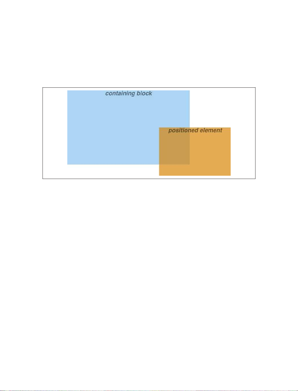
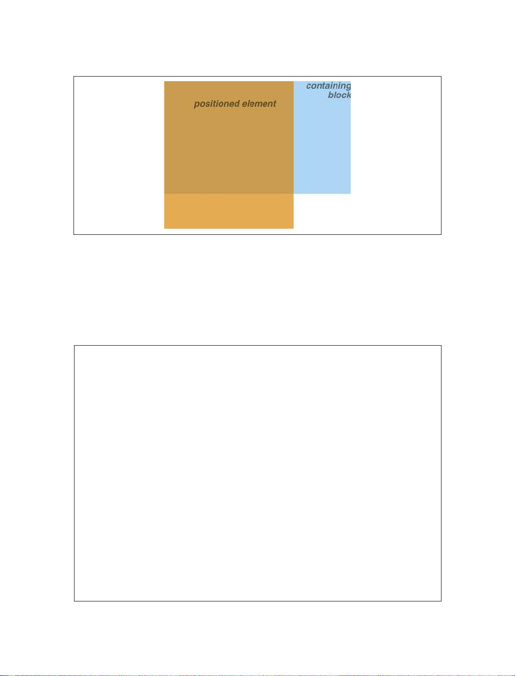
By using negative offset values, it is possible to position an element outside its
containing block. For example, the following values will lead to the result shown in Figure 2:
top: 50%; bottom: -2em; left: 75%; right: -7em;
Figure 2. Positioning an element outside its containing block
In addition to length and percentage values, the offset properties can also be set to
auto, which is the default value. There is no single behavior for auto; it changes
based on the type of positioning used. We’ll explore how auto works later on, as we
consider each of the positioning types in turn. Width and Height
There will be many cases when, having determined where you’re going to position
an element, you will want to declare how wide and how high that element should be.
In addition, there will likely be conditions where you’ll want to limit how high or wide
a positioned element gets, not to mention cases where you want the browser to go
ahead and automatically calculate the width, height, or both.
Setting Width and Height
If you want to give your positioned element a specific width, then the obvious
property to turn to is width. Similarly, height will let you declare a specific height for a positioned element.
Although it is sometimes important to set the width and height of an element, it
is not always necessary when positioning elements. For example, if the placement of
the four sides of the element is described using top, right, bottom, and left, lOMoAR cPSD| 22014077
then the height and width of the element are implicitly determined by the offsets.
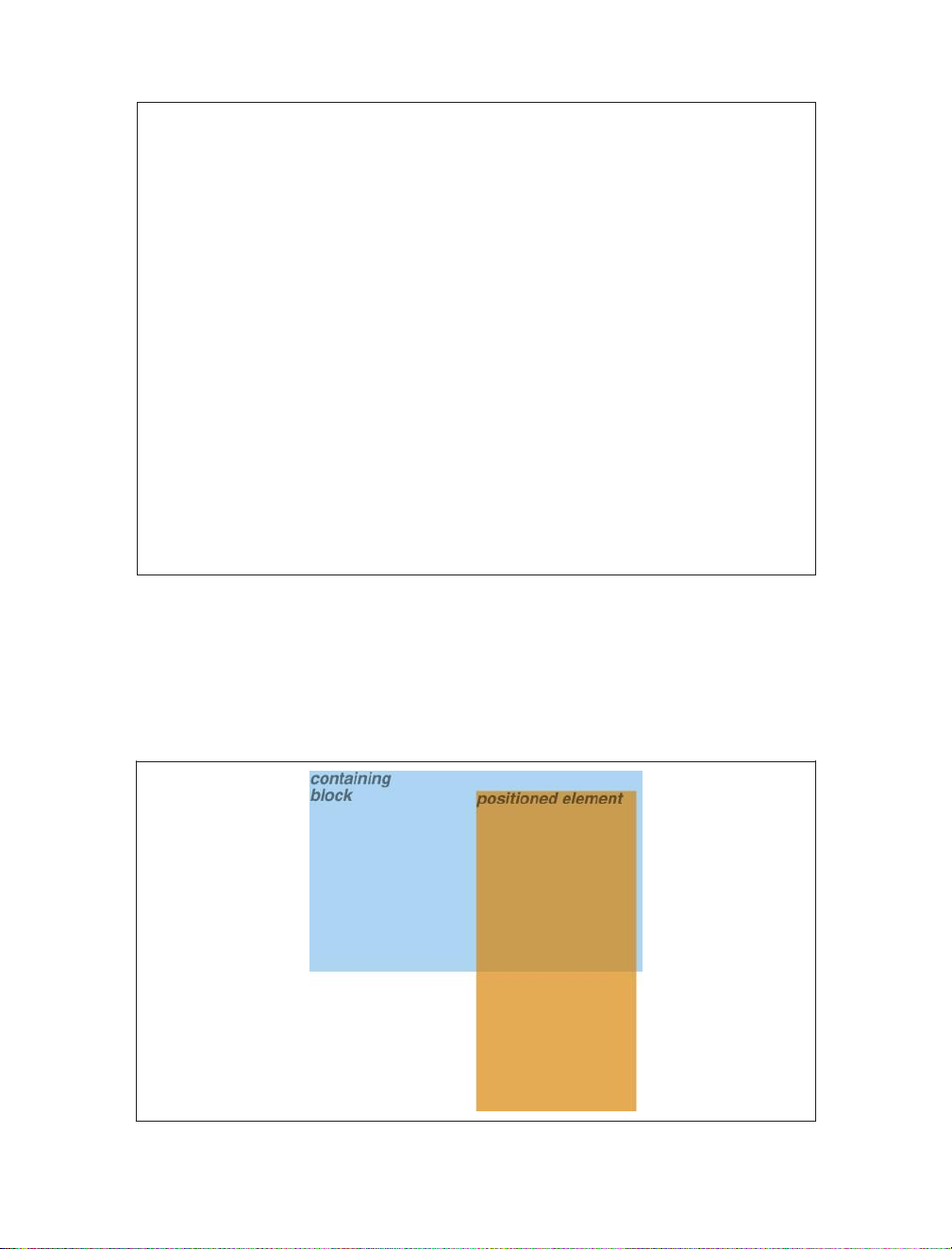
Assume that we want an absolutely positioned element to fill the left half of its
containing block, from top to bottom. We could use these values, with the result depicted in Figure 3:
Figure 3. Positioning and sizing an element using only the offset properties
Since the default value of both width and height is auto, the result shown in
Figure 3 is exactly the same as if we had used these values:
top: 0; bottom: 0; left: 0; right: 50%; width: 50%; height: 100%;
The presence of width and height in this example add nothing to the layout of the element.
Of course, if we were to add padding, a border, or a margin to the element, then the
presence of explicit values for height and width could very well make a difference:
top: 0; bottom: 0; left: 0; right: 50%; width: 50%; height: 100%; padding: 2em;
This will give us a positioned element that extends out of its containing block, as shown in Figure 4.
This happens because (by default) the padding is added to the content area, and the
content area’s size is determined by the values of height and width. In order to
get the padding we want and still have the element fit inside its containing block, we
would either remove the height and width declarations, explicitly set them both
to auto, or set box-sizing to border-box. lOMoAR cPSD| 22014077 Width and Height
Figure 4. Positioning an element partially outside its containing block
Limiting Width and Height
Should it become necessary or desirable, you can place limits on an element’s width
by using the following properties, which I’ll refer to as the min-max properties. An
element’s content area can be defined to have minimum dimensions using min- width and min-height. min-width, min-height Values: | | inherit Initial value: 0
All elements except nonreplaced inline elements and table Applies to: elements Inherited: No Percentages:
Refer to the width of the containing block Computed
For percentages, as specified; for length values, the absolute value: length; otherwise, none
Similarly, an element’s dimensions can be limited using the properties max-width and max-height. lOMoAR cPSD| 22014077 max-width, max-height Values: | | none | inherit Initial value: none
All elements except nonreplaced inline elements and table Applies to: elements Inherited: No Percentages:
Refer to the height of the containing block Computed
For percentages, as specified; for length values, the absolute value: length; otherwise, none
The names of these properties make them fairly self-explanatory. What’s less obvious
at first, but makes sense once you think about it, is that values for all these properties cannot be negative.
The following styles will force the positioned element to be at least 10em wide by
20em tall, as illustrated in Figure 5:
top: 10%; bottom: 20%; left: 50%; right: 10%;
min-width: 10em; min-height: 20em; lOMoAR cPSD| 22014077
Figure 5. Setting a minimum width and height for a positioned element Width and Height lOMoAR cPSD| 22014077
This isn’t a very robust solution since it forces the element to be at least a certain size
regardless of the size of its containing block. Here’s a better one:
top: 10%; bottom: auto; left: 50%; right:
10%; height: auto; min-width: 15em;
Here we have a case where the element should be 40% as wide as the containing
block but can never be less than 15em wide. We’ve also changed the bottom and
height so that they’re automatically determined. This will let the element be as tall
as necessary to display its content, no matter how narrow it gets (never less than 15em, of course!).
We’ll look at the role auto plays in the height and width of
positioned elements in an upcoming section.
You can turn all this around to keep elements from getting too wide or tall by using
max-width and max-height. Let’s consider a situation where, for some reason,
we want an element to have three-quarters the width of its containing block but to
stop getting wider when it hits 400 pixels. The appropriate styles are:
left: 0%; right: auto; width: 75%; max-width: 400px;
One great advantage of the min-max properties is that they let you mix units with
relative safety. You can use percentage-based sizes while setting length-based limits, or vice versa.
It’s worth mentioning that these min-max properties can be very useful in
conjunction with floated elements. For example, we can allow a floated element’s
width to be relative to the width of its parent element (which is its containing block),
while making sure that the float’s width never goes below 10em. The reverse approach is also possible:
p.aside {float: left; width: 40em; max-width: 40%;}
This will set the float to be 40em wide, unless that would be more than 40% the width
of the containing block, in which case the float will be limited to that 40% width.
Content Overnow and Clipping
If the content of an element is too much for the element’s size, it will be in danger of
overflowing the element itself. There are a few alternatives in such situations, and
CSS lets you select among them. It also allows you to define a clipping region to
determine the area of the element outside of which these sorts of things become an issue.
Tài liệu liên quan:
-
Bài tập Chương 8: KIỂU CẤU TRÚC môn Lập trình Windows | Trường Đại học Sư phạm Thành phố Hồ Chí Minh
102 51 -

Báo cáo môn Lập trình Windows | Trường Đại học Sư phạm Thành phố Hồ Chí Minh
200 100 -

CSharp Console - Tài liệu thực hành lập trình môn Lập trình Windows | Trường Đại học Sư phạm Thành phố Hồ Chí Minh
120 60 -
Mô hình hoá cấu trúc môn Lập trình Windows | Trường Đại học Sư phạm Thành phố Hồ Chí Minh
122 61 -

Mô hình hoá chức năng môn Lập trình Windows | Trường Đại học Sư phạm Thành phố Hồ Chí Minh
136 68