





Preview text:
PRACTICAL EXERCISES FOR THE COURSE
“QUALITY CONTROL, QUALITY MANAGEMENT” (MTMEL7012A)
Tünde Pusztahelyi, Ph.D., associate professor University of Debrecen
Faculty of Agricultural and Food Sciences, and Environmental Management 2019
A Debreceni Egyetem fejlesztése a felsőfokú oktatás minőségének és
hozzáférhetőségének együttes javítása érdekében EFOP-3.4.3-16-2016-00021 Co C nt n en e t n t
Exercise 1 Root cause analysis – 5 WHY method ...................................................................... 3
Exercise 2 Root cause analysis – Flowcharting ........................................................................ 4
Exercise 3 Root cause analysis – Fishbone diagram ................................................................. 6
Exercise 4 Root cause analysis – Affinity diagram .................................................................... 8
Exercise 5 Check sheet ............................................................................................................. 10
Exercise 6 Histogram ............................................................................................................... 11
Exercise 7 Pareto diagram ...................................................................................................... 13
Exercise 8 ABC diagram .......................................................................................................... 15
Exercise 9 Gantt diagram ........................................................................................................ 17
Exercise 10 Scatter plot ........................................................................................................... 19
Exercise 11 Control chart ........................................................................................................ 25
Exercise 12 Force field analysis .............................................................................................. 29
Exercise 13 Break even analysis .............................................................................................. 31
Exercise 14 Matrix of competence ........................................................................................... 32
Exercise 15 FMEA (Failure Modes and Effect Analysis) ........................................................ 33
Exercise 16 The 5 S method for order and cleanliness ............................................................ 34 2
Exercise 1 Root cause analysis – 5 WHY method
Purpose of the exercise: Introduction of a fundamental root cause analysis tool
Required knowledge: PDCA, DMAIC
5 WHY a method is a primary tool of the Kaizen philosophy. The investigator keeps asking “why”
until a conclusion is reached. Ususally, a minimum of five-six questions should be asked, although
additional questions are sometimes required if the real cause is yet to be identified, rather than
simply settling for a partial conclusion. Usage
in situations and problems with high human interactions
used during DMAIC process in the Analyze phase or the Plan phase in PDCA cycles.
used in co-ordination with other analytic tools (e.g. Cause and Effect Diagram) used as a standalone tool. Area
improvement of the production quality management audits cost reduction Exercise
1., Imagine a situation with a problem and keep asking “why” to analyze the root cause. 3
Exercise 2 Root cause analysis – Flowcharting
Purpose of the exercise: Practice a new management method for data arrangement. Required knowledge: -
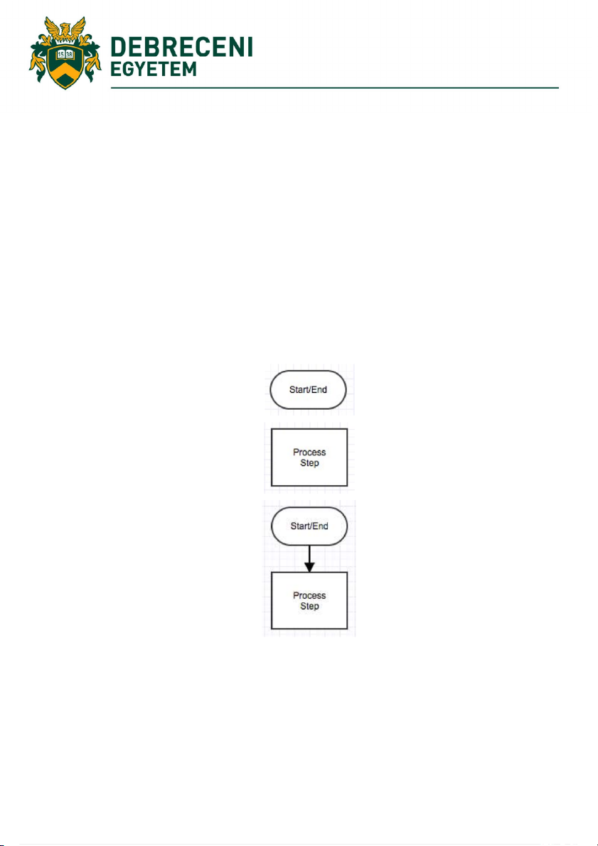
Flowcharts are diagrams that show step-by-step progression through procedures or systems using
connecting lines and a set of conventional symbols.
Flowcharts organize information about a process in a graphical manner, making it clear what is
impacted. There are numerous available flowcharting tools, however, it is recommended to keep
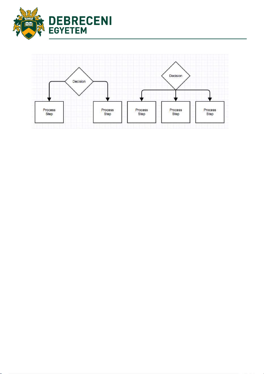
flowcharts simple, using a rectangle for a process step, an arrow for direction, and a diamond for a decision point: 4
Macro-flowcharts show the main steps while micro-flowcharts show the detailed process in small steps.
Project 1: Make a macro-flowchart about your morning schedule.
Project 2: Make a micro-flowchart about tea making. 5
Exercise 3 Root cause analysis – Fishbone diagram
Alias Cause and Effect Diagram or Ishikawa diagram
Purpose of the exercise: Practice a new management method for data arrangement.
Required knowledge: Factors (6 M or 9M) affecting quality in manufacturing Causes in industry
In manufacturing -6M or 9M- see Lecture. In service -4S
Surroundings. E.g. Does your establishment project the right image?
Suppliers. E.g. Are there any problems delivering your service? Do you have problems with low
quality deliveries? Are there too many dropped phone calls? Can your server handle traffic spikes?
Systems. E.g. Do you have procedures and policies in place for all scenarios? Do you have modern
cash registers to help your servers?
Skills. E.g. Are your employers appropriately trained? Do they have the right experience? In marketing -7Ps
Product. Consider all aspects of your product including its quality, its perceived image, availability,
warranties, support and customer service.
People. Costumers buy your product or service, may interact with many people: e.g. salespeople,
delivery people, customer service people. Are there any potential problems with your company culture?
Process/Procedure. E.g. How do you handle problems when they arise? Is your staff trained
appropriately and do they follow their training?
Promotion. Consider advertising, sales, PR, branding, direct marketing, partnerships, and social media.
Price. E.g. How does the price of your product or service compare to competitors? What discounts
and payment methods are available?
Physical evidence/Packaging. E.g. How is your product or service consumed? Is how or where you
present your product hurting your ability to convert? Are your facilities clean and tidy? Is the packaging cheap or expensive? 6
Place/Plant. E.g. Is your distribution efficient and cost-effective? Is your product sold in the right
stores or neighbourhoods? Are your stores convenient for your target customers? Project:
1. Identify the problem. Define the issue or process to be examined. 2. Brainstorm.
3. Draw the backbone. Draw a straight, horizontal line (called the spine or backbone) on the
page, and on the right side, draw a rectangle at the end. Write a brief description of the problem in the rectangle.
4. Add causes and effects. Causes are added with lines branching off from the main backbone
at an angle. Write descriptions of the causes at the end of all branches. These are usually one
of the main categories. Details related to the cause or effect may be added as sub-categories
branching off further from the main branch. Add branches and a cause or effect until all
factors have been documented. The resulted diagram will resemble a fish skeleton.
5. Analyze. When the diagram has been completed, analyze the information as it has been
organized in order to come to a solution and create action items. 7
Exercise 4 Root cause analysis – Affinity diagram
Purpose of the exercise: Practice a new management method for data arrangement.
Required knowledge: Factors (6 M or 9M) affecting quality in manufacturing
The final root cause analysis tool is the affinity diagram.
Usually as the output from a brainstorming session, an affinity diagram can be used to generate,
organize, and consolidate information related to the issue in question. After ideas have been
generated, they are grouped according to their similarity to identify the primary causes. The affinity
diagram is for stimulating discussion about a problem or issue or opening possibilities for improvement or solution.
A manager can use this tool when:
is confronted with many facts or ideas.
the issues seem to be too large and complex to handle.
the group consensus is necessary. Exercise:
1. Describe the issue or problem.
2. Generate ideas (brainstorming - teamwork).
3. Write each idea on sticky notes and put these on a table.
4. Sort ideas into natural themes by asking: a. Which ideas are similar?
b. Is the idea connected to any others?
5. If you are working in a team:
a. Separate into smaller groups of 3 to 4 people
b. Sort the ideas so that nobody is influenced by anyone else’s comments in silence
c. Create theme cards (called affinity cards)
d. Create a short 3-5-words descriptions for the relationship of the cards
e. Write the theme/header on a blank card and place at the top of the group it describes
f. Create a “super-headers” where necessary
g. Use a “sub-header” card where necessary as well 8
6. Keep moving the cards around until consensus is reached
7. Create a total group consensus
8. Discuss the shared meaning of each of the sorted groups
9. Continue until a consensus is reached Some practical tips:
If an idea does not fit into any theme, separate it (called “stand-alone” idea).
If some ideas fit into more than one theme, create a copies and put it into the proper groups.
Try to limit the total number of theme cards to between five and nine. 9 Exercise 5 Check sheet
Purpose of the exercise: Introduce data collection methods Required knowledge: -
A check sheet helps to record simple facts (numbers, situations) and statistics that happen for over
a period. Types of check sheets: commonly used check sheets are tabular check sheets or tally
sheets, graphical or location check sheets and distribution check sheets.
It can apply the five main questions: Who Where What How When
In this way, we record data for further analysis and provide a historical record. When to use:
To collect data of the same person or the same working step over a time range.
To collect data on the frequency or pattern of events, defects, defect location, defect causes, problems, or similar causes.
To collect data from a production process. Procedure
1. Decide what will be observed. Develop operational practice.
2. Decide when and for what time range will be collected.
3. Decide the form. Set it up to use it easy, e.g. with X marks, or symbols.
4. Label all spaces on the form
5. Check the sheet with collecting data for a short time range.
Practice 1 Make a check sheet for a process. e.g. weekly schedule of your study hours 10 Exercise 6 Histogram
Purpose of the exercise: Introduce an essential manager tool Required knowledge: -
With the help of this management tool, we can Analyse data distribution
Summarize an extensive data set graphically
Compare measurements to specifications
Communicate information to the team Assist in decision making How to construct a histogram
1. Count the total number of data points.
2. Summarize the data on a tally sheet.
3. Calculate the range of the data set.
4. Determine the number of intervals
5. Calculate the interval width
6. Determine the starting point of each interval
7. Count the number of points in each interval 8. Draw the histogram
9. Check the distribution and spread of data 11 Example Practices
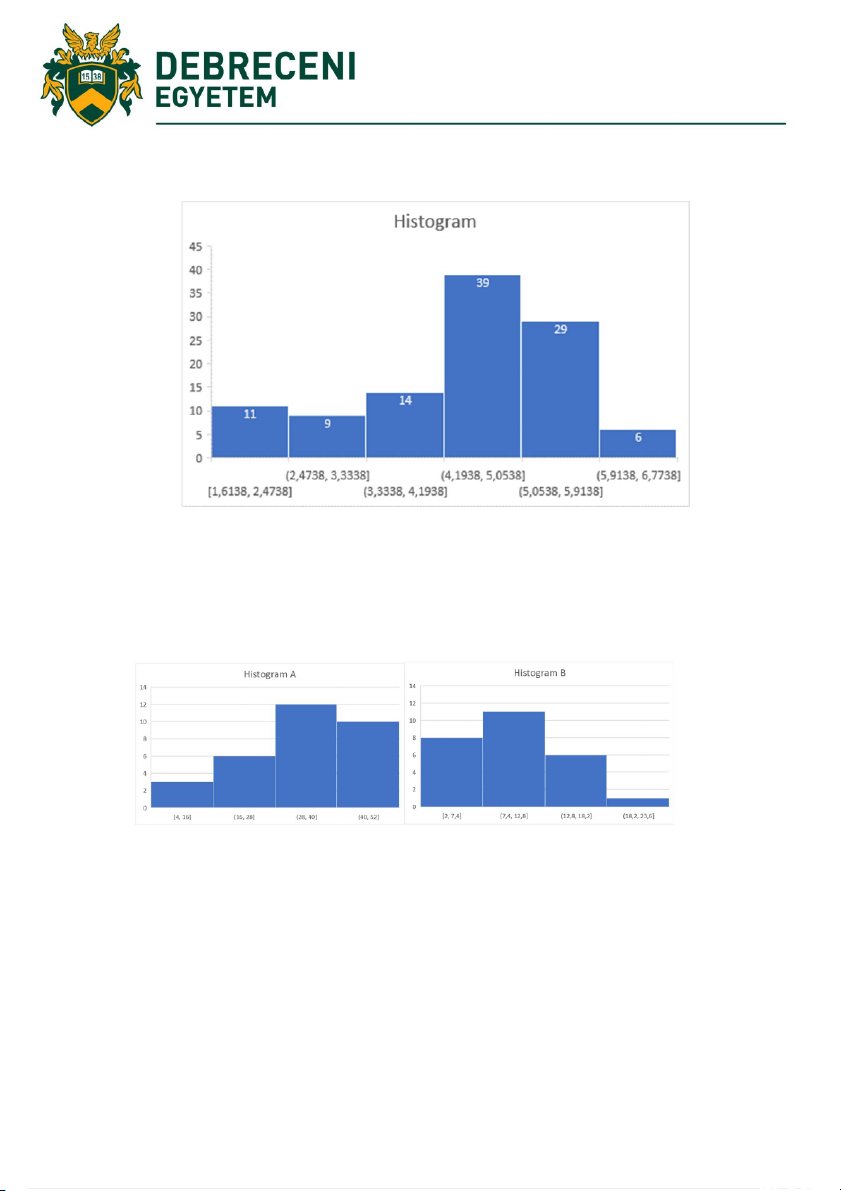
1. John and Mabel breed chickens. The following data shows how many chickens they produced
in 15 weeks: 83 76 90 58 66 44 86 66 61 59 50 53 61 64 73. Construct a histogram that displays
these results. Construct a relative frequency histogram based on the same data.
2. Using the next histograms answer the questions
a) Which distribution had collected more data? Show how you know.
b) Which distribution has a larger range? Show or explain how you know.
c) Which distribution is more likely to have a shape described as “skewed right?”
d) Which distribution is more likely to have a higher median than mean? Explain why this would happen. 12 Exercise 7 Pareto diagram
Purpose of the exercise: to separates the „vital few” causes from the „trivial many”. Required knowledge: -
The theory was developed by Vilfredo Pareto (1848-1923), an Italian economist who stated and
proved that 20% of the population possesses 80% of the wealth. The analysis method was adapted
by Joseph Juran for problem analysis: the 80/20 rule states that approximately 80% of the problems
are created by approximately 20% of the causes.
e.g. 20% of the customers that provide 80% of the revenue
e.g. 20% of defects which are the cause of 80% of customer complaints
e.g. 20% of the activities which produce 80% of the defects We can use it
when analysing data about the frequency of problems or causes in a process;
when there are many problems or causes, and you want to focus on the most significant ones;
when analysing broad causes by looking at their specific components;
when communicating with others about your data. The steps of the analysis
1. Find the Causes: the possible causes to positive effects like profits or revenues of a company
and will, therefore, need to be maximised. Alternatively, these could be the causes of adverse
effects like losses or defects and will then need to be minimized.
2. Prepare a Frequency Table: once the causes have been listed down, they need to be checked
for their importance. It can be done by running simulations of the process several times and
recording the outcomes. A frequency table is one of the best way to do so. Prepare a cumulative frequency column.
3. Convert it into Percentages: when a frequency table has been created, it is time to convert the
numbers into percentages because percentages are easier to understand than regular numbers. 13
4. Arrange in Descending Order: The most important causes must be at the top while the least
important ones must be at the bottom of the table. Thus, the arrangement must be in descending
order. The percentages should be cumulatively taken track of. The causes that come before the
cumulative percentage of 80% in reached are usually considered the vital few factors. This
arrangement makes it easy to understand the critical factors and make necessary changes to achieve desired results. Analysis:
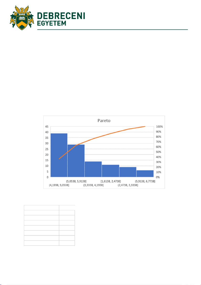
Bar chart should be arranged in descending order of height from left to right
Bars on the left are relatively more important than those on right Example:
Practice 1 Analyze main causes of a problem
Problem: late arrivals Frequency tra ic 82 public transport 56 weather 41 overslept 22 mis-scheduling 11 slow mo on 6 friends 3 14 Exercise 8 ABC diagram
Purpose of the exercise: Introduction to a method of an inventory control
Required knowledge: Pareto diagram
ABC analysis is a method that divides the subject up into three categories: A, B and C. Category A
represents the most valuable products or customers that you have. These are the products that
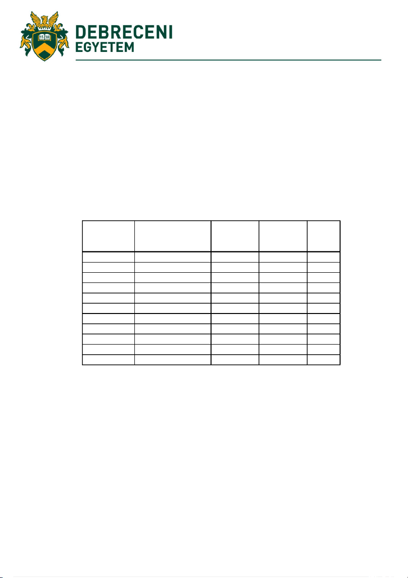
contribute highly to your overall profit without affecting much of your resources. Example % of the total % Inventory valoriza on inventory Class accumulated valor Factory 1 5500 42,85157772 42,85157772 A Factory 2 5000 38,95597974 81,80755746 A Factory 3 1000 7,791195949 89,59875341 B Factory 4 600 4,674717569 94,27347098 B Factory 5 400 3,116478379 97,38994936 B Factory 6 95 0,740163615 98,13011297 C Factory 7 90 0,701207635 98,83132061 C Factory 8 70 0,545383716 99,37670432 C Factory 9 50 0,389559797 99,76626412 C Factory 10 30 0,233735878 100 12835 100
Practice: Calculate and plot ABC diagram 15 % of the total % Inventory valoriza on inventory Class accumulated valor Factory 1 12562 Factory 2 4210 Factory 3 3210 Factory 4 2631 Factory 5 1540 Factory 6 800 Factory 7 600 Factory 8 520 Factory 9 340 Factory 10 200 26613 100 16 Exercise 9 Gantt diagram
Purpose of the exercise: Introduction of timeline analysis of project steps Required knowledge: -
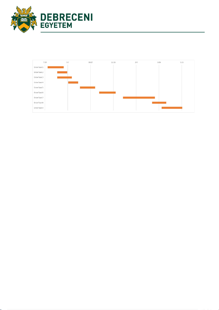
Practice 1 List your project schedule in an Excel table.
Break down the entire project into pieces of work, or phases. These will be called project tasks and
they form the basis of the Gantt chart.
In Excel 2007, 2010, 2013 or 2016, you enter the data by listing the Start Date and Finish Date of
each task, and, it's duration (in days or hours or minutes). You should also include a brief description
of the task. Make sure to sort these tasks in order, by placing the earliest start date first and the latest start date last.
We should work in Excel: https://www.officetimeline.com/make-gantt-chart/excel#download- excel-file
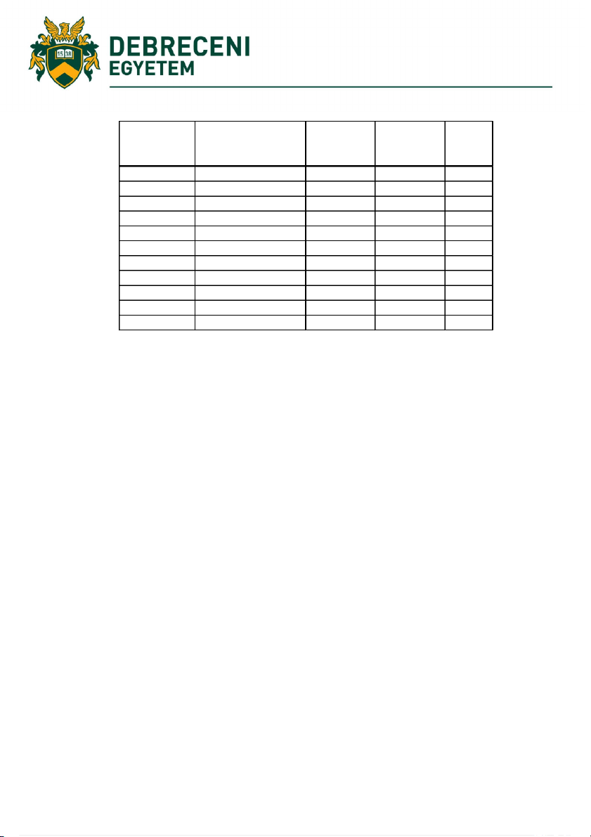
Use data table similar below one Start date End date Descrip on Dura on (min) 0:00 6:00:00 sleeping 360 6:00 7:00 morning prepara ons 60 6:00 8:00 listening to music 120 7:00 7:30 walking 30 7:30 7:50 co ee break 20 8:00 9:30 lecture 1 90 10:00 12:30 lecture 2 150 12:30 13:30 lunch break 60 13:00 14:00 english learning 60 14:00 16:00 lecture 3 120 16:00 16:30 nordic walking 30 16:30 17:50 prepara on 80 17:00 23:00 party me 360 19:00 23:10 lestening to music 250 23:00 23:40 cleaning 40 23:40 0:00 prepara on to sleep 20 17 Example 18 Exercise 10 Scatter plot
Purpose of the exercise: analysing relationships between two variables Required knowledge: -
A scatter diagram is a tool for analysing relationships between two variables. It can be applied when
you have paired numerical data, your dependent variable may have multiple values for each value
of your independent variable or you trying to determine whether the two variables are related:
e.g. to identify potential root causes of problems.
e.g. after brainstorming, causes and effects using a Fishbone diagram, to determine objectively
whether a cause and effect are related.
e.g. when determining whether two effects that appear to be related both occur with the same cause.
e.g. when testing for autocorrelation before constructing a Control chart. Steps of the analysis
1. Collect two groups of data and create a summary table of the data.
2. Draw a diagram labelling the horizontal and vertical axes. Commonly “cause” variable is
labelled on the X axis and the “effect” variable is labelled on the Y axis.
3. Plot the data pairs on the diagram.
4. Interpret the scatter diagram for direction and strength. Interpretation
As in case of any graph of data, look for the overall pattern and for striking deviations from that
pattern. The overall pattern of a scatter plot can be described by the direction, form, and strength of
the relationship. An important kind of departure is an outlier, an individual value that falls outside
the overall pattern of the relationship. Testing the relationship
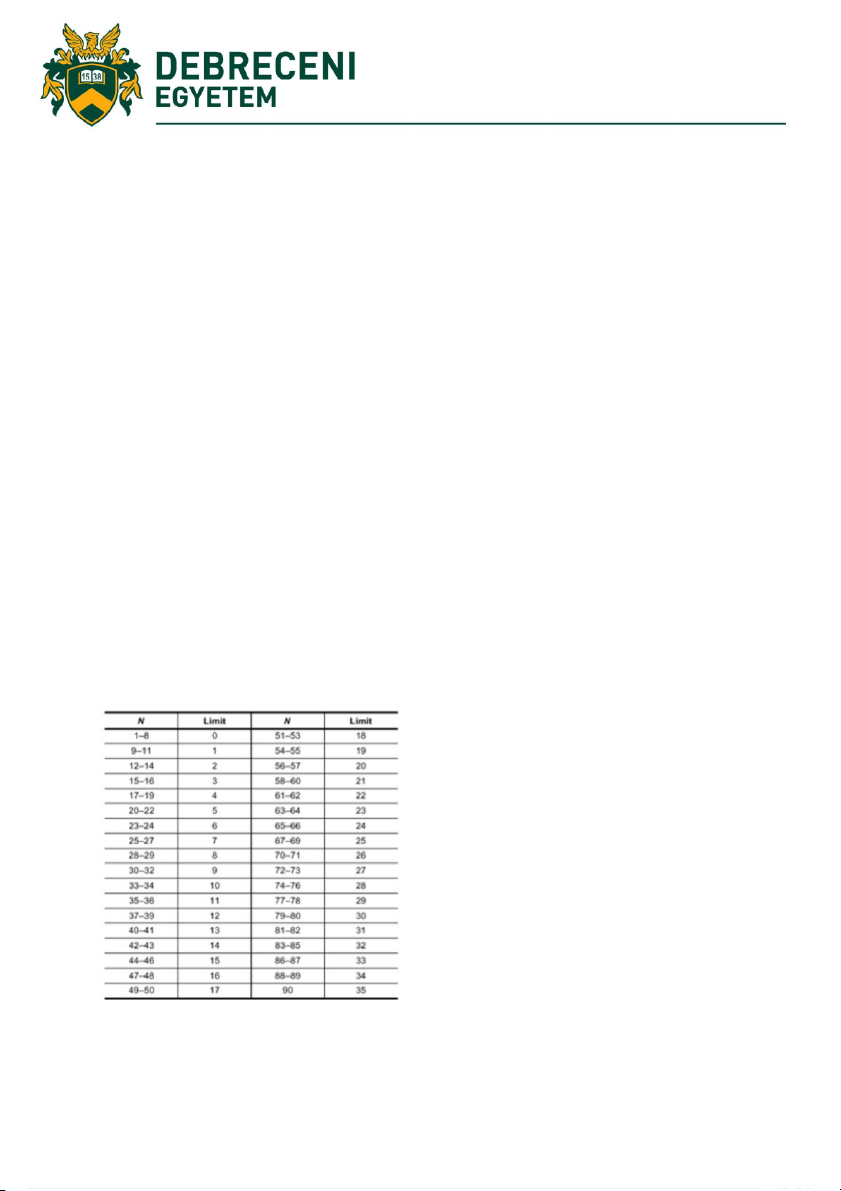
If a line is not clear, statistics (N and Q) determine whether there is reasonable certainty that a
relationship exists. If the statistics say that no relationship exists, the pattern could have occurred by random chance. 19 Example 1
The manufacturing team suspects a relationship between product purity (in percent) and the amount
of iron (measured in parts per million or ppm). Purity and iron are plotted against each other as a scatter diagram.
There are 24 data points. Median lines are drawn so that 12 points fall on each side for both percent
purity and ppm iron. Divide points on the graph into four quadrants. If there are X points on the graph:
Count X/2 points from top to bottom and draw a horizontal line.
Count X/2 points from left to right and draw a vertical line.
If number of points is odd, draw the line through the middle point.
Count the points in each quadrant. Do not count points on a line.
Add the diagonally opposite quadrants. Find the smaller sum and the total of points in all quadrants.
A = points in upper left + points in lower right
B = points in upper right + points in lower left Q = the smaller of A and B N = A + B
Look up the limit for N on the Trend Test Table.
If Q is less than the limit, the two variables are related. If Q is greater than or equal to the limit, the
pattern could have occurred from random chance. 20
