50 sample ielts writing task answers for band 9 success môn English Studies| Trường Đại học Thăng Long
This collection of sample answers is intended to help youunderstand what is necessary in order to write a great essay. All of these answers have been written by a native speaker who is also a professional writer and IELTS trainer with more than ten years of experience. Tài liệu giúp bạn tham khảo, ôn tập và đạt kết quả cao. Mời đọc đón xem!
Môn: English Studies 199 tài liệu
Trường: Trường Đại học Thăng Long 550 tài liệu
Tác giả:


Preview text:
22:56, 09/01/2026
50 Sample IELTS Writing Task Answers for Band 9 Success - Studocu
50 Sample Answers for IELTS Writing [Academic] – from TED-IELTS.com Introduction
This collection of sample answers is intended to help you understand what is necessary in order to
write a great essay. All of these answers have been written by a native speaker who is also a
professional writer and IELTS trainer with more than ten years of experience.
It is important to note before we begin that these answers are not the only way to score band 9.
Whether you study English, Korean, Arabic, Spanish, or any other language, it is important to note
that there is more than one way to express yourself. If we gather 1,000 professional writers, they
would produce 1,000 different IELTS essays.
The fifty answers in this book have been written in order to guide IELTS candidates to the most
effective means of composing an essay. They show how to fulfil the requirements of the marking
rubric without using overly complex language.
In fact, that is one of the most important things that you should remember. Accuracy and range are
more important than using “difficult” language. The best way to approach IELTS writing is through
common sense. You could broadly categorise any good approach to an IELTS essay like this: 1) Analyse the question 2) Structure your answer 3) Write your essay 4) Check your writing
Obviously, the hardest part is #3 because there is so much to consider. However, it is important to
note that you do not need to achieve perfection in your essay. You just have to make it very good.
When it comes to structure, I always tell people to keep it simple. Do not try to reinvent the wheel.
Every task 2 essay requires an introduction and conclusion, as well as two or three body paragraphs.
Your structure should look like this: 1) Introduction 2) Body paragraph 1 3) Body paragraph 2 4) Conclusion
The contents of your body paragraphs will be determined by the requirements of the question. If it is
“discuss both views” question, then your essay will devote one paragraph to one side of the
argument and one paragraph to the other. This is also a great way to add balance to your essay – but
remember that balance is not necessary. It is also acceptable to offer a strong argument.
For task 1, you have a little more freedom. You should write an introduction but what follows may
be one or two or three paragraphs. It completely depends upon the information that you are
presented with. However, you should note that a conclusion is not necessary.
The sample answers in this book should help you to understand the construction and execution of a
very good IELTS essay. Do not think that these are the only ways to do it. They are intended as
models to help you but ultimately the process of planning and writing an essay comes down to one person – you. David S. Wills Founder, TED-IELTS 1 22:56, 09/01/2026
50 Sample IELTS Writing Task Answers for Band 9 Success - Studocu
50 Sample Answers for IELTS Writing [Academic] – from TED-IELTS.com Task 1
The twenty essays in this section are all based upon task 1 of the IELTS writing test. They offer
descriptions of the data in a selected graph, chart, map, or diagram. The information that I have
chosen to describe is based upon my own interpretation. You should choose what you think is the
most interesting or important data.
As for structure, I have mostly written essays with three paragraphs. This allows me to write an
introduction that contains an overview, and then split the data into two groups. Sometimes,
however, this is not possible. Sometimes you need to split it into three groups, but try to avoid
writing too many paragraphs. This can cause you to lack sufficient development of your ideas. Paragraph Purpose/Contents Introduction
Overview of the data (explain what the chart is) Highlight a main trend
Body paragraph 1 First set of data
Start with most important information
Body paragraph 2 Second set of data
Start with most important information
Try to include some logical flow in your descriptions. If you start with the highest number, then
move on to the second highest and then the third. Do not jump about from first to third to second.
This would be confusing for your reader. 2 22:56, 09/01/2026
50 Sample IELTS Writing Task Answers for Band 9 Success - Studocu
50 Sample Answers for IELTS Writing [Academic] – from TED-IELTS.com Question Answer
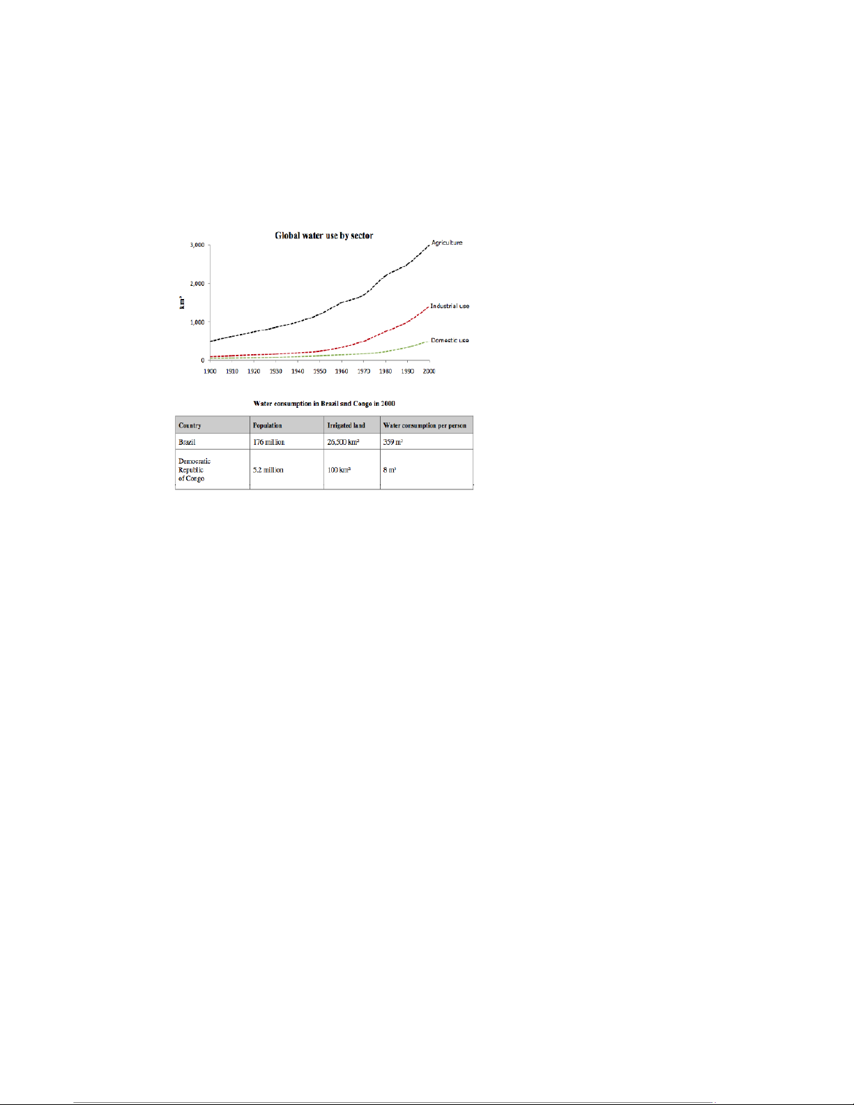
The line graph shows changes in water use for the whole world over a one hundred year period, split
between three different sectors, while the table looks at just two countries – Brazil and the
Democratic Republic of Congo – for the year 2000.
Over the one-hundred-year period, it is obvious that all three types of water use increased
significantly, although none of them changed positions. Throughout the whole period, agricultural
purposes required more water than any other, beginning at about 500km3 and soaring to more than
3,000km3 a century later. Industrial use was much lower, at about 100km3 in the year 1900, but also
soared, finishing the period at about 1,500km3. Domestic use required slightly less water than
industrial use at the beginning of the period, but grew to use around 500km3 by the millennium.
In the year 2000, Brazil had a population and area of irrigated land vastly larger than that of the
Democratic Republic of Congo. Similarly, the amount of water used per person was more than forty
times greater than that of the D.R. Congo. 3 22:56, 09/01/2026
50 Sample IELTS Writing Task Answers for Band 9 Success - Studocu
50 Sample Answers for IELTS Writing [Academic] – from TED-IELTS.com Question Answer
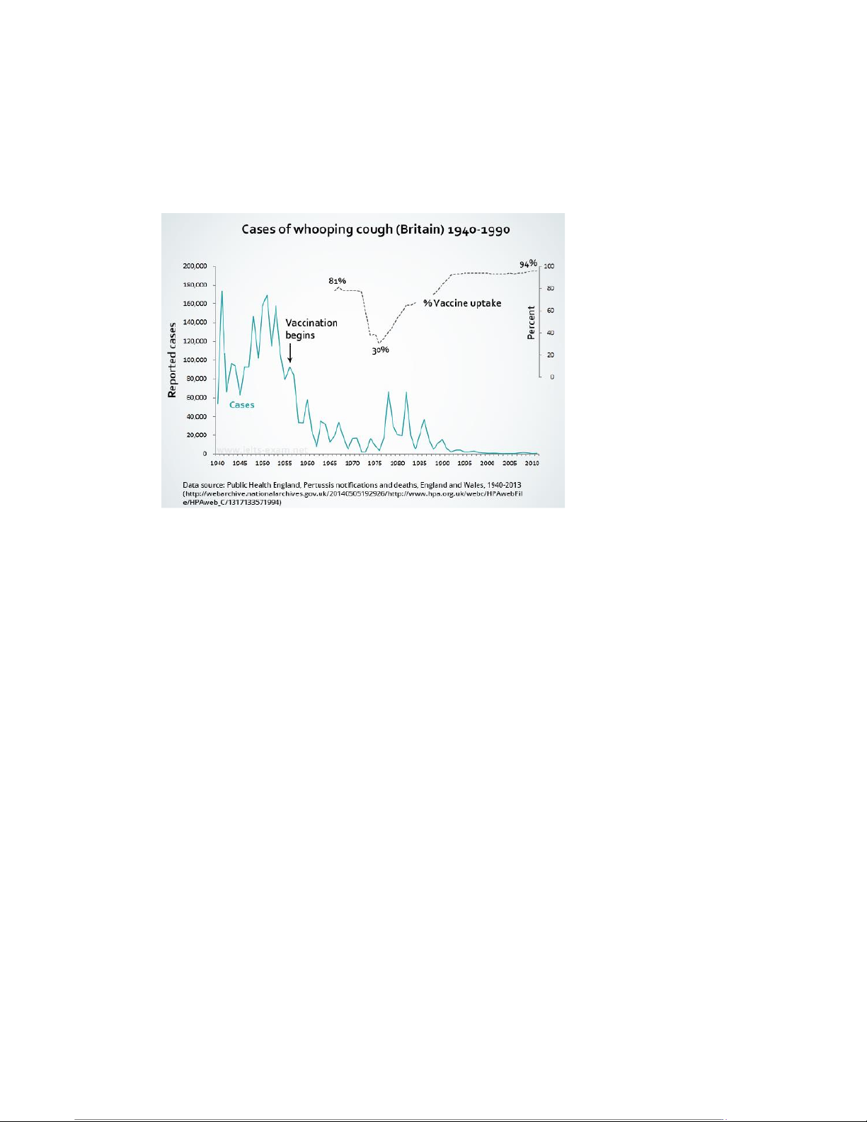
The line graph displays information about a disease called “whooping cough” in the United Kingdom
over a fifty-year period, beginning in 1940. It charts the number of reported cases against the
prevalence of vaccination programmes. It can be determined that instances of whooping cough
declined after vaccination was introduced, rose again when it stopped, and then virtually
disappeared when vaccination rates covered almost all of the population.
Prior to the introduction of whooping cough vaccinations in the United Kingdom, the number of
cases fluctuated wildly between sixty thousand and a hundred and seventy thousand cases per year.
From the first year of vaccination onwards, this number fell rapidly until whooping cough was nearly
eradicated in the sixties and seventies. At this point, with the disease nearly vanquished, vaccination
rates dropped to just thirty percent, causing a spike in the number of cases. As the vaccination
programme restarted, whooping cough continued to be a problem until vaccinations covered almost
all of the population, at which point the disease virtually disappeared. By the twenty-first century,
there was only a negligible number of cases. Note
This task was extremely complex and required an unusually long introduction. Because of that, I did
not want to group my later descriptions into two paragraphs. I felt this would not leave enough
room for a thorough and accurate description. As such, this is a rare case of a two-paragraph IELTS essay. 4 22:56, 09/01/2026
50 Sample IELTS Writing Task Answers for Band 9 Success - Studocu
50 Sample Answers for IELTS Writing [Academic] – from TED-IELTS.com Question Answer
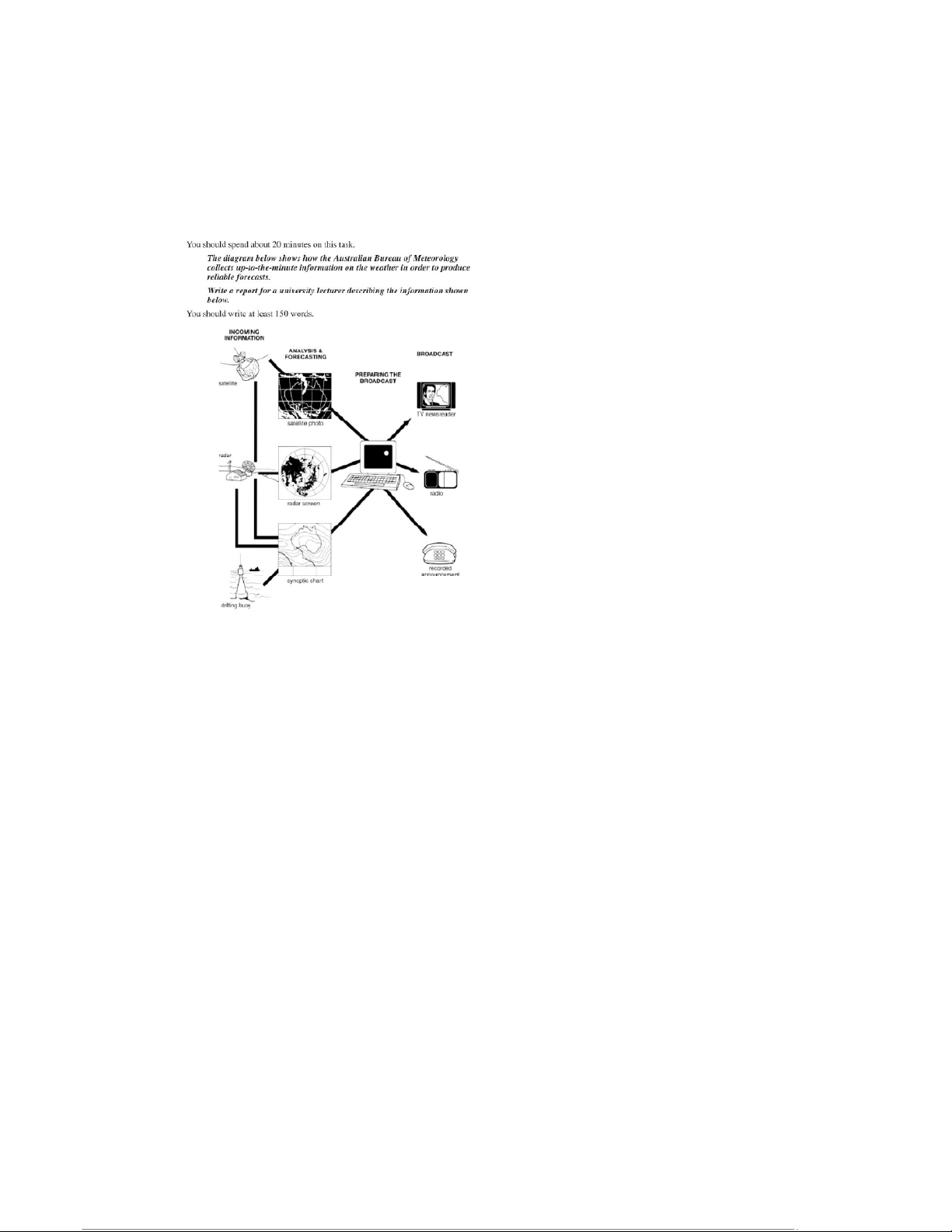
The process diagram presents information about how the Australian Bureau of Meteorology gathers,
processes, and distributes information pertaining to the weather. There are three sources of data
and three methods of forecasting information about the weather.
Initially, meteorological data is gathered from a network of satellites, radar stations, and drifting
buoys. The satellites provide photos of the Earth from space, while information from the radar
system and the satellites together produce a radar screen image. Finally, these two sources of
information combine with the drifting buoys to produce a synoptic chart.
Each of these three types of data is then analysed in order to provide a weather forecast. Once the
forecast has been decided upon by the meteorologists, the broadcast is prepared using a computer
system. This is then delivered to the general public via three methods: TV newsreaders, radio
broadcasts, and recorded announcements sent out over the phone system. 5 22:56, 09/01/2026
50 Sample IELTS Writing Task Answers for Band 9 Success - Studocu
50 Sample Answers for IELTS Writing [Academic] – from TED-IELTS.com Question Answer
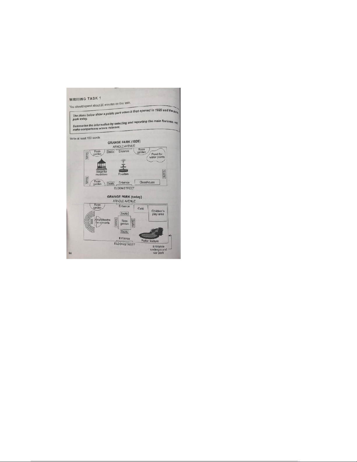
The two maps show images of a park approximately one hundred years apart. The park has changed
almost entirely since it was first opened in 1920.
In 1920, the park had a fountain in the centre, and to the west of that was a stage for musicians.
There were rose gardens in the north-west and south-west corners, as well as one in the north-east,
next to a pond for water plants. In the south-east of the park there was a glasshouse. There were
also seats located around the edges of the park.
Today, there is little that remains of the original features, except for the two entrances and one of
the rose gardens. The fountain has been replaced by a central rose garden, which is surrounded by
seats, and to the west there is now an amphitheatre. The water pond has made way for a children’s
play park, and the nearby rose garden has been turned into a café. 6 22:56, 09/01/2026
50 Sample IELTS Writing Task Answers for Band 9 Success - Studocu
50 Sample Answers for IELTS Writing [Academic] – from TED-IELTS.com Question Answer
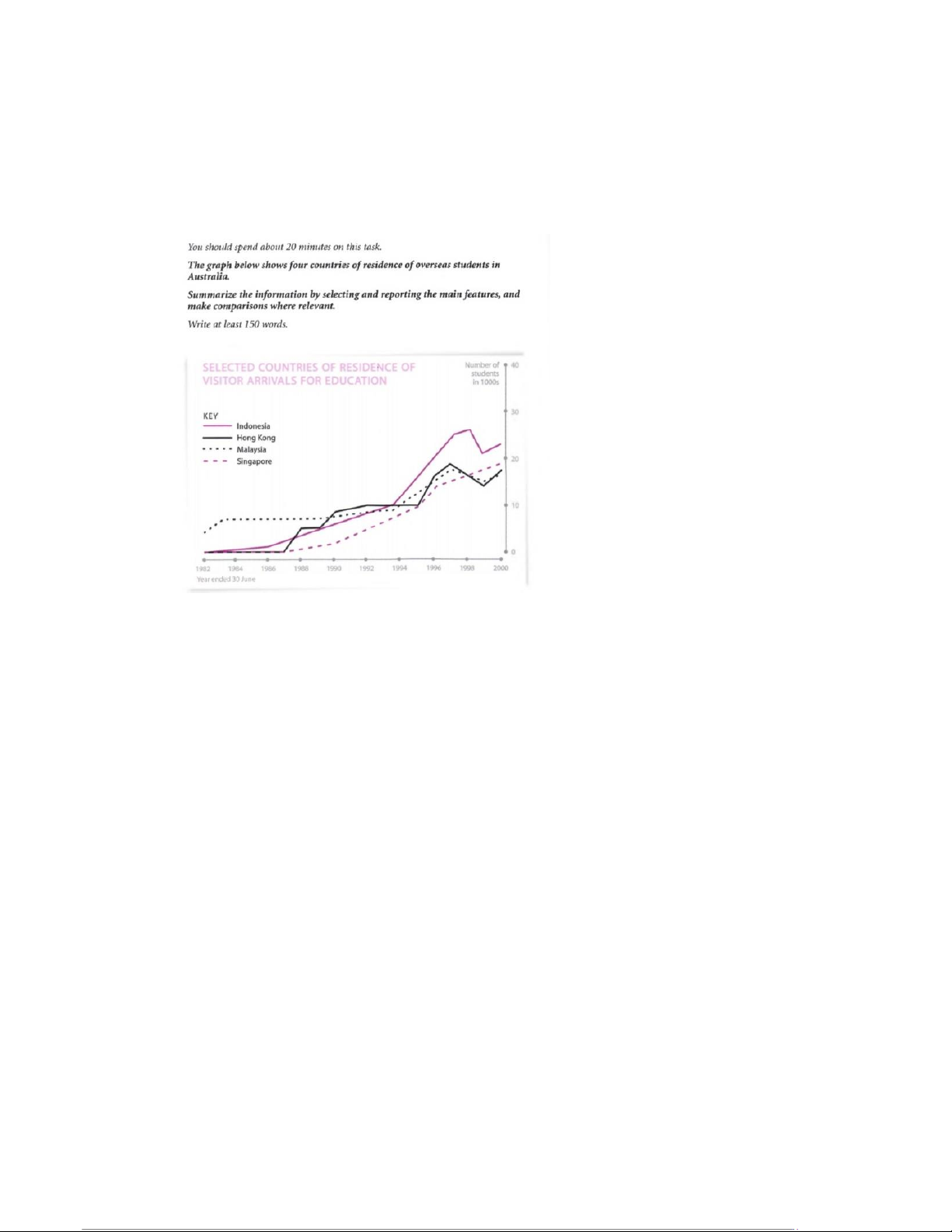
The line graph shows the number of students arriving in Australia from four different Asian
countries. The number of students from each of these countries increased during the almost two-
decade-long period, but at different rates.
In the first year listed on the graph, there was a higher number of students from Malaysia than the
other three countries, with about five thousand Malaysian students visiting Australia. For
approximately the first five years, this figure was far higher than that of the other three countries.
While there were just under ten thousand Malaysian students, the other nations sent only about
one thousand. From about 1986 onwards, however, the other countries began sending more
students and these numbers rose faster than that of Malaysian students. By 2000, the final year on
the graph, Malaysia sent fewer students than the other nations listed, despite having quadrupled
from about five thousand to just shy of twenty thousand.
In contrast, the number of students from Hong Kong, Indonesia, and Singapore began to rise quickly
in the mid- to late-eighties. Hong Kong rose suddenly, then levelled off, and then increased fitfully
after that, while Indonesia sent more students at a steadily increasing rate until about 1998, when
numbers dropped. Singapore followed a similar trend but without the sudden drop near the end. 7 22:56, 09/01/2026
50 Sample IELTS Writing Task Answers for Band 9 Success - Studocu
50 Sample Answers for IELTS Writing [Academic] – from TED-IELTS.com Question Answer
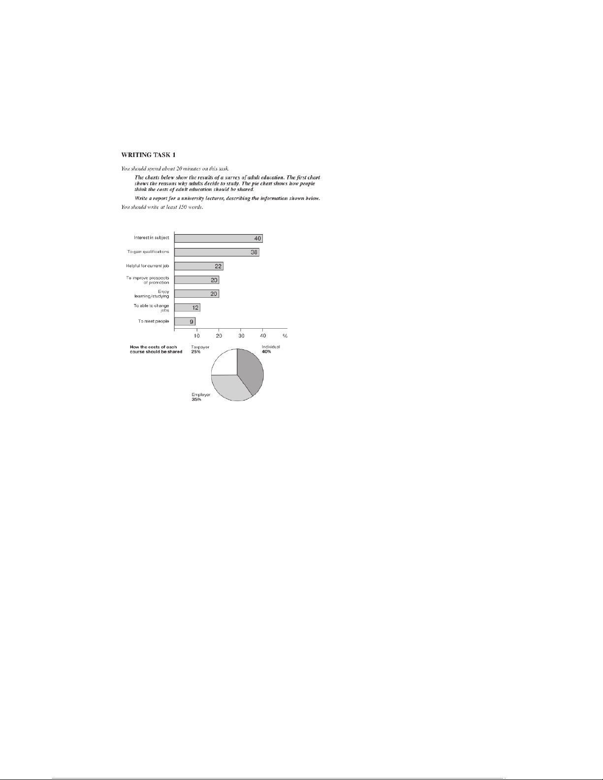
There is a bar chart and a pie chart containing information taken from a survey on adult education.
The bar chart describes why adults go into education and the pie chart shows who the respondents
think should pay for it. People mostly go into education out of interest, and, perhaps unsurprisingly,
it is believed that they should pay for it themselves.
According to the data, forty percent of adults go into education due to some sort of interest in a
particular subject, while thirty-eight percent do it to gain qualifications. These are far and away the
most common reasons, as the next most frequently cited reason was almost half this value. Several
reasons were picked by about twenty percent of people, including the fact that it may help them
earn a promotion at work. The least frequently stated answer was that adult education is a good way to meet new people.
The survey results showed forty percent of people believe the individual should pay the costs of a
course. This matches quite well with the previous data, as the same percentage of people did these
courses purely out of interest. 8 22:56, 09/01/2026
50 Sample IELTS Writing Task Answers for Band 9 Success - Studocu
50 Sample Answers for IELTS Writing [Academic] – from TED-IELTS.com Question Answer
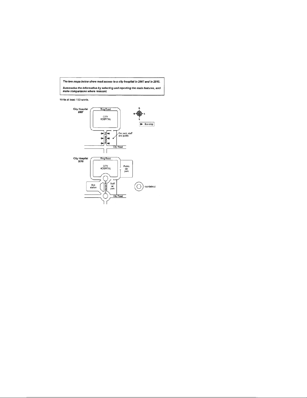
The two maps depict the transportation facilities surrounding a city hospital in the years 2007 and
2010. Several changes took place during the intervening years.
In 2007, the hospital was accessible from the City Road via the Hospital Road, and this continued to
loop around the hospital as the ring road. There were several bus stops alongside the Hospital Road,
and a joint staff and public car park sat on the east side of road, with its access point just off the ring road.
By 2010, much had changed. The junction from the City Road to the Hospital Road had been
converted to a roundabout, as had the junction connecting the Hospital Road with the ring road. The
bus stops had been replaced by a bus station on the west side of the Hospital Road, while the joint
staff and public car park had become a devoted staff car park. On the east side of the ring road, a
new public car park had been built. 9 22:56, 09/01/2026
50 Sample IELTS Writing Task Answers for Band 9 Success - Studocu
50 Sample Answers for IELTS Writing [Academic] – from TED-IELTS.com Question Answer
There are four pie charts that give information about the generation of electricity in France and
Germany in the year 2009. One set of charts looks at the total generation of electricity, while the
other looks at how renewable forms of energy were produced. The two countries had roughly
similar amounts of renewable energy, but these came from totally different sources.
Almost six tenths of Germany electricity came from conventional thermal sources, with almost a
quarter coming from nuclear power. In France, however, about three quarters came from nuclear
power and just a tenth came from conventional thermal. Both countries had similar figures for
renewable sources – 17.4% for Germany and 13.7% for France.
In terms of different renewable energy sources, Germany relied primarily upon biomass, with forty
percent of its renewable energy from that source, compared to less than a tenth for France. More
than eighty percent of French renewables came from hydropower, compared to less than a fifth in
Germany. About a third of German renewable energy came from wind, while the figure was just a
tenth in France, and both countries produced very little solar power. 10 22:56, 09/01/2026
50 Sample IELTS Writing Task Answers for Band 9 Success - Studocu
50 Sample Answers for IELTS Writing [Academic] – from TED-IELTS.com Question Answer
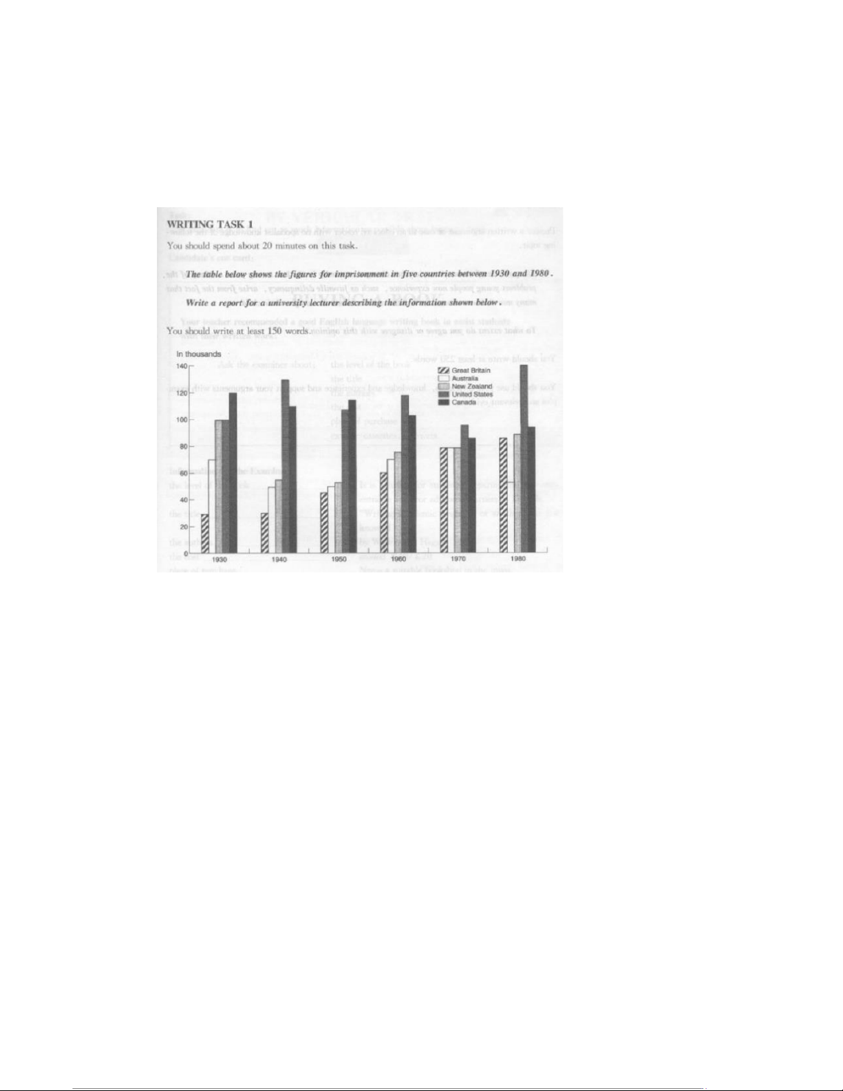
The bar chart gives information about the number of prisoners in five different countries over a
period of fifty years, beginning in 1930. In each of the six different years recorded from this period,
the United States and Canada had either the highest or second highest number of prisoners.
In more than half of the years recorded, the United States had the highest number of prisoners of
these five countries, fluctuating between 100,000 and 140,000 inmates. During those two years
when the United States did not have the highest numbers, Canada surpassed them. In 1930 and
1940, Canada had roughly 120,000 prisoners and the United States was second or joint-second with
closer to 100,000 or 110,000 inmates.
The other countries tended to have far fewer people incarcerated, except New Zealand in the first
year, when they had 100,000 people in prison, giving it the same number as the United States. After
that, New Zealand’s figures fell in 1940, but rose continually until the end of the period. Australia
followed the same pattern, reducing the number of prisoners between 1930 and 1940, but
increasing it after that. The United Kingdom was similar but had a much lower total in 1930. Overall,
the British prison population grew more than any other nation and leapfrogged Australia in the final year. 11 22:56, 09/01/2026
50 Sample IELTS Writing Task Answers for Band 9 Success - Studocu
50 Sample Answers for IELTS Writing [Academic] – from TED-IELTS.com Question Answer
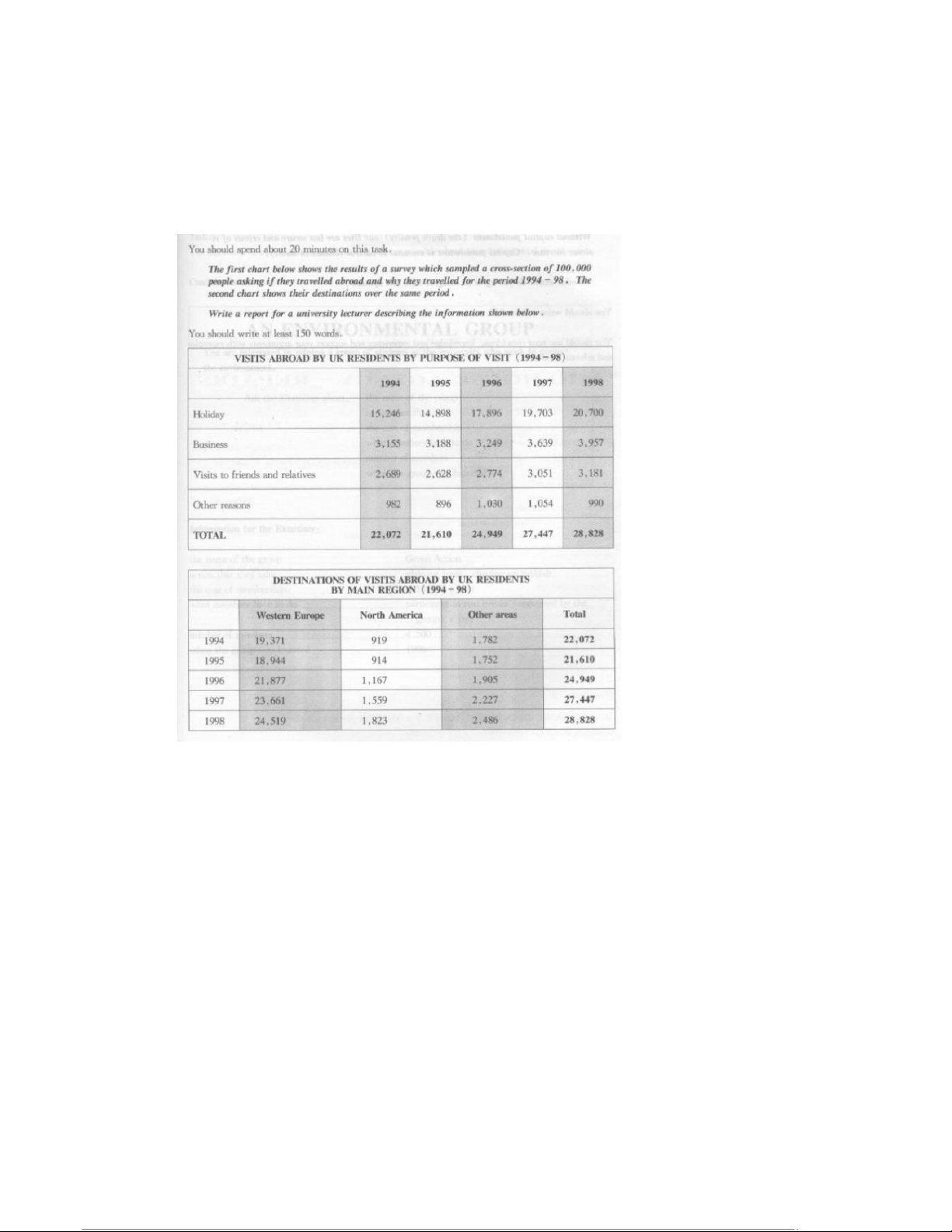
The first table contains information about why British people travelled abroad between 1994 and
1998, and the second shows where they went. It can be seen that people mostly went abroad on
holiday, and that Western Europe was the predominant travel destination for Brits during these years.
In 1994, a little over 22,000 of the British people surveyed said that they travelled abroad, with
about three quarters of those travelling for a holiday. The following year, the overall number of
travellers dropped, but in each of the subsequent years the number grew so that in 1998 there were
nearly 29,000 people travelling abroad. Once again, the vast majority of these people were going for
their holidays, with slight growth in the number travelling for business, to visit friends or family, and other reasons.
In each of the years recorded, most people went to Western Europe. Nearly 20,000 people went to
Western Europe in 1994, growing to nearly 25,000 in the final year of graph. No more than 2,500
people ever went to North America or any other area during those five years. 12 22:56, 09/01/2026
50 Sample IELTS Writing Task Answers for Band 9 Success - Studocu
50 Sample Answers for IELTS Writing [Academic] – from TED-IELTS.com Question Answer
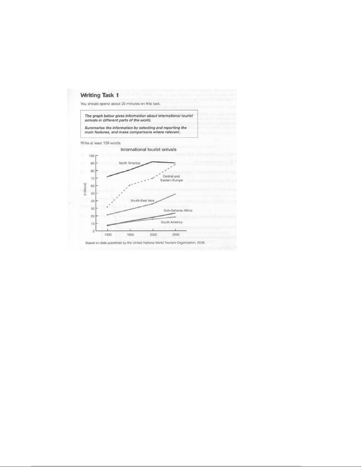
The line graph shows the number of international tourists arriving in five different regions. The chart
records data from 1990 to 2005 and, in each of those years, North America received the highest
number of tourists. However, in the final year it was a close tie between North America and Central
and Eastern Europe, which had risen quite rapidly since the millennium.
In 1990, there were more than twice as many arrivals in North American as in the next most popular
tourist destination, which was Central and Eastern Europe. The figures for North American continued
to grow steadily until the turn of the century, after which they pulled back slightly. During the final
five-year period, the number of arrivals was approximately 90 million. From 30 million in 1990, the
number of arrivals to Central and Eastern Europe rapidly increased and ended the period at almost 90 million as well.
The figures for the other three regions were similar to those of Central and Eastern Europe in that
they constantly increased, but they did so at a much less rapid rate. Southeast Asia saw a somewhat
steady rise from 20 million to about 50 million, while Sub-Saharan Africa and South America
followed a very similar trend to one another. They both grew from less than 10 million to very roughly 20 million. 13 22:56, 09/01/2026
50 Sample IELTS Writing Task Answers for Band 9 Success - Studocu
50 Sample Answers for IELTS Writing [Academic] – from TED-IELTS.com Question Answer
The pie charts show information about three different kinds of nutrients and their prevalence in
typical American meals. There are four kinds of meal mentioned, including snacks. The figures for
sodium and saturated fat are loosely similar, but for added sugar they are quite different.
Sodium and saturated fat are both extremely common in typical American dinners. According to the
pie charts, 43% of sodium is consumed at dinner time as well as 37% of saturated fat, but just 23% of
added sugar is found in American dinners. Almost a third of sodium eaten by Americans is consumed
at lunch, alongside more than a quarter of saturated fat. Breakfasts contain the lowest amount of
these potentially unhealthy ingredients, at 14% sodium and 16% for both saturated fat and added sugar.
The figures for snacks look quite different. More than four tenths of the added sugar consumed by
Americans came from snacks, which also contained a fifth of the saturated fats and about a sixth of sodium. 14 22:56, 09/01/2026
50 Sample IELTS Writing Task Answers for Band 9 Success - Studocu
50 Sample Answers for IELTS Writing [Academic] – from TED-IELTS.com Question
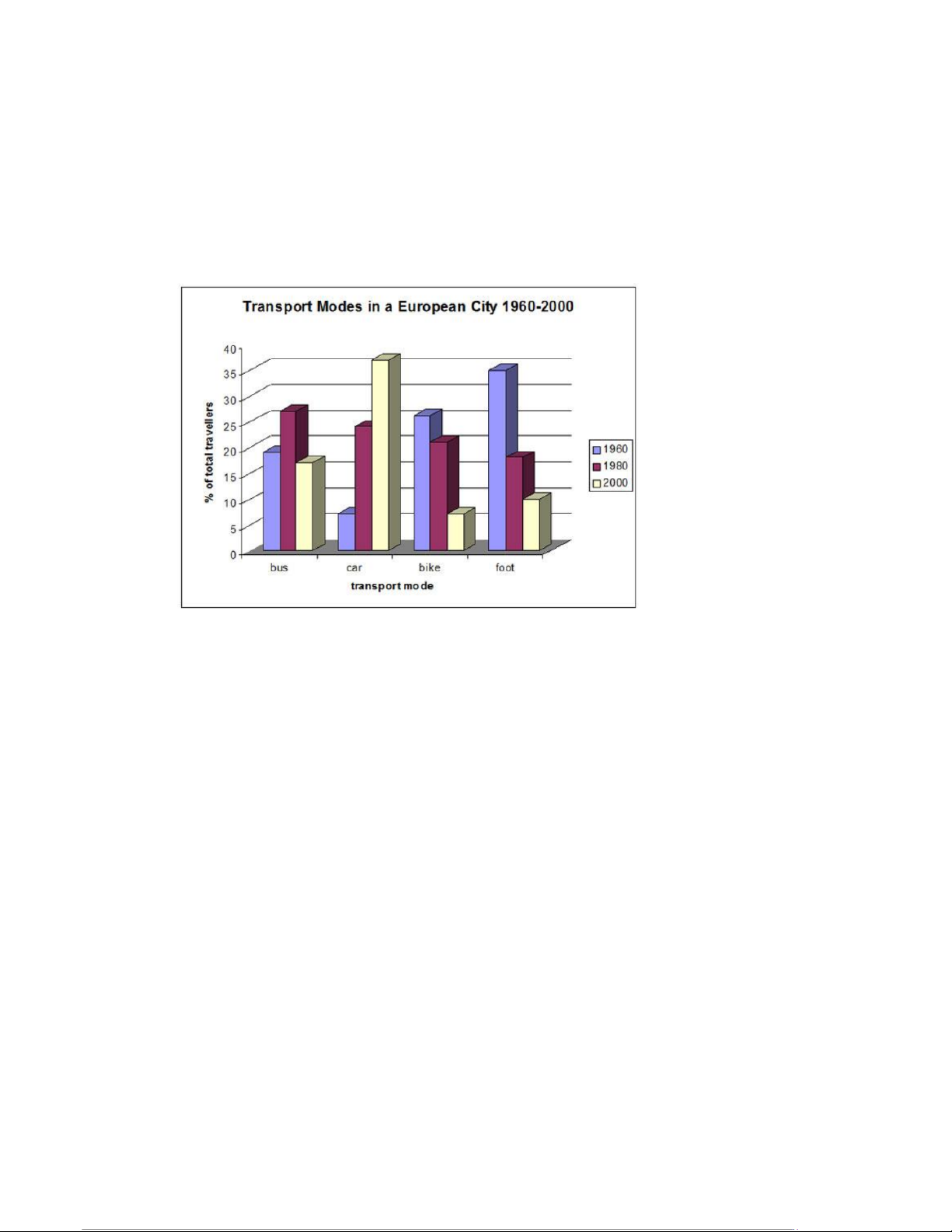
The following bar chart shows the different modes of transport used to travel to and from work in
one European city in 1960, 1980 and 2000. Answer
The bar chart compares modes of transportation for people commuting to work in a European city. It
looks at data from a forty-year period, beginning in 1960 and ending in 2000. There were significant changes during this time.
In 1960, the most popular means of getting to work was by walking, with nearly 35% of people
choosing to go on foot. Similarly, a quarter of people chose to cycle to work. These methods were
far more popular than taking a car, which only about 5% of people did.
These data saw a complete reversal over the next forty years, with walking and cycling falling in
popularity, while driving skyrocketed to become the most common method of commuting. By 2000,
the figures for these three methods had nearly inverted.
Buses, on the other hand, started and ended the period at around the same level, although they
spiked in popularity in 1980, briefly being the chosen type of transport for about a quarter of people. 15 22:56, 09/01/2026
50 Sample IELTS Writing Task Answers for Band 9 Success - Studocu
50 Sample Answers for IELTS Writing [Academic] – from TED-IELTS.com Question Answer
There are two maps, one of which shows Islip town centre at present and one which shows plans for
its redevelopment. A great many changes are anticipated to take place.
Currently, Islip town centre is comprised of a main road that has shops along either side. There is
housing behind the shops, and on the western edge of the main road there is a small side road
leading to a school. To the east, another side road leads to a park.
The proposed changes completely reshape the landscape of Islip. Only half of the shops will remain,
and the main road will be turned into a pedestrian walkway. On the northern side of what was once
the main road, there will be a bus station, a shopping centre, a car park, and some new housing. The
park in the east will be reduced in size and more new housing added, whilst perhaps the most
notable change of all will be a large dual carriageway that will encircle the whole town. 16 22:56, 09/01/2026
50 Sample IELTS Writing Task Answers for Band 9 Success - Studocu
50 Sample Answers for IELTS Writing [Academic] – from TED-IELTS.com Question Answer
The bar chart shows data about exercise done by Australians in 2010. The information is categorized
by age and gender, and it is clear that women do more physical activity than men in each age group except for the youngest.
In the youngest group, which shows data about people aged fifteen to twenty-four, the males are
recorded as doing more exercise than the females, with 58.2% compared to 47.7% saying that they
do regular physical activity. In the next age bracket, however, the percentage of men who exercise
drops significantly to 42.2%, while the number of women rises slightly. The same trend takes place
during the next age group as well, with the number of men exercising continuing to decline, and the number for women rising.
From the age of thirty-five onwards, the number of women exercising stays fairly steady, while the
figures for men improve, until the final groups of men and women aged sixty-five and over. In this
category, both men and women do far less physical activity, and their figures are very close, at 46.7% and 47.1% respectively. 17 22:56, 09/01/2026
50 Sample IELTS Writing Task Answers for Band 9 Success - Studocu
50 Sample Answers for IELTS Writing [Academic] – from TED-IELTS.com Question Answer
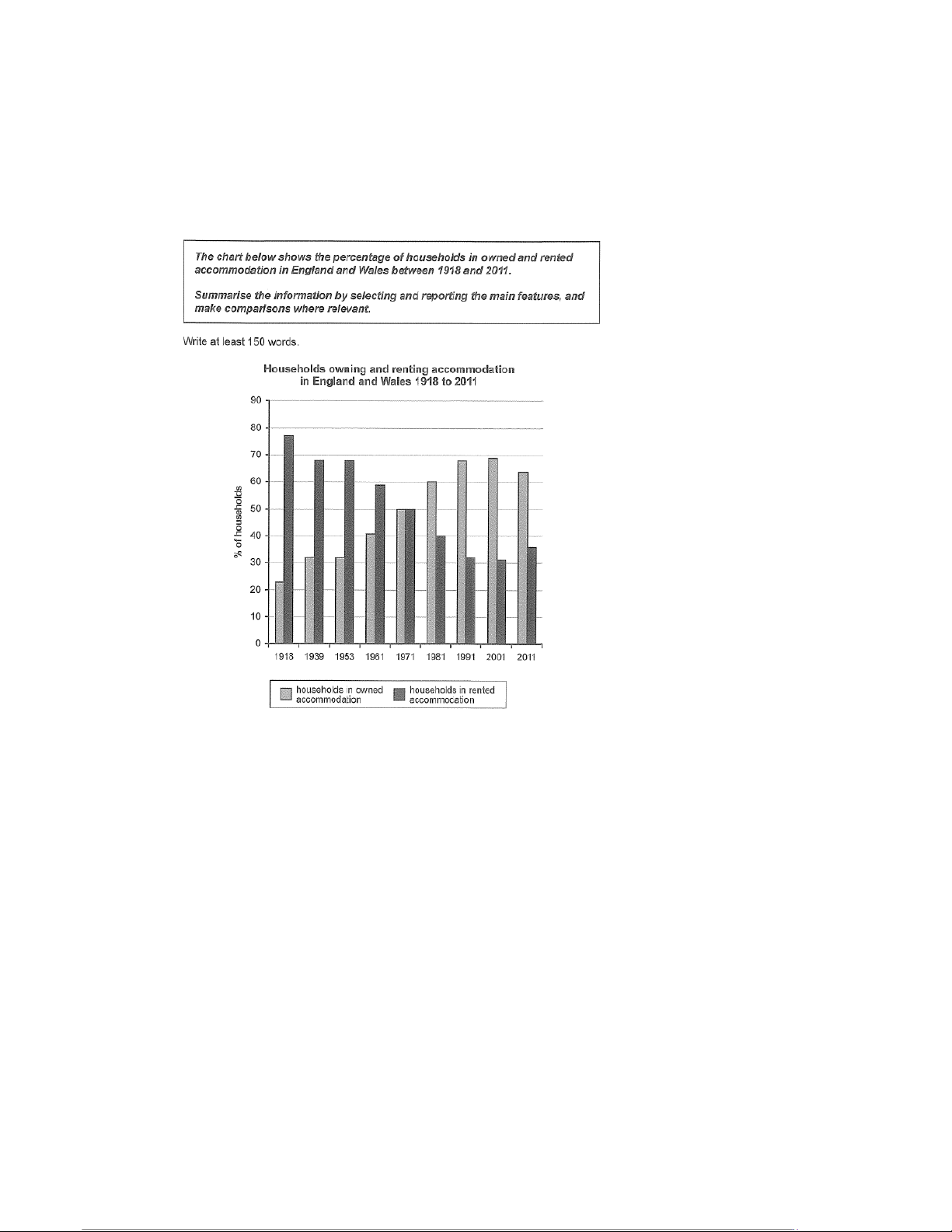
The bar chart shows the percentage of people in England and Wales who owned or rented their
property over a period of nearly one hundred years, beginning in 1918 and ending in 2011. The data
is inversely correlated, meaning that as the number owners increased, the number of renters decreased.
In 1918, accommodations were overwhelmingly rented, with nearly 80% of people renting their
homes rather than owning them. Twenty years later, this figure had dropped to less than 70% of
people, and there was no change over the next decade and a half.
From 1961 onwards, the percentage of people owning a home exploded, while the number of
renters went into free fall. For thirty years this trend continued, until around the millennium it
slowed down, and finally began to reverse in 2011. Between 2001 and 2011, the percentage of
homeowners decreased for the first time in more than a half century. 18 22:56, 09/01/2026
50 Sample IELTS Writing Task Answers for Band 9 Success - Studocu
50 Sample Answers for IELTS Writing [Academic] – from TED-IELTS.com Question Answer
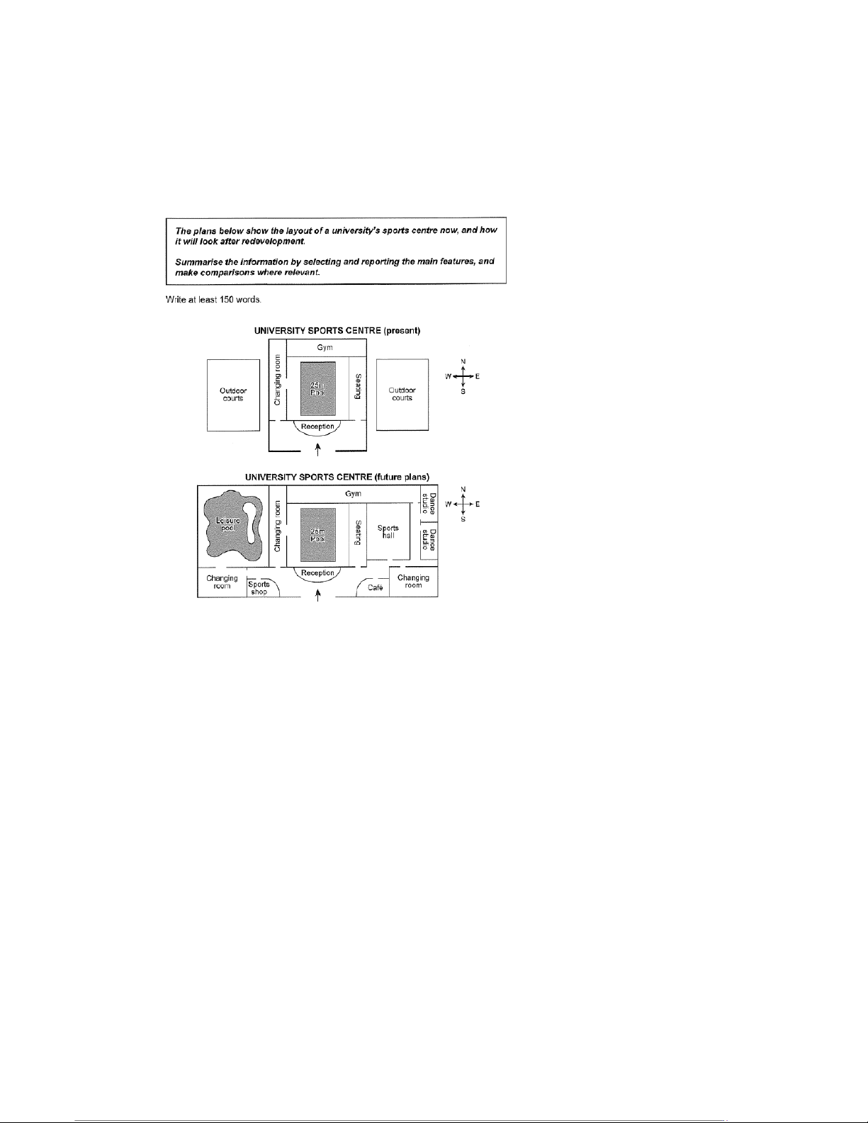
There are two maps depicting a university sports centre before and after a period of redevelopment.
There are some parts that will remain the same and others that will be completely altered, and the
total area of the sports centre will be increased significantly.
At the centre of the sports centre is a 25-metre swimming pool, surrounded by a seating area and a
changing room, with a reception desk between it and the entrance. These features have not
changed between the first map and the second. However, the gym, which sits behind the swimming
pool, has been substantially expanded, and in the second map it is approximately twice the size it
originally was. To the east of the gym, two dance studios have been added in the second map, and
to the west there is now a large leisure pool. At the front of the building, near the reception, there
are two additional changing rooms, as well as a sports shop and café. 19 22:56, 09/01/2026
50 Sample IELTS Writing Task Answers for Band 9 Success - Studocu
50 Sample Answers for IELTS Writing [Academic] – from TED-IELTS.com Question Answer
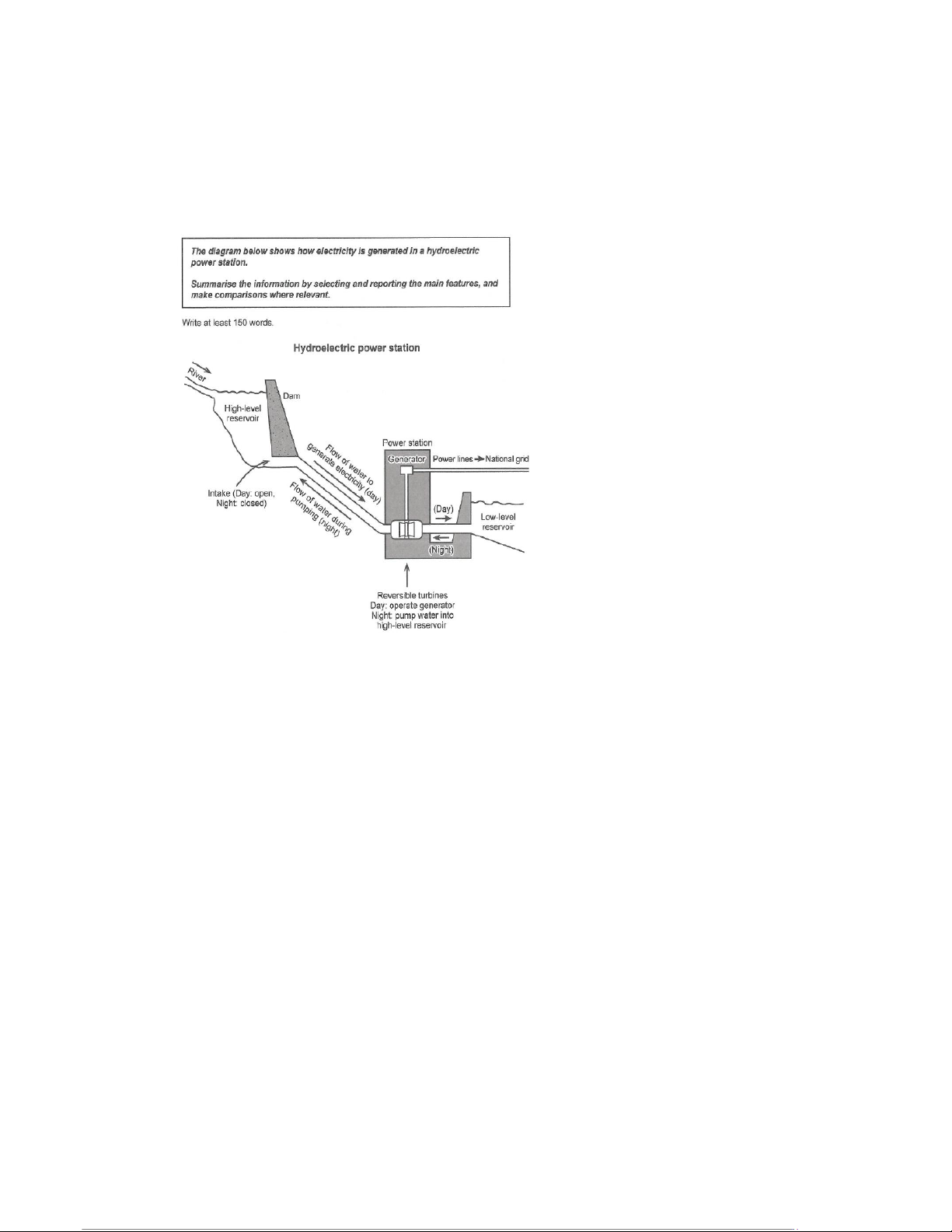
The diagram depicts a hydroelectric power station, and shows how electricity is generated by the
flow of water through a dam and other component parts. Ultimately, water flows from one reservoir
to another, producing electricity that is sent to the national grid.
Firstly, water enters a reservoir from a river. The water is held back from its natural course by a dam,
underneath which there is an intake pipe that is open during the day and closed at night. During the
daytime, water flows down, via gravity, to the power station, which is housed below the dam. In the
power station, the flowing water spins a generator, which produces an electrical current that is then
distributed via power lines to the national grid.
Once the water has generated this electricity, it flows into a lower reservoir, but at night it is
pumped back up through the system to the upper reservoir, ready to begin the process again the following day. 20
Tài liệu liên quan:
-
English-Vietnamese Translation Guide: The World is Flat môn English Studies| Trường Đại học Thăng Long
31 16 -
Midterm Exam - IC Course: Intercultural Communication Insights môn English Studies| Trường Đại học Thăng Long
33 17 -
Outline and Essay on Apathy's Effects on Individuals & Society môn English Studies| Trường Đại học Thăng Long
35 18 -
Listening Practice: Tapescripts and Exercises - Level 1 môn English Studies| Trường Đại học Thăng Long
34 17 -

TOEIC Sample Tests: Speaking and Writing Overview môn English Studies| Trường Đại học Thăng Long
38 19