Các dạng biểu đồ và cách viết | English 1 (TĐT) | Đại học Tôn Đức Thắng
Overview: Đoạn Overview đầy đủ thường kéo dài từ 2 – 3 câu. Trong đoạn này, bạn cần trả lời được các câu hỏi: Số liệu nào cao nhất? Số liệu nào thấp nhất? Có điều gì khác đáng chú ý trong biểu đồ, hình vẽ đã cho hay không? Các cấu trúc thường dùng: Overall, the data indicates that. Tài liệu được sưu tầm và soạn thảo dưới dạng file PDF để gửi tới các bạn cùng tham khảo, ôn tập đầy đủ kiến thức, chuẩn bị cho các buổi học thật tốt. Mời bạn đọc đón xem!
Môn: English 1 (TĐT) 67 tài liệu
Trường: Trường Đại học Tôn Đức Thắng 4.3 K tài liệu
Tác giả:


Preview text:
lOMoAR cPSD| 40342981
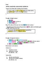
CÁC DẠNG BÀI IELTS WRITING TASK 1 Line graph Bar chart Pie chart lOMoAR cPSD| 40342981 Table Mixed charts lOMoAR cPSD| 40342981 Process lOMoAR cPSD| 40342981 Map LINE GRAPH: lOMoAR cPSD| 40342981 Intro: paraphrase đề Overview:
Đoạn Overview đầy đủ thường kéo dài từ 2 – 3 câu. Trong đoạn này,
bạn cần trả lời được các câu hỏi: •
Số liệu nào cao nhất? Số liệu nào thấp nhất? •
Có điều gì khác đáng chú ý trong biểu đồ, hình vẽ đã cho hay không?
Các cấu trúc thường dùng: •
Overall, the data indicates that… •
In general, it can be seen that… •
It can be seen that A experienced an upward/downward trend over the period of time. •
The most dramatic change was seen in… •
It is noticeable that A accounted for the largest proportion/percentage… •
In particular, the number/the amount of A saw/witnessed a rise/decline….
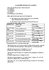
Body1 và Body2 miêu tả chi tiết + so sánh số liệu Tính từ Trạng từ Nghĩa dramatic dramatically lOMoAR cPSD| 40342981 sharp sharply enormous enormously
Thay đổi nhiều, đáng kể, nhanh và rõ substantial substantially considerable considerably significant significantly remarkable remarkably rapid rapidly tremendous tremendously noticeable noticeably moderate moderately constant constantly
Thay đổi bình thường, ổn định progressive progressively slight slightly
Thay đổi ít, không đáng kể marginal marginal y minimal minimally steady steadily slow slowly gradual gradual y lOMoAR cPSD| 40342981 Xu hướng (Trend) Động từ (Verb)
Danh từ Xu hướng giảm mạnh dive (Noun) dive Xu hướng tăng increase increase rise rise grow growth go up upward trend climb
Xu hướng tăng mạnh rocket rocket soar soar leap leap jump jump Xu hướng giảm go down downward trend reduce reduction decline decline drop drop decrease decrease fall/fall down fall plunge plunge slump slump lOMoAR cPSD| 40342981 plummet plummet
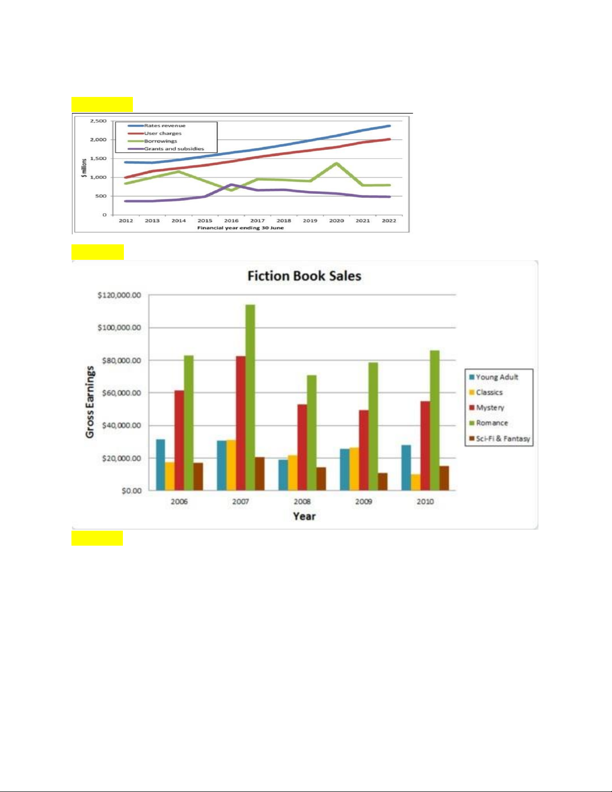
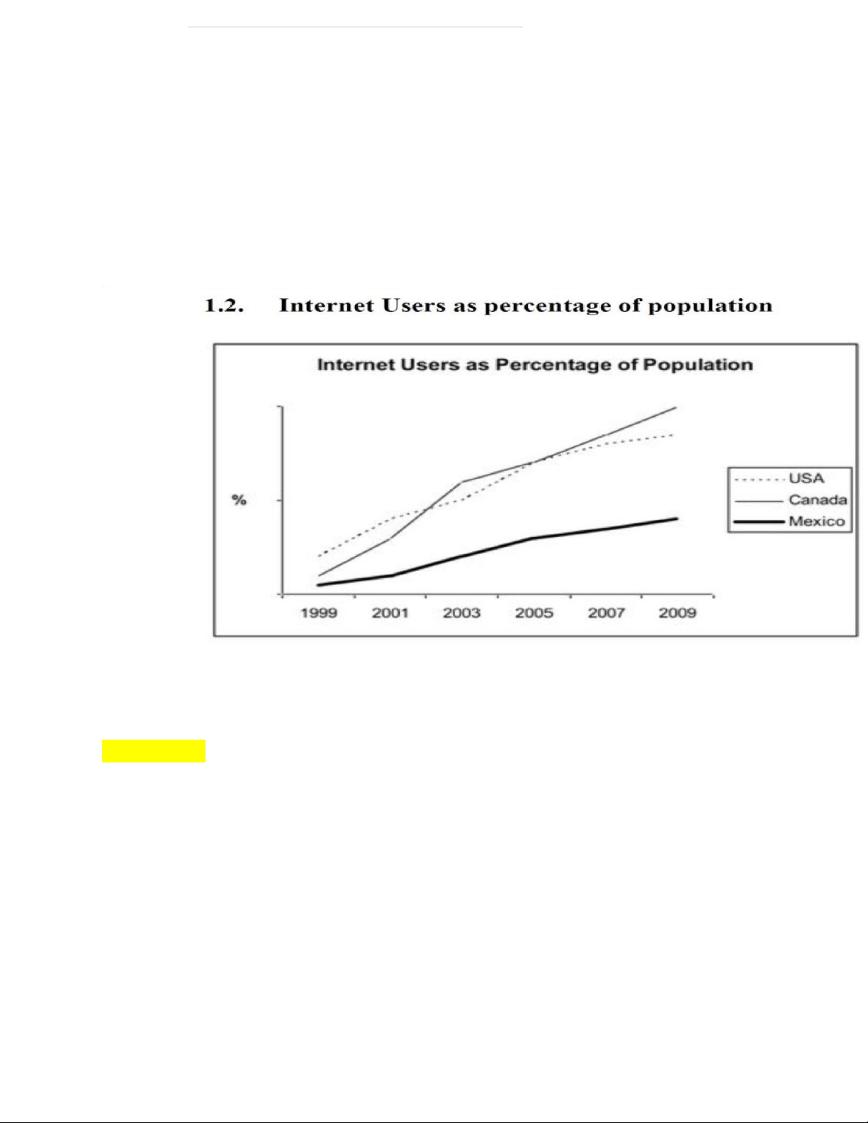
The chart below shows the percentage of internet users in three countries from 1999 to 2009
The line graph compares the percentage of people in three countries who
used the Internet between 1999 and 2009.
It is clear that the proportion of the population who used the Internet
increased in each country over the period shown. Overall, a much larger
percentage of Canadians and Americans had access to the Internet in
comparison with Mexicans, and Canada experienced the fastest growth in Internet usage.
In 1999, the proportion of people using the Internet in the USA was about
20%. The figures for Canada and Mexico were lower, at about 10% and 5%
respectively. In 2005, Internet usage in both the USA and Canada rose rise
to around 70% of the population, while the figure for Mexico reached just over 25%.
By 2009, the percentage of Internet users was highest in Canada. Almost
100% of Canadians used the Internet, compared to about 80% of
Americans and only 40% of Mexicans.
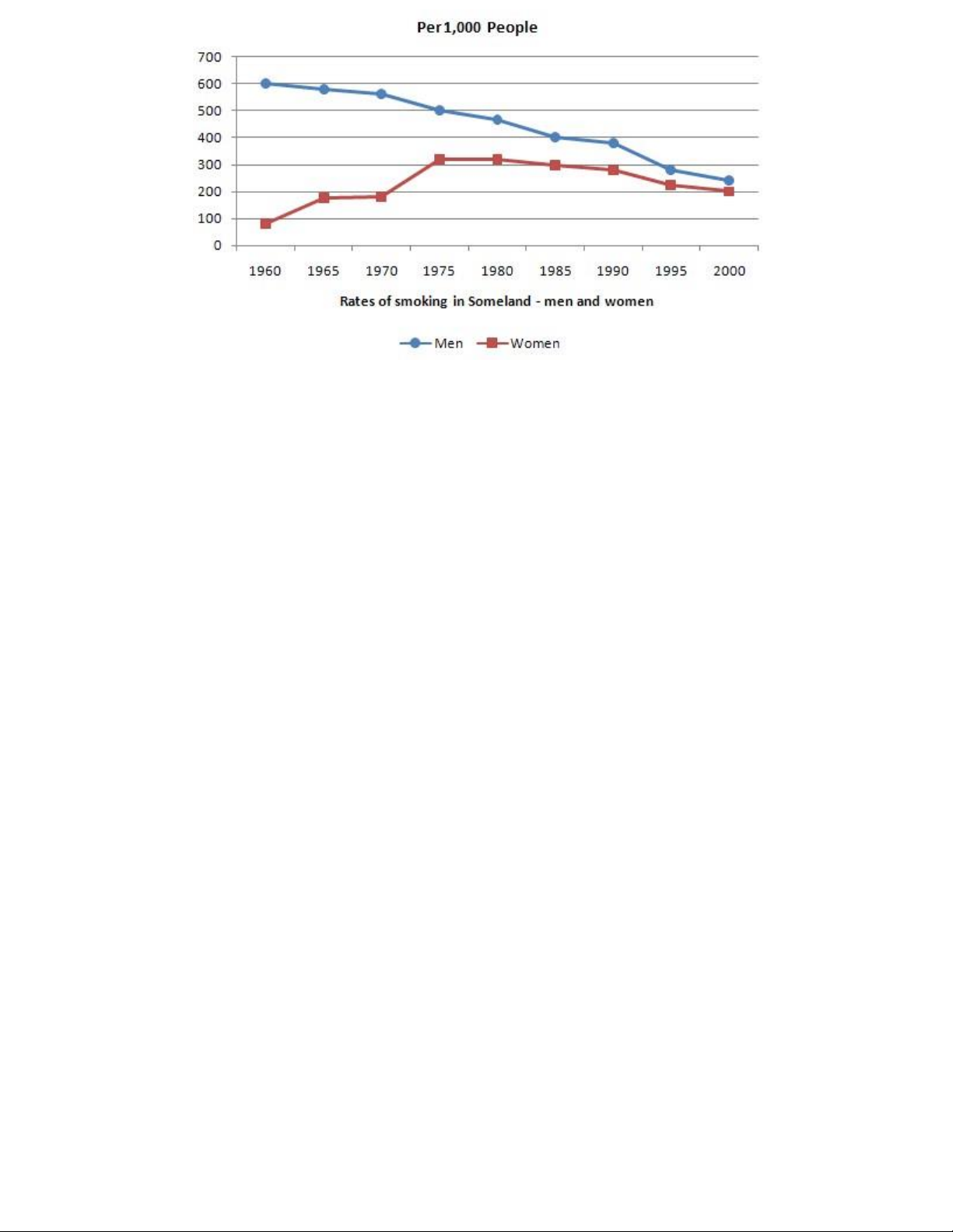
Write a report for a university lecturer describing the information in the graph below. lOMoAR cPSD| 40342981
The line graph shows/describes/illustrates the figures of 1000 cigarette
users between men and women in Someland from 1960 to 2000.
Overall, Men=>decrease slowly, women fluctuate slightly, reach the highest
point, during this period of time It See/witness a +adj+ rise/decline There was a fluctuation
Which was as doubled as the initiating number
Tài liệu liên quan:
-
Unit One & Two Overview | English 1 (TĐT) | Đại học Tôn Đức Thắng
148 74 -
English Listening Comprehension Practice | English 1 (TĐT) | Đại học Tôn Đức Thắng
117 59 -
A Comprehensive Lesson Plan | English 1 (TĐT) | Đại học Tôn Đức Thắng
164 82 -

Listening Answer Key: Unit One & Two Overview | English 1 (TĐT) | Đại học Tôn Đức Thắng
128 64 -
Lý thuyết tổng hợp: So sánh tính từ, trạng từ và danh từ | English 1 (TĐT) | Đại học Tôn Đức Thắng
105 53