Cambridge IELTS Writing Task 1: Sample Essays and Analysis môn English Studies| Trường Đại học Thăng Long
The two plans show that there were a number of small butimportant changes to the ground floor of a museum between 1990 and 2010. Tài liệu giúp bạn tham khảo, ôn tập và đạt kết quả cao. Mời đọc đón xem!
Môn: English Studies 199 tài liệu
Trường: Trường Đại học Thăng Long 550 tài liệu
Tác giả:


Preview text:
16:20, 09/01/2026
Cambridge IELTS Writing Task 1: Sample Essays and Analysis - Studocu
TỔNG HỢP CÁC BÀI ESSAY MẪU TỪ SÁCH CAMBRIDGE IELTS IELTS WRITING TASK 1 16:20, 09/01/2026
Cambridge IELTS Writing Task 1: Sample Essays and Analysis - Studocu IELTS Trainer 2 1. Test 1
The plans below show the layout of the ground floor of a museum in 1990 and in 2010.
Summarise the information by selecting and reporting the main features, and make comparisons where relevant.
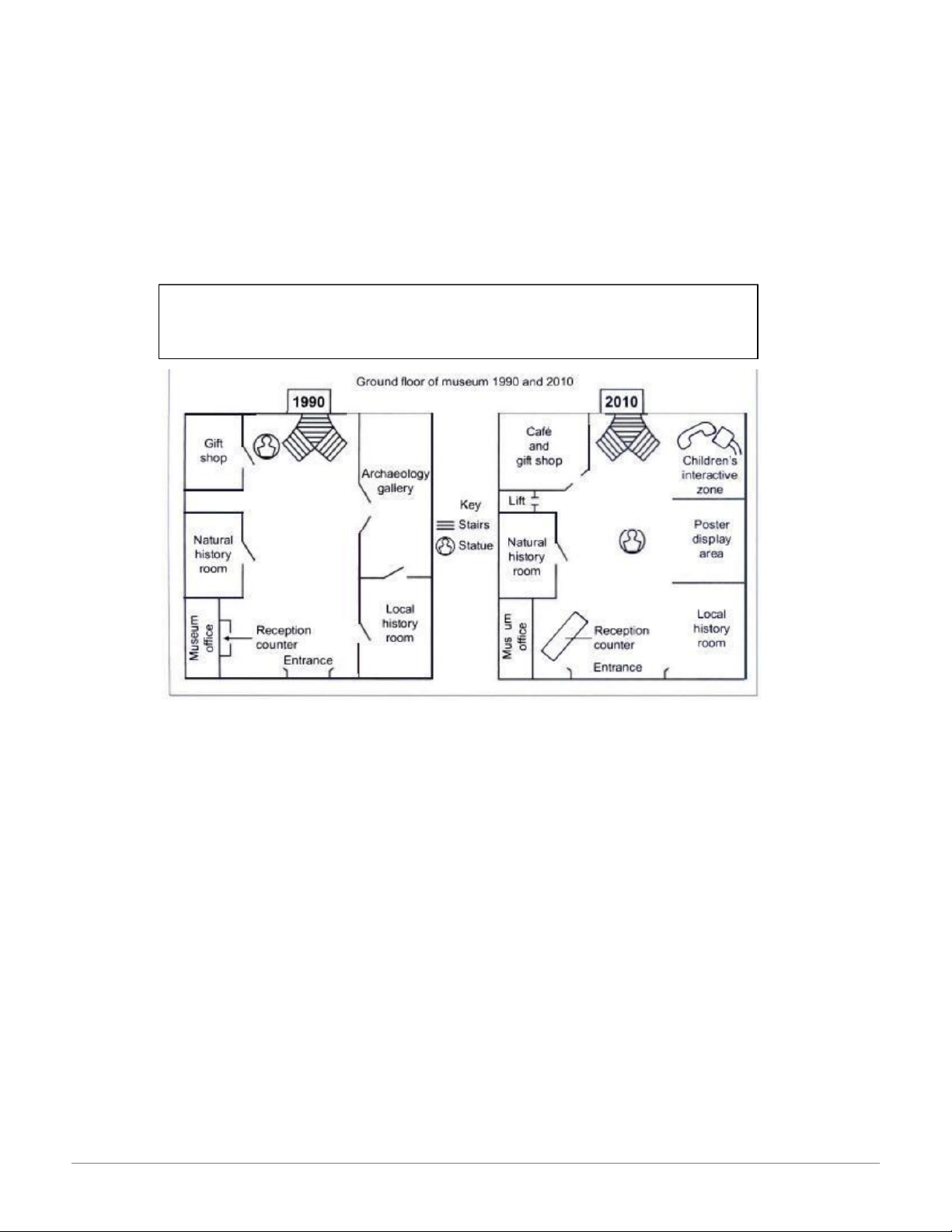
The two plans show that there were a number of small but important changes to the
ground floor of a museum between 1990 and 2010. The general design remained the
same, with the entrance and stairs in the same place, although the entrance was
widened and certain areas were used for different purposes.
The most noticeable alteration was the removal of the Archaeology Gallery. This was
replaced with two new areas: a poster display space and a children’s interactive zone.
The Natural History and Local History rooms stayed the same size and in the same
location, but one wall of the latter was knocked down, making it more open. The
museum office was unchanged but the reception counter was enlarged and moved
closer to the entrance. The original gift shop was expanded to include a café. The
statue which in 1990 was next to the staircase was moved to the centre of the floor. A
lift was added in the space between the Gift Shop and the Natural History Room. ( 170 words) 16:20, 09/01/2026
Cambridge IELTS Writing Task 1: Sample Essays and Analysis - Studocu 2. Test 2
The charts below show the proportion of expenditure by students, on average, at
one university, in 2000 and 2010.
Summarise the information by selecting and reporting the main features, and
make comparisons where relevant
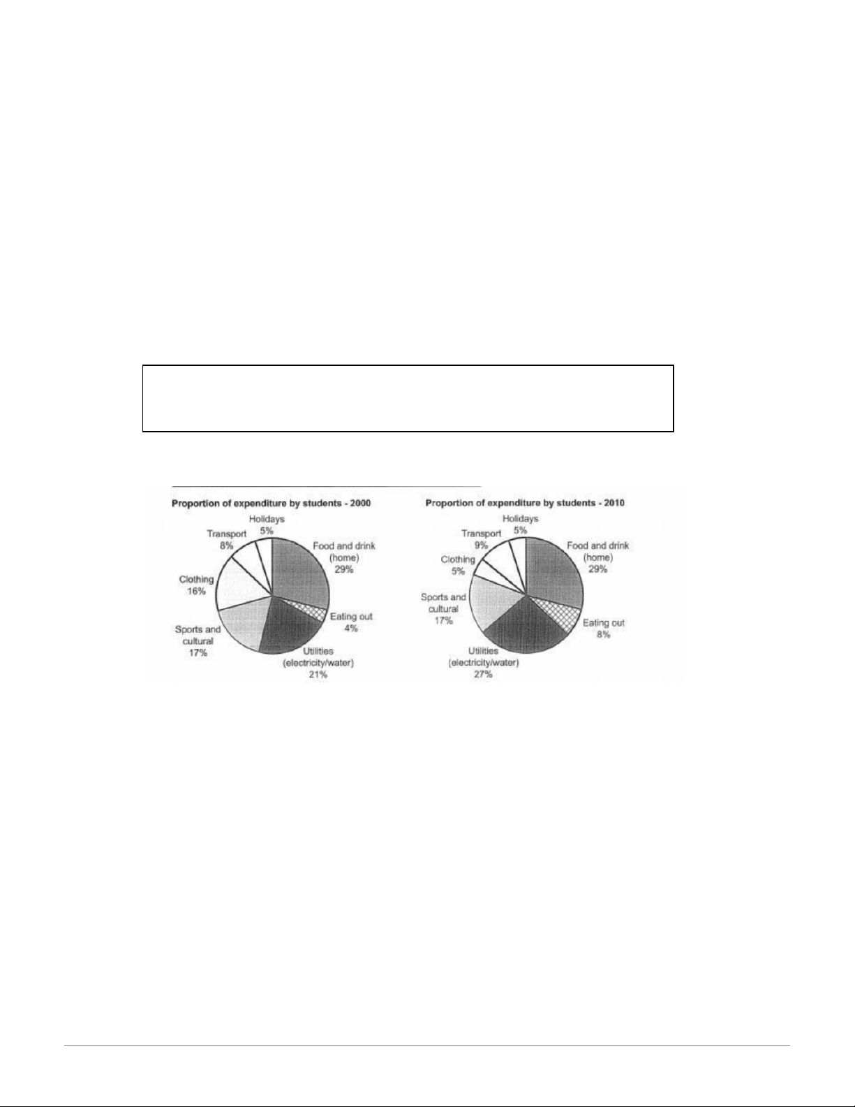
The two charts show how, on average, students in one university divided their spending
across seven areas, in 2010 compared with 2000. It is noticeable that the two biggest
areas for expenditure – food and utilities – between them accounted for over half the total outlay in both years.
However, it is also worth noting that the proportion of spending on food and drink
remained the same, at 29%, while figures for utilities rose quite significantly, from 21%
to 27%. One small but significant statistic was that while eating at home accounted for 16:20, 09/01/2026
Cambridge IELTS Writing Task 1: Sample Essays and Analysis - Studocu
the same percentage in 2010 as in 2000, eating out made up a higher percentage,
rising from 4% to 8%. Another striking change was the proportion of spending on
clothing: this went down markedly, from 16% to just 5% in 2010. Three other areas saw
no or hardly any alteration: the portion of spending on sports and cultural activities
remained at 17% in both years, spending on transport rose by 1% to 9%, while the
proportion on holidays remained exactly the same, at 5%. (175 words) 3. Test 3
The chart below shows the percentage of people accessing news via different
media in one country in 2013, 2015, and 2017.
Summarise the information by selecting and reporting the main features, and make comparisons where relevant. 16:20, 09/01/2026
Cambridge IELTS Writing Task 1: Sample Essays and Analysis - Studocu
The chart shows that there is considerable variation in the ways people accessed news
in the country in question between 2013 and 2017. The most noticeable trend was the
huge decline in the percentage of the population getting their news from printed newspapers.
This saw a collapse from 42% in 2013 to just 22% over five years. By contrast, the
proportion using the internet for news grew from 32% to 41% in 2015 and then saw a
massive rise to 68% by 2017. Figures for radio news saw almost no change, holding
steady at approximately one third. TV news had a sizeable decline between 2013 and
2015 (79% to 67%) but this was followed by a small rise to 71% in 2017. It is noticeable
that in 2013 TV was by far the most popular medium for news access with a 35% gap
between this and the next most popular – newspapers, at 42%. In 2017, TV was still the
most used medium but a close second was the internet and the difference had
narrowed to just 3% – 71% compared to 68%. (181 words) 4. Test 4
The graph below shows information about the use of public transport in one
country by age and location of residence in 2016
Summarise the information by selecting and reporting the main features, and
make comparisons where relevant 16:20, 09/01/2026
Cambridge IELTS Writing Task 1: Sample Essays and Analysis - Studocu
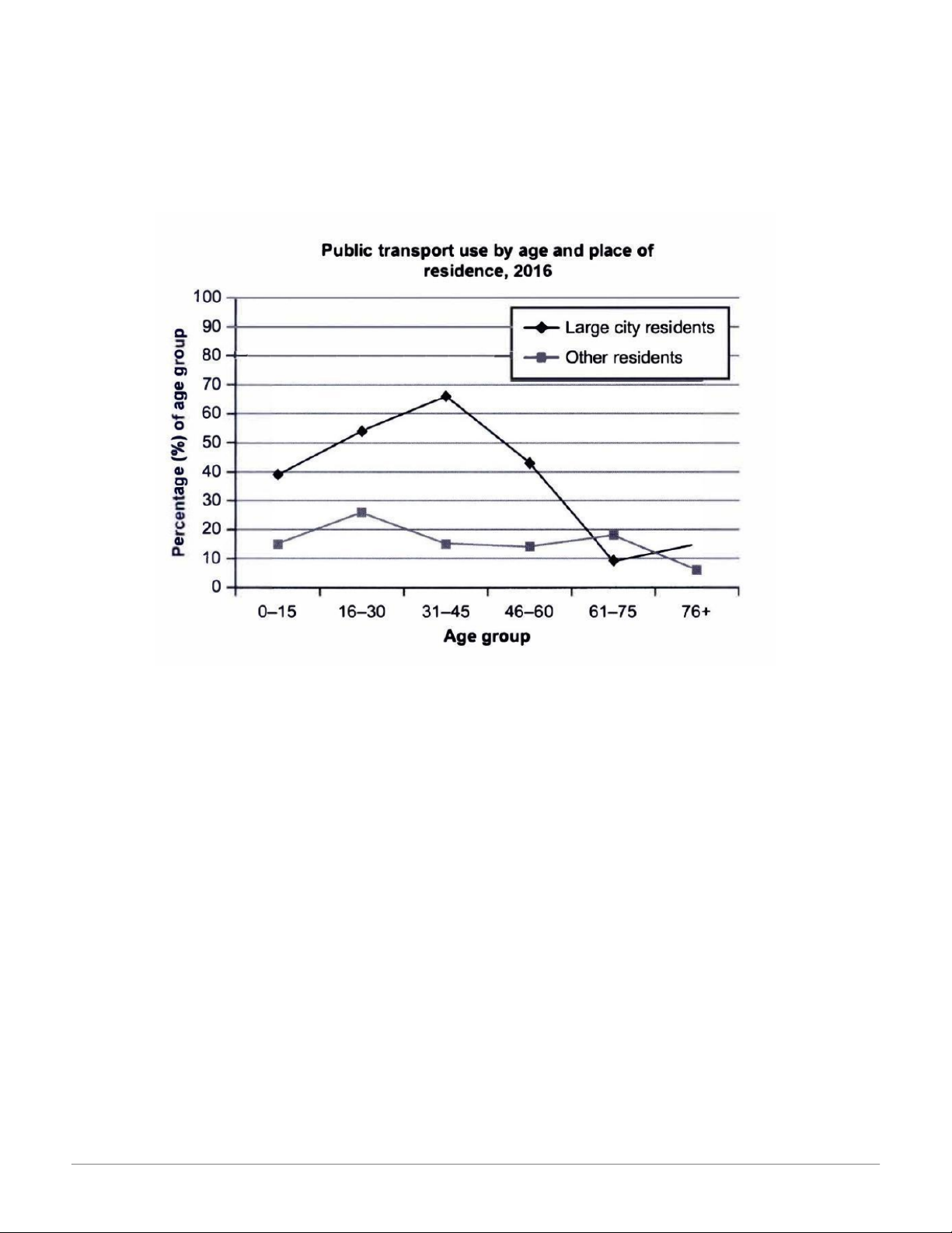
The graph shows a clear difference in the pattern of public transport use in 2016
between people living in large cities and other citizens, in the country in question.
The gap between the two is particularly noticeable for younger and middle-age groups,
with the highest difference for 31–45 year olds: 66% of city dwellers used public
transport compared with just 15% of people living outside large urban centres. For
children the difference was smaller but still significant, at 39% and 15% respectively.
However, for the older ages the trend changed: there was actually a lower percentage
of 61–75 year olds in large urban areas using public transport (9%) than others (18%),
though for those in the oldest age bracket the figures reversed (15% and 6%). It is
noteworthy that there is a more marked fluctuation across age groups for city dwellers:
starting at 39% for the youngest, the figure rises to 66% before dropping sharply to a
low of 9%. By contrast, figures for those living outside big cities hold fairly steady, with a
high of 26% for 16–30 year olds and a low of 6% for the oldest group (190 words) 16:20, 09/01/2026
Cambridge IELTS Writing Task 1: Sample Essays and Analysis - Studocu 5. Test 5
The table shows how patients evaluated different services at three health centres.
Summarize the information by selecting and reporting the main features, and
make comparisons where relevant. Write at least 150 words.
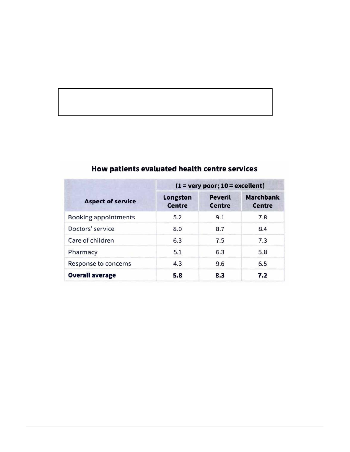
The table shows that there are significant differences in patients’ perceptions of quality
of provision at the three health centres. By far the most highly rated is the Peveril
Centre with an overall mean of 8.3 and the highest scores in all service areas. The
weakest performing centre overall was Longston at just 5.8, with Marchbank between
the two at 7.2. It is noticeable that one aspect – Doctors’ service – received relatively
strong evaluations in all three centres, with scores ranging from 8 to 8.7. Pharmacy
received the poorest ratings of the services in all the centres: at 5.1, 6.3 and 5.8 at
Longston, Peveril and Marchbank respectively. Regarding the other aspects of
provision, there is considerable variation. Perhaps the most striking differential in ratings
is in Response to concerns, which for Peveril is the highest scoring of all the aspects, at
9.6. This compares with 6.5 for this area at Marchbank and just 4.3 at Longston. 16:20, 09/01/2026
Cambridge IELTS Writing Task 1: Sample Essays and Analysis - Studocu
Ratings for Care of children are moderate in all three centres, though they are
significantly lower for Longston than for the other two: 6.3, compared to 7.5 at Peveril and 7.3 at Marchbank. (204 words) 6. Test 6
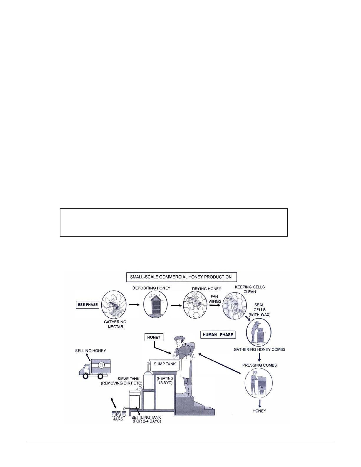
The diagram below shows how honey is made in small-scale commercial production.
Summarize the information by selecting and reporting the main features, and make comparisons where relevant. 16:20, 09/01/2026
Cambridge IELTS Writing Task 1: Sample Essays and Analysis - Studocu
The diagram shows that there are two major phases to the commercial production of
honey: by bees and by human intervention. The process starts when nectar is gathered
by forager bees from flowers. This is carried back to the hive, where it is deposited in
wax cells as honey, which at this stage is very runny. Worker bees then fan their wings
to dry it, thereby making it thicker. Each cell is then sealed with wax to keep the
substance clean; the cells form the honeycombs, which are gathered and taken to the
factory. There they are pressed to release the honey, which is poured into the top
container of three, the sump tank, where it is heated to 45–50°C. This makes it thin
enough to flow by gravity to the next tank, where it is sieved to remove impurities. It
then runs down to the last container, the settling tank, where it sits for two to four days
before being drained out into jars. The jars are then labelled and transported to the place of sale. (177 words) 16:20, 09/01/2026
Cambridge IELTS Writing Task 1: Sample Essays and Analysis - Studocu IELTS Trainer 1 7. Test 1
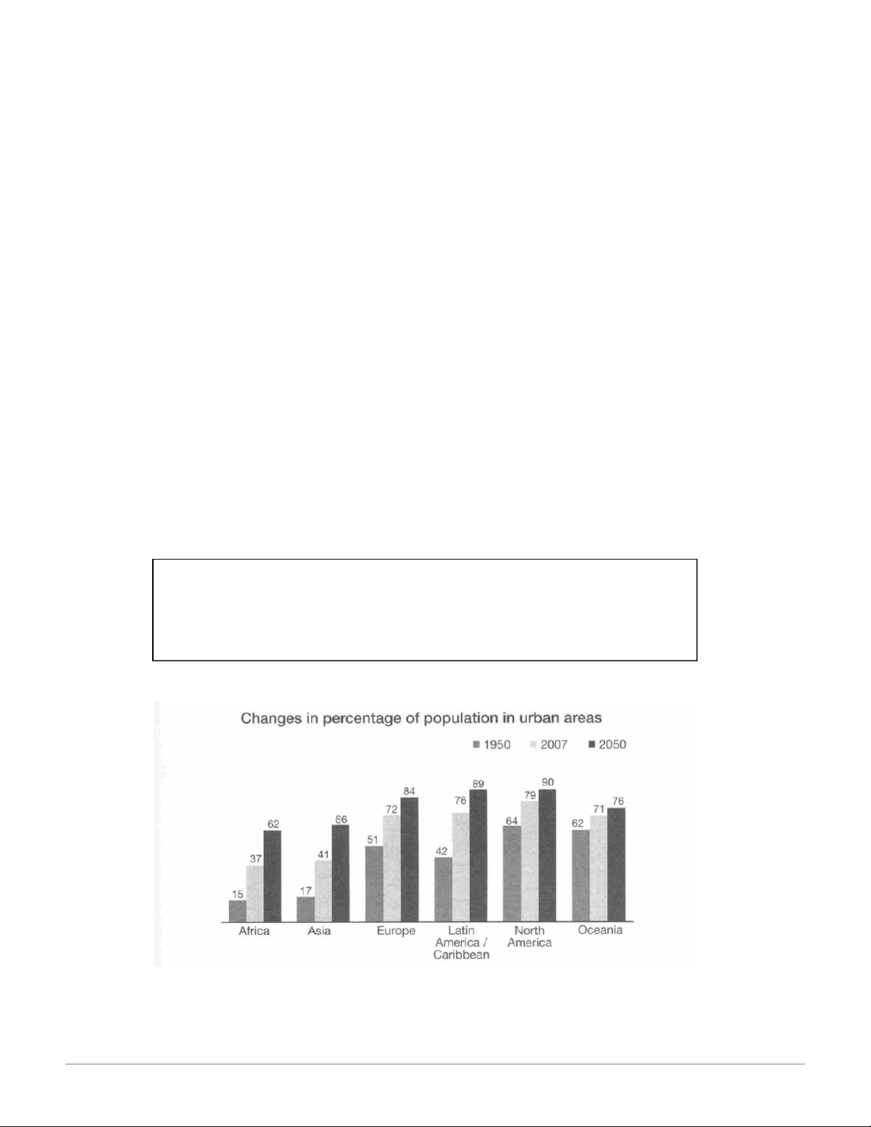
The bar chart below gives information about the percentage of the population living
in urban areas in different parts of the world.
Summarise the information by selecting and reporting the main features, and make comparisons where relevant. Write at least 150 words. 16:20, 09/01/2026
Cambridge IELTS Writing Task 1: Sample Essays and Analysis - Studocu
This bar chart compares the growth in the percentage of the population living in urban
areas in six different regions of the world.
According to the chart, between 1950 and 2007 the percentage of the population living
in cities in Latin America and the Caribbean almost doubled from 42% to 76%, whereas
in Europe it only increased by 21%. However, in Europe over half the people already lived in cities in 1950.
When we compare the projected increases in Asia and Europe by 2050 we see that in
Asia the percentage will continue to grow at the same speed, with a further increase of
25%, whereas in Europe the change will be even slower than before, increasing by only
12%. By 2050, the vast majority (around 90%) of people in Latin America, the
Caribbean and North America will live in cities. Even in Africa, more than half the
population (62%) will live in urban areas by then. 8. Test 2
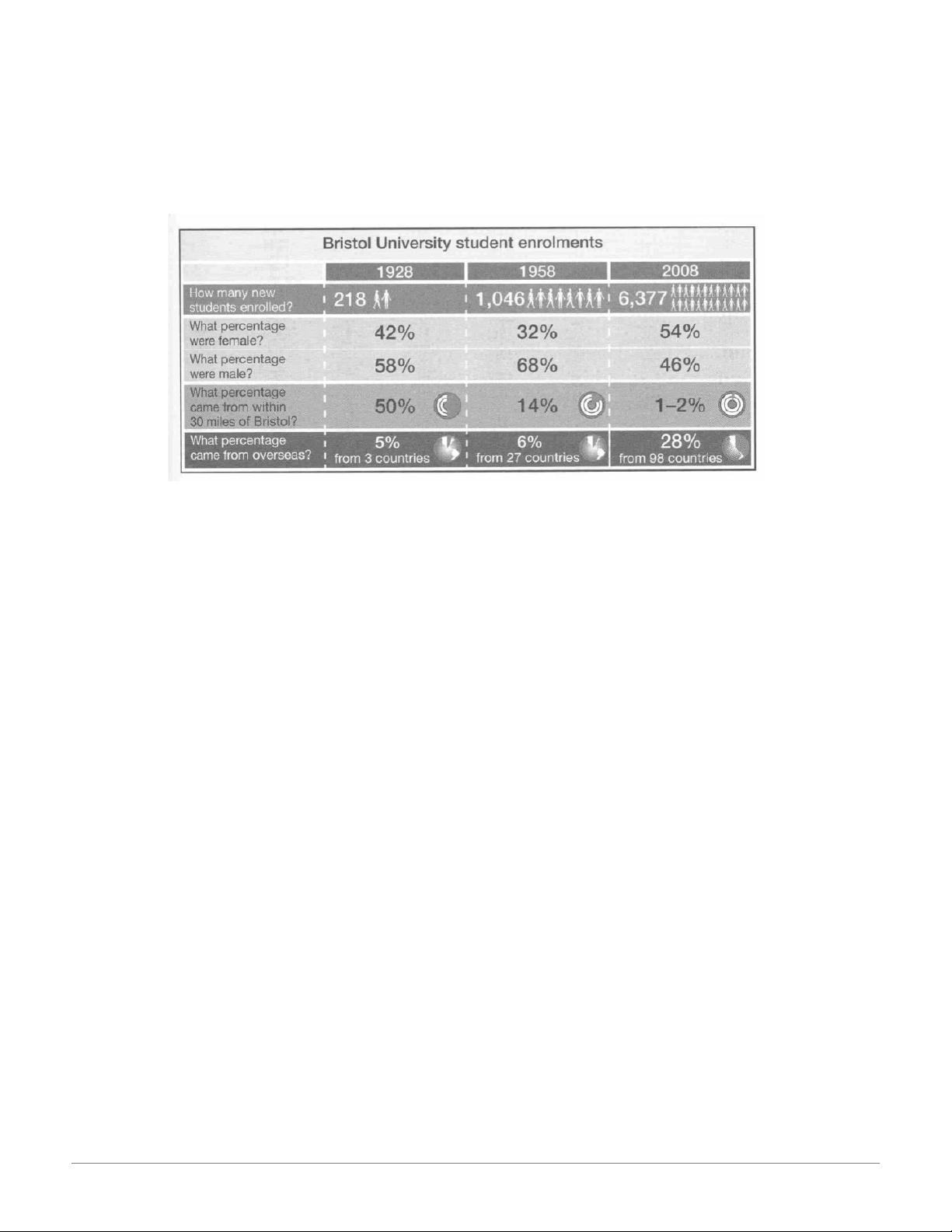
The table below gives information about student enrolments at Bristol University in 1928, 1958, and 2008.
Summarise the information by selecting and reporting the main features, and make comparisons where relevant. 16:20, 09/01/2026
Cambridge IELTS Writing Task 1: Sample Essays and Analysis - Studocu
In the table we can see information about the numbers of students enrolling at Bristol
University in the three years, 1928, 1958 and 2008. It compares the percentage of
females and males, and also students from abroad and those from within 30 miles of the city.
The most noticeable changes concern the overall growth of student numbers, from 218
in 1928 to 6,377 in 2008, and the proportions of local students, who constituted 50% of
the total in 1928, but only 1-2% in 2008.
It is surprising to note that the percentage of female enrolments did not rise steadily, but
dropped between 1928 and 1958. However, at the same time, the percentage of the
student population who came from abroad remained almost unchanged between 1928
and 1958, being 5% and 6% respectively, but rose markedly after that, so that by 2008
foreign students represented 28% of the total. 16:20, 09/01/2026
Cambridge IELTS Writing Task 1: Sample Essays and Analysis - Studocu 9. Test 3
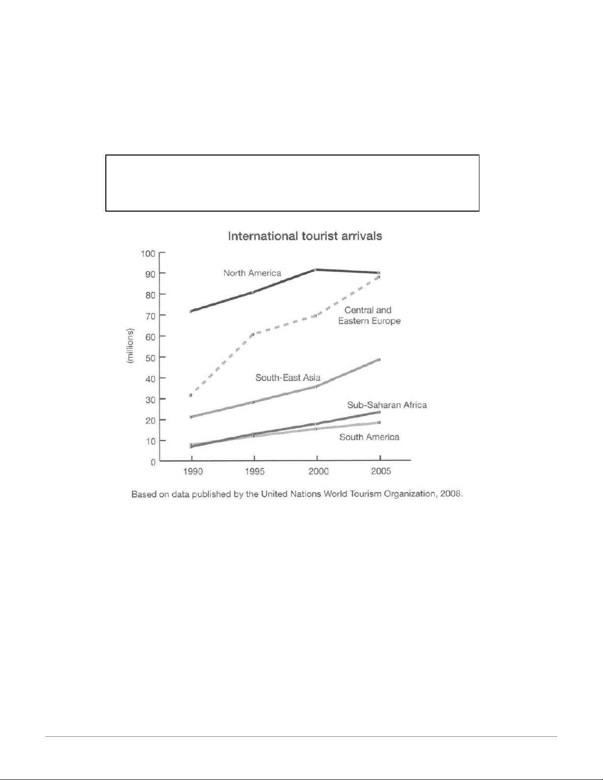
The graph below gives information about international tourist arrivals in different parts of the world.
Summarize the information by selecting and reporting the main features, and make comparisons where relevant.
The graph shows the overall numbers of tourist arrivals in five parts of the world
between 1990 and 2005. In 1990 over 70 million tourists visited North America, more
than twice as many as the next most popular destination shown, Central and Eastern
Europe. However, between 2000 and 2005 there was a decrease of approximately
1,500,000 in the numbers going to North America whereas there was an increase of
nearly 20 million tourists visiting Central and Eastern Europe. The result was that in
2005 the number of tourists arriving in North America and Central and Eastern Europe
was almost equal at around 90 million each. The number of tourists visiting South-East
Asia rose steadily over the whole period but by 2005 the total was still under 50 million.
The regions with the fewest tourist arrivals were South America and Sub-Saharan
Africa. The number of tourists going there was similar between 1990 and 1995 but after 16:20, 09/01/2026
Cambridge IELTS Writing Task 1: Sample Essays and Analysis - Studocu
that there was a greater increase in tourists going to Sub-Saharan Africa than to South America. 10. Test 4
The graph below gives information about how much people in the United States
and the United Kingdom spend on petrol.
Summarize the information by selecting and reporting the main features, and make comparisons where relevant
The graph compares the percentage of their income which people in the UK and USA
spend on petrol. From the data, we can see two clear differences.
Firstly, the difference between the poorest 10% and the richest 10% is greater in the UK
than in the USA. In the former, the poorest spend less than 0.5% of their income on
petrol: suggesting that they do not use cars very much, and the richest spend around
3%. By contrast, in the US, the poorest spend around 4-5% while the richest spend
between 2 and 3%. This suggests that virtually everyone in the USA uses a car
sometimes. Secondly, in the USA it is also noticeable that the percentage of income
spent by the poor can be twice that spent by the rich. However, in the UK, the
percentage spent rises quite steeply for the poorer members of the population but then 16:20, 09/01/2026
Cambridge IELTS Writing Task 1: Sample Essays and Analysis - Studocu
remains almost constant apart from the very richest, when it falls again. In both
countries people on middle incomes spend about the same percentage. Overall, the
percentage of income spent on fuel generally gets higher in the UK, the more you earn,
whereas it decreases in the US. 11. Test 5
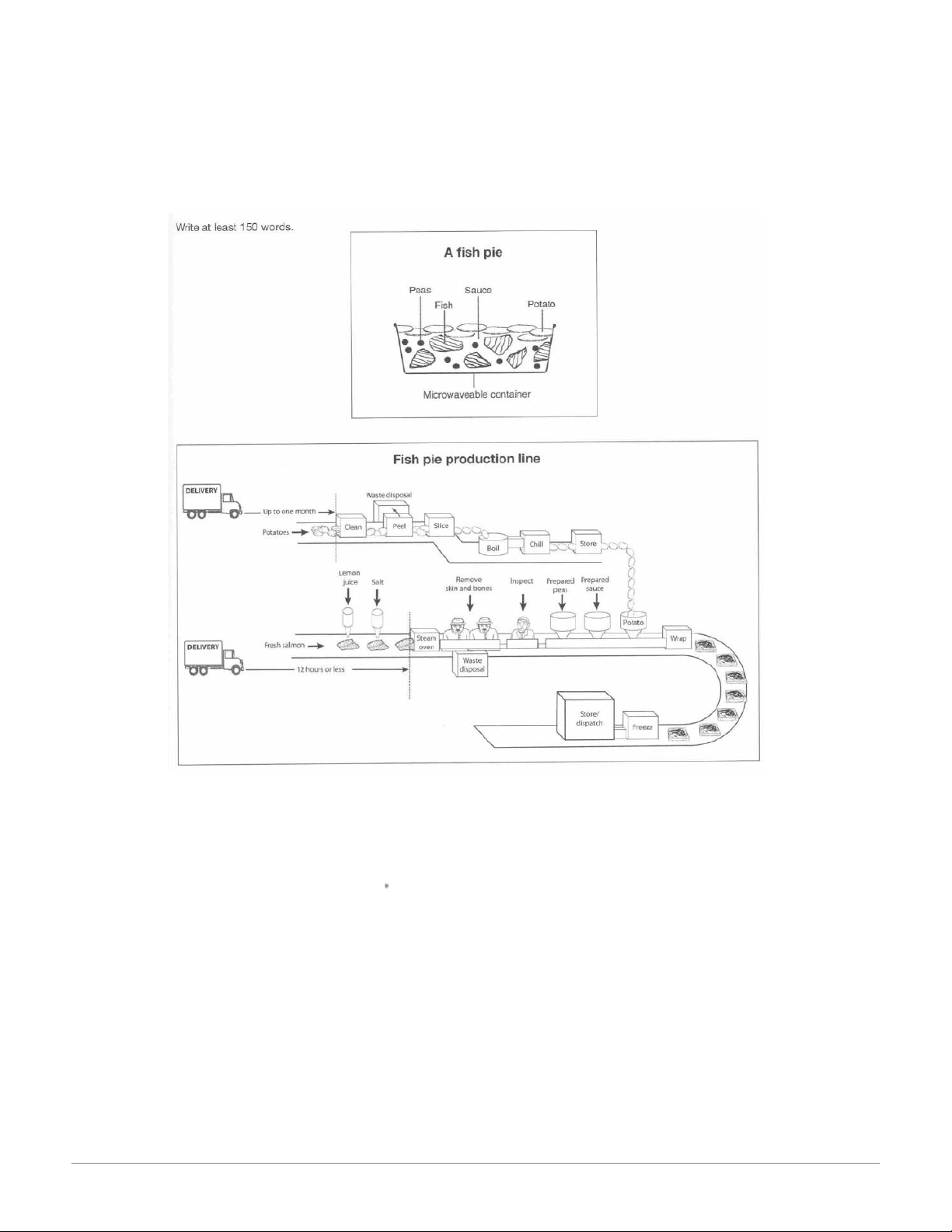
The diagrams below give information about the manufacture of frozen fish pies.
Summarize the information by selecting and reporting the main features, and make comparisons where relevant. 16:20, 09/01/2026
Cambridge IELTS Writing Task 1: Sample Essays and Analysis - Studocu
This diagram shows that there are a number of processes involved in the commercial
production of frozen fish pies. The main ingredients consist of fresh salmon, peas and
sauce, with sliced potatoes, and they are prepared separately. The potatoes, which may
have been delivered up to a month in advance, are cleaned, peeled and cut into slices. The slices are boiled and
then chilled before being stored until needed. The
preparation of the fish is more labour intensive than the preparation of the potatoes.
Within twelve hours of being delivered to the factory, the fresh fish is cooked by being
steamed with lemon juice and salt. Then the skin and bones are removed by hand and
disposed of, before a visual inspection takes place.
After this, the pies are assembled in microwaveable containers. Peas and sauce, which
have also been prepared, are added to the fish and then the pie is covered with a layer 16:20, 09/01/2026
Cambridge IELTS Writing Task 1: Sample Essays and Analysis - Studocu
of cooked potato slices. The pies are then wrapped and frozen. At this point they are
ready for dispatch, or they may be stored at the factory before being dispatched. 16:20, 09/01/2026
Cambridge IELTS Writing Task 1: Sample Essays and Analysis - Studocu 12. Test 6
The charts below give information about weather in two Brazilian cities.
Summarize the information by selecting and reporting the main features, and make comparisons where relevant. 16:20, 09/01/2026
Cambridge IELTS Writing Task 1: Sample Essays and Analysis - Studocu
These charts give information about the rainfall and temperatures for the cities of
Brasilia and Recife, with additional data about hours of sunshine and days with thunder.
Although temperatures in Brasilia can be quite extreme, from just above freezing to
37oC, the average daily temperatures in Recife are not so variable. In Brasilia the range
can be as great as 15 degrees, but in Recife average daily temperatures generally vary
from 22oC to 31oC throughout the year. 16:20, 09/01/2026
Cambridge IELTS Writing Task 1: Sample Essays and Analysis - Studocu
The most noticeable contrast is in the rainfall. Brasilia is wettest from September to May,
with only two or three wet days in June, July and August. During the wet months, there
is thunder on approximately half the days. By contrast, Recife has at least ten wet days,
even its driest season, which lasts from October to January. From April to August there
is rain on over twenty days per month. However, thunder is less common there, with a
maximum of three thundery days in April.
Official Cambridge Guide to IELTS 13. Test 1
The chart below gives information on the percentage of British people giving
money to charity by age range for the years 1990 and 2010.
Summarise the information by selecting and reporting the main features and
make comparisons where relevant.
Tài liệu liên quan:
-
English-Vietnamese Translation Guide: The World is Flat môn English Studies| Trường Đại học Thăng Long
31 16 -
Midterm Exam - IC Course: Intercultural Communication Insights môn English Studies| Trường Đại học Thăng Long
33 17 -
Outline and Essay on Apathy's Effects on Individuals & Society môn English Studies| Trường Đại học Thăng Long
35 18 -
Listening Practice: Tapescripts and Exercises - Level 1 môn English Studies| Trường Đại học Thăng Long
35 18 -

TOEIC Sample Tests: Speaking and Writing Overview môn English Studies| Trường Đại học Thăng Long
38 19