Change Overtime and Fixed Time - Tiếng Anh | Trường Đại Học Ngoại ngữ Huế
Change Overtime and Fixed Time - Tiếng Anh | Trường Đại Học Ngoại ngữ Huế được sưu tầm và soạn thảo dưới dạng file PDF để gửi tới các bạn sinh viên cùng tham khảo, ôn tập đầy đủ kiến thức, chuẩn bị cho các buổi học thật tốt. Mời bạn đọc đón xem!
Môn: Tiếng anh 1 (ENGL 101E) 228 tài liệu
Trường: Trường Đại học Ngoại ngữ, Đại học Huế 466 tài liệu
Tác giả:


Preview text:
Task 1: Fixed Time vs. Change Over Time
Checklist of 11 Expectations 1. Comparatives Examples:
Only Greece and Italy have a greater number of historical monuments.
A higher number of cars are exported from Japan than imported. 2. Superlatives Examples:
The chemical sector used the greatest amounts of both ground water and aquifers.
The water usage by the metal industry accounted for the second largest.
The amount spent on the public water supply was the largest of all the expenses. 3. Adverbials Examples:
There are significantly more men than women at gyms.
Ground water usage was considerably larger than what was expected.
The number of contract workers increased slightly to 18% 4. Approximations Examples:
Purchases accounted for roughly 14,000 vehicles.
Just over a third of the attendees were senior citizens. 5. Linking Comparatives Examples:
A great deal of people prefer travelling by car while/whereas others choose the train.
Adults do not have much free time. Meanwhile, children have far more free time.
Compared with Android phones, iPhones are lighter and produce better images.
6. Proportional Terms – for both fixed time and change over time
1. doubled, tripled, increased twofold, etc. (verb phrases)
In the first two examples here, the basic form of the sentence is subject + verb + time span. Time span is not
necessary but does add useful information to the sentences.
One common alternative for double and triple is the verb + adverb phrase “increased twofold” or “increased
threefold”. The only other point to note here is that the adverb “nearly” comes between “increased” and “threefold”. Examples – Profits doubled
from year 1 to year 4.
The amount of compost nearly tripled over the period shown in the chart.
The amount of compost increased nearly threefold
over the period shown in the chart.
2. a twofold increase, etc. (noun phrases)
It’s also common to use “increase” as a noun with “twofold” working as an adjective together with the be verb. For
whatever reason, this form is usually used for increases rather than decreases. Examples – There was
a two-fold increase from year 1 to year 4.
There was a nearly threefold increase in the amount of compost over the period shown in the chart.
3. double, triple, half, twice, etc. (predeterminers)
Double and triple are predeterminers which include multipliers (double, twice, four/five times…) as well as
fractions (one-third, three-quarters, half, etc.). They are most commonly used when making comparisons. Multipliers: Examples –
The profits in year 4 were double / twice the profits in year 1.
2009 statistics show triple / three times the amount of recycling as of 2006. Fractions: Examples –
The number of people traveling by bus was half as much in 2005 compared to 2010. T
wice as many people travelled by bus in 2010 compared to 2005 Note –
the entire checklist is meant to be used as a reminder of grammar range and vocabulary. This does NOT mean you must
use all the point in the checklist to receive a high band score. A high band score will more likely be a result of accuracy
rather than range. Make sure you prioritize the accuracy of your language choices as much as the range because
leveling up your range is pointless without accuracy.
7. Specific Statements – figures / data / numbers for both fixed time and change over time Examples:
Fixed time: Violence against other people was the crime committed the most by women, at/with 23 percent.
Fixed time: Over twice as many robberies were committed by men than women, at/with 7 percent and 3 percent respectively.
Fixed time: Just under half the students went into industry, with service industries attracting more Brighton
graduates than any other sector by far — at almost a third (33.0%).
Fixed time: The least popular choices included work in the charitable sector and careers in sport, both of
which were chosen by well under 1% of graduates.
Fixed time: Whereas North America can boast 19% of the world's global meat production, South America produces just 4%.
Change over time: The number of fatalities at work reached an all-time high in 1994, accounting for 6,612 deaths that year.
Change over time: The number of deaths at work in 2009 (4,551) was nearly equal to workplace fatalities in 2010 (4,690).
Change over time: The total demand for face masks skyrocketed to 75 per household per week in June of 2021.
Change over time: There was a considerable fall by approximately 5% in the proportion change of estate
prices in New York between 1990 and 1995.
Change over time: Tokyo and London, which had the same figures, witnessed a dramatic decrease to about
7% over the same period. However, the figures for Madrid and Frankfurt were around 2% and 3%, respectively.
Change over time: During the latter period from 1996 to 2002, the figure for exported coffee was the highest
at 66%, and with more than 40% of the coffee being shipped to America.
Change over time: This rate in Frankfurt was 2%, which was lower than in the first 5-year period. Finally, the
change in percentage for Tokyo fell by around 5% between 1996 and 2002.
Change over time: The most popular languages were Spanish, German and French, of which the Spanish
language was the most popular, starting from 1889 students in 2000 and gradually increasing to 2453 in 2005. Change Over Time: 1. Comparatives 2. Superlatives 3. Adverbials 4. Approximations 5. Linking Comparatives 6. Proportional Terms 7. Specific Statements +
8. Language of Movement
pronoun + nouns OR subject + past tense verb Examples:
There was an increase (noun) in the number of exports to America.
Italian leather exports arriving in Australia peaked (verb) in late November, 2020.
9. Degree of Speed / Change
adjective + noun - OR - adverb + past tense verb Examples:
The figure for sales increased significantly (verb+ adverb) to just over 10 billion units sold.
There was a rapid rise (adjective + noun) in the number of immigrants arriving in America just after WWII.
10. Time Periods / Time Expressions – prepositional phrases that answers WHEN?
preposition + time/date Examples:
Between January and March, tourism experienced a significant drop.
Throughout the whole period, sales rose steadily.
From 8am to 10am, visits to the state park rose dramatically.
11. Sequencers – especially for a process or diagram Examples:
First, Next, Before…, After…, Then…
…, after/before which… , …before/after… , This was followed by…
Summary: Checklist of 11 Expectations
This language is covered in the checklist for the 11 expectations of fixed time vs. change over time.
1. Analyze the graph (brainstorm) What is the graph about ( ? What Where? When?)
What are the axes of the graph?
What is the unit used in the graph?
Note – Use the answer for these questions to write an introductory sentence.
2. Language for fixed time or change over time
If the graph is fixed time, use comparatives and superlatives
If the graph is change over time, determine the general trends of the subjects, using language of movement –
ex. increase, decrease, fluctuate or remain constant, etc.
Note – With change over time graphs, try to have at least 1 comparison (superlative) in each body paragraph
3. Key features: movements (change over time)
If only 1 subject is shown in the graph: Divide the graph into 2 different periods based on the major changes in
movement. Each period will be reported in one body paragraph
If 2 or more subjects are shown in the graph, you have 2 options:
If there are only 2 trends/categories – report each subject in their own body paragraphs, with at least 1
comparison between the 2 subjects in each paragraph.
If there are 3 or more trends/categories – group subjects with similar trends in respective body
paragraphs, report each subject, with at least 1 comparison between the subjects in each body paragraph.
4. Specific Statements: figures / data
Specific figures/data/numbers need to balance out the general statements of the report by giving specific figures for the following:
Start / End figure (change over time)
Similar / Equal figures (fixed time & change over time)
Lowest / Highest figures (fixed time & change over time)
Figures for level periods (ex. figures for ‘...between...and…’ in change over time graphs.
Note – You do NOT need to write a specific statement for every data point on the graph. General statements cover the entire graph, but
specific statements only cover the most important / standout figures for each subject on the graph, as shown above.
All Change-Over-Time Graphs are actually Line Graphs
The table below shows the hours of leisure time spent by people in different age groups in Someland.
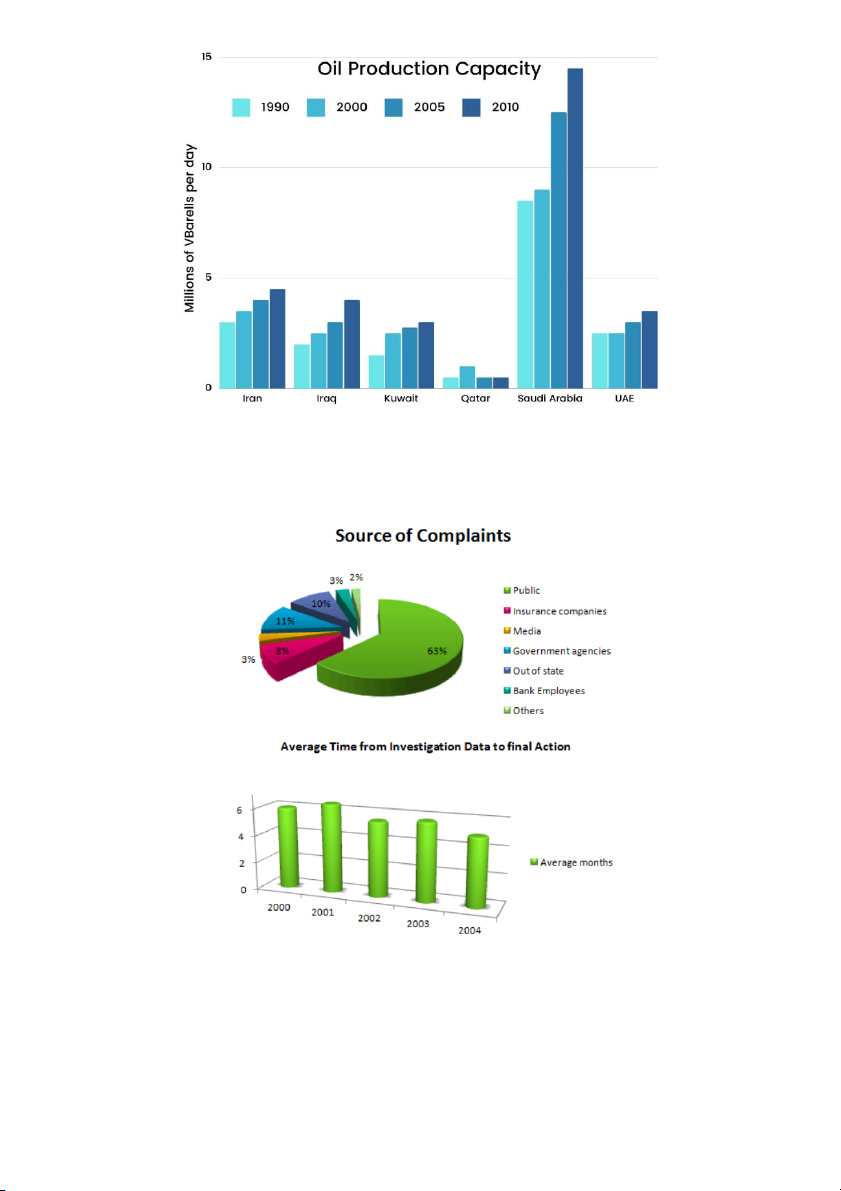
The bar chart illustrates the oil production capacity of several countries in the Middle East over a 20-year period. Example Graphs
The graphs indicate the source of complaints about the Bank of America and the amount of time it takes to have the complaints resolved.
The charts below show the results of a survey about what people of different age groups say makes them most happy.
COMMON MISTAKES with numbers
Fixed Time & Change Over Time
General Statements – subjects / comparisons / movement + Specific Statements – figures / data / numbers
1. When you write a specific large number, especially in specific statements, don't add -s to its end:
5,000,000 = “…exported roughly 5 million kilograms” (not 5 millions kilograms)
4,000 = “…sold nearly 4 thousand motorbikes” (not 4 thousands motorbikes)
2. The noun which follows the large number is always plural.
The number is a countable noun, therefore is used in general statements
“There were four hundred guests at the wedding.”
3. Unspecific large number + of is used to show big quantities:
“There were thousands of people in the meeting.”
“There were millions of voters who turned up for elections, at roughly 20 million (adj) voters (n pl).”
4. Always write percent without s (ex. five percent, twenty-three percent)
The word percentage(s) is a countable noun that usually goes in the general statement, NOT the specific statement.
Meanwhile, percent is an expression of the symbol % which often goes in the specific statement
“The percentage of households that are locked down has increased to 95 percent.”
5. Write two-figure numbers with a hyphen (ex. fifty-four, seventy-two, twenty-one).
“Students finish their post-secondary education when they’re about twenty-four or twenty-five years old.”
6. Always write 100, 1000, 1,000,000 with ‘a’ or ‘one’:
“A hundred” = one hundred (not “hundred”)
“A million” = one million (not “million”)
“A thousand” = one thousand (not “thousand”)
Writing Numbers – https://canvas.hull.ac.uk/courses/213/pages/writing-numbers
COMMON MISTAKES with prepositions when expressing figures Change Over Time
1. Prepositions referring to a single point in graph – beginnings, endings, peaks At With Examples –
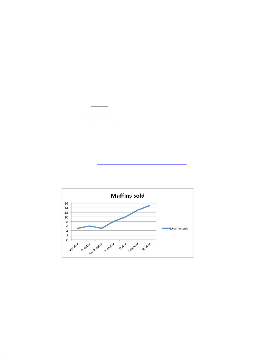
The number of muffins sold started with / at about 5 on Monday.
Sales peaked at about 15 muffins on Sunday.
Sales for muffins ended with / at roughly 15 on Sunday.
2. Prepositions referring to movement – following language of movement From T … o Examples –
Muffin sales increased significantly from about 5 muffins on Wednesday to about 15 on Sunday.
The sale of muffins rocketed to just over 14 muffins by the end of the week.
There was a slight rise in sales from about 5 muffins on Monday to about 30 on Wednesday.
3. Prepositions used with fluctuations Around Between and … … Examples –
Between Monday and Wednesday, muffin sales fluctuated slightly 4 between and 6 muffins.
For three days, the sale of muffins fluctuated slightly around 5 muffins.
4. Prepositions used with amounts – answers how much?
By – combined with verb language of movement
Of – combined with noun language of movement Examples –
Muffin sales increased significantly by 10 muffins between Wednesday and Sunday.
There was a significant increase of 10 muffins between Wednesday and Sunday.
For more details on prepositions go here - https://www.mmmenglish.com/2017/10/10/prepositions-of-time-in-on-at-by/ Structure for Task 1
Introduction – 2 sentences
Introductory sentence (paraphrase what / where / when)
Overview statement (general movement trend or the most striking feature on the graph (highest and lowest))
Body – 2 (optional 3) body paragraphs (
fixed time or change over time)
Cover key features and make comparisons using general description
Include specific data at date points using specific data
Conclusion (optional and not recommended)
This is entirely optional and is really not necessary if you have a proper overview. You are only
wasting more minutes for no additional score.
Introduction (2 sentences)
1. Introductory Sentence - signpost language + paraphrase what / where / when Signpost language What Where When This graph shows ... the number of exports from Vietnam over 10 years starting in 1990. The diagram outlines... rates of economic in the U.K. between 1990 and growth 1996. This table lists... the top ten agencies... in Melbourne in 2010 and 2020. This pie chart the turnover rate in within 3 different in the first quarter of the represents manufacturing factories year. This line chart depicts the changes in sales in Apple Inc. over the past year.
This chart illustrates ... the sales of each in Vingroup during the past ten salesman weeks.
2. Overview statement - signpost language + general trend
If fixed time, the general trend will mention the most and/or the least and/or the biggest/smallest differences
If graph is change over time, the general trend will mention general increases and/or decreases and/or
fluctuations and/or level movements Signpost language –
Overall, on the whole, generally, in general As an overall trend.
BREAKDOWN – Paraphrasing
It is helpful to describe what is being measured in more than one way. We can make a noun phrase
such as the use of cars into the two-word noun phrase – car use
Notice that the noun cars from the first phrase transforms into an adjective in the second phrase, so it
looks like a singular noun (car) because adjectives do not have -s forms For example
the percentage of employees can be paraphrased as employee percentages.
Vietnamese coffee can be paraphrased as coffee from Vietnam Note –
Pay special attention to articles and prepositions and plurals when paraphrasing
When changing word forms and word order, be sure to add / subtract articles and prepositions when necessary
Also be sure that the main noun is plural because subjects in general statements are plural
Practice paraphrasing these subjects
1. The number of participants =.................................................................................
2. Summer travel costs =...........................................................................................
3. The rate of crime =.................................................................................................
4. The cost of motorbikes =........................................................................................
5. Education levels =..................................................................................................
6. The sale of comic books =....................................................................................
7. Employee salaries =...............................................................................................
8. Tourist percentages =............................................................................................. Special note –
Academic writing takes its cues from Scientific / Medical writing, which has historically regarded apostrophes and
contractions as informal. Therefore, when writing / paraphrasing the subject, the general rule is to use the ‘ ’ s of tructure
for subjects rather than possessive nouns.
Do this – The rates of crimes
Do not do this – Crime’s rates we can say- ‘crime rates’ SAMPLE ANSWERS:
1. The number of participants = …participant numbers...................................................
2. Summer travel costs = …the cost of travelling in the summer / travel costs for summer
3. The rate of crime = …crime rates / the rate of criminal activity......................................
4. The cost of motorbikes = …motorbike costs / cost the
of buying a motorbike..............
5. Education levels = …the levels of education.................................................................
6. The sale of comic books = …comic book sales / number the
of comic books sold.....
7. Employee salaries = …salaries for employees / employee income..............................
8. Tourist percentages = … percentage the of tourists / proportion the
of tourists.............
BREAKDOWN – Structures for Describing Trends Change Over Time
Four ways to describe trends for change over time graphs
1. Subject + VERB + ADVERB / Time
In 2005, the use of cars increased significantly.
Fast food consumption fell slightly in 2005.
2. There + be + article + ADJECTIVE + NOUN + in + subject / Time
There was a significant increase in the use of cars in November of 2017.
In November of 2017, there was a slight fall in fast food consumption.
3. Subject + phrasal verb + article + ADJECTIVE + / Time NOUN
Between 2000 and 2005, the use of cars witnessed a significant increase.
Fast food consumption underwent a slight fall between 2000 and 2005.
4. Time expression + phrasal verb + article + ADJECTIVE + + NOUN in + subject
The year 2005 witnessed a dramatic surge in the number of exports.
Weekends experience a dramatic increase in fast food consumption compared to weekdays.
phrasal verbs – witnessed, underwent, experienced, saw
Rewrite these sentences using diverse structures
1. The cost of petrol rose considerably between 2000 and 2005.
There was a considerable rise in the cost of petrol between 2000 and 2005.......................................
The cost of petrol experienced a considerable rise between 2000 and 2005.......................................
The period between 2000 and 2005 witnessed a considerable rise in the cost of petrol....................
2. There was a sharp decline in fruit prices in the year 2000.
Fruit prices............................................................................................................................................
..............................................................................................................................................................
..............................................................................................................................................................
3. The number of people who speak Spanish increased significantly between 2000 and 2005.
There has .............................................................................................................................................
..............................................................................................................................................................
..............................................................................................................................................................
4. There had been a slight increase in participation rates in November of 2017.
Participation rates ................................................................................................................................
..............................................................................................................................................................
..............................................................................................................................................................
Note – pay attention to the verb tense and subject/verb agreement.
Rewrite these sentences using diverse structures
1. The cost of petrol rose considerably between 2000 and 2005.
There was a considerable rise in the cost of petrol between 2000 and 2005.................
The cost of petrol experienced a considerable rise between 2000 and 2005.................
The period between 2000 and 2005 witnessed a considerable rise in the cost of petrol.
2. There was a sharp decline in fruit prices in the year 2000.
Fruit prices sharply declined in the year 2000...............................................................
Fruit prices experienced a sharp decline in the year 2000.............................................
The year 2000 witnessed a sharp decline in fruit prices................................................
3. The number of Spanish speakers increased significantly from 2000 to 2005.
There was a significant increase in the number of Spanish speakers from 2000 to 2005.
From 2000 to 2005, the number of Spanish speakers experienced a significant increase.
The period between 2000 and 2005 saw a significant increase in the number of Spanish speakers.
Note – pay attention to the verb structure and subject/verb agreement
4. There had been a slight increase in participation rates in November of 2017.
Participation rates in 2017 had slightly increased.........................................................
In 2017, participation rates had undergone a slight increase.......................................
2017 had experienced a slight increase in participation rates.....................................
BREAKDOWN EXAMPLE REPORT (CHANGE OVER TIME- TREND)
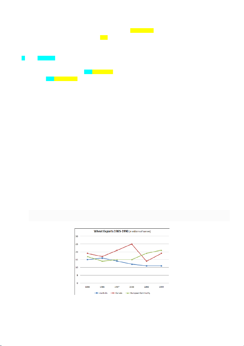
The graph below shows the differences in wheat exports over three different areas from 1985 to 1990.
INTRODUCTION – 2 sentences 1.
Signpost language + paraphrase the question (what / where / when) 2.
Signpost language + general trend (movement/direction for change over time graph and/or comparatives/superlatives for fixed time graph) *
* For multiple trends, use linking comparatives = while, whereas, Meanwhile
1. First sentence: Signpost Language + Paraphrase the introduction given in the question What = wheat exports
Where = over three different areas (Australia, Canada, European Community)
When = from 1985 to 1990 (past tense) Example:
Original question: The graph below shows [signpost language] the differences in wheat exports [what] over three different
areas [where] from 1985 to 1990 [when].
Paraphrased introduction: The line chart depicts a comparison between the amount of wheat exported by three regions between 1985 and 1990.
2. Second sentence: Signpost Language + Summarize the information presented in the graph
Signpost language = Overall, on the whole, in general, generally
signpost language + general trends with no specific numbers or data Example:
Overall, there was a steady fall in AUSTRALIAN wheat exports while wheat exports for the EUROPEAN COMMUNITY
increased. Meanwhile, the figure for CANADA fluctuated during the period. In addition, AUSTRALIA exported the least
amount of wheat throughout most of the period. (introduction+ overview should never exceed 50 words) Complete Introduction:
The line chart depicts a comparison between the amount of wheat exported by three regions between 1985 and 1990.
Overall, there was a steady fall in Australian wheat exports while wheat exports for the European Community increased.
Meanwhile, the figure for Canada fluctuated during the period. In addition, Australia exported the least amount of wheat throughout most of the period.
BODY PARAGRAPHS: General statements + Specific Statements General Statements:
General statements: time / sequencing, subjects / nouns, pronouns, comparisons, movement, phrasal verbs. Examples: 1.
Australia’s wheat export figure rose slightly between 1985 and 1986. 2.
Then, it declined steadily to its lowest point. 3.
Regarding Canada, in 1985, many tons of wheat were exported. 4.
Following this, there was a slight decrease in 1986 before reaching a peak in 1988. 5.
Afterward, the figure plunged in 1989, but then subsequently rose to its 1985 level at the end of the period. 6.
By contrast, the wheat exports from the European Community experienced an increase
during the six-year period. 7.
In 1985, many tons of wheat were exported, but this number fell in 1986. 8.
From this point, exports rose gradually to the highest point in 1990, was which slightly higher than
Canada but considerably greater than Australia. Specific Statements:
Specific Statements: data / figures / specific numbers. Examples: 1.
Australia’s wheat export figure rose slightly from 15 million tons in 1985 to
around 16 million tons in 1986. 2.
Then, it declined steadily to its lowest point of just over 10 million tons in 1990. 3.
Regarding Canada, in 1985 approximately 19 million tons of wheat were exported. 4.
Following this, there was a slight decrease to about 17 million in 1986 before reaching a peak of 25 million tons in 1988. 5.
Afterward, the figure plunged to below 15 million in 1989, but then subsequently rose to its 1985 level
at the end of the period. 6.
By contrast, the wheat exports from the European Community experienced an increase
during the six-year period. 7.
In 1985, nearly 16 million tons of wheat were exported, but this number fell to about 14 million in 1986. 8.
From this point, exports rose gradually to a high of about 21 million tons in 1990, which was slightly
higher than Canada but considerably greater than Australia.
FINAL DRAFT- CHANGE OVER TIME (TREND)
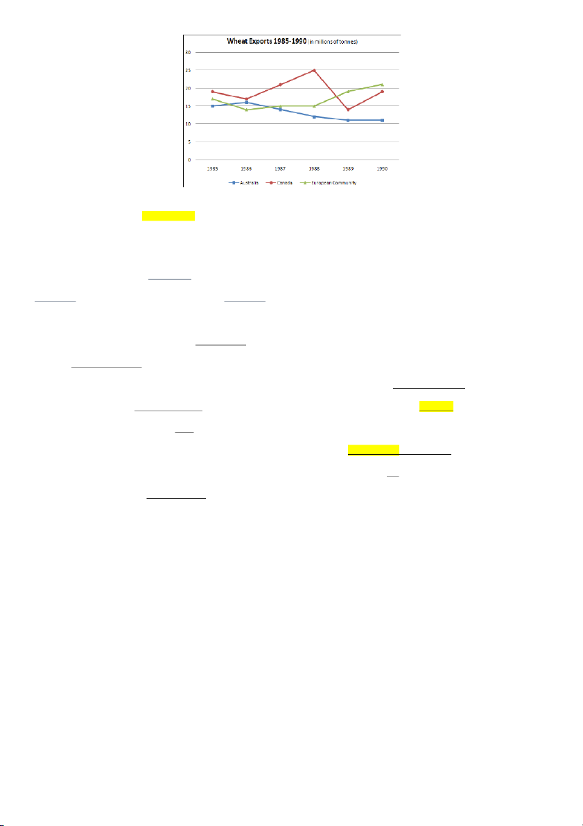
The graph below shows the differences in wheat exports over three different areas from 1985 to 1990.
General statements Specific statements Signpost language
Time / Sequencer Phrasal verbs Comparison
The line chart depicts a comparison between the amount of wheat exported by three regions between 1985 and
1990. Overall, there was a steady fall in Australian wheat exports while wheat exports for the European community
increased. Meanwhile, the figure for Canada fluctuated during the period. In addition, Australia exported the least
amount of wheat throughout most of the period.
Wheat exports for Australia rose slightly from 15 million tons in 1985 to around 16 million tons in 1986.
Then, it declined steadily to its lowest point of just over 10 million tons in 1990. Regarding Canada, in 1985
approximately 19 million tons of wheat were exported. Following this, there was a slight decrease to about 17
million in 1986 before reaching a peak
of 25 million tons in 1988. Afterward, the figure plunged to below 15 million
in 1989, but then subsequently rose to its 1985 level at the end of the period.
By contrast, the wheat exports from the European Community experienced an increase
during the six-year
period. In 1985, nearly 16 million tons of wheat were exported, but this number fell to about 14 million in 1986.
From this point, exports rose gradually to a high of about 21 million tons in 1990, which was slightly higher than
Canada but considerably greater than Australia.
(217 words) (MAXIMUM WORD COUNT 200 Level 1/SWI and 220 for Level 2-3/SWA)
HOMEWORK 1 CHANGE OVER TIME (TREND)
Sample report: https://www.english-exam.org/IELTS/academic_writing_samples_task_1/1201/
BREAKDOWN EXAMPLE REPORT- FIXED TIME (COMPARISON)
The charts below give information on transport and car use in Edmonton. Summarize the information by selecting
and reporting the main features, and make comparisons where relevant.
People’s reasons for using the car in the city Commute to work 55% Shopping 15% Leisure activities 15% Taking children to school 40% Business 45%
INTRODUCTION – 2 sentences 1.
Signpost language + paraphrase the question (what / where / when) 2.
Signpost language + general trend (movement/direction for change over time graph and/or comparatives/superlatives for fixed time graph) *
* For multiple trends, use linking comparatives = while, whereas, Meanwhile
1. First sentence: Signpost Language + Paraphrase the introduction given in the question
What = types of transport used / reasons for using the car Where = in Edmonton
When = [no time period given, so use present tense]
Signpost language = The pie chart illustrates…the table shows Example:
Paraphrased what / where = the type of transport people of Edmonton prefer to use / reasons why people use their car in Edmonton
Paraphrased introduction: The pie chart illustrates the types of transport people of Edmonton prefer to use while the table shows the reasons why
use their cars in the city they .
2. Second sentence: Signpost Language + Summarize the information presented in the graph
Signpost language = Overall, on the whole, in general, generally
General comparison = people of Edmonton use public transport far less that personal cars / most people choose cars for commuting to work. Example:
Overall, people of Edmonton used public transport far less than personal cars, whilst most people chose cars for commuting to
work, which accounted for the highest percentage. Complete Introduction:
The pie chart illustrates the types of transport people of Edmonton preferred to use while the table shows the reasons
why they use their cars in the city. Overall, people of Edmonton used public transport far less than personal cars.
Meanwhile, most people chose cars for commuting to work, which accounted for the highest percentage.
FINAL DRAFT- FIXED TIME (COMPARISON)
The charts below give information on transport and car use in Edmonton. Summarize the information by selecting
and reporting the main features, and make comparisons where relevant.
People’s reasons for using the car in the city Commute to work 55% Shopping 15% Leisure activities 15% Taking children to school 40% Business 45%
General statements Specific statements / Signpost language / Phrasal verbs
(The parenthetical numbers are from the checklist of 11 expectations)
The pie chart illustrates the types of transport people of Edmonton prefer to use whereas (5) the table shows the reasons
why they use their cars in the city. Overall, people of Edmonton use public transport far less than (1) personal cars. Meanwhile (5),
most people (2) choose cars for commuting to work, which accounts for the highest percentage (2).
Looking at the pie chart first, just under (4) half of the people (6) use cars as a means of transport in this city, amounting to
45% of the total (7), which is by far (3) the highest (2) in the pie chart. The second most popular form of transport (2) is the LRT, while
(5) buses and taxis, standing at 10% each (7), are the main means of transport for the rest of the people.
Turning to the table, at 55% (7), the majority of people use their cars to commute to work. Cars are also used for taking
children to school or business purposes, accounting for 40% and 45% respectively (7). People who use cars for shopping and leisure
activities, at 15% each (7), are exactly (4) three times lower (6) than the percentage of people using cars for business, which accounts
for 45% (7). (188 words/ 20 mins)
HOMEWORK 2 - FIXED TIME (COMPARISON)
Sample report: https://www.english-exam.org/IELTS/academic_writing_samples_task_1/1002/
Tài liệu liên quan:
-
Tổng hợp bài tập thì tương lai đơn | Trường Đại học Ngoại Ngữ, Đại học Huế
373 187 -
Complex Sentence - English | Trường Đại Học Ngoại ngữ Huế
300 150 -
Work - English | Trường Đại Học Ngoại ngữ Huế
359 180 -
Grammar of present tense - English | Trường Đại Học Ngoại ngữ Huế
332 166 -
Writing Practice Test - English | Trường Đại Học Ngoại ngữ Huế
465 233