Final Exam Notes | Môn Data Science and Visualization - Trường Đại học Quốc tế, Đại học Quốc gia Thành phố Hồ Chí Minh
Final Exam Notes Môn Data Science and Visualization. Tài liệu được sưu tầm gồm 12 trang, giúp bạn ôn tập tốt hơn. Mời các bạn đón xem.
Môn: Data Science and Visualization 11 tài liệu
Trường: Trường Đại học Quốc tế, Đại học Quốc gia Thành phố Hồ Chí Minh 2 K tài liệu
Tác giả:


Preview text:
lOMoAR cPSD| 23136115 Perception
1. Perception VS Cognition - Perception
+ Identification and interpretation of sensory information
+ From the physical stimulus to recognizing information
+ Shaped by learning, memory, expectation - Cognition
+ The processing of information, applying knowledge Perception Cognition Eye, optical nerve, visual Recognizing objects cortex Relations between objects Basic perception Conclusion drawing First processing Problem solving Not conscious Learning, … Reflexes
2. Dimensions: Hue - Saturation - Value Hue Saturation Value
color value expressed as a + The purity of a color
+ Lightness or darkness of a color number from 0 to 360
+ Pigments: no white/black is added + the intensity of light
+ Light: what is the ratio of dominant wavelength to others
Other color models: RGB, HSL, …
3. Paint mixing: light mixing (additive) VS ink mixing
(subtractive) VS paint mixing (subtractive - wavelength) Paint mixing Ink mixing Light mixing
paints+ Subtractive mix of transparent + Additive mix of colored lights
+ Physical mixing of opaque inks + Primary: Red, Green, Blue
+ Primary: red, yellow, blue + + Primary: cyan, magenta, yellow
+ Secondary: Cyan, Magenta, Yellow Secondary (mixed): green, + Secondary: RGB + Additive model orange, purple
+ Subtractive model - absorb + Approx. black = C+M+Y wavelength + True black = C+M+Y+K + Subtractive model
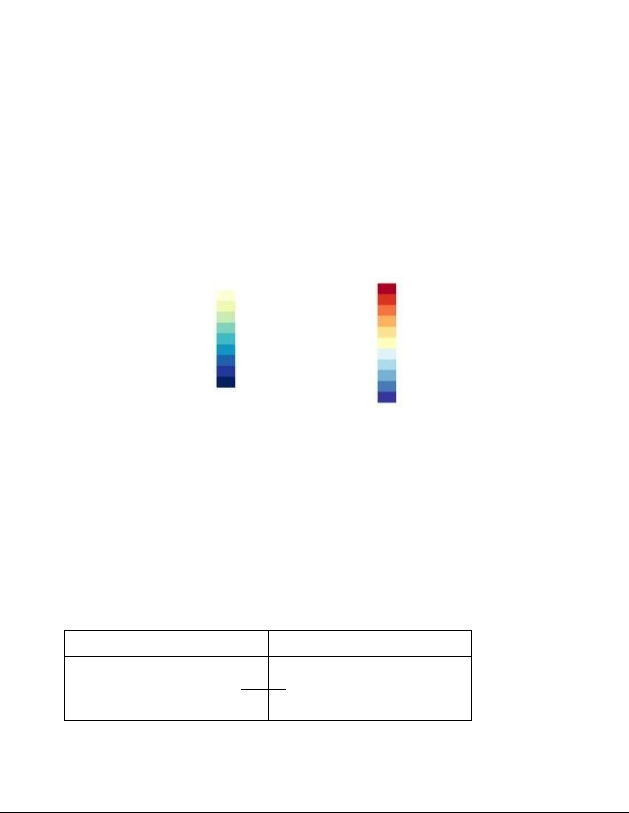
4. Colormap: categorical vs ordered, sequential vs diverging,
segmented vs continuous, univariate vs bivariate a. Categorical vs. Ordered: lOMoAR cPSD| 23136115
Categorical Colormap: Used for representing categorical data where each category is
assigned a distinct color. These colormaps have discrete color categories without any
inherent ordering. (phân loại, mà riêng biệt)
Ordered Colormap: Represents data that has an inherent order, such as ordinal or
sequential data. Colors in an ordered colormap are usual y arranged in a meaningful
sequence. (số đếm, sử dụng thang màu) b. Sequential vs. Diverging:
Sequential Colormap: Progresses through a range of colors from low to high values,
typically used for representing data that has a natural progression, like temperature or
elevation. (luôn tăng,vd 1234, cái sau màu đậm hơn cái trc)
Diverging Colormap: Contains two different colors, each representing opposite extremes
with a neutral color in the middle. Diverging colormaps are often used to highlight
deviations from a midpoint or to emphasize positive and negative deviations from a central
value. (bắt đầu từ 1 cực) Sequential Diverging c. Segmented vs. Continuous:
Segmented Colormap: Comprises distinct, non-continuous color segments. Each
segment may represent a different range or category. (giá trị tách biệt)
Continuous Colormap: Gradual y changes in color across its range without any distinct
breaks or segments. Continuous colormaps are commonly used for representing smooth transitions in data. d. Univariate vs. Bivariate:
Univariate Colormap: Represents variation in a single variable. For example, a colormap
might represent different shades of blue to indicate varying temperatures. (1 biến)
Bivariate Colormap: Represents variation in two variables simultaneously. Bivariate
colormaps are often used in heatmaps where both rows and columns are assigned colors
based on their respective values. (2 biến)
5. Qualitative data vs. quantitative data (value, saturation, not hue) Qualitative data Quantitative data
Qualitative data are data representing
Quantitative data are data represented
information and concepts that are not
numerical y, including anything that can be represented by numbers.
counted, measured, or given a numerical value. 6. Bin or not to bin
Number of bin: log2(n) (n: Range) lOMoAR cPSD| 23136115
Clearer Pictures: Binning makes graphs smoother, so it's easier to spot trends. Loses
Some Details: Binning might smooth things out too much, hiding little differences in the data.
7. Caution to color blindness: red-green weakness/blindness NOTION 10% of males, 1% of females
Most common: red-green weakness / blindness
Reason: lack of medium or long wavelength receptors, or altered spectral sensitivity (most common: green shift)
8. Color is relative to brightness contrast
The perceived brightness of an object is relative to it‘s background Pop out
1. Difference in hue/curvature Hue Pop Out Curvature Pop Out
This occurs when an object stands This happens when an object
out from its surroundings due to a stands out because of its shape or difference in color.
curvature, rather than its color. Our eyes are sensitive
to Even if all objects have the same
differences in color, so objects with color, the one with a unique shape
distinct hues tend to grab our will catch our eye. attention more easily.
2. Task: target detection, boundary detection, region tracking, counting/estimation - Target detection
+ Detect the presence or absence of a target - Boundary detection
+ Detect a texture boundary between two groups of elements, where are
of the elements in each group have a common visual property - Region tracking
+ Track one or more elements with a unique visual feature as they move in time and space - Counting and estimation
+ Users count or estimate the number of elements with a unique visual feature lOMoAR cPSD| 23136115
3. To find meaning in what we see, we must selectively pay
attention to what is important
Vd trong bar chart yếu tố độ cao quan trọng hơn màu sắc, chú ý ~ điểm qtrọng
để nhận biết ý nghĩa của hình
4. Gestalt principles:
patterns that transcend the visual stimuli that produced them,
grouping/linking by placing entities in close proximity, Co modulation of a
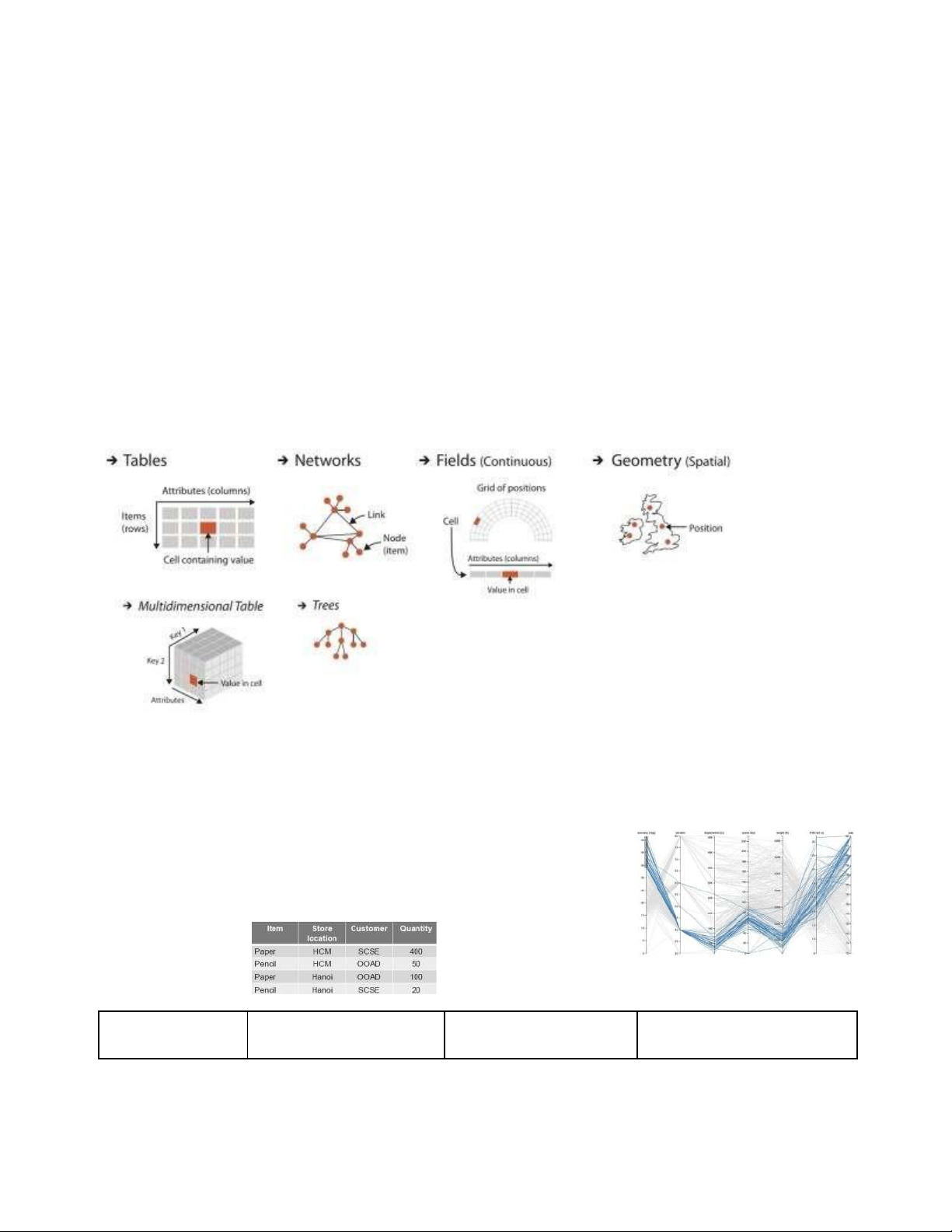
channel color, shape, size, value, orientation, texture Data 1. Dataset types: - Table Flat table
Multi-dimensional table Collections Visualize table lOMoAR cPSD| 23136115 1 item per row, Indexing based on How we groups items: each column is multiple keys Sets attribute,
unique - Multiple keys: Items, - Unique items,
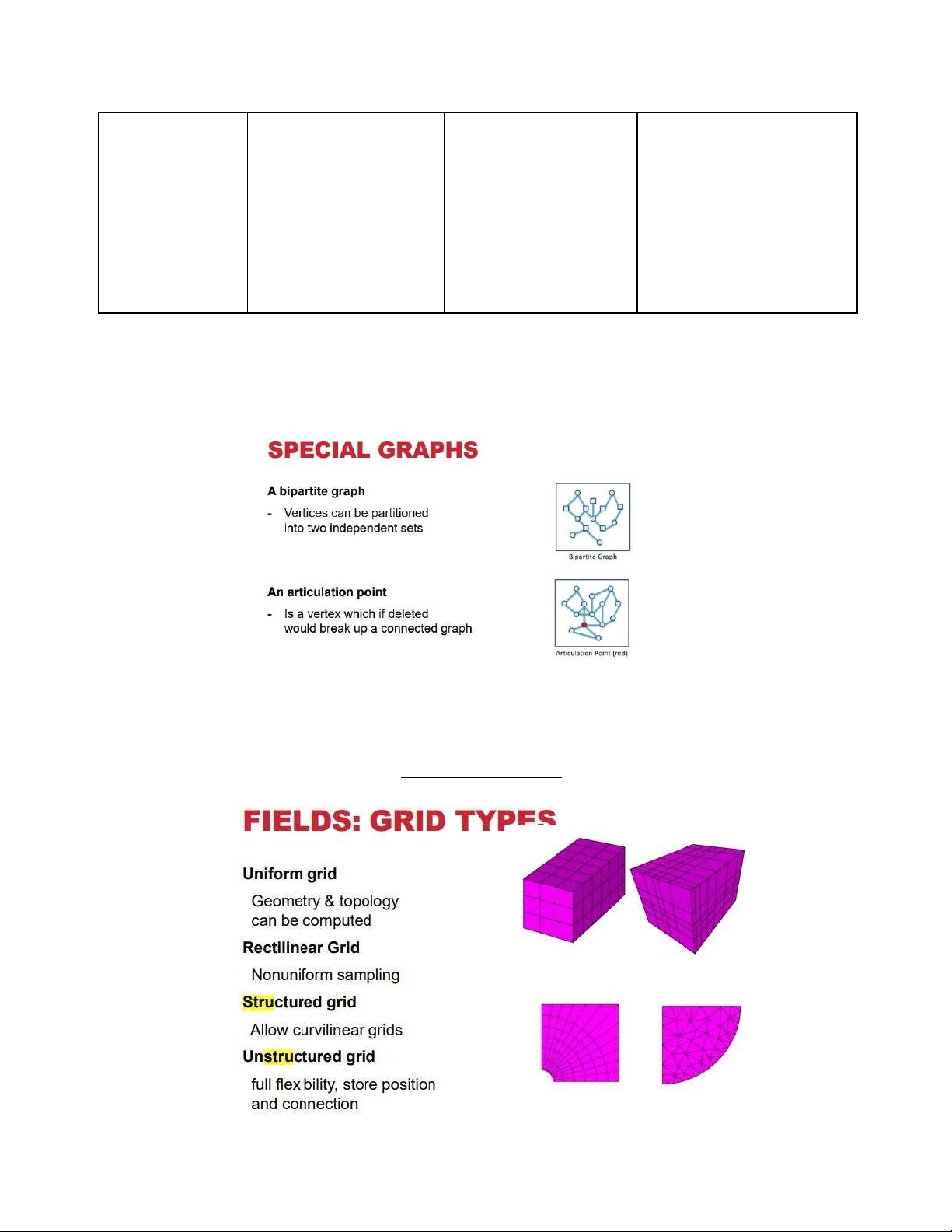
(implicity) key, no Store location, Customer, unordered duplicates Period List - Attribute: Quantity - duplicates allowed Clusters - Groups of similar items - Graphs/Network + Set of nodes, set of edges + Connecting these vertices - Tree
+ A tree is a graph with no cycles - Fields
+ Sets of attributes values associated with cells
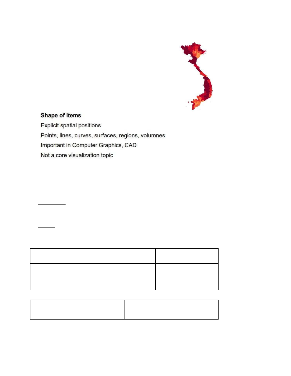
+ Cell contains data from continuous domain + Grids types lOMoAR cPSD| 23136115 - Geometry 2. Data unit types:
- Items : individual entity, discrete
- Attributes : measured, observed, logged property
- Links : Express relationship between two items
- Positions : Spatial data → location in 2D or 3D
- Grids : Sampling strategy for continuous data
3. Structured vs Unstructured vs Semi-structured data Structure Unstructured Semi-structure - Know data types,
data khong duoi dang email, hinh anh semantics (data bang dạng bảng) 4. InfoVis vs SciVis
SciVis (cho 1 mảng khoa học)
InfoVis (visualization thể hiện thông tin) lOMoAR cPSD| 23136115 -
It's about showing information - It's about showing scientific
in pictures to help people understand it stuff in pictures to help scientists better. understand it better. -
Deals with things like numbers, - Deals with things like how
trends, and how things are connected. things move, how they're shaped, and
- Is used for things like making charts, how they behave. graphs, and interactive maps. -
Is used for things like showing -
Use it in fields like business, how atoms look, how air flows, and
science,and social studies to analyze how diseases spread. data and find patterns. - Use in fields like physics,
medicine, and weather forecasting to study
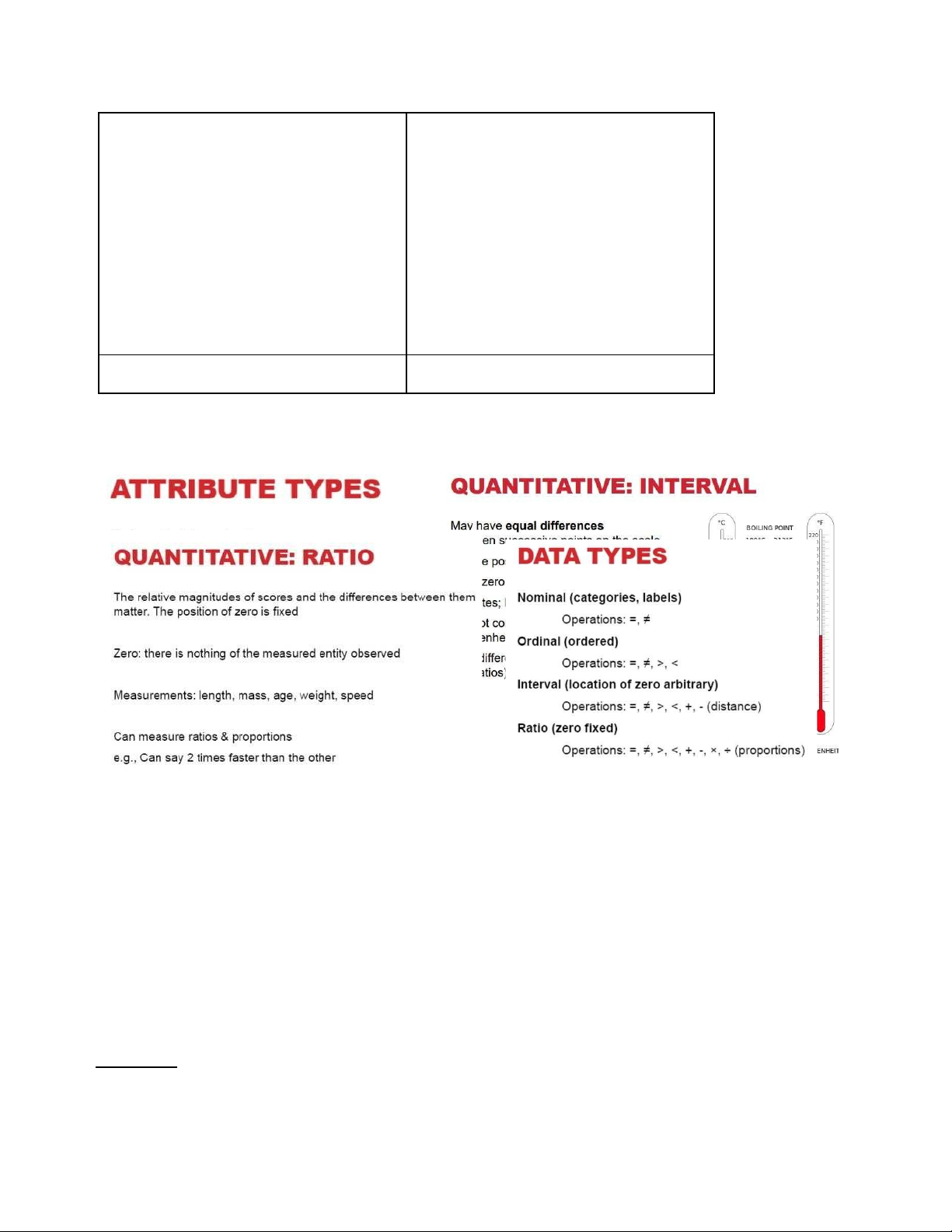
complex things and make discoveries. 5. Attribute types:
- Categorical, quantitative (nominal vs ordinal vs interval vs ratio equals, not equals/ sign/
plus, minus/multiply, division) (file C3, slide 27)
6. Sequential vs Diverging data Sequential - Homogeneous from min to max Diverging
- Two or multiple sequences that meet
- Elevation dataset: above sea level & below sea level
- Temperature of water: below or above freezing / boiling Mark vs Channel
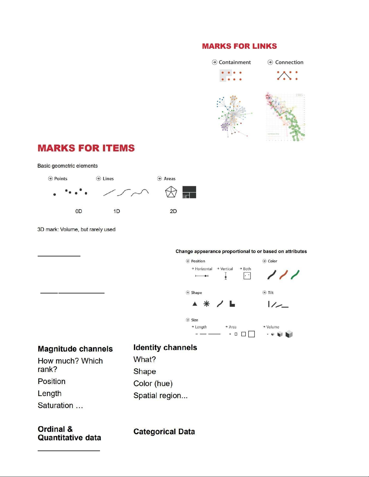
1. Marks: represent items or links (points, lines, areas, connection, containment) lOMoAR cPSD| 23136115
2 . Channels : change appearance based
on attribute = visual variable (position,
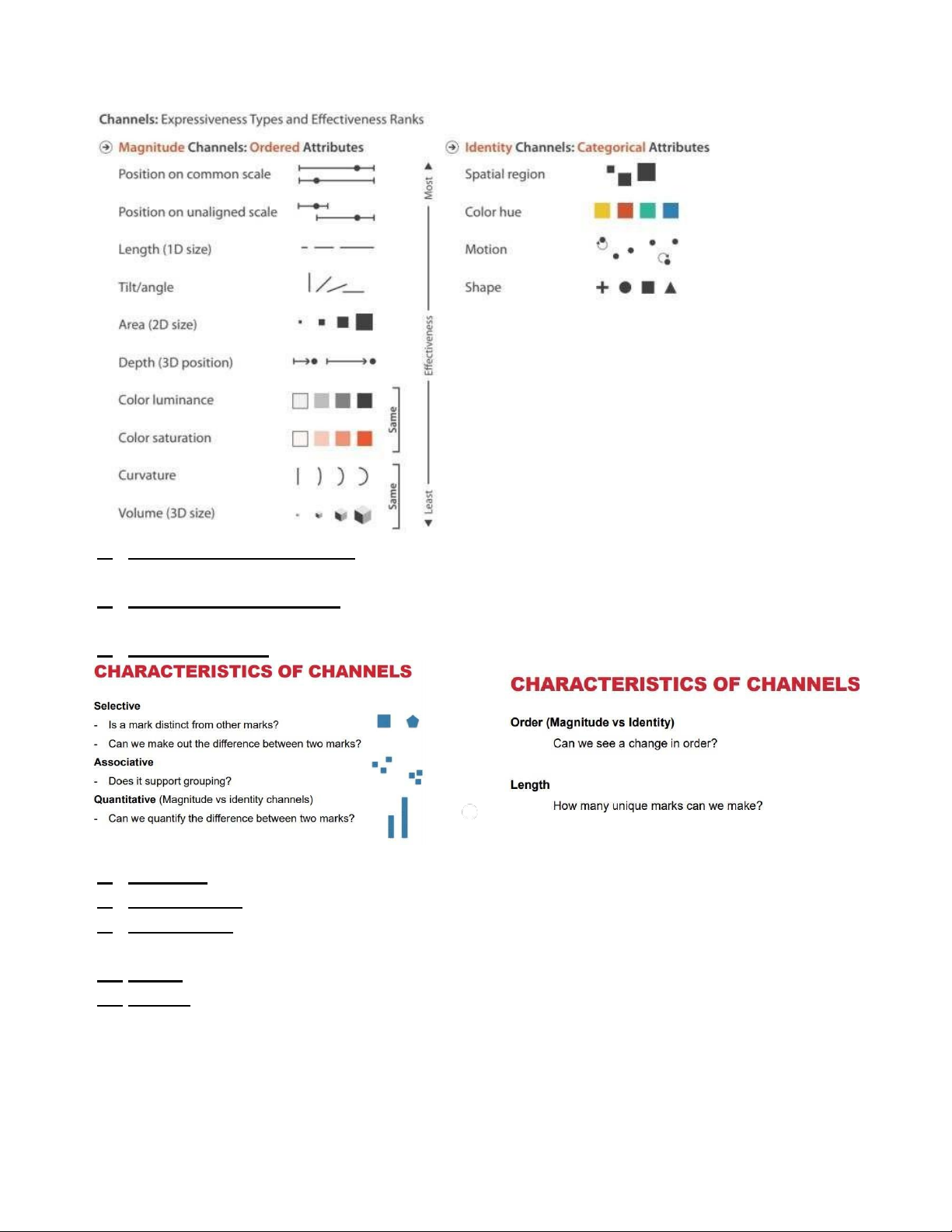
color, shape, tilt, size, volume 3D) Type s of Channels * * Rank of Channels lOMoAR cPSD| 23136115
4. Expressiveness principle: the visual encoding should express all of, and
only, the information in the dataset attributes
5. Effectiveness principle: the importance of the attribute should match the salience of the channel
6. Characteristics: selective, associative, quantitative, order, length
7. Position: Strongest visual variables, Suitable for all data types
8. Length, size: Good for 1D, OK for 2D, Bad for 3D (ratio)
9. Luminance: OK for quantitative data when length & size are used. Not very many shades are recognizable
10. Color: Good for qualitative data (identity channel)
11. Shape: Great to recognize many classes. No grouping, ordering Design Guideline
1. The visualization should show all of the data and only the data
2. Use the best visual channel available for the most important aspect of the data lOMoAR cPSD| 23136115
3. Show data variation, not design variation; Clear, detailed, and thorough labeling
and appropriate scales; Size of the graphic effect should be directly proportional to the numerical quantities
4. Focus on LIE FACTOR, SCALE DISTORTION, ZERO-STARTING BASELINE
(should start at minimum of data), FRAMING, BIASES, AGGREGATED CHARTS
(chồng chéo), PIE CHARTS (difficult for comparison)
Visualization Design Principles 1. Data-Ink ratio 2. Chart Junk
- A term coined by data visualization expert Edward Tufte to refer to elements of a
chart or graph that do not add value to the data being presented, but rather serve
only to distract or confuse the viewer. 3. Alignment matter 4. Unjustified 3D
Interaction ( tuong tac) WHY
INTERACT WITH VISUALIZATION?
Need to explore data that is big/complex
Too much data Too many ways to show it
Interaction ampli 昀椀 es cognition
Understand things better if we can touch them When we can observe cause and e 昀昀 ect MANTRA
Visual information seeking matra (Shneiderman, 1996) Overview 昀椀 rst, Zoom
and 昀椀 lter, Then details on demand Related, history, extract Views C7 WHY MULTIPLE VIEWS? Eyes beat memory
- Showing two views side by side are easier to compare thanchanging views over time
No single visual encoding is optimal for all possible tasks
- Use di 昀昀 erent encoding for one dataToo many to shown in one view LINKED VIEWS OPTIONS Four options lOMoAR cPSD| 23136115
- Highlighting: to link, or not
- Navigation: to share, or not
- Encoding: same or multiform- Dataset: Shared all, subset, or none TRELLIS PLOTS
panel variables attributes encoded in individual views partitioning variables
partitioning attributes assigned to columns and rows
main-e 昀昀 ects ordering order partitioning variable based on derived data support
perception of trends and structure in data Story telling C9
Good stories do more than provide facts and data - They situate and give context - They
engage - They educate Who / What / Where Why / How
Underscore your arguments with Data/Facts Leverage the power of Visualization - Show
trends - Show correlations - Show outliers - Convey magnitudes
Martini Glass structure start with author driven, open up for exploration Interactive
slideshow Split into multiple scenes, allow interaction mid-way Dril -down story Let reader
decide which path to follow, all paths are annotated LAYOUT PRINCIPLE Descriptive titles
Descriptive subtitles ( phu de mieu ta) Annotations (chu thich)
Saturation ( phan hoa theo mau cua tung entity) WHEN DO WE DESIGN?
Wicked problems No clear problem definition Solutions are either good enough or not
good enough Multiple solutions exist, not true/false No clear point to stop with a solution
INTERNAL VS EXTERNAL VALIDITY
Internal validity – can you trust your experiment
High when tested under controlled lab conditions Observed e 昀昀 ects
are due to the test conditions (and not random variables)
External validity – is your experiment representative of real world usage
High when interface is tested in the 昀椀 eld, e.g. handheld device tested in museum
Results are valid in real world The trade-o 昀昀
The more akin to real-world situations, the more experiment is susceptible
to uncontrolled sources of variation
QUANTITATIVE VS QUALITATIVE EVALUATION Quantitative methods
Objective metrics, measurements Use lOMoAR cPSD| 23136115
numbers/statistics for interpreting data Qualitative methods Subjective metrics
Description of situations, events, people, interactions, and observed
behaviors, the use of direct quotations from people about their
experiences, attitudes, beliefs, and thoughts
Focused on understanding how people make meaning of and experience their environment or world SCOPE OF EVALUATION Pre-design
To understand potential users’ work env. And work 昀氀 ow Design
To scope a visual encoding and interaction design space based on
human perception and cognition Prototype
to see if a visualization has achieved its design goals, to see how a
prototype compares with the current state-
of-the-art systems or techniques Deployment
to see how a visualization in 昀氀 uences work 昀氀 ow and work
processes, to assess the visualization’s e 昀昀 ectiveness and use in the 昀椀 eld Re-design
to improve a current design by identifying usability problems
Exercise for Storytelling (chap 9) Ex1
Tài liệu liên quan:
-
Giới thiệu các loại mật thư và kỹ thuật giải mật thư | Data Science | Trường Đại học Quốc tế, Đại học Quốc gia Thành phố Hồ Chí Minh
21 11 -

Midterm Exam Môn Data Science and Visualization | Trường Đại học Quốc tế, Đại học Quốc gia Thành phố Hồ Chí Minh
167 84 -
Project Proposal: COVID-19's Impact on Population Density | Môn Data Science and Visualization - Trường Đại học Quốc tế, Đại học Quốc gia Thành phố Hồ Chí Minh
103 52 -

Final Review Môn Data Science and Visualization | Trường Đại học Quốc tế, Đại học Quốc gia Thành phố Hồ Chí Minh
105 53