Introduction - Business English | Trường Đại học Hùng Vương
Introduction - Business English | Trường Đại học Hùng Vương được sưu tầm và soạn thảo dưới dạng file PDF để gửi tới các bạn sinh viên cùng tham khảo, ôn tập đầy đủ kiến thức, chuẩn bị cho các buổi học thật tốt. Mời bạn đọc đón xem!
Môn: Business English( TA1901) 89 tài liệu
Trường: Trường Đại học Hùng Vương 164 tài liệu
Tác giả:

Preview text:
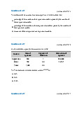
Introduction Xét ví d : ụ Đềề:
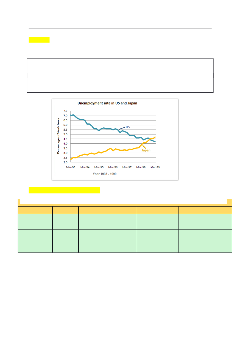
The graph below shows the unemployment rates in the US and Japan between March 1993 and March 1999.
Summarise the information by selecting and reporting the main features, and make
comparisons where relevant. Nhi m v ệ m ụ bài: Par ở aphrase
The graph below shows the unemployment rates in the US and Japan between March 1993 and March 1999. Subject Verb What Where When The graph shows The unemployment rates In the US and Between March 1993 below Japan and March 1999 The line graph illustrates
The percentage of people In the US and
Over a six-year period. who were jobless Japan (unemployed) Exercise:
1. The bar chart shows the percentage of Internet users in three different
countries from 2000 to 2010. (3 countries: Vietnam, America, Austria)
2. The table below shows the number of hours per week spent on computer games by young people.
3. The line graph shows the amount of money spent on five different items by consumers in 2002.
4. The graph shows the average number of Vietnamese students studying in
Portugal, Korea and Japan between 2010 and 2017. Homework
5. The pie chart shows the average household expenditures in Vietnam and
Cambodia in 2015. (Money spent on housing, transport, food, healthcare)
6. The graph shows the average consumption of food in 2 countries in 2008 and
2014. (2 countries: Vietnam, France)
7. The graph shows the percentage of mobile phones owners in Vietnam in the
year 2000, 2005 and 2010.
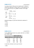
8. The table shows the average domestic water use in 5 countries from 2000 to
2010 (5 countries: the UK, Portugal, Vietnam, Japan, Austria)
Tài liệu liên quan:
-
Reading 10 Aggregate Output, Prices - Business English | Trường Đại học Hùng Vương
279 140 -
Reading 9 The Firm and Market Structures - Business English | Trường Đại học Hùng Vương
255 128 -
Reading 8 Topics in Demand - Business English | Trường Đại học Hùng Vương
253 127 -
Reading 7 Introduction to Linear Regression - Business English | Trường Đại học Hùng Vương
262 131 -
Reading 3 Probability Concepts - Business English | Trường Đại học Hùng Vương
284 142