LINE, BAR, PIE Graphs Analysis in English | English 1 (TĐT) | Đại học Tôn Đức Thắng
The line graph illustrates the amount of fast food consumed by teenagers in Australia between 1975 and 2000, a period of 25 years. Overall, the consumption of fish and chips declined over the period, whereas the amount of pizza and hamburgers that were eaten increased. Tài liệu được sưu tầm và soạn thảo dưới dạng file PDF để gửi tới các bạn cùng tham khảo, ôn tập đầy đủ kiến thức, chuẩn bị cho các buổi học thật tốt. Mời bạn đọc đón xem!
Môn: English 1 (TĐT) 67 tài liệu
Trường: Trường Đại học Tôn Đức Thắng 4.3 K tài liệu
Tác giả:


Preview text:
lOMoAR cPSD| 40342981 LINE GRAPH
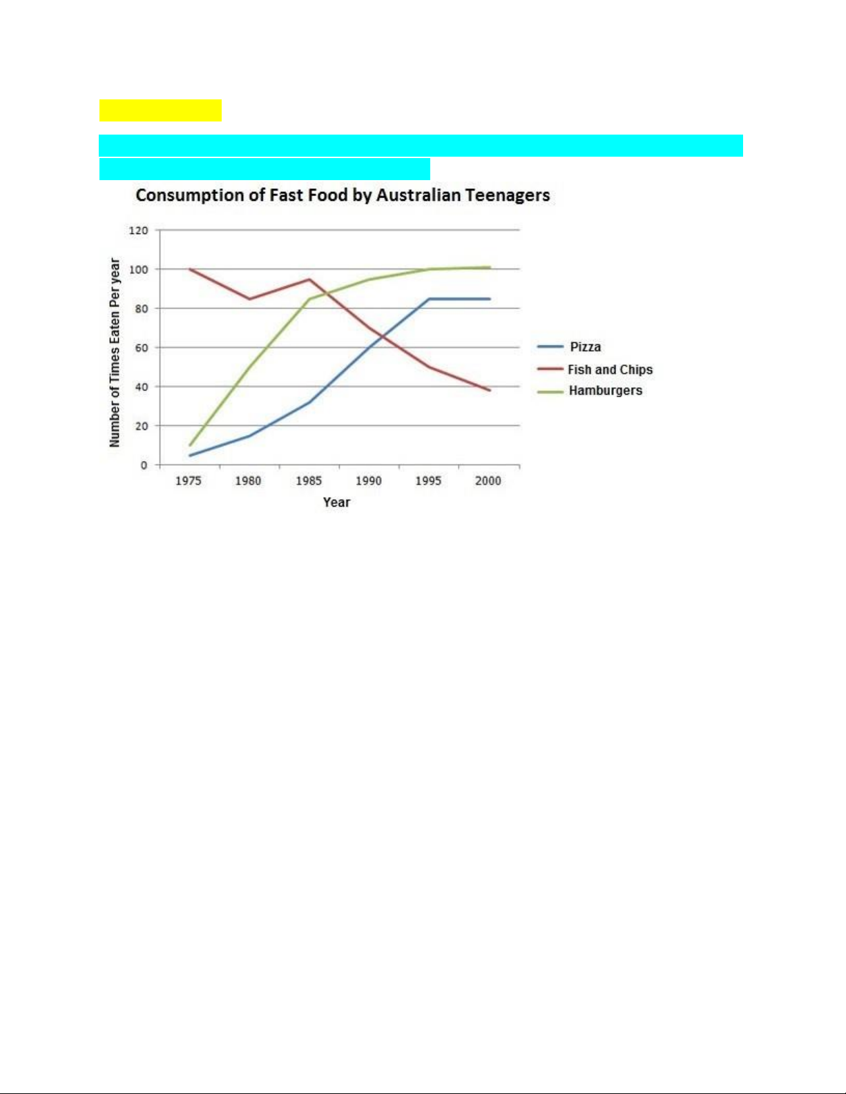
The line graph below shows changes in the amount and type of fast food consumed
by Australian teenagers from 1975 to 2000
The line graph illustrates the amount of fast food consumed by teenagers in
Australia between 1975 and 2000, a period of 25 years. Overall, the consumption
of fish and chips declined over the period, whereas the amount of pizza and
hamburgers that were eaten increased.
In 1975, the most popular fast food with Australian teenagers was fish and chips,
being eaten 100 times a year. This was far higher than Pizza and hamburgers,
which were consumed approximately 5 times a year. However, apart from a brief
rise again from 1980 to 1985, the consumption of fish and chips gradually declined
over the 25 year timescale to finish at just under 40 times per year.
In sharp contrast to this, teenagers ate the other two fast foods at much higher
levels. Pizza consumption increased gradually until it overtook the consumption of
fish and chips in 1990. It then leveled off from 1995 to 2000. The biggest rise was
seen in hamburgers, increasing sharply throughout the 1970’s and 1980’s,
exceeding fish and chips consumption in 1985. It finished at the same level that
fish and chips began, with consumption at 100 times a year lOMoAR cPSD| 40342981 BAR CHART
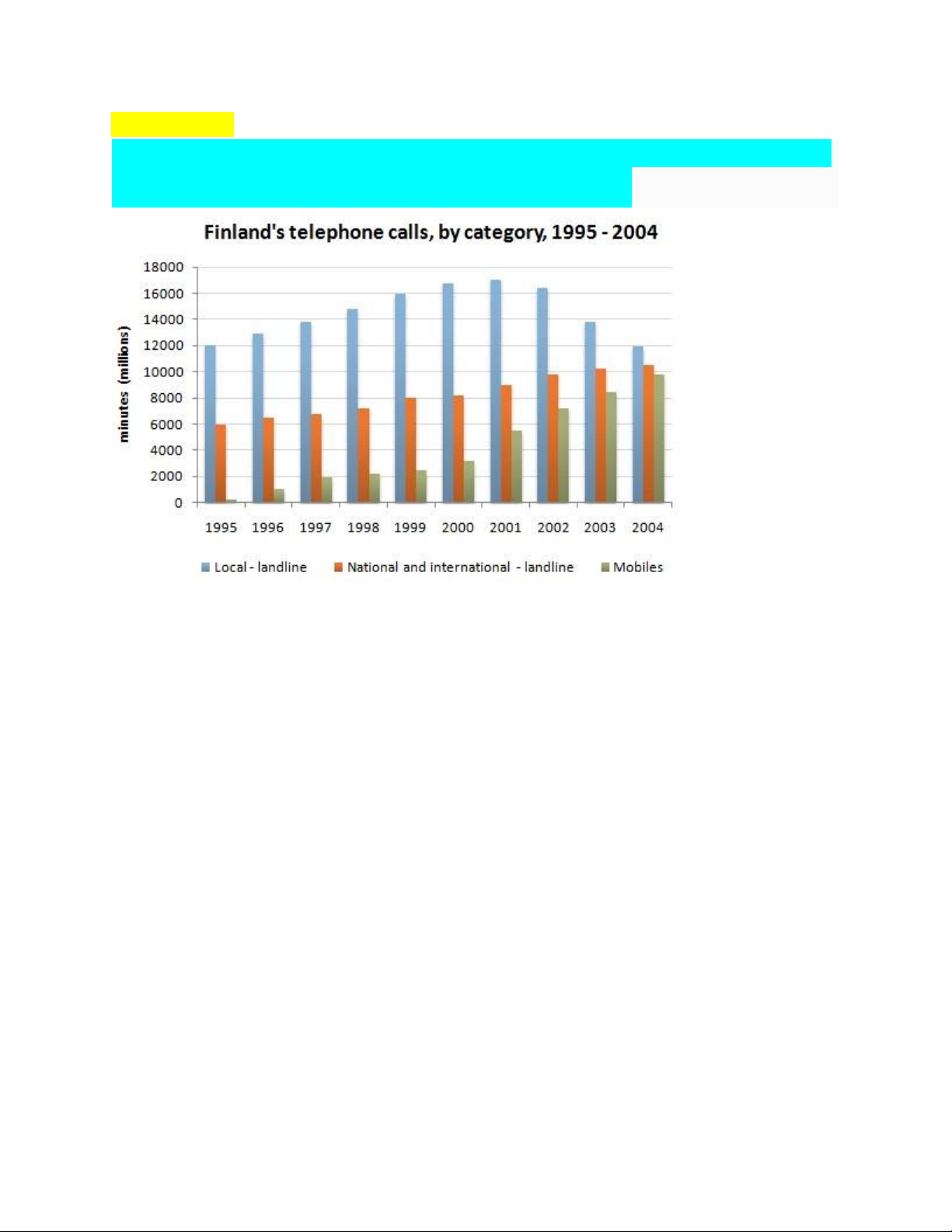
The chart below shows the total number of minutes (in millions) of telephone calls
in Finland, divided into three categories, from 1995 – 2004.
The bar chart shows the total time of telephone calls in minutes in Finland over a
period of ten years from 1995 to 2004. The call times are divided into
locallandline, national and international-landline and mobiles.
Firstly, local landline call time increased steadily from 1995, reaching its peak by
2001 of about 17000 million minutes. Following that, local landline call duration
declined sharply reaching the same duration as in 1995 amounting to around 12000 million minutes.
Secondly, national and international call duration steadily increased from 6000
million minutes in 1995 to over 10000 million minutes in 2004. Thirdly, mobile
phone call time increased gradually from 1995 to 2000 starting with few hundred
million minutes and reaching a total duration of 3000 million minutes in 2000.
Subsequently, there was a dramatic increase in mobile phone call duration from
year 2000 reaching around 10000 million minutes by 2005.
In summary, total call time increased from 1995 in both national and international
landline and mobile categories. Even though local landline call time increased
during the first six years, there was a steady decline from 2001. lOMoAR cPSD| 40342981
The chart below shows the number of jobs in tourism-related industries in one UK city between 1989 and 2009.
The given bar chart illustrates changes in the number of occupations in
tourismrelated industries in one UK city from 1989 to 2009.
Overall, it is clear that, except for the year 1994, restaurants registered the highest
number of jobs provided in this city while that of travel and tours remained lowest over the research period.
In 1989, the number of jobs in restaurants stood at the highest starting point of about
1100. This figure then saw a steady increase and reached a peak of just over 1600 in
2004 before declining to well under 1400 in 2009. Hotels recorded the second largest
number of occupations during the entire period, with the only exception in the year
1994 when it had 1400 jobs and overtook the leading position previously held by
restaurants. After that, the number of hotel-related posts dropped gradually to just over 1000 in 2009.
The number of jobs in travel and tours also witnessed the same trend as that of hotels
as it reached a peak of roughly 1050 in 1994 before decreasing considerably to about
420. The last sector – sport and leisure – experienced the most unpredictable pattern
in the number of jobs provided. In the first five years of the surveyed period, this
figure fell to approximately 660. Then, it rose sharply to 1050 in 1999 before
dropping back to nearly 700 in 2009.
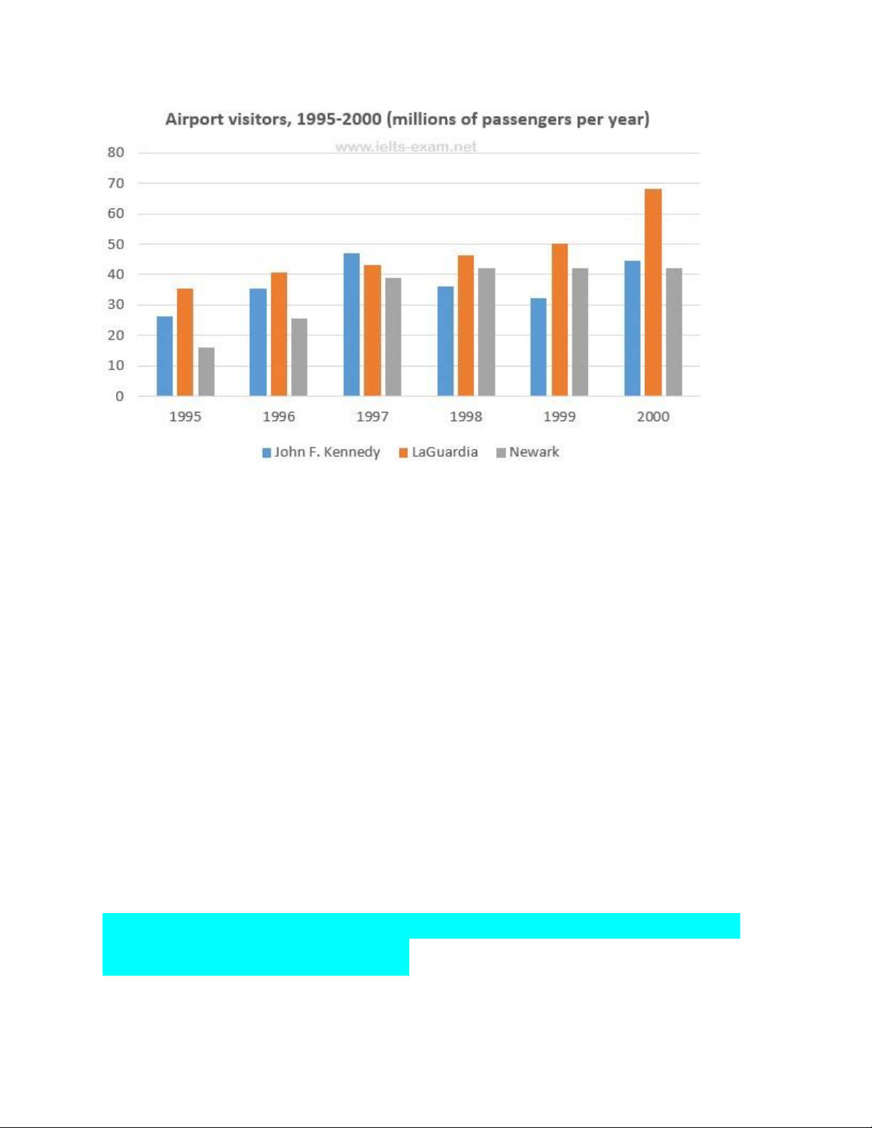
The chart below shows the number of travellers using three major airports in New
York City between 1995 and 2000. lOMoAR cPSD| 40342981
The bar chart gives information about how many people visited New York City
through three major airports, over a six-year period between 1995 and 2000.
Overall, it can be seen that over the period, there was a fluctuant trend in the
number of passengers who travelled via John F. Kennedy airport, while the other
two airports saw an upward trend. Another interesting point is that LaGuardia
airport was the most popular at the end.
Looking at the detail, the number of travellers at John F. Kennedy airport started at
26m in 1995, and then increased remarkably to reach the highest point of 47m in
1997. In 1999, the figure dipped to 32m. At the last year, there was a slight growth
to 44m. On the other hand, LaGuardia began at 35m in 1995, after that it rose
remarkably for the next three years, at 46m. In 2000, LaGuardia hit the peak point at 68m travellers.
However, if we look at Newark airport, it started at the lowest point of 16m
passengers in the first year. After this point, the trend increased significantly to
42m in 1998. In the last two years it remained stable at 42m travellers.
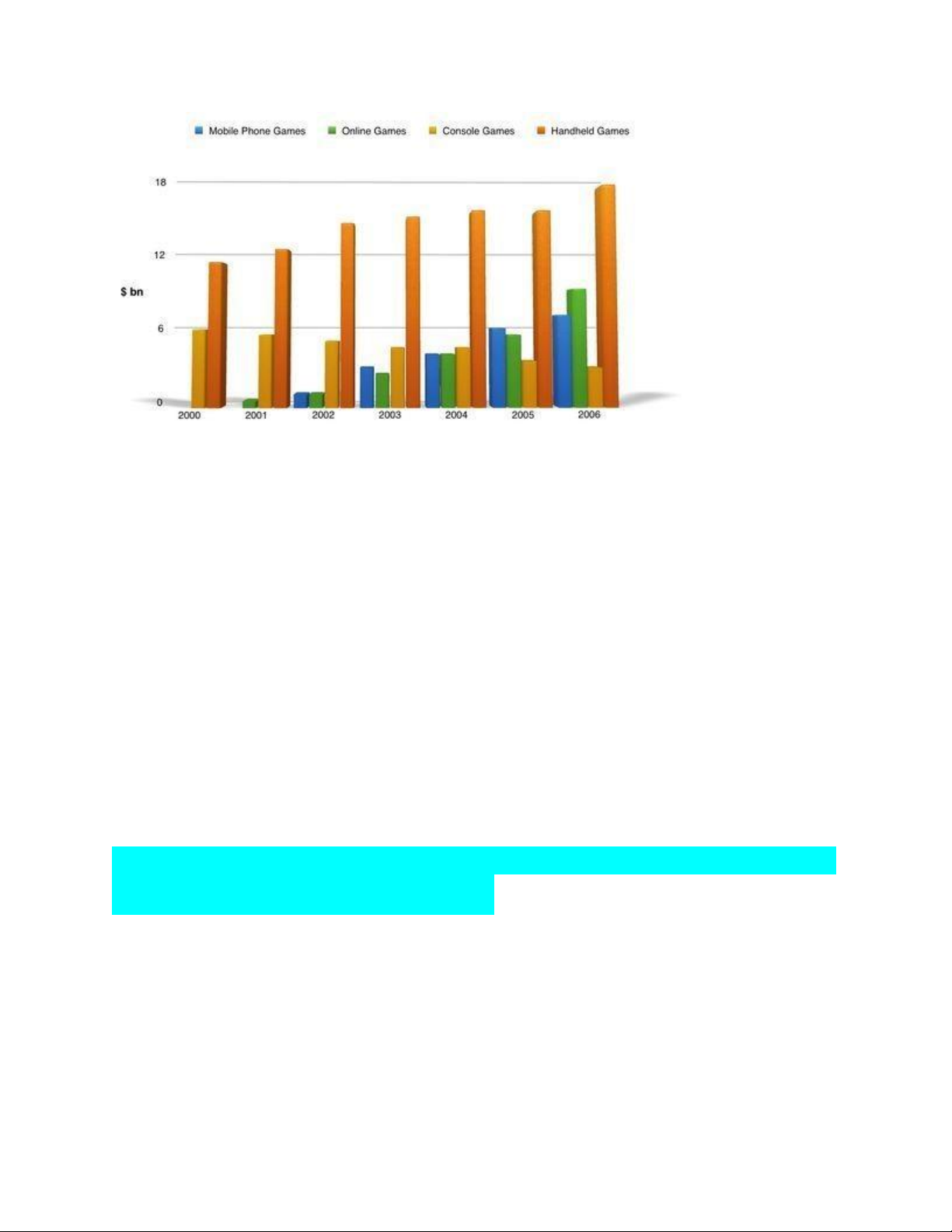
The bar graph shows the global sales (in billions of dollars) of different types of
digital games between 2000 and 2006. lOMoAR cPSD| 40342981
The bar graph compares the worldwide turnover for four kinds of electronic games
for a period of seven years, starting from 2000 to 2006. Overall, it can be observed
that sales for most of the digital games experienced an upward trend, except for
console games. Handheld games had by far the highest number of sales throughout this period.
In 2000, the sales figure for handheld games was close to 10 billion dollars, this
figure rose gradually to reach its peak at slightly under 18 billion dollars. In
contrast, at 6 billion dollars sales figure, console games were the second most
popular games in year 2000. Between 2000 and 2006, this figure continued to drop
to hit its lowest point of less than 3 billion dollars.
Global sales for online games and mobile phone games followed a similar pattern
with both sales numbers went up considerably for the first 6 years. By the seventh
year, sales revenues for both types of games were over 6 billion dollars.
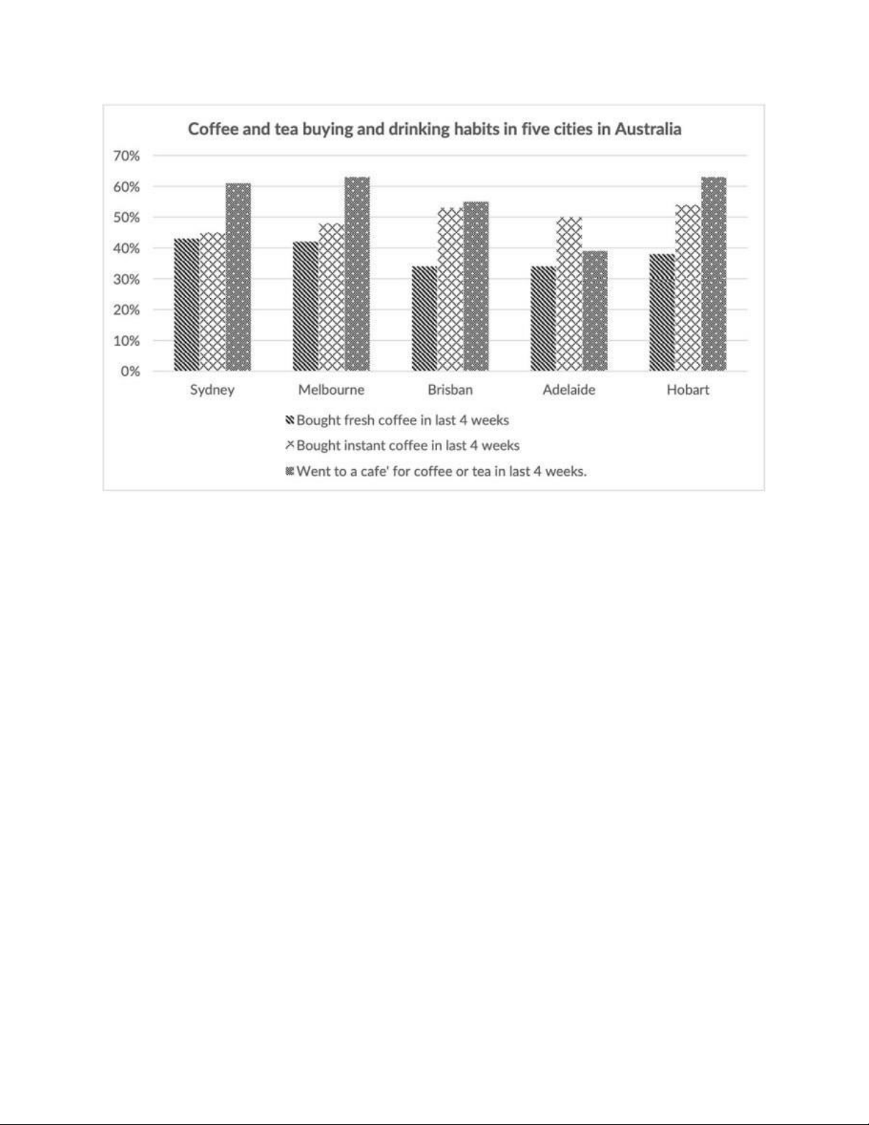
The chart below shows the results of a survey about people’s coffee and tea buying
and drinking habits in five Australian cities. lOMoAR cPSD| 40342981
The given bar chart illustrates the percentage of residents’ coffee and tea purchasing
and consuming habits in last 4 weeks in five different cities (Sydney, Melbourne,
Brisbane, Adelaide, and Hobart) in Australia.
In general, it is evident that going to a cafe to have coffee or tea was the most
common habit, except in Adelaide. Additionally, the percentage of people buying
instant coffee was always higher than that of those purchasing fresh coffee in all cities.
In terms of Sydney and Melbourne, while the percentage of Sydney’s people
drinking tea or coffee at a cafe was about 61%, the figure for Melbourne was slightly
higher, at around 63%. Meanwhile, above 45% of citizens in Sydney and Melbourne
had a habit of buying instant coffee, whereas the proportions of those purchasing
fresh coffee in these two cities were around 44% and 43% respectively.
Moving on to the remaining cities, having coffee or tea at a cafe accounted for the
largest percentage of people in Hobart, followed by Brisbane and Adelaide, at
approximately 51% and 49% respectively. At the same time, around 53% of people
in Brisbane and Hobart chose to buy instant coffee, compared to nearly 50% of those
in Adelaide. Finally, a close similarity can be seen in the percentage of people buying lOMoAR cPSD| 40342981
fresh coffee in Brisbane and Adelaide, at around 34%, while Hobart’s figure was higher, at roughly 38%. lOMoAR cPSD| 40342981 PIE CHAR T
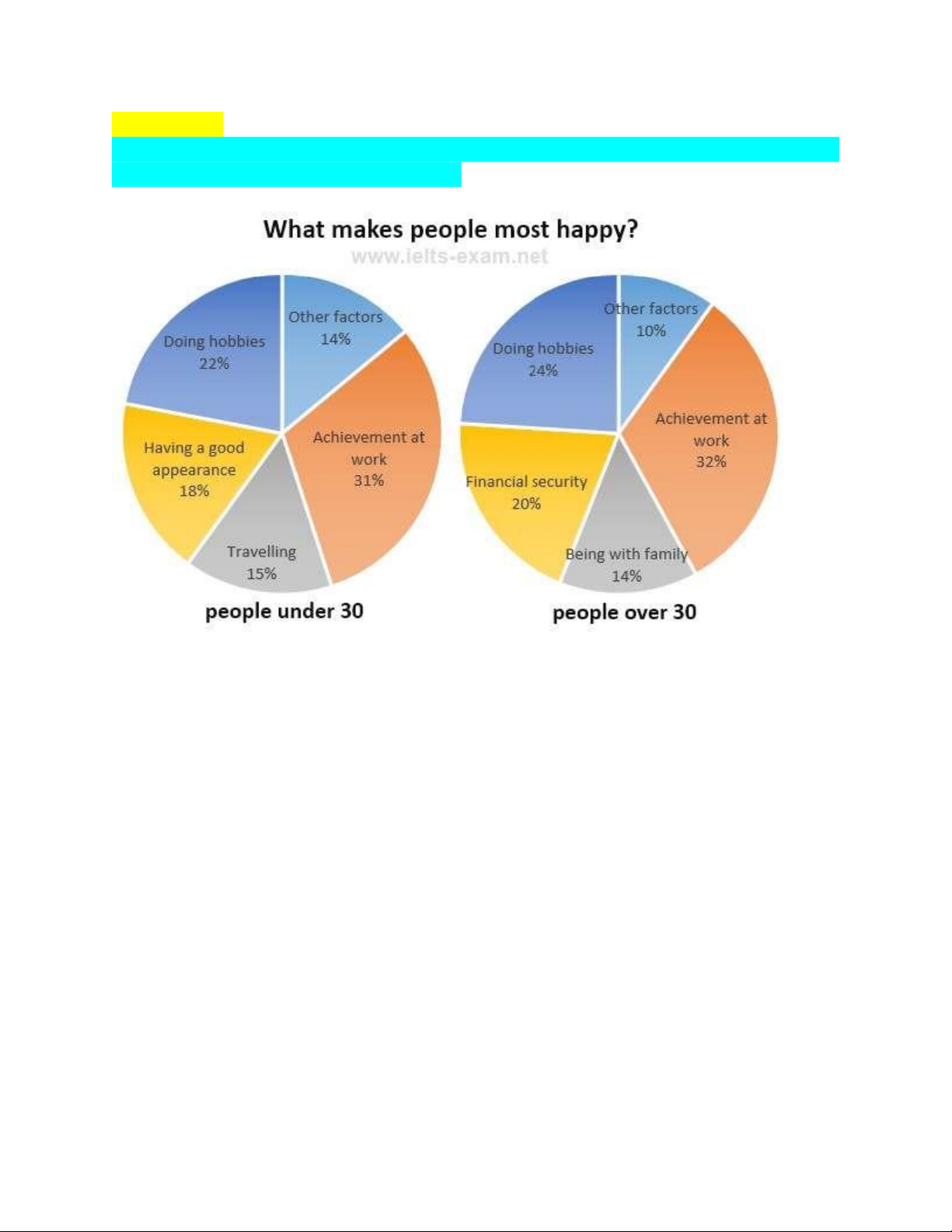
The charts below show the results of a survey about what people of different age
groups say what make them most happy
The given charts concentrate on the result of examination about what bring
happiness for people of two age groups
Overall, charts show Achievement at work sector has the highest proportion of
happiness in the both age groups. Besides, people who just under 30 feels happy if
they can travel and have a good looking while people who over 30 tend to satisfy
with their life when they gather with their family and have financial security.
As is illustrate, the percentage of joy come from Achievement at work make up
highest per cent with 31% for people under 30 and 32% for individuals over 30.
Similar, in terms of Doing hobbies, it has no big difference rate of happiness with
22% and 24% for under 30 age group and over 30 age group, respectively.
As regarded, there are the similar in the proportion of what make people feel happy
is that travelling with 15% for people under 30 and being with family with 14% for
those over 30. Moreover, having a good appearance make up 18% in five sectors of
people under 30 years old while Financial security of people over 30 years old have 20 per cent lOMoAR cPSD| 40342981
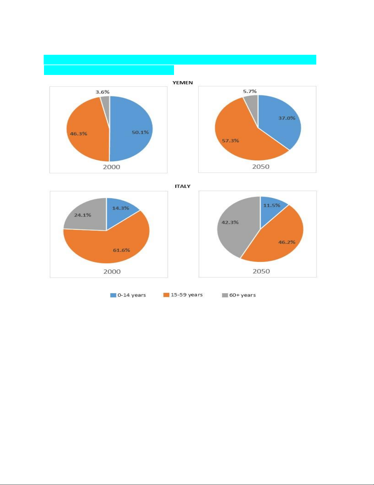
The charts below give Information on the ages of the populations of Yemen and
Italy In 2000 and projections for 2050.
The given pie charts show data on the population ages in Yemen and Italy in the
year 2000 and also projected these portions of the population for the year 2050.
According to the given data, more than half of the population of Yemen was below
14 years old in the year 2000. In this same year, their population from 15 to 59 years
old was just over 46% and only about 3% of their population was over 60 years old.
In this year there was one-fourth population in Italy over 60 years old and more than
60% of their population was from 15 to 59 years old. The percentage of aged people
in Italy was much higher than Yemen in 2000. Finally, the percentage of the
population up to 14 years in Italy was less than 15% in this year was.
The pie charts also give the projection of the percentage of population based on age
group for the year 2050 and according to this projection, the percentage of younger lOMoAR cPSD| 40342981
people in Yemen would decrease while the number of ag d people over 60 years
would increase only by 2%. On the contrary, the aged people in Italy in 2050 would
be more than 40% while they would have less young people.
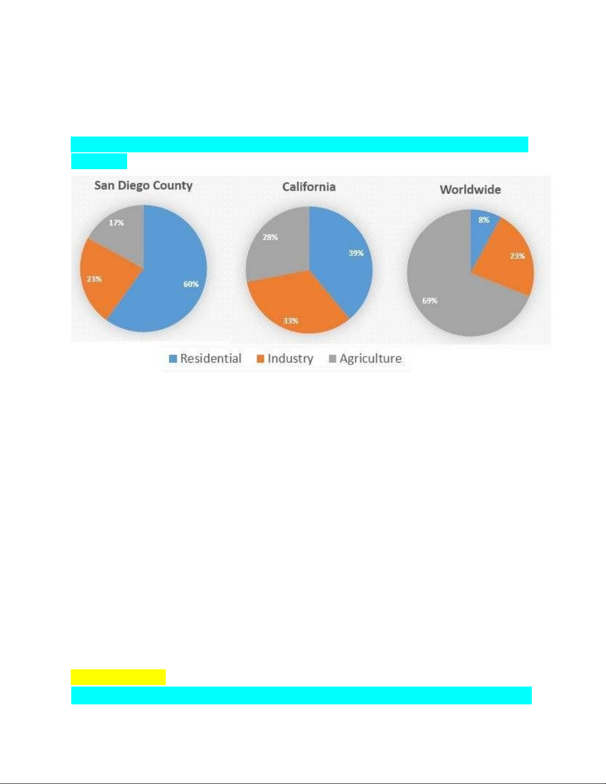
The pie charts below compare water usage in San Diego, California and the rest of the world.
The pie charts give information about the water used for residential, industrial and
agricultural purposes in San Diego County, California, and the world as a whole.
It is noticeable that more water is consumed by homes than by industry or
agriculture in the two American regions. By contrast, agriculture accounts for the
vast majority of water used worldwide.
In San Diego County and California State, residential water consumption accounts
for 60% and 39% of total water usage. By contrast, a mere 8% of the water used
globally goes to homes. The opposite trend can be seen when we look at water
consumption for agriculture. This accounts for a massive 69% of global water use,
but only 17% and 28% of water usage in San Diego and California respectively.
Such dramatic differences are not seen when we compare the figures for industrial
water use. The same proportion of water (23%) is used by industry in San Diego
and worldwide, while the figure for California is 10% higher, at 33%. MIXED CHART
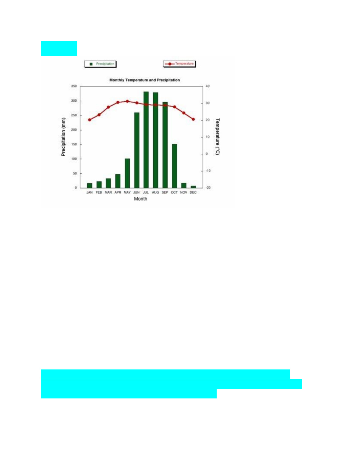
The climograph below shows average monthly temperatures and rainfall in the city lOMoAR cPSD| 40342981 of Kolkata.
The chart compares average figures for temperature and precipitation over the
course of a calendar year in Kolkata.
It is noticeable that monthly figures for precipitation in Kolkata vary considerably,
whereas monthly temperatures remain relatively stable. Rainfall is highest from
July to August, while temperatures are highest in April and May.
Between the months of January and May, average temperatures in Kolkata rise
from their lowest point at around 20°C to a peak of just over 30°C. Average rainfall
in the city also rises over the same period, from approximately 20mm of rain in January to 100mm in May.
While temperatures stay roughly the same for the next four months, the amount of
rainfall more than doubles between May and June. Figures for precipitation remain
above 250mm from June to September, peaking at around 330mm in July. The
final three months of the year see a dramatic fall in precipitation, to a low of about
10mm in December, and a steady drop in temperatures back to the January average.
The bar chart below shows the numbers of men and women attending various
evening courses at an adult education centre in the year 2009. The pie chart gives
information about the ages of these course participants. lOMoAR cPSD| 40342981
https://www.suabaiieltswriting.com/blog/phan-bo-bo-cuc-numbers-of-menwomen-
attending-various-evening-courses Link hướng dẫn làm bài
The proportions of English men and women of different ages who were living alone in 2011 lOMoAR cPSD| 40342981
The bar chart below shows the proportions of English men and women of different
ages who were living alone in 2011. The pie chart compares the numbers of
bedrooms in these one-person households.
The two charts give information about single-occupant households in England in
the year 2011. The bar chart compares figures for occupants age and gender, and
the pie chart shows data about the number of bedrooms in these homes.
Overall, females made up a higher proportion of people living alone than males,
and this difference is particularly noticeable in the older age categories. We can lOMoAR cPSD| 40342981
also see that the most common number of bedrooms in a single-occupant home was two.
A significant majority of the people aged 65 or over who were living alone in
England in 2011 were female. Women made up around 72% of single occupants
aged 75 to 84, and 76% of those aged 85 or over. By contrast, among younger
adults the figures for males were higher. For example, in the 35-49 age category,
men accounted for nearly 65% of people living alone.
In the same year, 35.4% of one-person households in England had two bedrooms,
while one-bedroom and three-bedroom homes accounted for 28% and 29.8% of the
total. Under 7% of single-occupant homes had four or more bedrooms.
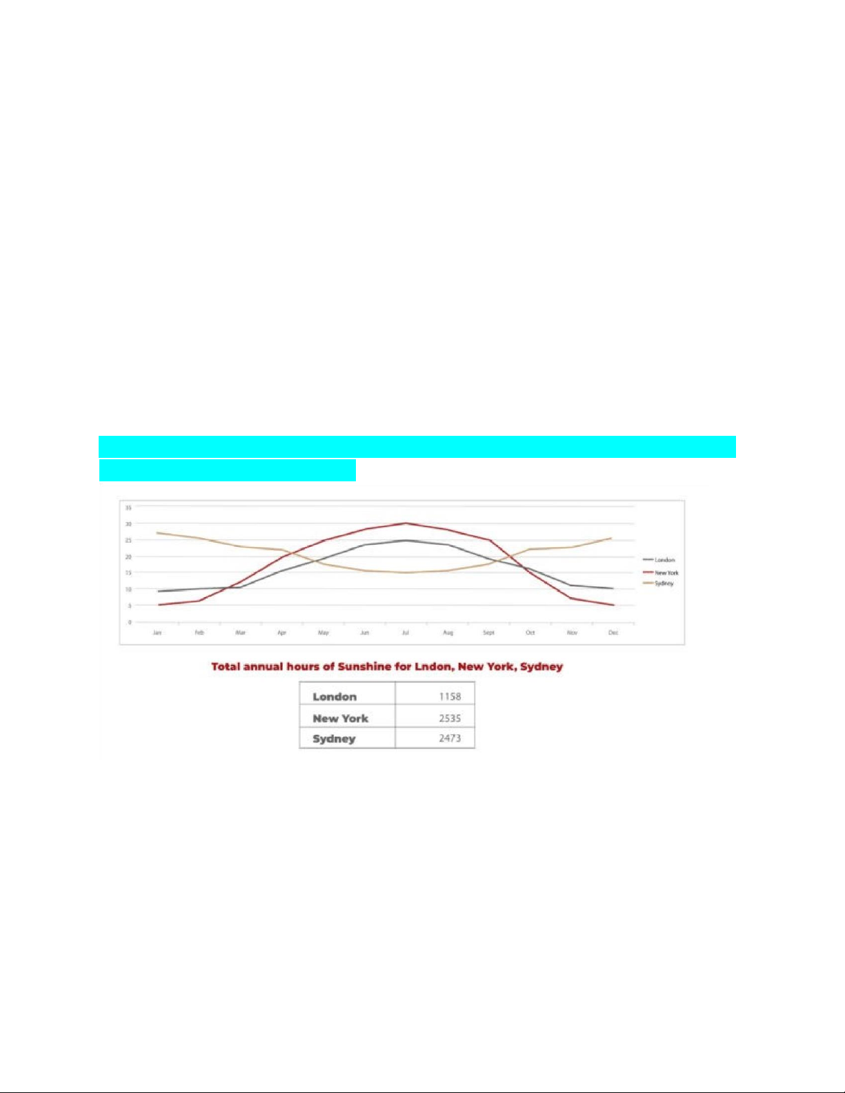
The line graph and table show the average monthly temperatures and annual hours
of sunshine in three major cities..
The given line graph describes the averaged temperatures each month for a
nondefined year in London, New York and Sydney while the table gives the total hours of sunshine.
Overall, New York is hotter than London in the summer months, while the reverse
is true in the winter. Sydney, being a Southern hemisphere city, has the opposite
pattern of temperature fluctuations. New York has notably the widest range of
temperature and the most hours of sunshine. lOMoAR cPSD| 40342981
In January, New York is definitely the coldest with only 5 degrees celsius,
compared to nearly 10 in London. Both cities then steadily climb to their peaks in
July with 30 and 25 degrees respectively. As the year draws to a close they return
to about the same temperatures they had in January. In contrast, Sydney, located
south of the equator, starts the year over 25 degrees centigrade and dips to a low of
15 in July before returning to January like temperatures in December.
The table’s data portrays how both New York and Sydney have over double the
sunshine hours than London with around 2500 for the former pair and only 1158 for the latter city.
Tài liệu liên quan:
-

Unit One & Two Overview | English 1 (TĐT) | Đại học Tôn Đức Thắng
148 74 -

English Listening Comprehension Practice | English 1 (TĐT) | Đại học Tôn Đức Thắng
117 59 -
A Comprehensive Lesson Plan | English 1 (TĐT) | Đại học Tôn Đức Thắng
164 82 -

Listening Answer Key: Unit One & Two Overview | English 1 (TĐT) | Đại học Tôn Đức Thắng
128 64 -

Lý thuyết tổng hợp: So sánh tính từ, trạng từ và danh từ | English 1 (TĐT) | Đại học Tôn Đức Thắng
106 53