








Preview text:
IELTS Sample Table ( Writing Task 1)
(Tài liệu được tham khảo tại: english-exam.org) #01
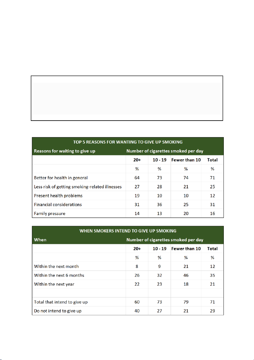
The tables below show people's reasons for giving up smoking, and when they intend to give up.
Summarise the information by selecting and reporting the main features, and make comparisons where relevant. Write at least 150 words. Model answer
The two tables together give a snapshot of the reasons people choose to stop smoking
and when they intend to give up.
The main reason smokers give for stopping is for general health (71%), with ûnancial
considerations (31%) and the risk of smoking-related diseases (25%) being the next two
most popular reasons. One fact to highlight from this table is that almost twice the
percentage of heavy smokers cite present health problems as the reason compared to light smokers.
According to the second table, the majority of smokers questioned (71%) intended to
give up, with light smokers more inclined to stop (79%) than heavy smokers (60%). 35%
of smokers said they were planning to give up within the next six months and only 12%
said they were prepared to try within the following month. Although only 29% of smokers
on average were unwilling to give up, heavy smokers were almost twice as unwilling to
try as light smokers, which perhaps reüects the level of addiction in the former group. (169 words) #02
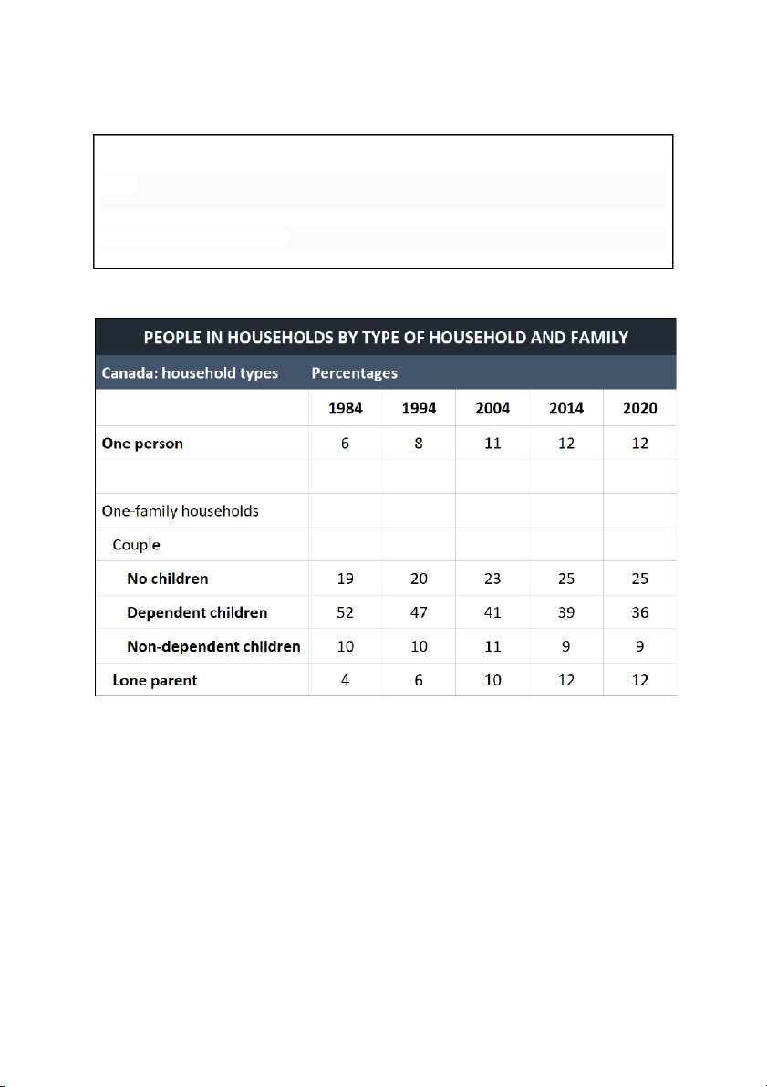
The table below shows the changes in some household types in Canada from 1984 to 2020.
Summarise the information by selecting and reporting the main features, and make comparisons where relevant. Write at least 150 words. Model answer
The table shows the changes in household types in Canada at 10-year intervals from
1984 to 2014 and again in 2020.
There has been a steady increase in households without children during this period.
One-person households doubled from 6% in 1984 to 12% in 2020, whilst the percentage
of couples with no children rose from 19% in 1984 to 23% in 2004 and to 25% in 2014.
However, this ûgure levelled out in 2020. Even bigger changes have occurred when it
comes to couples with dependent children. This category shrank from 52% in 1984 to
36% in 2020. In contrast, the percentage of lone parents trebled over the same period,
rising from 4% in 1984 to 12% in 2020. The percentage of families with non-dependent
children has remained more stable: 10% in 1984, rising only 1% over the next 20 years before falling to 9% in 2014.
In conclusion, the table shows deûnite patterns of change within the Canadian family
over the past 40 years, in particular the decline in the traditional. model of one couple with dependent children. (179 words) #03
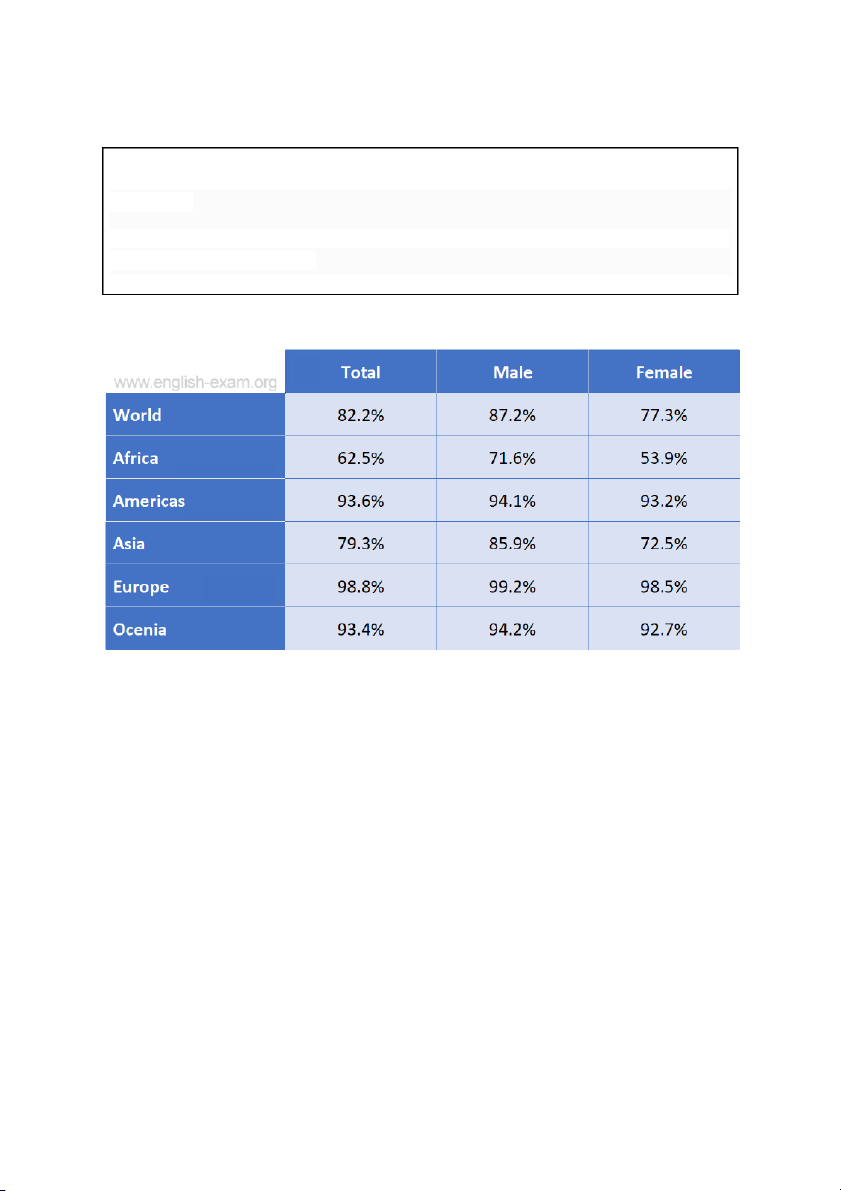
The table below shows the estimated literacy rates by region and gender for 2000-2004.
Summarise the information by selecting and reporting the main features, and make comparisons where relevant. Write at least 150 words. Model answer
The table shows estimated literacy rates for men and women in 2000-2004 in ûve
regions: Africa, the Americas, Asia, Europe and Oceania. It also shows average world
literacy rates for both genders for the same years.
According to the table, Europe has the highest literacy rates, reaching almost 99%. There
is virtually no difference in literacy rates for European men and women.
In Oceania and the Americas, the ûgures for both men and women are almost the same.
In both regions over 93% of the population is literate.
In both Asia and Africa, there are considerable differences in literacy rates between men
and women. In Asia, only 72.5% of women are literate, whereas the ûgure for Asian men
is 13% higher. In Africa, the gap is nearly double, with 53.9% of all African women being
literate and 71.6% of the African men being able to read and write.
Overall, around 82% of the world population is literate. In Europe, Oceania and the
Americas the literacy rates are the highest, with over 90% of the population able to read
and write. Asia and Africa have lower literacy rates than the other regions in the graph. (194 words) #04
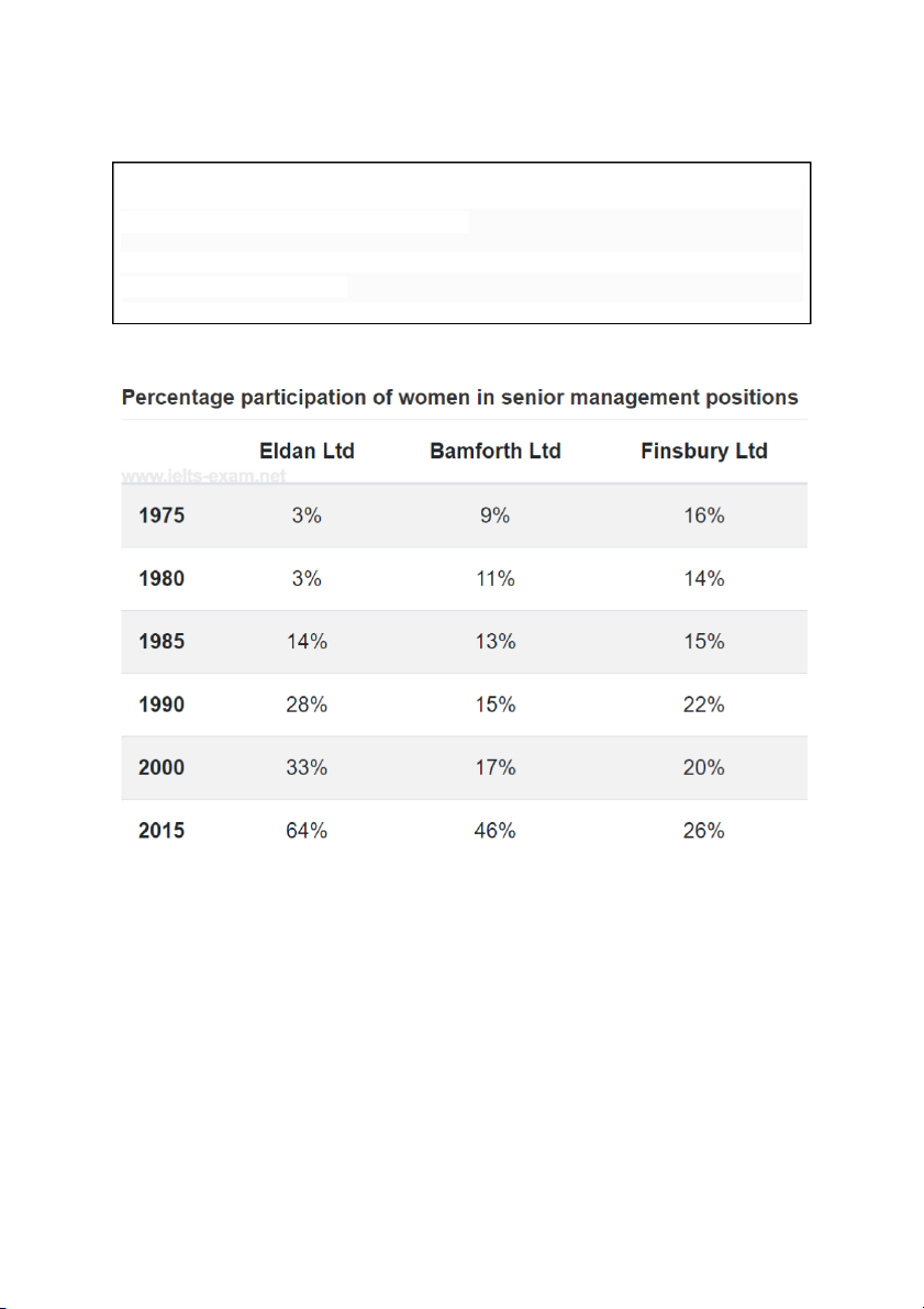
The table below shows the percentage participation of women in senior management
in three companies between 1975 and 2015.
Summarise the information by selecting and reporting the main features, and make comparisons where relevant. Write at least 150 words. Model answer
The table shows the percentage of women in senior management positions in three companies from 1975 to 2015.
While more women were in senior positions at Finsbury Ltd than the other two
companies in 1975 at 16%, the trend was fairly erratic with a 2% drop to 14% in 1980,
followed by a rise of 1% ûve years later. In 1990, women held 7% more top management
jobs than in 1985. After a slight drop back to 20% in 2000, by 2015 26% of top posts were ûlled by women.
By contrast, at Eldan Ltd women fared much better. In 1975, 3% of senior posts were
occupied by women with no change ûve years on. By 1985, the ûgure had increased to
14%, doubling to 28% in 1990. Ten years afterwards, there was a 5% increase in female
senior management jobs with a near twofold jump in 2015 to stand at 64%, the highest for the three companies.
The situation was less remarkable at Bamforth Ltd than the other two ûrms except for
the year 2015. In 1975, the percentage of senior posts held by women was 9% climbing
at the rate of 2% in each subsequent period until 2000, after which it leapt to 46%.
From the data, it is clear that women dominated senior posts at Eldan by 2015. (221 words) #05
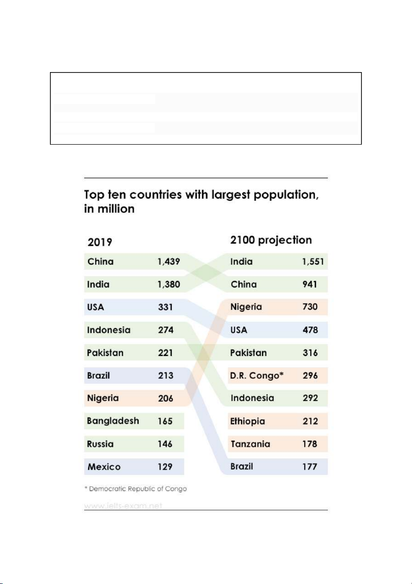
The table below shows top ten countries with largest population in 2019, and how it is projected to change by 2100.
Summarise the information by selecting and reporting the main features, and make comparisons where relevant. Write at least 150 words. Model answer
The table compares the population of the world's top ten countries in 2019 with projected numbers in 2100.
In 2019, China had the highest population of 1,439 million, with India second on 1,380
million. However, by 2100, India is projected to have the highest population of 1,551
million with China second on 941 million - down 498 million since 2019. Although the
USA is projected to increase its population from 331 million to 478 million, it steps down
from third to fourth place, being overtaken by Nigeria, which moves up from seventh
place with 206 million, to a total of 730 million, representing a massive increase of 524
million. Brazil drops from sixth place in 2019 with 213 million, down to tenth in 2100 on
177 million - a decrease of 36 million.
Three of the ten most populous countries in the world will no longer be among the top
ten in 2100, and all three will be supplanted by rapidly growing nations in Africa.
Except for China and Brazil, all other projections show an increase between 2019 and
2100, but there is a signiûcant shuffling of position by some countries, the elimination of
others, and the introduction of new contenders for a top-ten placing (203 words) #06
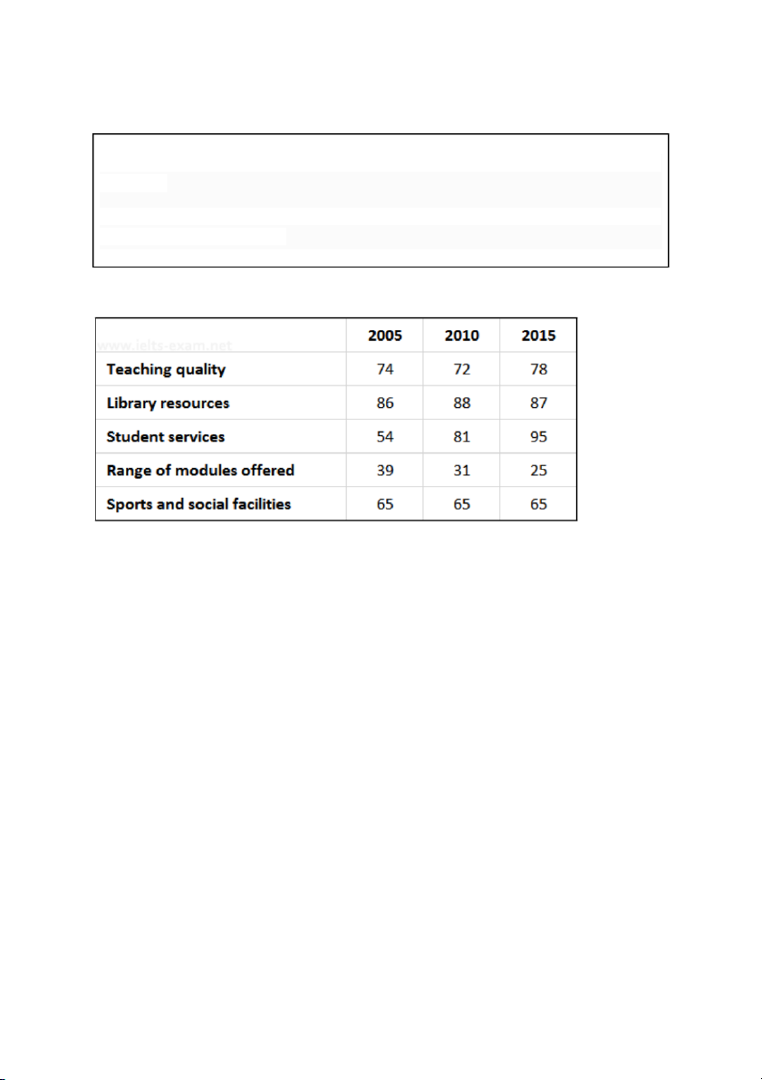
The table below shows the results of surveys in 2005, 2010 and 2015 about McGill University.
Summarise the information by selecting and reporting the main features, and make comparisons where relevant. Write at least 150 words. Model answer
The table shows the change in attitude, over ten years, of students at McGill University to
different aspects of its academic provision.
Overall, the most striking set of statistics relate to approval for student services. There
was a sharp increase in the number of students giving these services a good rating,
particularly in the ûrst ûve years: from 54 percent in 2005, to 81 percent in 2010, and 95
percent in 2015. There was also an overall improvement in ratings for teaching quality,
though the increase was relatively small (74 percent in 2005 rising to 78 percent in 2015)
and there was a decline in the interim (72 percent in 2010). There was also a üuctuation
in attitudes to library resources, rising from 86 percent to 88 percent in the ûrst ûve years
and then falling by one percent in 2015. Good ratings for the university’s sports and
social facilities were identical throughout, at 65 percent. Finally, there were poor ratings
at the beginning of the period for the range of modules offered (39 percent in 2005) and
they got worse, falling steadily to 31 percent in 2010 and 25 percent in 2015. (193 words) #07
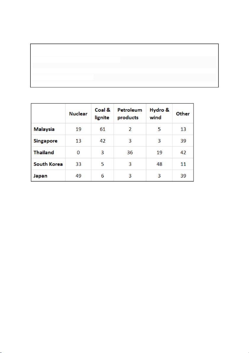
The table below shows the percentage use of four different fuel types to generate
electricity in five Asian countries in 2005.
Summarise the information by selecting and reporting the main features, and make comparisons where relevant. Write at least 150 words. Model answer
The table shows different sources of fuel for producing electricity and their percentage
use in ûve Asian countries in 2005. Generally, the ûve countries showed a signiûcant
difference in their patterns of consumption. Taking nuclear fuel ûrst, Japan had the
highest percentage at 49%, with South Korea second at 33%. In marked contrast,
Thailand used no nuclear power at all. Turning to Coal and Lignite, Malaysia and
Singapore used this to generate a large proportion of their electricity (61% and 42%
respectively), a much higher percentage than the remaining countries.
Regarding Petroleum products, Thailand produced 36% of its electricity from this source.
In comparison, the other countries only generated 3% or less of their electricity from this
fuel. However, Hydro and Wind reveal another pattern with South Korea producing
almost half of its electricity (48%) this way (over twice as high as Thailand which had the
second highest percentage at 19%). Finally, a signiûcant amount was produced from
other sources with three countries (Singapore, Thailand and Japan) generating around
40% of their electricity from other fuels. Overall, it can be seen that there was a
signiûcant variation in which fuels countries used to generate their electricity. (196 words) #08
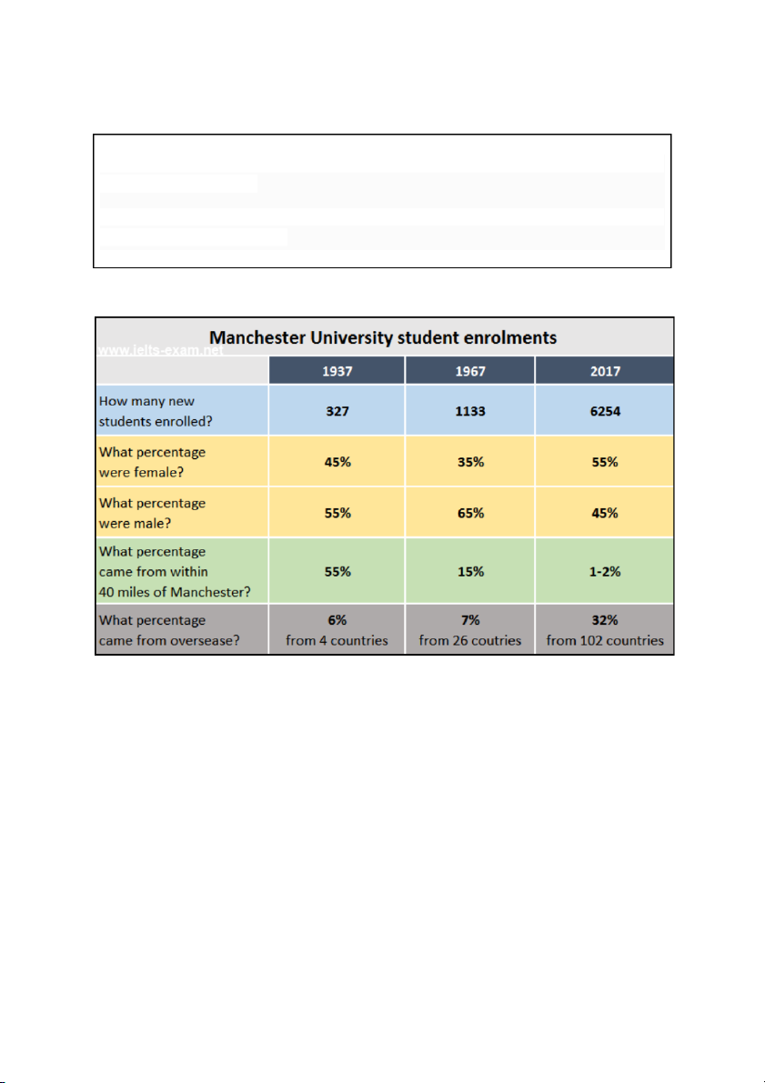
The table below gives information about student enrolments at Manchester University in 1937, 1967 and 2017.
Summarise the information by selecting and reporting the main features, and make comparisons where relevant. Write at least 150 words. Model answer
In the table we can see information about the numbers of students enrolling at
Manchester University in the three years, 1937, 1967 and 2017. It compares the
percentages of females and males, and also students from abroad and those from within 40 miles of the city.
The most noticeable changes concern the overall growth of student numbers, from 327
in 1937 to 6254 in 2017, and the proportions of local students, who constituted 55% of
the total in 1937, but only 1-2% in 2017.
It is surprising to note that the percentage of female enrolments did not rise steadily, but
dropped between 1937 and 1967. However, at the same time, the percentage of the
student population who came from abroad remained almost unchanged between 1937
and 1967, being 6% and 7% respectively, but rose markedly after that, so that by 2017
foreign students represented 32% of the total. (150 words) #09
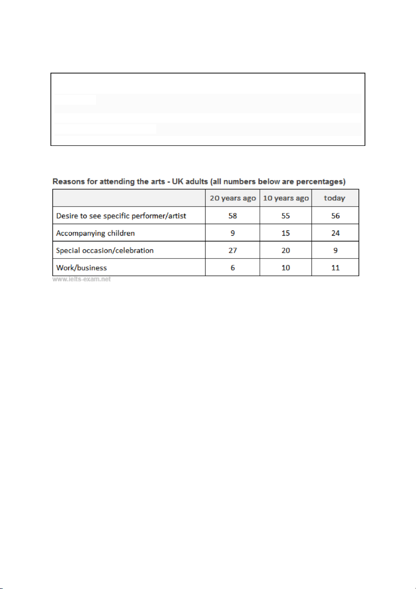
The table below shows the results of a 20-year study into why adults in the UK attend arts events.
Summarise the information by selecting and reporting the main features, and make comparisons where relevant. Write at least 150 words. Model answer
The table illustrates four reasons why adults in the UK have attended arts events over
the past twenty years. The major reason over the whole twenty-year period was a desire
to see a speciûc performer or artist; while the least important reason was attending arts
events for work-related reasons.
The percentage of people who attended events out of a desire to see a particular
performer has remained relatively stable throughout the twenty-year period; varying from
58% twenty years ago to 56% today.
On the other hand, the percentage of people accompanying children has shown a
signiûcant increase, from 9% 20 years ago to just under a quarter today. As far as those
who attended arts events because of special occasions or celebrations are concerned,
the percentage fell slightly from 27% 20 years ago to 20% a decade ago, dropping dramatically to 9% today.
There has been a slight increase in the percentage of people attending arts events for
work or business, from 6% 20 years ago to just over 10% today.
Overall, there has been a rise in people attending events in order to accompany children
and for work-related reasons, while fewer people choose to attend an arts event as a form of celebration. (204 words) #10
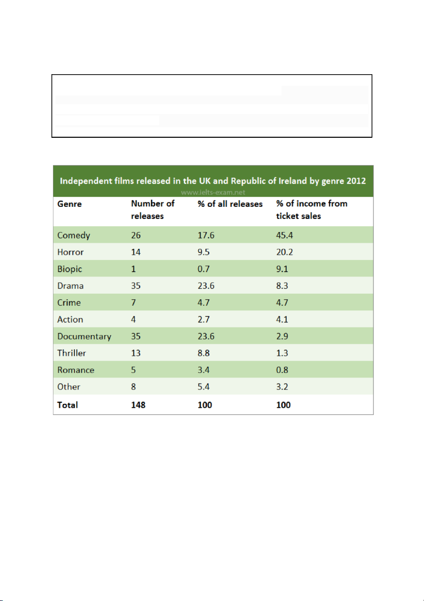
The table below gives information about UK independent films.
Summarise the information by selecting and reporting the main features, and make comparisons where relevant. Write at least 150 words. Model answer
The table provides information about different types of independent ûlms released in the
UK and the Republic of Ireland in 2012. It indicates how many ûlms of different genres
were made and also shows what proportion of total ticket sales was made by each kind of ûlm.
The table makes it very clear that there is no correlation between the number of ûlms
made in any category and the proportion of ticket sales earned by that sort of ûlm. For
example, the largest numbers of ûlms were made in the Drama and Documentary
categories - 35 of each of these were released. However, they earned only 8.3 and 2.9
percent of total ticket sales respectively.
Comedy ûlms were the most ûnancially successful: 26 ûlms, out of a total of 148, earned
45.4 percent of all the income from ticket sales. Another very successful type of ûlm in
2012 was the biopic. Although only one of these was released, it accounted for 9.1 percent of ticket sales. (166 words) #11
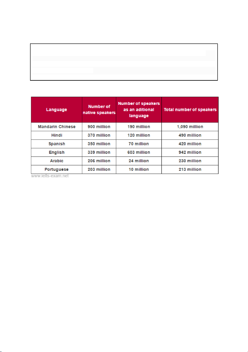
The table below gives information about languages with the most native speakers.
Summarise the information by selecting and reporting the main features, and make comparisons where relevant. Write at least 150 words. Model answer
The table illustrates the number of native speakers of six languages as well as the
number of speakers of these languages as an additional language. It is noticeable that
the number of speakers of Mandarin Chinese is strikingly higher than the other
languages with over one billion speakers.
People who speak Mandarin largely speak it as a ûrst language (900 million). In
comparison to this only 190 million people speak Mandarin Chinese as an additional
language. What is remarkable about English speakers is that the number of speakers of
English as an additional language is higher than that of native speakers of English (603 and 339 million respectively).
While the total number of Hindi speakers (490 million) is roughly equal to that of Spanish
speakers (420 million); when it comes to speaking these languages as an additional
language the number for Hindi is much higher (120 million) than that for Spanish (70 million).
Native speakers of Arabic and Portuguese are similar in number with 206 million and
203 million respectively. However, the number of Arabic speakers as an additional
language (24 million) is almost 2.5 times higher than speakers of Portuguese as an additional language. (195 words)
