Tài liệu Data Analytics with R-Time Serieswith R | Cấu trúc dữ liệu và giải thuật
some data for use in examples and exercises
forecast package (for forecasting functions)
ggplot2 package (for graphics functions)
fma package (for lots of time series data)
expsmooth package (for more time series data)
Tài liệu giúp bạn tham khảo, củng cố kiến thức và ôn tập đạt kết quả cao
Môn: Cấu trúc dữ liệu và giải thuật (IT003) 43 tài liệu
Trường: Trường Đại học Công nghệ Thông tin, Đại học Quốc gia Thành phố Hồ Chí Minh 661 tài liệu
Tác giả:


Preview text:
Data Analytics with R-Time Series with R 1. Time series graphics 2023 Time series in R
ts objects and ts function
A time series is stored in a ts object in R: · a list of numbers
· information about times those numbers were recorded. Example Year Observation 2012 123 2013 39 2014 78 2015 52 2016 110
y <- ts(c(123,39,78,52,110), start=2012) 3/62
ts objects and ts function
For observations that are more frequent than once per year, add a frequency argument.
E.g., monthly data stored as a numerical vector z:
y <- ts(z, frequency=12, start=c(2003, 1)) 4/62
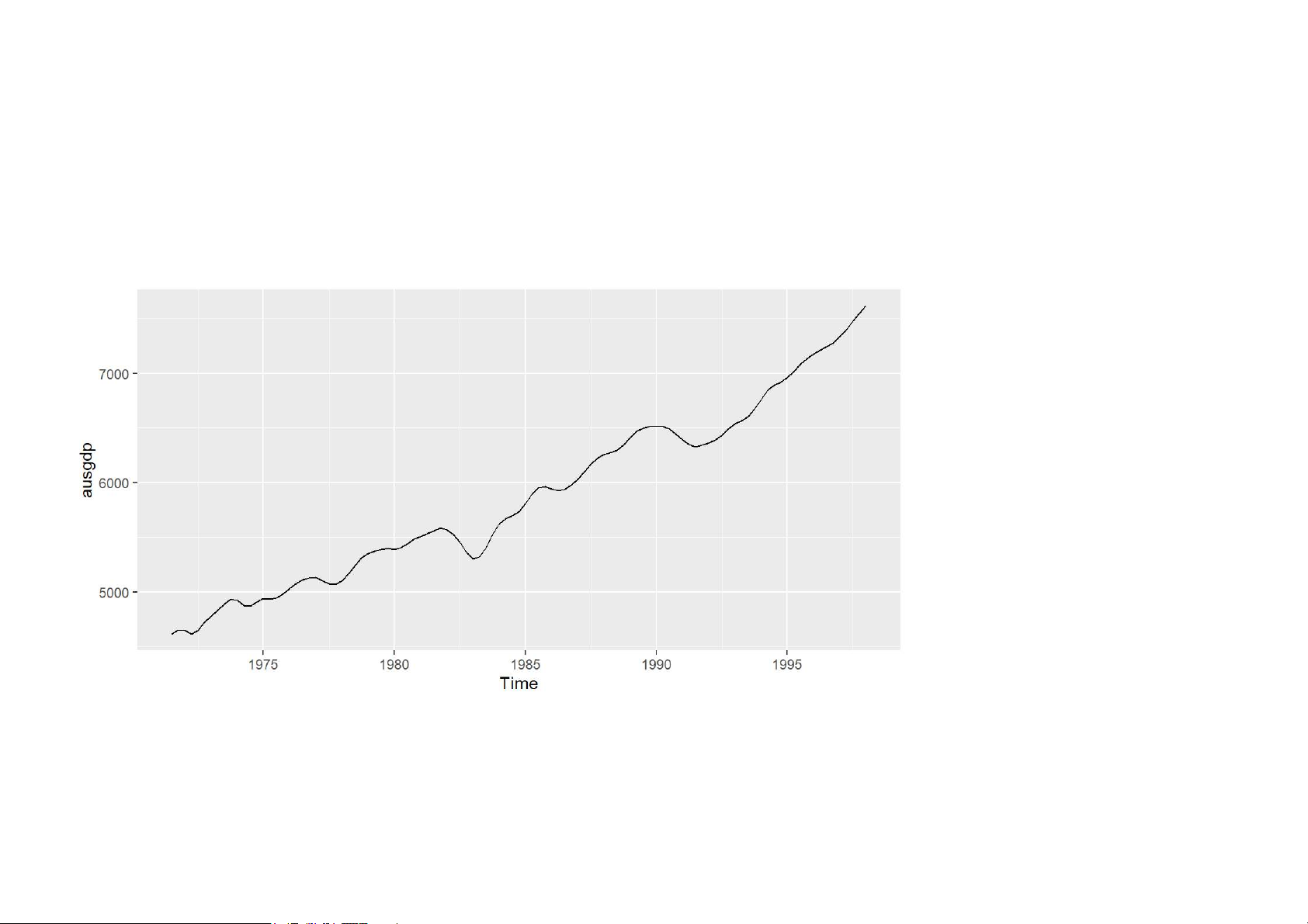
ts objects and ts function ts(data, frequency, start) 5/62 Australian GDP
ausgdp <- ts(x, frequency=4, start=c(1971,3)) · Class: “ts”
· Print and plotting methods available. ausgdp ## Qtr1 Qtr2 Qtr3 Qtr4 ## 1971 4612 4651 ## 1972 4645 4615 4645 4722 ## 1973 4780 4830 4887 4933 ## 1974 4921 4875 4867 4905 ## 1975 4938 4934 4942 4979 ## 1976 5028 5079 5112 5127 ## 1977 5130 5101 5072 5069 ## 1978 5100 5166 5244 5312 ## 1979 5349 5370 5388 5396 ## 1980 5388 5403 5442 5482 ## 1981 5506 5531 5560 5583 ## 1982 5568 5524 5452 5358 6/62 ## 1983 5303 5320 5408 5531 Australian GDP autoplot(ausgdp) 7/62
Residential electricity sales elecsales ## Time Series: ## Start = 1989 ## End = 2008 ## Frequency = 1
## [1] 2354.34 2379.71 2318.52 2468.99 2386.09
## [6] 2569.47 2575.72 2762.72 2844.50 3000.70
## [11] 3108.10 3357.50 3075.70 3180.60 3221.60
## [16] 3176.20 3430.60 3527.48 3637.89 3655.00 8/62 Class package > library(fpp2) This loads:
· some data for use in examples and exercises
· forecast package (for forecasting functions)
· ggplot2 package (for graphics functions)
· fma package (for lots of time series data)
· expsmooth package (for more time series data) 9/62 Time plots Time plots
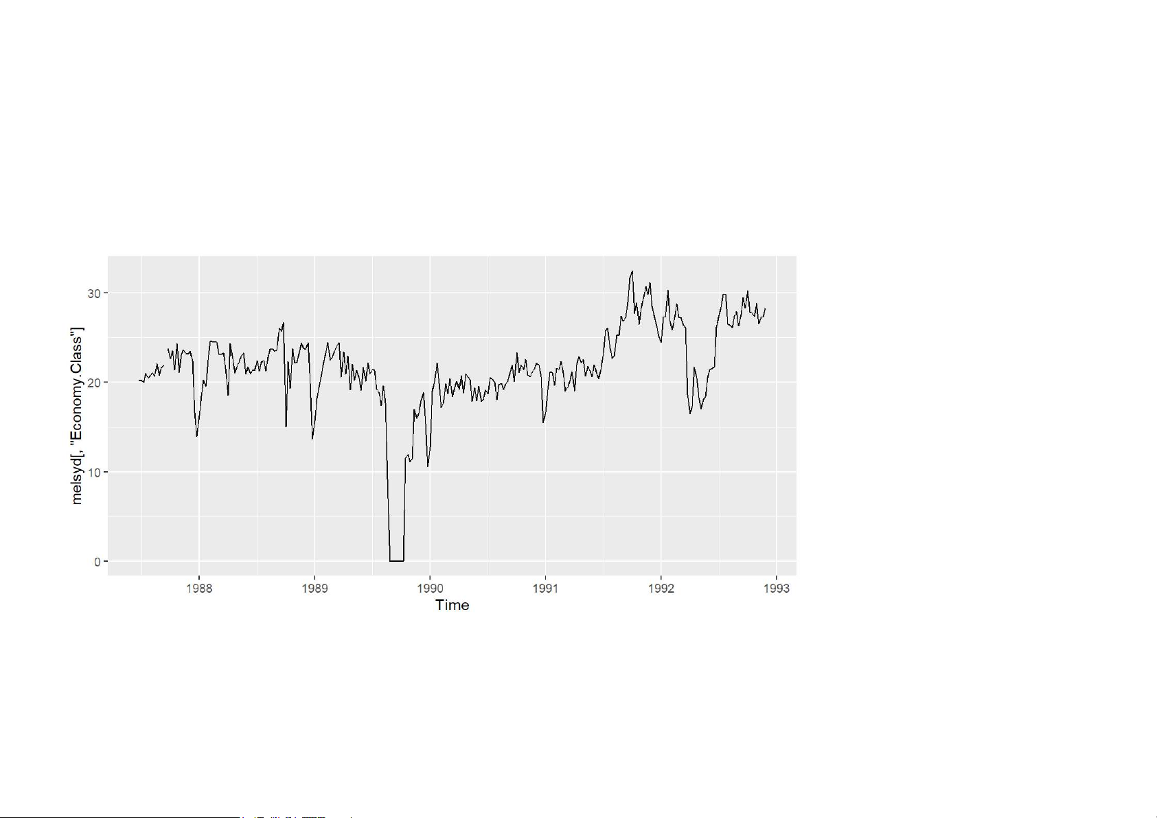
autoplot(melsyd[,"Economy.Class"]) 11/62 Time plots
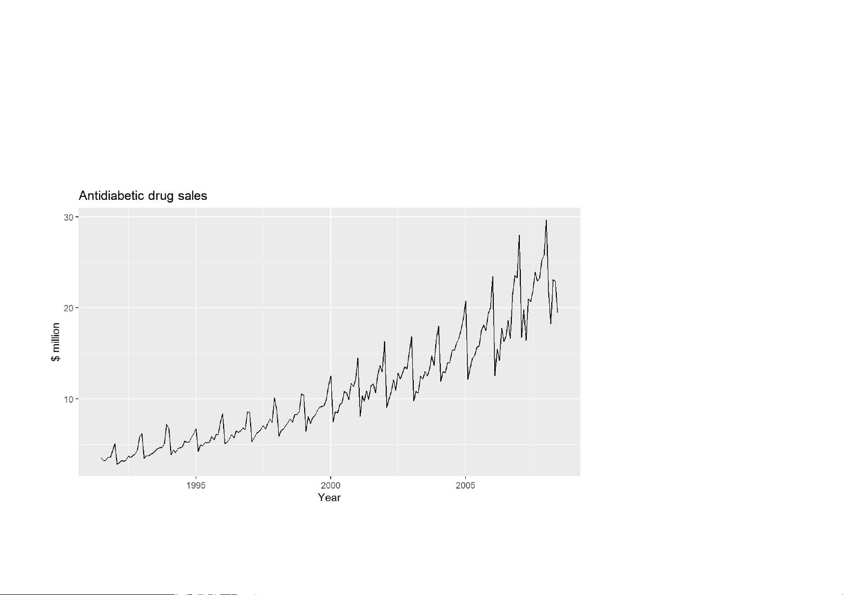
autoplot(a10) + ylab("$ million") + xlab("Year") +
ggtitle("Antidiabetic drug sales") 12/62 Your turn
· Create plots of the following time series: dole, bricksq, lynx, goog
· Use help() to find out about the data in each series.
· For the last plot, modify the axis labels and title. 13/62 Are time plots best?
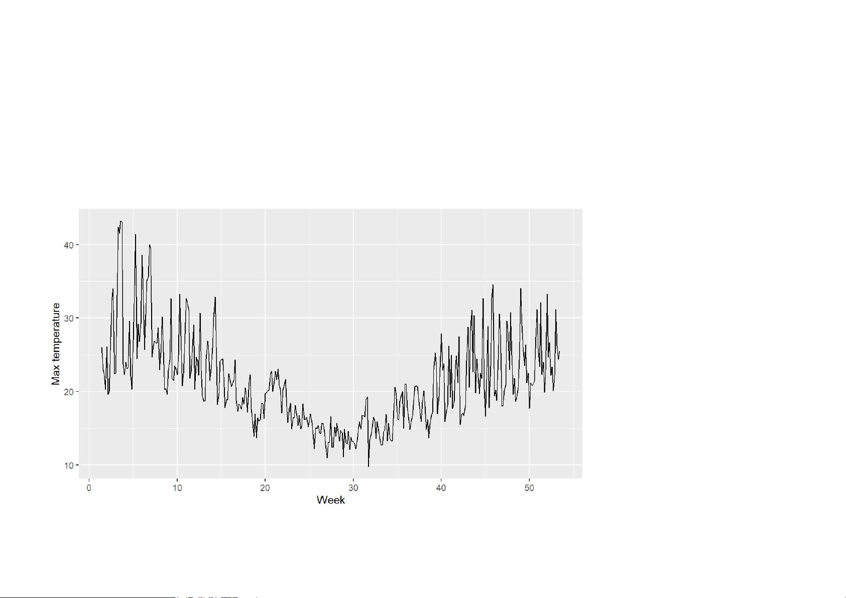
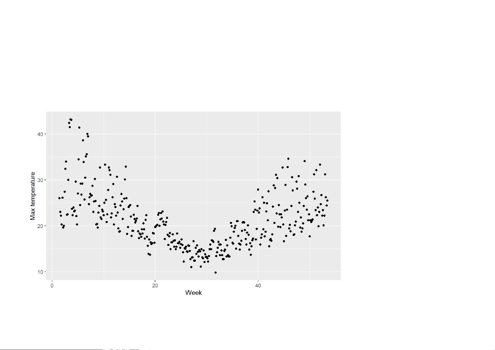
autoplot(elecdaily[,"Temperature"]) +
xlab("Week") + ylab("Max temperature") 14/62 Are time plots best?
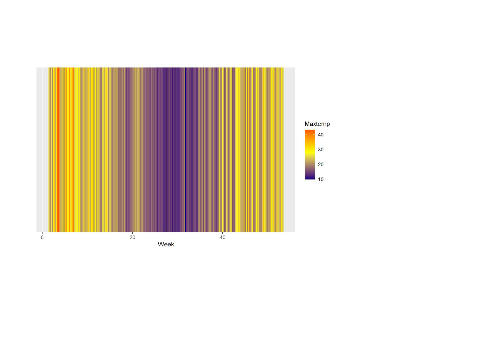
qplot(time(elecdaily), elecdaily[,"Temperature"]) +
xlab("Week") + ylab("Max temperature") 15/62 Are time plots best? 16/62 Are time plots best? 17/62 Seasonal plots Seasonal plots
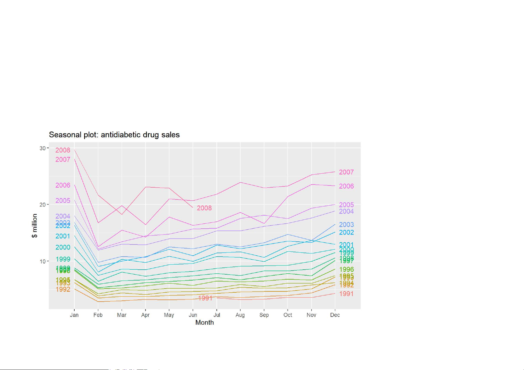
ggseasonplot(a10, year.labels=TRUE, year.labels.left=TRUE) + ylab("$ million") +
ggtitle("Seasonal plot: antidiabetic drug sales") 19/62 Seasonal plots
· Data plotted against the individual “seasons” in which the data were observed.
(In this case a “season” is a month.)
· Something like a time plot except that the data from each season are overlapped.
· Enables the underlying seasonal pattern to be seen more clearly, and also
allows any substantial departures from the seasonal pattern to be easily identified. · In R: ggseasonplot() 20/62
Tài liệu liên quan:
-

Giáo trình môn cấu trúc dữ liệu và giải thuật
9 5 -

Bài giảng Cơ sở dữ liệu | Trường Đại học Công nghệ Thông tin, Đại học Quốc gia Thành phố Hồ Chí Minh
17 9 -

Sổ tay kiến thức DSA | Cấu trúc dữ liệu và giải thuật
1.1 K 557 -
ĐÁP ÁN THAM KHẢO ĐỀ THI CUỐI KỲ HỌC KỲ 2 – NĂM HỌC 2021 – 2022 | : Cấu trúc dữ liệu và giải thuật
281 141 -

Bài giảng chương 10 : Cây nhị phân tìm kiếm | Cấu trúc dữ liệu và giải thuật
288 144