39 studies about human perception in 30 minutes| Tài liệu tham khảo môn quản trị dữ liệu và trực quan hóa| Trường Đại học Bách Khoa Hà Nội

These are my speaker notes from a talk I gave at OpenVis in April 2016. Originally this talk was supposed to be called “Everything we know about how humans perceive graphics,” which is... at a minimum, pretty pretentious. I scaled back a bit.

Trường:

Đại học Bách Khoa Hà Nội 2.8 K tài liệu

Thông tin:
36 trang 4 tháng trước

Bình luận

Vui lòng đăng nhập hoặc đăng ký để gửi bình luận.

39 studies about human perception in 30 minutes| Tài liệu tham khảo môn quản trị dữ liệu và trực quan hóa| Trường Đại học Bách Khoa Hà Nội

These are my speaker notes from a talk I gave at OpenVis in April 2016. Originally this talk was supposed to be called “Everything we know about how humans perceive graphics,” which is... at a minimum, pretty pretentious. I scaled back a bit.

52 26 lượt tải Tải xuống
4/5/22, 4:28 PM
39 studies about human perception in 30 minutes | by kennedy elliott | Medium
https://medium.com/@kennelliott/39-studies-about-human-perception-in-30-minutes-4728f9e31a73
1/36
kennedy elliott Follow
May 3, 2016 · 21 min read · Listen
Save
39 studies about human perception in 30
minutes
These are my speaker notes from a talk I gave at OpenVis in April 2016. Originally this talk
was supposed to be called “Everything we know about how humans perceive graphics,” which
is… at a minimum, pretty pretentious. I scaled back a bit.
Clearly I have learned everything there is to know about how humans perceive data
graphics in preparation for this talk. Literally everything. But I couldn’t possibly fit it all
into 30 minutes. So for your sake, lets just refer to this talk as 39 studies on human
perception in 30 minutes.
Open in app
Get started
4/5/22, 4:28 PM
39 studies about human perception in 30 minutes | by kennedy elliott | Medium
https://medium.com/@kennelliott/39-studies-about-human-perception-in-30-minutes-4728f9e31a73
2/36
I’m a graphics editor at The Washington Post, which means I’m part developer, part
journalist. Graphics editors like me often rely on common wisdom and experiential
knowledge to inform our decisions about design and visualization choices — which is
incredibly valuable.
For the last several years, I’ve wondered about what we actually know from scientific
studies about how humans perceive graphics. I’ve collected things here and there, but
when I started to get into the thick of it, I realized how extensive this body of research
really is. There is a lot that I’m leaving out.
This is an extreme distillation of these studies. In reality, these are robust studies, many
with multiple experiments each, loaded with meaningful nuance that I do not have time to
address. These are very simplistic representations of one or two core findings. I encourage
that you read them in their entirety and consider their complete findings.
In future posts, I’d like to dive in deeper to each section and present a bit more context for
these findings. Look out for more!
In Colin Ware’s book, Information Visualization, he wonders: Is visualization a science or a
language?
It’s perhaps a science because it must represent data accurately, methodically and without
flourish so that we can see the underlying trends and patterns. Because of this, selecting
the right visualization for your content could be prescriptive based on what you want to
show.
However, many argue that it is a language because it uses diagrams to convey meaning.
Data is encoded into symbology and semiology. The syntax and conventions of these
diagrams must be learned and are not inherent.
Throughout this presentation, think about which you think it is.
Open in app
Get started
4/5/22, 4:28 PM
39 studies about human perception in 30 minutes | by kennedy elliott | Medium
https://medium.com/@kennelliott/39-studies-about-human-perception-in-30-minutes-4728f9e31a73
3/36
foundations
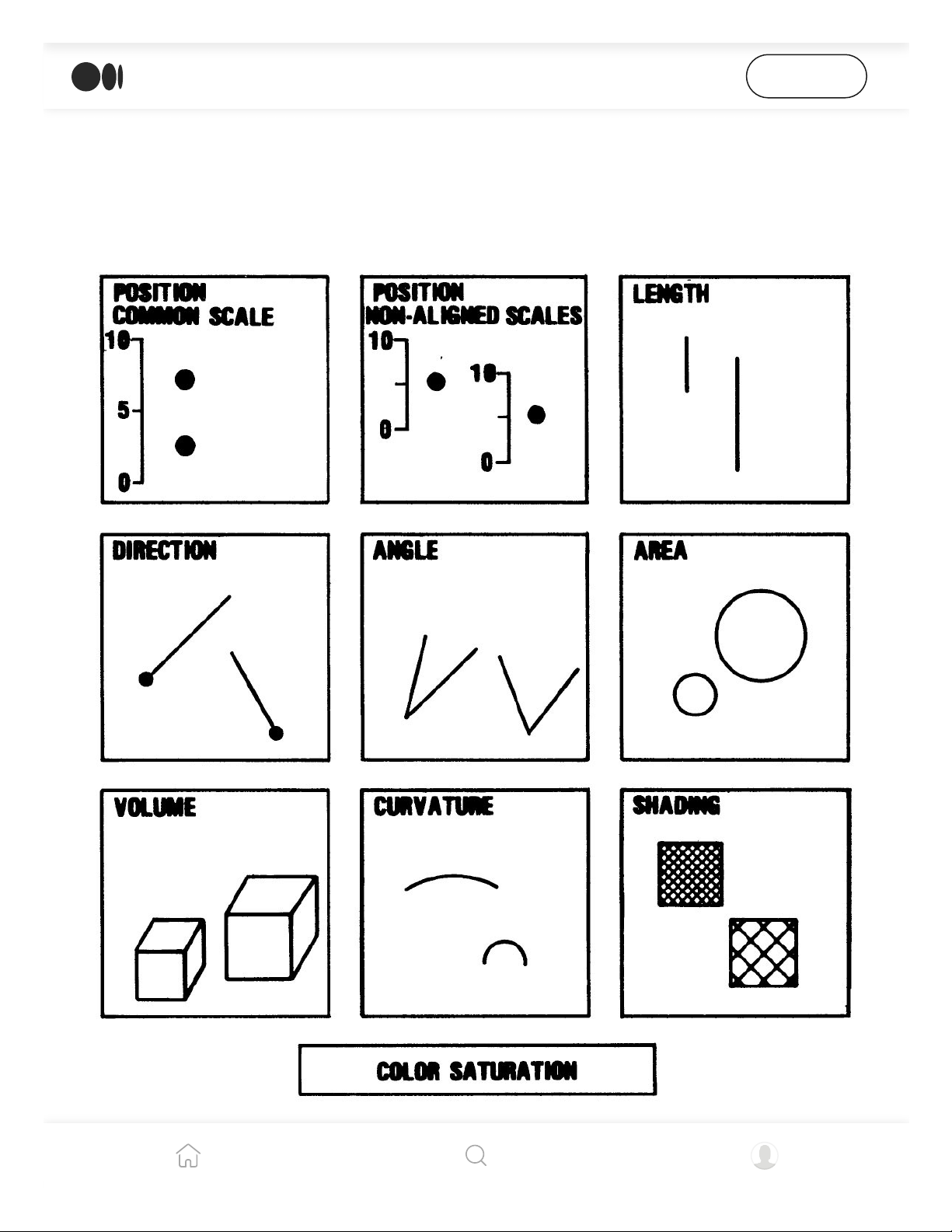
In 1984, William Cleveland and Robert McGill (1) published a study that can only be
described as the archetypical seminal study for information visualization.
In several experiments, Cleveland and McGill identified elementary perceptual tasks: the most basic tasks they
believe viewers perform when evaluating a visualization.
Open in app
Get started
4/5/22, 4:28 PM
39 studies about human perception in 30 minutes | by kennedy elliott | Medium
https://medium.com/@kennelliott/39-studies-about-human-perception-in-30-minutes-4728f9e31a73
4/36
It gives us our first ranking of so-called “elementary perceptual tasks,” which are the most
basic visual tasks we perform in our perception of graphs. It is referenced by many of the
studies I’m about to talk about, and in fact, whenever that happens, I put William
Cleveland’s little head next to it (I couldn’t find a picture of McGill).
At the top of the ranking, the easiest perceptual task, is “position along a common scale.”
Cleveland and McGill say it is easiest for us to compare objects in terms of a common scale,
like an axis. Scatterplots are a good example of this: circles in scatterplots are anchored on
two common scales, the x- and the y-axis.
Bar charts also involve comparing objects on a common scale, typically the x-axis, but
Cleveland and McGill admit they can also involve judgments of length and area. The list
goes on. I encourage you to read and familiarize yourself with what they consider to be
elementary perceptual tasks.
Open in app
Get started
4/5/22, 4:28 PM
39 studies about human perception in 30 minutes | by kennedy elliott | Medium
https://medium.com/@kennelliott/39-studies-about-human-perception-in-30-minutes-4728f9e31a73
5/36
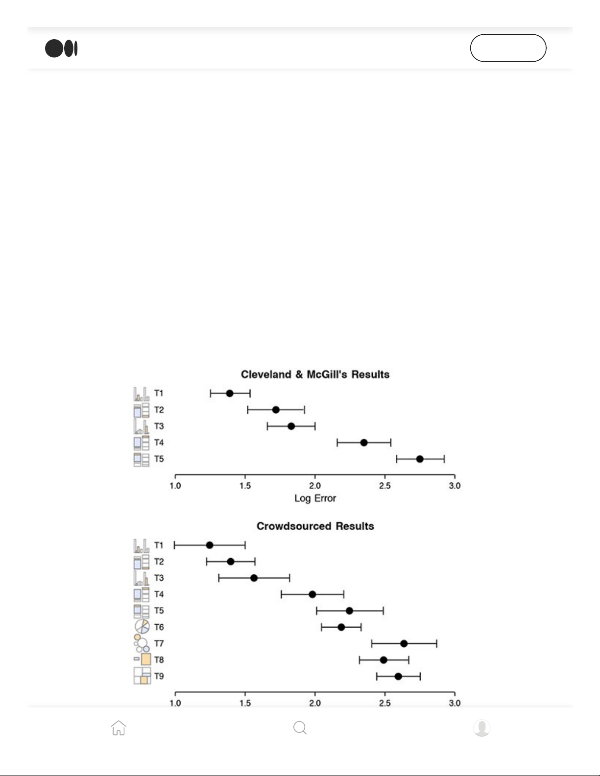
Heer and Bostock’s experiments with Mechanical Turk participants yielded similar results to those of Cleveland
and McGill.
However, this study was conducted three decades ago. How relevant is it today?
Fortunately for us, we have some clue. Heer and Bostock (2) revisited some of Cleveland
and McGill’s old experiments in a study they did as more of a proof of concept for using
Mechanical Turk users in scientific studies.
Their results were very similar to those of Cleveland and McGill, at least with the
perceptual tasks they tested for.
reference points
Three studies show that we have inherent biases related to the types of graphs we see and
the objects we see in them. These biases may distort the information we retrieve from a
graph.
We know that from Steven’s law, when an object is seen in context of other larger objects,
it appears larger itself. When it is seen in context with smaller objects, it appears smaller.
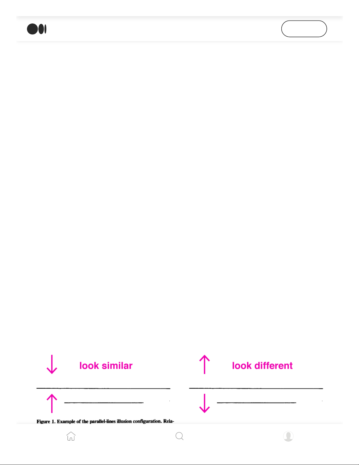
Jordan and Schiano (3) found that increasing spatial separation between lines produced
the opposite effect. If lines were close enough, a line’s length was more similar to the
length of the line around it (this is also known as assimilation). If the lines were far apart,
long lines appeared longer, and short lines appeared shorter (also known as contrast).
Jordan and Schiano found that when lines of varying sizes were presented close together participants recalled
Open in app
Get started
4/5/22, 4:28 PM
39 studies about human perception in 30 minutes | by kennedy elliott | Medium
https://medium.com/@kennelliott/39-studies-about-human-perception-in-30-minutes-4728f9e31a73
6/36
Jordan and Schiano found that when lines of varying sizes were presented close together, participants recalled
them being more similar in length. When they were presented farther apart, participants saw larger contrasts
between the lines.
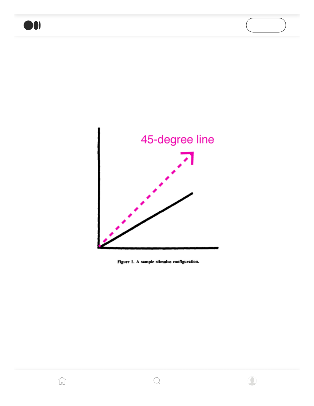
In two other studies, Schiano and Tversky (4, 5) found that charts were remembered as
being more symmetrical than they actually were. They gave participants diagrams that
looked like these, and told them they were either charts or maps.
They found that when participants encountered the diagrams introduced as charts, they
remembered the lines closer to the imaginary 45-degree line. Further, when the same line
was presented to them as a map, this distortion did not occur.
In two separate studies, Schiano and Tversky found that the 45-degree line is an imaginary reference point in
line graphs, but not in other types of charts.
When text appeared with the chart calling attention to its symmetry, participants recalled
it being a more symmetrical chart even if it was not. This leads me to believe that
annotations can be powerful in relaying information.
In a separate study, they confirmed a systematic bias toward an imaginary 45-degree line
in line charts. When a diagonal line was presented to participants, they continually
remembered this line as being closer to 45 degrees than it actually was, meaning they
underestimated larger angles and overestimated smaller angles. Thus, the 45-degree line
is a reference point for line charts, but not in other contexts.
Open in app
Get started
4/5/22, 4:28 PM
39 studies about human perception in 30 minutes | by kennedy elliott | Medium
https://medium.com/@kennelliott/39-studies-about-human-perception-in-30-minutes-4728f9e31a73
7/36
is a reference point for line charts, but not in other contexts.
Their work suggests that different visual systems promote different reference frames.
basic shapes
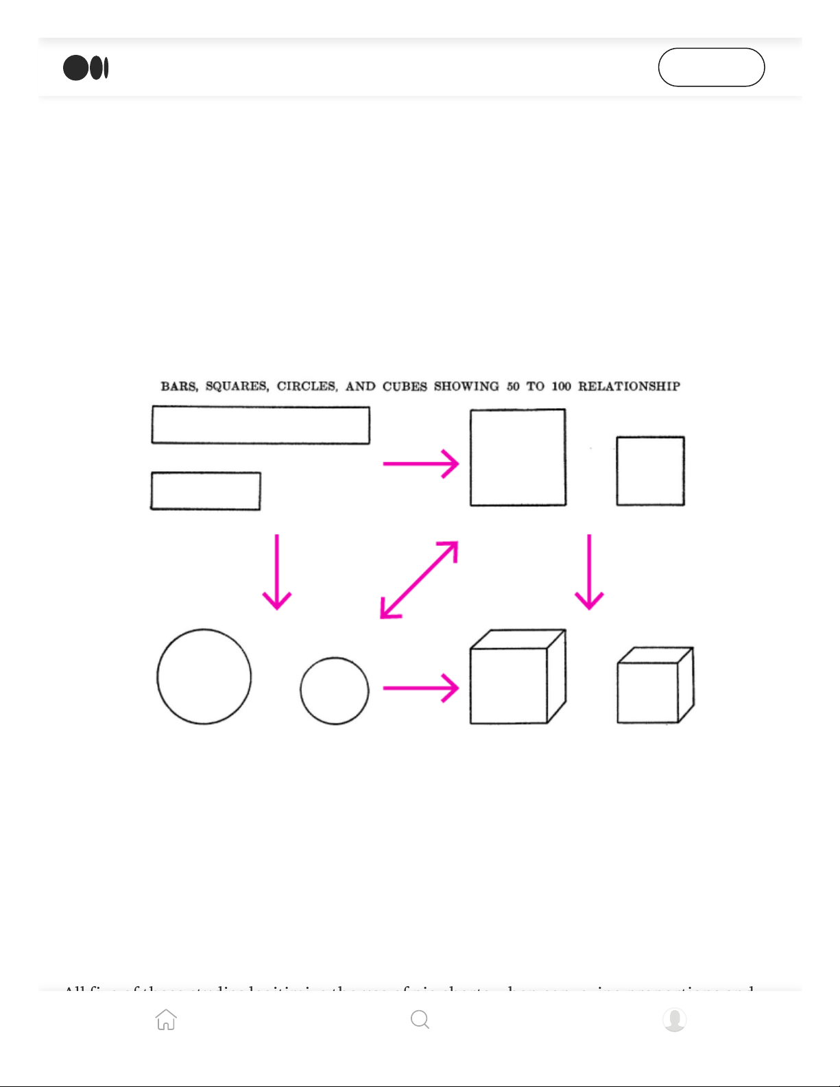
Croxton (6) found over eight decades ago that bars were more effective in communicating
comparative values than either circles, squares or cubes. Circles and squares were about as
effective as the other. Cubes were undoubtedly the worst. More on 3d later.
Croxton found that participants were more accurate when they compared the sizes of bars of unequal lengths.
Squares and circles were not much different. All three shapes fared better than cubes.
bars and pies for proportions
Much is said about the relative merits of bars and circles for showing proportions.
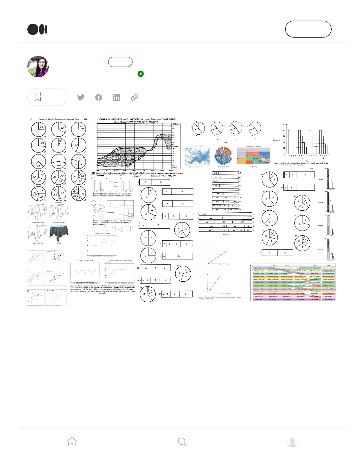
All five of these studies legitimize the use of pie charts when conveying proportions and
some even show their superiority over bar charts.
Open in app
Get started
4/5/22, 4:28 PM
39 studies about human perception in 30 minutes | by kennedy elliott | Medium
https://medium.com/@kennelliott/39-studies-about-human-perception-in-30-minutes-4728f9e31a73
8/36
I did not encounter any studies that said we should not use pie charts for showing
proportions in all cases.
Eells (7) was among the first to publish a paper on this topic in 1926. In his time, pie
charts were ridiculed much as they are today for their assumed perceptual inadequacies.
For example, he was told that the human eye cannot judge arcs, angles or chords very
efficiently.
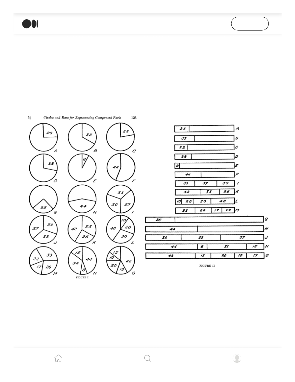
Eells gave a psychology class two worksheets — a series of pie charts and bar charts — and asked them to
estimate the proportion of each segment to the whole.
He also wanted to know more about how circles were processed. So he handed out
worksheets to a psychology class and asked them to estimate the proportions in these pie
and bar charts.
Not only did he find that pie charts were read as easily, quickly and accurately as bar
charts, but that as the number of components in the chart increased, bars become less
Open in app
Get started
4/5/22, 4:28 PM
39 studies about human perception in 30 minutes | by kennedy elliott | Medium
https://medium.com/@kennelliott/39-studies-about-human-perception-in-30-minutes-4728f9e31a73
9/36
efficient encoding the data. The opposite was true for pie charts
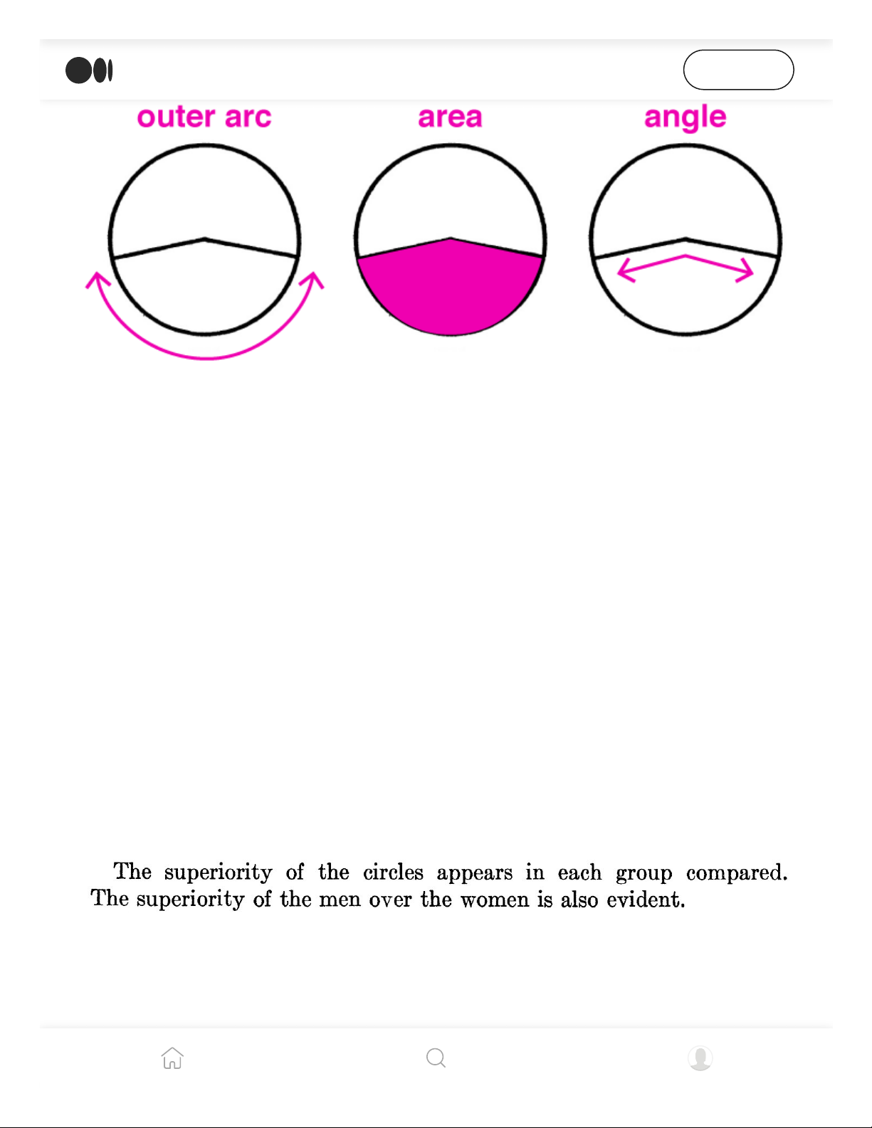
The three ways participants in Eells’s study reported perceiving proportion in pie charts. Only one woman
reported using chords, most likely because she had special training for this. She was the most accurate person
in the class in perceiving proportion in pie charts.
He found that 50 percent of people use the outer arc to make proportional judgments,
while 25 percent use area, and the other 25 percent use the inner arc or angle.
Furthermore, 71 people in the class preferred the pies and only 25 preferred the bars.
He concluded that we ought to use pie charts, not just for their appeal but because of their
scientific accuracy.
He also concluded that men were superior to women in estimating these proportions. So,
hats off to men… You’ve done it again! (To be clear, that was sarcasm, and Eells’s claim is
absurd and sexist. But it is worth calling out this example of casual, institutional bias to
acknowledge the ongoing, disproportionate hurdles women must traverse to be accepted
as equal in intelligence and abilities to men.)
Eells’s absurd, sexist conclusion from his study.
A follow-up study in response to Eells’s work the following year by Croxton (8) did not
find that pie charts were so conclusively better than bar charts, but they did pull ahead for
some of the cases.
Open in app
Get started
4/5/22, 4:28 PM
39 studies about human perception in 30 minutes | by kennedy elliott | Medium
https://medium.com/@kennelliott/39-studies-about-human-perception-in-30-minutes-4728f9e31a73
10/36
Six decades later, and in three more experiments, pie charts were hailed for their strength
in conveying proportional data, in some way or another.
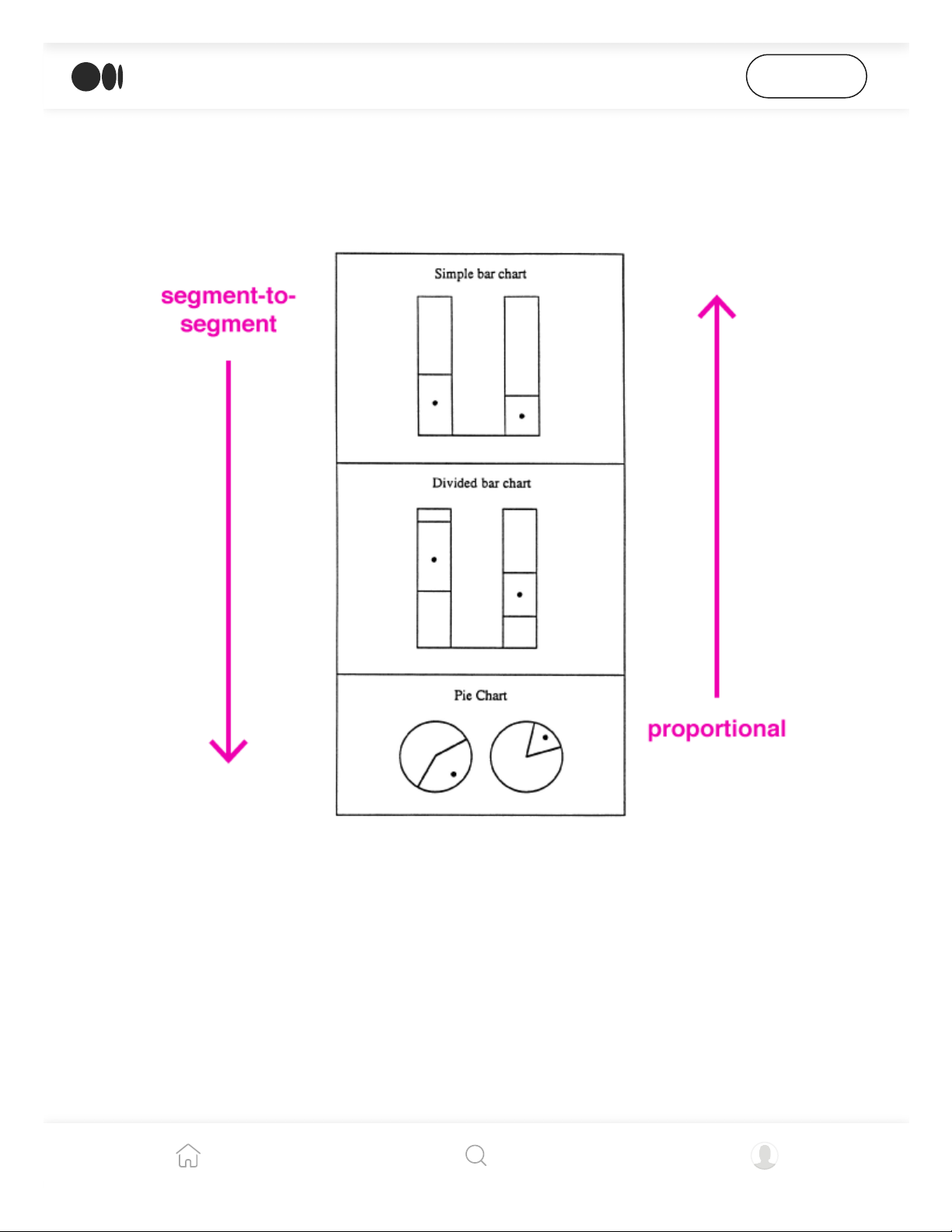
Simkin and Hastie (9) had participants make proportional judgments and segment-to-
segment (comparison) judgments. And found that for segment-to-segment judgments,
simple bar charts worked best, followed by divided bar charts and then pie charts.
Simkin and Hastie concluded that individuals have a particular schema for what to expect when viewing a
particular chart.
For proportional judgments, pie charts and divided bar charts were tied, with simple bar
charts the least effective.
Spence and Lewandowsky (10) found that comparisons among multiple segments take
longer and have lower accuracy. Pie charts fared the worst except when multiple segments
had to be compared. Tables were found to be inferior to everything except for
communicating absolute values, despite what Tufte advises.
Open in app
Get started
4/5/22, 4:28 PM
39 studies about human perception in 30 minutes | by kennedy elliott | Medium
https://medium.com/@kennelliott/39-studies-about-human-perception-in-30-minutes-4728f9e31a73
11/36
Hollands and Spence (11) found that as the number of components in bar charts increase,
their effectiveness at communicating proportions decreases. In fact, for each new
component in bar charts, a reader needs an additional 1.7 seconds for processing.
bars and lines
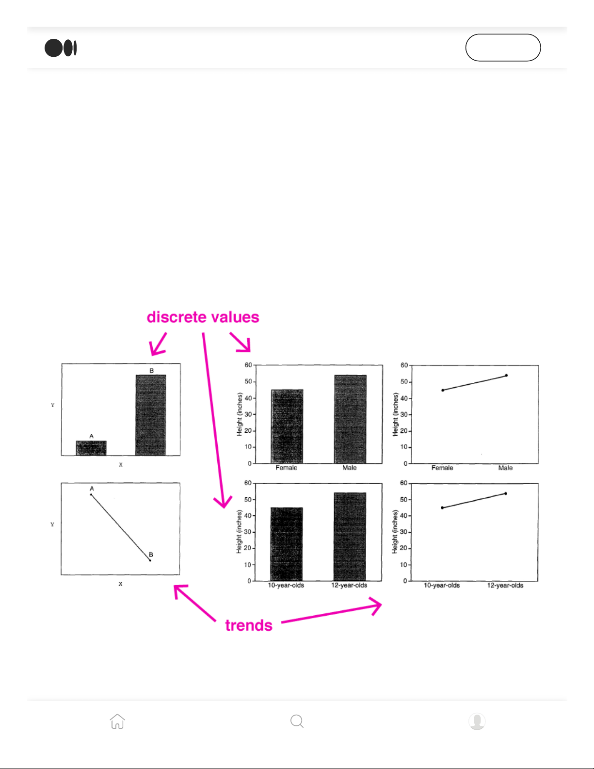
In two separate experiments in the same study, Zacks and Tversky (12) found that when
participants were shown bar graphs and asked to describe the data, they continually
referenced contrasts between the variables in the bars (e.g., “A is greater in X quantity
than B”). Whereas with line charts, participants described trends (e.g., “As X increases, Y
increases”).
Zacks and Tversky found that participants described contrasts between the x-axis variables more when
presented with bar charts, and relationships between the x-axis variables more with line charts.
Even when researchers (13) presented participants with a graph showing a third variable
of data, the line chart descriptions remained focused on x-y relationships, whereas the
Open in app
Get started
4/5/22, 4:28 PM
39 studies about human perception in 30 minutes | by kennedy elliott | Medium
https://medium.com/@kennelliott/39-studies-about-human-perception-in-30-minutes-4728f9e31a73
12/36
bars branched out a bit more to include this new variable.
These studies show that people have a hard time seeing messages in line charts beyond
trends.
bars and pies and lines
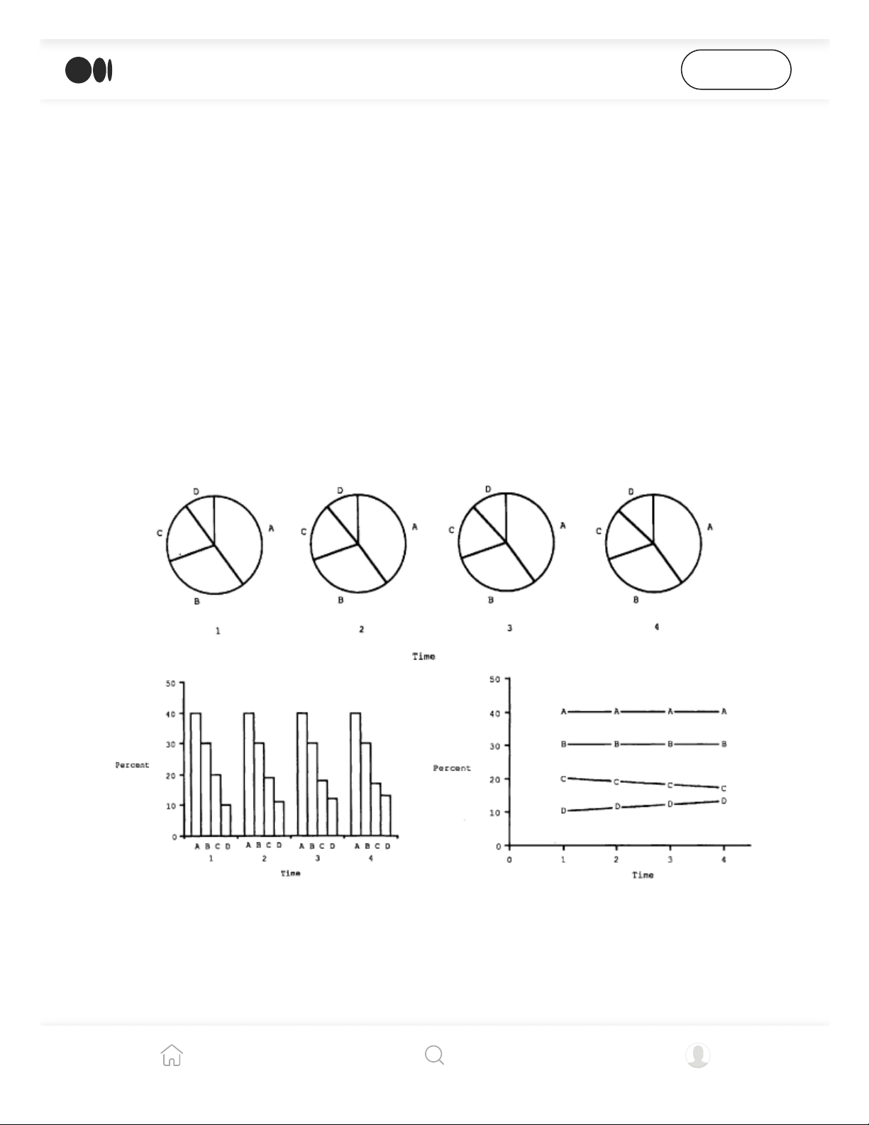
Hollands and Spence (14) evaluated if the performance of a graph depends on the type of
judgment that needs to be done. They felt that line charts were superior to other graphs
for showing change because they were “integrated” interfaces: viewers are able to
perceive change directly from slope. Using pie charts to depict change requires sequencing
several charts, and therefore are inferior, “separated” interfaces.
In their first experiment in the study, Hollands and Spence presented participants with these three graphs to
evaluate how accurately they could evaluate change.
They tested participants’ perception of change and proportion among bar, pie and line
charts.
Pie charts obviously failed at communicating change efficiently, but they found that bar
h h d i il li h d h d d h
Open in app
Get started
4/5/22, 4:28 PM
39 studies about human perception in 30 minutes | by kennedy elliott | Medium
https://medium.com/@kennelliott/39-studies-about-human-perception-in-30-minutes-4728f9e31a73
13/36
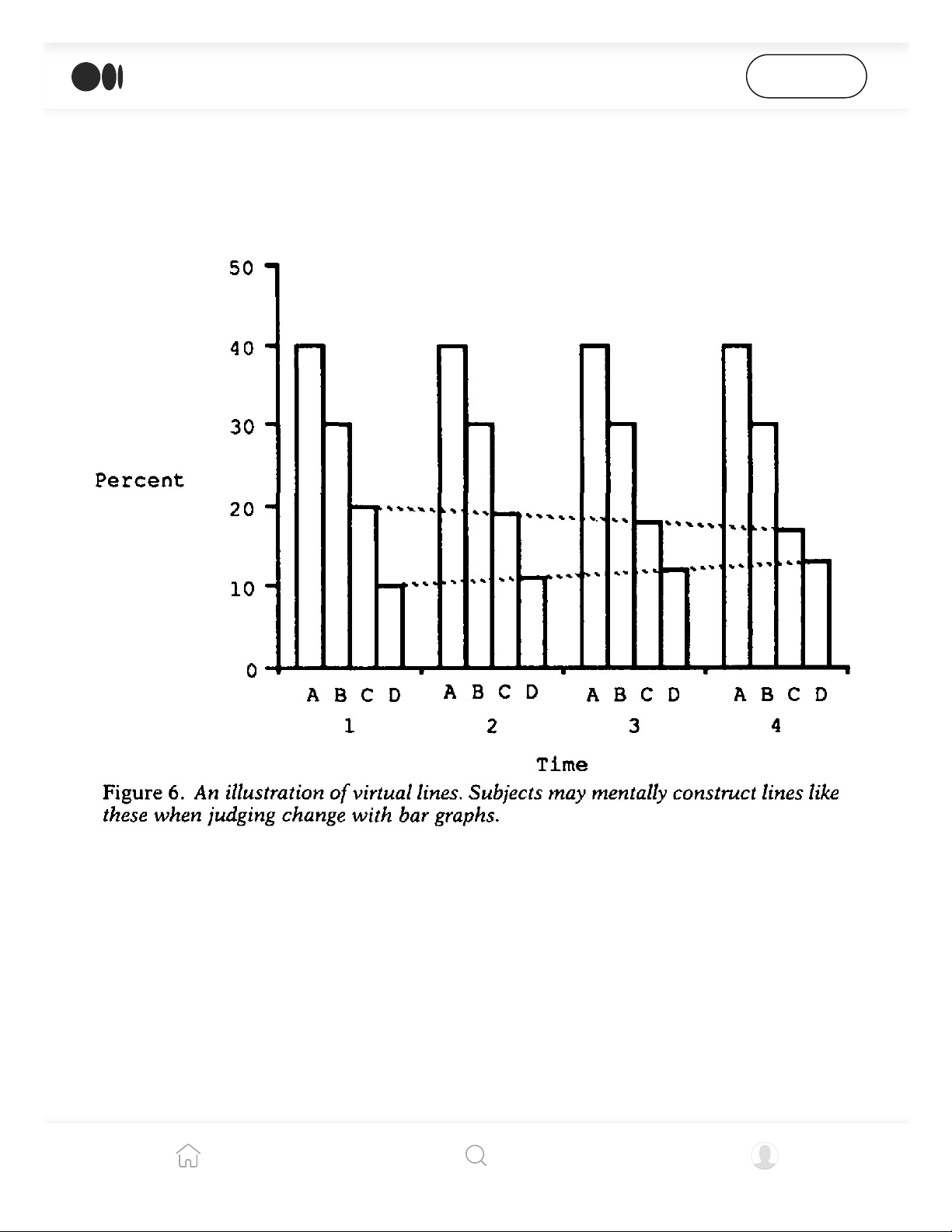
charts had similar success to line charts, and they wondered why.
They hypothesized that it was because people draw imaginary lines between the bars. So
they created a new, terrible graph called a tiered bar chart that would break up these
imaginary lines, and tested participants again.
Hollands and Spence guessed that the reason bar charts performed as well as line charts is because
participants drew an imaginary line between the bars to detect change.
They found that yes, any chart allowing the reader to see a real or imaginary trend line
was the best at communicating change. For proportions, if charts had no scales, pies were
the best.
line charts
Line shape can be loaded with context that fascinates us but also distorts our perception
Open in app
Get started
4/5/22, 4:28 PM
39 studies about human perception in 30 minutes | by kennedy elliott | Medium
https://medium.com/@kennelliott/39-studies-about-human-perception-in-30-minutes-4728f9e31a73
14/36
Line shape can be loaded with context that fascinates us, but also distorts our perception
of data.
As we know, the independent variable (the cause) is usually plotted on the x-axis and the
dependent variable (the effect) on the y-axis. But we also tend to perceive slope as being a
metaphor for quickness, height or amount. These two conventions can be in conflict with
each other.
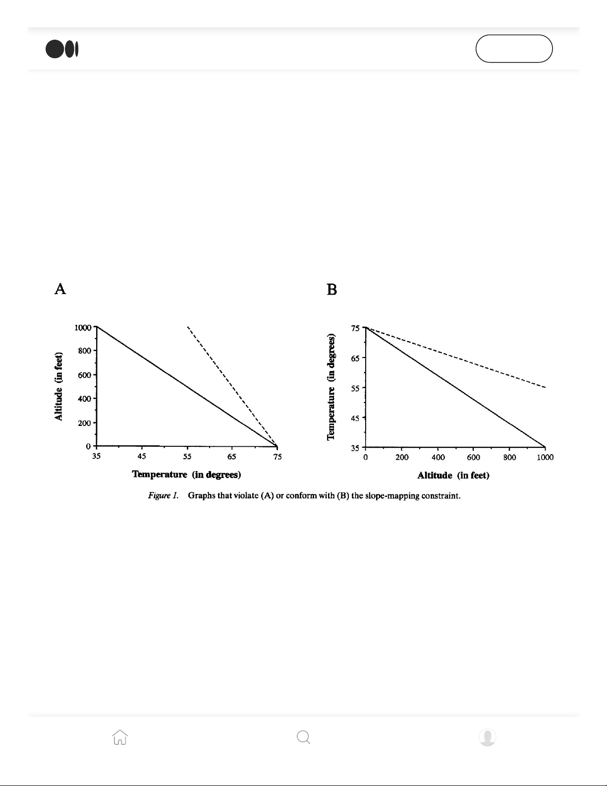
Gattis and Holyoak (15) designed an experiment where slope could indicate height, or
altitude but that meant that the independent and dependent variables were on the wrong
axis. They presented both the right and wrong chart to participants and asked if the dotted
line indicated a quicker or slower rate.
Following common convention, altitude should be plotted on the x-axis because it is the independent variable in
this case. However, plotting altitude on the y-axis allows for the slope of the line to become a visual metaphor for
height.
When altitude was on the y-axis, corresponding with the visual metaphor, participants
were more accurate. In other words, we tend to see slope as representative of quickness,
height, amount or rate above anything else. They concluded that there are certain
pictorial properties of slopes that “facilitate reasoning above all others.”
They also revealed a universal association of “more” or “better” with the upward direction.
Carswell and coauthors (16) found that when line graphs showed trend reversals, people
studied them longer. They found that this was not the case when they varied the number
Open in app
Get started
4/5/22, 4:28 PM
39 studies about human perception in 30 minutes | by kennedy elliott | Medium
https://medium.com/@kennelliott/39-studies-about-human-perception-in-30-minutes-4728f9e31a73
15/36
of data points, symmetry or linearity.
3d
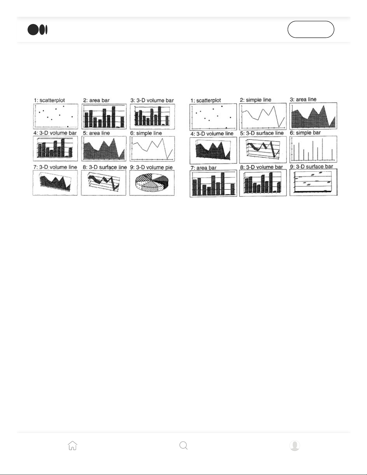
Here are four studies that suggest we evaluate 3d objects more accurately than we
commonly think. Two of these studies individually reject Tufte’s popular “high data-to-ink
ratio” philosophy.
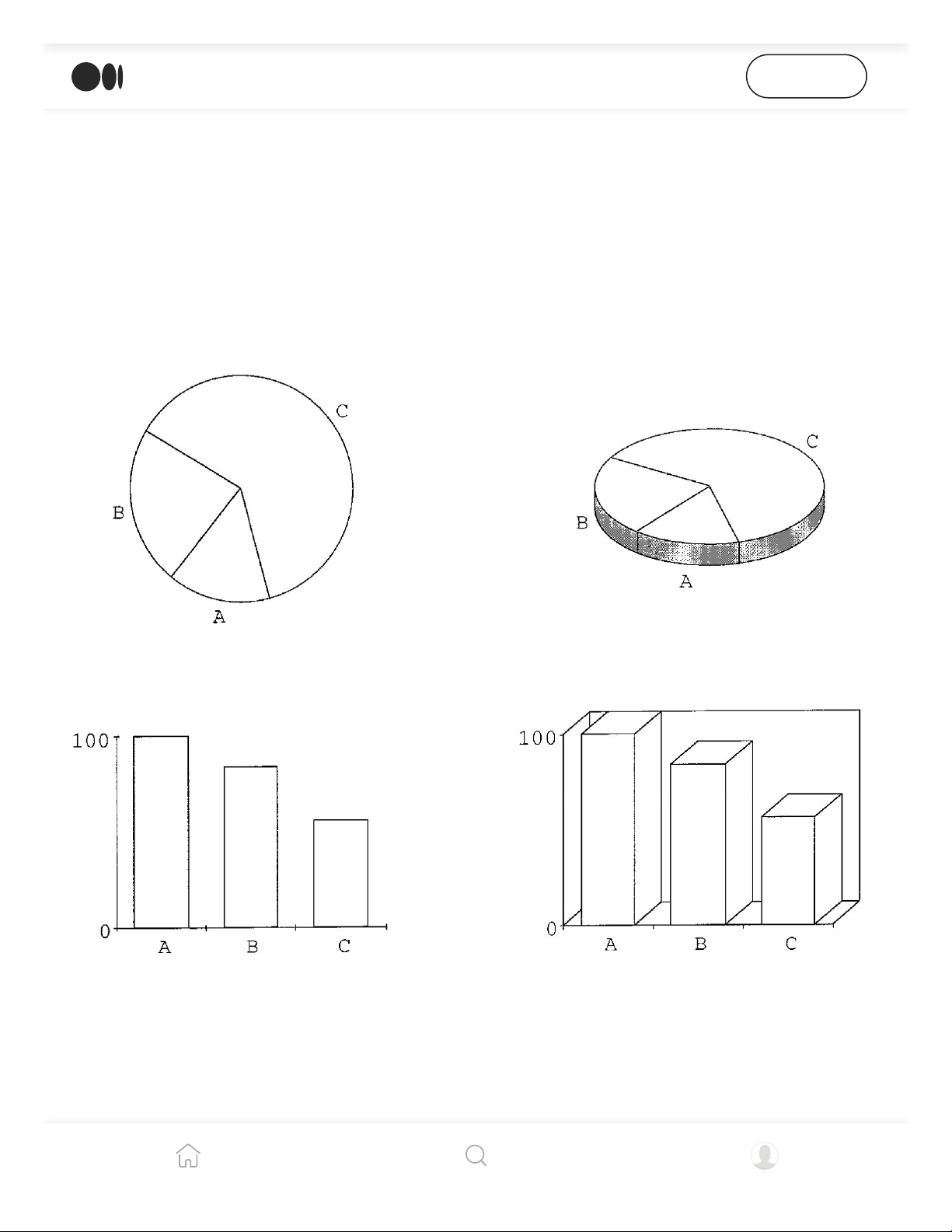
Siegrist observed how well participants could evaluate size differences among 2d and 3d variants of pie and bar
charts. Participants were about as accurate with 3d bar charts as the 2d versions, but were less successful with
3d pie charts.
Siegrist (17) finds that among bar charts, 2d is not superior to 3d, but 3d charts take
slightly longer to process. With pies, 2d is better, and the perspective angle makes a big
difference in how accurately the slices are evaluated, most likely because some of the
Open in app
Get started
4/5/22, 4:28 PM
39 studies about human perception in 30 minutes | by kennedy elliott | Medium
https://medium.com/@kennelliott/39-studies-about-human-perception-in-30-minutes-4728f9e31a73
16/36
slices are more obscured than others.
Levy and coauthors (18) acknowledge that 3d graphics, while “glitzy” and “sexy,” do not
convey any additional information and force the reader to “deal with redundant and
extraneous cues.
In two separate experiments in the same study, Levy and coauthors gave participants several 2d and 3d chart
options to choose from.
Participants were given the option to select among 2d and 3d charts. When they were told
to select a chart to present to other people, they tended to choose 3d charts. They also
selected 3d charts when they were told the data had to be remembered. They selected 2d
bar graphs more when they were told they needed to convey specific details, and selected
line charts when the message had to be communicated quickly. The authors conclude that
3d charts can be useful in some cases
Open in app
Get started
4/5/22, 4:28 PM
39 studies about human perception in 30 minutes | by kennedy elliott | Medium
https://medium.com/@kennelliott/39-studies-about-human-perception-in-30-minutes-4728f9e31a73
17/36
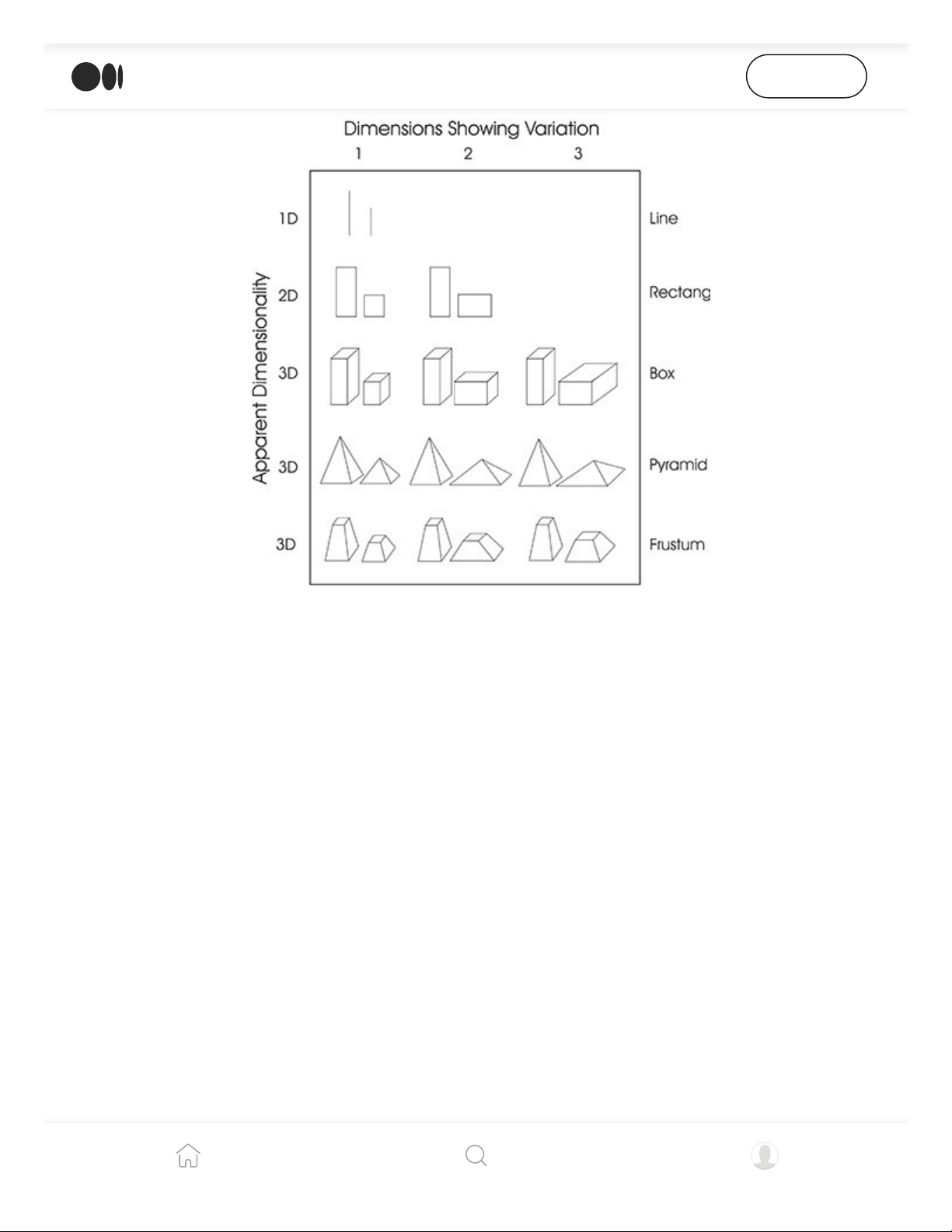
Spence found that humans perceive the distortion described in Steven’s law only if two or more dimensions were
altered between shapes. If only one dimension is altered between shapes, distortion does not occur.
The final two experiments by Spence (19, 20) deal with Steven’s law, which again (very
simplistically) says that an object’s size appears larger when presented with larger objects,
or smaller when presented with smaller objects. Spence found that contrary to popular
physics, this distortion does not happen when comparing two shapes of the same
dimensionality. Only when you vary the dimensionality among shapes does this distortion
occur.
scatterplots
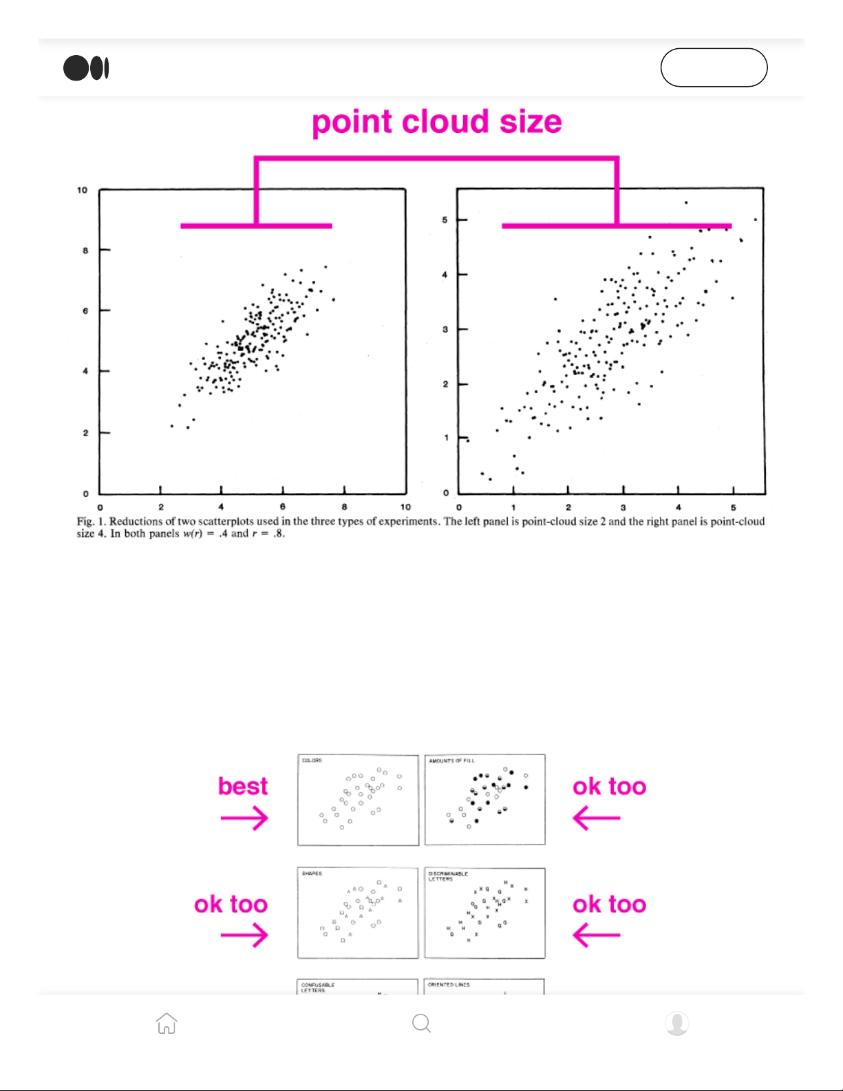
Cleveland and coauthors (21) found people come to conclusions about the correlation in
scatterplots partly based on the size of the point cloud. When the same correlation is
represented in two graphs, but in one graph the scale is blown out so the point cloud
becomes very small, people perceive it as having a higher correlation.
Open in app
Get started
4/5/22, 4:28 PM
39 studies about human perception in 30 minutes | by kennedy elliott | Medium
https://medium.com/@kennelliott/39-studies-about-human-perception-in-30-minutes-4728f9e31a73
18/36
Cleveland and coauthors found that altering point cloud size alone could lead to inaccuracies in evaluating
correlation in scatterplots.
Experimenting with symbol type in scatterplots, Lewandowsky and Spence (22) find that
altering color is most discernible to the eye. When varying color is not an option, varying
fill or shape (or even non-confusable lettering) has “no great loss in accuracy.
Open in app
Get started
4/5/22, 4:28 PM
39 studies about human perception in 30 minutes | by kennedy elliott | Medium
https://medium.com/@kennelliott/39-studies-about-human-perception-in-30-minutes-4728f9e31a73
19/36
Lewandowsky and Spence found that humans can most accurately discern variations in color in scatterplot
symbols.
He suggests that using letters has one clear advantage: providing a semi-label for the data
(M for males; F for females). I personally think this can be achieved with annotation
without the risk of confusing the location of the symbol’s centroid.
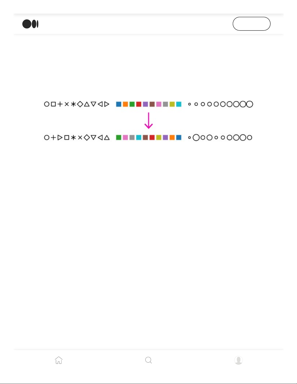
Demiralp and coauthors reordered the existing Tableau color and symbol palette so that they were ranked by
how easily individuals could perceive their differences.
In a crowd-sourced experiment, Demiralp and coauthors (23) reordered the native
Tableau color and symbol palette so that it’d be ordered by the shapes and colors most
discernible to the eye.
treemaps
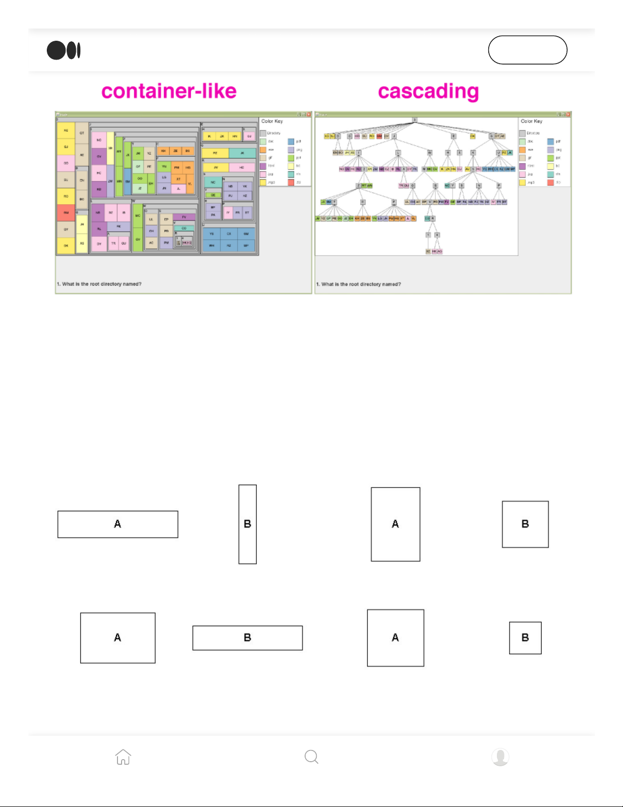
Ziemkiewicz and Kosara (24) found that directing participants to navigate treemaps with
metaphors to complete certain tasks made them more accurate. For example, directing
participants to find a data point “inside” a container-like treemap and telling them to look
“below” in a cascading treemap worked best.
Open in app
Get started
4/5/22, 4:28 PM
39 studies about human perception in 30 minutes | by kennedy elliott | Medium
https://medium.com/@kennelliott/39-studies-about-human-perception-in-30-minutes-4728f9e31a73
20/36
Ziemkiewicz and Kosara used visual metaphors to direct participants to complete simple tasks with different
types of treemaps. When the visual metaphors matched the particular style of the treemap, participants were
more accurate.
Kong, Heer and Argawala (25) found that people discern values in treemaps best when
the components are rectangles with diverse aspect ratios. Somewhat counterintuitively,
squares are not easy to compared to each other. Extreme ratios in rectangles are also
ineffective for comparisons.
Kong, Heer and Argawalas experiments revealed that humans aren’t as accurate comparing the sizes of squares
as comparing rectangles with varying aspect ratios.
They additionally found that, surprisingly to them, small multiples of bar charts were
better than treemaps at representing datasets with fewer than about 1,000 data points for
Open in app
Get started
| 1/36

Preview text:

4/5/22, 4:28 PM
39 studies about human perception in 30 minutes | by kennedy elliott | Medium Open in app Get started kennedy el iott Fol ow
May 3, 2016 · 21 min read · Listen Save
39 studies about human perception in 30 minutes
These are my speaker notes from a talk I gave at OpenVis in April 2016. Originally this talk
was supposed to be called “Everything we know about how humans perceive graphics,” which
is… at a minimum, pretty pretentious. I scaled back a bit.

Clearly I have learned everything there is to know about how humans perceive data
graphics in preparation for this talk. Literally everything. But I couldn’t possibly fit it all
into 30 minutes. So for your sake, let’s just refer to this talk as “39 studies on human perception in 30 minutes.”
https://medium.com/@kennelliott/39-studies-about-human-perception-in-30-minutes-4728f9e31a73 1/36 4/5/22, 4:28 PM
39 studies about human perception in 30 minutes | by kennedy elliott | Medium Open in app Get started
I’m a graphics editor at The Washington Post, which means I’m part developer, part
journalist. Graphics editors like me often rely on common wisdom and experiential
knowledge to inform our decisions about design and visualization choices — which is incredibly valuable.
For the last several years, I’ve wondered about what we actually know from scientific
studies about how humans perceive graphics. I’ve collected things here and there, but
when I started to get into the thick of it, I realized how extensive this body of research
really is. There is a lot that I’m leaving out.
This is an extreme distillation of these studies. In reality, these are robust studies, many
with multiple experiments each, loaded with meaningful nuance that I do not have time to
address. These are very simplistic representations of one or two core findings. I encourage
that you read them in their entirety and consider their complete findings.
In future posts, I’d like to dive in deeper to each section and present a bit more context for
these findings. Look out for more!
In Colin Ware’s book, Information Visualization, he wonders: Is visualization a science or a language?
It’s perhaps a science because it must represent data accurately, methodically and without
flourish so that we can see the underlying trends and patterns. Because of this, selecting
the right visualization for your content could be prescriptive based on what you want to show.
However, many argue that it is a language because it uses diagrams to convey meaning.
Data is encoded into symbology and semiology. The syntax and conventions of these
diagrams must be learned and are not inherent.
Throughout this presentation, think about which you think it is.
https://medium.com/@kennelliott/39-studies-about-human-perception-in-30-minutes-4728f9e31a73 2/36 4/5/22, 4:28 PM
39 studies about human perception in 30 minutes | by kennedy elliott | Medium Open in app Get started foundations
In 1984, William Cleveland and Robert McGill (1) published a study that can only be
described as the archetypical seminal study for information visualization.
In several experiments, Cleveland and McGil identified “elementary perceptual tasks”: the most basic tasks they
believe viewers perform when evaluating a visualization.
https://medium.com/@kennelliott/39-studies-about-human-perception-in-30-minutes-4728f9e31a73 3/36 4/5/22, 4:28 PM
39 studies about human perception in 30 minutes | by kennedy elliott | Medium Open in app Get started
It gives us our first ranking of so-called “elementary perceptual tasks,” which are the most
basic visual tasks we perform in our perception of graphs. It is referenced by many of the
studies I’m about to talk about, and in fact, whenever that happens, I put William
Cleveland’s little head next to it (I couldn’t find a picture of McGill).
At the top of the ranking, the easiest perceptual task, is “position along a common scale.”
Cleveland and McGill say it is easiest for us to compare objects in terms of a common scale,
like an axis. Scatterplots are a good example of this: circles in scatterplots are anchored on
two common scales, the x- and the y-axis.
Bar charts also involve comparing objects on a common scale, typically the x-axis, but
Cleveland and McGill admit they can also involve judgments of length and area. The list
goes on. I encourage you to read and familiarize yourself with what they consider to be elementary perceptual tasks.
https://medium.com/@kennelliott/39-studies-about-human-perception-in-30-minutes-4728f9e31a73 4/36 4/5/22, 4:28 PM
39 studies about human perception in 30 minutes | by kennedy elliott | Medium Open in app Get started
Heer and Bostock’s experiments with Mechanical Turk participants yielded similar results to those of Cleveland and McGil .
However, this study was conducted three decades ago. How relevant is it today?
Fortunately for us, we have some clue. Heer and Bostock (2) revisited some of Cleveland
and McGill’s old experiments in a study they did as more of a proof of concept for using
Mechanical Turk users in scientific studies.
Their results were very similar to those of Cleveland and McGill, at least with the
perceptual tasks they tested for. reference points
Three studies show that we have inherent biases related to the types of graphs we see and
the objects we see in them. These biases may distort the information we retrieve from a graph.
We know that from Steven’s law, when an object is seen in context of other larger objects,
it appears larger itself. When it is seen in context with smaller objects, it appears smaller.
Jordan and Schiano (3) found that increasing spatial separation between lines produced
the opposite effect. If lines were close enough, a line’s length was more similar to the
length of the line around it (this is also known as assimilation). If the lines were far apart,
long lines appeared longer, and short lines appeared shorter (also known as contrast).
Jordan and Schiano found that when lines of varying sizes were presented close together participants recal ed
https://medium.com/@kennelliott/39-studies-about-human-perception-in-30-minutes-4728f9e31a73 5/36 4/5/22, 4:28 PM
39 studies about human perception in 30 minutes | by kennedy elliott | Medium
Jordan and Schiano found that when lines of varying sizes were presented close together, participants recal ed
them being more similar in length. When they were presented farther apart, participants saw larger contrasts Open in app Get started between the lines.
In two other studies, Schiano and Tversky (4, 5) found that charts were remembered as
being more symmetrical than they actually were. They gave participants diagrams that
looked like these, and told them they were either charts or maps.
They found that when participants encountered the diagrams introduced as charts, they
remembered the lines closer to the imaginary 45-degree line. Further, when the same line
was presented to them as a map, this distortion did not occur.
In two separate studies, Schiano and Tversky found that the 45-degree line is an imaginary reference point in
line graphs, but not in other types of charts.
When text appeared with the chart calling attention to its symmetry, participants recalled
it being a more symmetrical chart even if it was not. This leads me to believe that
annotations can be powerful in relaying information.
In a separate study, they confirmed a systematic bias toward an imaginary 45-degree line
in line charts. When a diagonal line was presented to participants, they continually
remembered this line as being closer to 45 degrees than it actually was, meaning they
underestimated larger angles and overestimated smaller angles. Thus, the 45-degree line
is a reference point for line charts, but not in other contexts.
https://medium.com/@kennelliott/39-studies-about-human-perception-in-30-minutes-4728f9e31a73 6/36 4/5/22, 4:28 PM
39 studies about human perception in 30 minutes | by kennedy elliott | Medium
is a reference point for line charts, but not in other contexts. Open in app Get started
Their work suggests that different visual systems promote different reference frames. basic shapes
Croxton (6) found over eight decades ago that bars were more effective in communicating
comparative values than either circles, squares or cubes. Circles and squares were about as
effective as the other. Cubes were undoubtedly the worst. More on 3d later.
Croxton found that participants were more accurate when they compared the sizes of bars of unequal lengths.
Squares and circles were not much different. Al three shapes fared better than cubes.
bars and pies for proportions
Much is said about the relative merits of bars and circles for showing proportions.
All five of these studies legitimize the use of pie charts when conveying proportions and
some even show their superiority over bar charts.
https://medium.com/@kennelliott/39-studies-about-human-perception-in-30-minutes-4728f9e31a73 7/36 4/5/22, 4:28 PM
39 studies about human perception in 30 minutes | by kennedy elliott | Medium Open in app Get started
I did not encounter any studies that said we should not use pie charts for showing proportions in all cases.
Eells (7) was among the first to publish a paper on this topic in 1926. In his time, pie
charts were ridiculed much as they are today for their assumed perceptual inadequacies.
For example, he was told that the human eye cannot judge arcs, angles or chords very efficiently.
Eel s gave a psychology class two worksheets — a series of pie charts and bar charts — and asked them to
estimate the proportion of each segment to the whole.
He also wanted to know more about how circles were processed. So he handed out
worksheets to a psychology class and asked them to estimate the proportions in these pie and bar charts.
Not only did he find that pie charts were read as easily, quickly and accurately as bar
charts, but that as the number of components in the chart increased, bars become less
https://medium.com/@kennelliott/39-studies-about-human-perception-in-30-minutes-4728f9e31a73 8/36 4/5/22, 4:28 PM
39 studies about human perception in 30 minutes | by kennedy elliott | Medium
efficient encoding the data. The opposite was true for pie charts Open in app Get started
The three ways participants in Eel s’s study reported perceiving proportion in pie charts. Only one woman
reported using chords, most likely because she had special training for this. She was the most accurate person
in the class in perceiving proportion in pie charts.
He found that 50 percent of people use the outer arc to make proportional judgments,
while 25 percent use area, and the other 25 percent use the inner arc or angle.
Furthermore, 71 people in the class preferred the pies and only 25 preferred the bars.
He concluded that we ought to use pie charts, not just for their appeal but because of their scientific accuracy.
He also concluded that men were superior to women in estimating these proportions. So,
hats off to men… You’ve done it again! (To be clear, that was sarcasm, and Eells’s claim is
absurd and sexist. But it is worth calling out this example of casual, institutional bias to
acknowledge the ongoing, disproportionate hurdles women must traverse to be accepted
as equal in intelligence and abilities to men.)
Eel s’s absurd, sexist conclusion from his study.
A follow-up study in response to Eells’s work the following year by Croxton (8) did not
find that pie charts were so conclusively better than bar charts, but they did pull ahead for some of the cases.
https://medium.com/@kennelliott/39-studies-about-human-perception-in-30-minutes-4728f9e31a73 9/36 4/5/22, 4:28 PM
39 studies about human perception in 30 minutes | by kennedy elliott | Medium
Six decades later, and in three more experiments, pie charts were hailed for their strength
in conveying proportional data, in some way or another. Open in app Get started
Simkin and Hastie (9) had participants make proportional judgments and segment-to-
segment (comparison) judgments. And found that for segment-to-segment judgments,
simple bar charts worked best, followed by divided bar charts and then pie charts.
Simkin and Hastie concluded that individuals have a particular schema for what to expect when viewing a particular chart.
For proportional judgments, pie charts and divided bar charts were tied, with simple bar charts the least effective.
Spence and Lewandowsky (10) found that comparisons among multiple segments take
longer and have lower accuracy. Pie charts fared the worst except when multiple segments
had to be compared. Tables were found to be inferior to everything except for
communicating absolute values, despite what Tufte advises.
https://medium.com/@kennelliott/39-studies-about-human-perception-in-30-minutes-4728f9e31a73 10/36 4/5/22, 4:28 PM
39 studies about human perception in 30 minutes | by kennedy elliott | Medium
Hollands and Spence (11) found that as the number of components in bar charts increase,
their effectiveness at communicating proportions decreases. In fa
O cpte, nf ion r aepapch neGw et started
component in bar charts, a reader needs an additional 1.7 seconds for processing. bars and lines
In two separate experiments in the same study, Zacks and Tversky (12) found that when
participants were shown bar graphs and asked to describe the data, they continually
referenced contrasts between the variables in the bars (e.g., “A is greater in X quantity
than B”). Whereas with line charts, participants described trends (e.g., “As X increases, Y increases”).
Zacks and Tversky found that participants described contrasts between the x-axis variables more when
presented with bar charts, and relationships between the x-axis variables more with line charts.
Even when researchers (13) presented participants with a graph showing a third variable
of data, the line chart descriptions remained focused on x-y relationships, whereas the
https://medium.com/@kennelliott/39-studies-about-human-perception-in-30-minutes-4728f9e31a73 11/36 4/5/22, 4:28 PM
39 studies about human perception in 30 minutes | by kennedy elliott | Medium
bars branched out a bit more to include this new variable. Open in app Get started
These studies show that people have a hard time seeing messages in line charts beyond trends. bars and pies and lines
Hollands and Spence (14) evaluated if the performance of a graph depends on the type of
judgment that needs to be done. They felt that line charts were superior to other graphs
for showing change because they were “integrated” interfaces: viewers are able to
perceive change directly from slope. Using pie charts to depict change requires sequencing
several charts, and therefore are inferior, “separated” interfaces.
In their first experiment in the study, Hol ands and Spence presented participants with these three graphs to
evaluate how accurately they could evaluate change.
They tested participants’ perception of change and proportion among bar, pie and line charts.
Pie charts obviously failed at communicating change efficiently, but they found that bar h h d i il li h d h d d h
https://medium.com/@kennelliott/39-studies-about-human-perception-in-30-minutes-4728f9e31a73 12/36 4/5/22, 4:28 PM
39 studies about human perception in 30 minutes | by kennedy elliott | Medium
charts had similar success to line charts, and they wondered why. Open in app Get started
They hypothesized that it was because people draw imaginary lines between the bars. So
they created a new, terrible graph called a tiered bar chart that would break up these
imaginary lines, and tested participants again.
Hol ands and Spence guessed that the reason bar charts performed as wel as line charts is because
participants drew an imaginary line between the bars to detect change.
They found that yes, any chart allowing the reader to see a real or imaginary trend line
was the best at communicating change. For proportions, if charts had no scales, pies were the best. line charts
Line shape can be loaded with context that fascinates us but also distorts our perception
https://medium.com/@kennelliott/39-studies-about-human-perception-in-30-minutes-4728f9e31a73 13/36 4/5/22, 4:28 PM
39 studies about human perception in 30 minutes | by kennedy elliott | Medium
Line shape can be loaded with context that fascinates us, but also distorts our perception of data. Open in app Get started
As we know, the independent variable (the cause) is usually plotted on the x-axis and the
dependent variable (the effect) on the y-axis. But we also tend to perceive slope as being a
metaphor for quickness, height or amount. These two conventions can be in conflict with each other.
Gattis and Holyoak (15) designed an experiment where slope could indicate height, or
altitude but that meant that the independent and dependent variables were on the wrong
axis. They presented both the right and wrong chart to participants and asked if the dotted
line indicated a quicker or slower rate.
Fol owing common convention, altitude should be plotted on the x-axis because it is the independent variable in
this case. However, plotting altitude on the y-axis al ows for the slope of the line to become a visual metaphor for height.
When altitude was on the y-axis, corresponding with the visual metaphor, participants
were more accurate. In other words, we tend to see slope as representative of quickness,
height, amount or rate above anything else. They concluded that there are certain
pictorial properties of slopes that “facilitate reasoning above all others.”
They also revealed a universal association of “more” or “better” with the upward direction.
Carswell and coauthors (16) found that when line graphs showed trend reversals, people
studied them longer. They found that this was not the case when they varied the number
https://medium.com/@kennelliott/39-studies-about-human-perception-in-30-minutes-4728f9e31a73 14/36 4/5/22, 4:28 PM
39 studies about human perception in 30 minutes | by kennedy elliott | Medium
of data points, symmetry or linearity. Open in app Get started 3d
Here are four studies that suggest we evaluate 3d objects more accurately than we
commonly think. Two of these studies individually reject Tufte’s popular “high data-to-ink ratio” philosophy.
Siegrist observed how wel participants could evaluate size differences among 2d and 3d variants of pie and bar
charts. Participants were about as accurate with 3d bar charts as the 2d versions, but were less successful with 3d pie charts.
Siegrist (17) finds that among bar charts, 2d is not superior to 3d, but 3d charts take
slightly longer to process. With pies, 2d is better, and the perspective angle makes a big
difference in how accurately the slices are evaluated, most likely because some of the
https://medium.com/@kennelliott/39-studies-about-human-perception-in-30-minutes-4728f9e31a73 15/36 4/5/22, 4:28 PM
39 studies about human perception in 30 minutes | by kennedy elliott | Medium
slices are more obscured than others. Open in app Get started
Levy and coauthors (18) acknowledge that 3d graphics, while “glitzy” and “sexy,” do not
convey any additional information and force the reader to “deal with redundant and extraneous cues.”
In two separate experiments in the same study, Levy and coauthors gave participants several 2d and 3d chart options to choose from.
Participants were given the option to select among 2d and 3d charts. When they were told
to select a chart to present to other people, they tended to choose 3d charts. They also
selected 3d charts when they were told the data had to be remembered. They selected 2d
bar graphs more when they were told they needed to convey specific details, and selected
line charts when the message had to be communicated quickly. The authors conclude that
3d charts can be useful in some cases
https://medium.com/@kennelliott/39-studies-about-human-perception-in-30-minutes-4728f9e31a73 16/36 4/5/22, 4:28 PM
39 studies about human perception in 30 minutes | by kennedy elliott | Medium Open in app Get started
Spence found that humans perceive the distortion described in Steven’s law only if two or more dimensions were
altered between shapes. If only one dimension is altered between shapes, distortion does not occur.
The final two experiments by Spence (19, 20) deal with Steven’s law, which again (very
simplistically) says that an object’s size appears larger when presented with larger objects,
or smaller when presented with smaller objects. Spence found that contrary to popular
physics, this distortion does not happen when comparing two shapes of the same
dimensionality. Only when you vary the dimensionality among shapes does this distortion occur. scatterplots
Cleveland and coauthors (21) found people come to conclusions about the correlation in
scatterplots partly based on the size of the point cloud. When the same correlation is
represented in two graphs, but in one graph the scale is blown out so the point cloud
becomes very small, people perceive it as having a higher correlation.
https://medium.com/@kennelliott/39-studies-about-human-perception-in-30-minutes-4728f9e31a73 17/36 4/5/22, 4:28 PM
39 studies about human perception in 30 minutes | by kennedy elliott | Medium Open in app Get started
Cleveland and coauthors found that altering point cloud size alone could lead to inaccuracies in evaluating
correlation in scatterplots.
Experimenting with symbol type in scatterplots, Lewandowsky and Spence (22) find that
altering color is most discernible to the eye. When varying color is not an option, varying
fill or shape (or even non-confusable lettering) has “no great loss in accuracy.”
https://medium.com/@kennelliott/39-studies-about-human-perception-in-30-minutes-4728f9e31a73 18/36 4/5/22, 4:28 PM
39 studies about human perception in 30 minutes | by kennedy elliott | Medium Open in app Get started
Lewandowsky and Spence found that humans can most accurately discern variations in color in scatterplot symbols.
He suggests that using letters has one clear advantage: providing a semi-label for the data
(M for males; F for females). I personally think this can be achieved with annotation
without the risk of confusing the location of the symbol’s centroid.
Demiralp and coauthors reordered the existing Tableau color and symbol palette so that they were ranked by
how easily individuals could perceive their differences.
In a crowd-sourced experiment, Demiralp and coauthors (23) reordered the native
Tableau color and symbol palette so that it’d be ordered by the shapes and colors most discernible to the eye. treemaps
Ziemkiewicz and Kosara (24) found that directing participants to navigate treemaps with
metaphors to complete certain tasks made them more accurate. For example, directing
participants to find a data point “inside” a container-like treemap and telling them to look
“below” in a cascading treemap worked best.
https://medium.com/@kennelliott/39-studies-about-human-perception-in-30-minutes-4728f9e31a73 19/36 4/5/22, 4:28 PM
39 studies about human perception in 30 minutes | by kennedy elliott | Medium Open in app Get started
Ziemkiewicz and Kosara used visual metaphors to direct participants to complete simple tasks with different
types of treemaps. When the visual metaphors matched the particular style of the treemap, participants were more accurate.
Kong, Heer and Argawala (25) found that people discern values in treemaps best when
the components are rectangles with diverse aspect ratios. Somewhat counterintuitively,
squares are not easy to compared to each other. Extreme ratios in rectangles are also ineffective for comparisons.
Kong, Heer and Argawala’s experiments revealed that humans aren’t as accurate comparing the sizes of squares
as comparing rectangles with varying aspect ratios.
They additionally found that, surprisingly to them, small multiples of bar charts were
better than treemaps at representing datasets with fewer than about 1,000 data points for
https://medium.com/@kennelliott/39-studies-about-human-perception-in-30-minutes-4728f9e31a73 20/36