Đề cương ôn tập Writing Task 1- English A1 | Học viện phụ nữ Việt Nam
Đề cương ôn tập Writing Task 1- English A1 | Học viện phụ nữ Việt Nam được sưu tầm và soạn thảo dưới dạng file PDF để gửi tới các bạn sinh viên cùng tham khảo, ôn tập đầy đủ kiến thức, chuẩn bị cho các buổi học thật tốt. Mời bạn đọc đón xem!
Môn: English A1 51 tài liệu
Trường: Học viện Phụ nữ Việt Nam 805 tài liệu
Tác giả:


Preview text:
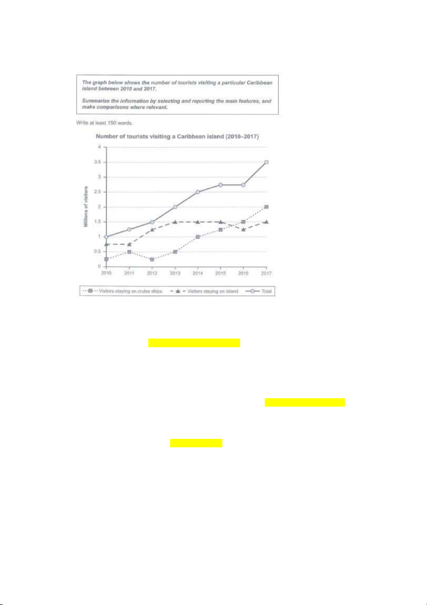
The line graph presents the number of visitors who travelled to a Caribbean island from 2010 to 2017.
Overall, the number of tourists who chose to stay on ships and on island both increased during
the period, but the former recorded a more significant rise compared to the latter. Thus, there
was a constant rise in the total number of visitors to the island.
the former: cái được nhắc đến trước
the latter: cái được nhắc đến sau
Between 2010 and 2013/ Throughout 2010 to 2013, the number of visitors staying on cruise
ships fluctuated and rose to 0,5 million at the end of the period. On the contrary/ In contrast,
the figure for tourists staying on island increased considerably, more particularly/specifically,
there was a 0,75 million rise after 3 years.
From 2013 to 2017/ In the next 4 years, the number of tourists who spent time on cruises rose
constantly from 0,5 to 2 million. On the other hand, the figure for visitors who chose to stay on
island remained unchanged/ remained constant at 1,5 million with a dip to 1,25 million in 2016.
mirror the trend….: soi lại y hệt số liệu của cái j đấy purchase = buy consume = drink exception: ngoại lệ respectively: lần lượt people = resident = citizen
The bar chart illustrates the habits of Australian people in purchasing and consuming coffee and
tea in five different cities in last 4 weeks.
Overall, buying fresh coffee is the least common choice. On the contrary, most people went to a
café for drinks with an exception in Adelaide where people prefer instant coffee to store-bought ones.
It is clear that over 45% of people in each city went out for coffee and tea in the last 4 weeks
with Melbourne and Hobart being the highest at about 63% and Sydney being the third with just
under 2%. On the other hand, Brisbane and Adelaide consumed fewer store-bought drinks at
approximately 56% and 49% respectively. Over 50% of citizens in Brisbane and Hobart bought
instant coffee in the last 4 weeks which makes them the two cities with most people purchasing
this type of drink. The figure for Adelaide was exactly 50% while that for Melbourne and
Sydney was 58% and 46% respectively. Sydney and Melbourne were the two cities with the
highest percentage of people buying fresh coffee at over 40%, Hobart stood in third place with
the figure at about 30% while Brisbane and Adelaide bought the least fresh coffee at a percentage of under 35%. Paraphrase
household chores = housework = chores household = family
electrical supplies = electrical appliances
The first graph shows the proportion of households that used electrical supplies and the second
graph illustrates the total hour spent on household chores per week in a country from 1920 to 2019.
Overall, the percentage of refrigerators owned recorded a strong increase while the figure for the
other two supplies rose more slowly. The number of hours of housework per week dropped
significantly after almost a century.
In the first chart, the percentage of families who owned refrigerators jumped from 0% to 100%
in 60 years and was maintained until 2019. The figure for washing machines recorded a 35% rise
from 1920 to 2019 with a drop in 1980. In addition, there was a strong increase in the proportion
of households with vacuum cleaners, from 30% in 1920 to 100% in 2000, the figure stayed the same for the next 19 years.
In the second chart, the number of hours spent on chores dropped quickly from 50 to 20 hours
per week between 1920 and 1960. After that, there was a much slower fall of only 10% from 1960 to 2019. decrease/ fall: giảm
The line graph illustrates the number of shop closures and openings in one country between 2011 and 2018.
Overall, the number of shop closures and openings both decreased but there was a dip/ drop in
the figure for the former in 2015 and for the latter in 2012.
In 2011, the number of shop closures fluctuated and rose slightly to approximately 6,500 shops
by 2014, it then dropped to the lowest point of the figure which was under 1,000 shops in 2015.
However, the figure managed to recover to over 5,000 shops in the following year and remained
stable until 2018 with a small decrease in 2017.
The number of shop openings significantly decreased from about 8,500 to exactly 4,000 in the
first two years, the figure then rebounded by 50% to over 6,000 shops by 2014. In the following
year, the number of shops that opened fell to the 2012 level and stayed almost unchanged until
2017, when it continued to fall to 3,000 shops, reaching the lowest point of the figure.
The line graph illustrates the number of shop closures and openings in one country between 2011 and 2018.
Overall, the number of shop closures and openings both decreased but there was a dip/ drop in
the figure for the former in 2015 and for the latter in 2012.
From 2011 to 2014, the number of shops that closed fluctuated and rose slightly to about 6,500 at
the end of the period, on the other hand, the figure for shops that opened recorded a considerable
fall from over 8,000 to approximately 4,000 after one year and recovered to more than 6,000 in 2014.
Between 2014 and 2018, there was a drop in the number of shop closures (from about 6,500 to
under 1,000) in 2015, however, it managed to rise to more than 5,000 after only one year. This
figure stayed the same until 2018 with a small decrease in 2017. On the contrary, there was a fall
in the number of shop openings from approximately 6,000 to 4,000 shops in 2015 and rose
slightly after two years, however, the figure dropped to exactly 3,000 shops in 2018. food housing = accommodation fuel and power = energy clothing and footwear
household goods = household appliances
personal goods = personal items transport leisure = entertainment
tend to do sth: có xu hướng làm gì consume: tiêu tốn
The bar chart compares the weekly spending of families in one country in 1968 and 2018.
Overall, families tended to spend the most money on food in 1968 and on entertainment in 2018,
in contrast, fuel and power consumed the least amount of weekly income in both years.
It is clear that food, accommodation, leisure and transport consumed the largest amount of
money from families in both years. In particular, in 1968, families spent 35% of their weekly
income on food and 10% on accommodation, followed by leisure activities which consumed
approximately 9% of their income and transport with just under 1%. After 50 years, the amount
of income families spent on entertainment increased significantly to about 23%, followed by
housing which took in roughly 18% of families’ weekly income. Families spent about 17% and
14% on food and transport respectively.
On the other hand, energy, clothes, household and personal items took in less money. In 1968,
families spent the most money on clothing and footwear, at exactly 10%. Household and
personal goods each consumed roughly 8% of families’ income and energy took in over 5% of
which. In addition, the amount of money spent on household appliances stayed the same after 50
years while that of clothes and personal items each reduced by half. Fuel and power consumed
under 5% of families’ income.
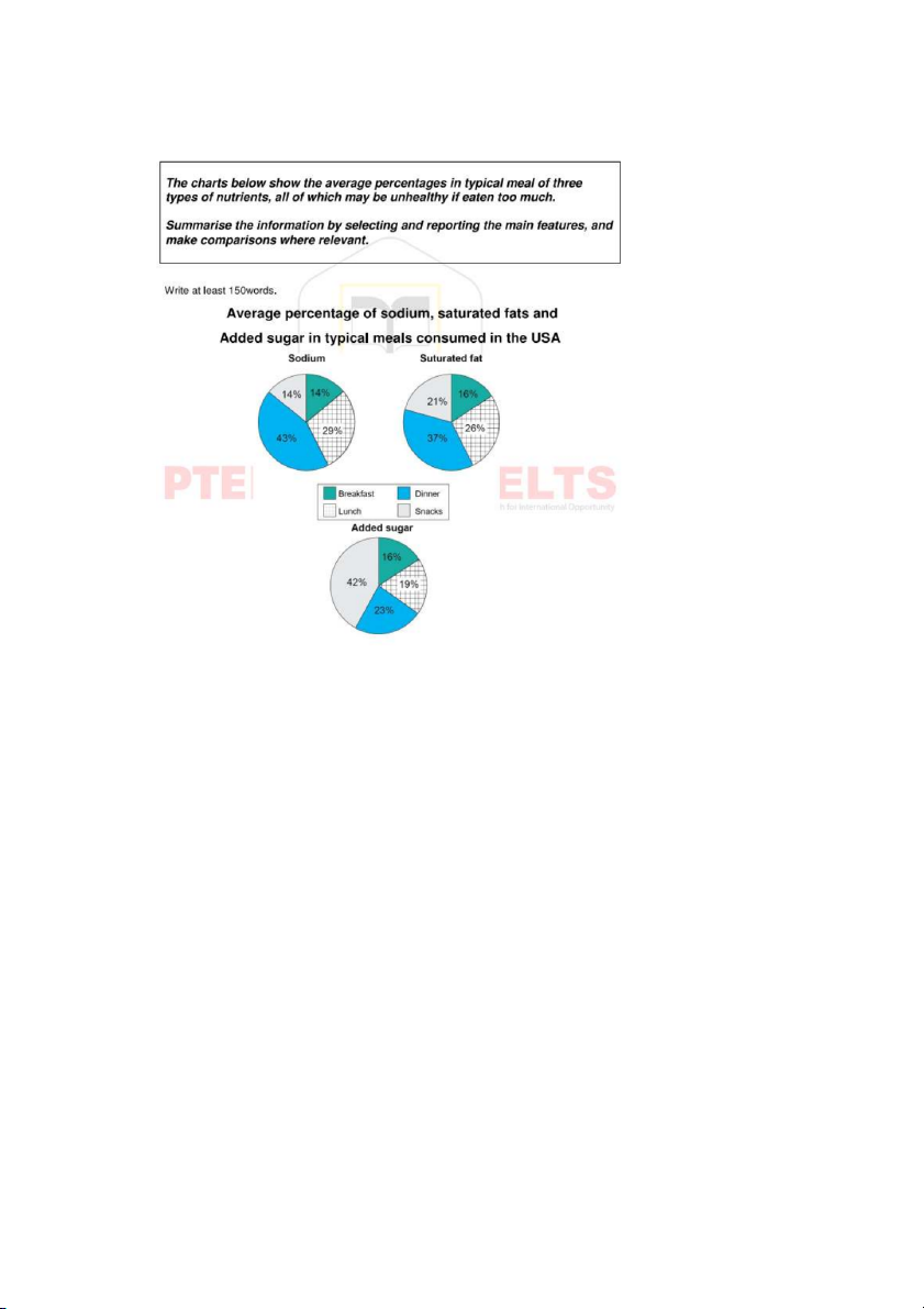
The three pie charts illustrate the average proportion of sodium, saturated fat and added sugar
consumed in four daily meals by Americans, all these nutrients could be unhealthy if eaten too much.
Overall, dinner contains the highest amount of sodium and saturated fat while the majority of
sugar is consumed in snacks, in contrast, breakfast has the least amount of all three nutrients.
Breakfast and snacks each contain 14% sodium while the amount of that eaten in lunch doubles
(29%) and in dinner is comparatively high (43%). The percentage of saturated fat consumed in
breakfast is still the lowest (16%) whereas that in snacks and lunch is 5% and 10% higher
respectively and in dinner is 37%, which accounts for more than a third of the chart. The
proportion of sugar added to breakfast is the same as that of fat while that in lunch is a bit higher
(19%). Snacks contain 42% sugar, which makes up almost half of the chart whereas the figure for dinner is 23%.
Tài liệu liên quan:
-

New English File Pre-intermediate Student's Book (2005) – Giáo trình môn English A1 | Học viện Phụ nữ Việt Nam
28 14 -
The Time Value of Money - English Grammar | Học Viện Phụ phụ nữa Việt Nam
355 178 -
Chapter 4 - Time Value of Money - English Grammar | Học Viện Phụ phụ nữa Việt Nam
320 160 -
Chuyên đề sự phối hợp thì - English Grammar | Học Viện Phụ phụ nữa Việt Nam
321 161 -
Direct Hits Vocabulary 3 - English A1 | Học Viện Phụ Nữ Việt Nam
316 158