Ielts Writing Task 1 Simon - Tài liệu tham khảo môn Tiếng Anh(TA8 ISW) | Đại học Hoa Sen

Ielts Writing Task 1 Simon - Tài liệu tham khảo môn Tiếng Anh(TA8 ISW) | Đại học Hoa Sen được sưu tầm và soạn thảo dưới dạng file PDF để gửi tới các bạn sinh viên cùng tham khảo, ôn tập đầy đủ kiến thức, chuẩn bị cho các buổi học thật tốt. Mời bạn đọc đón xem

Writing'Task'1'-'Simon' Page'1'
IELTS'Writing'Task'1'Simon'
Contents'
1.! Line graph ................................................................................................................................ 2!
1.1.! Tips for Line graph ........................................................................................................... 2!
1.2.! Internet Users as percentage of population ...................................................................... 3!
1.3.! Internatioal migration in UK ............................................................................................ 4!
1.4.! UK acid rain emission ...................................................................................................... 5!
1.5.! Water consumption .......................................................................................................... 6!
1.6.! Car ownership .................................................................................................................. 7!
2.! Bar chart .................................................................................................................................. 8!
2.1.! Marriages and divorces .................................................................................................... 8!
2.2.! Levels of participation ...................................................................................................... 9!
2.3.! Consumer good .............................................................................................................. 11!
2.4.! House prices ................................................................................................................... 12!
3.! Table ...................................................................................................................................... 13!
3.1.! Tips for table .................................................................................................................. 13!
3.2.! Rail networks .................................................................................................................. 14!
3.3.! Poverty proportion in Australia ...................................................................................... 15!
3.4.! Daily activities ................................................................................................................ 16!
3.5.! Goods consumer ............................................................................................................. 17!
4.! Pie chart ................................................................................................................................. 17!
4.1.! Cam7, page 101 .............................................................................................................. 18!
4.2.! Diet ................................................................................................................................. 18!
5.! Map ........................................................................................................................................ 20!
5.1.! Village of Chorleywood ................................................................................................. 20!
5.2.! Gallery ............................................................................................................................ 21!
5.3.! House design .................................................................................................................. 22!
5.4.! 2 proposed supermarket ................................................................................................. 23!
6.! Process ................................................................................................................................... 24!
Writing'Task'1'-'Simon' Page'2'
6.1.! Tips for process diagram ................................................................................................ 24!
6.2.! Forecast in Australia ....................................................................................................... 25!
6.3.! Brick manufactuting ....................................................................................................... 26!
6.4.! Water cycle ..................................................................................................................... 27!
1. Line graph
1.1. Tips for Line graph
Line graphs always show changes over time. Here's some advice about how to describe them:
Try to write 4 paragraphs - introduction, summary of main points, 2 detail paragraphs.
For your summary paragraph, look at the "big picture" - what changes happened to all of
the lines from the beginning to the end of the period shown (i.e. from the first year to the
last). Is there a trend that all of the lines follow (e.g. an overall increase)?
You don't need to give numbers in your summary paragraph. Numbers are specific
details. Just mention general things like 'overall change', 'highest' and 'lowest', without
giving specific figures.
Never describe each line separately. The examiner wants to see comparisons.
If the graph shows years, you won't have time to mention all of them. The key years to
describe are the first year and the last year. You should also mention any 'special' years
(e.g. a peak or a significant rise/fall).
Start describing details (paragraph 3) with a comparison of the lines for the first year
shown on the graph (e.g. 1990, the number of...). in
Use the past simple (increased, fell) for past years, and 'will' or 'is expected/predicted to'
for future years.
Don't use the passive (e.g. the number was increased), continuous (e.g. the number was
increasing), or perfect tenses (e.g. the number has increased).
Writing'Task'1'-'Simon' Page'3'
1.2. Internet Users as percentage of population
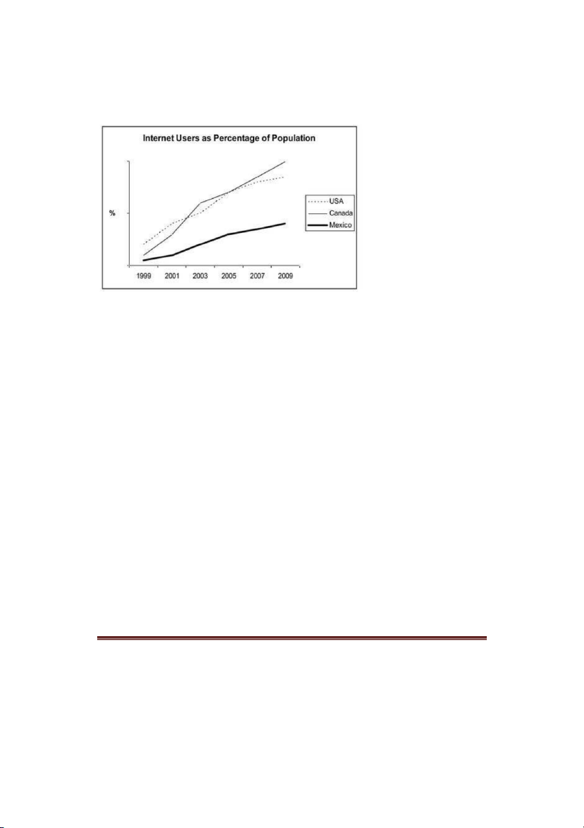
The line graph compares the percentage of people in three countries who used the Internet
between 1999 and 2009.
It is clear that the proportion of the population who used the Internet increased in each country
over the period shown. Overall, a much larger percentage of Canadians and Americans had
access to the Internet in comparison with Mexicans, and Canada experienced the fastest growth
in Internet usage.
In 1999, the proportion of people using the Internet in the USA was about 20%. The figures for
Canada and Mexico were lower, at about 10% and 5% respectively. In 2005, Internet usage in
both the USA and Canada rose to around 70% of the population, while the figure for Mexico
reached just over 25%.
By 2009, the percentage of Internet users was highest in Canada. Almost 100% of Canadians
used the Internet, compared to about 80% of Americans and only 40% of Mexicans.
Writing'Task'1'-'Simon' Page'4'
1.3. International migration in UK
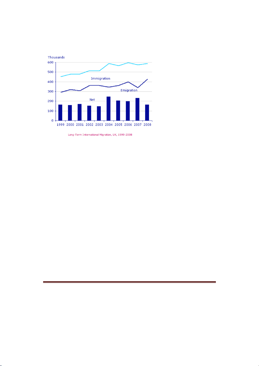
The chart gives information about UK immigration, emigration and net migration between 1999
and 2008.
Both immigration and emigration rates rose over the period shown, but the figures for
immigration were significantly higher. Net migration peaked in 2004 and 2007.
In 1999, over 450,000 people came to live in the UK, while the number of people who emigrated
stood at just under 300,000. The figure for net migration was around 160,000, and it remained at
a similar level until 2003. From 1999 to 2004, the immigration rate rose by nearly 150,000
people, but there was a much smaller rise in emigration. Net migration peaked at almost 250,000
people in 2004.
After 2004, the rate of immigration remained high, but the number of people emigrating
fluctuated. Emigration fell suddenly in 2007, before peaking at about 420,000 people in 2008. As
a result, the net migration figure rose to around 240,000 in 2007, but fell back to around 160,000
in 2008.
(159)
Writing'Task'1'-'Simon' Page'5'
1.4. UK acid rain emission
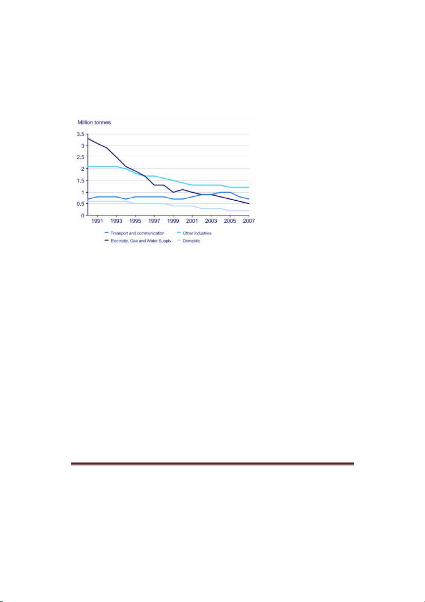
The graph below shows UK acid rain emissions, measured in millions of tones, from four
different sectors between 1990 and 2007.
I've made the following essay into a gap-fill exercise.
The line graph compares four sectors in ______ of the amount of acid rain emissions that they
produced over a period of 17 years in the UK.
It is clear that the total amount of acid rain emissions in the UK ______ ______ between 1990
and 2007. The most ______ decrease was seen in the electricity, gas and water supply sector.
In 1990, around 3.3 million tones of acid rain emissions came from the electricity, gas and water
sector. The transport and communication sector was ______ for about 0.7 million tones of
emissions, while the domestic sector ______ around 0.6 million tones. Just over 2 million tones
of acid rain gases came from other industries.
Emissions from electricity, gas and water supply fell dramatically to only 0.5 million tones in
2007, a ______ of almost 3 million tones. While acid rain gases from the domestic sector and
other industries fell gradually, the transport sector ______ a small increase in emissions, ______
a peak of 1 million tones in 2005.
Fill the gaps using these words:
produced, reaching fell, responsible, saw, considerably, terms, drop, dramatic
Writing'Task'1'-'Simon' Page'6'
1.5. Water consumption
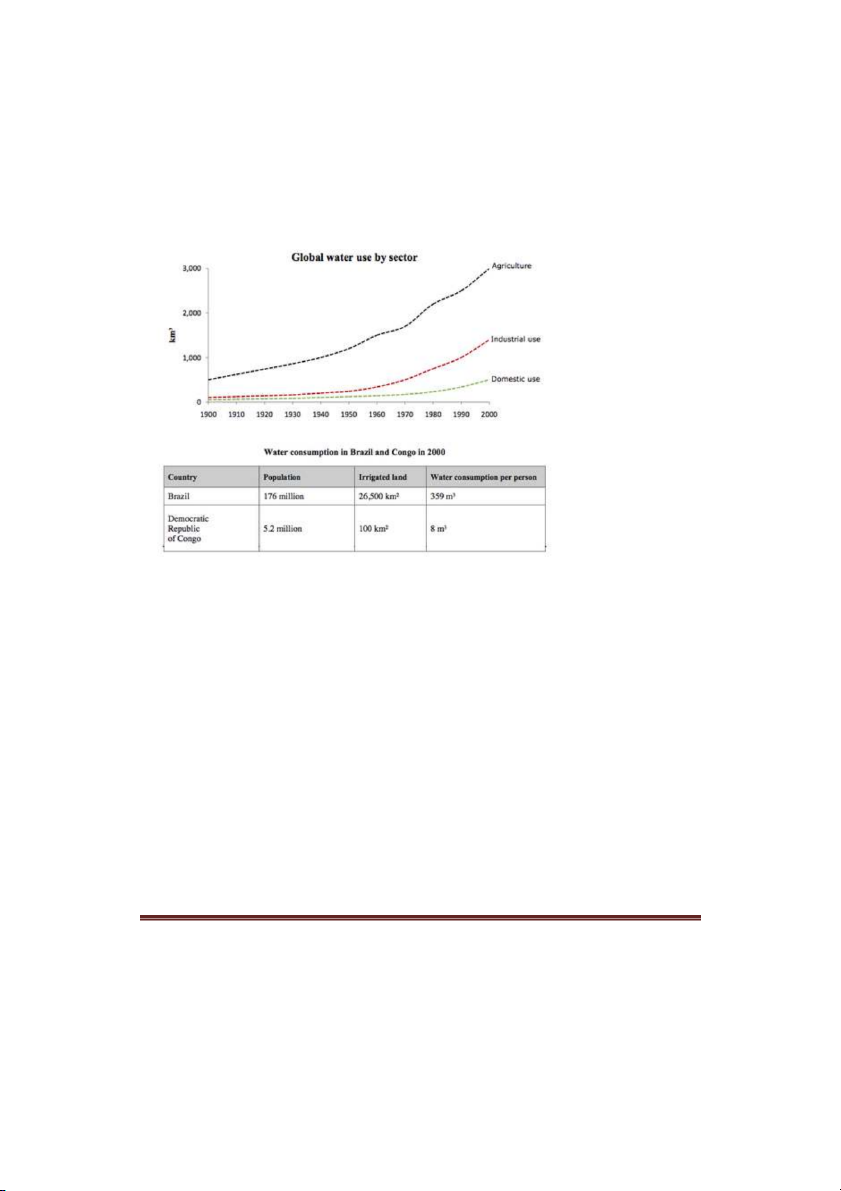
The graph and table below give information about water use worldwide and water
consumption in two different countries.
The charts compare the amount of water used for agriculture, industry and homes around the
world, and water use in Brazil and the Democratic Republic of Congo.
It is clear that global water needs rose significantly between 1900 and 2000, and that agriculture
accounted for the largest proportion of water used. We can also see that water consumption was
considerably higher in Brazil than in the Congo.
In 1900, around 500km of water was used by the agriculture sector worldwide. The figures for ³
industrial and domestic water consumption stood at around one fifth of that amount. By 2000,
global water use for agriculture had increased to around 3000km , industrial water use had risen ³
to just under half that amount, and domestic consumption had reached approximately 500km . ³
In the year 2000, the populations of Brazil and the Congo were 176 million and 5.2 million
respectively. Water consumption per person in Brazil, at 359m , was much higher than that in the ³
Congo, at only 8m , and this could be explained by the fact that Brazil had 265 times more ³
irrigated land.
(184 words, band 9)
Writing'Task'1'-'Simon' Page'7'
1.6. Car ownership
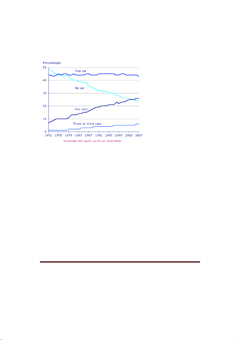
The graph below gives information about car ownership in Britain from 1971 to 2007.
The graph shows changes in the number of cars ______ household in Great Britain ______ a
period of 36 years.
Overall, car ownership in Britain increased ______ 1971 and 2007. In particular, the number of
households with two cars rose, while the number of households ______ a car fell.
In 1971, ______ half of all British households did not have regular use of a car. Around 44% of
households had one car, but only about 7% had two cars. It was uncommon for families to own
three or more cars, ______ around 2% of households falling into this category.
The one-car household was the most common type from the late 1970’s ______, although there
was little change in the ______ for this category. The biggest change was seen in the proportion
of households without a car, which fell steadily over the 36-year period ______ around 25% in
2007. In contrast, the proportion of two-car families rose steadily, reaching about 26% in 2007,
and the proportion of households with more than two cars rose ______ around 5%.
Fill the gaps in the essay with the following words:
almost, to, figures, per, between, by, over, with, without, onwards
Writing'Task'1'-'Simon' Page'8'
2. Bar chart
2.1. Marriages and divorces
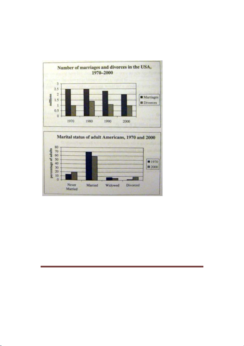
The first bar chart shows changes in the number of marriages and divorces in the USA, and the
second chart shows figures for the marital status of American adults in 1970 and 2000.
It is clear that there was a fall in the number of marriages in the USA between 1970 and 2000.
The majority of adult Americans were married in both years, but the proportion of single adults
was higher in 2000.
In 1970, there were 2.5 million marriages in the USA and 1 million divorces. The marriage rate
remained stable in 1980, but fell to 2 million by the year 2000. In contrast, the divorce rate
peaked in 1980, at nearly 1.5 million divorces, before falling back to 1 million at the end of the
period.
Writing'Task'1'-'Simon' Page'9'
Around 70% of American adults were married in 1970, but this figure dropped to just under 60%
by 2000. At the same time, the proportion of unmarried people and divorcees rose by about 10%
in total. The proportion of widowed Americans was slightly lower in 2000.
(174)
2.2. Levels of participation
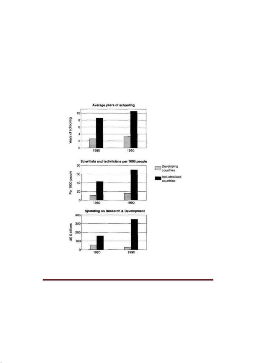
The charts below show the levels of participation in education and science in developing and
industrialised countries in 1980 and 1990.
The three bar charts show average years of schooling, numbers of scientists and technicians, and
research and development spending in developing and developed countries. Figures are given for
1980 and 1990.
Writing'Task'1'-'Simon' 'Page'10
It is clear from the charts that the figures for developed countries are much higher than those for
developing nations. Also, the charts show an overall increase in participation in education and
science from 1980 to 1990.
People in developing nations attended school for an average of around 3 years, with only a slight
increase in years of schooling from 1980 to 1990. On the other hand, the figure for industrialised
countries rose from nearly 9 years of schooling in 1980 to nearly 11 years in 1990.
From 1980 to 1990, the number of scientists and technicians in industrialised countries almost
doubled to about 70 per 1000 people. Spending on research and development also saw rapid
growth in these countries, reaching $350 billion in 1990. By contrast, the number of science
workers in developing countries remained below 20 per 1000 people, and research spending fell
from about $50 billion to only $25 billion.
(187 words)
| 1/28

Preview text:

IELTS'Writing'Task'1'Simon' Contents'
1.! Line graph ................................................................................................................................ 2!
1.1.! Tips for Line graph ........................................................................................................... 2!
1.2.! Internet Users as percentage of population ...................................................................... 3!
1.3.! Internatioal migration in UK ............................................................................................ 4!
1.4.! UK acid rain emission ...................................................................................................... 5!
1.5.! Water consumption .......................................................................................................... 6!
1.6.! Car ownership .................................................................................................................. 7!
2.! Bar chart .................................................................................................................................. 8!
2.1.! Marriages and divorces .................................................................................................... 8!
2.2.! Levels of participation ...................................................................................................... 9!
2.3.! Consumer good .............................................................................................................. 11!
2.4.! House prices ................................................................................................................... 12!
3.! Table ...................................................................................................................................... 13!
3.1.! Tips for table .................................................................................................................. 13!
3.2.! Rail networks .................................................................................................................. 14!
3.3.! Poverty proportion in Australia ...................................................................................... 15!
3.4.! Daily activities ................................................................................................................ 16!
3.5.! Goods consumer ............................................................................................................. 17!
4.! Pie chart ................................................................................................................................. 17!
4.1.! Cam7, page 101 .............................................................................................................. 18!
4.2.! Diet ................................................................................................................................. 18!
5.! Map ........................................................................................................................................ 20!
5.1.! Village of Chorleywood ................................................................................................. 20!
5.2.! Gallery ............................................................................................................................ 21!
5.3.! House design .................................................................................................................. 22!
5.4.! 2 proposed supermarket ................................................................................................. 23!
6.! Process ................................................................................................................................... 24! Writing'Task'1'-'Simon' Page'1'
6.1.! Tips for process diagram ................................................................................................ 24!
6.2.! Forecast in Australia ....................................................................................................... 25!
6.3.! Brick manufactuting ....................................................................................................... 26!
6.4.! Water cycle ..................................................................................................................... 27! 1. Line graph
1.1. Tips for Line graph
Line graphs always show changes over time. Here's some advice about how to describe them: •
Try to write 4 paragraphs - introduction, summary of main points, 2 detail paragraphs. •
For your summary paragraph, look at the "big picture" - what changes happened to all of
the lines from the beginning to the end of the period shown (i.e. from the first year to the
last). Is there a trend that all of the lines follow (e.g. an overall increase)? •
You don't need to give numbers in your summary paragraph. Numbers are specific
details. Just mention general things like 'overall change', 'highest' and 'lowest', without giving specific figures. •
Never describe each line separately. The examiner wants to see comparisons. •
If the graph shows years, you won't have time to mention all of them. The key years to
describe are the first year and the last year. You should also mention any 'special' years
(e.g. a peak or a significant rise/fall). •
Start describing details (paragraph 3) with a comparison of the lines for the first year
shown on the graph (e.g. in 1990, the number of...). •
Use the past simple (increased, fell) for past years, and 'will' or 'is expected/predicted to' for future years. •
Don't use the passive (e.g. the number was increased), continuous (e.g. the number was
increasing), or perfect tenses (e.g. the number has increased). Writing'Task'1'-'Simon' Page'2'
1.2. Internet Users as percentage of population
The line graph compares the percentage of people in three countries who used the Internet between 1999 and 2009.
It is clear that the proportion of the population who used the Internet increased in each country
over the period shown. Overall, a much larger percentage of Canadians and Americans had
access to the Internet in comparison with Mexicans, and Canada experienced the fastest growth in Internet usage.
In 1999, the proportion of people using the Internet in the USA was about 20%. The figures for
Canada and Mexico were lower, at about 10% and 5% respectively. In 2005, Internet usage in
both the USA and Canada rose to around 70% of the population, while the figure for Mexico reached just over 25%.
By 2009, the percentage of Internet users was highest in Canada. Almost 100% of Canadians
used the Internet, compared to about 80% of Americans and only 40% of Mexicans. Writing'Task'1'-'Simon' Page'3'
1.3. International migration in UK
The chart gives information about UK immigration, emigration and net migration between 1999 and 2008.
Both immigration and emigration rates rose over the period shown, but the figures for
immigration were significantly higher. Net migration peaked in 2004 and 2007.
In 1999, over 450,000 people came to live in the UK, while the number of people who emigrated
stood at just under 300,000. The figure for net migration was around 160,000, and it remained at
a similar level until 2003. From 1999 to 2004, the immigration rate rose by nearly 150,000
people, but there was a much smaller rise in emigration. Net migration peaked at almost 250,000 people in 2004.
After 2004, the rate of immigration remained high, but the number of people emigrating
fluctuated. Emigration fell suddenly in 2007, before peaking at about 420,000 people in 2008. As
a result, the net migration figure rose to around 240,000 in 2007, but fell back to around 160,000 in 2008. (159) Writing'Task'1'-'Simon' Page'4'
1.4. UK acid rain emission
The graph below shows UK acid rain emissions, measured in millions of tones, from four
different sectors between 1990 and 2007.
I've made the following essay into a gap-fill exercise.
The line graph compares four sectors in ______ of the amount of acid rain emissions that they
produced over a period of 17 years in the UK.
It is clear that the total amount of acid rain emissions in the UK ______ ______ between 1990
and 2007. The most ______ decrease was seen in the electricity, gas and water supply sector.
In 1990, around 3.3 million tones of acid rain emissions came from the electricity, gas and water
sector. The transport and communication sector was ______ for about 0.7 million tones of
emissions, while the domestic sector ______ around 0.6 million tones. Just over 2 million tones
of acid rain gases came from other industries.
Emissions from electricity, gas and water supply fell dramatically to only 0.5 million tones in
2007, a ______ of almost 3 million tones. While acid rain gases from the domestic sector and
other industries fell gradually, the transport sector ______ a small increase in emissions, ______
a peak of 1 million tones in 2005.
Fill the gaps using these words:
produced, reaching fell, responsible, saw, considerably, terms, drop, dramatic Writing'Task'1'-'Simon' Page'5' 1.5. Water consumption
The graph and table below give information about water use worldwide and water
consumption in two different countries.
The charts compare the amount of water used for agriculture, industry and homes around the
world, and water use in Brazil and the Democratic Republic of Congo.
It is clear that global water needs rose significantly between 1900 and 2000, and that agriculture
accounted for the largest proportion of water used. We can also see that water consumption was
considerably higher in Brazil than in the Congo.
In 1900, around 500km³ of water was used by the agriculture sector worldwide. The figures for
industrial and domestic water consumption stood at around one fifth of that amount. By 2000,
global water use for agriculture had increased to around 3000km³, industrial water use had risen
to just under half that amount, and domestic consumption had reached approximately 500km . ³
In the year 2000, the populations of Brazil and the Congo were 176 million and 5.2 million
respectively. Water consumption per person in Brazil, at 359m³, was much higher than that in the Congo, at only 8m ,
³ and this could be explained by the fact that Brazil had 265 times more irrigated land. (184 words, band 9) Writing'Task'1'-'Simon' Page'6' 1.6. Car ownership
The graph below gives information about car ownership in Britain from 1971 to 2007.
The graph shows changes in the number of cars ______ household in Great Britain ______ a period of 36 years.
Overall, car ownership in Britain increased ______ 1971 and 2007. In particular, the number of
households with two cars rose, while the number of households ______ a car fell.
In 1971, ______ half of all British households did not have regular use of a car. Around 44% of
households had one car, but only about 7% had two cars. It was uncommon for families to own
three or more cars, ______ around 2% of households falling into this category.
The one-car household was the most common type from the late 1970’s ______, although there
was little change in the ______ for this category. The biggest change was seen in the proportion
of households without a car, which fell steadily over the 36-year period ______ around 25% in
2007. In contrast, the proportion of two-car families rose steadily, reaching about 26% in 2007,
and the proportion of households with more than two cars rose ______ around 5%.
Fill the gaps in the essay with the following words:
almost, to, figures, per, between, by, over, with, without, onwards Writing'Task'1'-'Simon' Page'7' 2. Bar chart
2.1. Marriages and divorces
The first bar chart shows changes in the number of marriages and divorces in the USA, and the
second chart shows figures for the marital status of American adults in 1970 and 2000.
It is clear that there was a fall in the number of marriages in the USA between 1970 and 2000.
The majority of adult Americans were married in both years, but the proportion of single adults was higher in 2000.
In 1970, there were 2.5 million marriages in the USA and 1 million divorces. The marriage rate
remained stable in 1980, but fell to 2 million by the year 2000. In contrast, the divorce rate
peaked in 1980, at nearly 1.5 million divorces, before falling back to 1 million at the end of the period. Writing'Task'1'-'Simon' Page'8'
Around 70% of American adults were married in 1970, but this figure dropped to just under 60%
by 2000. At the same time, the proportion of unmarried people and divorcees rose by about 10%
in total. The proportion of widowed Americans was slightly lower in 2000. (174)
2.2. Levels of participation
The charts below show the levels of participation in education and science in developing and
industrialised countries in 1980 and 1990.
The three bar charts show average years of schooling, numbers of scientists and technicians, and
research and development spending in developing and developed countries. Figures are given for 1980 and 1990. Writing'Task'1'-'Simon' Page'9'
It is clear from the charts that the figures for developed countries are much higher than those for
developing nations. Also, the charts show an overall increase in participation in education and science from 1980 to 1990.
People in developing nations attended school for an average of around 3 years, with only a slight
increase in years of schooling from 1980 to 1990. On the other hand, the figure for industrialised
countries rose from nearly 9 years of schooling in 1980 to nearly 11 years in 1990.
From 1980 to 1990, the number of scientists and technicians in industrialised countries almost
doubled to about 70 per 1000 people. Spending on research and development also saw rapid
growth in these countries, reaching $350 billion in 1990. By contrast, the number of science
workers in developing countries remained below 20 per 1000 people, and research spending fell
from about $50 billion to only $25 billion. (187 words) Writing'Task'1'-'Simon' Page'1 ' 0