
Preview text:
Interaction Design Lab – Week 02 – Indivual Work Name: Student ID:
Deadline: 11:59pm of the lab day – by submitting into dropbox on E-Learning system
File name format: Interaction Design Lab – Week 02 – StudentID.docx (or .pdf or .zip)
Academic integrity: please writing each member name as mean to acknowledge that the below work is your work only:
These days, timepieces (such as clocks, wristwatches, and so on) have a variety of functions. Not
only do they tell the time and date, but they can speak to you, remind you when it’s time to do
something, and record your exercise habits among other things. The interface for these devices,
however, shows the time in one of two basic ways: as a digital number such as 11:40 or through
an analog display with two or three hands—one to represent the hour, one for the minutes, and one for the seconds.
This in-depth activity is to design an innovative timepiece. This could be in the form of a
wristwatch, a mantelpiece clock, a sculpture for a garden or balcony, or any other kind of
timepiece you prefer. The goal is to be inventive and exploratory by following these steps:
a) Think about the interactive product that you are designing: What do you want it to do? Find
five potential users, and ask them what they would want. Write a list of requirements for
the clock, add some usability criteria and user experience criteria based on the definitions in exercise you did in Chapter 1.
I think I will create a compact smart electronic watch. I have a habit of not setting an alarm
on my phone, so I often wake up late and am late for school for a variety of reasons,
oversleeping is one of them. A smart watch that can listen, call and connect directly to the
phone can optimize time management.
-Some requirements I can list here is : +Have smart password +Have easy ability for user
+Can see the time at day and night
+Different vibrate ( slight , medium, strong) -Touch screen Some usability: +How its done? +Is this watch reliable?
+Eny bug or crash screen when using ? +It is easy to use?
Normally, to use a smart watch, we usually wear it. Sometimes when pressing the keyboard
or doing work that requires double use, it is very tiring for your hands. So my design will
help this to minimize the contact area and optimize the features of a regular watch by
eliminating the need to wear, my design is 20mm diameter and thin 2.5 mm. Its contact
surface may stick tightly to the user's skin.
b) Look around for similar devices and seek out other sources of inspiration that you might find
helpful. Make a note of any findings that are interesting, useful, or insightful.
-The apple watch looks heavy on the hand and very bulky, but my design does not need to
be worn on the hand and the diameter is small so it is very light.
-The apple watch has a lot of features and is quite expensive, but my design only optimizes
the features with basic but upgraded features such as vibration alarm, diet mode, and sports
mode. That helps my watch work smoothly and the price is cheap.
-Something can be useful is when you forgot to wear your watch or when you sleep without
your watch , we can see how mine watch can help when you acctually cant feel the watch
when you sleep or do something because its take less space and very light.
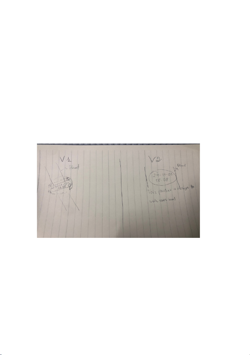
c) Sketch some initial designs for the timepiece. Try to develop two distinct alternatives that
meet your set of requirements. (hand-drawing only please!)
d) Evaluate the two designs by using your usability criteria and by role-playing an interaction
with your sketches. Involve potential users in the evaluation, if possible. Does it do what you
want? Is the time or other information being displayed always clear? Design is iterative, so
you may want to return to earlier elements of the process before you choose one of your alternatives.
- The performance of these two versions is quite similar. However, the first version is smaller
and slimmer than version 2, this is mainly designed for people with slim and small wrists.
Version 2 looks more luxurious for people with medium and large wrists. The issue here is
whether it does not affect the user when "wearing" this watch and whether its sound and
vibration modes are effective or not. It all depends on the material the watch is made of and
the way the script is written. Of course the watch's menu will display the date, month, year
and real time. The user simply swipes up to display other functions
