Learn new words and improve your language level to be able to communicate in English effectively
Learn new words and improve your language level to be able to communicate in English effectively
Môn: Tiếng anh tăng cường 24 tài liệu
Trường: Trường Đại học Tài chính - Ngân hàng Hà Nội 185 tài liệu
Tác giả:


Preview text:
WRITING TASK 1 Intro+overview
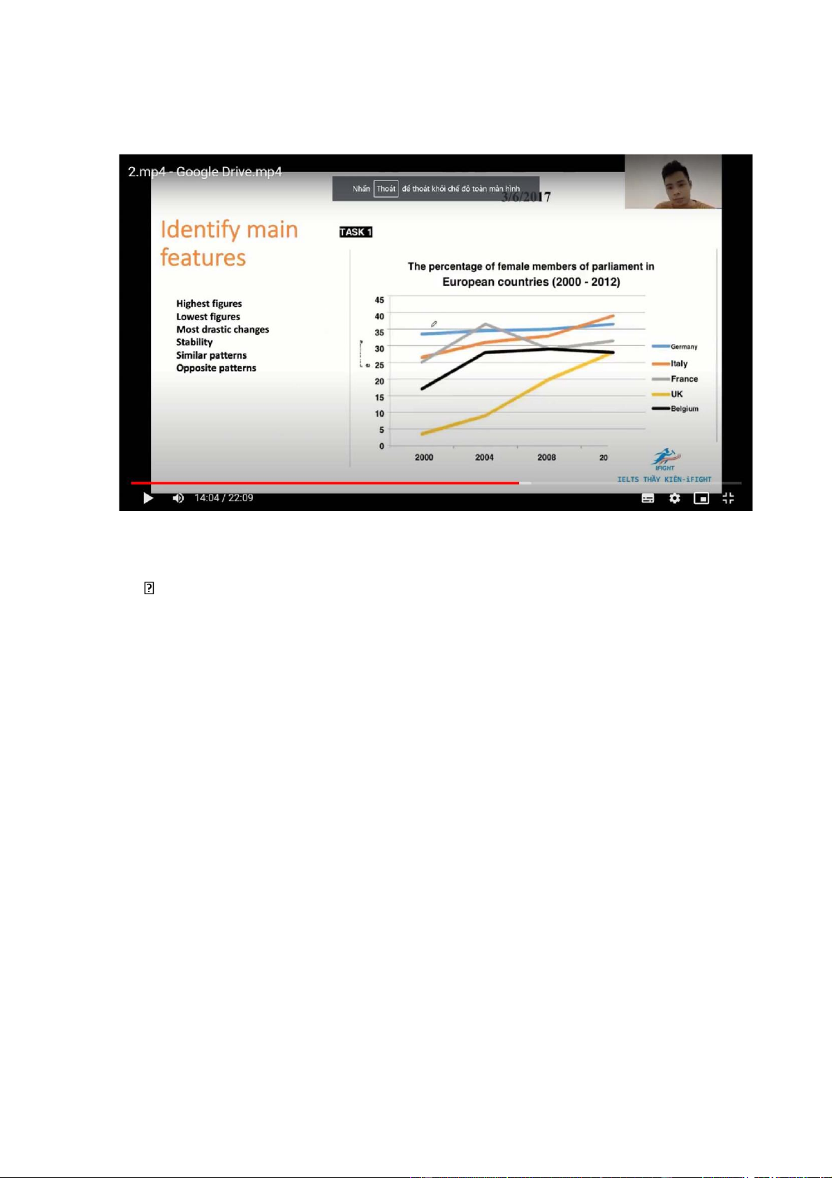
• The line graph (chart) illustrates (compares) the percentage of females
elected in parliament in 5 Europe countries between 2000 and 2012
The line graph illustrates how five Europe countries chose their members for parliament btw 2000 and 2012
• Overall there was an increase in the proportion of female members in
parliament in all 5 countries examined, with the most dramatic rise being
seen in the figures for the UK. Despite that, the UK consistently had the
lowest figures over the period
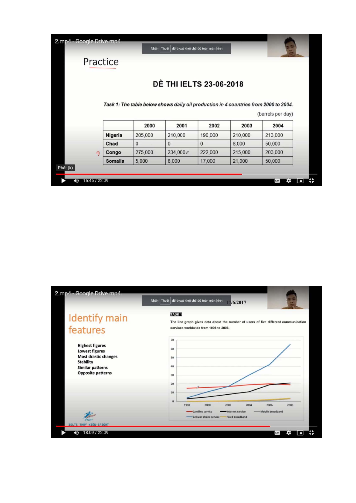
• The chart illustrates how much oil was produced daily in 4 countries btw
2000 and 2003 / The chart illustrates how many barrels of oil were produce daily in….
• Overall, there was an increase in the daily amount of oil produces in
Nigeria, Chad and Somalia, while a gradual decline (in oil production/
output) was seen in Congo. In addition, Congo generally produced the most
oil among the 4 countries examined, but it was surparssed/ overtaken by
Nilgeria in the last year of the period
• The graph illustrates how many ppl used/ subscribed to 5 means of
communication btw 1998 and 2008
• Overall, there was an increase in the numbers of subscribers to all of the
communication services given/ examined, with the most dramatic rise
being seen in the figures for cellular phone service to become the most
popular/ commonly-used service from 2002 onwards
Grammar+ Coherence and Cohesion- Super boosters
• (Overview) -> There was an increase in…, (with ….witnessing the most
dramatic rise), while (if there is another trend). In addition, …highest figures…
• The number/proportion/amount of….started at…, after which it experience
a rise/growth/ decline to…in….., before ending the period at…
• Data…., with a subsequent increase/ decrease/ levelling off/ fluctuation…. and a final
• The figure for…(number/ proportion/ amount of…) was at… (or change..),
followed by an slow/ significant increase/ decrease to…
• The figure for….+V, and (but)+V
• Similar/ opposite changes can be seen in the figure(s) for…., which…
The figure for … saw similar/ opposite changes, ving The figure for … +change, ending/ reaching….
Eg: ….. Started at…., after which it experienced a rise/growth/ decline
to….in…., before ending the period at…
• The number of students stuyding abroad started at 0.4 million, after
which it experienced/ witnessed/ saw a dramatic rise to 1.4 million in
1985, before ending the period at 0.8
Data…., with a subsequent… and a final…..
• 0.4 million students studied abroad in 1970 in the US, with a subsequent
considerable/significant rise to 1.4 million and a final drop to 0.8
…..Was at…, followed by a (slow/significant) increase/ decrease to…
• The number of students studying abroad in 1970 was 0.4 million,
followed by a significant increase to reach a peak of 1.4 million in 1985,
and a final drop to 0.8 15 years later
• The number of students studying abroad increased significantly from 0.4
million in 1970 to reach a peak of 1.4 million in 1985, followed by a final
drop to 0.8 15 years later
The number/ amount/ proportion….+V and V
• The numer of students studying abroad increased sharply from 0.4 at the
beginning of the periof to reach a peak of 1.4 in 1985, but later dropped
to 0,8 in the last year of the period examined
The number/ amount/ proportion….. +change, ending/reaching….
• The number of students studying abroad increased sharply, reaching a
peak of 1.4 in 1985, but it latter dropped to 0.8 in the last year of the period examined Vocabulary • Increase/ grow/ rise • Decrease/ decline/ drop
• Fluctuation/ fluctuate in the range from…to…/ hover around
• Significant/ considerable/ dramatic/ sharp
• Slight/ slow/ gradual/ marginal/ moderate
• Reach a peak of…= peak at= reach/ hit a high of
• Reach a low of…= hit a trough of…
• Remain unchanged/ stable= level off (a levelling off)
• The number of As/ A numbers/ how many s+v
• The amount of/ how much s+v
• Percentage= proportion= share 4 categories Intro
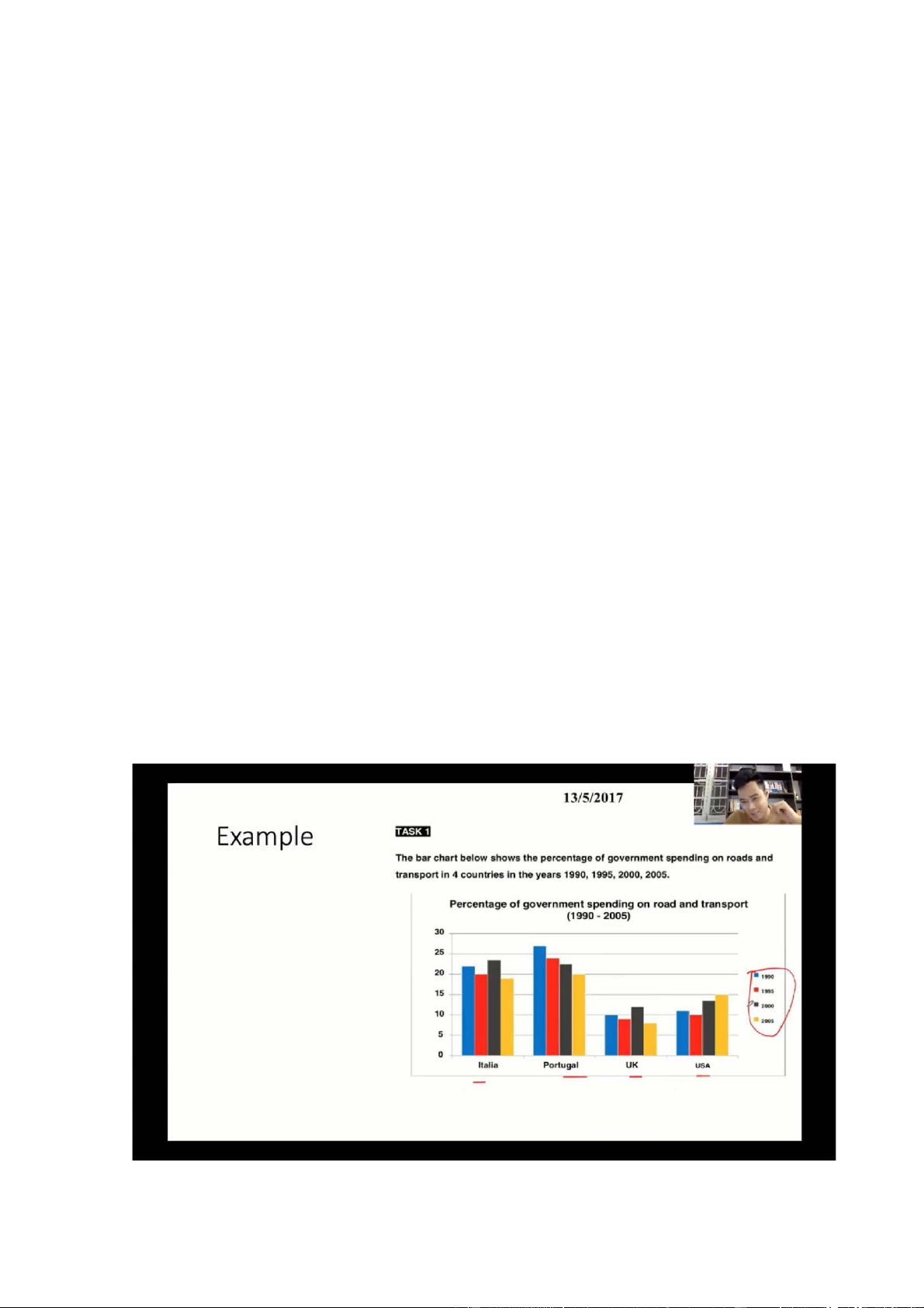
• The chart illustrates how much governments in 4 countries invested in
roads and transport btw 1990 and 2005
• The chart illustartes how governments in 4 countries invested in the
transport infrastructure btw 1990 and 2005
• The chart illustrates the percentage of government expenditure on roads
and transport in 4 countries btw 1990 and 2005 Overview
Overall, there was a decline in the proportion of government spending on
roads and transport in Italy, Portugal, and the UK, while a rise was seen in
the USA. In addition, Portugal generally had the highest figures throughout the period Body 1
The share of the government’s budget spent on roads and transport in
Portuga; started at about 27%, after which it saw a progressive decrease to
exactly 20% in 2005. Conversely, the figure for the USA rose from just over
10% in 1990 to 15% in 2005, despite a small fall in the first 5 years
Just over= north of= upward of
Just under= shy of= downward of Exactly= precisely Body 2
Approximately 22% of the Italian national budget was spent on/ went into
the transport infrastructure, with subsequent fluctuations and a final decline
from 24% in 2000 to about 19% in 2005. Similarly, the figure for the UK
fluctuated in the range from 9% to 13% from 1990 to 2000, before ending the period at around 7%
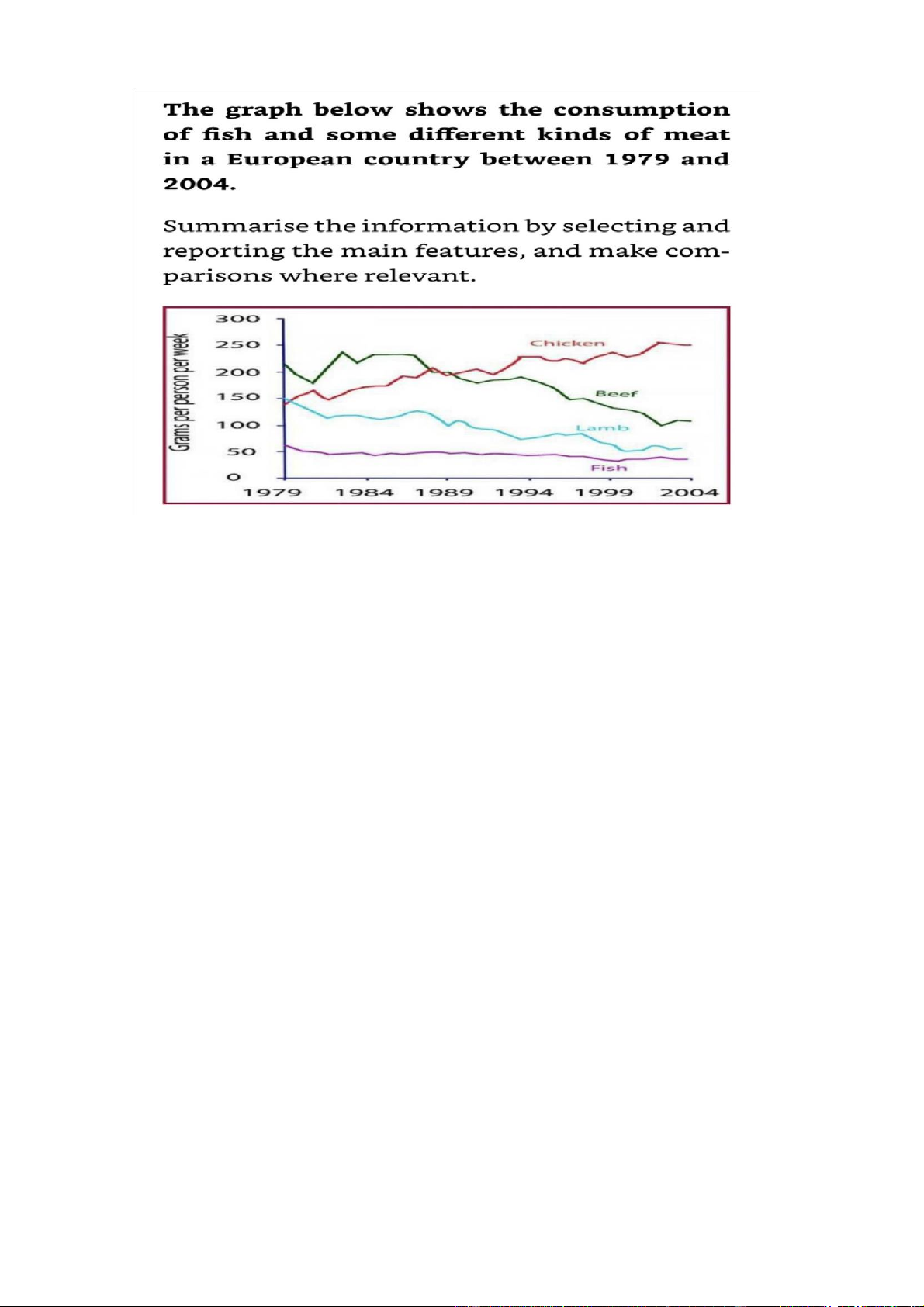
The line graph illustrates how much fish and some other kinds of meat were
consumed/used/eaten per person in a country in Europe from 1979 to 2004
Overall, there was a decline in the amount of beef, lamb and fish eaten, while the
figure for chicken increase to surpass that of beef, making it the most consumed
type of meat from 1989 onwards
The amount of beef eaten per person in the country examined started at about 220
grams, after which it saw fluctuations until 1989, before decreasing to end the
period at around 100 grams. Conversely, the figure for chicken rose from just
under 150 grams per person to north of 200 gpp in 1989 and kept rising to reach 250 gpp in the final year
150 grams of lamb was used by an average person in the country mentioned in
1979, with a decline to approximately 75 gpp in 2004. Meanwhile/ in the
meantime, the figure for fish decreased slightly from around 60 gpp to just under
50 gpp after a few years and maintained at this level towards the end of the period 5+ categories
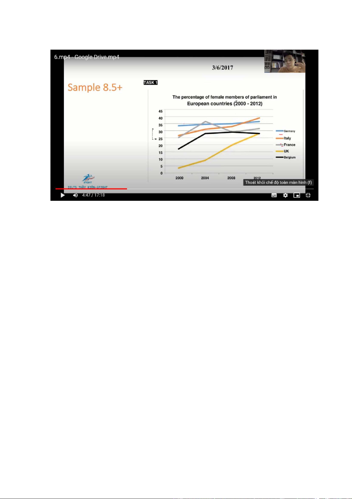
The line graph illustrates the percentage of females elected in parliament in 5
European countries btw 2000 and 2012
Overall, there was an increase in the proportion of female members in parliament
in all 5 countries examined, with the UK witnessing the most dramatic rise.
Despite this, it consistently had the lowest figures throughout the period
The percentage of positions held by women in Germany was about 34%, after
which it saw a gradual rise to 36% in 2012. Similar changes, but to greater extents,
were seen in the figures for Italy and the UK, which grew from 26% to almost
40% and from 4% to around 27% respectively
25% of members in France’s parliament were women, with a subsequent jump to
reach a peak at around 37% by 2004, before ending at 32%. Meanwhile, the figure
for Belgium increased from 17% in 2000 to 28% in 2004 and levelled off towards the end of the period
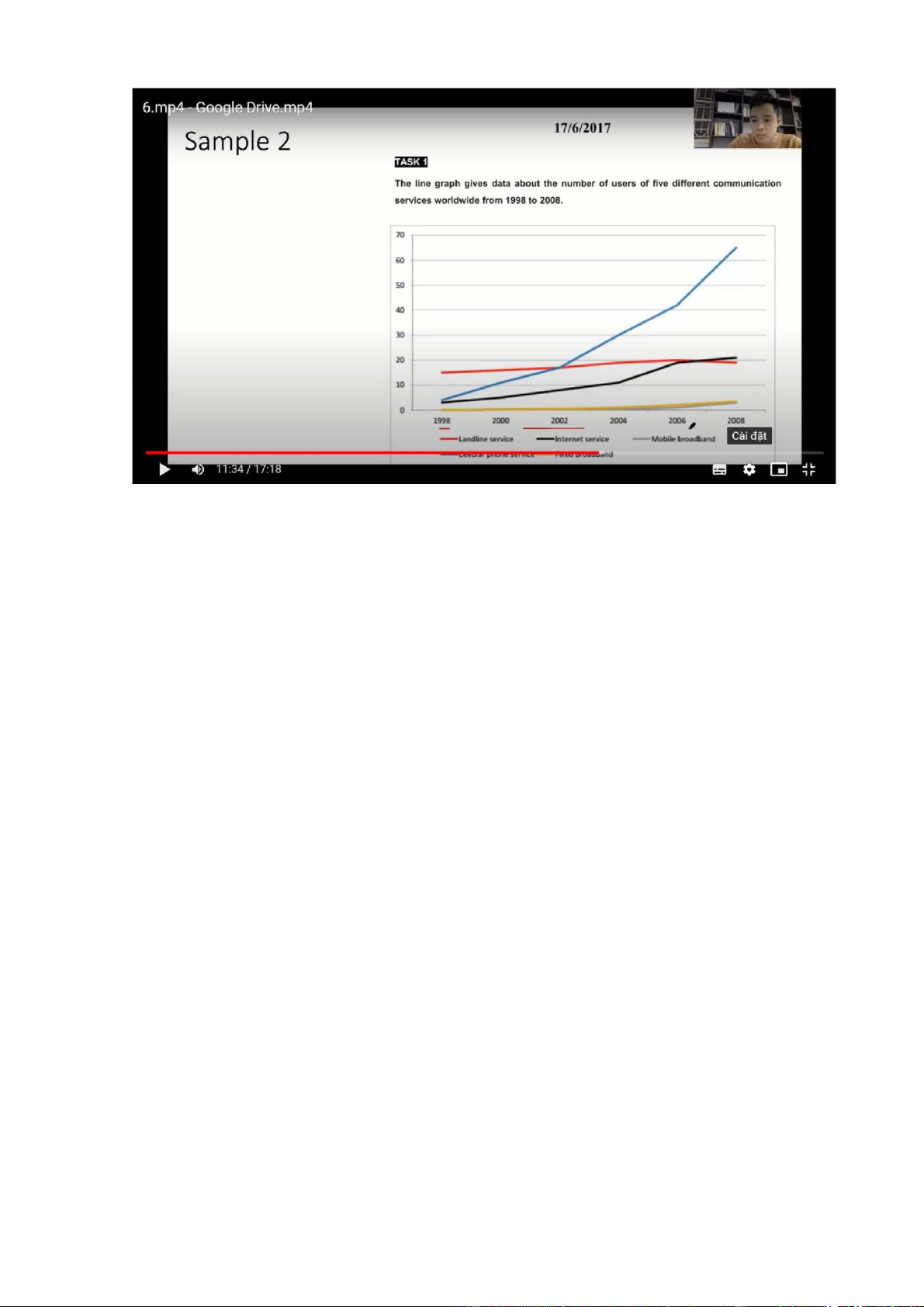
The chart illustrates how many ppl used 5 different means of communication worldwide btw 1998 and 2008
Overall, there was an increase in the number of users of all 5 communication
services, with cellular phone service enjoying the most considerable growth to
become by far the most used/ popular from 2005 onwards
The number of subscribers to landlind service started at 15 million, after which it
experienced a gradual rise to 20 million in 2006, before ending the period at about
19 million. Similarly, not until the year 2002 did ppl start using fixed broadband
and mobile broadband, and the figures for these two servcies increased slightly to 4 million
5 million ppl subscribed to cellular phone service in 1998, with a gradual growth
to roughly 18 million 4 years later, and a final substantial growth to just over 65
million at the end of the period. Similar changes, but to a lesser extent, can be
seen in the figures for internet services, which increased from just under 5 million
in 1998 to exactly 20 million in 2006, followed by a final levelling off towards the end of the period < 4 categories
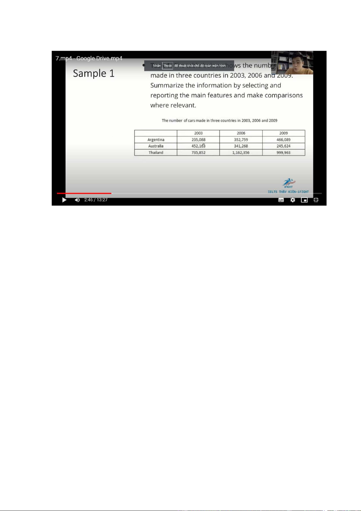
The table illustrates how many cars were produced in Argentina, Australia and Thailand btw 2003 and 2009
Overall, there was an increase in the number of cars manufactured in Argentina
and Thailand, while a constant decline was seen in Australia’s car production. It
is also clear that Thailand consistently had by far the highest figure throughout
the period, even though a considerable decline was seen in the latter half of the period
The number of automobiles manufactured in Thailand started at 735,852 units,
after which it saw a dramatic rise to 1,162,356 in 2006. A similar change was seen
in the figure for Argentina, which increased from 235,088 to 352,759 in the first
3 years. By contrast, 452.136 cars were made in Australia in 2000, with a
subsequent significant decline to to 341,268 units in 2003
From 2006 to 2009, the numbers of cars produced in Argentina continued to
increase, reaching 466,085 units. Conversely, the figures for Thailand and
Australia dropped to 999,963 and 245,624 units
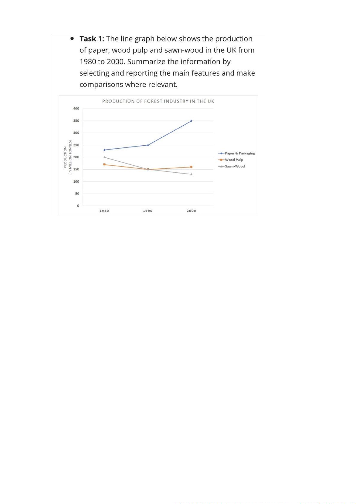
The chart illustrates how much paper, wood pulp and sawn-wood were produced in the UK btw 1980 and 2000
Overall, there was a dramatic increase in paper and packaging production in the
UK, especially in the latter half of the period, while the opposite trend can be seen
in the figures for sawn wood and those for wood pulp fluctuated slightly. It is also
clear that the amount of paper and packaging material produced in UK had by far
the highest figures throughout the years
The amount of paper and packaging produced in the UK started at about 240
million tons, after which it saw a slight increase to 250 million tons ten years later.
Opposite changes can be seen in the figure for wood pulp and sawn-wood, which
decreased from 200 and 165 million tons to exactly 150 million tons in the first 10 years
From 1990 to 2000, the amount for paper and packaging produced rose
significantly, reaching 350 million tons. The figure for woodpulp saw similar
changes, but to a much lesser extent, growing to roughly 160 million tons.
Conversely, the production of sawn-wood kept decreasing to approximately 125 million tons 2 years
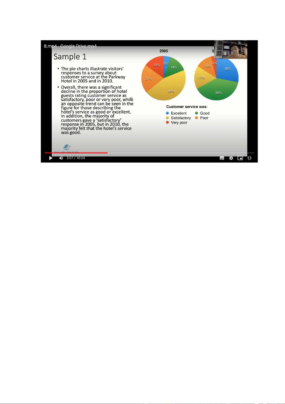
The pie charts illustrate visistors’ responses to a survey about customer service at
the Parkway Hotel in 2005 and 2010
Overall, there was a significant decline in the propotion of hotel guests rating
customer service as satisfactory, poor or very poor, while an opposite trend can be
seen in the figure for those describing the hotel’s service as good or excellent. In
addition, the majority of customers gave a satisfactory response in 2005, but in
2010, the majority felt that the hotel’s service was good
The precentage of hotel’s visistors rating its customer service as excellent started
at 5%, after which it saw a significant rise to 28% in 2010. Furthermore, only 14%
of guets described customer service in the hotel as good in 2005, with a
subsequent three-fold increase to 39% five years later. As a result, the figure for
ppl giving a satisfactory response declined significantly from 45% to 17% over the period
The proportion of guests who considered the hotel’s customer service to be poor
almost halved, ending at 12%. A similar change can be seen in the figure for ppl
who thought customer service to be very poor which dropped from 15% to only 4% over the 5-year period
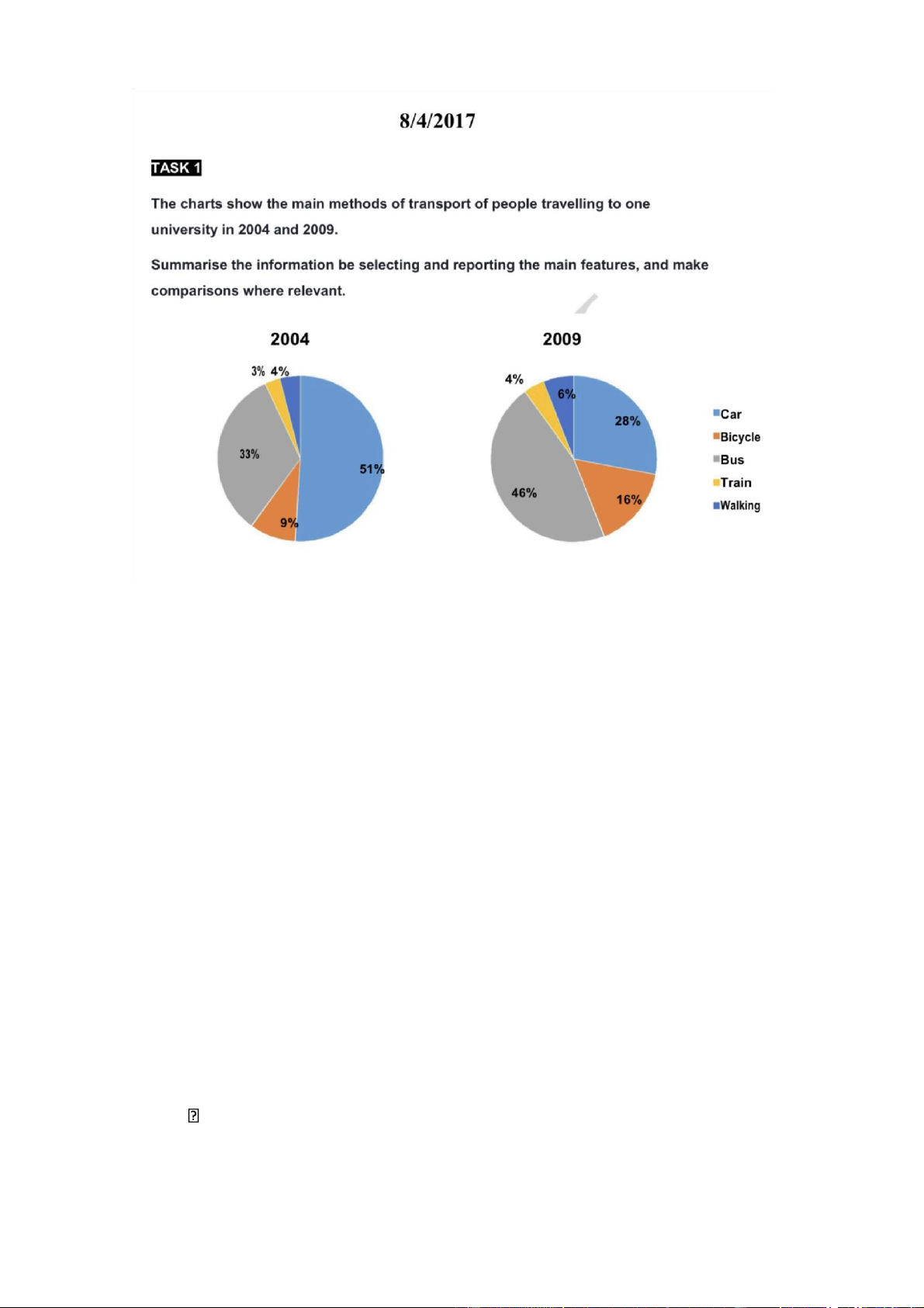
The pie charts illustrate how students in a university traveled to school in 2004 and 2009
Overall, there was a significant decline in the proportion of ppl traveling to the
examined university by car, while an increase was seen in the figures for other
means of transport. In addition, the majority of students chose to commute to their
university by car in 2004 and by bus in 2009, by contrast, the figures for ppl opting
to take a train or walk to school were negligible in both years
The percentage of ppl driving to university started at 51% in 2004, after which it
experienced a considerable fall to 28% in 2009. The reverse trend can be seen in
the figure for those going to this university by bus, which rose from 33% in 2004 to 46% in 2009
9% of ppl in the survey said that they often cycled to school in 2004, followed by
a rise to 16% after a half decade. The figures for people taking a train or walking
to school increased neligibly, reaching 4% and 6% respectively Future
• To be likely to/ expected/ anticipated/ predicted/ forecasted/ projected to..
A prediction/ anticipation/ projection of a rise/ decline to
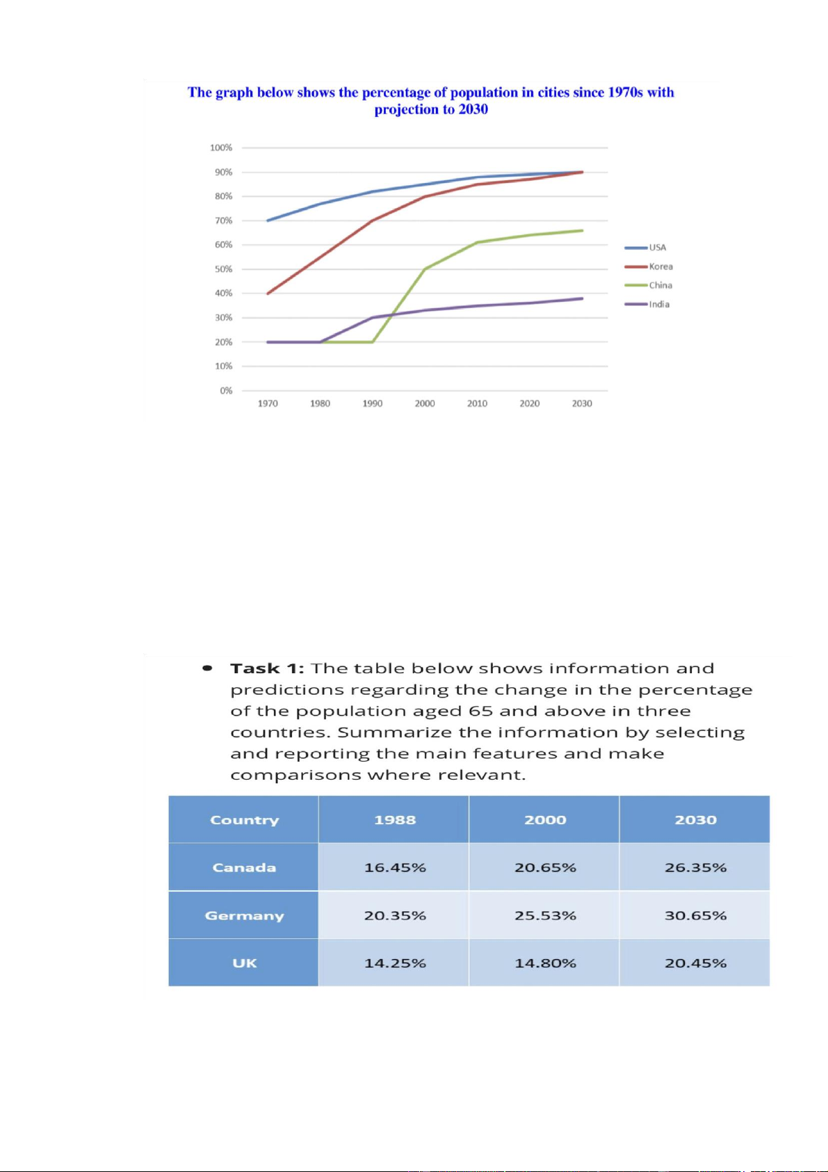
• The proportion of US citizens living in cities/ urban areas started at 70% in
1970, after which it experienced a steady rise to about 88% in 2010, before
being expected to reach 90% in 2030
• 70% of the ppl living in the US chose to reside in urban areas in 1970, with
a steady growth to about 88% in 2010, and a prediction of a slow growth to 90% at the end of the period
• The proportion of the US population residing/ inhabiting/ dwelling in cities
increased steadily form 70% in 1970 to about 88% in 2010, followed by a
projection of a slow rise to 90% in 2030
The table illustrates the proportion of ppl aged 65 and over in Canada, G and the
UK in 1988,2000 and an estimation of 2030
Overall there is a rise in the percentage of the elderly ppl in all 3 countries over
the period examined, with the UK witnessing almost no change in the first 12
years. In addition, G consistently have the largest proportion of the elderly, the
figures for the UK are lowest in all 3 years
In 1988, the percentage of senior citizens in G started at 20.35%, after which it
saw a rise to 25,35%. The figure for Canada saw a similar change, growing from
16,45% to 20,65% in the first 12 years. Meanwhile, the proportion of elderly ppl
in the UK remained relatively unchanged during this period, at shy of 15%
By 2030, the population of pple aged 65 and plus in G is expected to increase at
the same rate, reaching 30,65%. The figures for Canada and the UK will increase
by just over 4% to end at 26,35% and 20,45% respectively Total
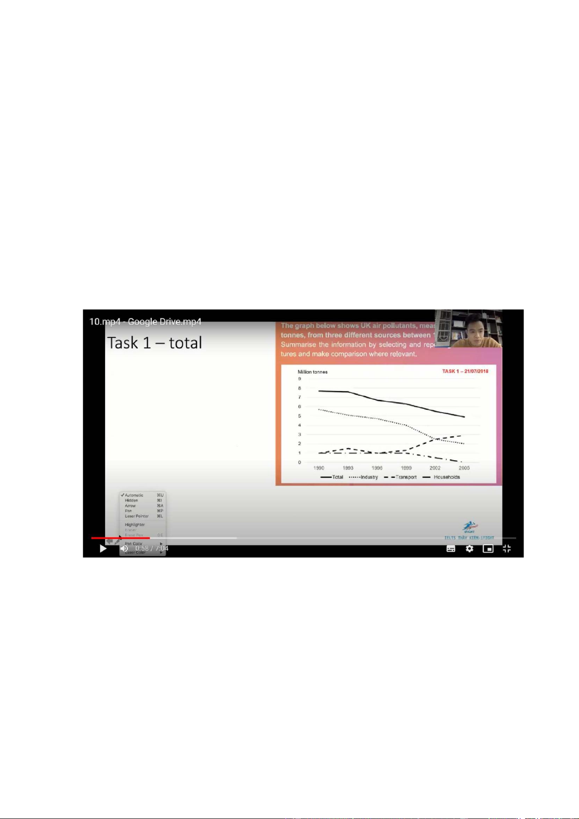
The chart illustrates how much toxic gasses were emitted into the atmosphere
from 3 different sources in the UK from 1990 to 2005
Overall there was a decline in the total amount of air pollution in the UK, which
was the result of decreases in the amounts of emmsions from industrial and
domestic activities. In addition, the amount of air pollutants released from
transport vehicles saw an increase, surpassing the industry sector to become the
most serious polluter from 2002 onwards
Just under 8 million tonnes of air pollutants were discharged from all 3 sectors,
with a gradual decline to 5 million tonnes at the end of the period. Similarly, the
figure for the industry sector decreased steadily from 6 million tonnes to exactly 2 million tonnes in 2005
The amount of toxic fumes released from the transport sector started at 1 million
tonnes, after which it experienced mild fluctuations at this level, before increasing
from about 1.2 millon tonnes in 1999 to shy of 3 million tonnes in 2005. Opposite
changes, but to a lesser extent, can be seen in the figures for household activities,
which contributed 1 million tonnes of air pollutants in the first 10 years, followed
by a progressive drop to almost 0 in 2005 No change
• ….., and the figures for….and…were/ are lower, at…and…. Respectively ,…. Followed by….. • While…., …
• Data…, compared to…. /as opposed to/ in comparison to….
• ……(Far) exceeds that of…and…, with respective figures being…and….
• …..was…, which was % higher than that of….. Examples
• The oil consumption in J was about 70 million tonnes, and the figures for
the UAE and Canada were lower, at 20 miilion and 35 million respectively
• The oil consumption in J was highest, at 70 million tonnes, followed by Canada and the UAE
• The oil consumption in J far exceeded that of the UAE and Canada, with
respective figures being 70 million, 20 million nd 35 million tonnes
• The oil consumption in J (about 70 million tonnes) was far higher than that
of the UAE and C, which was 20 million and 35 million respectively
• About 70 million tonnes of oil was consumed in J, compared to about 20
million in the UAE and 35 million in C Other structures (comparing+adding info)
• Developing countries are more reliant on alternative energy production
than developed countries (around 69% and 20% respectively)
• Solar power accounts for far less of the total energy production than gas or
coal does, and the figures are 2%, 20% and 60% respectively
• The middle east produces twice as much oil as Europe throughout the
period, with respective figures being…..
• The oil production in the Middle east was double that of Europe throughout the period
• Western countries consume 3 times as much oil as the middle east almost over the period
• Russoa consumes slightly more oil than G
• The production of oil in the Middle east and europe is equal/ the same/ similar No change- Overview
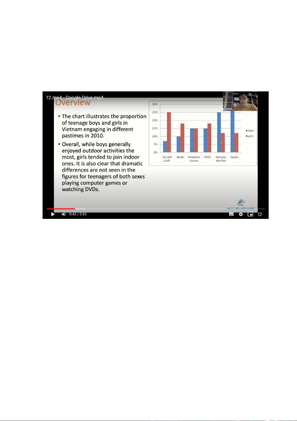
The chart illustrates the proportion of teengae boys and girls in V engagin in different pastimes in 2010
Overall, while boys generally enjoyed outdoor activities the most, girls tend to
join indoor ones. It is also clear that dramatic differences are not seen in the figures
for teenagers of both sexes playing computer games or watching dvds
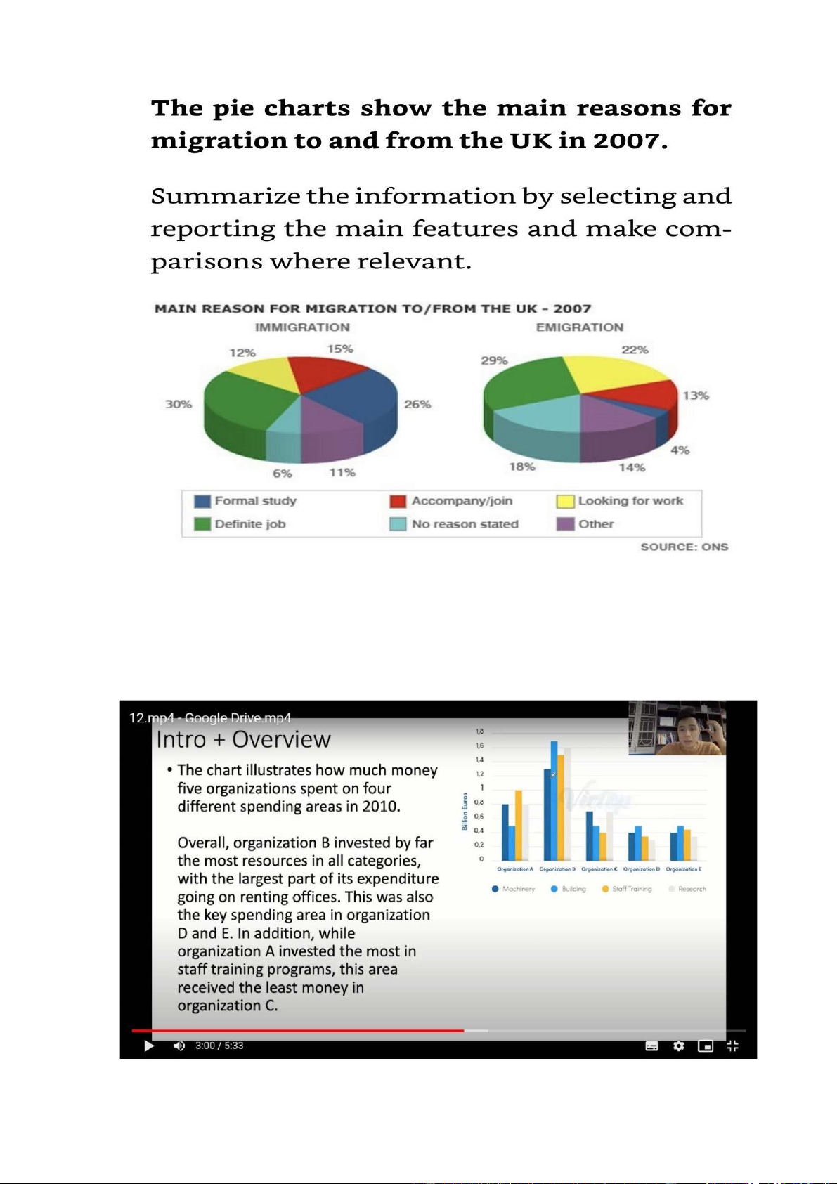
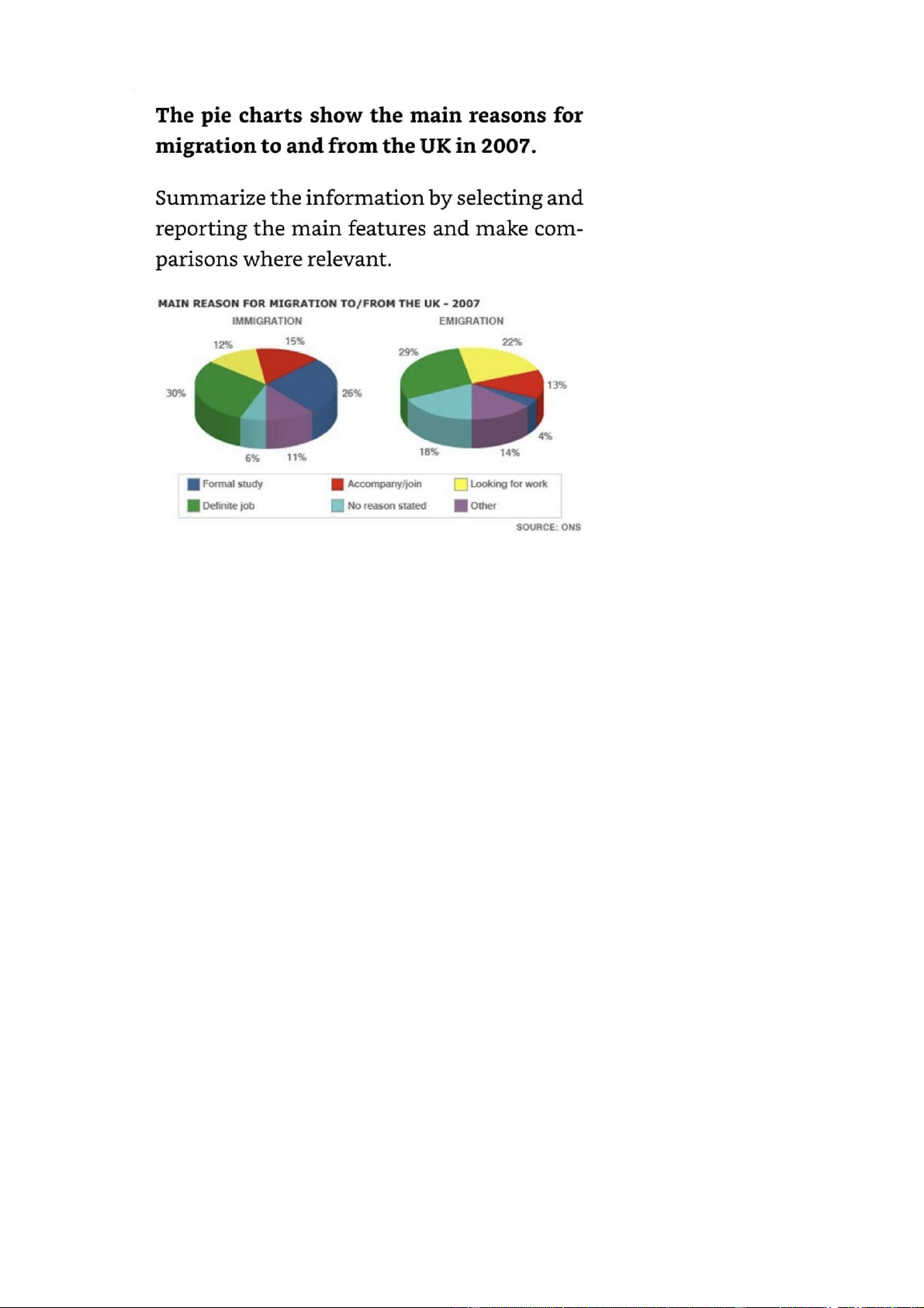
The chart illustrate why ppl migrated to and from the UK in 2007
Overall, the percentage of ppl moving in or out of the UK to undertake a
permanent jo was highest in both charts. In addition, the figure for those who came
to the UK to pursue a formal education was also significant, but this is the least stated factor among emigrants
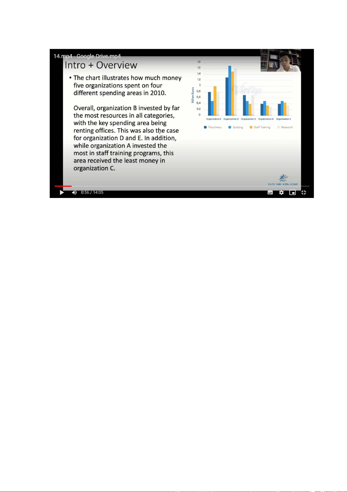
The chart illustrates how much money five organizations spent on 4 different spending areas in 2010
Overall, organization B invested by far the most resources in all categories, with
the largest part of its expenditure going on renting offices. This was also the key
spending area in organization D and E. In addition, while organization A invested
the most in staff training programs, this area received the least money in organization C
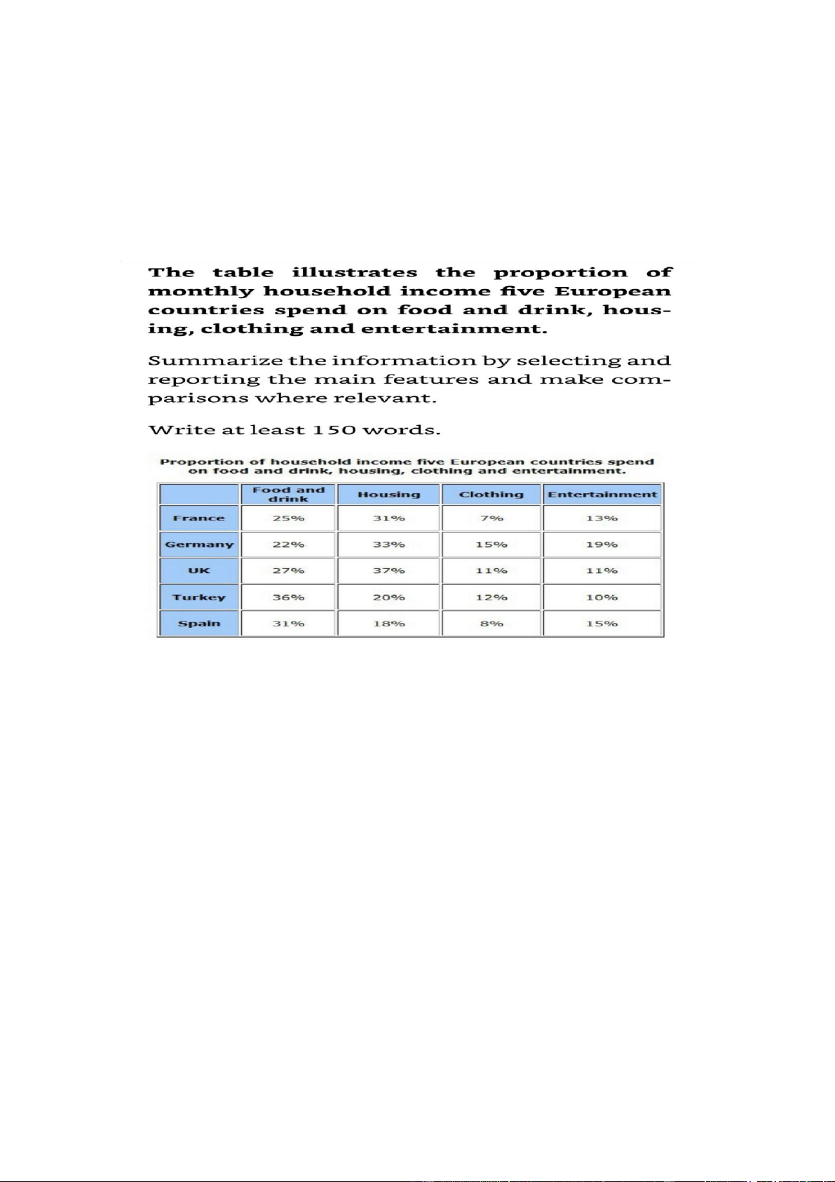
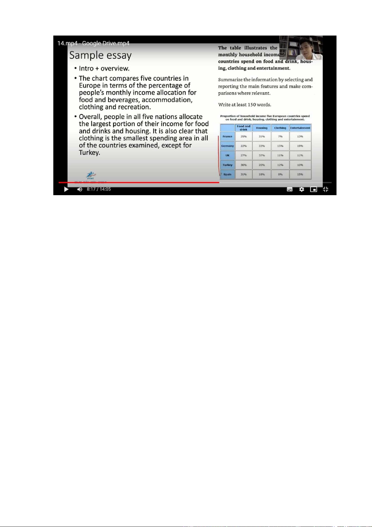
The chart compares five countries in Europe in terms of the percentage of people’s
monthly income allocation for food and beverages, accomodation, clothing and recreation
Overall, ppl in all 5 nations allocate the largest proportion of their income for food
and drinks and housing. It is also clear that clothing is the smallest spending area
in all of the countries examined, except for Turkey 2 items
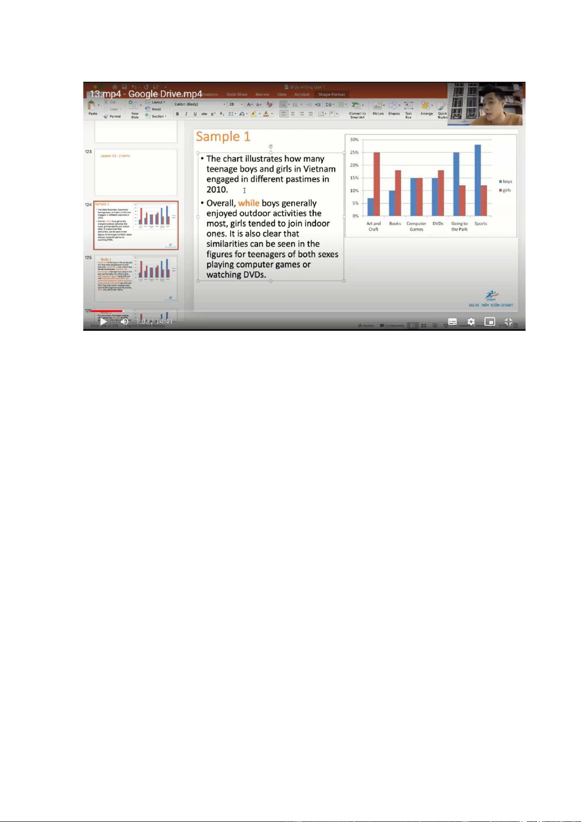
The chart illustrates how many teenage boys and girls in VN engaged in different pastimes in 2010
Overall, while boys generally enjoyed outdoor activities the most, girls tended to
join indoor ones. It is also clear that similarities can be seen in the figures for
teenagers of both sexes playing computer games or watching DVDs.
About 27% of the boys in the survey said that they often played sports in their free
time, compared to only 12% of their female counterparts. Similarly, the
percentage of teenage boys going to the park was far higher than that of girls, with
respective figures being 25% and 12%. Dramatic differences were also seen in the
proportion of girls and boys doing art and craft, which was 25% and 4% in that
order. As for reading books, around 18% of girls enjoyed this activity, while only 10% of boys did so
The percentage of teenagers playing video games was the same for both genders,
with 15% of the total boys and girls in the survey having this leisure pursuit. While
15% of boys also chose to watch DVDs in their leisure time, a slightly higher
percentage of girls (approximately 18%) did the same
The charts illustrate why ppl migrated to and from the uk in 2007
Overall, the percentage of ppl moving in or out of the uk to undertake a permament
job was highest in both charts. In addition, the figure for those who came to the
UK to pursue a formal education was also significant, but this is the least stated factor among emigrants
The proportion of ppl who went to the UK assume a permanent position in
companies base in this country is similar to that of those who left the country for
the same reason, with respective figures being 30% and 29%. Similarities can also
be seen in the percentage of ppl whose reason for migration is to accompany their
relatives, which is 15% for immigration and 13% for emigration
Regarding categories with pronounced differences, while 26% of the immigrants
said that they entered the UK for academic pursuits, this is only the case for a
mere 4% of emigrants. Meanwhile, 22% of the ppl who moved out of the UK said
that they did so in order to find work, compared to only 12% of immigrants.
Finally, the percentage of ppl who gave other reasons or no reason for emigration
was 32%, which was almost double that of their immigrant counterparts
No change- a lot of information
The chart illustrates how much money five organizations spent on 4 different spending areas in 2010
Overall, organization B invested by far the most resources in all categories, with
the key spending are being renting offices. This was also the case for organization
D and E. In addition, while organization A invested the most in satff training
programs, this arae received the least money in organization C
Regarding organization B, its spending on building was 1.7 billion Euros in 2010,
compared to around 0.5 billion in the remaining 4 organizations. Similarly, 1.6
billion Euros was invested in research in organization B, doubling that of
organization A. The figures for organization C,D and E were lower, at about 0.7, 0.3 and 0.35 respectively
Staff training cost the most in organization A, at 1 billion Euros, which was still
0.5 billion smaller than that of organization B. The figures for the remaining 3
organizations were around 0.4 billion. Organization B spent 1.3 billion on
machinery, followed by organization A (0.8 billion), and organization C( 0.7
billion), while both generation D and E used only 0.4 billion for this area
The chart compares five countries in Europe in terms of the percentage of ppl’s
monthly income allocation for food and beverages, accomodation, clothing and recreation
Overall, ppl in all 5 nations allocate the largest proportion of their income for food
and drinks and housing. It is also clear that clothing is the smallest spenidng area
in all of the countries examined, except for Turkey
The percentage of money used for food and drink in Turkey is highest, accounting
for 36% of residents’income, and the figures for Spain and the UK are lower at
31% and 27% respectively. In addition, ppl in G and F allocated around 25% their
monthly earnings for this spending area. By contrast, 37% of ppl’s income is
expended on accomoodation in the UK, compared to 33% in G and 31% in F.
Meanwhile, the figures for T and S are about 20%
Clothing accounts for 15% of how much ppl earn monthly in G, doubling that of
F and S. Meanwhile, the spending on clothing in the UK and Turkey is similar,
with respective figures being 11% and 12%. Finally 19% of G households’income
goes into entertainment, in comparison with 15% in S and 13% in F. The
expenditure on recreational activities in the UK and T is almost the same, at around 10% Mixed charts
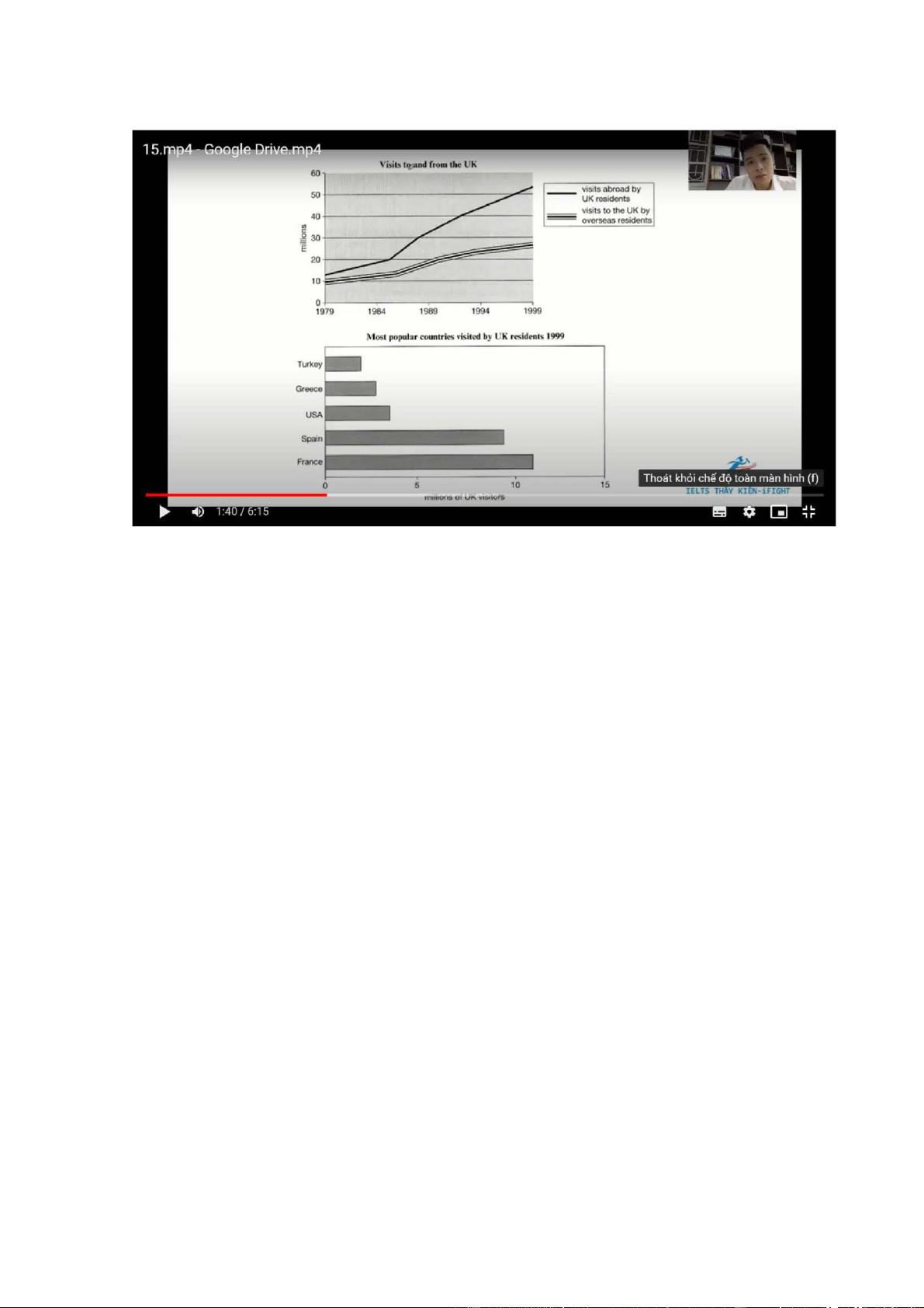
The line graph illustrates the number of UK residents going abroad and overseas
residents visiting the UK btw 1979 and 1999. The bar chart gives information
about how many UK residents travelled to 5 of the most popular countries in 1999
Overall there was an increase in the number of visits to and from the UK and there
were more visits abroad by UK residents than to the UK by overseas residents
over the period given. In addition, the most popular country to visit by UK residents was F in 1999
The number of UK residents visiting overseas began at just under 15 million, after
which it rose significantly to reach over 50 million in 1999. Similar changes, but
to a lesser extent, can be seen in the figures for overseas residents visiting the UK,
which had climed steadily from 10 million in 1979 to just under 30 million by the final year
In 1999 F was visited by over 10 million UK residents, followed by S at
approximately 9 million The figures for the USA and Greece were lower, at about
4 million and 3 million visitors respectively. The least popular country visited was
T, which had only about 2 million UK residents going there
Tài liệu liên quan:
-
Study English 2 key - Tiếng anh tăng cường | Trường Đại học Tài chính - Ngân hàng Hà Nội
543 272 -
Self Study English - Tiếng anh tăng cường | Trường Đại học Tài chính - Ngân hàng Hà Nội
1.4 K 675 -
Study Material ( English 3) - Tiếng anh tăng cường | Trường Đại học Tài chính - Ngân hàng Hà Nội
2.1 K 1.1 K -
Reading true false - Tiếng anh tăng cường | Trường Đại học Tài chính - Ngân hàng Hà Nội
1.1 K 529 -
Examen blanc - Tiếng anh tăng cường | Trường Đại học Tài chính - Ngân hàng Hà Nội
296 148