Lecture note môn android đại học bách khoa hà nôi
lecture note
Môn: Phát triển ứng dụng cho thiết bị di động 23 tài liệu
Trường: Đại học Bách Khoa Hà Nội 5.7 K tài liệu
Tác giả:
Preview text:
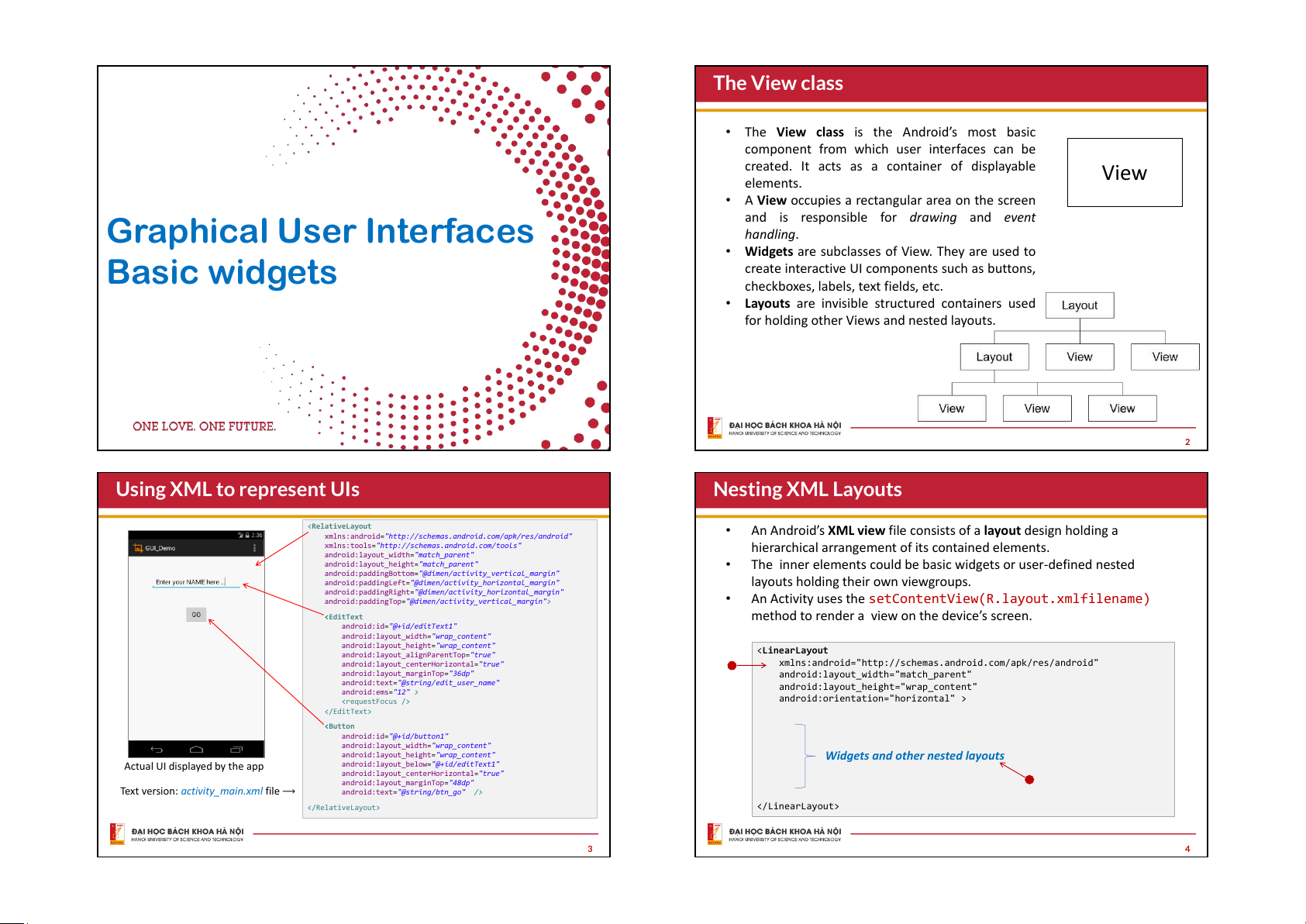
The View class
• The View class is the Android’s most basic
component from which user interfaces can be
created. It acts as a container of displayable View elements.
• A View occupies a rectangular area on the screen
Graphical User Interfaces
and is responsible for drawing and event handling.
• Widgets are subclasses of View. They are used to Basic widgets
create interactive UI components such as buttons,
checkboxes, labels, text fields, etc.
• Layouts are invisible structured containers used
for holding other Views and nested layouts. 2
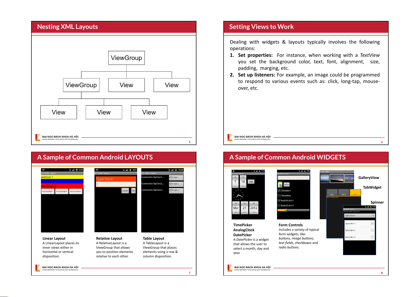
Using XML to represent UIs Nesting XML Layouts <RelativeLayout •
An Android’s XML view file consists of a layout design holding a
xmlns:android="http://schemas.android.com/apk/res/android"
xmlns:tools="http://schemas.android.com/tools"
hierarchical arrangement of its contained elements.
android:layout_width="match_parent"
android:layout_height="match_parent" •
The inner elements could be basic widgets or user-defined nested
android:paddingBottom="@dimen/activity_vertical_margin"
android:paddingLeft="@dimen/activity_horizontal_margin"
layouts holding their own viewgroups.
android:paddingRight="@dimen/activity_horizontal_margin"
android:paddingTop="@dimen/activity_vertical_margin"> •
An Activity uses the setContentView(R.layout.xmlfilename)
method to render a view on the device’s screen.
android:id="@+id/editText1"
android:layout_width="wrap_content"
android:layout_height="wrap_content" <
android:layout_alignParentTop="true" LinearLayout
android:layout_centerHorizontal="true"
xmlns:android="http://schemas.android.com/apk/res/android"
android:layout_marginTop="36dp"
android:layout_width="match_parent"
android:text="@string/edit_user_name"
android:layout_height="wrap_content" android:ems="12" >
android:orientation="horizontal" > android:id="@+id/button1"
android:layout_width="wrap_content"
android:layout_height="wrap_content"
Widgets and other nested layouts Actual UI displayed by the app
android:layout_below="@+id/editText1"
android:layout_centerHorizontal="true"
android:layout_marginTop="48dp"
Text version: activity_main.xml file ⟶ android:text="@string/btn_go" /> 3 4 Nesting XML Layouts Setting Views to Work
Dealing with widgets & layouts typically involves the following operations:
1. Set properties: For instance, when working with a TextView
you set the background color, text, font, alignment, size, padding, marging, etc.
2. Set up listeners: For example, an image could be programmed
to respond to various events such as: click, long-tap, mouse- over, etc. 5 6
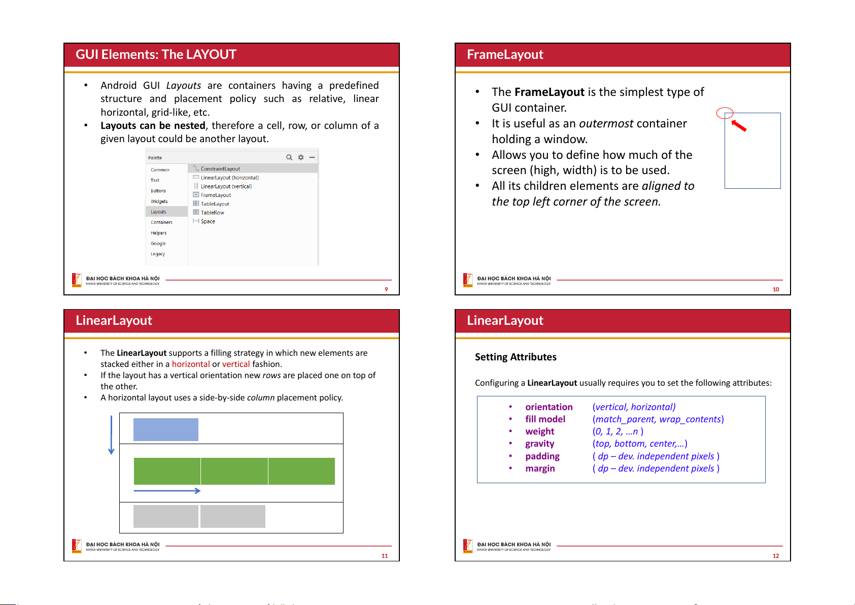
A Sample of Common Android LAYOUTS
A Sample of Common Android WIDGETS GalleryView TabWidget Spinner TimePicker Form Controls AnalogClock Includes a variety of typical DatePicker form widgets, like: Linear Layout Relative Layout Table Layout
A DatePicker is a widget
buttons, image buttons, A LinearLayout places its A RelativeLayout is a A TableLayout is a that allows the user to
text fields, checkboxes and inner views either in ViewGroup that allows ViewGroup that places select a month, day and radio buttons. horizontal or vertical you to position elements elements using a row & year. disposition. relative to each other. column disposition. 7 8
GUI Elements: The LAYOUT FrameLayout
• Android GUI Layouts are containers having a predefined
• The FrameLayout is the simplest type of
structure and placement policy such as relative, linear horizontal, grid-like, etc. GUI container.
• Layouts can be nested, therefore a cell, row, or column of a
• It is useful as an outermost container
given layout could be another layout. holding a window.
• Allows you to define how much of the
screen (high, width) is to be used.
• All its children elements are aligned to
the top left corner of the screen. 9 10 LinearLayout LinearLayout •
The LinearLayout supports a filling strategy in which new elements are Setting Attributes
stacked either in a horizontal or vertical fashion. •
If the layout has a vertical orientation new rows are placed one on top of the other.
Configuring a LinearLayout usually requires you to set the following attributes: •
A horizontal layout uses a side-by-side column placement policy. • orientation (vertical, horizontal) • fill model
(match_parent, wrap_contents) • weight (0, 1, 2, …n ) • gravity
(top, bottom, center,…) • padding
( dp – dev. independent pixels ) • margin
( dp – dev. independent pixels ) 11 12
LinearLayout : Orientation
LinearLayout : Fill Model
The android:orientation •
xmlns:android="http://schemas.android.com/apk/res/and
Widgets have a "natural size“ based on their included text
property can be set to: horizontal roid"
android:id="@+id/myLinearLayout" (rubber band effect).
for columns, or vertical for rows.
android:layout_width="match_parent"
android:layout_height="match_parent"
• On occasions you may want your widget to have a specific
Use setOrientation() for
android:orientation="horizontal"
android:padding="4dp" >
space allocation (height, width) even if no text is initially runtime changes.
android:id="@+id/labelUserName"
provided (as is the case of the empty text box shown below). horizontal
android:layout_width="wrap_content"
android:layout_height="wrap_content"
android:background="#ffff0000" natural
android:text=" User Name " sizes empty screen
android:textColor="#ffffffff" space android:textSize="16sp"
android:textStyle="bold" />
android:id="@+id/ediName" v
android:layout_width="wrap_content" e
android:layout_height="wrap_content" r
android:text="Maria Macarena"
android:textSize="18sp" /> t i
android:id="@+id/btnGo" c
android:layout_width="wrap_content" a
android:layout_height="wrap_content" l android:text="Go"
android:textStyle="bold" /> 13 14
LinearLayout : Fill Model
LinearLayout : Fill Model
All widgets inside a LinearLayout must include ‘width’ and ‘height’ attributes. 125 dp
xmlns:android="http://schemas.android.com/apk/res/android" entire row
android:id="@+id/myLinearLayout"
(320 dp on medium resolution screens)
android:layout_width="match_parent"
android:layout_height="match_parent" android:layout_width
android:background="#ff0033cc"
android:orientation="vertical" android:layout_height Row-wise
android:padding="6dp" >
android:id="@+id/labelUserName"
android:layout_width="match_parent" Use all the row
Values used in defining height and width can be:
android:layout_height="wrap_content"
android:background="#ffff0066"
android:text="User Name" 1.
A specific dimension such as 125dp (device independent pixels dip )
android:textColor="#ff000000"
android:textSize="16sp"
android:textStyle="bold" /> 2.
wrap_content indicates the widget should just fill up its natural space.
android:id="@+id/ediName"
android:layout_width="match_parent"
android:layout_height="wrap_content" 3.
match_parent (previously called ‘fill_parent’) indicates the widget wants
android:textSize="18sp" />
to be as big as the enclosing parent.
android:id="@+id/btnGo"
android:layout_width="125dp" Specific size: 125dp
android:layout_height="wrap_content"
Medium resolution is: 320 x 480 dpi. android:text="Go"
Shown on a Gingerbread device
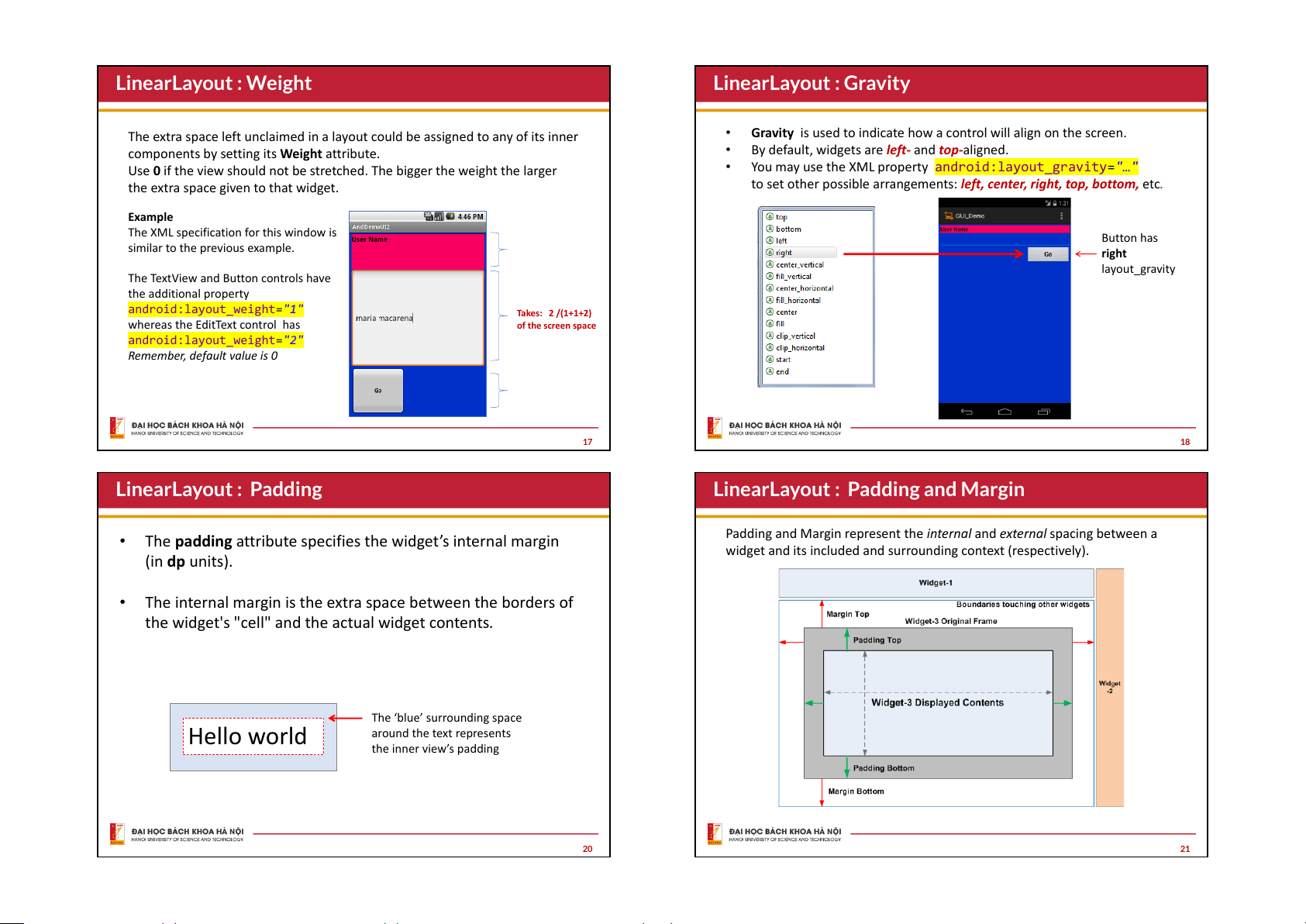
android:textStyle="bold" /> 15 16 LinearLayout : Weight LinearLayout : Gravity
The extra space left unclaimed in a layout could be assigned to any of its inner •
Gravity is used to indicate how a control will align on the screen.
components by setting its Weight attribute. •
By default, widgets are left- and top-aligned.
Use 0 if the view should not be stretched. The bigger the weight the larger •
You may use the XML property android:layout_gravity="…"
the extra space given to that widget.
to set other possible arrangements: left, center, right, top, bottom, etc. Example
The XML specification for this window is Button has
similar to the previous example. right layout_gravity
The TextView and Button controls have the additional property
android:layout_weight="1" Takes: 2 /(1+1+2)
whereas the EditText control has of the screen space android:layout_weight="2"
Remember, default value is 0 17 18 LinearLayout : Padding
LinearLayout : Padding and Margin
• The padding attribute specifies the widget’s internal margin
Padding and Margin represent the internal and external spacing between a
widget and its included and surrounding context (respectively). (in dp units).
• The internal margin is the extra space between the borders of
the widget's "cell" and the actual widget contents.
The ‘blue’ surrounding space Hello world around the text represents the inner view’s padding 20 21
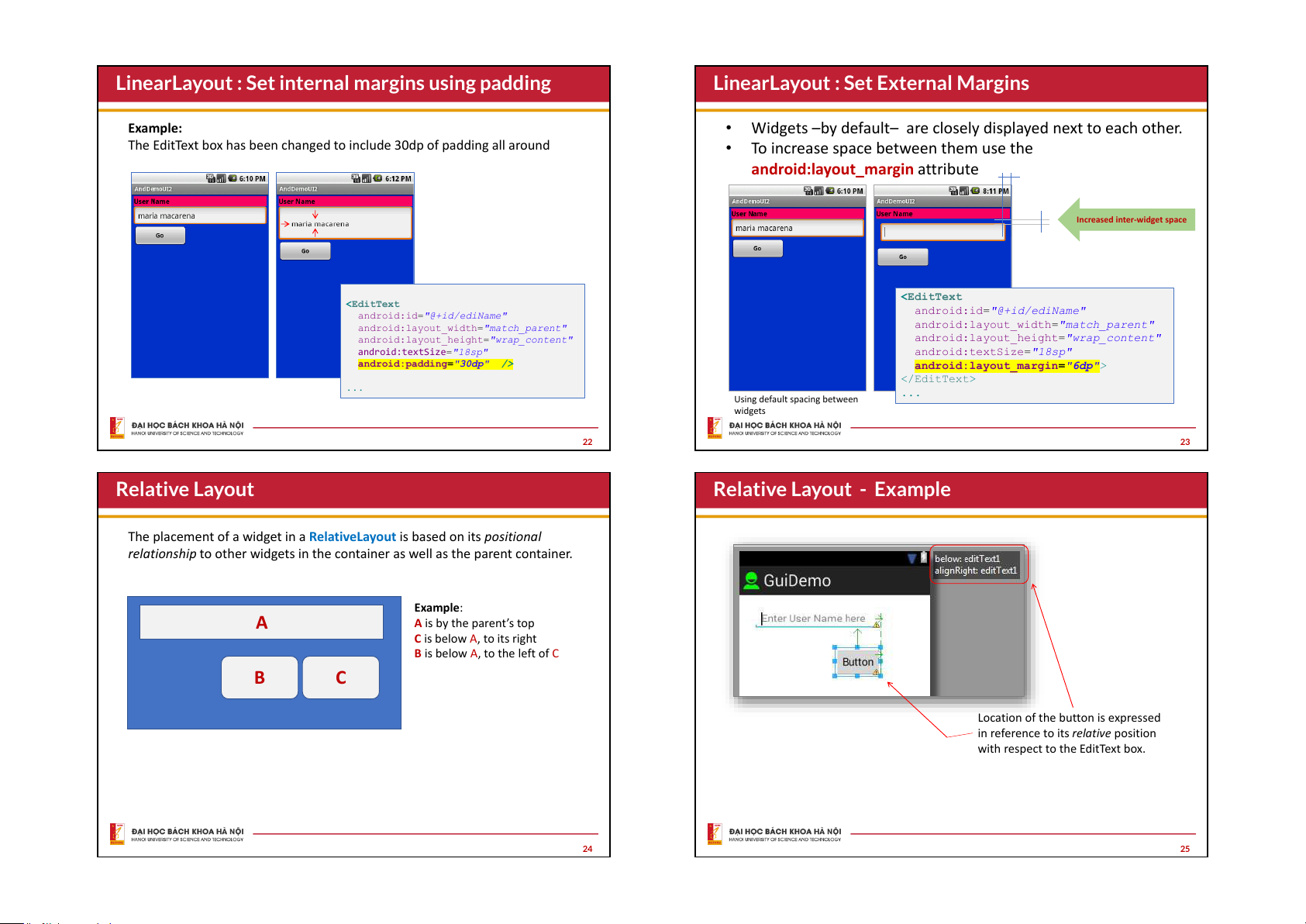
LinearLayout : Set internal margins using padding
LinearLayout : Set External Margins Example:
• Widgets –by default– are closely displayed next to each other.
The EditText box has been changed to include 30dp of padding all around
• To increase space between them use the
android:layout_margin attribute
Increased inter-widget space
android:id="@+id/ediName" android:id="@+id/ediName"
android:layout_width="match_parent"
android:layout_width="match_parent"
android:layout_height="wrap_content"
android:layout_height="wrap_content"
android:textSize="18sp"
android:textSize="18sp"
android:padding="30dp" />
android:layout_margin="6dp"> ... ... Using default spacing between widgets 22 23 Relative Layout
Relative Layout - Example
The placement of a widget in a RelativeLayout is based on its positional
relationship to other widgets in the container as well as the parent container. Example: A
A is by the parent’s top
C is below A, to its right
B is below A, to the left of C B C
Location of the button is expressed
in reference to its relative position
with respect to the EditText box. 24 25
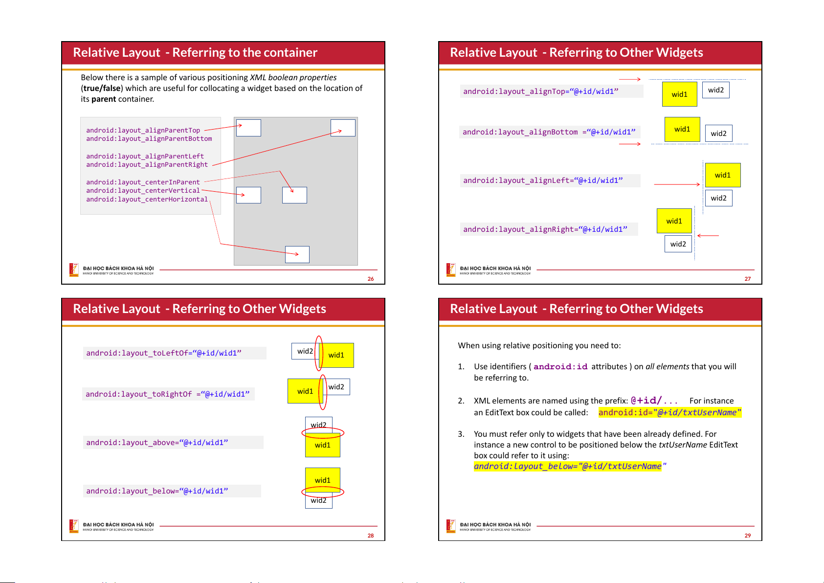
Relative Layout - Referring to the container
Relative Layout - Referring to Other Widgets
Below there is a sample of various positioning XML boolean properties
(true/false) which are useful for collocating a widget based on the location of android:layout_alignTop wid2 =“@+id/wid1” wid1 its parent container. android:layout_alignParentTop wid1
android:layout_alignBottom =“@+id/wid1” wid2
android:layout_alignParentBottom android:layout_alignParentLeft
android:layout_alignParentRight wid1 android:layout_centerInParent
android:layout_alignLeft=“@+id/wid1” android:layout_centerVertical
android:layout_centerHorizontal wid2 wid1
android:layout_alignRight=“@+id/wid1” wid2 26 27
Relative Layout - Referring to Other Widgets
Relative Layout - Referring to Other Widgets
When using relative positioning you need to: wid2
android:layout_toLeftOf=“@+id/wid1” wid1 1.
Use identifiers ( android:id attributes ) on all elements that you will be referring to. wid2 wid1
android:layout_toRightOf =“@+id/wid1” 2.
XML elements are named using the prefix: @+id/... For instance
an EditText box could be called: android:id="@+id/txtUserName" wid2 3.
You must refer only to widgets that have been already defined. For
android:layout_above=“@+id/wid1” wid1
instance a new control to be positioned below the txtUserName EditText box could refer to it using:
android:layout_below="@+id/txtUserName" wid1
android:layout_below=“@+id/wid1” wid2 28 29
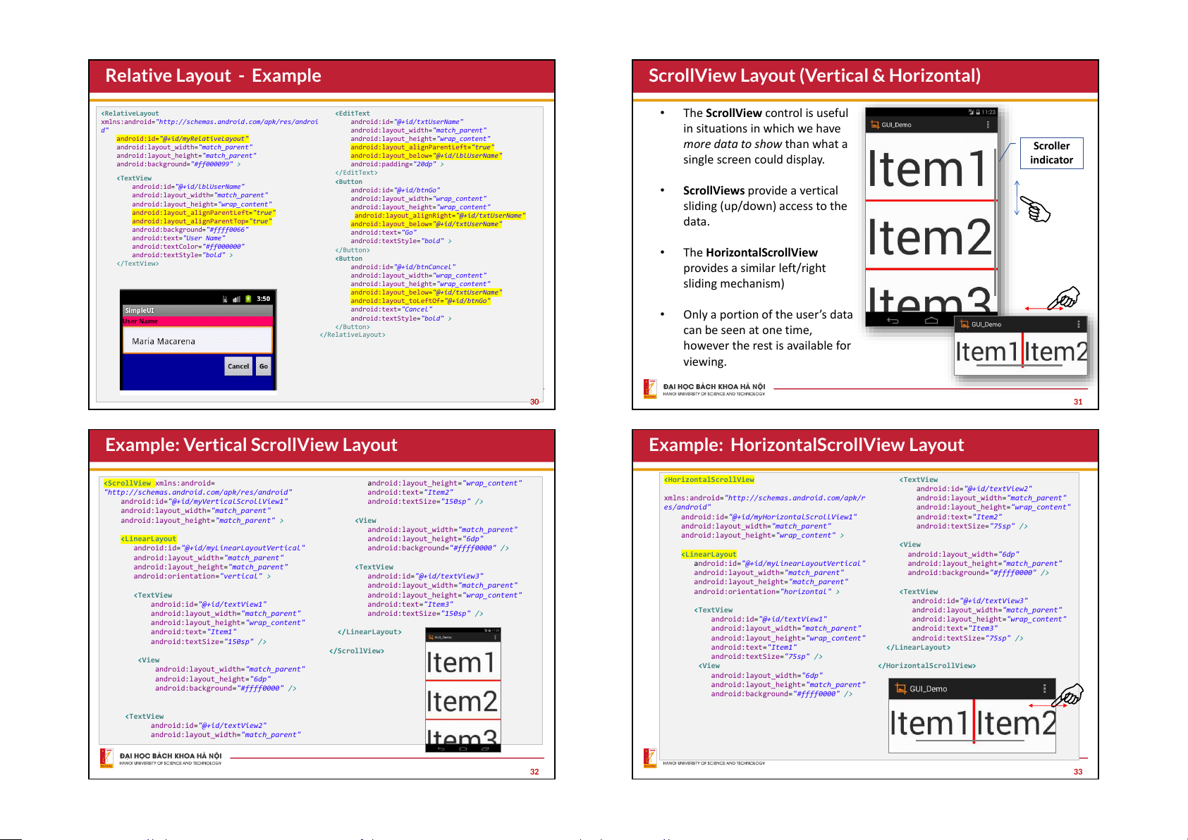
Relative Layout - Example
ScrollView Layout (Vertical & Horizontal) •
The ScrollView control is useful
xmlns:android="http://schemas.android.com/apk/res/androi android:id="@+id/txtUserName" d"
android:layout_width="match_parent"
in situations in which we have
android:id="@+id/myRelativeLayout"
android:layout_height="wrap_content"
android:layout_width="match_parent"
android:layout_alignParentLeft="true"
more data to show than what a Scroller
android:layout_height="match_parent"
android:layout_below="@+id/lblUserName" single screen could display. indicator
android:background="#ff000099" >
android:padding="20dp" >
android:id="@+id/lblUserName"
android:id="@+id/btnGo" •
ScrollViews provide a vertical
android:layout_width="match_parent"
android:layout_width="wrap_content"
android:layout_height="wrap_content"
android:layout_height="wrap_content"
sliding (up/down) access to the
android:layout_alignParentLeft="true"
android:layout_alignRight="@+id/txtUserName"
android:layout_alignParentTop="true"
android:layout_below="@+id/txtUserName" data.
android:background="#ffff0066" android:text="Go"
android:text="User Name"
android:textStyle="bold" >
android:textColor="#ff000000"
android:textStyle="bold" > •
The HorizontalScrollView
android:id="@+id/btnCancel" provides a similar left/right
android:layout_width="wrap_content"
android:layout_height="wrap_content" sliding mechanism)
android:layout_below="@+id/txtUserName"
android:layout_toLeftOf="@+id/btnGo" android:text="Cancel" •
Only a portion of the user’s data
android:textStyle="bold" > can be seen at one time,
however the rest is available for viewing. 30 31
Example: Vertical ScrollView Layout
Example: HorizontalScrollView Layout xmlns:android=
android:layout_height="wrap_content"
"http://schemas.android.com/apk/res/android" android:text="Item2"
android:id="@+id/textView2"
android:id="@+id/myVerticalScrollView1"
android:textSize="150sp" />
xmlns:android="http://schemas.android.com/apk/r android:layout_width="match_parent"
android:layout_width="match_parent" es/android"
android:layout_height="wrap_content"
android:layout_height="match_parent" >
android:id="@+id/myHorizontalScrollView1" android:text="Item2"
android:layout_width="match_parent"
android:layout_width="match_parent"
android:textSize="75sp" />
android:layout_height="wrap_content" >
android:layout_height="6dp"
android:id="@+id/myLinearLayoutVertical"
android:background="#ffff0000" />
android:layout_width="match_parent"
android:layout_width="6dp"
android:layout_height="match_parent"
android:id="@+id/myLinearLayoutVertical" android:layout_height="match_parent"
android:orientation="vertical" >
android:id="@+id/textView3"
android:layout_width="match_parent"
android:background="#ffff0000" />
android:layout_width="match_parent"
android:layout_height="match_parent"
android:orientation="horizontal" >
android:layout_height="wrap_content"
android:id="@+id/textView1" android:text="Item3"
android:id="@+id/textView3"
android:layout_width="match_parent"
android:textSize="150sp" />
android:layout_width="match_parent"
android:layout_height="wrap_content"
android:id="@+id/textView1"
android:layout_height="wrap_content" android:text="Item1"
android:layout_width="match_parent" android:text="Item3"
android:textSize="150sp" />
android:layout_height="wrap_content" android:textSize="75sp" />
android:text="Item1"
android:textSize="75sp" />
android:layout_width="match_parent"
android:layout_height="6dp"
android:layout_width="6dp"
android:background="#ffff0000" />
android:layout_height="match_parent"
android:background="#ffff0000" />
android:id="@+id/textView2"
android:layout_width="match_parent" 32 33
Connecting layouts to Kotlin code
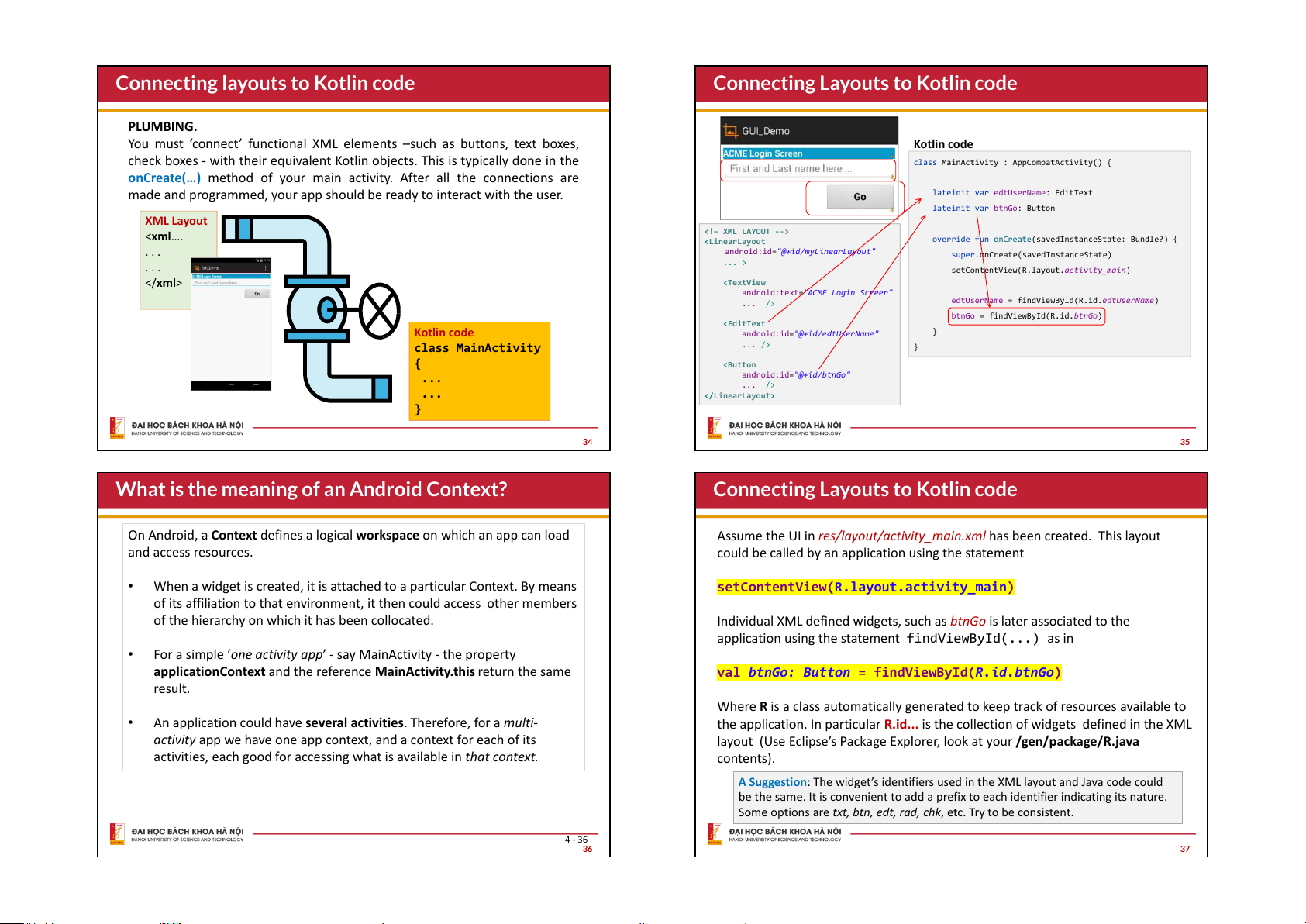
Connecting Layouts to Kotlin code PLUMBING.
You must ‘connect’ functional XML elements –such as buttons, text boxes, Kotlin code
check boxes - with their equivalent Kotlin objects. This is typically done in the
class MainActivity : AppCompatActivity() {
onCreate(…) method of your main activity. After all the connections are
made and programmed, your app should be ready to interact with the user.
lateinit var edtUserName: EditText lateinit var btnGo: Button XML Layout <xml….
<!– XML LAYOUT -->
override fun onCreate(savedInstanceState: Bundle?) { . . .
android:id="@+id/myLinearLayout"
super.onCreate(savedInstanceState) . . . ... >
setContentView(R.layout.activity_main) xml>
android:text="ACME Login Screen"
edtUserName = findViewById(R.id.edtUserName) ... />
btnGo = findViewById(R.id.btnGo) Kotlin code }
android:id="@+id/edtUserName" class MainActivity ... /> } { ... android:id="@+id/btnGo" ... /> ... } 34 35
What is the meaning of an Android Context?
Connecting Layouts to Kotlin code
On Android, a Context defines a logical workspace on which an app can load
Assume the UI in res/layout/activity_main.xml has been created. This layout and access resources.
could be called by an application using the statement •
When a widget is created, it is attached to a particular Context. By means
setContentView(R.layout.activity_main)
of its affiliation to that environment, it then could access other members
of the hierarchy on which it has been collocated.
Individual XML defined widgets, such as btnGo is later associated to the
application using the statement findViewById(...) as in •
For a simple ‘one activity app’ - say MainActivity - the property
applicationContext and the reference MainActivity.this return the same
val btnGo: Button = findViewById(R.id.btnGo) result.
Where R is a class automatically generated to keep track of resources available to •
An application could have several activities. Therefore, for a multi-
the application. In particular R.id... is the collection of widgets defined in the XML
activity app we have one app context, and a context for each of its
layout (Use Eclipse’s Package Explorer, look at your /gen/package/R.java
activities, each good for accessing what is available in that context. contents).
A Suggestion: The widget’s identifiers used in the XML layout and Java code could
be the same. It is convenient to add a prefix to each identifier indicating its nature.
Some options are txt, btn, edt, rad, chk, etc. Try to be consistent. 4 - 36 36 37
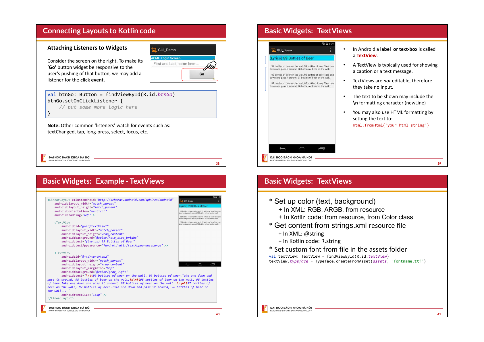
Connecting Layouts to Kotlin code
Basic Widgets: TextViews
Attaching Listeners to Widgets •
In Android a label or text-box is called a TextView.
Consider the screen on the right. To make its ‘Go’ •
A TextView is typically used for showing
button widget be responsive to the
user’s pushing of that button, we may add a a caption or a text message.
listener for the click event. •
TextViews are not editable, therefore they take no input.
val btnGo: Button = findViewById(R.id.btnGo) •
The text to be shown may include the
btnGo.setOnClickListener {
\n formatting character (newLine)
// put some more logic here } •
You may also use HTML formatting by setting the text to:
Note: Other common ‘listeners’ watch for events such as:
Html.fromHtml("your html string")
textChanged, tap, long-press, select, focus, etc. 38 39
Basic Widgets: Example - TextViews
Basic Widgets: TextViews
"http://schemas.android.com/apk/res/android"
* Set up color (text, background)
android:layout_width="match_parent"
android:layout_height="match_parent"
android:orientation="vertical"
+ In XML: RGB, ARGB, from resource
android:padding="6dp" >
+ In Kotlin code: from resource, from Color class
android:id="@+id/textView1"
* Get content from strings.xml resource file
android:layout_width="match_parent"
android:layout_height="wrap_content" + In XML: @string
android:background="@color/holo_blue_bright"
android:text="(Lyrics) 99 Bottles of Beer" + In Kotlin code: R.string
android:textAppearance="?android:attr/textAppearanceLarge" />
* Set custom font from file in the assets folder
android:id="@+id/textView2"
val textView: TextView = findViewById(R.id.textView)
android:layout_width="match_parent"
textView.typeface = Typeface.createFromAsset(assets, "fontname.ttf")
android:layout_height="wrap_content"
android:layout_marginTop="6dp"
android:background="@color/gray_light"
android:text="\n\t99 bottles of beer on the wall, 99 bottles of beer.Take one down and
pass it around, 98 bottles of beer on the wall.\n\n\t98 bottles of beer on the wall, 98 bottles
of beer.Take one down and pass it around, 97 bottles of beer on the wall. \n\n\t97 bottles of
beer on the wall, 97 bottles of beer.Take one down and pass it around, 96 bottles of beer on the wall... "
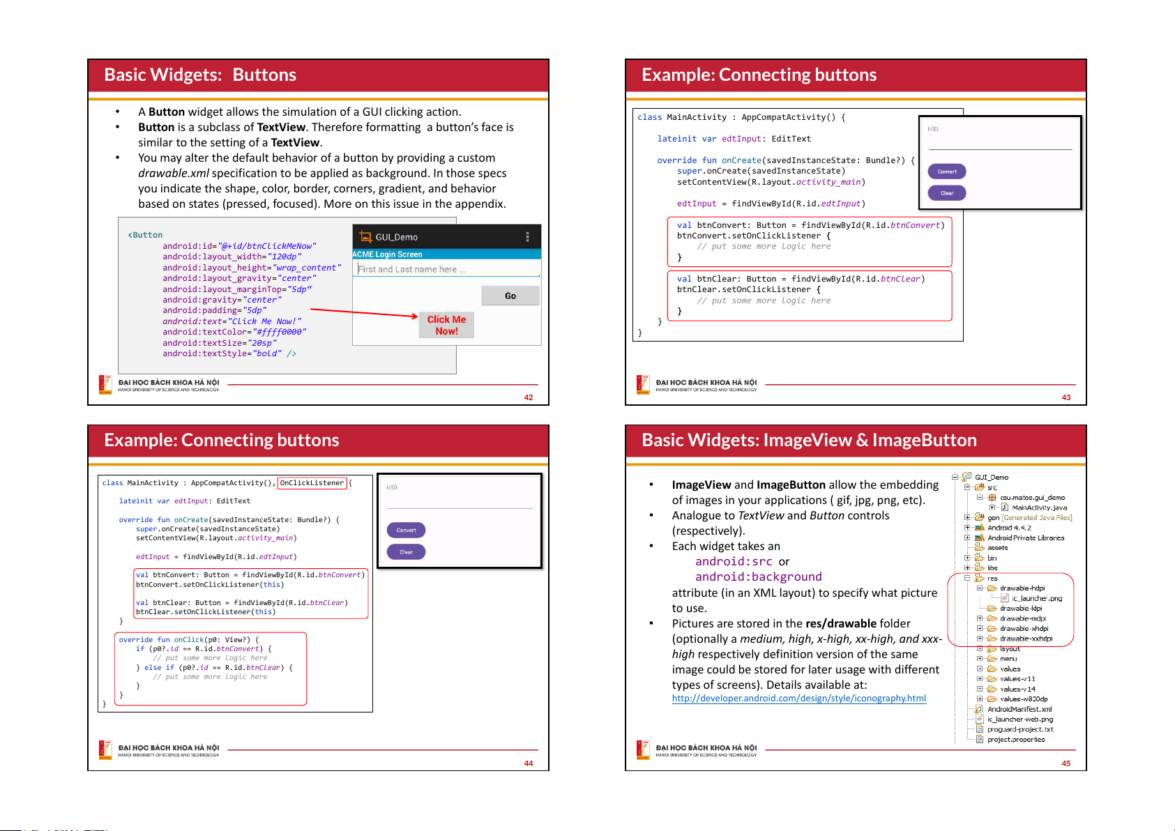
android:textSize="14sp" /> 40 41 Basic Widgets: Buttons
Example: Connecting buttons •
A Button widget allows the simulation of a GUI clicking action.
class MainActivity : AppCompatActivity() { •
Button is a subclass of TextView. Therefore formatting a button’s face is
similar to the setting of a TextView.
lateinit var edtInput: EditText •
You may alter the default behavior of a button by providing a custom
override fun onCreate(savedInstanceState: Bundle?) {
drawable.xml specification to be applied as background. In those specs
super.onCreate(savedInstanceState)
setContentView(R.layout.activity_main)
you indicate the shape, color, border, corners, gradient, and behavior
based on states (pressed, focused). More on this issue in the appendix.
edtInput = findViewById(R.id.edtInput)
val btnConvert: Button = findViewById(R.id.btnConvert)
btnConvert.setOnClickListener {
android:id="@+id/btnClickMeNow"
// put some more logic here
android:layout_width="120dp" }
android:layout_height="wrap_content"
android:layout_gravity="center"
val btnClear: Button = findViewById(R.id.btnClear)
android:layout_marginTop="5dp“
btnClear.setOnClickListener {
android:gravity="center"
// put some more logic here android:padding="5dp" }
android:text="Click Me Now!" }
android:textColor="#ffff0000" } android:textSize="20sp"
android:textStyle="bold" /> 42 43
Example: Connecting buttons
Basic Widgets: ImageView & ImageButton
class MainActivity : AppCompatActivity(), OnClickListener { •
ImageView and ImageButton allow the embedding
lateinit var edtInput: EditText
of images in your applications ( gif, jpg, png, etc). •
override fun onCreate(savedInstanceState: Bundle?) {
Analogue to TextView and Button controls
super.onCreate(savedInstanceState) (respectively).
setContentView(R.layout.activity_main) • Each widget takes an
edtInput = findViewById(R.id.edtInput) android:src or
val btnConvert: Button = findViewById(R.id.btnConvert) android:background
btnConvert.setOnClickListener(this)
attribute (in an XML layout) to specify what picture
val btnClear: Button = findViewById(R.id.btnClear)
btnClear.setOnClickListener(this) to use. } •
Pictures are stored in the res/drawable folder
override fun onClick(p0: View?) {
(optionally a medium, high, x-high, xx-high, and xxx-
if (p0?.id == R.id.btnConvert) {
// put some more logic here
high respectively definition version of the same
} else if (p0?.id == R.id.btnClear) {
image could be stored for later usage with different
// put some more logic here }
types of screens). Details available at: }
http://developer.android.com/design/style/iconography.html } 44 45
Basic Widgets: ImageView & ImageButton
Basic Widgets: Buttons - Combining Images & Text
xmlns:android="http://schemas.android.com/apk/res/android"
A common Button widget could display text and
android:layout_width="match_parent" a simple image as shown below
android:layout_height="match_parent"
android:padding="6dp"
android:orientation="vertical" > . . .
android:id="@+id/imgButton1"
android:layout_width="wrap_content"
android:layout_width="wrap_content"
android:layout_height="wrap_content"
android:layout_height="wrap_content"
android:drawableLeft="@drawable/ic_launcher"
android:src="@drawable/ic_launcher" >
android:gravity="left|center_vertical" android:padding="15dp"
android:text="Click me" />
android:id="@+id/imgView1"
android:layout_width="200dp"
android:layout_height="150dp"
android:scaleType="fitXY"
android:src="@drawable/flowers1" > 46 47
Basic Widgets: How icons are used in Android?
Basic Widgets: EditText Boxes
Icons are small images used to graphically represent mdpi (761 bytes) •
The EditText widget is an extension of
your application and/or parts of it. They may appear 1x = 48 x 48 pixels BaseLine
TextView that allows user’s input.
in different parts of your app including: hdpi (1.15KB) • Home screen 1.5x = 72 x 72 px •
In addition to plain text, this widget • Launcher window.
can display editable text formatted • Options menu •
with HTML-styles such as bold, italics, Action Bar x-hdpi (1.52KB) •
underline, etc ). This is done with Status bar 2x = 96 x 96 px • Multi-tab interface.
Html.fromHtml(html_text) • Pop-up dialog boxes • List view •
Moving data in and out of an EditText
Detailed information on Android’s iconography is available xx-hdpi (2.47KB)
box is usually done in Kotlin through 3x = 144 x 144 px at: the following methods:
http://developer.android.com/design/style/iconography.html
txtBox.setText(“someValue”) txtBox.text.toString() 48 49
Basic Widgets: EditText Boxes Example: Login-Screen
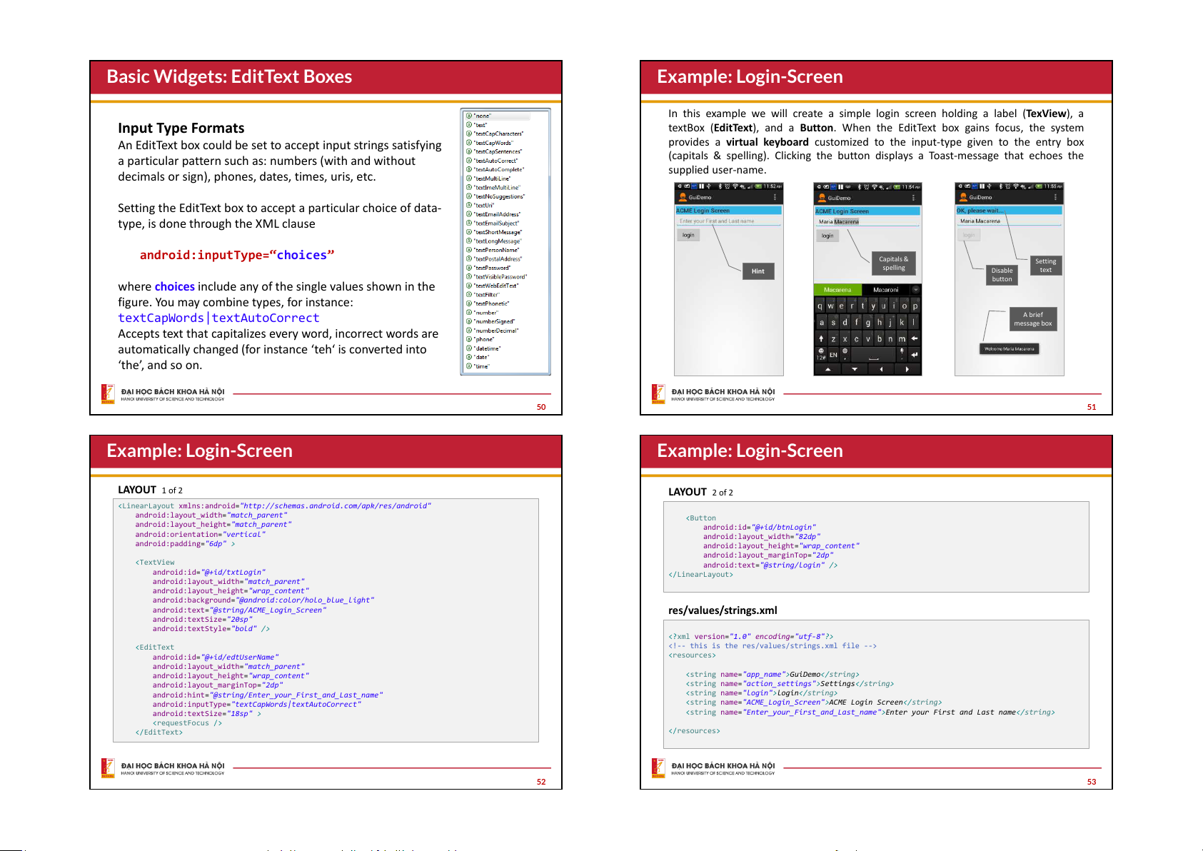
In this example we will create a simple login screen holding a label (TexView), a Input Type Formats
textBox (EditText), and a Button. When the EditText box gains focus, the system
An EditText box could be set to accept input strings satisfying
provides a virtual keyboard customized to the input-type given to the entry box
a particular pattern such as: numbers (with and without
(capitals & spelling). Clicking the button displays a Toast-message that echoes the supplied user-name.
decimals or sign), phones, dates, times, uris, etc.
Setting the EditText box to accept a particular choice of data-
type, is done through the XML clause
android:inputType=“choices” Capitals & Setting spelling Hint Disable text button
where choices include any of the single values shown in the
figure. You may combine types, for instance: textCapWords|textAutoCorrect A brief message box
Accepts text that capitalizes every word, incorrect words are
automatically changed (for instance ‘teh‘ is converted into ‘the’, and so on. 50 51 Example: Login-Screen Example: Login-Screen LAYOUT 1 of 2 LAYOUT 2 of 2
"http://schemas.android.com/apk/res/android"
android:layout_width="match_parent"
android:layout_height="match_parent"
android:id="@+id/btnLogin"
android:orientation="vertical"
android:layout_width="82dp"
android:padding="6dp" >
android:layout_height="wrap_content"
android:layout_marginTop="2dp"
android:text="@string/login" />
android:id="@+id/txtLogin"
android:layout_width="match_parent"
android:layout_height="wrap_content"
android:background="@android:color/holo_blue_light"
android:text="@string/ACME_Login_Screen" res/values/strings.xml android:textSize="20sp"
android:textStyle="bold" />
<?xml version="1.0" encoding="utf-8"?>
android:id="@+id/edtUserName"
android:layout_width="match_parent"
android:layout_height="wrap_content" "app_name">GuiDemo
android:layout_marginTop="2dp" "action_settings">Settings
android:hint="@string/Enter_your_First_and_Last_name" "login">login
android:inputType="textCapWords|textAutoCorrect"
"ACME_Login_Screen">ACME Login Screen
android:textSize="18sp" >
"Enter_your_First_and_Last_name">Enter your First and Last name 52 53
Example: Login-Screen - MainActivity code
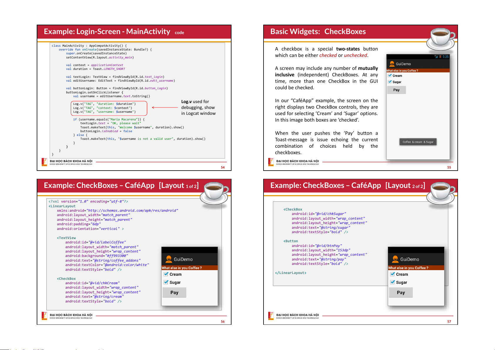
Basic Widgets: CheckBoxes
class MainActivity : AppCompatActivity() {
override fun onCreate(savedInstanceState: Bundle?) {
A checkbox is a special two-states button
super.onCreate(savedInstanceState)
which can be either checked or unchecked.
setContentView(R.layout.activity_main)
val context = applicationContext
val duration = Toast.LENGTH_SHORT
A screen may include any number of mutually
inclusive (independent) CheckBoxes. At any
val textLogin: TextView = findViewById(R.id.text_login)
val editUsername: EditText = findViewById(R.id.edit_username)
time, more than one CheckBox in the GUI
val buttonLogin: Button = findViewById(R.id.button_login) could be checked.
buttonLogin.setOnClickListener {
val username = editUsername.text.toString() Log.v used for
In our “CaféApp” example, the screen on the
Log.v("TAG", "duration: $duration")
Log.v("TAG", "context: $context") debugging, show
right displays two CheckBox controls, they are
Log.v("TAG", "username: $username") in Logcat window
used for selecting ‘Cream’ and ‘Sugar’ options.
if (username.equals("Maria Macarena")) {
In this image both boxes are ‘checked’.
textLogin.text = "OK, please wait"
Toast.makeText(this, "Welcome $username", duration).show()
buttonLogin.isEnabled = false
When the user pushes the ‘Pay’ button a } else {
Toast.makeText(this, "$username is not a valid user", duration).show()
Toast-message is issue echoing the current } } combination of choices held by the } checkboxes. } 54 55
Example: CheckBoxes – CaféApp [Layout 1 of 2]
Example: CheckBoxes – CaféApp [Layout 2 of 2]
<?xml version="1.0" encoding="utf-8"?>
xmlns:android="http://schemas.android.com/apk/res/android"
android:layout_width="match_parent"
android:id="@+id/chkSugar"
android:layout_height="match_parent"
android:layout_width="wrap_content" android:padding="6dp"
android:layout_height="wrap_content"
android:orientation="vertical" >
android:text="@string/sugar"
android:textStyle="bold" />
android:id="@+id/labelCoffee"
android:layout_width="match_parent"
android:id="@+id/btnPay"
android:layout_height="wrap_content"
android:layout_width="153dp"
android:background="#ff993300"
android:layout_height="wrap_content"
android:text="@string/coffee_addons"
android:text="@string/pay"
android:textColor="@android:color/white"
android:textStyle="bold" />
android:textStyle="bold" />
android:id="@+id/chkCream"
android:layout_width="wrap_content"
android:layout_height="wrap_content"
android:text="@string/cream"
android:textStyle="bold" /> 56 57
Example: CheckBoxes – CaféApp [@string/… ]
Example: CheckBoxes – CaféApp [Code]
Resources: res/values/strings
class MainActivity : AppCompatActivity() {
override fun onCreate(savedInstanceState: Bundle?) {
<?xml version="1.0" encoding="utf-8"?>
super.onCreate(savedInstanceState)
setContentView(R.layout.activity_main) "app_name">GuiDemo
val chkCream: CheckBox = findViewById(R.id.chkCream) "action_settings">Settings
val chkSugar: CheckBox = findViewById(R.id.chkSugar) "click_me">Click Me
val buttonLogin: Button = findViewById(R.id.btnPay) "sugar">Sugar
buttonLogin.setOnClickListener { "cream">Cream var msg = "Coffee "
"coffee_addons">What else in your coffee?
if (chkCream.isChecked) "pay">Pay msg += "& cream "
if (chkSugar.isChecked) msg += "& sugar "
Toast.makeText(applicationContext, msg, Toast.LENGTH_SHORT).show() } } } 58 59
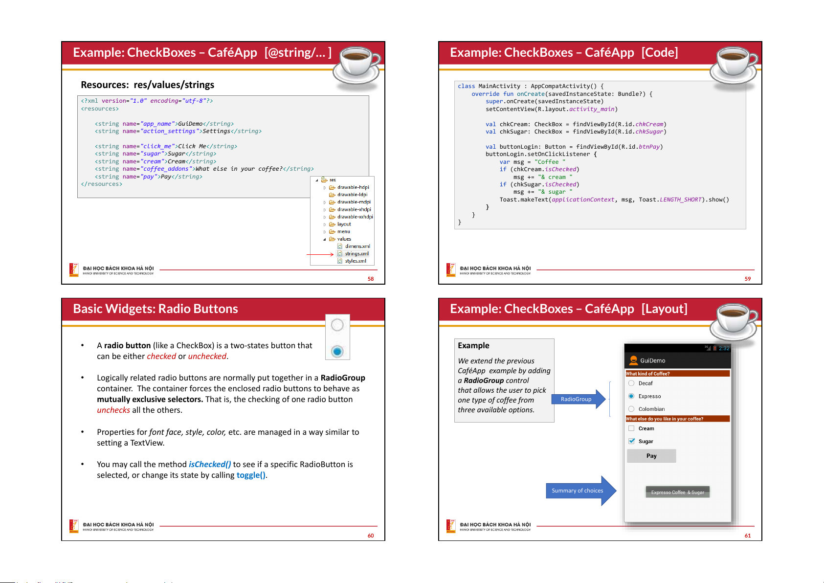
Basic Widgets: Radio Buttons
Example: CheckBoxes – CaféApp [Layout] •
A radio button (like a CheckBox) is a two-states button that Example
can be either checked or unchecked. We extend the previous
CaféApp example by adding •
Logically related radio buttons are normally put together in a RadioGroup
a RadioGroup control
container. The container forces the enclosed radio buttons to behave as
that allows the user to pick
mutually exclusive selectors. That is, the checking of one radio button
one type of coffee from RadioGroup
unchecks all the others.
three available options. •
Properties for font face, style, color, etc. are managed in a way similar to setting a TextView. •
You may call the method isChecked() to see if a specific RadioButton is
selected, or change its state by calling toggle(). Summary of choices 60 61
Example: CheckBoxes – CaféApp [Layout]
Example: CheckBoxes – CaféApp [MainActivity]
Only new XML and Kotlin code is shown
class MainActivity : AppCompatActivity() {
override fun onCreate(savedInstanceState: Bundle?) {
android:id="@+id/textView1"
super.onCreate(savedInstanceState)
android:layout_width="match_parent"
android:id="@+id/radioGroupCoffeeType"
setContentView(R.layout.activity_main)
android:layout_height="wrap_content"
android:layout_width="match_parent"
android:background="#ff993300"
android:layout_height="wrap_content" >
val chkCream: CheckBox = findViewById(R.id.chkCream)
android:text="@string/kind_of_coffee"
val chkSugar: CheckBox = findViewById(R.id.chkSugar)
android:textColor="#ffffff"
android:textStyle="bold" />
android:id="@+id/radDecaf"
val radCoffeeType: RadioGroup = findViewById(R.id.radioGroupCoffeeType)
android:layout_width="wrap_content"
val radDecaf: RadioButton = findViewById(R.id.radDecaf)
android:layout_height="wrap_content"
val radExpresso: RadioButton = findViewById(R.id.radExpresso)
android:text="@string/decaf" />
val radColombian: RadioButton = findViewById(R.id.radColombian)
val buttonLogin: Button = findViewById(R.id.btnPay)
android:id="@+id/radExpresso"
buttonLogin.setOnClickListener {
android:layout_width="wrap_content" var msg = "Coffee "
android:layout_height="wrap_content"
if (chkCream.isChecked)
android:text="@string/expresso" /> msg = "$msg & cream "
if (chkSugar.isChecked) msg = "$msg & sugar "
android:id="@+id/radColombian"
android:layout_width="wrap_content"
val radioId = radCoffeeType.checkedRadioButtonId
android:layout_height="wrap_content"
android:checked="true"
if (radColombian.id == radioId) msg = "Colombian $msg"
android:text="@string/colombian" />
if (radExpresso.isChecked) msg = "Expresso $msg"
if (radDecaf.isChecked) msg = "Decaf $msg" 62 63
Example: CheckBoxes – CaféApp [MainActivity]
Appendix. Using the @string resource
A good programming practice in Android is NOT to directly enter literal strings as
immediate values for attribute inside xml files. // Alternative when (radioId) {
For example, if you are defining a TextView to show a company headquarter’s
R.id.radColombian -> msg = "Colombian $msg"
R.id.radExpresso -> msg = "Expresso $msg"
location, a clause such as android:text="Cleveland" should not be used
R.id.radDecaf -> msg = "Decaf $msg"
(observe it produces a Warning [I18N] Hardcoded string “Cleveland”, }
should use @string resource )
Toast.makeText(applicationContext, msg, Toast.LENGTH_SHORT).show() }
Instead you should apply a two steps procedure in which } } 1.
You write the literal string –say headquarter – in res/values/string.xml. Enter "headquarter">Cleveland Alternative you may also manage a RadioGroup 2.
Whenever the string is needed provide a reference to the string using the as follows (this is simpler because you don’t need
notation @string/headquarter. For instance in our example you should enter
android:text="@string/headquarter" to define the individual RadioButtons WHY?
If the string is used in many places and its actual value changes we just update the
resource file entry once. It also provides some support for internationalization -easy to
change a resource string from one language to another. 64 65
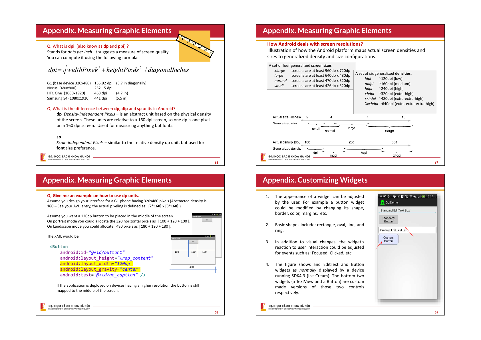
Appendix. Measuring Graphic Elements
Appendix. Measuring Graphic Elements
How Android deals with screen resolutions?
Q. What is dpi (also know as dp and ppi) ?
Stands for dots per inch. It suggests a measure of screen quality.
Illustration of how the Android platform maps actual screen densities and
You can compute it using the following formula:
sizes to generalized density and size configurations.
A set of four generalized screen sizes
dpi = sqrt (width_pixels^2
2 + height_pixels^2) / diag 2 onal_inches
dpi = widthPixe s l + heightPix ls e / diagonalI c n hes xlarge
screens are at least 960dp x 720dp
A set of six generalized densities: large
screens are at least 640dp x 480dp ldpi ~120dpi (low)
normal screens are at least 470dp x 320dp
G1 (base device 320x480) 155.92 dpi (3.7 in diagonally) mdpi ~160dpi (medium) small
screens are at least 426dp x 320dp Nexus (480x800) 252.15 dpi hdpi ~240dpi (high) HTC One (1080x1920) 468 dpi (4.7 in)
xhdpi ~320dpi (extra-high) Samsung S4 (1080x1920) 441 dpi (5.5 in)
xxhdpi ~480dpi (extra-extra-high)
Xxxhdpi ~640dpi (extra-extra-extra-high)
Q. What is the difference between dp, dip and sp units in Android?
dp Density-independent Pixels – is an abstract unit based on the physical density
of the screen. These units are relative to a 160 dpi screen, so one dp is one pixel
on a 160 dpi screen. Use it for measuring anything but fonts. sp
Scale-independent Pixels – similar to the relative density dp unit, but used for font size preference. 66 67
Appendix. Measuring Graphic Elements
Appendix. Customizing Widgets
Q. Give me an example on how to use dp units. 1.
The appearance of a widget can be adjusted
Assume you design your interface for a G1 phone having 320x480 pixels (Abstracted density is
by the user. For example a button widget
160 – See your AVD entry, the actual pixeling is defined as: [2*160] x [3*160] )
could be modified by changing its shape, border, color, margins, etc.
Assume you want a 120dp button to be placed in the middle of the screen.
On portrait mode you could allocate the 320 horizontal pixels as [ 100 + 120 + 100 ].
On Landscape mode you could allocate 480 pixels as [ 180 + 120 + 180 ]. 2.
Basic shapes include: rectangle, oval, line, and ring. The XML would be 3.
In addition to visual changes, the widget’s
reaction to user interaction could be adjusted
android:id="@+id/button1" 180 120 180
for events such as: Focused, Clicked, etc.
android:layout_height="wrap_content"
android:layout_width="120dp" 4.
The figure shows and EditText and Button
android:layout_gravity="center" 480
widgets as normally displayed by a device
android:text="@+id/go_caption" />
running SDK4.3 (Ice Cream). The bottom two
widgets (a TextView and a Button) are custom
If the application is deployed on devices having a higher resolution the button is still
made versions of those two controls
mapped to the middle of the screen. respectively. 68 69
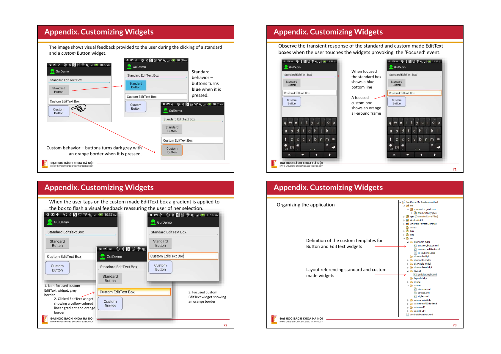
Appendix. Customizing Widgets
Appendix. Customizing Widgets
The image shows visual feedback provided to the user during the clicking of a standard
Observe the transient response of the standard and custom made EditText
and a custom Button widget.
boxes when the user touches the widgets provoking the ‘Focused’ event. Standard When focused behavior – the standard box buttons turns shows a blue bottom line blue when it is pressed. A focused custom box shows an orange all-around frame
Custom behavior – buttons turns dark grey with
an orange border when it is pressed. 71
Appendix. Customizing Widgets
Appendix. Customizing Widgets
When the user taps on the custom made EditText box a gradient is applied to Organizing the application
the box to flash a visual feedback reassuring the user of her selection.
Definition of the custom templates for Button and EditText widgets
Layout referencing standard and custom made widgets 1. Non-focused custom EditText widget, grey 3. Focused custom border EditText widget showing 2. Clicked EditText widget an orange border showing a yellow colored linear gradient and orange border 72 73
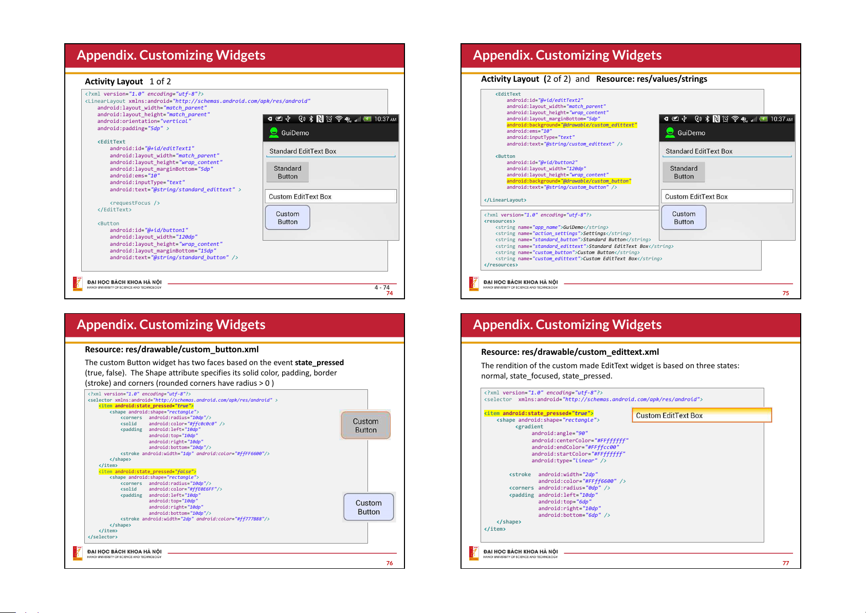
Appendix. Customizing Widgets
Appendix. Customizing Widgets Activity Layout 1 of 2
Activity Layout (2 of 2) and Resource: res/values/strings
<?xml version="1.0" encoding="utf-8"?>
"http://schemas.android.com/apk/res/android"
android:id="@+id/editText2"
android:layout_width="match_parent"
android:layout_width="match_parent"
android:layout_height="match_parent"
android:layout_height="wrap_content"
android:orientation="vertical"
android:layout_marginBottom="5dp"
android:background="@drawable/custom_edittext"
android:padding="5dp" > android:ems="10"
android:inputType="text"
android:text="@string/custom_edittext" />
android:id="@+id/editText1"
android:layout_width="match_parent"
android:layout_height="wrap_content"
android:id="@+id/button2"
android:layout_marginBottom="5dp"
android:layout_width="120dp" android:ems="10"
android:layout_height="wrap_content"
android:inputType="text"
android:background="@drawable/custom_button"
android:text="@string/standard_edittext" >
android:text="@string/custom_button" />
<?xml version="1.0" encoding="utf-8"?> "app_name">GuiDemo
android:id="@+id/button1" "action_settings">Settings
android:layout_width="120dp"
"standard_button">Standard Button
android:layout_height="wrap_content"
"standard_edittext">Standard EditText Box
android:layout_marginBottom="15dp"
"custom_button">Custom Button
android:text="@string/standard_button" />
"custom_edittext">Custom EditText Box 4 - 74 74 75
Appendix. Customizing Widgets
Appendix. Customizing Widgets
Resource: res/drawable/custom_button.xml
Resource: res/drawable/custom_edittext.xml
The custom Button widget has two faces based on the event state_pressed
The rendition of the custom made EditText widget is based on three states:
(true, false). The Shape attribute specifies its solid color, padding, border
normal, state_focused, state_pressed.
(stroke) and corners (rounded corners have radius > 0 )
<?xml version="1.0" encoding="utf-8"?>
<?xml version="1.0" encoding="utf-8"?>
xmlns:android="http://schemas.android.com/apk/res/android" >
"http://schemas.android.com/apk/res/android"> "true">
android:shape="rectangle"> "true">
android:radius="10dp"/>
android:shape="rectangle">
android:color="#ffc0c0c0" /> android:left="10dp" android:top="10dp" android:angle="90" android:right="10dp"
android:centerColor="#FFffffff"
android:bottom="10dp"/>
android:endColor="#FFffcc00"
android:width="1dp" android:color="#ffFF6600"/>
android:startColor="#FFffffff"
android:type="linear" /> "false">
android:width="2dp"
android:shape="rectangle">
android:radius="10dp"/>
android:color="#FFff6600" />
android:color="#ffE0E6FF"/>
android:radius="0dp" />
android:left="10dp"
android:left="10dp" android:top="10dp" android:top="6dp" android:right="10dp" android:right="10dp"
android:bottom="10dp"/>
android:bottom="6dp" />
android:width="2dp" android:color="#ff777B88"/>
76 77
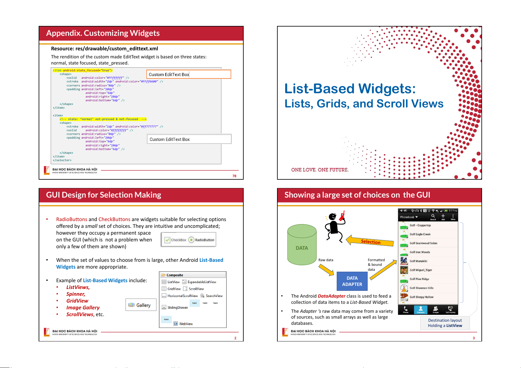
Appendix. Customizing Widgets
Resource: res/drawable/custom_edittext.xml
The rendition of the custom made EditText widget is based on three states:
normal, state focused, state_pressed. "true">
android:color="#FFffffff" />
android:width="2dp" android:color="#FFff6600" />
android:radius="0dp" />
android:left="10dp" List-Based Widgets: android:top="6dp" android:right="10dp"
android:bottom="6dp" />
Lists, Grids, and Scroll Views
android:width="1dp" android:color="#ff777777" />
android:color="#ffffffff" />
android:radius="0dp" />
android:left="10dp" android:top="6dp" android:right="10dp"
android:bottom="6dp" /> 78
GUI Design for Selection Making
Showing a large set of choices on the GUI •
RadioButtons and CheckButtons are widgets suitable for selecting options
offered by a small set of choices. They are intuitive and uncomplicated;
however they occupy a permanent space
on the GUI (which is not a problem when only a few of them are shown) DATA •
When the set of values to choose from is large, other Android List-Based Raw data Formatted
Widgets are more appropriate. & bound data •
Example of List-Based Widgets include: DATA • ADAPTER ListViews, • Spinner, •
The Android DataAdapter class is used to feed a • GridView
collection of data items to a List-Based Widget. • Image Gallery • •
The Adapter ‘s raw data may come from a variety
ScrollViews, etc.
of sources, such as small arrays as well as large Destination layout databases. Holding a ListView 2 3
Tài liệu liên quan:
-
Lecture note chính thức môn android hust
9 5 -

Báo cáo Lession 5 Môn Phát triển ứng dụng cho thiết bị di động | Đại học Bách Khoa Hà Nội
66 33 -

Báo cáo bài 2 Môn Phát triển ứng dụng cho thiết bị di động | Đại học Bách Khoa Hà Nội
72 36 -

Báo cáo Môn Phát triển ứng dụng cho thiết bị di động | Đại học Bách Khoa Hà Nội
84 42