Lesson 3 Writing Task 0 - English | Đại học Văn Lang

Lesson 3 Writing Task 0 - English | Đại học Văn Lang được sưu tầm và soạn thảo dưới dạng file PDF để gửi tới các bạn sinh viên cùng tham khảo, ôn tập đầy đủ kiến thức, chuẩn bị cho các buổi học thật tốt. Mời bạn đọc đón xem

Môn:

English (EIIGH) 40 tài liệu

Trường:

Đại học Văn Lang 741 tài liệu

Thông tin:
5 trang 2 tháng trước

Bình luận

Vui lòng đăng nhập hoặc đăng ký để gửi bình luận.

Lesson 3 Writing Task 0 - English | Đại học Văn Lang

Lesson 3 Writing Task 0 - English | Đại học Văn Lang được sưu tầm và soạn thảo dưới dạng file PDF để gửi tới các bạn sinh viên cùng tham khảo, ôn tập đầy đủ kiến thức, chuẩn bị cho các buổi học thật tốt. Mời bạn đọc đón xem

42 21 lượt tải Tải xuống
Class code: 231_DTA0590_16 & 17; 231_71ENG610063_62 & 63
Student’s name: Nguyễn Văn Anh Bảo
Peer editor’s name:
Date: September 18 &19, 2023
WRITING ASSIGNMENT LESSON 3
Unit 6: PIE CHARTS
Look at the charts below. Practice brainstorming ideas and write a complete report.
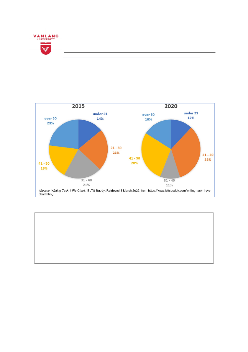
The pie charts below show the proportion of staff employed by age in the public sector
in the UK in 2015 and 2020.
Summarize the information by selecting and reporting the main features and make comparisons
where relevant.
Write at least 150 words.
Task 1: Complete the outline for your essay.
Introduction
The two pie charts give information about the percentages of staff employed by age in the public
sector in the UK from 2015 to 2020.
Overview
In 2015, the working age under 21 years old was quite low
In 2020, the working age 30 to 41 is the lowest
Workers from 21 to 30 years old accounted for the highest number in 2015 and 2020
Body 1
In crease
The age 21 to 30 : 23% to 30%
41 to 50: 19% to 28%
Body 2
Decrease
Under 21 :14% to 12%
31-40: 21% to 11%
Over 50: 23% to 16%
Task 2: Write the first draft of your essay using the completed outline.
1st draft
The two pie charts give information about the percentages of staff employed by age in the public sector
in the UK from 2015 to 2020.
Overall, a significant difference can be seen in 2015, when the working age under 21 years old was
relatively low. In 2020, the age range of 31 to 40 is the lowest compared to the remaining periods. While
workers from 21 to 30 years old accounted for the highest number between 2015 and 2020.
First, employees aged 21 to 30 and over 50 accounted for an equal proportion in 2015, then the group of
employees aged 21 to 30 had a change in 2020, increasing by 10% compared to 2015. Next, the group of
employees from 41 to 50 years old also increased from 19% in 2015 to 28% in 2020.
The group of people under 21 years old decreased slightly by 2% in 2020 from 14% to 12%.
Accordingly, the group of employees over 50 years old also decreased by 7% in 2020. The group aged
from 31 to 40 decreased the most in 2020 from 21% to 11%.
Task 3: Check your work using the checklist below.
Self-assessment (checklist)
Content
Y/
N
Feedback
Task Achievement
Does the report contain at least 150 words?
Has the author paraphrased the question in the
introduction?
Has the overview presented the most noticeable feature
of the pie chart(s) (e.g. the highest proportion, the main
difference/similarity, etc.)?
Has the report covered the significant features (the
biggest/ smallest proportions, or differences/
similarities)?
Coherence & Cohesion
Has the information been grouped into paragraphs
clearly?
Is the report presented in a logical order?
Are there at least 3 transitional expressions used
correctly (e.g. First, Besides, Overall, etc.)?
Lexical Resource
Has the question been paraphrased properly?
Does the author avoid repeating vocabulary?
Does the report contain vocabulary specific to pie
charts?
Grammatical Range and Accuracy
Are the sentences grammatically correct?
Has punctuation been used correctly?
Have the verb tenses and subject-verb agreement been
checked?
Timing
Was the task completed within 20 minutes?
Task 4: Invite a friend to help check your work.
Peer assessment (checklist)
Content
Y/
N
Feedback
Task Achievement
Does the report contain at least 150 words?
Has the author paraphrased the question in the
introduction?
Has the overview presented the most noticeable feature
of the pie chart(s) (e.g. the highest proportion, the main
difference/similarity, etc.)?
Has the report covered the significant features (the
biggest/ smallest proportions, or differences/
similarities)?
Coherence & Cohesion
Has the information been grouped into paragraphs
clearly?
Is the report presented in a logical order?
Are there at least 3 transitional expressions used
correctly (e.g. First, Besides, Overall, etc.)?
Lexical Resource
Has the question been paraphrased properly?
Does the author avoid repeating vocabulary?
Does the report contain vocabulary specific to pie
charts?
Grammatical Range and Accuracy
Are the sentences grammatically correct?
Has punctuation been used correctly?
Have the verb tenses and subject-verb agreement been
checked?
Timing
Was the task completed within 20 minutes?
Task 5: Write the final version of your essay in the box below.
Final version
The two pie charts give information about the percentages of staff employed by age in the public sector
in the UK from 2015 to 2020.
It is clear that, we can see the lowest rates of the tow pie charts fall in the age group under 21 years old
in 2015 and from 31 to 40 years old in 2020. While workers aged 21 to 30 accounted for the highest
number in the UK between 2015 and 2020.
First, employees aged 21 to 30 and over 50 accounted for an equal proportion in 2015, but the group of
employees aged 21 to 30 had a change in 2020, increasing by a tenth compared to 2015. Next, the
proportion of employees aged 41 to 50 climbed from 19% in 2015 to 28% in 2020.
The group of people under 21 years old decreased slightly by 2% in 2020 from 14% to 12%.
Accordingly, the group of employees over 50 years old also decreased by 7% in 2020. The group aged
from 31 to 40 decreased the most in 2020 from 21% to 11%.
| 1/5

Preview text:

Class code: 231_DTA0590_16 & 17; 231_71ENG610063_62 & 63
Student’s name: Nguyễn Văn Anh Bảo Peer editor’s name:
Date: September 18 &19, 2023

WRITING ASSIGNMENT – LESSON 3 Unit 6: PIE CHARTS
Look at the charts below. Practice brainstorming ideas and write a complete report.
The pie charts below show the proportion of staff employed by age in the public sector in the UK in 2015 and 2020.
Summarize the information by selecting and reporting the main features and make comparisons where relevant. Write at least 150 words.
Task 1: Complete the outline for your essay.
The two pie charts give information about the percentages of staff employed by age in the public Introduction
sector in the UK from 2015 to 2020.
In 2015, the working age under 21 years old was quite low Overview
In 2020, the working age 30 to 41 is the lowest
Workers from 21 to 30 years old accounted for the highest number in 2015 and 2020 In crease Body 1 The age 21 to 30 : 23% to 30% 41 to 50: 19% to 28% Decrease Under 21 :14% to 12% Body 2 31-40: 21% to 11% Over 50: 23% to 16%
Task 2: Write the first draft of your essay using the completed outline.1st draft
The two pie charts give information about the percentages of staff employed by age in the public sector in the UK from 2015 to 2020.
Overall, a significant difference can be seen in 2015, when the working age under 21 years old was
relatively low. In 2020, the age range of 31 to 40 is the lowest compared to the remaining periods. While
workers from 21 to 30 years old accounted for the highest number between 2015 and 2020.
First, employees aged 21 to 30 and over 50 accounted for an equal proportion in 2015, then the group of
employees aged 21 to 30 had a change in 2020, increasing by 10% compared to 2015. Next, the group of
employees from 41 to 50 years old also increased from 19% in 2015 to 28% in 2020.
The group of people under 21 years old decreased slightly by 2% in 2020 from 14% to 12%.
Accordingly, the group of employees over 50 years old also decreased by 7% in 2020. The group aged
from 31 to 40 decreased the most in 2020 from 21% to 11%.
Task 3: Check your work using the checklist below.
Self-assessment (checklist) Y/ Content Feedback N Task Achievement
Does the report contain at least 150 words?
Has the author paraphrased the question in the introduction?
Has the overview presented the most noticeable feature
of the pie chart(s) (e.g. the highest proportion, the main difference/similarity, etc.)?
Has the report covered the significant features (the
biggest/ smallest proportions, or differences/ similarities)? Coherence & Cohesion
Has the information been grouped into paragraphs clearly?
Is the report presented in a logical order?
Are there at least 3 transitional expressions used
correctly (e.g. First, Besides, Overall, etc.)? Lexical Resource
Has the question been paraphrased properly?
Does the author avoid repeating vocabulary?
Does the report contain vocabulary specific to pie charts?
Grammatical Range and Accuracy
Are the sentences grammatically correct?
Has punctuation been used correctly?
Have the verb tenses and subject-verb agreement been checked? Timing
Was the task completed within 20 minutes?
Task 4: Invite a friend to help check your work.
Peer assessment (checklist) Y/ Content Feedback N Task Achievement
Does the report contain at least 150 words?
Has the author paraphrased the question in the introduction?
Has the overview presented the most noticeable feature
of the pie chart(s) (e.g. the highest proportion, the main difference/similarity, etc.)?
Has the report covered the significant features (the
biggest/ smallest proportions, or differences/ similarities)? Coherence & Cohesion
Has the information been grouped into paragraphs clearly?
Is the report presented in a logical order?
Are there at least 3 transitional expressions used
correctly (e.g. First, Besides, Overall, etc.)? Lexical Resource
Has the question been paraphrased properly?
Does the author avoid repeating vocabulary?
Does the report contain vocabulary specific to pie charts?
Grammatical Range and Accuracy
Are the sentences grammatically correct?
Has punctuation been used correctly?
Have the verb tenses and subject-verb agreement been checked? Timing
Was the task completed within 20 minutes?
Task 5: Write the final version of your essay in the box below.Final version
The two pie charts give information about the percentages of staff employed by age in the public sector in the UK from 2015 to 2020.
It is clear that, we can see the lowest rates of the tow pie charts fall in the age group under 21 years old
in 2015 and from 31 to 40 years old in 2020. While workers aged 21 to 30 accounted for the highest
number in the UK between 2015 and 2020.
First, employees aged 21 to 30 and over 50 accounted for an equal proportion in 2015, but the group of
employees aged 21 to 30 had a change in 2020, increasing by a tenth compared to 2015. Next, the
proportion of employees aged 41 to 50 climbed from 19% in 2015 to 28% in 2020.
The group of people under 21 years old decreased slightly by 2% in 2020 from 14% to 12%.
Accordingly, the group of employees over 50 years old also decreased by 7% in 2020. The group aged
from 31 to 40 decreased the most in 2020 from 21% to 11%.