Midterm note Môn Data Science and Visualization | Trường Đại học Quốc tế, Đại học Quốc gia Thành phố Hồ Chí Minh
Midterm note Môn Data Science and Visualization. Tài liệu được sưu tầm gồm 17 trang, giúp bạn ôn tập tốt hơn. Mời các bạn đón xem.
Môn: Data Science and Visualization 11 tài liệu
Trường: Trường Đại học Quốc tế, Đại học Quốc gia Thành phố Hồ Chí Minh 2 K tài liệu
Tác giả:


Preview text:
id="chart">
Tài liệu liên quan:
-
Giới thiệu các loại mật thư và kỹ thuật giải mật thư | Data Science | Trường Đại học Quốc tế, Đại học Quốc gia Thành phố Hồ Chí Minh
22 11 -
Midterm Exam Môn Data Science and Visualization | Trường Đại học Quốc tế, Đại học Quốc gia Thành phố Hồ Chí Minh
167 84 -
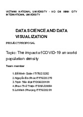
Project Proposal: COVID-19's Impact on Population Density | Môn Data Science and Visualization - Trường Đại học Quốc tế, Đại học Quốc gia Thành phố Hồ Chí Minh
103 52 -
Final Exam Notes | Môn Data Science and Visualization - Trường Đại học Quốc tế, Đại học Quốc gia Thành phố Hồ Chí Minh
121 61 -
Final Review Môn Data Science and Visualization | Trường Đại học Quốc tế, Đại học Quốc gia Thành phố Hồ Chí Minh
106 53