
On writing task - Tiếng Anh ngoại giao | Học viện Ngoại giao Việt Nam

On writing task - Tiếng Anh ngoại giao | Học viện Ngoại giao Việt Nam được sưu tầm và soạn thảo dưới dạng file PDF để gửi tới các bạn sinh viên cùng tham khảo, ôn tập đầy đủ kiến thức, chuẩn bị cho các buổi học thật tốt. Mời bạn đọc đón xem!

Thông tin:
34 trang 4 tháng trước

Bình luận

Vui lòng đăng nhập hoặc đăng ký để gửi bình luận.

On writing task - Tiếng Anh ngoại giao | Học viện Ngoại giao Việt Nam

On writing task - Tiếng Anh ngoại giao | Học viện Ngoại giao Việt Nam được sưu tầm và soạn thảo dưới dạng file PDF để gửi tới các bạn sinh viên cùng tham khảo, ôn tập đầy đủ kiến thức, chuẩn bị cho các buổi học thật tốt. Mời bạn đọc đón xem!

35 18 lượt tải Tải xuống
TNG H P CÁC BÀI ESSAY M U T SÁCH
CAMBRIDGE IELTS
IELTS WRITING TASK 1
17:52 29/7/24
5 - On writing task 1
about:blank
1/34
IELTS Trainer 2
1. Test 1
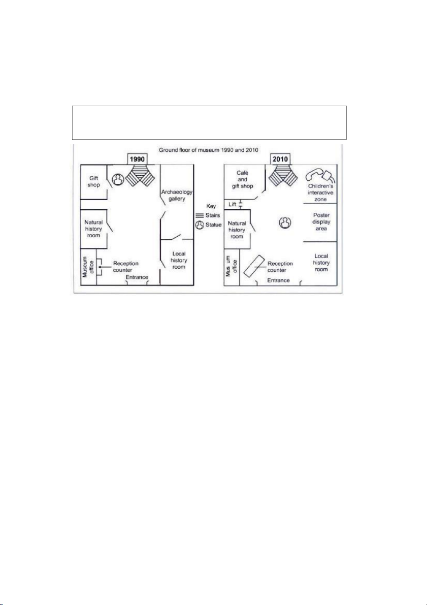
The plans below show the layout of the ground floor of a museum in 1990 and in
2010.
Summarise the information by selecting and reporting the main features, and make
comparisons where relevant.
The two plans show that there were a number of small but important changes to the
ground floor of a museum between 1990 and 2010. The general design remained the
same, with the entrance and stairs in the same place, although the entrance was widened
and certain areas were used for different purposes.
The most noticeable alteration was the removal of the Archaeology Gallery. This was
replaced with two new areas: a poster display space and a children’s interactive zone.
The Natural History and Local History rooms stayed the same size and in the same
location, but one wall of the latter was knocked down, making it more open. The museum
office was unchanged but the reception counter was enlarged and moved closer to the
entrance. The original gift shop was expanded to include a café. The statue which in 1990
was next to the staircase was moved to the centre of the floor. A lift was added in the
space between the Gift Shop and the Natural History Room.
( 170 words)
17:52 29/7/24
5 - On writing task 1
about:blank
2/34
2. Test 2
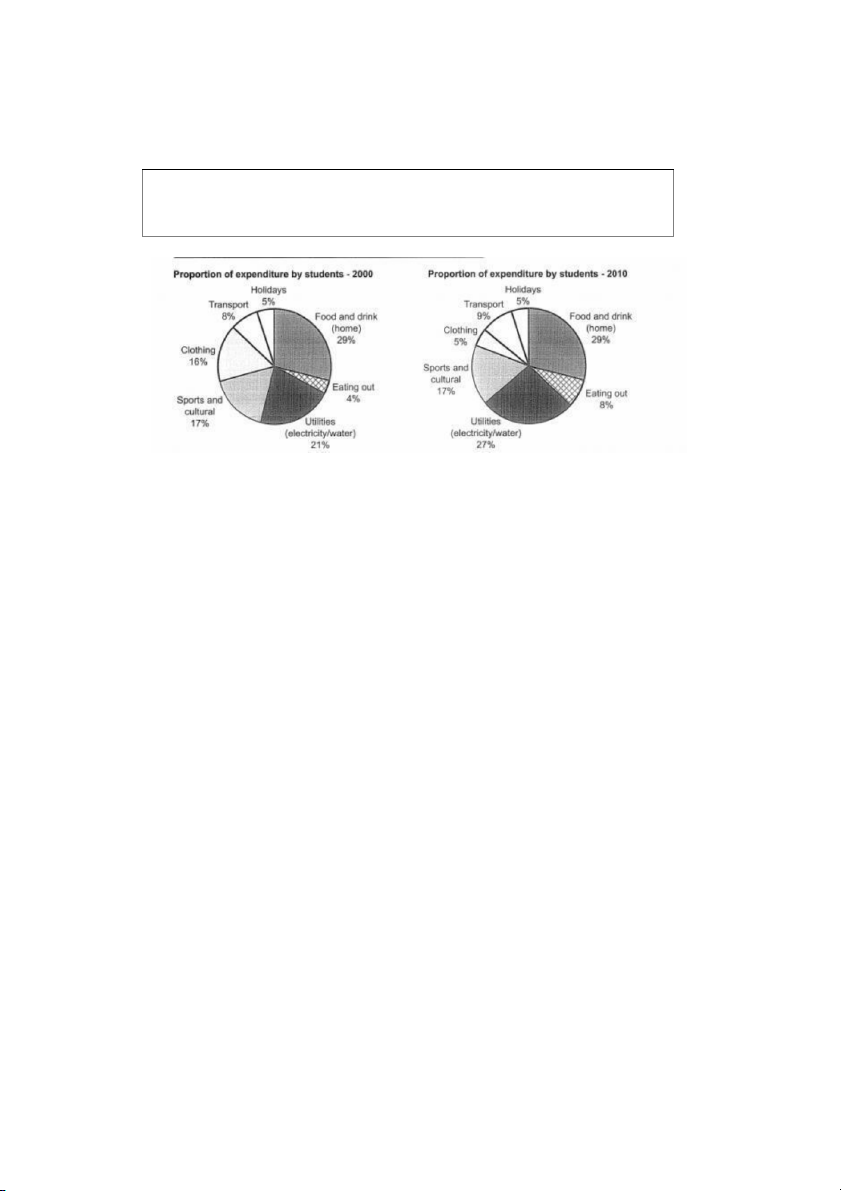
The charts below show the proportion of expenditure by students, on average, at
one university, in 2000 and 2010.
Summarise the information by selecting and reporting the main features, and make
comparisons where relevant
The two charts show how, on average, students in one university divided their spending
across seven areas, in 2010 compared with 2000. It is noticeable that the two biggest
areas for expenditure food and utilities between them accounted for over half the total
outlay in both years.
However, it is also worth noting that the proportion of spending on food and drink
remained the same, at 29%, while figures for utilities rose quite significantly, from 21% to
27%. One small but significant statistic was that while eating at home accounted for the
same percentage in 2010 as in 2000, eating out made up a higher percentage, rising from
4% to 8%. Another striking change was the proportion of spending on clothing: this went
down markedly, from 16% to just 5% in 2010. Three other areas saw no or hardly any
alteration: the portion of spending on sports and cultural activities remained at 17% in
both years, spending on transport rose by 1% to 9%, while the proportion on holidays
remained exactly the same, at 5%.
(175 words)
17:52 29/7/24
5 - On writing task 1
about:blank
3/34
3. Test 3
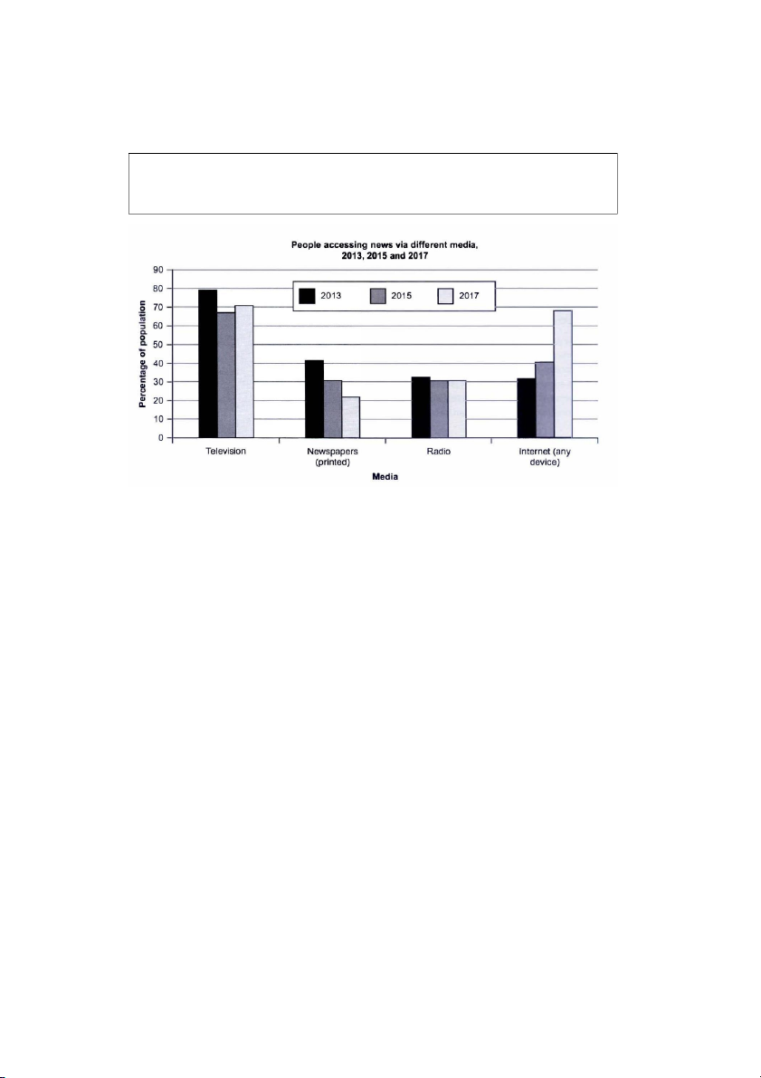
The chart below shows the percentage of people accessing news via different media
in one country in 2013, 2015, and 2017.
Summarise the information by selecting and reporting the main features, and make
comparisons where relevant.
The chart shows that there is considerable variation in the ways people accessed news
in the country in question between 2013 and 2017. The most noticeable trend was the
huge decline in the percentage of the population getting their news from printed
newspapers.
This saw a collapse from 42% in 2013 to just 22% over five years. By contrast, the
proportion using the internet for news grew from 32% to 41% in 2015 and then saw a
massive rise to 68% by 2017. Figures for radio news saw almost no change, holding
steady at approximately one third. TV news had a sizeable decline between 2013 and
2015 (79% to 67%) but this was followed by a small rise to 71% in 2017. It is noticeable
that in 2013 TV was by far the most popular medium for news access with a 35% gap
between this and the next most popular newspapers, at 42%. In 2017, TV was still the
most used medium but a close second was the internet and the difference had narrowed
to just 3% 71% compared to 68%.
(181 words)
17:52 29/7/24
5 - On writing task 1
about:blank
4/34
4. Test 4
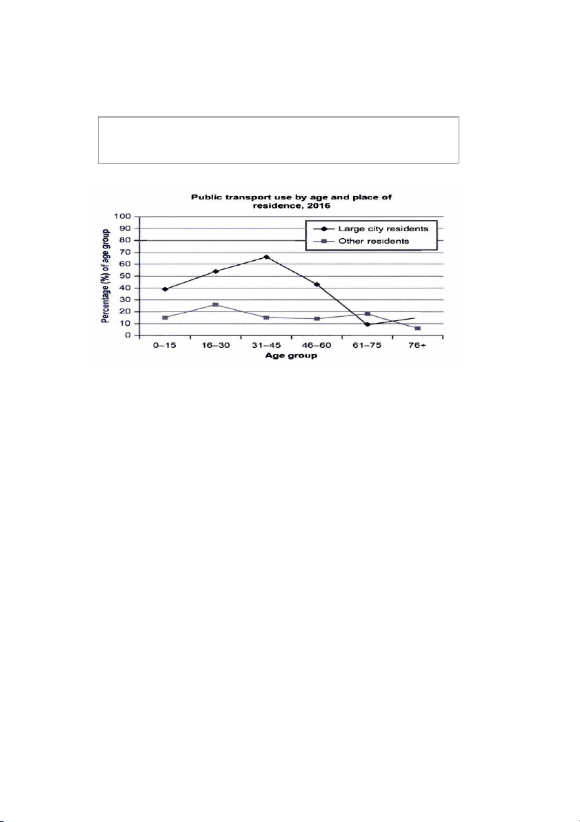
The graph below shows information about the use of public transport in one
country by age and location of residence in 2016
Summarise the information by selecting and reporting the main features, and
make comparisons where relevant
The graph shows a clear difference in the pattern of public transport use in 2016 between
people living in large cities and other citizens, in the country in question.
The gap between the two is particularly noticeable for younger and middle-age groups,
with the highest difference for 31 45 year olds: 66% of city dwellers used public transport
compared with just 15% of people living outside large urban centres. For children the
difference was smaller but still significant, at 39% and 15% respectively. However, for the
older ages the trend changed: there was actually a lower percentage of 61 75 year olds
in large urban areas using public transport (9%) than others (18%), though for those in
the oldest age bracket the figures reversed (15% and 6%). It is noteworthy that there is a
more marked fluctuation across age groups for city dwellers: starting at 39% for the
youngest, the figure rises to 66% before dropping sharply to a low of 9%. By contrast,
figures for those living outside big cities hold fairly steady, with a high of 26% for 16 30
year olds and a low of 6% for the oldest group
(190 words)
17:52 29/7/24
5 - On writing task 1
about:blank
5/34
5. Test 5
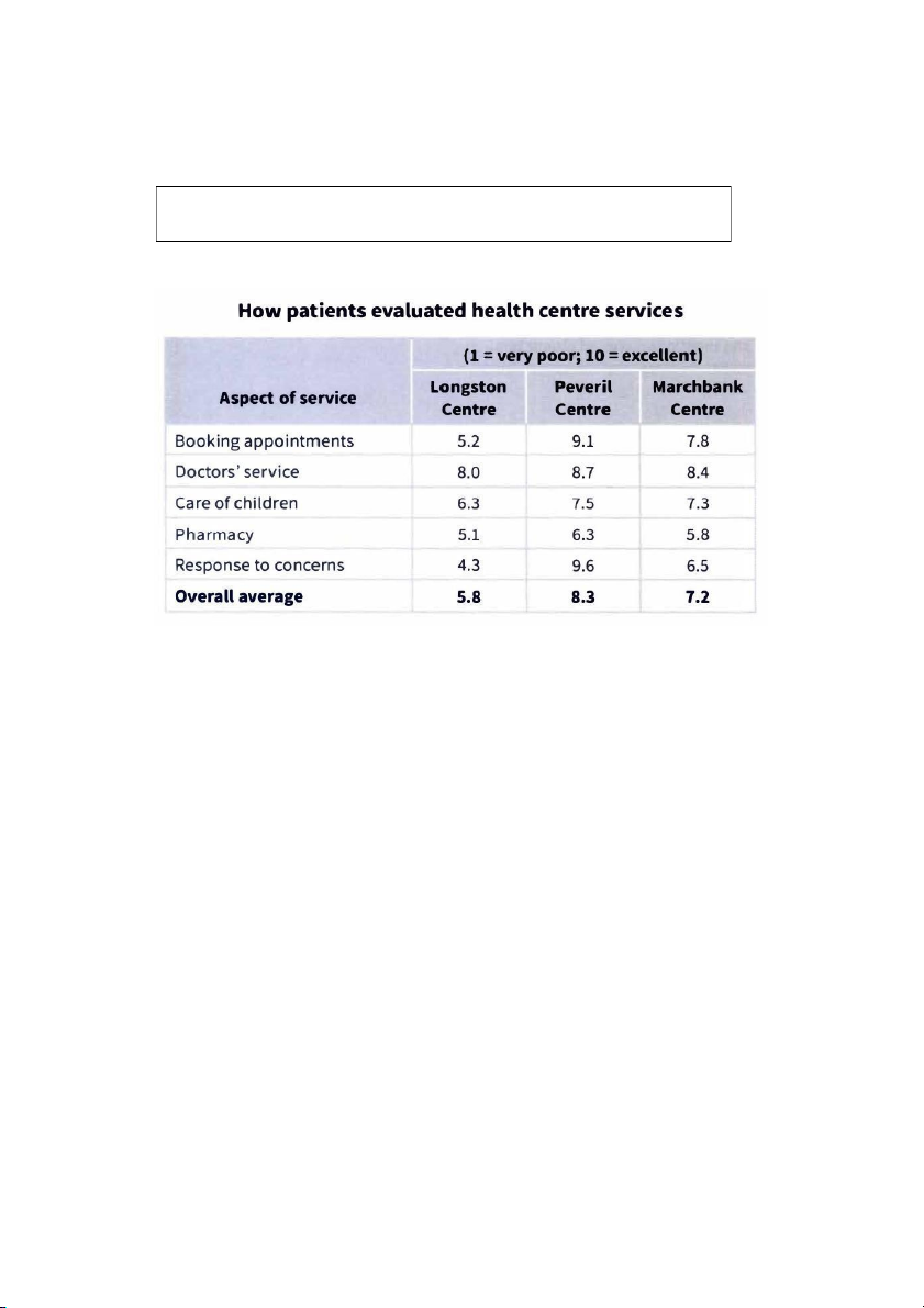
The table shows how patients evaluated different services at three health centres.
Summarize the information by selecting and reporting the main features, and
make comparisons where relevant. Write at least 150 words.
The table shows that there are significant differences in patients’ perceptions of quality of
provision at the three health centres. By far the most highly rated is the Peveril Centre
with an overall mean of 8.3 and the highest scores in all service areas. The weakest
performing centre overall was Longston at just 5.8, with Marchbank between the two at
7.2. It is noticeable that one aspect Doctors’ service received relatively strong
evaluations in all three centres, with scores ranging from 8 to 8.7. Pharmacy received the
poorest ratings of the services in all the centres: at 5.1, 6.3 and 5.8 at Longston, Peveril
and Marchbank respectively. Regarding the other aspects of provision, there is
considerable variation. Perhaps the most striking differential in ratings is in Response to
concerns, which for Peveril is the highest scoring of all the aspects, at 9.6. This compares
with 6.5 for this area at Marchbank and just 4.3 at Longston. Ratings for Care of children
are moderate in all three centres, though they are significantly lower for Longston than
for the other two: 6.3, compared to 7.5 at Peveril and 7.3 at Marchbank.
(204 words)
17:52 29/7/24
5 - On writing task 1
about:blank
6/34
6. Test 6
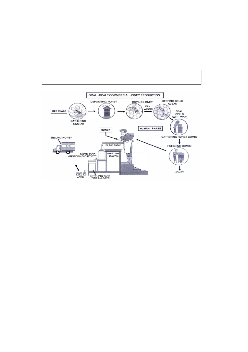
The diagram below shows how honey is made in small-scale commercial production.
Summarize the information by selecting and reporting the main features, and make
comparisons where relevant.
The diagram shows that there are two major phases to the commercial production of
honey: by bees and by human intervention. The process starts when nectar is gathered
by forager bees from flowers. This is carried back to the hive, where it is deposited in wax
cells as honey, which at this stage is very runny. Worker bees then fan their wings to dry
it, thereby making it thicker. Each cell is then sealed with wax to keep the substance
clean; the cells form the honeycombs, which are gathered and taken to the factory. There
they are pressed to release the honey, which is poured into the top container of three, the
sump tank, where it is heated to 45 50°C. This makes it thin enough to flow by gravity to
the next tank, where it is sieved to remove impurities. It then runs down to the last
container, the settling tank, where it sits for two to four days before being drained out into
jars. The jars are then labelled and transported to the place of sale.
(177 words)
17:52 29/7/24
5 - On writing task 1
about:blank
7/34
IELTS Trainer 1
7. Test 1
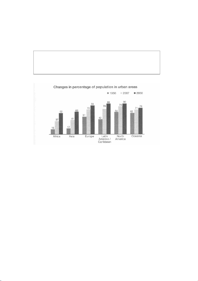
This bar chart compares the growth in the percentage of the population living in urban
areas in six different regions of the world.
According to the chart, between 1950 and 2007 the percentage of the population living in
cities in Latin America and the Caribbean almost doubled from 42% to 76%, whereas in
Europe it only increased by 21%. However, in Europe over half the people already lived
in cities in 1950.
When we compare the projected increases in Asia and Europe by 2050 we see that in
Asia the percentage will continue to grow at the same speed, with a further increase of
25%, whereas in Europe the change will be even slower than before, increasing by only
12%. By 2050, the vast majority (around 90%) of people in Latin America, the Caribbean
and North America will live in cities. Even in Africa, more than half the population (62%)
will live in urban areas by then.
17:52 29/7/24
5 - On writing task 1
about:blank
8/34
8. Test 2
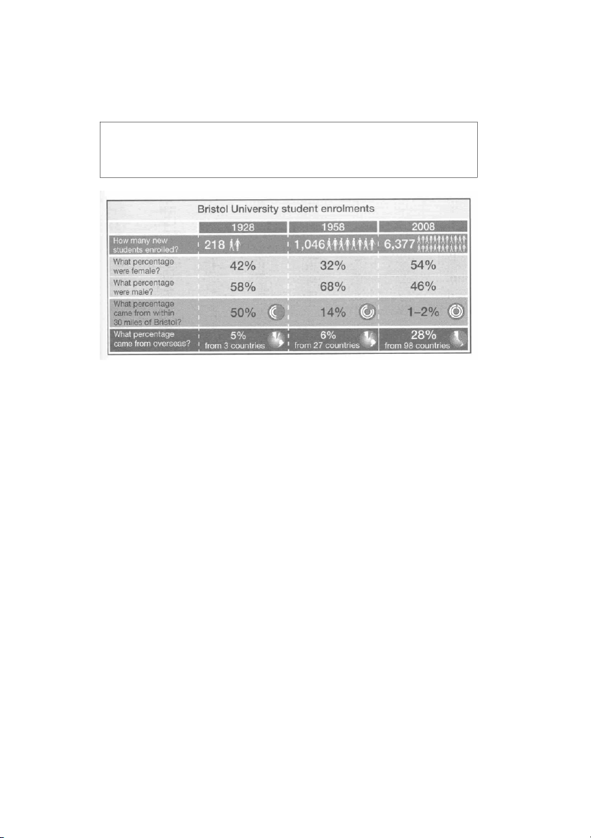
In the table we can see information about the numbers of students enrolling at Bristol
University in the three years, 1928, 1958 and 2008. It compares the percentage of
females and males, and also students from abroad and those from within 30 miles of the
city.
The most noticeable changes concern the overall growth of student numbers, from 218
in 1928 to 6,377 in 2008, and the proportions of local students, who constituted 50% of
the total in 1928, but only 1-2% in 2008.
It is surprising to note that the percentage of female enrolments did not rise steadily, but
dropped between 1928 and 1958. However, at the same time, the percentage of the
student population who came from abroad remained almost unchanged between 1928
and 1958, being 5% and 6% respectively, but rose markedly after that, so that by 2008
foreign students represented 28% of the total.
17:52 29/7/24
5 - On writing task 1
about:blank
9/34
9. Test 3
The graph below gives information about international tourist arrivals in different
parts of the world.
Summarize the information by selecting and reporting the main features, and make
comparisons where relevant.
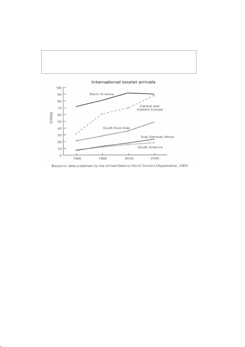
The graph shows the overall numbers of tourist arrivals in five parts of the world between
1990 and 2005. In 1990 over 70 million tourists visited North America, more than twice
as many as the next most popular destination shown, Central and Eastern Europe.
However, between 2000 and 2005 there was a decrease of approximately 1,500,000 in
the numbers going to North America whereas there was an increase of nearly 20 million
tourists visiting Central and Eastern Europe. The result was that in 2005 the number of
tourists arriving in North America and Central and Eastern Europe was almost equal at
around 90 million each. The number of tourists visiting South-East Asia rose steadily over
the whole period but by 2005 the total was still under 50 million. The regions with the
fewest tourist arrivals were South America and Sub-Saharan Africa. The number of
tourists going there was similar between 1990 and 1995 but after that there was a greater
increase in tourists going to Sub-Saharan Africa than to South America.
17:52 29/7/24
5 - On writing task 1
about:blank
10/34
10. Test 4
The graph below gives information about how much people in the United States and
the United Kingdom spend on petrol.
Summarize the information by selecting and reporting the main features, and make
comparisons where relevant
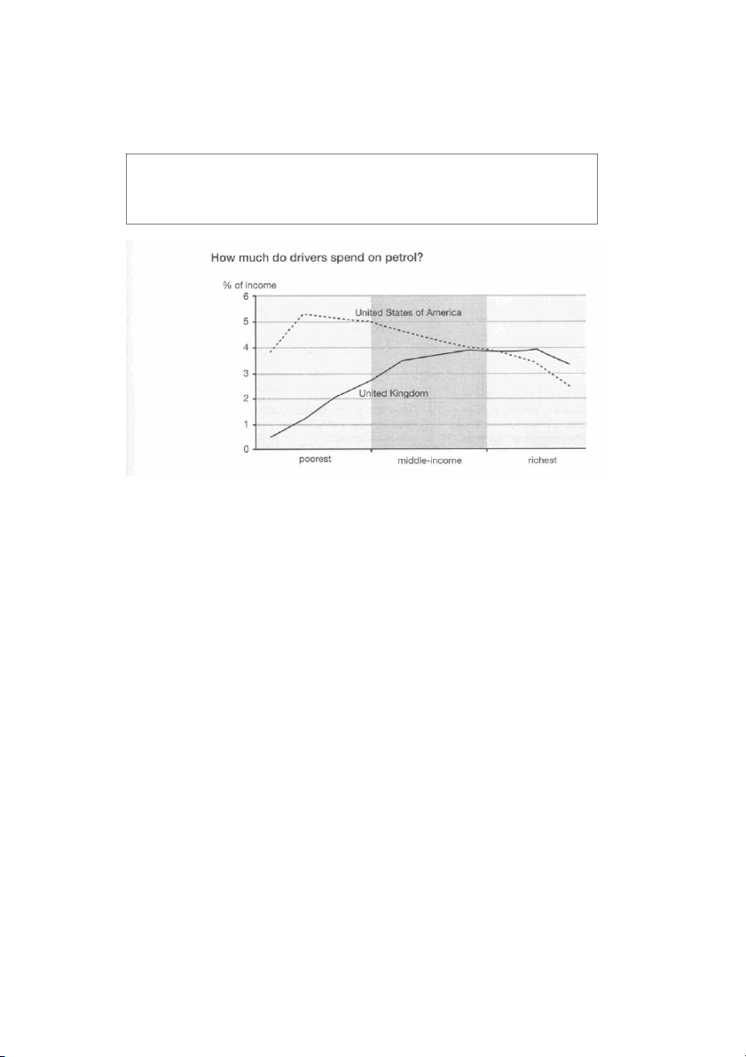
The graph compares the percentage of their income which people in the UK and USA
spend on petrol. From the data, we can see two clear differences.
Firstly, the difference between the poorest 10% and the richest 10% is greater in the UK
than in the USA. In the former, the poorest spend less than 0.5% of their income on petrol:
suggesting that they do not use cars very much, and the richest spend around 3%. By
contrast, in the US, the poorest spend around 4-5% while the richest spend between 2
and 3%. This suggests that virtually everyone in the USA uses a car sometimes.
Secondly, in the USA it is also noticeable that the percentage of income spent by the poor
can be twice that spent by the rich. However, in the UK, the percentage spent rises quite
steeply for the poorer members of the population but then remains almost constant apart
from the very richest, when it falls again. In both countries people on middle incomes
spend about the same percentage. Overall, the percentage of income spent on fuel
generally gets higher in the UK, the more you earn, whereas it decreases in the US.
17:52 29/7/24
5 - On writing task 1
about:blank
11/34
11. Test 5
This diagram shows that there are a number of processes involved in the commercial
production of frozen fish pies. The main ingredients consist of fresh salmon, peas and
sauce, with sliced potatoes, and they are prepared separately. The potatoes, which may
have been delivered up to a month in advance, are cleaned, peeled and cut into slices.
The slices are boiled and then chilled before being stored until needed. The preparation
of the fish is more labour intensive than the preparation of the potatoes. Within twelve
hours of being delivered to the factory, the fresh fish is cooked by being steamed with
lemon juice and salt. Then the skin and bones are removed by hand and disposed of,
before a visual inspection takes place.
After this, the pies are assembled in microwaveable containers. Peas and sauce, which
have also been prepared, are added to the fish and then the pie is covered with a layer
of cooked potato slices. The pies are then wrapped and frozen. At this point they are
ready for dispatch, or they may be stored at the factory before being dispatched
17:52 29/7/24
5 - On writing task 1
about:blank
12/34
12. Test 6
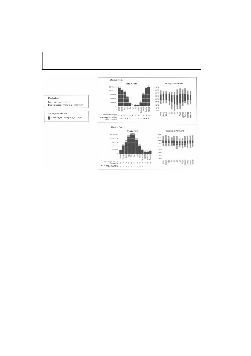
The charts below give information about weather in two Brazilian cities.
Summarize the information by selecting and reporting the main features, and make
comparisons where relevant.
These charts give information about the rainfall and temperatures for the cities of Brasilia
and Recife, with additional data about hours of sunshine and days with thunder.
Although temperatures in Brasilia can be quite extreme, from just above freezing to 37
o
C,
the average daily temperatures in Recife are not so variable. In Brasilia the range can be
as great as 15 degrees, but in Recife average daily temperatures generally vary from
22
o
C to 31 C throughout the year.
o
The most noticeable contrast is in the rainfall. Brasilia is wettest from September to May,
with only two or three wet days in June, July and August. During the wet months, there is
thunder on approximately half the days. By contrast, Recife has at least ten wet days,
even its driest season, which lasts from October to January. From April to August there
is rain on over twenty days per month. However, thunder is less common there, with a
maximum of three thundery days in April.
17:52 29/7/24
5 - On writing task 1
about:blank
13/34
Official Cambridge Guide to IELTS
13. Test 1
The chart below gives information on the percentage of British people giving money
to charity by age range for the years 1990 and 2010.
Summarise the information by selecting and reporting the main features and make
comparisons where relevant.
The chart examines the levels of donation among people of different ages in Britain.
Overall, a greater percentage of British people gave money to charity in 1990 than in
2010. However, across the two years, the pattern differs before and after the age of 50.
In 1990, 42% of the 36- -group made charitable donations, and this figure is the 50 age
highest on the chart. The 18-25s contributed the least at only 17%. By 2010, these figures
had fallen significantly to 35% and 7% respectively. The level of donations from the 26-
35 age-group also experienced a decrease in 2010 from 31% to 24%.
While donations up to the age of 50 declined across the two years, they rose among the
51-65 age-group from 35% to nearly 40%, which was the highest percentage for 2010.
The figure for the over 65s was lower than this, at 35%, but it was still a little higher than
the 1990 figure of 32%.
(157 words)
17:52 29/7/24
5 - On writing task 1
about:blank
14/34
14. Test 2
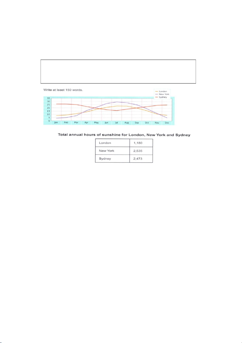
The graph and table below show the average monthly temperatures and the average
number of hours of sunshine per year in three major cities.
Summarize the information by selecting and reporting the main features and make
comparisons where relevant.
The data provides information on average temperatures and annual hours of sunshine in
London, New York and Sydney.
The temperature patterns for London and New York are similar, although New York has
warmer summers and colder winters. In both cities, peaks occur in July/August, at 23 in
0
London and 29
0
in New York. In contrast, Sydney's hottest weather is in
December/January when temperatures average 25 . During this period, New York's
0
temperatures dip to an average of around 5 , compared with 8 in London. On the other
0 0
hand, Sydney's lowest average temperatures in July are just over 15 .
0
As far as hours of sunshine are concerned, New York and Sydney have similar
averages of 2,535 and 2,473 hours respectively. London, however, has a much
lower average of 1,180 hours.
Clearly, London is the coldest city and has the fewest hours of sunshine. New York
has the hottest summers, but Sydney enjoys the warmest overall climate.
(156 words)
17:52 29/7/24
5 - On writing task 1
about:blank
15/34
15. Test 3
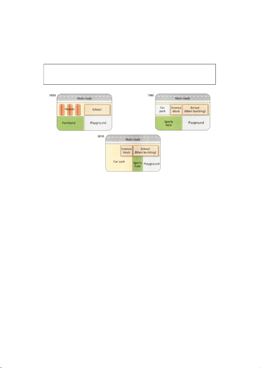
The diagrams below show the changes that have taken place at West Park Secondary
School since its construction in 1950.
Summarise the information by selecting and reporting the main features and make
comparisons where relevant
The diagrams show West Park School at three different stages in its development: 1950,
1980 and 2010.
In 1950, the school was built close to a main road and next to a number of houses. A
large area behind the school was turned into a playground, while the area behind the
houses was farmland.
By 1980, the houses had been demolished in order to make way for a small car park and
an additional school building, which became the science block. In addition to the existing
playground, the school also gained the farmland and converted it into a sports field.
In 2010, the school building remained unchanged but the car park was extended to cover
the entire sports field. As a result of this, the original playground was divided into two so
that it provided a smaller playground and a small sports field.
During this period, the school has increased in size and a car park has been created and
enlarged. The combined recreational areas, however, first expanded and were then
reduced in size.
(174 words)
17:52 29/7/24
5 - On writing task 1
about:blank
16/34
16. Test 4
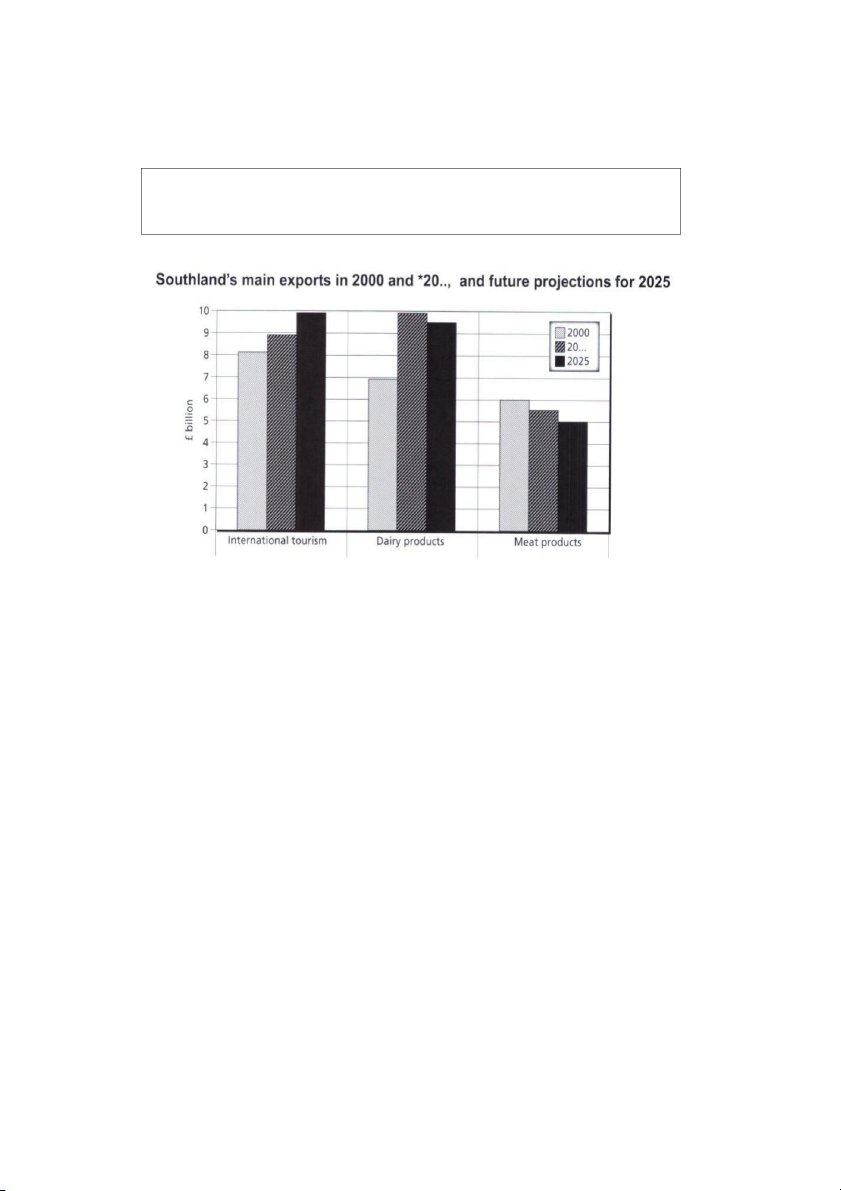
The chart below gives information about Southland's main exports in 2000, *20..,
and future projections for 2025.
Summarise the information by selecting and reporting the main features, and make
comparisons where relevant.
This bar chart illustrates the performance of Southland's primary exports in 2000 and
2013. It also indicates future projections for 2025. According to the data, it seems likely
that international tourism will become the dominant industry, although dairy exports will
remain strong. In 2000, we can see that tourism was the greatest exports earner of the
three industries. with revenue standing at just over £8 billion. This figure has increased
slightly, so that now , in 2013, it has reached almost £9 billion. It is estimated that
international tourism will continue to grow, so that by 2025, it will be earning around £10
billion for the country. In 2000, dairy exports were worth around £7 billion, but since then
there has been a dramatic increase, and sales for this year are approximately £10 billion.
Experts are predicting that exports in this area may fall slightly, so a figure of £9.5 billion
is expected for 2025. Meat products are the third key industry in Southland, but sales have
dropped since 2000 and now stand at £5.5 billion. It is expected that sales will continue to
decrease in the future.
( 187 words)
17:52 29/7/24
5 - On writing task 1
about:blank
17/34
17. Test 5
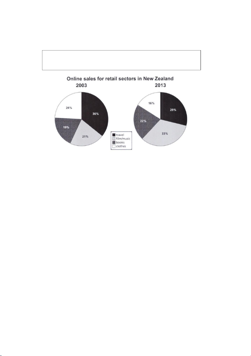
The pie charts below show the online shopping sales for retail sectors in New
Zealand in 2003 and 2013.
Summarise the information by selecting and reporting the main features, and make
comparisons where relevant.
The two pie charts compare the percentages of online sales across different retail sectors
in New Zealand in the years 2003 and 2013. For three of the sectors, it is evident that over
this time frame there was significant change in their proportion of online transactions.
At 36% we can see that the travel sector accounted for the majority of online sales in 2003,
but this percentage had dropped to 29% by 2013. Across the same ten-year period, as an
increasing number of people chose to purchase films and music online. we can see that
transactions went from just 21% to 33%, making it the retail sector with the highest overall
share of the online market.
In 2003, the clothing industry boasted an impressive 24% of total online sales in New
Zealand. However, by 2013, the figure had fallen considerably to 16%. Interestingly, online
sales of books eventually overtook sales of clothes, although books still represented only
22% of the market.
( 162 words)
17:52 29/7/24
5 - On writing task 1
about:blank
18/34
18. Test 6
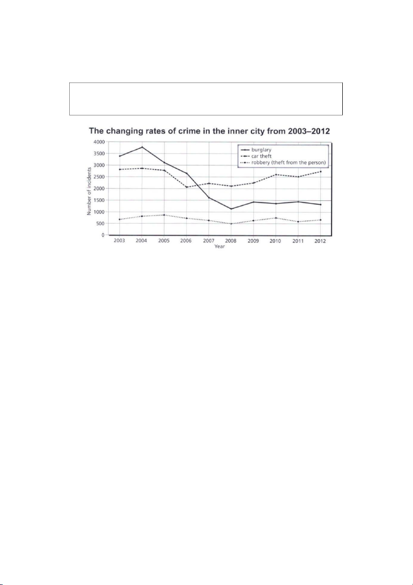
The chart below shows the changes that took place in three different areas of crime in
Newport city centre from 2003-2012.
Summarise the information by selecting and reporting the main features, and make
comparisons where relevant.
This graph illustrates how crime rates altered in Newport inner city during the period 2003-
2012. We can see immediately that the greatest change occurred in the number of
burglaries, while incidents of theft remained low but steady.
In 2003, we can see that burglary was the most common crime, with approximately 3,400
reported cases. The figure rose to around 3,700 in 2004, but then there was a downward
trend until 2008. At this point the figure stood at just over 1,000 incidents. This rose slightly
in 2009, then continued to fluctuate for the remaining period.
In 2003, the number of cars being stolen stood at around 2,800 and followed a similar
trend to burglary until 2006. At this point the number rose, standing at around 2,200 in
2007. There was a marginal decrease in the following year, but from then on, the trend
was generally upwards.
Finally, robbery has always been a fairly minor problem for Newport. The number of
offences committed changed little over nine years. It is interesting to note that the figure
of approximately 700 in 2003 is the same figure for 2012.
(187 words)
17:52 29/7/24
5 - On writing task 1
about:blank
19/34
19. Test 7 (không có sample)
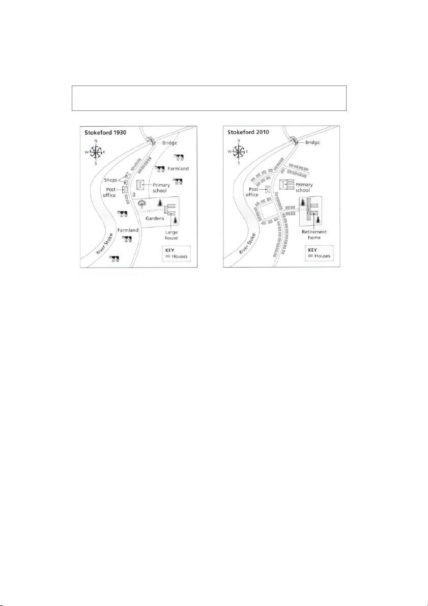
The maps below show the village of Stokeford in 1930 and in 2010.
Summarise the information by selecting and reporting the main features, and
make comparisons where relevant.
17:52 29/7/24
5 - On writing task 1
about:blank
20/34
| 1/34

Preview text:

17:52 29/7/24 5 - On writing task 1
TNG HP CÁC BÀI ESSAY MU T SÁCH CAMBRIDGE IELTS IELTS WRITING TASK 1 about:blank 1/34 17:52 29/7/24 5 - On writing task 1 IELTS Trainer 2 1. Test 1
The plans below show the layout of the ground floor of a museum in 1990 and in 2010.
Summarise the information by selecting and reporting the main features, and make comparisons where relevant.
The two plans show that there were a number of small but important changes to the
ground floor of a museum between 1990 and 2010. The general design remained the
same, with the entrance and stairs in the same place, although the entrance was widened
and certain areas were used for different purposes.
The most noticeable alteration was the removal of the Archaeology Gallery. This was
replaced with two new areas: a poster display space and a children’s interactive zone.
The Natural History and Local History rooms stayed the same size and in the same
location, but one wall of the latter was knocked down, making it more open. The museum
office was unchanged but the reception counter was enlarged and moved closer to the
entrance. The original gift shop was expanded to include a café. The statue which in 1990
was next to the staircase was moved to the centre of the floor. A lift was added in the
space between the Gift Shop and the Natural History Room. ( 170 words) about:blank 2/34 17:52 29/7/24 5 - On writing task 1 2. Test 2
The charts below show the proportion of expenditure by students, on average, at
one university, in 2000 and 2010.
Summarise the information by selecting and reporting the main features, and make comparisons where relevant
The two charts show how, on average, students in one university divided their spending
across seven areas, in 2010 compared with 2000. It is noticeable that the two biggest
areas for expenditure – food and utilities – between them accounted for over half the total outlay in both years.
However, it is also worth noting that the proportion of spending on food and drink
remained the same, at 29%, while figures for utilities rose quite significantly, from 21% to
27%. One small but significant statistic was that while eating at home accounted for the
same percentage in 2010 as in 2000, eating out made up a higher percentage, rising from
4% to 8%. Another striking change was the proportion of spending on clothing: this went
down markedly, from 16% to just 5% in 2010. Three other areas saw no or hardly any
alteration: the portion of spending on sports and cultural activities remained at 17% in
both years, spending on transport rose by 1% to 9%, while the proportion on holidays
remained exactly the same, at 5%. (175 words) about:blank 3/34 17:52 29/7/24 5 - On writing task 1 3. Test 3
The chart below shows the percentage of people accessing news via different media
in one country in 2013, 2015, and 2017.
Summarise the information by selecting and reporting the main features, and make comparisons where relevant.
The chart shows that there is considerable variation in the ways people accessed news
in the country in question between 2013 and 2017. The most noticeable trend was the
huge decline in the percentage of the population getting their news from printed newspapers.
This saw a collapse from 42% in 2013 to just 22% over five years. By contrast, the
proportion using the internet for news grew from 32% to 41% in 2015 and then saw a
massive rise to 68% by 2017. Figures for radio news saw almost no change, holding
steady at approximately one third. TV news had a sizeable decline between 2013 and
2015 (79% to 67%) but this was followed by a small rise to 71% in 2017. It is noticeable
that in 2013 TV was by far the most popular medium for news access with a 35% gap
between this and the next most popular – newspapers, at 42%. In 2017, TV was still the
most used medium but a close second was the internet and the difference had narrowed
to just 3% – 71% compared to 68%. (181 words) about:blank 4/34 17:52 29/7/24 5 - On writing task 1 4. Test 4
The graph below shows information about the use of public transport in one
country by age and location of residence in 2016
Summarise the information by selecting and reporting the main features, and
make comparisons where relevant
The graph shows a clear difference in the pattern of public transport use in 2016 between
people living in large cities and other citizens, in the country in question.
The gap between the two is particularly noticeable for younger and middle-age groups,
with the highest difference for 31–45 year olds: 66% of city dwellers used public transport
compared with just 15% of people living outside large urban centres. For children the
difference was smaller but still significant, at 39% and 15% respectively. However, for the
older ages the trend changed: there was actually a lower percentage of 61–75 year olds
in large urban areas using public transport (9%) than others (18%), though for those in
the oldest age bracket the figures reversed (15% and 6%). It is noteworthy that there is a
more marked fluctuation across age groups for city dwellers: starting at 39% for the
youngest, the figure rises to 66% before dropping sharply to a low of 9%. By contrast,
figures for those living outside big cities hold fairly steady, with a high of 26% for 16–30
year olds and a low of 6% for the oldest group (190 words) about:blank 5/34 17:52 29/7/24 5 - On writing task 1 5. Test 5
The table shows how patients evaluated different services at three health centres.
Summarize the information by selecting and reporting the main features, and
make comparisons where relevant. Write at least 150 words.
The table shows that there are significant differences in patients’ perceptions of quality of
provision at the three health centres. By far the most highly rated is the Peveril Centre
with an overall mean of 8.3 and the highest scores in all service areas. The weakest
performing centre overall was Longston at just 5.8, with Marchbank between the two at
7.2. It is noticeable that one aspect – Doctors’ service – received relatively strong
evaluations in all three centres, with scores ranging from 8 to 8.7. Pharmacy received the
poorest ratings of the services in all the centres: at 5.1, 6.3 and 5.8 at Longston, Peveril
and Marchbank respectively. Regarding the other aspects of provision, there is
considerable variation. Perhaps the most striking differential in ratings is in Response to
concerns, which for Peveril is the highest scoring of all the aspects, at 9.6. This compares
with 6.5 for this area at Marchbank and just 4.3 at Longston. Ratings for Care of children
are moderate in all three centres, though they are significantly lower for Longston than
for the other two: 6.3, compared to 7.5 at Peveril and 7.3 at Marchbank. (204 words) about:blank 6/34 17:52 29/7/24 5 - On writing task 1 6. Test 6
The diagram below shows how honey is made in small-scale commercial production.
Summarize the information by selecting and reporting the main features, and make comparisons where relevant.
The diagram shows that there are two major phases to the commercial production of
honey: by bees and by human intervention. The process starts when nectar is gathered
by forager bees from flowers. This is carried back to the hive, where it is deposited in wax
cells as honey, which at this stage is very runny. Worker bees then fan their wings to dry
it, thereby making it thicker. Each cell is then sealed with wax to keep the substance
clean; the cells form the honeycombs, which are gathered and taken to the factory. There
they are pressed to release the honey, which is poured into the top container of three, the
sump tank, where it is heated to 45–50°C. This makes it thin enough to flow by gravity to
the next tank, where it is sieved to remove impurities. It then runs down to the last
container, the settling tank, where it sits for two to four days before being drained out into
jars. The jars are then labelled and transported to the place of sale. (177 words) about:blank 7/34 17:52 29/7/24 5 - On writing task 1 IELTS Trainer 1 7. Test 1
The bar chart below gives information about the percentage of the population living
in urban areas in different parts of the world.
Summarise the information by selecting and reporting the main features, and make comparisons where relevant. Write at least 150 words.
This bar chart compares the growth in the percentage of the population living in urban
areas in six different regions of the world.
According to the chart, between 1950 and 2007 the percentage of the population living in
cities in Latin America and the Caribbean almost doubled from 42% to 76%, whereas in
Europe it only increased by 21%. However, in Europe over half the people already lived in cities in 1950.
When we compare the projected increases in Asia and Europe by 2050 we see that in
Asia the percentage will continue to grow at the same speed, with a further increase of
25%, whereas in Europe the change wil be even slower than before, increasing by only
12%. By 2050, the vast majority (around 90%) of people in Latin America, the Caribbean
and North America will live in cities. Even in Africa, more than half the population (62%)
will live in urban areas by then. about:blank 8/34 17:52 29/7/24 5 - On writing task 1 8. Test 2
The table below gives information about student enrolments at Bristol University in 1928, 1958, and 2008.
Summarise the information by selecting and reporting the main features, and make comparisons where relevant.
In the table we can see information about the numbers of students enrolling at Bristol
University in the three years, 1928, 1958 and 2008. It compares the percentage of
females and males, and also students from abroad and those from within 30 miles of the city.
The most noticeable changes concern the overall growth of student numbers, from 218
in 1928 to 6,377 in 2008, and the proportions of local students, who constituted 50% of
the total in 1928, but only 1-2% in 2008.
It is surprising to note that the percentage of female enrolments did not rise steadily, but
dropped between 1928 and 1958. However, at the same time, the percentage of the
student population who came from abroad remained almost unchanged between 1928
and 1958, being 5% and 6% respectively, but rose markedly after that, so that by 2008
foreign students represented 28% of the total. about:blank 9/34 17:52 29/7/24 5 - On writing task 1 9. Test 3
The graph below gives information about international tourist arrivals in different parts of the world.
Summarize the information by selecting and reporting the main features, and make comparisons where relevant.
The graph shows the overall numbers of tourist arrivals in five parts of the world between
1990 and 2005. In 1990 over 70 million tourists visited North America, more than twice
as many as the next most popular destination shown, Central and Eastern Europe.
However, between 2000 and 2005 there was a decrease of approximately 1,500,000 in
the numbers going to North America whereas there was an increase of nearly 20 million
tourists visiting Central and Eastern Europe. The result was that in 2005 the number of
tourists arriving in North America and Central and Eastern Europe was almost equal at
around 90 million each. The number of tourists visiting South-East Asia rose steadily over
the whole period but by 2005 the total was still under 50 million. The regions with the
fewest tourist arrivals were South America and Sub-Saharan Africa. The number of
tourists going there was similar between 1990 and 1995 but after that there was a greater
increase in tourists going to Sub-Saharan Africa than to South America. about:blank 10/34 17:52 29/7/24 5 - On writing task 1 10. Test 4
The graph below gives information about how much people in the United States and
the United Kingdom spend on petrol.
Summarize the information by selecting and reporting the main features, and make comparisons where relevant
The graph compares the percentage of their income which people in the UK and USA
spend on petrol. From the data, we can see two clear differences.
Firstly, the difference between the poorest 10% and the richest 10% is greater in the UK
than in the USA. In the former, the poorest spend less than 0.5% of their income on petrol:
suggesting that they do not use cars very much, and the richest spend around 3%. By
contrast, in the US, the poorest spend around 4-5% while the richest spend between 2
and 3%. This suggests that virtually everyone in the USA uses a car sometimes.
Secondly, in the USA it is also noticeable that the percentage of income spent by the poor
can be twice that spent by the rich. However, in the UK, the percentage spent rises quite
steeply for the poorer members of the population but then remains almost constant apart
from the very richest, when it falls again. In both countries people on middle incomes
spend about the same percentage. Overall, the percentage of income spent on fuel
generally gets higher in the UK, the more you earn, whereas it decreases in the US. about:blank 11/34 17:52 29/7/24 5 - On writing task 1 11. Test 5
The diagrams below give information about the manufacture of frozen fish pies.
Summarize the information by selecting and reporting the main features, and make comparisons where relevant.
This diagram shows that there are a number of processes involved in the commercial
production of frozen fish pies. The main ingredients consist of fresh salmon, peas and
sauce, with sliced potatoes, and they are prepared separately. The potatoes, which may
have been delivered up to a month in advance, are cleaned, peeled and cut into slices.
The slices are boiled and then chilled before being stored until needed. The preparation
of the fish is more labour intensive than the preparation of the potatoes. Within twelve
hours of being delivered to the factory, the fresh fish is cooked by being steamed with
lemon juice and salt. Then the skin and bones are removed by hand and disposed of,
before a visual inspection takes place.
After this, the pies are assembled in microwaveable containers. Peas and sauce, which
have also been prepared, are added to the fish and then the pie is covered with a layer
of cooked potato slices. The pies are then wrapped and frozen. At this point they are
ready for dispatch, or they may be stored at the factory before being dispatched about:blank 12/34 17:52 29/7/24 5 - On writing task 1 12. Test 6
The charts below give information about weather in two Brazilian cities.
Summarize the information by selecting and reporting the main features, and make comparisons where relevant.
These charts give information about the rainfall and temperatures for the cities of Brasilia
and Recife, with additional data about hours of sunshine and days with thunder.
Although temperatures in Brasilia can be quite extreme, from just above freezing to 37oC,
the average daily temperatures in Recife are not so variable. In Brasilia the range can be
as great as 15 degrees, but in Recife average daily temperatures generally vary from
22oC to 31oC throughout the year.
The most noticeable contrast is in the rainfall. Brasilia is wettest from September to May,
with only two or three wet days in June, July and August. During the wet months, there is
thunder on approximately half the days. By contrast, Recife has at least ten wet days,
even its driest season, which lasts from October to January. From April to August there
is rain on over twenty days per month. However, thunder is less common there, with a
maximum of three thundery days in April. about:blank 13/34 17:52 29/7/24 5 - On writing task 1
Official Cambridge Guide to IELTS 13. Test 1
The chart below gives information on the percentage of British people giving money
to charity by age range for the years 1990 and 2010.
Summarise the information by selecting and reporting the main features and make comparisons where relevant.
The chart examines the levels of donation among people of different ages in Britain.
Overall, a greater percentage of British people gave money to charity in 1990 than in
2010. However, across the two years, the pattern differs before and after the age of 50.
In 1990, 42% of the 36-50 age-group made charitable donations, and this figure is the
highest on the chart. The 18-25s contributed the least at only 17%. By 2010, these figures
had fallen significantly to 35% and 7% respectively. The level of donations from the 26-
35 age-group also experienced a decrease in 2010 from 31% to 24%.
While donations up to the age of 50 declined across the two years, they rose among the
51-65 age-group from 35% to nearly 40%, which was the highest percentage for 2010.
The figure for the over 65s was lower than this, at 35%, but it was still a little higher than the 1990 figure of 32%. (157 words) about:blank 14/34 17:52 29/7/24 5 - On writing task 1 14. Test 2
The graph and table below show the average monthly temperatures and the average
number of hours of sunshine per year in three major cities.
Summarize the information by selecting and reporting the main features and make comparisons where relevant.
The data provides information on average temperatures and annual hours of sunshine in London, New York and Sydney.
The temperature patterns for London and New York are similar, although New York has
warmer summers and colder winters. In both cities, peaks occur in July/August, at 230 i n
London and 290 in New York. In contrast, Sydney's hottest weather is in
December/January when temperatures average 250 . During this period, New York's
temperatures dip to an average of around 50, compared with 80 in London. On the other
hand, Sydney's lowest average temperatures in July are just over 150.
As far as hours of sunshine are concerned, New York and Sydney have similar
averages of 2,535 and 2,473 hours respectively. London, however, has a much lower average of 1,180 hours.
Clearly, London is the coldest city and has the fewest hours of sunshine. New York
has the hottest summers, but Sydney enjoys the warmest overall climate. (156 words) about:blank 15/34 17:52 29/7/24 5 - On writing task 1 15. Test 3
The diagrams below show the changes that have taken place at West Park Secondary
School since its construction in 1950.
Summarise the information by selecting and reporting the main features and make comparisons where relevant
The diagrams show West Park School at three different stages in its development: 1950, 1980 and 2010.
In 1950, the school was built close to a main road and next to a number of houses. A
large area behind the school was turned into a playground, while the area behind the houses was farmland.
By 1980, the houses had been demolished in order to make way for a small car park and
an additional school building, which became the science block. In addition to the existing
playground, the school also gained the farmland and converted it into a sports field.
In 2010, the school building remained unchanged but the car park was extended to cover
the entire sports field. As a result of this, the original playground was divided into two so
that it provided a smaller playground and a small sports field.
During this period, the school has increased in size and a car park has been created and
enlarged. The combined recreational areas, however, first expanded and were then reduced in size. (174 words) about:blank 16/34 17:52 29/7/24 5 - On writing task 1 16. Test 4
The chart below gives information about Southland's main exports in 2000, *20..,
and future projections for 2025.
Summarise the information by selecting and reporting the main features, and make comparisons where relevant.
This bar chart illustrates the performance of Southland's primary exports in 2000 and
2013. It also indicates future projections for 2025. According to the data, it seems likely
that international tourism will become the dominant industry, although dairy exports will
remain strong. In 2000, we can see that tourism was the greatest exports earner of the
three industries. with revenue standing at just over £8 billion. This figure has increased
slightly, so that now , in 2013, it has reached almost £9 billion. It is estimated that
international tourism will continue to grow, so that by 2025, it will be earning around £10
billion for the country. In 2000, dairy exports were worth around £7 billion, but since then
there has been a dramatic increase, and sales for this year are approximately £10 billion.
Experts are predicting that exports in this area may fall slightly, so a figure of £9.5 billion
is expected for 2025. Meat products are the third key industry in Southland, but sales have
dropped since 2000 and now stand at £5.5 billion. It is expected that sales will continue to decrease in the future. ( 187 words) about:blank 17/34 17:52 29/7/24 5 - On writing task 1 17. Test 5
The pie charts below show the online shopping sales for retail sectors in New Zealand in 2003 and 2013.
Summarise the information by selecting and reporting the main features, and make comparisons where relevant.
The two pie charts compare the percentages of online sales across different retail sectors
in New Zealand in the years 2003 and 2013. For three of the sectors, it is evident that over
this time frame there was significant change in their proportion of online transactions.
At 36% we can see that the travel sector accounted for the majority of online sales in 2003,
but this percentage had dropped to 29% by 2013. Across the same ten-year period, as an
increasing number of people chose to purchase films and music online. we can see that
transactions went from just 21% to 33%, making it the retail sector with the highest overall share of the online market.
In 2003, the clothing industry boasted an impressive 24% of total online sales in New
Zealand. However, by 2013, the figure had fallen considerably to 16%. Interestingly, online
sales of books eventually overtook sales of clothes, although books still represented only 22% of the market. ( 162 words) about:blank 18/34 17:52 29/7/24 5 - On writing task 1 18. Test 6
The chart below shows the changes that took place in three different areas of crime in
Newport city centre from 2003-2012.
Summarise the information by selecting and reporting the main features, and make comparisons where relevant.
This graph illustrates how crime rates altered in Newport inner city during the period 2003-
2012. We can see immediately that the greatest change occurred in the number of
burglaries, while incidents of theft remained low but steady.
In 2003, we can see that burglary was the most common crime, with approximately 3,400
reported cases. The figure rose to around 3,700 in 2004, but then there was a downward
trend until 2008. At this point the figure stood at just over 1,000 incidents. This rose slightly
in 2009, then continued to fluctuate for the remaining period.
In 2003, the number of cars being stolen stood at around 2,800 and followed a similar
trend to burglary until 2006. At this point the number rose, standing at around 2,200 in
2007. There was a marginal decrease in the following year, but from then on, the trend was generally upwards.
Finally, robbery has always been a fairly minor problem for Newport. The number of
offences committed changed little over nine years. It is interesting to note that the figure
of approximately 700 in 2003 is the same figure for 2012. (187 words) about:blank 19/34 17:52 29/7/24 5 - On writing task 1
19. Test 7 (không có sample)
The maps below show the village of Stokeford in 1930 and in 2010.
Summarise the information by selecting and reporting the main features, and
make comparisons where relevant. about:blank 20/34