Taxonomy of Interactive Dynamics in Visual Analysis | Môn Data Science and Visualization - Trường Đại học Quốc tế, Đại học Quốc gia Thành phố Hồ Chí Minh
The increasing scale and availability of digital data provides an extraordinary resource for informing public policy, scientific discovery, business strategy, and even our personal lives. Tài liệu được sưu tầm gồm 26 trang, giúp bạn ôn tập tốt hơn. Mời các bạn đón xem.
Môn: Data Science and Visualization 11 tài liệu
Trường: Trường Đại học Quốc tế, Đại học Quốc gia Thành phố Hồ Chí Minh 2 K tài liệu
Tác giả:


Preview text:
lOMoAR cPSD| 23136115 VISUALIZATION Interactive Dynamics for Visual Analysis
A taxonomy of tools that support the fluent and flexible use of visualizations
Jeffrey Heer, Stanford University
Ben Shneiderman, University of Maryland, College Park
The increasing scale and availability of digital data provides an extraordinary resource for informing public policy,
scientific discovery, business strategy, and even our personal lives. To get the most out of such data, however, users
must be able to make sense of it: to pursue questions, uncover patterns of interest, and identify (and potentially correct)
errors. In concert with data-management systems and statistical algorithms, analysis requires contextualized human
judgments regarding the domainspecific significance of the clusters, trends, and outliers discovered in data.
Visualization provides a powerful means of making sense of data. By mapping data attributes to visual properties
such as position, size, shape, and color, visualization designers leverage perceptual skills to help users discern and
interpret patterns within data.11 A single image, however, typically provides answers to, at best, a handful of questions.
Instead, visual analysis typically progresses in an iterative process of view creation, exploration, and refinement.
Meaningful analysis consists of repeated explorations as users develop insights about significant relationships,
domain-specific contextual influences, and causal patterns. Confusing widgets, complex dialog boxes, hidden
operations, incomprehensible displays, or slow response times can limit the range and depth of topics considered and
may curtail thorough deliberation and introduce errors. To be most effective, visual analytics tools must support the
fluent and flexible use of visualizations at rates resonant with the pace of human thought.
The goal of this article is to assist designers, researchers, professional analysts, procurement officers, educators,
and students in evaluating and creating visual analysis tools. We present a taxonomy of interactive dynamics that
contribute to successful analytic dialogues. The taxonomy
TABLE 1: Taxonomy of interactive dynamics for visual analysis Data & View Specification
Visualize data by choosing visual encodings.
Filter out data to focus on relevant items.
Sort items to expose patterns.
Derive values or models from source data. View Manipulation
Select items to highlight, filter, or manipulate them.
Navigate to examine high-level patterns and low-level detail.
Coordinate views for linked, multi-dimensional exploration.
Organize multiple windows and workspaces. Process & Provenance
Record analysis histories for revisitation, review and sharing.
Annotate patterns to document findings.
Share views and annotations to enable collaboration.
Guide users through analysis tasks or stories.
consists of 12 task types grouped into three high-level categories, as shown in table 1: (1) data and view
specification (visualize, filter, sort, and derive); (2) view manipulation (select, navigate, coordinate, and organize);
and (3) analysis process and provenance (record, annotate, share, and guide). These categories incorporate the lOMoAR cPSD| 23136115 VISUALIZATION
critical tasks that enable iterative visual analysis, including visualization creation, interactive querying, multiview
coordination, history, and collaboration. Validating and evolving this taxonomy is a community project that
proceeds through feedback, critique, and refinement.
Our focus on interactive elements presumes a basic familiarity with visualization design. The merits and frailties
of bar charts, scatter plots, timelines, and node-link diagrams, and of the visualencoding decisions that underlie such
graphics, are certainly a central concern, but we will largely pass over them here. A number of articles and books
address these topics in great detail,11,12,16,52 and we recommend them to interested readers.
Within each branch of the taxonomy presented here, we describe example systems that exhibit useful interaction
techniques. To be clear, these examples do not constitute an exhaustive survey; rather, each is intended to convey the
nature and diversity of interactive operations. Throughout the article the term analyst refers to someone who uses
visual analysis tools and not to a specific person or role. Our notion of analyst encompasses anyone seeking to
understand data: traditional analysts investigating financial markets or terrorist networks, scientists uncovering new
insights, journalists piecing together a story, and people tracking various facets of their lives, including blood
pressure, money spent, electricity used, or miles traveled. DATA AND VIEW SPECIFICATION
To enable analysts to explore large data sets involving varied data types (e.g., multivariate, geospatial, textual,
temporal, networked), flexible visual analysis tools must provide appropriate controls for specifying the data and
views of interest. These controls enable analysts to selectively visualize the data, to filter out unrelated information to
focus on relevant items, and to sort information to expose patterns. Analysts also need to derive new data from the
input data, such as normalized values, statistical summaries, and aggregates. VISUALIZE
Perhaps the most fundamental operation in visual analysis is to specify a visualization of data: analysts must indicate
which data is to be shown and how it should be depicted. Historically, this process required custom programming of
a specific visualization component. Within user interfaces, such visualization “widgets” are often presented in a chart
typology, a palette of available visualization templates (bar charts, scatter plots, map views, etc.) into which analysts
can slot their data. This method of interaction will be immediately familiar to users of spreadsheet programs: users
select a chart type and assign data variables to visual aspects such as the X/Y axes and the size or color of visualized
marks. A chart typology has the benefits of simplicity and familiarity, but it also limits the types of possible
visualizations and makes it cumbersome to try out different visualizations of the same data.
Some visualization system designers have explored alternative approaches. Classic scientific visualization
systems1 and more recent platforms for artistic expression9 use data-flow graphs, in which the visualization
process is deconstructed into a set of finer-grained operators for data import, transformation, layout, coloring, etc.
Analysts interactively chain these operators together to construct novel displays. Through flexible combinations
of operators, data-flow models can enable a larger space of visualization designs. Data-flow systems require more
input effort than chart typologies, however, and may be limited by the set of available operators. In many cases,
novel designs require analysts with programming expertise to develop new building blocks for the system.
Other systems are based on formal grammars for visualization construction. These grammars constitute high-
level languages for succinctly describing how data should be mapped to visual features. By combining a handful
of such statements, analysts can construct complex, customized visualizations with a high degree of design control.
This approach is used by a number of popular data visualization frameworks such as Leland Wilkinson’s Grammar
of Graphics,57 ggplot2 for the R statistical analysis platform,56 and Protovis for HTML5.10 Each of these requires
at least minimal programming ability, however. lOMoAR cPSD| 23136115 VISUALIZATION
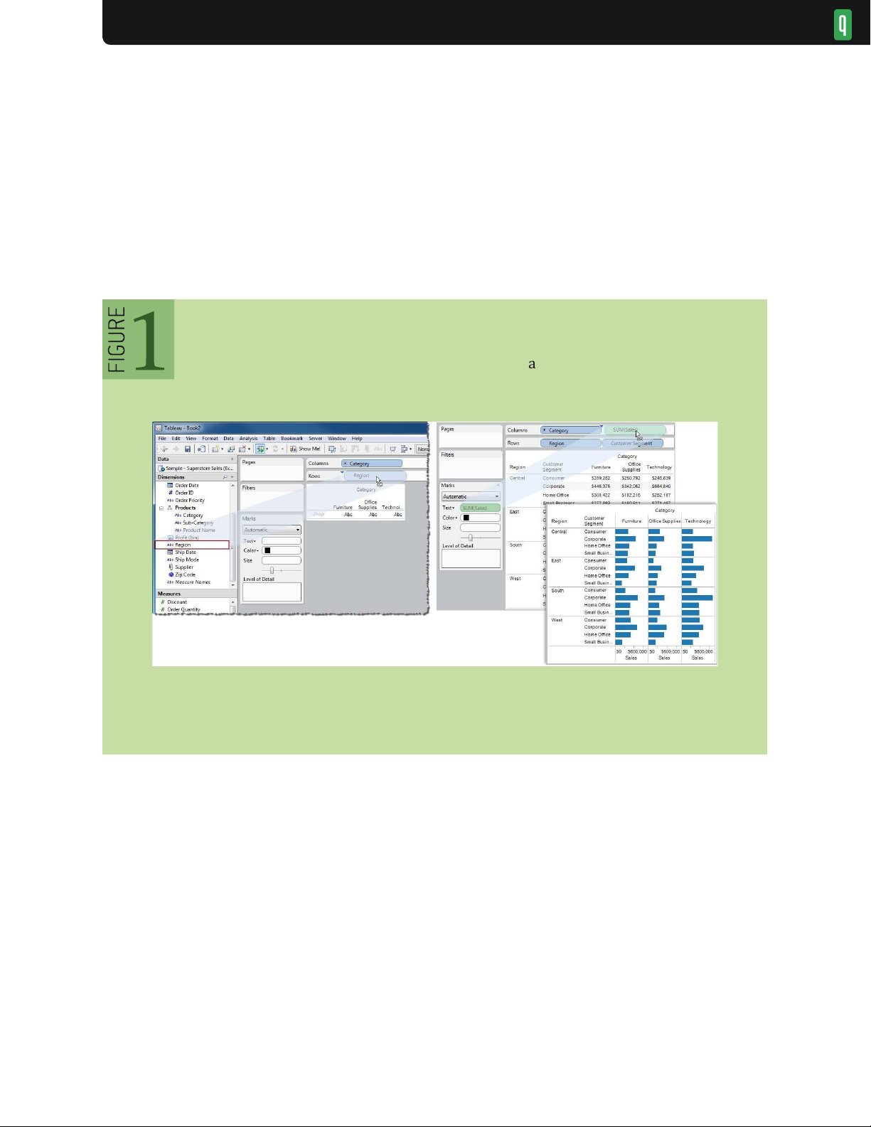
Tableau51 (née Polaris50) provides an example of visualization specification by drag-and-drop operations: analysts
place data variables on “shelves” corresponding to visual encodings such as spatial position, size, shape, and color
(see figure 1). The visual specification is then translated into an underlying formal grammar that determines both the
visualization design and corresponding queries to a database. This approach leverages the expressiveness of formal
grammars while avoiding the need for programming. Another advantage is that formal grammars can be augmented
with automated design facilities: a system can generate multiple visualization suggestions from a partial specification.
37,38,44 While systems based on formal grammars are both fluent and expressive, users need to understand the
underlying generative model, which imposes a steeper learning curve than the more familiar chart typology.
Visual encoding via drag-and-drop actions in Tableau 51
Fortunately, these methods are not mutually exclusive. Analysts can apply a data-flow system or formal grammar
to define new components to include within a chart typology, leveraging the improved expressiveness of the former
and the ease of use of the latter. Novel interfaces for visualization specification are still needed. A formal grammar
that uses graphical marks (rectangles, lines, plotting symbols, etc.) as its basic primitives provides a conceptual
model compatible with interactive design tools. New tools requiring little to no programming might place custom
visualization design in the hands of a broader audience. FILTER
Filtering of data values is intrinsic to the visualization process, as analysts rarely visualize the entirety of a data set
at once. Instead, they construct a variety of visualizations for selected data dimensions. Given an overview of
selected dimensions, analysts then often want to shift their focus among different data subsets— for example, to
examine different time slices or isolate specific categories of values.
Designers have devised a variety of interaction techniques to limit the number of items in a display. Analysts
might directly select (e.g., “lasso”) items in a display and then highlight or exclude them; we discuss these forms lOMoAR cPSD| 23136115 VISUALIZATION
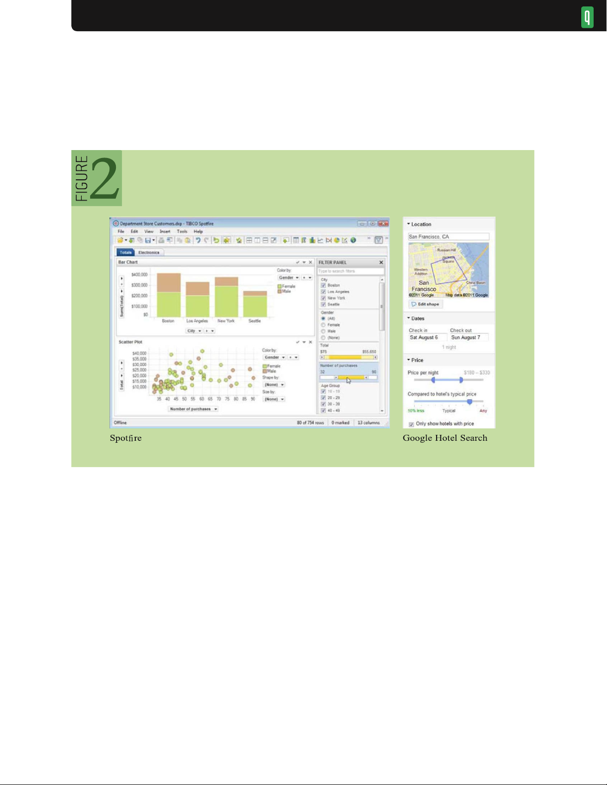
of direct view manipulation later. Another option is to use a suite of auxiliary controls, or dynamic query widgets,47
for controlling item visibility (see figures 2, 3, and 4). The choice of appropriate widget is largely determined by
the underlying data type. Categorical or ordinal data can be filtered using simple radio buttons or checkboxes
(when the number of distinct items is small), or scrollable lists, hierarchies, and search boxes with
Examples of dynamic query filter widgets
autocomplete (when the number of distinct items is large or contains arbitrary text). Ordinal, quantitative, and
temporal data can also be filtered using a standard slider (for a single threshold value) or a range slider (for
specifying multiple endpoints). When coupled with realtime updates to the visualization, these widgets allow rapid
and reversible exploration of data subsets. In figure 2, Spotfire (left) provides a variety of controls for filtering
visualized data: checkboxes and radio buttons filter categorical variables, while range sliders filter numerical
values; on the right, Google Hotel Search provides widgets for geographic, date, and price ranges. Query controls
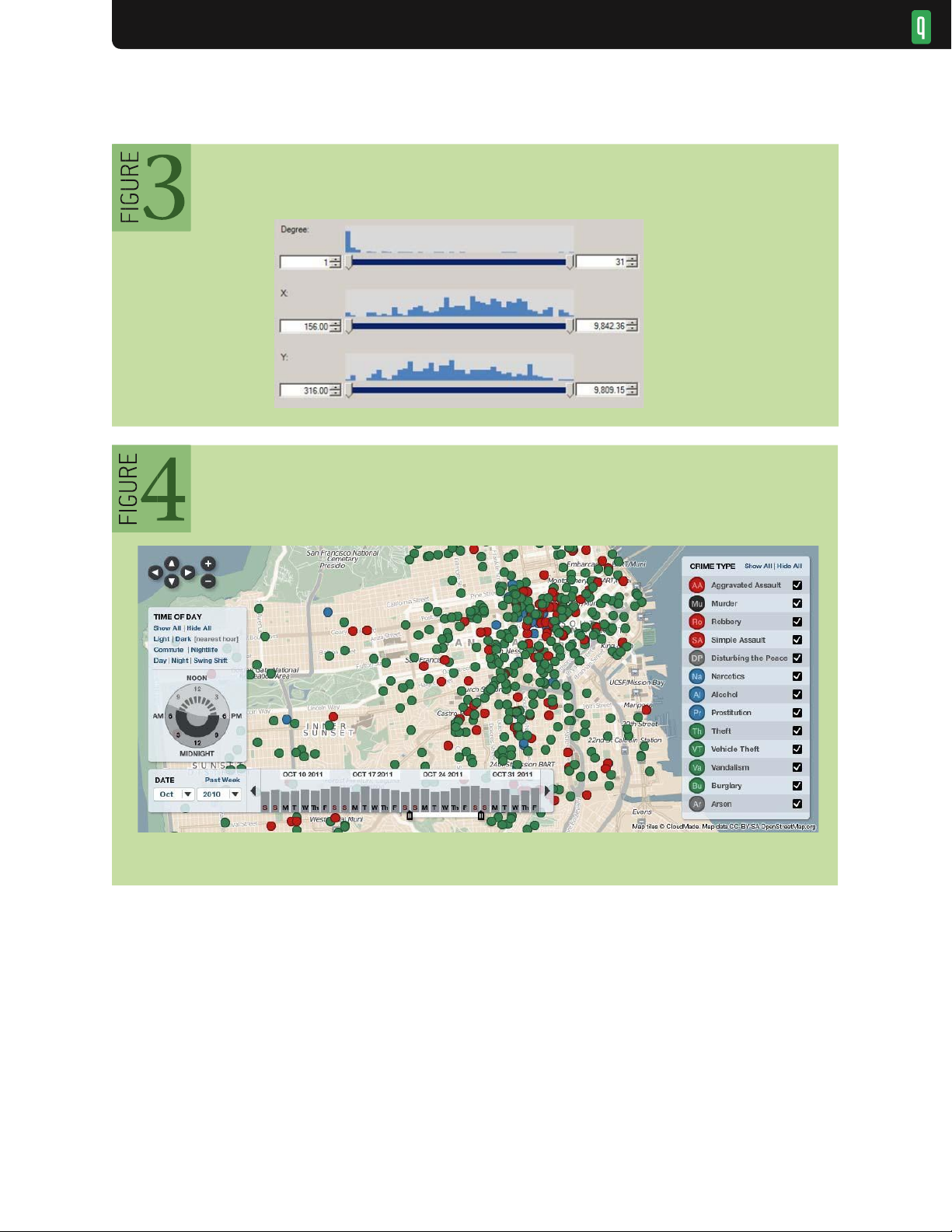
can be further augmented with visualizations of their own: figure 3 shows a range slider augmented with a
histogram of underlying values.
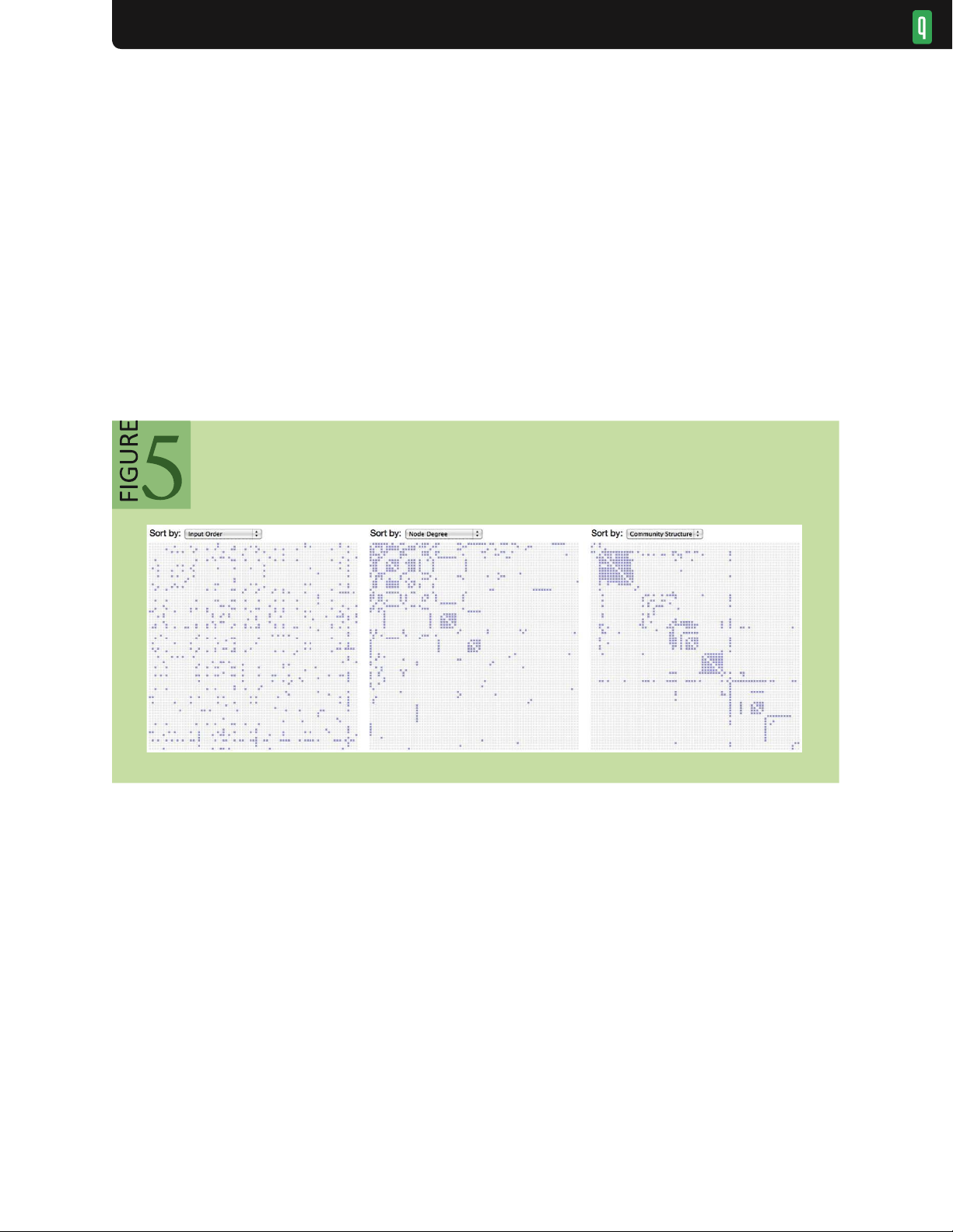
Expert analysts also benefit from more advanced functionality. For example, a search box might lOMoAR cPSD| 23136115 VISUALIZATION Histogram sliders in NodeXL
Zoomable map from CrimeSpotting.org
support sophisticated query mechanisms, ranging in complexity from simple keyword search, to regular expression
matching, to a full-fledged structured query language. While these additional mechanisms may not support rapid,
incremental exploration as fluently as graphical widgets, they provide a means for expressing more nuanced criteria.
Filtering also interacts with other operations: filtering widgets may operate over data sorted in a user-specified manner
(see next section), or users might create derived values (see section after next) and filter based on the results. SORT
Ordering (or sorting) is another fundamental operation within a visualization. A proper ordering can effectively surface
trends and clusters of values5 or organize the data according to a familiar unit of analysis (days of the week, financial
quarters, etc.). The most common method of ordering is to sort records according to the value of one or more variables.
Sorting controls can be simple choices in a toolbar or clicks on the header of a table to produce ascending or lOMoAR cPSD| 23136115 VISUALIZATION
descending sorts for numerical or textual values. Sometimes specialized sort orders such as weekday or month names
are necessary to reveal important patterns.
Ordering becomes more complicated in the case of multiple view displays, in which both entire plots and the values
they contain may be sorted to reveal patterns or anomalies. Sorting values consistently across plots (for example, by
their marginal mean or median values) can reveal patterns while facilitating comparison among plots.
Some data types (e.g., multivariate tables, networks) do not always lend themselves to simple sorting by value.
Such data may require more sophisticated seriation methods20,57,58 that attempt to minimize a distance measure
among items. The goal is to reveal underlying structure (e.g., clustering) within the data. An example is shown in
figure 5, a matrix-based visualization of a social network. On the left, a matrix plot of a social network conveys
little structure when the rows and columns (representing people) are sorted alphabetically. Interactively reordering
the matrix by node degree reveals more structure (center). Seriating the matrix by network connectivity reveals
underlying clusters of communities (right). Reorderable matrices DERIVE
As an analysis proceeds in iterative cycles, users may find that the input data is insufficient: variables may need to
be transformed or new attributes derived from existing values. Common cases include normalization or log
transforms to enable more effective value comparisons. Derived measures are often used to summarize the input data,
ranging from descriptive statistics (mean, median, variance) to model fitting (regression curves) and data
transformation (group-by aggregation such as counts or summations). While analysts can derive new values prior to
importing data for visual analysis, the overhead of moving between tools stymies fluid, iterative exploration. As a
result, visual analytics tools should include facilities for deriving new data from input data. Often this functionality
is provided via a calculation language, similar to those found in spreadsheets or database query languages. Beyond
these basic functions, hypothesis-testing methods (t-tests, ANOVA) can amplify the benefits of smooth integration of statistics and visualization.
Improved derivation methods present a promising frontier for visual analytics research. How can visual tools
support flexible construction of more advanced models or derived values? Using programming-by-demonstration
methods, analysts might annotate patterns (e.g., of network intrusion events60) from which the system can generalize
pattern-recognition rules. Or, visual tools might automatically fit applicable statistical models to the data based on
the current visualization state. For example, the nesting of variables within common “pivot” displays could be lOMoAR cPSD| 23136115 VISUALIZATION
mapped to the structure of a linear model. More principled frameworks that wed visualization to modeling and
forecasting are still emerging. VIEW MANIPULATION
Once analysts have created a visualization through data and view specification actions, they should be able to
manipulate the view to highlight patterns, investigate hypotheses, and drill down for more details. Analysts must be
able to select items or data regions to highlight, filter, or operate on them. Large information spaces may require
analysts to scroll, pan, zoom, and otherwise navigate the view to examine both high-level patterns and fine-grained
details. Multiple, linked visualizations often provide clearer insights into multidimensional data than do isolated
views. Analysis tools must be able to coordinate multiple views so that selection and filtering operations apply to all
displays at once and organize the resulting dashboards and work spaces. SELECT
Pointing to an item or region of interest is common in everyday communication because it indicates the subject of
conversation and action. In the physical world, people coordinate their gestures, gaze, and speech to indicate salient
items. For example, different hand gestures can communicate angle (oriented flat hand), height (horizontal flat hand),
intervals (thumb and index finger in “C” shape), groupings (circling a region), and forces (accelerating fist). 27 In
visual analysis, reference (or selection) remains of critical importance, but it is realized through a more limited set
of actions, such as clicking or lassoing items of interest.
Common forms of selection within visualizations include mouse hover, mouse click, region selections (e.g.,
rectangular and elliptical regions, or free-form “lassos”), and area cursors (e.g., “brushes”4 or dynamic
selectors such as the bubble cursor,18 which selects the item currently closest to the mouse pointer).
These selections often determine a set of objects to be manipulated, enabling highlighting, annotation, filtering, or
details-on-demand. Note that interactive selection is closely related to filtering: selections can be used to identify items
to remove from the display. The context of interaction must also be taken into account when choosing a selection
method. For example, responding to hover events to provide details-on-demand is inappropriate when using touch-
based input on a tablet or mobile phone.
Selections can also vary in terms of their expressive power. Most interfaces support selections of a collection of
items. Though this approach is easy to implement, it does not allow analysts to specify higher-level criteria. A more
powerful, albeit more complex, approach is to support selections as queries over the data. 22 Maintaining query
structure increases the expressiveness of visualization applications. For example, rather than directly selecting the
contained items, drawing a rectangle in a chart may specify a range query over the data variables represented by the
X and Y axes. The resulting selection criteria can then be saved and applied to dynamic data (updating items may
enter or exit a query region) or to a completely different visualization. Examples include querying stock-price
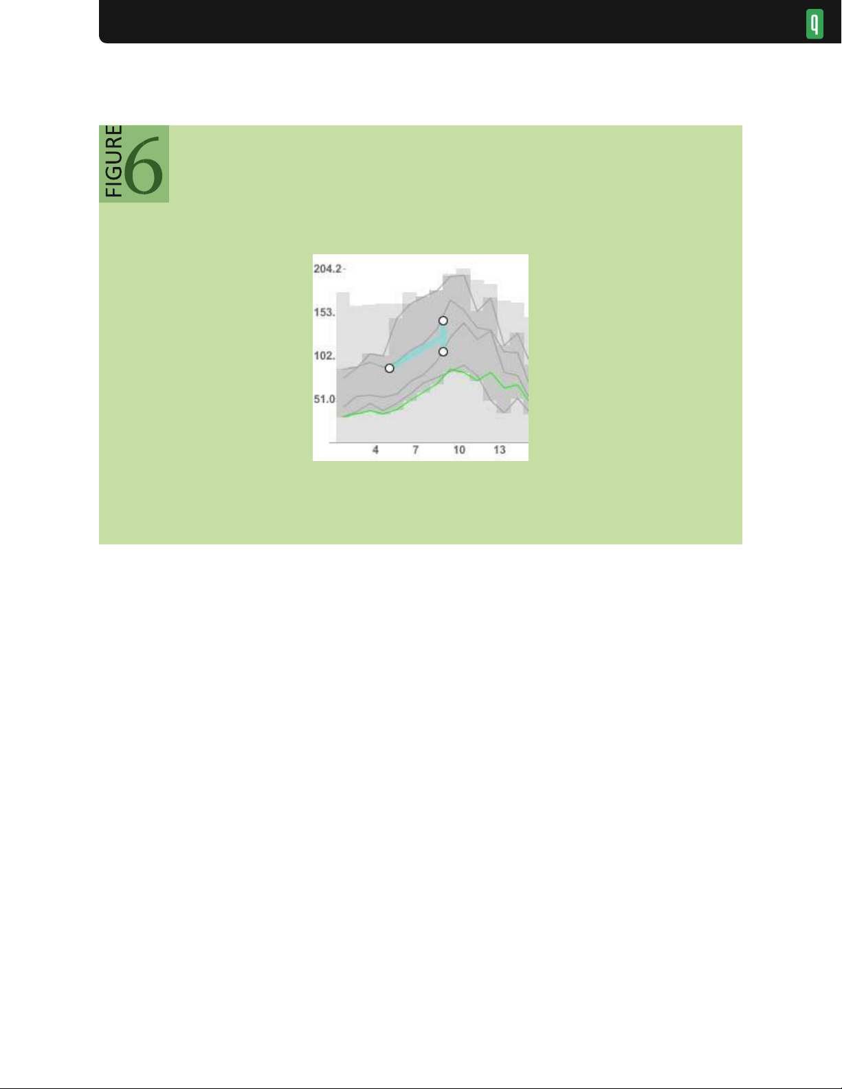
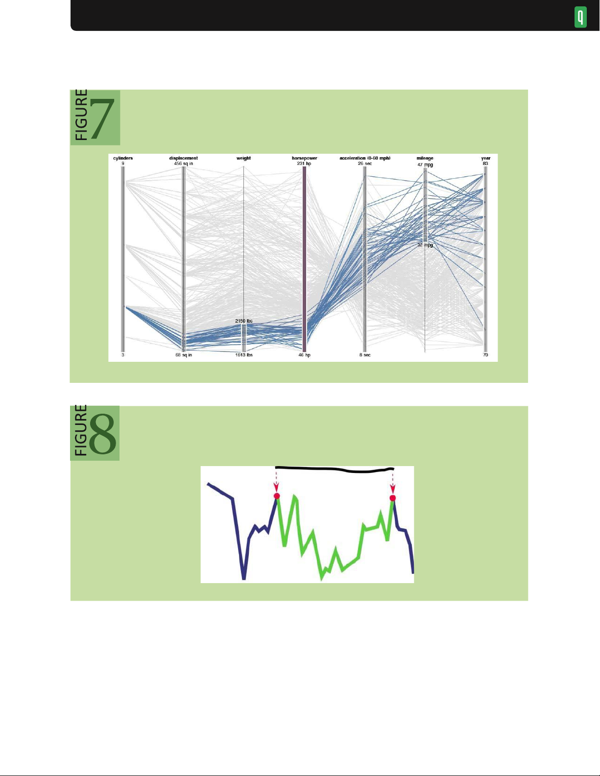
changes in TimeSearcher28 (see figure 6) and attribute ranges in parallel coordinates displays30 (figure 7). In figure 6
an angular selection tool specifies a target slope (rate of change) and tolerance for a collection of stock prices. All
time series with a similar slope over the queried time range are selected; shaded regions show envelopes of minimum
and maximum values. The widget operates directly on the visualization: dragging the widget from left to right
interactively queries other time windows. In figure 7 parallel coordinates plot multidimensional data as line segments
among parallel axes. Here, an analyst has dragged along the axes to create interactive selections that highlight
automobiles with low weight and high mileage. lOMoAR cPSD| 23136115 VISUALIZATION
Querying time-series by slope in TimeSearcher 28
Designing more expressive selection methods remains an active area of research. For example, researchers have
proposed methods to map mouse gestures over a time-series visualization to select perceptually salient data regions
such as peaks, valleys, and slopes35 (see figure 8) or to query complex patterns of temporal variation. 29 Initial
selections can also be used as a starting point for more complex selections, as analysts might click a representative
object and then formulate a broader selection based on the object’s properties (e.g., “select all items blue like this
one”). 22 Of course, selection need not be limited to the mouse and keyboard: input modalities such as touch, gesture,
and speech might enable new, effective forms of selection. lOMoAR cPSD| 23136115 VISUALIZATION
Selection queries in parallel coordinates 35
Perceptual interpretation of Ink annotations NAVIGATE
How analysts navigate a visualization is in part determined by where they start. One common pattern of navigation
adheres to the widely cited visual information-seeking mantra: “Overview first, zoom and filter, then details-on-
demand.”48 Analysts may begin by taking a broad view of the data, including assessment of prominent clusters,
outliers, and potential data-quality issues. These orienting actions can then be followed by more specific, detailed
investigations of data subsets. A common example is geographic maps: an overview might show an overall territory,
followed by zooming into regions of interest. For example, the map in figure 4 depicts criminal activity by time and
region. It shows all crimes committed after dark during the last week of October 2011. Dynamic query widgets enable lOMoAR cPSD| 23136115 VISUALIZATION
filtering by time of day (left), date span (bottom), and type of crime (right). Pan (drag) and zoom (buttons and scroll
wheel) controls enable view navigation. As an analyst zooms in on the map, the circular crime markers gain detailed
labels— a form of semantic zooming.
Of course, starting with an expansive overview is not always advisable. A legal analyst researching for an upcoming
trial may be wise to forego an overview of the entire history of U.S. court decisions. Instead, the analyst might start
with the legal decisions most relevant to the current case, perhaps determined by keyword search, and expand the
investigation to other, cited decisions. This form of navigation can be summarized as “Search, show context, expand on demand.”53
In either case, visualizations often function as viewports onto an information space. Analysts need to manipulate
these viewports to navigate the space. Common examples include scrolling or panning a display via scrollbars or
mouse drag, and zooming among different levels using a zoom slider or scroll wheel (figure 4). Zooming need not
follow a strict geometric metaphor: semantic zooming7 methods can modify both the amount of information shown
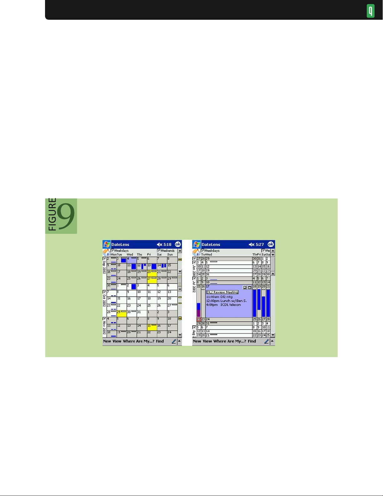
and how it is displayed as analysts move among levels of detail. In the calendar in figure 9, the display magnifies
selected regions as analysts navigate from months to days to hours. Semantic zooming reveals more details within
focal regions. Additionally, dynamic query widgets, such as range sliders for the X and Y axes
DateLens Focus-plus-Context Calendar 6
of a scatter plot, can filter the visible data range and thus provide a form of zooming within a chart.
To aid navigation further, researchers have developed a variety of focus plus context methods. These “bifocal”
views49 provide a detailed view of a high-interest data region while retaining surrounding context to help keep analysts
oriented. A second key idea is the use of overview and detail displays. For example, a geographic visualization might
include a large zoomed-in map (the detail), while a smaller, zoomed-out map includes a rectangle showing the position
of the zoomed-in view within the broader terrain (the overview). In this case, the detail view provides the focus, and
the overview provides context. The benefits are highest when the zoom factor (ratio of overview to detail view) is 5-
20.42 When larger zoom factors are needed, intermediate overviews may also be helpful.
A different approach is to use distortion or magnification techniques that transform the entire display region such
that contextual regions are demagnified. A simple example is the Mac OS X dock, which uses 1D fisheye distortion
to show common applications; more sophisticated methods employ distortion in multiple dimensions. While often lOMoAR cPSD| 23136115 VISUALIZATION
visually intriguing, complex distortion methods have yet to prove their worth in real-world applications: viewers can
become disoriented by nonlinear distortions, which show no significant performance improvement over simpler methods such as zooming. 39
In addition to manipulating display space, focus-plus-context methods can be applied directly to the data itself.
The goal is to identify which data items are currently of high interest (focus), which are of high importance
regardless of the current focus (context), and which can be safely removed from view. DOI (degree-of-interest)
functions17,24,53 calculate scores for information content based both on general importance (e.g., top-level
categories within a hierarchy, or nodes with high centrality in a graph) and current interest (e.g., as indicated by
mouse clicks, search queries, or proximity to other high-interest items). The distribution of DOI scores can then
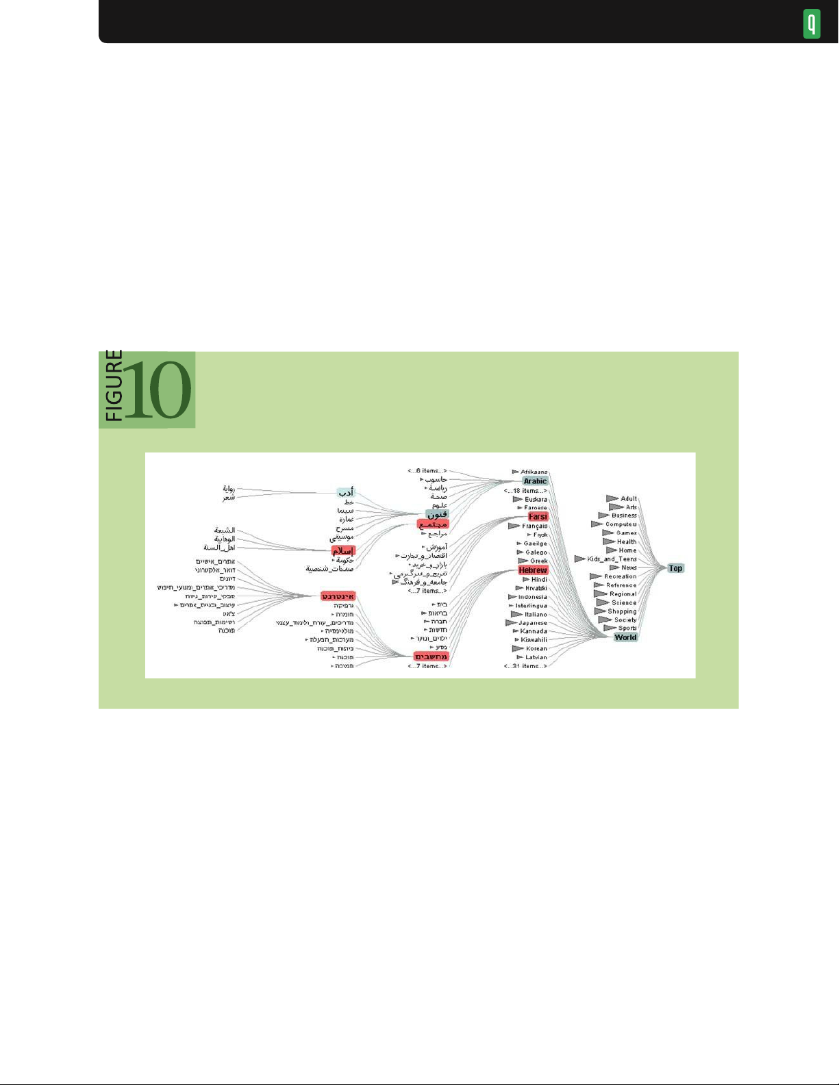
be used to selectively control the visibility of items based on the current view size and context of interaction, as
in figure 10. As analysts click on or search for different items, the DOI scores
Degree-of-interest tree of a taxonomy with 600k item s 24
dynamically update to reveal relevant unseen data or hide irrelevant detail. A model of the analyst’s current interest
filters the display to the most relevant items. Low-interest items are elided but still accessible through aggregate
representations. The interest estimates update as an analyst explores the taxonomy, initiating animated transitions
between different views of the data.
Visualizations can provide cues to assist analysts’ decisions of where and how to navigate. The controls for view
manipulation have often been invisible, such as zooming/panning by mouse movement. Improved strategies facilitate
discovery by analysts and provide visible indication of settings in legends or other ways, such as scrollbar positions,
that provide informative feedback. An important challenge is to show selected items, even when they are not in view.
For example, the results of a text search that are not currently in view might be shown by markers in the scrollbar61 or
the periphery of the display. 3,19 COORDINATE
Many analysis problems require coordinated multiple views that enable analysts to see their data from different
perspectives. A public policy analyst studying educational attainment might produce a bar chart of people’s ages, a
map of locations, a textual list with education history, and a scatter plot showing income vs. education. By selecting lOMoAR cPSD| 23136115 VISUALIZATION
a single item or a group in one view, analysts might see related details or highlighted items in the other views. This
powerful approach to exploring multivariate data also enables drilling down into subgroups, marking sets, and exporting selections.
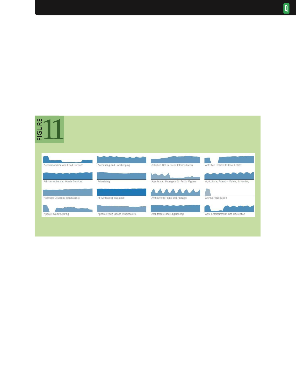
Multiview displays can facilitate comparison. For example, Edward Tufte52 advocates the use of small multiples:
a collection of visualizations placed in spatial proximity and typically using the same measures and scales. As in
figure 11, these small multiples, also called trellis plots, enable rapid comparison of different data dimensions or time
slices. The visualization shows employment figures by economic sector in Minnesota. The repetition of the chart
form supports comparison among sectors. Plotting all the data in one chart would otherwise clutter and obscure individual trends.
Selecting a point in time in one view highlights the corresponding point in all other views. Small multiples display
Alternatively, multiple view displays can use a variety of visualization types— such as histograms, scatter plots,
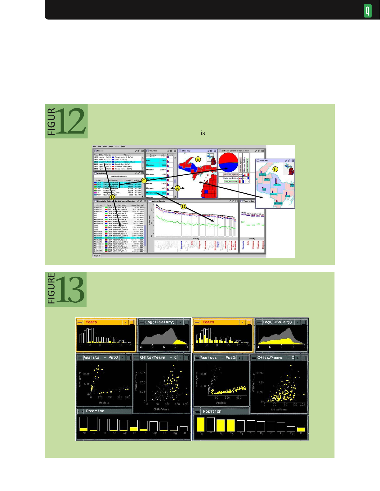
maps, or network diagrams— to show different projections of a multidimensional data set. An analyst constructs a
complex patchwork of interlinked tables, plots, and maps in figure 12 to analyze the outcomes of elections in
Michigan. Annotations indicate how selected data items correspond between visualization views. Accompanying
items such as legends, histogram sliders, and scrollbars with highlighting markers can all provide multiple views onto
the data. Automatically generated legends and axes are important for providing accurate annotations for analysts and
meaningful explanations when visualizations are shared. Legends and axes can also become control panels for
changing color palettes, marker attributes, variable ranges, or provenance information.43
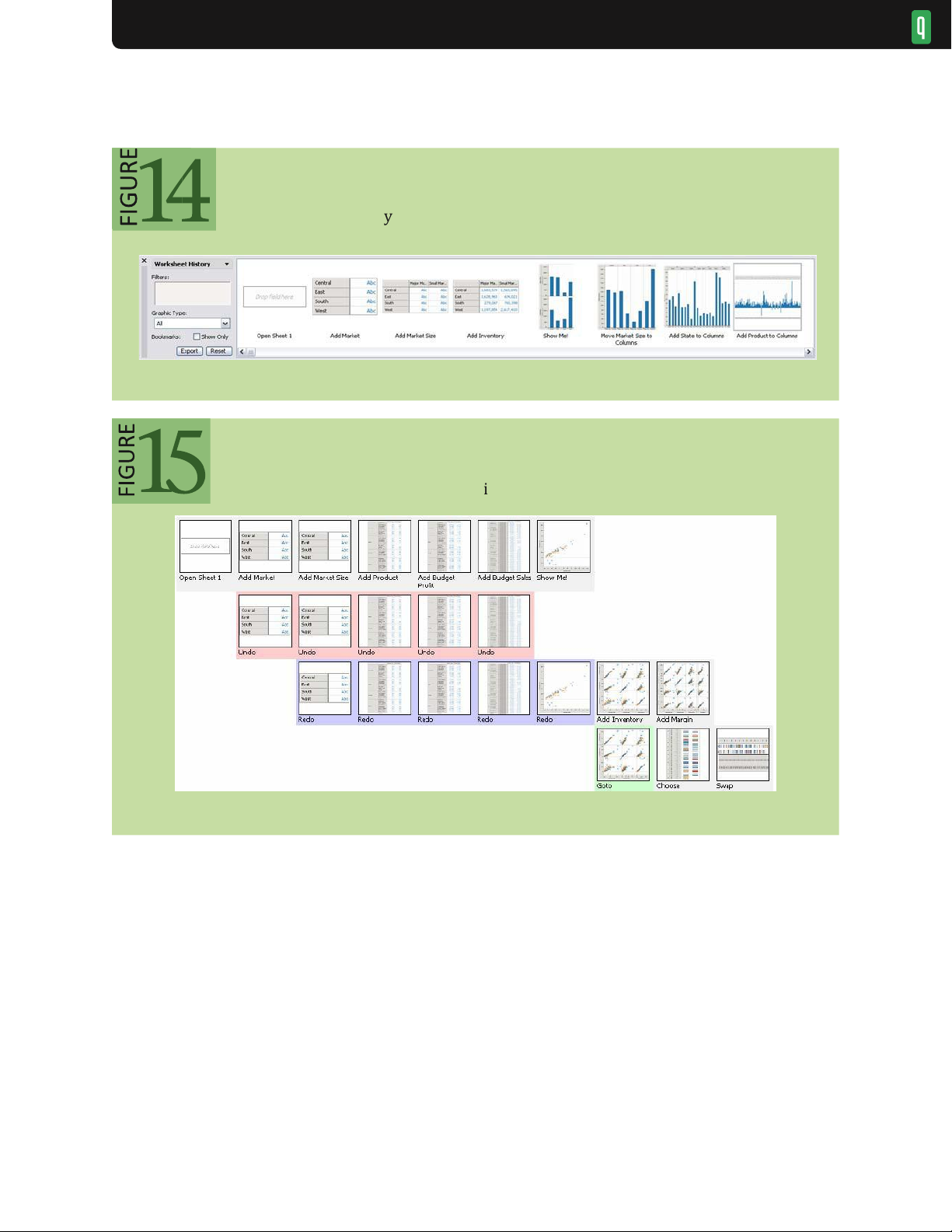
Multiview displays can also enable interactive exploration across views. Brushing and linking is the process of
selecting (brushing) items in one display to highlight (or hide) corresponding data in the other views.4 In figure 13, a
baseball analyst makes selections in one plot and corresponding items highlight in the others. On the left, selecting
high-income players (top-right plot) shows little dependence on career length or fielding ability, but correlates with
hitting performance. On the right, selecting the cluster of players who make more assists than put-outs (middle-left
plot) reveals a strong dependence on position. Each visualization can thus serve as an input channel for revealing
patterns across a data set. Linked selection enables rich, multidimensional reasoning by allowing analysts to assess
how patterns in one view project onto the others. Analysts may wish to coordinate views in variety of ways:40,55
selecting items in one view might highlight matching records in other views, or instead provide filtering criteria to lOMoAR cPSD| 23136115 VISUALIZATION
remove information from the other displays. Linked navigation provides an additional form of coordination: scrolling
or zooming one view can simultaneously manipulate other views.
Though comparing multiple visualizations requires viewers to orchestrate their attention and mentally integrate
patterns among views, this process is often more effective than cluttering a single visualization with too many
dimensions. Future studies of how analysts construct multiview
Multiple coordinated views in Improvis 55 e
Brushing and linking of baseball statistics in GGobi lOMoAR cPSD| 23136115 VISUALIZATION
displays and specify coordination behaviors (e.g., highlighting, filtering) could provide designers with an
understanding of how to build more effective tools. In addition, if designers ensure that rich multiview displays stay
understandable, analysts are more likely to make compelling insights. Newcomers to an analysis, or even seasoned
analysts simply returning from a coffee break, may become confused by the number of views and the potentially
complicated set of coordinated queries between them. Visual analytics systems that provide access to coordination
settings and replay the history of view construction can enhance understanding. ORGANIZE
When analysts make use of multiple views they face the corresponding challenge of managing a collection of
visualizations. As in traditional window-based interfaces, analysts may wish to open, close, maximize, and lay out
different components. As purely manual window manipulation can be tedious, well-designed visual analytics tools
simplify the organization of visualization views, legends, and interactive controls. For example, a human resources
data set may show a scatter plot of salary by years of experience, plus a bar chart showing 10 age groups, and a
treemap with seven corporate sites, each with 10-30 job titles. These three visualizations might give a large area for
the scatter plot, with the bar chart and treemap to the right side stacked one above the other. A control panel with
sliders, checkboxes, radio buttons, and a search box could be on the far right, with a details-ondemand window and
annotation box across the bottom. This tiled approach allows analysts with sufficiently large displays to see all the
information and selectors at once, minimizing distracting scrolling or window operations, while enabling them to
concentrate on extracting and reporting insights. The coordination across windows means that slider movements or
checkbox selections will cause all views to update, allowing rapid exploration of just the employees at certain sites or specific job titles.
Typical systems allow analysts to add views, such as a second scatter plot, in ways that make modest changes to
the existing window organization. An alternative approach is to add a new tab that contains the second scatter plot, so
analysts can switch between the first and second set of windows. A common feature is to add trellised views, so
multiple visualizations can be created at once— for example, separate bar charts showing age distributions for each of the seven corporate sites.
More advanced systems might aid this process through automated support8 that enables multiple windows to be
opened/closed as a group and lays them out in orderly ways. Useful methods include standard scatter plot matrices
(showing all pairs of scatter plots) or custom generation of related views of interest (e.g., of data variables correlated
to the visualized attributes). Desirable features are automatic (re)sizing as views are added or removed and layout
routines to place related views in spatial proximity.
As larger and multiple displays become more common, layout organization tools will become decisive factors in
creating effective user experiences. Similarly, the demand for tablet and smartphone visualizations will promote
innovation in layout organizations that are compact and reconfigurable by simple gestures. Zooming, panning,
flipping, and sequencing strategies will also improve analyst experiences and facilitate effective presentations to others. PROCESS AND PROVENANCE
Visual analytics is not limited to the generation and manipulation of visualizations— it involves a process of iterative
data exploration and interpretation. As a result, visual analytics tools that provide facilities for scaffolding the
analysis process will be more widely adopted. Tools should preserve analytic provenance by keeping a record of
analyst actions and insights so that the history of work can be reviewed and refined. Textual logs of activity have
benefits, but visual overviews of activity can be more compact and comprehensible. If analysts can annotate patterns,
outliers, and views of interest, they can document their observations, questions, and hypotheses. In a networked lOMoAR cPSD| 23136115 VISUALIZATION
environment, analysts should be empowered to share results and discuss with colleagues, coordinate the work of
multiple groups, or support processes that may take weeks and months. Moreover, analysis tools can explicitly guide
novices through common analysis tasks, provide progress indicators for experts, or lead viewers through an analysis story. RECORD
When analyzing data with visualizations, users regularly traverse the space of views in an iterative fashion.
Exploratory analysis may result in a number of hypotheses, leading to multiple rounds of questions and answers.
Analysts can generate unexpected questions that may be investigated immediately or revisited later. After
conducting analysis, analysts may need to review, summarize, and communicate their findings, often in the form of reports or presentations.
To support iterative analysis, visual analysis tools can record and visualize analysts’ interaction histories. At a
minimum, applications should provide basic undo and redo support. While lowlevel input such as mouse and
keyboard events are easy to capture, histories become much more valuable when they record high-level semantic
actions. By modeling the space of user actions (view specifications, sorting, filtering, zooming, etc.), richer logs
can be constructed and visualized.15,25,32,45 Common visual representations of analytic actions include both
chronological (“timeline”) and sequential (“comic strip”) views. As shown in figure 14, a “comic strip” display
retraces the steps taken in a visual analysis of business operations data.
Visual histories also reveal the hierarchical patterns of branching histories. Reading the graph shown in figure 15
in a snake-like fashion (first left-to-right, then right-to-left) reveals patterns of iterative exploration, branching, and
backtracking in an analysis. Techniques for “chunking” related actions together can further reduce clutter. 25,36
Visual histories can support a range of interactions. First, histories provide a convenient mechanism to revisit prior
analysis states and resume incomplete explorations. Adding metadata such as comments, tags, or ratings to states can
facilitate later review and sharing. Interactive histories can also capture a repeatable sequence of operations that can be named and saved as a lOMoAR cPSD| 23136115 VISUALIZATION Visual analysis history 25
Behavior graph of branching analysis 25
reusable macro. This powerful feature enables analysts who are dealing with many similar data sets to automate their
efforts. Histories might spur sharing: analysts can export selected analysis trails, ranging from screen shots to
interactive presentations, to external media. Finally, histories also provide a means to study analysts and model analytic processes. 32,45 ANNOTATE
Interactive visualizations often serve not only as data exploration tools, but also as a means for recording, organizing,
and communicating insights gained during exploration. One option is to allow textual annotation of states within a
visual history. More expressive annotations are possible through direct interaction with the view, using the selection
techniques discussed earlier. Analysts may wish to “point” to specific items or regions within a visualization and associate these
annotations with explanatory text or links to other views. 26
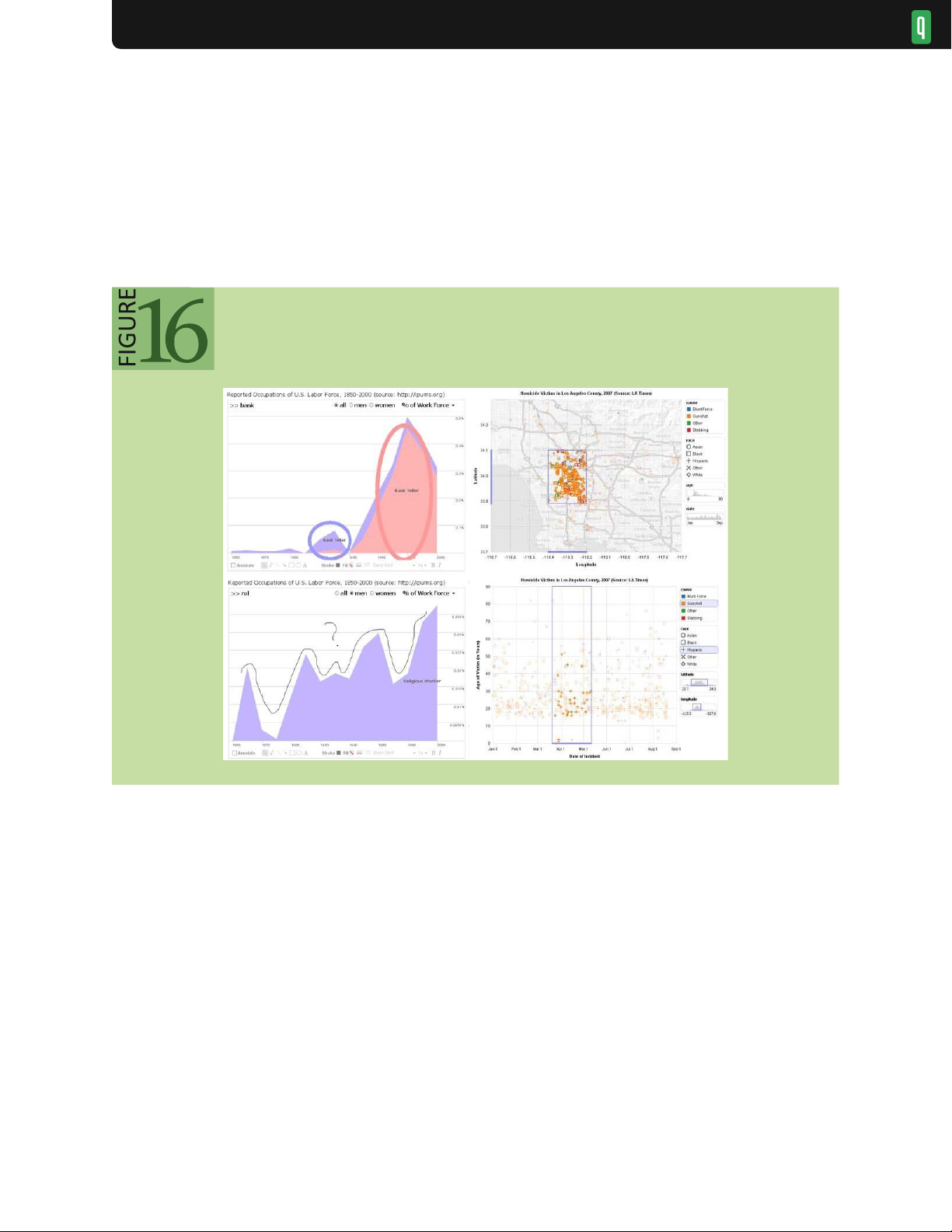
Freeform graphical annotations provide one expressive form of pointing. 26 Drawing a circle around a cluster of
items or pointing an arrow at a peak in a graph can direct the attention of viewers. The angle or color of the arrow lOMoAR cPSD| 23136115 VISUALIZATION
or shape of the hand-drawn circle may communicate emotional cues or add emphasis. The left side of figure 16
shows annotated occupational data: the top annotation highlights a gender reversal among bank tellers using color-
coded ellipses; the bottom annotation expresses confusion regarding the erratic percentage of religious workers.
Although such drawings allow a high degree of expression, they lack an explicit tie to the underlying data. Freeform
annotations implemented as vector graphics can persist over geometric transformations such as panning and
zooming, but if they are not “data-aware,” then they may become meaningless in the Annotated visualizations
face of operations such as filtering or aggregation.
Annotations can be made data-aware when realized as selections, as seen in the right side of figure 16. In the top
chart, selection queries anchor annotations of crime data. The bottom chart shows annotations transferred across a
change in visual encodings: the selected geographic range is now conveyed using histogram sliders. These selections
can be represented as a set of selected items, a declarative query, or both. 22 Data-aware annotations allow a pointing
intention to be reapplied to different views of the same data, enabling reuse of references across different choices of
visual encodings. Data-aware annotations may also enable analysts to search for all commentary or visualizations that
reference a particular data item. As data-aware annotations are machine readable, they might also be used to export
selected data or aggregated to identify data subsets of high interest. SHARE
Researchers in visual analytics often focus on the perceptual and cognitive processes of a single analyst. In practice,
real-world analysis is also a social process that may involve multiple interpretations, discussion, and dissemination of
results. 26,54 The implication is clear: to support the analysis life cycle fully, visual analytics tools should support social
interaction. At minimum, tools must be able to export views (png, jpg, ppt, etc.) or data subsets (csv, json, xls, etc.)
for sharing and revisitation. An important capability is to export the settings for the control panels, so other analysts lOMoAR cPSD| 23136115 VISUALIZATION
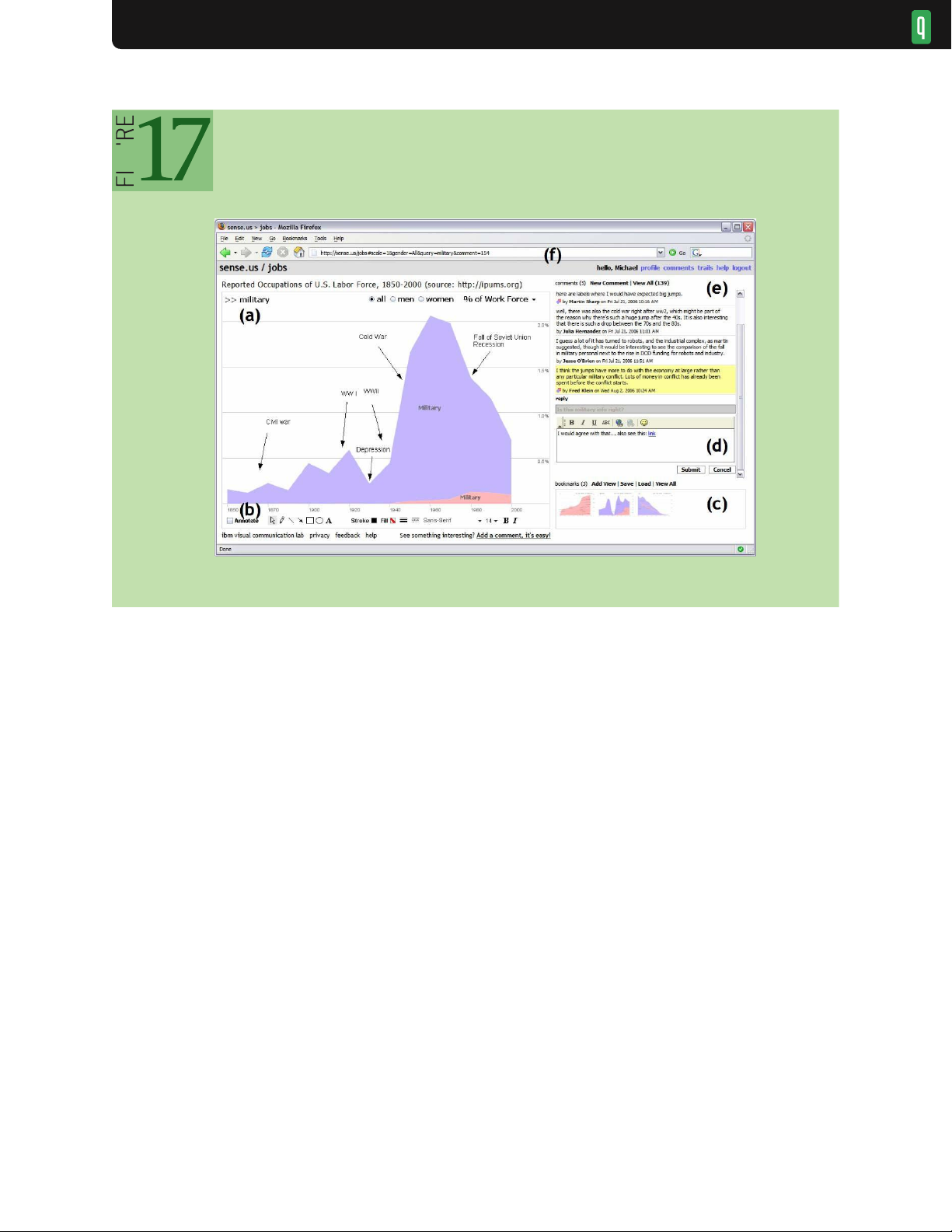
can see the same visualization. Figure 17 shows sense.us 26 one example of a collaborative visual analysis tool
incorporating view sharing, annotation, and discussion. The system consists of (a) an interactive visualization, (b) a
set of graphical annotation tools, (c) bookmark trails for saved views, (d) a text-entry field for adding comments
(bookmarks can be dragged onto the text field to link views to a comment), (e) textual comments attached to the
current view, and (f) a shareable URL that is updated automatically as the visualization state changes.
A simple but effective aid to collaboration is view sharing via application bookmarking: a visual analytics system
should be able to model and export its internal state. 26,54 Unlike a static screen shot, bookmarking enables analysts to
take up an exploration where their collaborators left off. View sharing often takes the form of an URL or similar
identifier that allows a collaborator to navigate quickly to a view of interest. Seeing an identical view provides
collaborators with a common ground for discussion. Annotation methods can be applied within such views to further
collaboration. One challenge for effective view sharing concerns how to handle dynamic data: should a bookmarked
view maintain a snapshot to historical data, provide access to the most current data, or both?
Another method of sharing and dissemination is to publish a visualization. Commercial tools such as Spotfire and
Tableau can publish visualization dashboards as interactive Web pages. These Web-based components provide a
subset of interactive functionality (e.g., selection, search, and drill-down) to enable some amount of follow-up
analysis. Services such as IBM’s Many Eyes54 can be used to embed visualization applets in external Web sites.
Publishing is particularly important for reaching larger audiences. While publishing is a necessary condition for
broad sharing, it may not be sufficient by itself for engaging viewers. 21 Visualizations embedded within a blog or
discussion forum can reach an established audience and may foster discussion more effectively than a centralized site.13
Other collaborative concerns depend on the context of use. Are collaborators working synchronously (same
time) or asynchronously (different time)? Are they co-located (same place) or lOMoAR cPSD| 23136115 VISUALIZATION
distributed (different place)? Each of these configurations may require specialized strategies that
consider the division of work, access control, presence indicators, and activity awareness. 21,26,31 GUIDE
The exploration process is well understood for some traditional domains. For example, a very simple
workflow might remove incomplete data items, sort, select high-value items, and report on these
analytic sto lead analysts through work flows for common tasks. selections. Analysts,
however, may need to develop new strategies that are formalized to guide newcomers and provide
progress indicators to experts. Visual-analysis systems can incorporate guided
Some processes are clearly linear, but many visual-analytics tasks require richer systematic yet flexible
processes that allow analysts to take excursions while keeping track of what they have done. nodes, plot nodes,
find communities); the system allows analysts to skip steps selectively and keeps a
For example, SocialAction41 organizes social-network analysis into a sequence of activities (e.g., rank
record of which steps have been completed. In figure 18, the panel on the left suggests common steps
to structure social network analysis and provides progress indicators.
In a related vein, experts often develop visualizations that are used by less knowledgeable team
members, in much the same way that spreadsheet macros enable specialists to encode accounting or
business practices for others. More research is needed to identify effective visual-analytics processes
and enable expert analysts to create reusable workflows.
In recent years, journalists have been experimenting with different forms of narrative visualization
46 by structuring interactive graphics to tell stories with data. Visualizations from The lOMoAR cPSD| 23136115 VISUALIZATION narrative
Collaborative visual analysis in Sense.us 26
Tài liệu liên quan:
-
Giới thiệu các loại mật thư và kỹ thuật giải mật thư | Data Science | Trường Đại học Quốc tế, Đại học Quốc gia Thành phố Hồ Chí Minh
22 11 -

Midterm Exam Môn Data Science and Visualization | Trường Đại học Quốc tế, Đại học Quốc gia Thành phố Hồ Chí Minh
167 84 -
Project Proposal: COVID-19's Impact on Population Density | Môn Data Science and Visualization - Trường Đại học Quốc tế, Đại học Quốc gia Thành phố Hồ Chí Minh
103 52 -
Final Exam Notes | Môn Data Science and Visualization - Trường Đại học Quốc tế, Đại học Quốc gia Thành phố Hồ Chí Minh
121 61 -
Final Review Môn Data Science and Visualization | Trường Đại học Quốc tế, Đại học Quốc gia Thành phố Hồ Chí Minh
106 53