







Preview text:
IELTS Sample Pie Chart ( Writing Task 1)
(Tài liệu được tham khảo tại: english-exam.org) #01
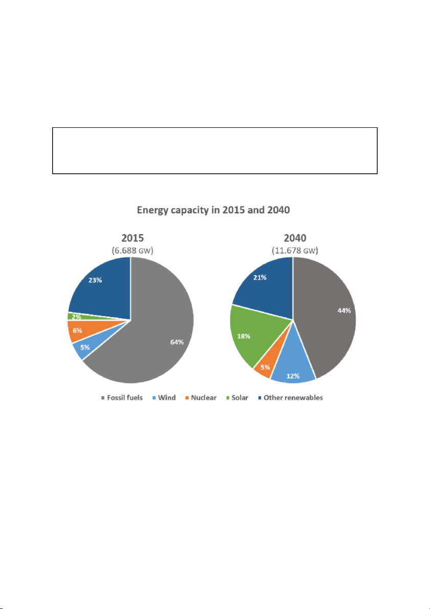
The pie charts below compare the proportion of energy capacity in gigawatts (GW) in 2015 with the predictions for 2040.
Summarize the information by selecting and reporting the main features, and make comparisons where relevant. Write at least 150 words. Model answer
The charts show the expected changes in energy capacity in 2040 compared to 2015.
The most noticeable feature is the drop in the proportion of the annual gross capacity of
fossil fuels, with the projected capacity almost doubling from 6.688 to 11.678 gigawatts. It is
expected to experience a signiûcant decline, falling from 64% in 2015 to 44% in 2040. By
contrast, it is predicted that there will be a dramatic rise in the proportion of energy capacity
from solar energy with a jump from 2% to 18% in 2040. While the proportion of the capacity
for wind is anticipated to increase more than twofold from 5% in 2015 to 12% in 2040, it is
estimated that other renewables will account for a smaller proportion with a decrease from
23% to 21%. The projected proportion for nuclear energy will be 5% in 2040, a slight decline from 6%.
It is clear that despite the decline in the proportion of energy capacity from fossil fuels and
the rise in solar and wind sources, the former will remain a major energy source in 2040. (182 words) #02
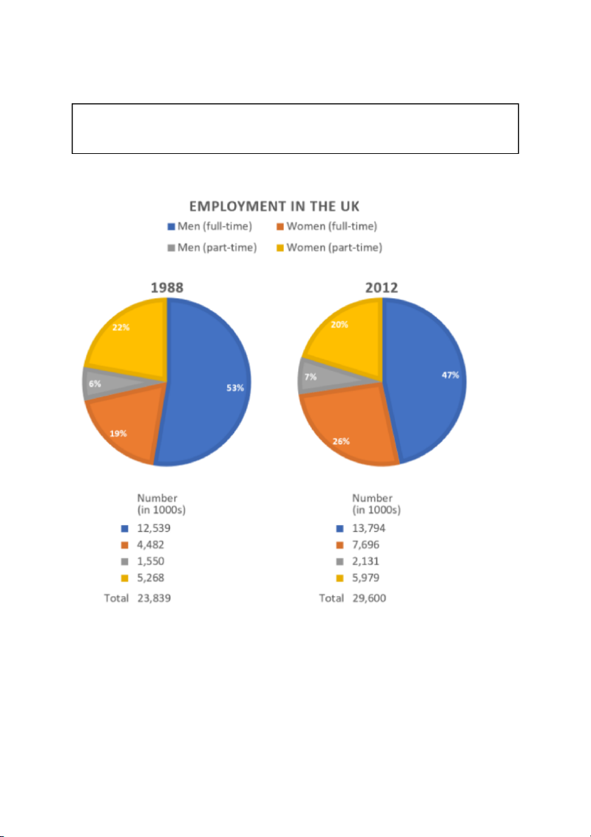
The charts give information about employment in the UK in 1998 and 2012.
Summarize the information by selecting and reporting the main features, and make comparisons where relevant. Write at least 150 words. Model answer
The pie charts show the numbers and percentages of men and women in both full-time and
part-time employment in the UK in 1988 and 2012. Overall, we can see that all numbers
increased but there were signiûcant differences in the proportions for each year.
Firstly, although the number of men in full-time employment was largest in both years, the
greatest change was in the number of women working full-time. This increased from
4,482,000 in 1988 to 7,696,000 in 2012. These changes can be seen in the percentages of
the total workforce; in 1988, women in full-time employment made up only 19% of working
people, but this increased to 26% in 2012. As well as the number of people working full-time,
the number of people working part-time also increased, with women being the largest
number in both years: 5,268,000 and 5,979,000, compared with 1,550,000 and 2,131,000 for men.
In conclusion, apart from female full-time employment and male part-time employment,
percentage ûgures decreased between the two years. Most signiûcantly, men working
full-time dropped below 50% to 47% in 2012. (177 words) #03
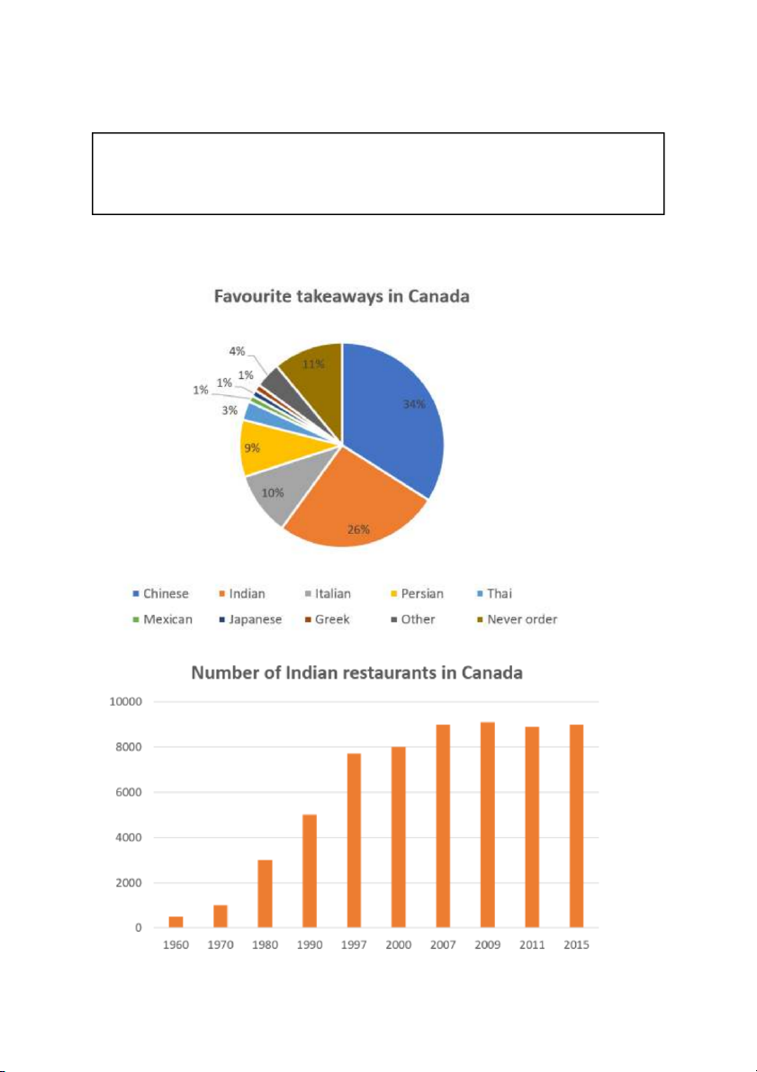
The charts below show the favorite takeaways of people in Canada and the number of
Indian restaurants in Canada between 1960 and 2015.
Summarize the information by selecting and reporting the main features, and make comparisons where relevant. Write at least 150 words. Model answer
The pie chart shows which type of takeaway food is the most popular in Canada, while the
bar chart shows how many Indian restaurants existed in Canada between 1960 and 2015.
We can see that Chinese and Indian takeaways are the favourites, and that the number of
Indian restaurants in Canada rose steadily during this period.
The pie chart shows that Chinese and Indian takeaways are much more popular than all the
others, at 34% and 26%. There are another two types that quite a lot of people like. These are
Italian at 10% and Persian at 9%. Greek, Japanese and Mexican were only chosen by 1% of people.
The pie chart shows us that Indian food is popular and the bar chart shows how its
popularity grew. There was a rising trend from 1960 onwards. The increase was greatest in
the 1990s, from about 5000 restaurants in 1990 to almost 8000 in 2000. Since 2007, the
number has remained stable at just over 9000. (165 words) #04
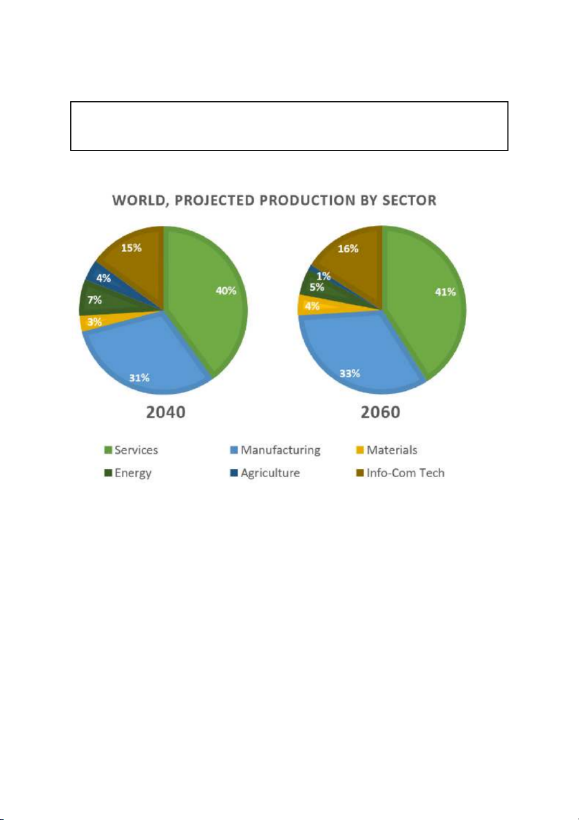
The charts show projections for global production by sector in 2040 and 2060.
Summarize the information by selecting and reporting the main features, and make comparisons where relevant. Write at least 150 words. Model answer
The charts show projections for global production by sector in 2040 and 2060. Generally
speaking, there is little change in the projected proportion of production by the various
sectors in the two years, with manufacturing and services being the most dominant.
It is forecast that the services and manufacturing sectors together will account for more
than half of global production in 2040 and 2060, 71% (40% and 31%) and 74% (41% and 33%)
respectively. By contrast, the proportion of production from energy is expected to decline
from 7% in 2040 to 5% in 2060, a drop of approximately one third. It is also anticipated that
there will be a similar dramatic drop for agriculture production from 4% to 1% with
production in materials, by contrast, comprising 4% in 2060 compared to 3% in 2040.
As regards info-communications and technology, there is expected to be little difference in
the proportion of production the sector constitutes, with a slight rise from 15% to 16% over the period. (165 words) #05
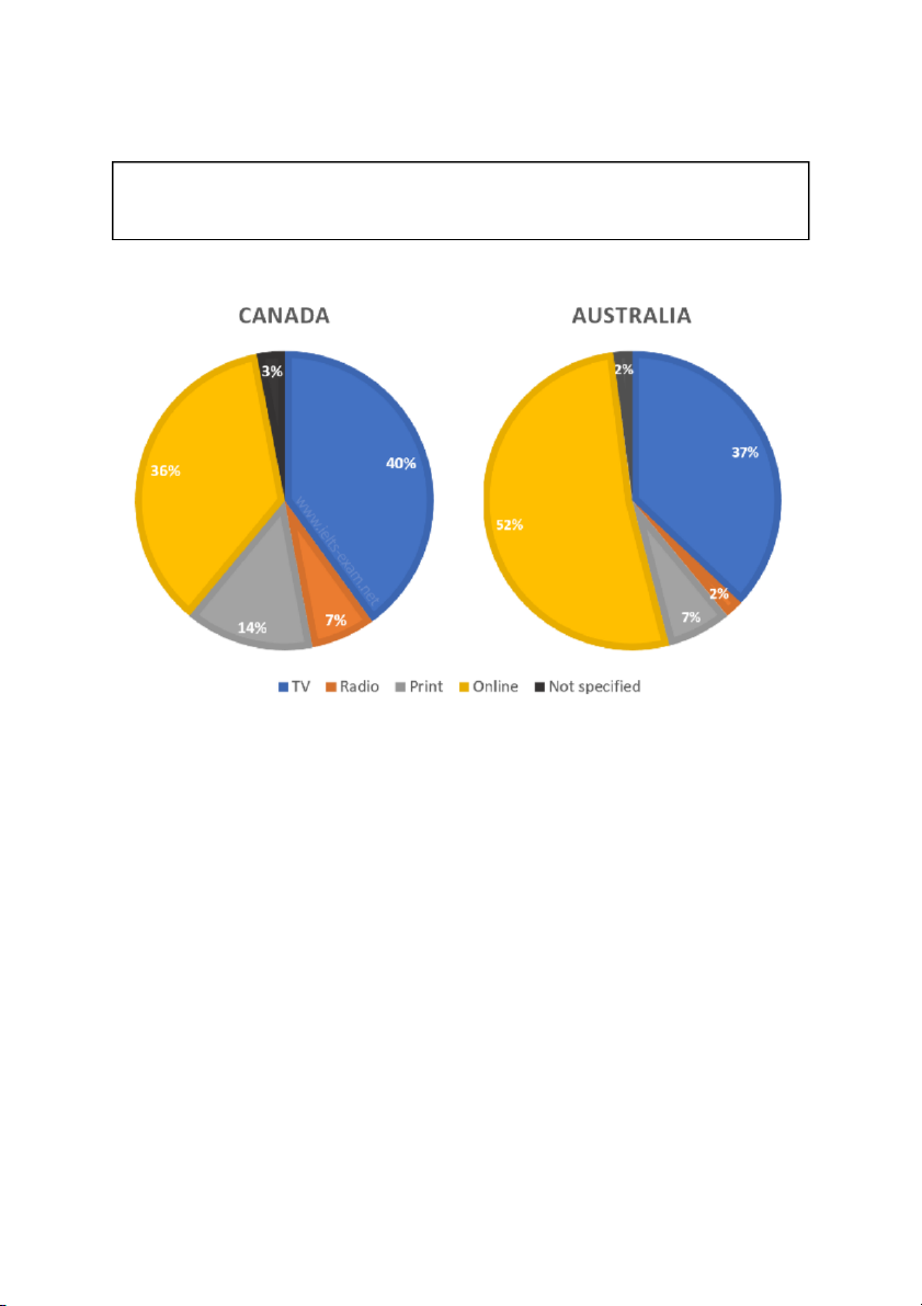
The pie charts compare ways of accessing the news in Canada and Australia.
Summarize the information by selecting and reporting the main features, and make comparisons where relevant. Write at least 150 words. Model answer
The pie charts show the principle ways of ûnding out the news in two different countries,
Canada and Australia. The two nations show broadly similar patterns, though there are some
differences, both signiûcant and minor.
One of the most prominent features of this data is that, while in Canada over a third of
people access the news online, in Australia the ûgure is more than half, at 52%. It is apparent
that viewing the TV news is popular in both countries, with about two ûfths of Canadian
population favoring this mode of delivery and only 3% fewer in Australia. One major
difference between Canada and Australia is that over twice as many people read the news in
print in the former, compared with the latter. The ûgures are 14% and 7% respectively.
Similarly, listening to the news on the radio is preferred by three times more people in Canada than in Australia.
Overall, it can be said that the high levels of internet use in Australia mean that other
methods such as radio and print are used less in comparison with Canada. (182 words) #06
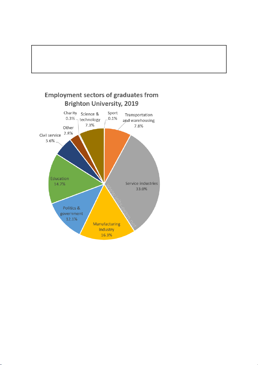
The chart below shows the proportions of graduates from Brighton University in 2019
entering different employment sectors.
Summarize the information by selecting and reporting the main features, and make comparisons where relevant. Write at least 150 words. Model answer
The pie chart illustrates the career choices of Brighton University's 2019 graduates, giving
the percentages who worked in each of various sectors after ûnishing university.
Overwhelmingly, industry and government were the most popular choices.
Just under half the students went into industry, with service industries attracting more
Brighton graduates than any other sector by far — almost a third (33.0%). About half that
number (16.3%) took jobs in manufacturing.
Politics and public service were the next most popular choice, accounting for nearly a ûfth of
graduates. Just over 12% went into politics and a further 5.6% chose the civil service. The
other signiûcant career choices were education (about 15%) and two others: transportation
and warehousing, with 7.8%; and science and technology with 7.3%.
The least popular choices included work in the charitable sector and careers in sport, both of
which were chosen by well under 1% of graduates. Finally, 2.8% entered work in other, unspeciûed, sectors. (155 words) #07
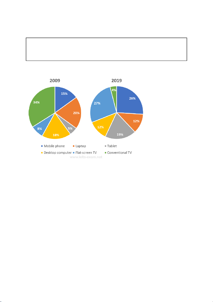
The pie charts below show the devices people in the 18 to 25 age group use to watch
television in Canada in two different years.
Summarize the information by selecting and reporting the main features, and make comparisons where relevant. Write at least 150 words. Model answer
The two charts illustrate the appliances that young adults in Canada use to watch television
programmes and how this has changed over the ten-year period from 2009 to 2019. One of
the key changes over this decade is the transition from conventional televisions to
üat-screens, with the former falling from 34% to 4% and the latter rising from 8% to 27% for
the period, making it the number one television device. The latter has replaced the former as
the most popular TV viewing device.
Another general trend is that younger people are now watching television on smaller, more
portable devices than in 2009. In particular, the use of mobile phones and tablets for viewing
purposes has increased by almost three quarters to 26% and tablet use seeing an almost
four-fold increase to 19%. This trend is reinforced by the number of 18 to 25-year-olds using
computers for the TV viewing. Both desktop and laptop computers saw substantial falls in
usage (around a third for both).
Overall then, it can be said that the two pie charts suggest the TV viewing habits in Canada
over the period saw a move away from older devices and towards more modern equivalents. (198 words) #08
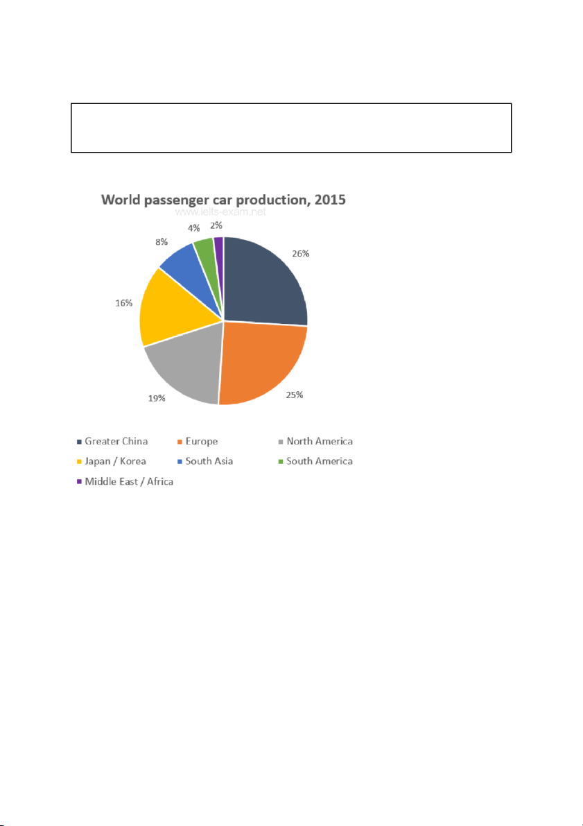
The graph shows data on the manufacture of passenger cars in 2015.
Summarise the information by selecting and reporting the main features, and make comparisons where relevant. Write at least 150 words. Model answer
The pie chart gives the percentage of passenger cars manufactured by different regions of
the world. For the purposes of this data set, the world is divided into seven regions.
What stands out is that the regions of Greater China and Europe lead the way in terms of the
manufacture of passenger cars, with 26% and 25% respectively. By contrast, very few cars
are produced in the Middle East and Africa: just 2% originate from that area.
Turning next to the Americas, a sharp contrast can be seen between the Northern and
Southern parts of the continent. Whereas North America can boast 19% of the world's
passenger car production, South America manufactures just 4% of this type of vehicle.
Finally, moving on to Japan and Korea, despite the fact that they are just two countries rather
than a whole region, they account for a sizeable proportion of the total, at 16%. (151 words) #08
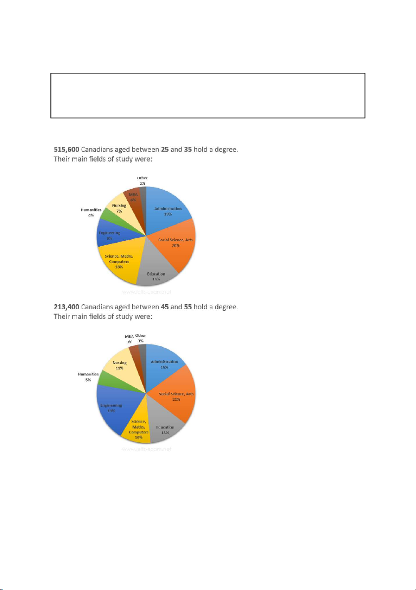
The graphs below show the post-school qualiûcations held by Canadians in the age groups 25 to 35 and 45 to 55.
Summarize the information by selecting and reporting the main features, and make comparisons where relevant. Write at least 150 words. Model answer
These two pie charts show the differences between two groups of Canadians (25 to 35 and
45 to 55 year olds) in terms of their post-school qualiûcations.
The ûrst point to note is the huge increase in the number of people with qualiûcations. The
younger group is more than two times bigger than the older group (515,600 compared to 213,400).
Comparing the two groups, Humanities and Nursing have experienced an increase in
popularity with older graduates; Nursing rose by 4%. However, the biggest gain was made by
engineering, which increased from 9% to 19% of the whole.
Some subjects were more popular with the younger age group. The biggest loss in graduate
numbers were to Science, Maths and Computers which, as a group, have decreased by 8%.
Administration has declined by 4%.
To sum up, the graphs show a more than twofold increase in the number of graduates. The
most noticeable change in subject percentages is the increase in the number of engineering graduates. (164 words) #09
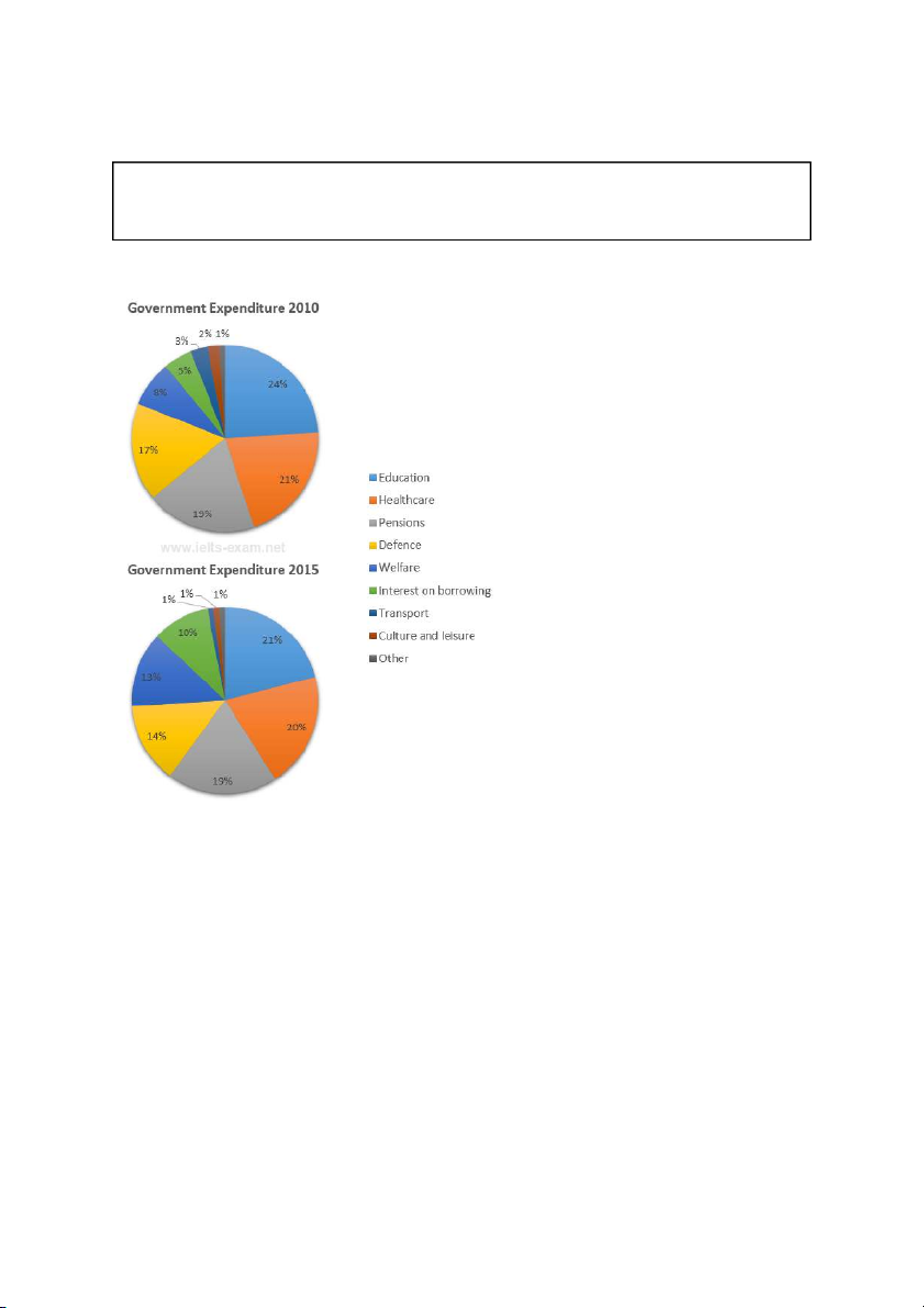
The charts below show local government expenditure in 2010 and 2015.
Summarize the information by selecting and reporting the main features, and make comparisons where relevant. Write at least 150 words. Model answer
The charts show the percentage breakdown of government spending across nine categories
in 2010 and 2015. Over the ûve-year period, there were signiûcant changes in expenditure.
In both years, the four largest areas of government expenditure were: education, healthcare,
pensions, and defence, with education taking the largest share (24% in 2010 and 21% in
2015). The smallest areas of expenditure were transport, culture and leisure and "other".
Interest on borrowing and spending on welfare lay in between.
Interestingly, between 2010 and 2015, spending on all four of the largest areas had dropped,
with the exception of pensions, which remained the same at 19%. Spending on transport and
culture and leisure also fell signiûcantly, with the transport budget declining by two thirds. On
the other hand, spending on welfare and interest on government borrowing rose markedly,
with the latter doubling over the ûve-year period to 10%.
Overall, the charts indicate that the government has had to cut expenditure in most areas in
order to fund the cost of borrowing and welfare. (170 words) #10
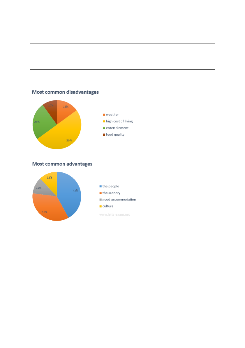
The pie charts below show the most common advantages and disadvantages of Bowen
Island, according to a survey of visitors.
Summarize the information by selecting and reporting the main features, and make comparisons where relevant. Write at least 150 words. Model answer
The two pie charts show the aspects of Bowen Island that tourists enjoy the most and the least.
Bowen Island has many features that attract tourists but the most popular of these are the
scenery and the people, with more than two thirds of the visitors to the island listing these as
the greatest advantages. The standard of accommodation on the island appears to be more
than adequate, with 11% of respondents listing this as an advantage. 12% of visitors cite the
culture of the island as a major attraction.
However, the island seems far from being a perfect tourist destination. When it comes to the
negative aspects of the island, the high cost of living, poor weather and the quality or lack of
entertainment are seen as the worst of these. Together, these three categories make up 90%
of the total disadvantages. In spite of the high costs on the island, 10% of the visitors complain of poor food quality.
Overall, it seems that most people like Bowen Island because of the scenery and people.
However, it is possible that the unspoilt nature of the island means there is little in the way of
entertainment and this, combined with the high cost of living, makes it unlikely to appeal to everyone. (212 words)
