Báo cáo bài tập lớn môn Xác suất thống kê "Stats Project 2" nội dung bằng tiếng Anh
Báo cáo bài tập lớn môn Xác suất thống kê "Stats Project 2" nội dung bằng tiếng Anh của Đại học Bách khoa Thành phố Hồ Chí Minh với những kiến thức và thông tin bổ ích giúp sinh viên tham khảo, ôn luyện và phục vụ nhu cầu học tập của mình cụ thể là có định hướng ôn tập, nắm vững kiến thức môn học và làm bài tốt trong những bài kiểm tra, bài tiểu luận, bài tập kết thúc học phần, từ đó học tập tốt và có kết quả cao cũng như có thể vận dụng tốt những kiến thức mình đã học vào thực tiễn cuộc sống. Mời bạn đọc đón xem!
Môn: Xác suất thống kê (MT2013) 9 tài liệu
Trường: Trường Đại học Bách khoa - Đại học Quốc gia Thành phố Hồ Chí Minh 721 tài liệu
Tác giả:


Preview text:
lOMoARcPSD| 36991220
Studocu is not sponsored or endorsed by any college or university
VIETNAM NATIONAL UNIVERSITY, HO CHI MINH CITY UNIVERSITY OF TECHNOLOGY
FACULTY OF APPLIED MATHEMATICS
PROBABILITY AND STATISTICS (MT2013) Assignment Project 2 lOMoARcPSD| 36991220
University of Technology, Ho Chi Minh City
Faculty of Applied Mathematics Contents
1 Member list & Workload 3 2 Theory Basis 4
2.1 Introduction . . . . . . . . . . . . . . . . . . . . . . . . . . . . . . . . . . . . . . . 4
2.2 Simple regression . . . . . . . . . . . . . . . . . . . . . . . . . . . . . . . . . . . . 4
2.3 Sum of Squares and the related types
. . . . . . . . . . . . . . . . . . . . . . . . 5
2.3.1 What is Sum of Squares (SS)?
. . . . . . . . . . . . . . . . . . . . . . . . 5
2.3.2 Sum of Squares Total (SST) . . . . . . . . . . . . . . . . . . . . . . . . . . 5
2.3.3 Sum of Squares due to Regression (SSR) . . . . . . . . . . . . . . . . . . . 6
2.3.4 Sum of Squares Error (SSE) . . . . . . . . . . . . . . . . . . . . . . . . . . 6
2.3.5 Coefficient of determination . . . . . . . . . . . . . . . . . . . . . . . . . . 6
2.4 Ordinary Least Square . . . . . . . . . . . . . . . . . . . . . . . . . . . . . . . . . 7
2.5 Estimating the variance . . . . . . . . . . . . . . . . . . . . . . . . . . . . . . . . 7
2.6 Confidence intervals on parameters . . . . . . . . . . . . . . . . . . . . . . . . . . 8
2.7 Sample correlation coefficient . . . . . . . . . . . . . . . . . . . . . . . . . . . . . 8
2.8 Model selection . . . . . . . . . . . . . . . . . . . . . . . . . . . . . . . . . . . . . 8
2.8.1 Base on the Coefficient of determination . . . . . . . . . . . . . . . . . . . 8
2.8.2 Base on an error determination . . . . . . . . . . . . . . . . . . . . . . . . 9
2.9 Some plotting methods . . . . . . . . . . . . . . . . . . . . . . . . . . . . . . . . . 9
2.9.1 Scatter plot . . . . . . . . . . . . . . . . . . . . . . . . . . . . . . . . . . . 9
2.9.2 Histogram . . . . . . . . . . . . . . . . . . . . . . . . . . . . . . . . . . . . 10
2.9.3 Boxplot . . . . . . . . . . . . . . . . . . . . . . . . . . . . . . . . . . . . . 11
2.9.4 QQ PLot . . . . . . . . . . . . . . . . . . . . . . . . . . . . . . . . . . . . 11
2.9.5 Correlation - Heatmap . . . . . . . . . . . . . . . . . . . . . . . . . . . . . 12 3 Activity 1 13
3.1 Dataset Overview . . . . . . . . . . . . . . . . . . . . . . . . . . . . . . . . . . . . 13 3.2 Import Data
. . . . . . . . . . . . . . . . . . . . . . . . . . . . . . . . . . . . . . 14 3.3 Data Cleaning
. . . . . . . . . . . . . . . . . . . . . . . . . . . . . . . . . . . . . 15
3.4 Data Visualization . . . . . . . . . . . . . . . . . . . . . . . . . . . . . . . . . . . 16 lOMoARcPSD| 36991220
University of Technology, Ho Chi Minh City
Faculty of Applied Mathematics
3.4.1 Descriptive Statistics . . . . . . . . . . . . . . . . . . . . . . . . . . . . . . 16
3.4.2 Histogram . . . . . . . . . . . . . . . . . . . . . . . . . . . . . . . . . . . . 17
3.4.3 Pair Plot and Correlation Heatmap . . . . . . . . . . . . . . . . . . . . . . 19
3.4.4 Box Plot . . . . . . . . . . . . . . . . . . . . . . . . . . . . . . . . . . . . 22
3.4.4.a Final grade for low correlated variables . . . . . . . . . . 23
3.4.4.b Final grade fo high correlated variables . . . . . . . . . . 25
3.5 Linear Regression Model . . . . . . . . . . . . . . . . . . . . . . . . . . . . . . . . 27
3.5.1 Simple Linear Regression . . . . . . . . . . . . . . . . . . . . . . . . . . . 27
3.5.1.a Assumption Requirements . . . . . . . . . . . . . . . . . . 27
3.5.1.b Perform the linear regression analysis . . . . . . . . . . . 29
3.5.1.c Result . . . . . . . . . . . . . . . . . . . . . . . . . . . . . 31
3.5.2 Multiple Linear Regression
. . . . . . . . . . . . . . . . . . . . . . . . . . 32
3.5.2.a Assumption Requirements . . . . . . . . . . . . . . . . . . 32
3.5.2.b Perform the linear regression analysis . . . . . . . . . . . 32
3.5.2.c Result . . . . . . . . . . . . . . . . . . . . . . . . . . . . . 34
3.5.2.d Prediction . . . . . . . . . . . . . . . . . . . . . . . . . . . 36
3.5.2.e Conclusion on exercise 1 . . . . . . . . . . . . . . . . . . . 38 4 Activity 2 38
4.1 Dataset Overview . . . . . . . . . . . . . . . . . . . . . . . . . . . . . . . . . . . . 38 4.2 Import Data
. . . . . . . . . . . . . . . . . . . . . . . . . . . . . . . . . . . . . . 39 4.3 Data Cleaning
. . . . . . . . . . . . . . . . . . . . . . . . . . . . . . . . . . . . . 39
4.4 Data Visualization . . . . . . . . . . . . . . . . . . . . . . . . . . . . . . . . . . . 40
4.4.1 Descriptive Statistics . . . . . . . . . . . . . . . . . . . . . . . . . . . . . . 40
4.4.2 Histogram . . . . . . . . . . . . . . . . . . . . . . . . . . . . . . . . . . . . 40
4.4.2.a Discrete Variables . . . . . . . . . . . . . . . . . . . . . . 45
4.4.2.b Skewness . . . . . . . . . . . . . . . . . . . . . . . . . . . 45
4.4.3 Pair Plot and Correlation Heatmap . . . . . . . . . . . . . . . . . . . . . . 47
4.4.4 Box Plot . . . . . . . . . . . . . . . . . . . . . . . . . . . . . . . . . . . . 50 lOMoARcPSD| 36991220
University of Technology, Ho Chi Minh City
Faculty of Applied Mathematics
4.4.4.a Transcode time for Output Bitrate and Framerate . . . . 51
4.4.4.b Transcode time for Codec type . . . . . . . . . . . . . . . 53
4.4.4.c Transcode time for Resolution . . . . . . . . . . . . . . . 54
4.4.5 Distribution Testing . . . . . . . . . . . . . . . . . . . . . . . . . . . . . . 55
4.5 Linear Regression Model . . . . . . . . . . . . . . . . . . . . . . . . . . . . . . . . 56
4.5.1 Transforming Data . . . . . . . . . . . . . . . . . . . . . . . . . . . . . . . 56
4.5.2 Creating dummy variables . . . . . . . . . . . . . . . . . . . . . . . . . . . 57
4.5.3 Fitting linear regression model . . . . . . . . . . . . . . . . . . . . . . . . 59
4.5.3.a Model 1 . . . . . . . . . . . . . . . . . . . . . . . . . . . . 59
4.5.3.b Model 2 . . . . . . . . . . . . . . . . . . . . . . . . . . . . 61
4.5.4 Prediction . . . . . . . . . . . . . . . . . . . . . . . . . . . . . . . . . . . . 63
4.6 Conclusion . . . . . . . . . . . . . . . . . . . . . . . . . . . . . . . . . . . . . . . 64 1
Member list & Workload No. Fullname Student ID Problems Percentage of work - Activity 2 - Data Analysis 1 Tran Nhat Duy 2153258 - Report formatting 20%
- Activity 2 - Linear Regression 2 Dang Quoc Minh 2153567 - Report formatting 20%
- Activity 2 - Linear Regression 3 Hoang Phan Ngoc Minh 2053214 - Report formatting 20% - Activity 1 - Theory Basis 4 Phan Vu Hoang Nam 2152784 - Report formatting 20% - Activity 1 5 Tran Bao Nguyen 2153637 - Report formatting 20% lOMoARcPSD| 36991220
University of Technology, Ho Chi Minh City
Faculty of Applied Mathematics 2 Theory Basis 2.1 Introduction
Linear regression is a statistical technique used to model the relationship between a dependent
variable and one or more independent variables by fitting a linear equation to the data.The linear equation takes the form of:
y = mx + b
The goal of linear regression is to find the best-fitting line through the data points, such that the
sum of the squared distances between the predicted values of y and the actual values of y is minimized. 2.2 Simple regression
With simple linear regression when we have a single input, we can use statistics to estimate the
coefficients. This requires that you calculate statistical properties from the data such as means,
standard deviations, correlations and covariance. All of the data must be available to traverse and
calculate statistics. The simple linear model in slope-intercept form:
Y = slope ∗ X + y − intercept
. In statistics this straight-line model is referred as a simple regression equation.
• Y stands for the dependent variable
• X stands for the independent variable
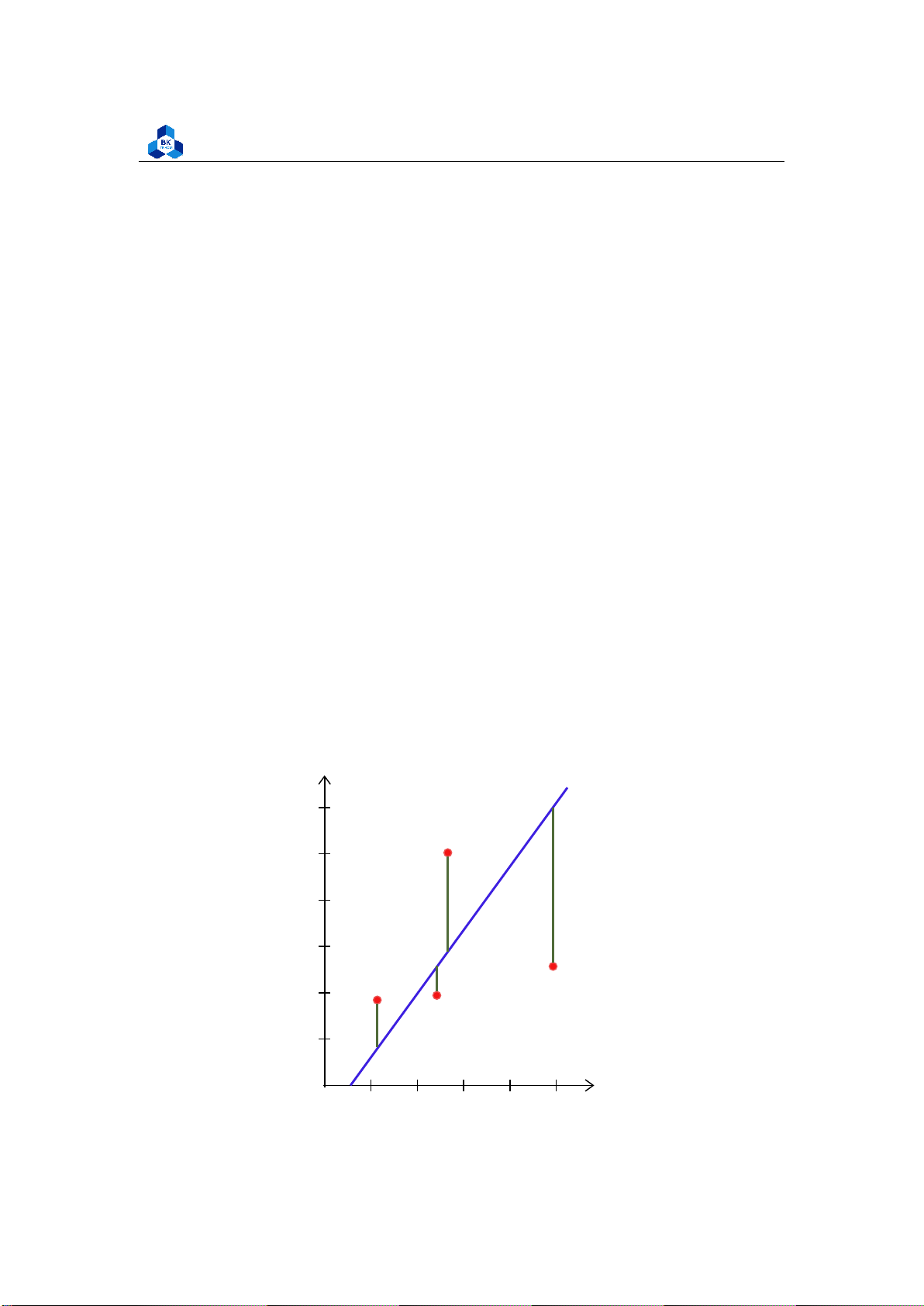
• Only the dependent variable (not the independent variable) is treated as a random variable. y 6 5 4 3 2 1 x O 1 2 3 4 5 lOMoARcPSD| 36991220
University of Technology, Ho Chi Minh City
Faculty of Applied Mathematics
In linear regression, the observations (red) are assumed to be the result of random deviations
(green) from an underlying relationship (blue) between a dependent variable (y) and an
independent variable (x).
NOTE: There are four assumptions associated with a linear regression model:
1. Linearity: The relationship between X and the mean of Y is linear.
2. Homoscedasticity: The variance of residual is the same for any value of X.
3. Independence: Observations are independent of each other.
4. Normality: For any fixed value of X, Y is normally distributed. 2.3
Sum of Squares and the related types 2.3.1
What is Sum of Squares (SS)?
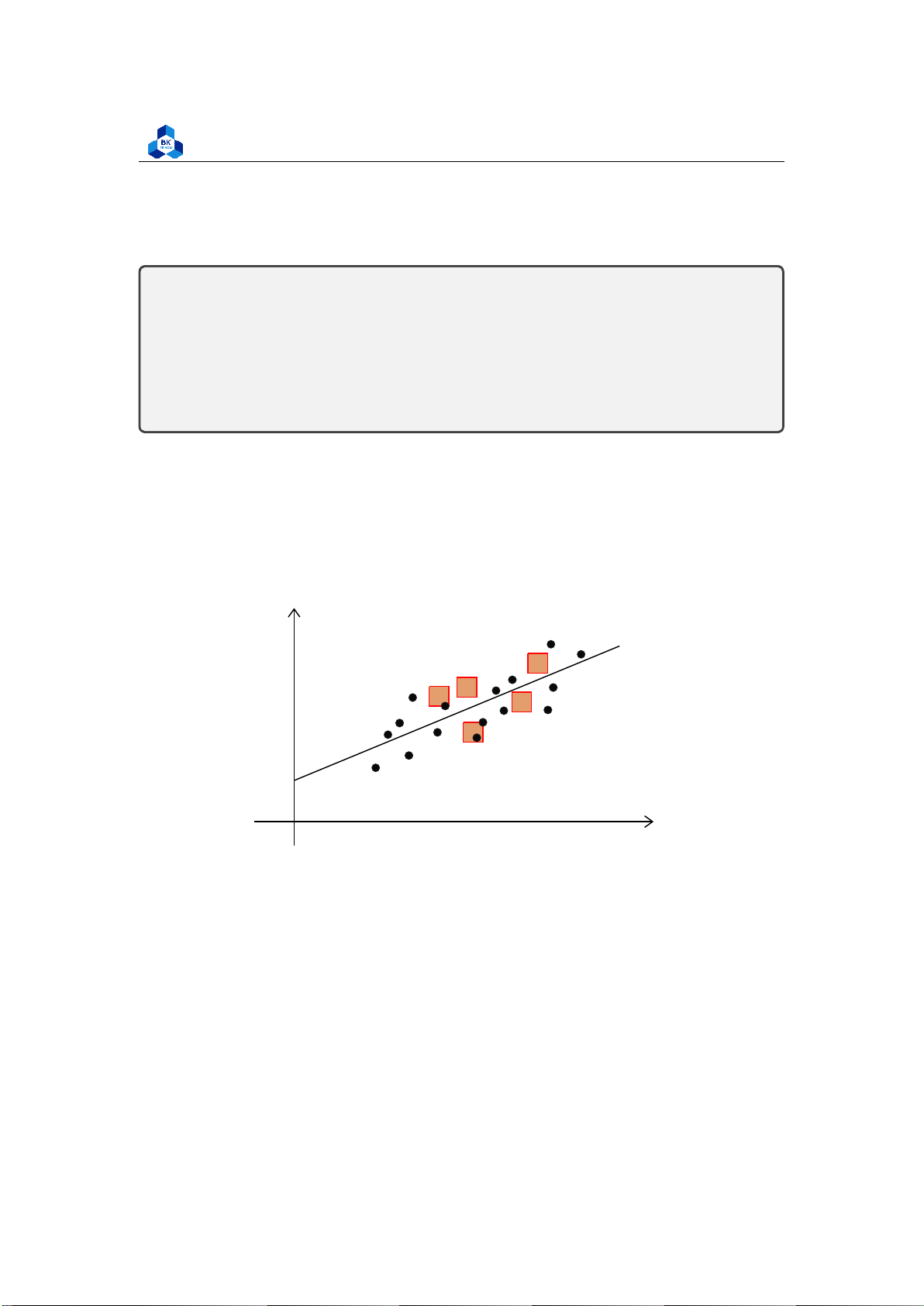
Sum of squares (SS) is a statistical tool that is used to identify the dispersion of data as well as how
well the data can fit the model in regression analysis. The sum of squares got its name because it
is calculated by finding the sum of the squared differences. y O x Figure 1: Sum of Squares
The sum of squares is one of the most important outputs in regression analysis. The general rule
is that a smaller sum of squares indicates a better model, as there is less variation in the data.
In finance, understanding the sum of squares is important because linear regression models
are widely used in both theoretical and practical finance. 2.3.2
Sum of Squares Total (SST)
The sum of squares total, denoted SST, is the squared differences between the observed dependent
variable and its mean. It can be illustrated as the dispersion of the observed variables around the
mean – much like the variance in descriptive statistics. lOMoARcPSD| 36991220
University of Technology, Ho Chi Minh City
Faculty of Applied Mathematics (1) In this notation:
• n refers to the number of observations.
• i refers to the index, or location, of the value in the sample, and it is initialized to 1, the position of the first sample value.
• yi refers to the sample value at the index i.
• y¯ refers to the mean of the sample. 2.3.3
Sum of Squares due to Regression (SSR)
The sum of squares due to regression, denoted as SSR, is the sum of the differences between the
predicted value and the mean of the dependent variable. Its measurement describes how well our
line fits the data. If this value of SSR is equal to the sum of squares total (SST), it means our
regression model captures all the observed variability and is completely fitted. (2) In this notation:
• n refers to the number of observations.
• i refers to the index, or location, of the value in the sample and is initialized to 1 - the position of the first sample value.
• yˆi refers to the predicted value at the index i.
• y¯ refers to the mean of the sample. 2.3.4
Sum of Squares Error (SSE)
The error sum of squares SSE can be interpreted as a measure of how much variation in y is left
unexplained by the model — that is, the amount that cannot be attributed to a linear relationship.
SST = SSE + SSR 2.3.5
Coefficient of determination
The coefficient of determination is a number between 0 and 1 that measures how well a statistical
model predicts an outcome. For instances, a coefficient of determination R = 0.5 suggests that
around 50% of the input sample that can be predicted by the regression model. 1) (3) lOMoARcPSD| 36991220
University of Technology, Ho Chi Minh City
Faculty of Applied Mathematics 2.4 Ordinary Least Square
OLS is a common technique for estimating coefficients of linear regression equations which
describe the relationship between one or more independent quantitative variables and a
dependent variable (simple or multiple linear regression).
Least squares stand for the minimum squares error (SSE).
The ordinary least squares method (OLS method): estimate a regression so as to ensure the
best fit selected the slope and intercept residuals are as small as possible. Residuals be either
positive or negative, and values around the regression line always sum to zero. = 0
(OLS residuals always sum to zero) (4)
The fitted coefficients b0 and b1 are chosen so that the fitted linear model y = b0 +b1x has the
smallest possible sum of squared residuals (SSE):
Differential calculus can be used to obtain the coefficient estimators b0 and b1 that minimize SSE: (5)
Alternatively, the OLS formula for the slope can be written as: (6) 2.5
Estimating the variance
Mean squared error (MSE) assesses the average squared difference between the observed and
predicted values. When a model has no error, the MSE equals zero. As model error increases, its
value increases. The mean squared error is also known as the mean squared deviation (MSD). Thus,
the mean squared error is also an unbiased estimate of σ2 (7)
The standard error of ˆσ2: (8)
SE (σˆ)2 indicates the variation of the observed data yi compared to the fitted linear regression line. 2.6
Confidence intervals on parameters
Under the assumptions of the simple linear regression model, a (1 − α)100% confidence interval
for the slope parameter β is: lOMoARcPSD| 36991220
University of Technology, Ho Chi Minh City
Faculty of Applied Mathematics ! (9) or equivalently:
Similarly, a (1 − α)100% confidence interval on the intercept parameter α is: or equivalently: ! (10) 2.7 Sample correlation coefficient
Let sx and sy denote, respectively, the sample standard deviations of the x values and the y values.
The sample correlation coefficient r of the data pairs (xi, yi), i = 1,2,. .,n, is defined by:
When r > 0, we say that the sample data pairs are positively correlated; and when r < 0, we say
that they are negatively correlated. 2.8 Model selection 2.8.1
Base on the Coefficient of determination (11) where:
• SSR stands for Residual Sum of Squares • SST stands for Total Sum of Squares
The closer the R-squared is to 1, the more suitable the built model is to the dataset used to run
the regression and vice versa. So basically, the model with higher R2 is the better model. However,
one drawbacks of R-squared is that the more variables are included in the model, the value of R2
will inevitably increase, undermining the role of feature selection. 2.8.2
Base on an error determination
By creating and comparing the error patterns (meaning the value that measure how good your
model is, or the error that your model makes when training the dataset), we usually use Rootmean-
square-error (RMSE) and Mean-square-error (MSE): lOMoARcPSD| 36991220
University of Technology, Ho Chi Minh City
Faculty of Applied Mathematics (12) RMSE = √MSE (13)
Now, we recognize that a smaller MSE or RMSE will leads to a better model. 2.9 Some plotting methods 2.9.1 Scatter plot
Scatter plots are the graphs that present the relationship between two variables in a data-set.
Scatter plots are particularly useful for visualizing patterns, trends, or correlations between
variables. They allow you to see the overall distribution of the data points and identify any
relationships that may exist between the variables. The general pattern in a scatter plot can provide
insights into the strength, direction, and nature of the relationship between the variables.
Scatter plots are used in either of the following situations:
1. Correlation Analysis: Scatter plots are commonly used to determine the correlationor
association between two variables. By plotting the variables on a scatter plot, you can
visually assess if there is a relationship between them and if it is positive, negative, or no correlation at all.
2. Outlier Detection: Scatter plots help in identifying outliers, which are data pointsthat
significantly deviate from the overall pattern of the data. Outliers can be easily spotted
as points that are far away from the general trend in the scatter plot.
3. Pattern Recognition: Scatter plots allow you to identify patterns or clusters withinthe
data. If there are distinct groups or clusters visible in the scatter plot, it can indicate
underlying patterns or subgroups in the data.
4. Comparing Data Sets: Scatter plots are useful for comparing two different data
setsand analyzing their relationship. By plotting both sets of data on the same scatter
plot, you can observe if there are any similarities or differences between the two variables.
5. Trend Analysis: Scatter plots can be used to analyze trends over time. By plottingthe
variables on a scatter plot with time on the x-axis, you can observe if there are any
patterns or trends emerging over the given time period.
6. Predictive Modeling: Scatter plots can assist in building predictive models.
Byvisualizing the relationship between input variables and the target variable, you
can gain insights into how the inputs influence the outcome. lOMoARcPSD| 36991220
University of Technology, Ho Chi Minh City
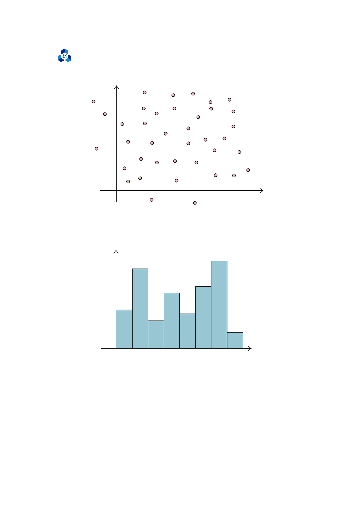
Faculty of Applied Mathematics y x O Figure2:Scatterplot 2.9.2 Histogram y 12 10 8 6 4 2 x O 5 10 15 20 25 30 35 Figure 3: Histogram
A histogram is a graphical representation of the distribution of a dataset. It is commonly used
to visualize the frequency or count of values within certain intervals, called bins. The histogram
displays the data as a set of contiguous bars, where the height of each bar represents the frequency
or count of values falling within that particular bin. lOMoARcPSD| 36991220
University of Technology, Ho Chi Minh City
Faculty of Applied Mathematics 2.9.3 Boxplot
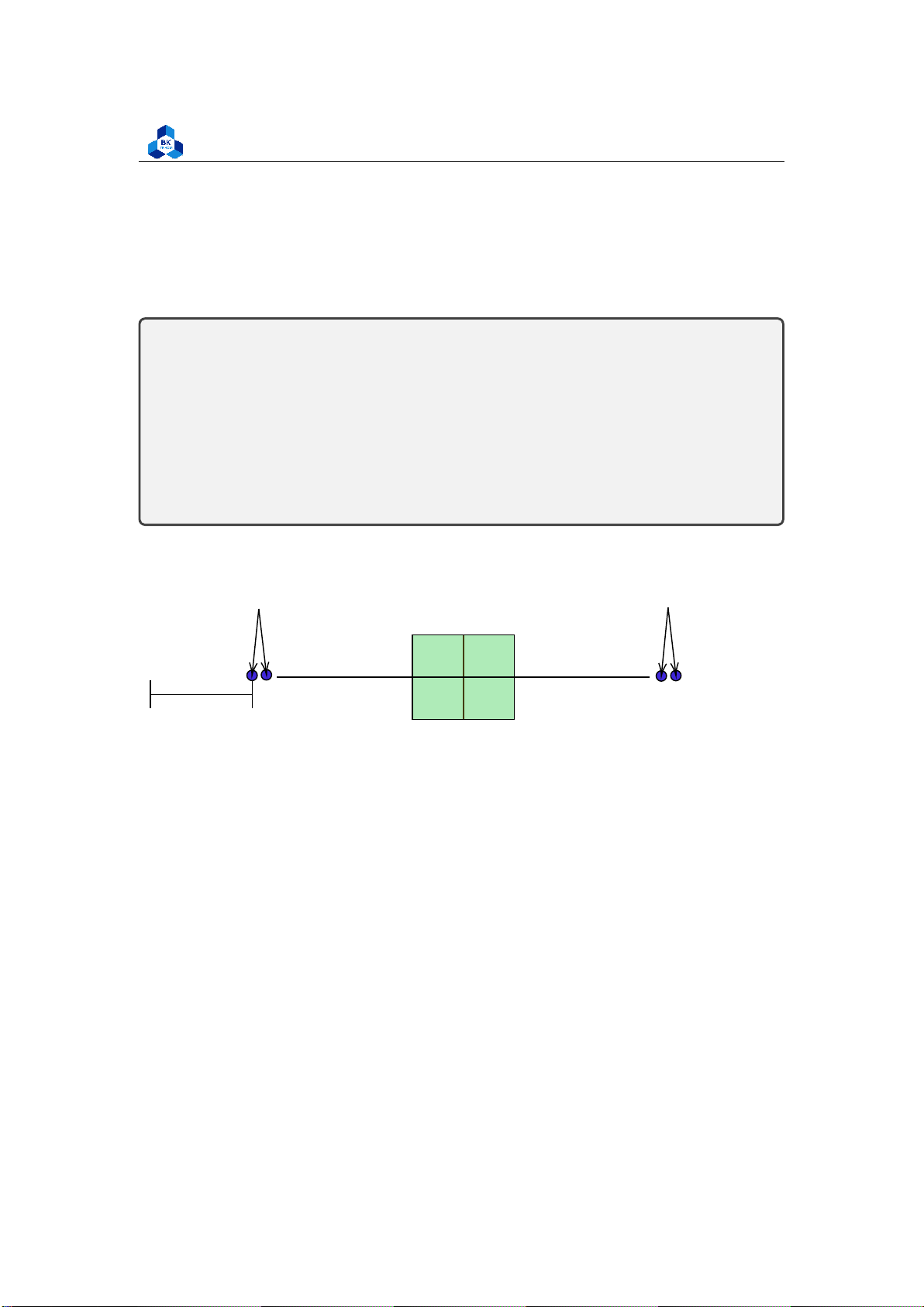
A box plot, also known as a box-and-whisker plot, is a graphical representation of the distribution
of a dataset. It displays key statistical measures such as the minimum, first quartile (Q1), median
(Q2), third quartile (Q3), and maximum values. The box plot provides a visual summary of the
central tendency, spread, and skewness of the data
• Median (Q2/50th percentile): The middle value of the data set
• First Quartile (Q1/25th percentile): The middle number between the smallest number (not
the “minimum”) and the median of the data set
• Third Quartile (Q3/75th percentile): The middle value between the median and the highest
value (not the “maximum”) of the dataset
• Interquartile Range (IQR): 25th to the 75th percentile
• Outliers (shown as blue circles) Interquartile Range Outliers Me dian IQR Outliers Minimum Maximum
Q1− 1.5 × IQR Q1 Q3
Q1 + 1.5 × IQR 25% 75% Figure 4: Boxplot 2.9.4 QQ PLot
In statistics, Q-Q (quantile-quantile) plots play a very vital role to graphically analyze and
compare two probability distributions by plotting their quantiles against each other. If the two
distributions which we are comparing are exactly equal then the points on the Q-Q plot will
perfectly lie on a straight line y = x. lOMoARcPSD| 36991220
University of Technology, Ho Chi Minh City
Faculty of Applied Mathematics Figure 5: Q-Q plot
If both sets of quantiles came from the same distribution, we should see the points forming a
line that’s roughly straight. 2.9.5 Correlation - Heatmap
A correlation heatmap is a visual representation of the correlation coefficients between pairs of
variables in a dataset. It uses colors to indicate the strength and direction of the relationships
between variables. By quickly identifying strong positive or negative correlations, correlation
heatmaps provide insights into the data’s underlying patterns and relationships. They are valuable
tools for exploratory data analysis, feature selection, and understanding complex datasets. lOMoARcPSD| 36991220
University of Technology, Ho Chi Minh City
Faculty of Applied Mathematics Figure 6: Heatmap 3 Activity 1 3.1 Dataset Overview
We choose Topic 2 as our Activity 1 problem, to study secondary student qualifications, specifically in Portugal.
The data contains the following attributes:
• sex - A student’s sex
• age - A student’s age
• studytime - Weekly study time of a student
• failures - The number of past class failures of a student
• higher - Whether a student wants to take higher education or not lOMoARcPSD| 36991220
University of Technology, Ho Chi Minh City
Faculty of Applied Mathematics
• absences - The number of school absences of a student
# These grades are related with the course subject, Math or Portuguese:
• G1 - first period grade
• G2 - second period grade • G3 - final grade
The data csv file contains many other attributes related to these students. However, most of them
are independent and do not affect these main attributes. Therefore, in the data import process, we
will exclude them from our primary data set for easier analysis.
The purpose of this activity is to first understand the dataset’s traits and attributes, and then
evaluate which of the above factors may affect the final grade (G3) using Linear Regression models. 3.2 Import Data
Firstly, we include libraries that are required for future use in this problem. library(summarytools) library(ggcorrplot) library(corrr) library(corrplot) library(data.table) library(dplyr) library(ggplot2) library(GGally) library(tidyverse) library(scatterplot3d) library(rgl) library(plotly) 1 2 3 4 5 6 7 8 9 10 11 12
Listing 1: List of library used
After all required libraries has been loaded, we start importing our data. The given data is named diem_so.csv: ###prepare data
my_data <- read.csv("D:/NGUYEN/DAI HOC/Book/Semester 4/PROBABILITY AND STATISTICS/
Project_II/diem_so.csv") head(my_data,10) 1 2 3
Listing 2: Scripts to import data to a data frame lOMoARcPSD| 36991220
University of Technology, Ho Chi Minh City
Faculty of Applied Mathematics
As mentioned above, there are many fields in data assumed to be independent already, which
means they have no correlation with the final grade. Therefore, we will filter the raw data with a
new one that contains several attributes, namely sex, age, studytime, failures, higher, absences,
G1, G2, G3. Further, we can observe a small portion of our data by using head function:
##filter data with necessary attribute
grade_data <- my_data[,c("sex","age","studytime","failures","higher","absences","
G1","G2","G3")] head(grade_data,10) 1 2 3 Listing 3: Data filtering
sex age studytime failures higher absences G1 G2 G3 1 F 18 2 0 yes 6 5 6 6 2 F 17 2 0 yes 4 5 NA 6 3 F 15 2 3 yes 10 7 8 10 4 F 15 3 0 yes 2 15 14 15 5 F 16 2 0 yes 4 6 10 10 6 M 16 2 0 yes 10 15 NA 15 7 M 16 2 0 yes 0 12 12 11 8 F 17 2 0 yes 6 6 5 6 9 M 15 2 0 yes 0 16 NA 19 10 M 15 2 0 yes 0 14 15 15 1 2 3 4 5 6 7 8 9 10 11 Listing 4: Data observation 3.3 Data Cleaning
In the first step of Data Cleaning, we will check for NA values in the whole data table. If the number
of NA values is remarkable due to its attribute, we will apply some solutions to refill/remove that
position in order to ensure the consistency of the data set. ##check NA values containing
apply(is.na(grade_data),2,sum) #check total NA values
apply(is.na(grade_data),2,which) #position reference
apply(is.na(grade_data),2,mean) #mean 1 2 3 4 Listing 5: NA values check lOMoARcPSD| 36991220
University of Technology, Ho Chi Minh City
Faculty of Applied Mathematics sex age studytime failures higher absences G1 G2 G3 0 0 0 0 0 0 0 5 0
> apply(is.na(grade_data),2,mean) #mean sex age studytime failures higher absences G1
0.00000000 0.00000000 0.00000000 0.00000000 0.00000000 0.00000000 0.00000000 G2 G3 0.01265823 0.00000000 1 2 3 4 5 6 7 8 Listing 6: NA check result
Here, it can be recognized that there are 5 NA values existing in column G2. Despite the fact that all
NA values stay in the same column, the number of NA values is still very small (just about 1,26%)
so we decide remove those cells from the data set.
##clean data cleaned_grade <- na.omit(grade_data)
apply(is.na(cleaned_grade),2,sum) #check total NA values 1 2 3
Listing 7: Scripts to remove NA values
> apply(is.na(cleaned_grade),2,sum) #check total NA values sex
age studytime failures higher absences G1 G2 G3 0 0 0 0 0 0 0 0 0 1 2 3 Listing 8: remove NA result
Beside, as considered with the characteristic of the pure data, we suppose that check duplicate
step (which is finding out whether there is a duplicated row in our dataset) is unnecessary. The
reason is that in original process, the only attribute that distinguishes two student is X, which is
listed from 1 to 395(max number of students). Otherwise, we believe two different students may
have the same other attributes such as sex, age, study time, failures, .. .. lOMoARcPSD| 36991220
University of Technology, Ho Chi Minh City
Faculty of Applied Mathematics 3.4 Data Visualization 3.4.1 Descriptive Statistics
In R language, there are multiple tools that provide us with descriptive summary. The descr method
will be helpful in this section. Due to the characteristic of the data set, we recognized beside numeric
data attributes, the columns of sex(’F’ and ’M’) and higher(’Yes’ and ’No’) contain only 2 different
values. Therefore, we decide to encode them into categorical variables (having values of 0 and 1)
for a simpler application of future functions, especially in Data Visualization. ##Encode non-numeric data ##Sex encode
cleaned_grade$sex[cleaned_grade$sex==’M’] <-1
cleaned_grade$sex[cleaned_grade$sex==’F’] <-0 ##Higher encode
cleaned_grade$higher[cleaned_grade$higher==’yes’] <-1
cleaned_grade$higher[cleaned_grade$higher==’no’] <-0 ##Datatype modify cleaned_grade[,c(1,5)] <-
sapply(cleaned_grade[,c(1,5)],as.integer)
##Check encoded data head(cleaned_grade,10) 1 2 3 4 5 6 7 8 9 10 11 Listing 9: Encode data
sex age studytime failures higher absences G1 G2 G3 1 0 18 2 0 1 6 5 6 6 3 0 15 2 3 1 10 7 8 10 4 0 15 3 0 1 2 15 14 15 5 0 16 2 0 1 4 6 10 10 7 1 16 2 0 1 0 12 12 11 8 0 17 2 0 1 6 6 5 6 10 1 15 2 0 1 0 14 15 15 11 0 15 2 0 1 0 10 8 9 12 0 15 3 0 1 4 10 12 12 13 1 15 1 0 1 2 14 14 14 1 2 3 4 5 6 7 8 9 10 11
Listing 10: Encode data result lOMoARcPSD| 36991220
University of Technology, Ho Chi Minh City
Faculty of Applied Mathematics
After numericalizing all the data, we can apply descr function to our data sheet: ##Data summary
descr(cleaned_grade, transpose = TRUE, stats = c("mean","sd","min","med","max","Q1 ","IQR","Q3")) 1 2 Listing 11: Data summary Descriptive Statistics cleaned_grade N: 390 Mean Std.Dev Min Median Max Q1 IQR Q3
--------------- ------- --------- ------- -------- ------- ------- ------ ------- 1 2 3 4 5 absences 5.72 8.03 0.00 4.00 75.00 0.00 8.00 8.00 age 16.71 1.28 15.00 17.00 22.00 16.00 2.00 18.00 failures 0.34 0.75 0.00 0.00 3.00 0.00 0.00 0.00 G1 10.93 3.29 3.00 11.00 19.00 8.00 5.00 13.00 G2 10.72 3.74 0.00 11.00 19.00 9.00 4.00 13.00 G3 10.41 4.57 0.00 11.00 20.00 8.00 5.75 14.00 higher 0.95 0.22 0.00 1.00 1.00 1.00 0.00 1.00 sex 0.47 0.50 0.00 0.00 1.00 0.00 1.00 1.00 studytime 2.03 0.84 1.00 2.00 4.00 1.00 1.00 2.00 6 7 8 9 10 11 12 13 14 15
Listing 12: Data summary result 3.4.2 Histogram
We can further visualize the quantitative traits of this data set by conducting histogram plot. lOMoARcPSD| 36991220
University of Technology, Ho Chi Minh City
Faculty of Applied Mathematics
png(file = "D:/NGUYEN/DAI HOC/Book/Semester 4/PROBABILITY AND STATISTICS/Rlab/
histo_1.png", width = 1000, height = 400) par(mfrow=c(1,2))
hist(cleaned_grade$absences,main="Absences", xlab="", col="cyan", breaks=50)
hist(cleaned_grade$age,main="Age", xlab="", col="cyan", breaks=16) dev.off()
png(file = "D:/NGUYEN/DAI HOC/Book/Semester 4/PROBABILITY AND STATISTICS/Rlab/
histo_2.png", width = 1000, height = 400) par(mfrow=c(1,2))
hist(cleaned_grade$studytime,main="Study time", xlab="", col="cyan", breaks=8)
hist(cleaned_grade$failures,main="Failures", xlab="", col="cyan", breaks=8) dev.off()
png(file = "D:/NGUYEN/DAI HOC/Book/Semester 4/PROBABILITY AND STATISTICS/Rlab/
histo_3.png", width = 1000, height = 400) par(mfrow=c(1,2))
hist(cleaned_grade$sex,main="Sex", xlab="", col="cyan", breaks=10)
hist(cleaned_grade$higher,main="Higher", xlab="", col="cyan", breaks=10) dev.off()
png(file = "D:/NGUYEN/DAI HOC/Book/Semester 4/PROBABILITY AND STATISTICS/Rlab/
histo_4.png", width = 1000, height = 400) par(mfrow=c(1,3))
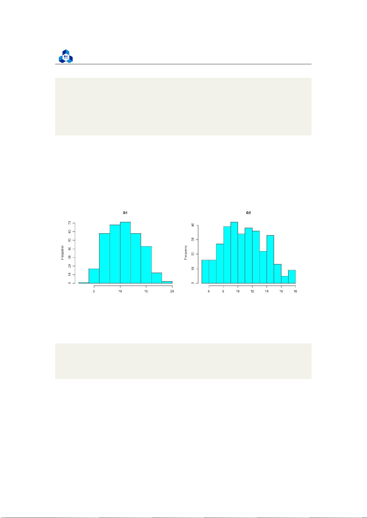
hist(cleaned_grade$G1,main="G1", xlab="", col="cyan", breaks=20)
hist(cleaned_grade$G2,main="G2", xlab="", col="cyan", breaks=20)
hist(cleaned_grade$G3,main="G3", xlab="", col="cyan", breaks=20) dev.off() 1 2 3 4 5 6 7 8 9 10 11 12 13 14 15 16 17 18 lOMoARcPSD| 36991220
University of Technology, Ho Chi Minh City
Faculty of Applied Mathematics 19 20 21 22 23 24 25 26 27 28 29 30 31 32 33
Listing 13: Scripts to plot histograms
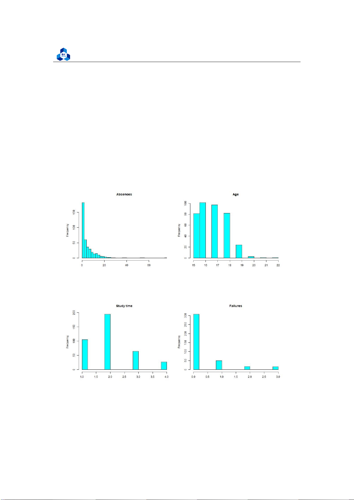
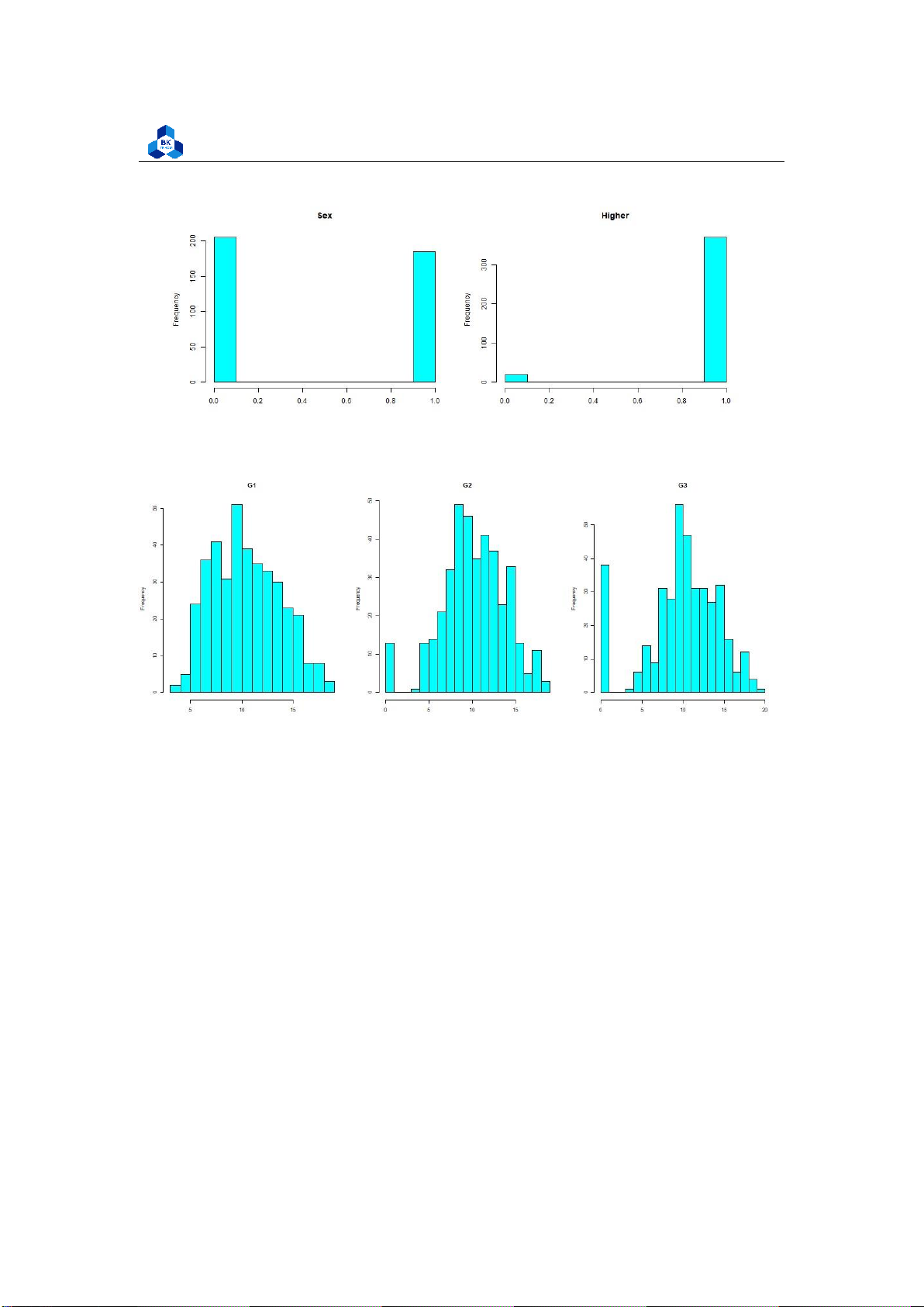
Figure 7: Histogram Plot Result [1]
Figure 8: Histogram Plot Result [2] lOMoARcPSD| 36991220
University of Technology, Ho Chi Minh City
Faculty of Applied Mathematics
Figure 9: Histogram Plot Result [3]
Figure 10: Histogram Plot Result [4]
We can accept the fact that Absences data does not follow the linear relationship (It looks rather
closer to e1/x function than the bell shape). Meanwhile, the value of other factors like age, study time,
etc. are discrete and vary in small range. Therefore, it is hard to conclude anything about them.
However, in the data of score (G1, G2, G3), if we ignore the 0 point column, we can experience that
those data are, somehow, close to the normal distribution (which have the shapes look like
downward bells). In fact, in reality, the zero points in an exam can be held by many reasons such as
abandon, absence, cheating, etc. Because of that, it may explain why zero column tend to show
differences trend like an outlier. 3.4.3
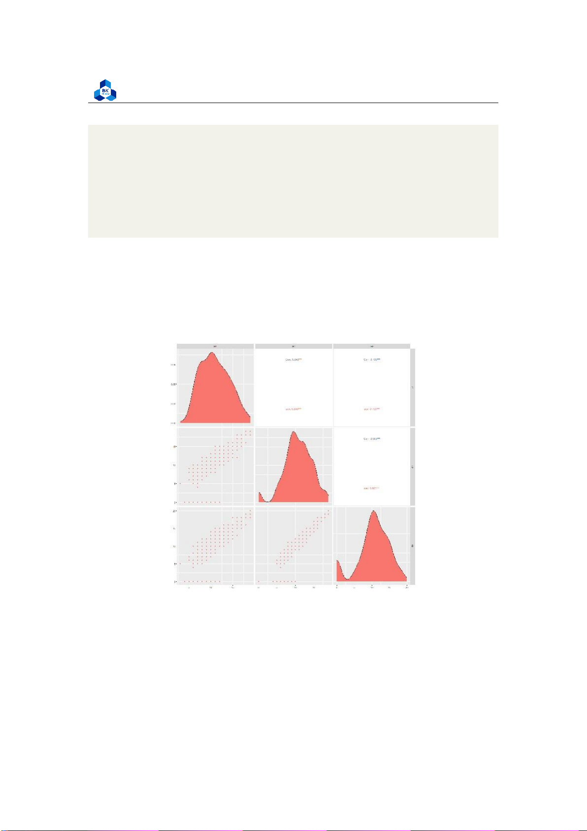
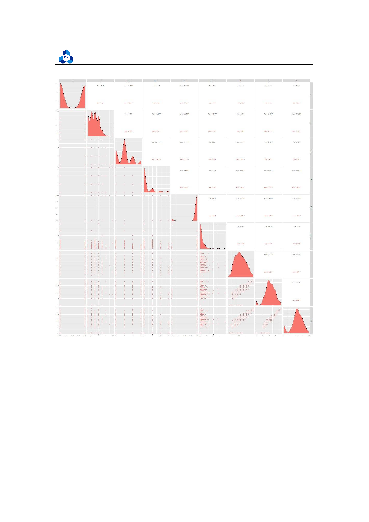
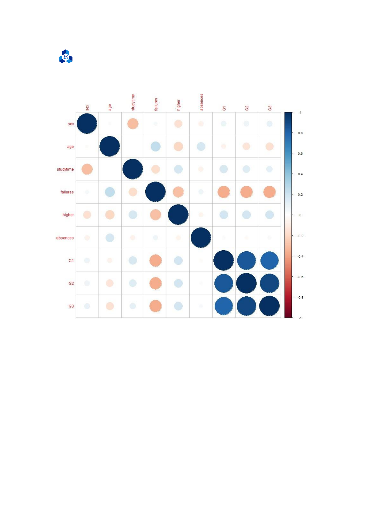
Pair Plot and Correlation Heatmap
After visualizing the frequency, we continue to observe the Paris Scatter Plot to study the linear
relationship (if any) amongst the variables. lOMoARcPSD| 36991220
University of Technology, Ho Chi Minh City
Faculty of Applied Mathematics
########### Pair Plot and Correlation Heat Map #Pair plot scripts
png(file = "D:/NGUYEN/DAI HOC/Book/Semester 4/PROBABILITY AND STATISTICS/Rlab/
ggpair.png" , width = 2000 , height = 2000)
ggpairs(cleaned_grade, columns=1:9, ggplot2::aes(colour="sex")) dev.off()
#Corheatmat scripts cor_df <- cor(cleaned_grade)
png(file = "D:/NGUYEN/DAI HOC/Book/Semester 4/PROBABILITY AND STATISTICS/Rlab/
corheat.png",width = 800, height = 800)
corrplot(cor_df,order=’AOE’) dev.off() 1 2 3 4 5 6 7 8 9 10
Figure 11: Plot of Scatter Pair (High correlation variable only) lOMoARcPSD| 36991220
University of Technology, Ho Chi Minh City
Faculty of Applied Mathematics
Figure 12: Plot of Scatter Pair lOMoARcPSD| 36991220
University of Technology, Ho Chi Minh City
Faculty of Applied Mathematics
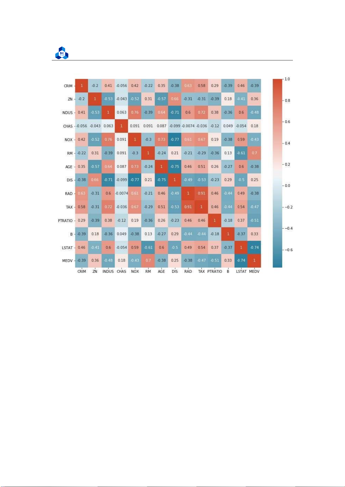
Figure 13: Plot of Correlation Heatmap
The figures show that G1, G2 and G3 are highly correlated to each other. G1 and G2 are considered
to be a factor of increasing function of G3 with the high correlation of over 0.8 and 0.9 respectively.
On the other hand, the attribute failures shows negative effect on both 3 score attributes G1, G2,
G3. These data can be related to real life where the final score is strictly depends on its process
components. Furthermore, the more failures taken, the less final score they obtained. The other
components are not really affect final score G3. 3.4.4 Box Plot
We further analyze final score based on each variables using Box plot models. To obtain an objective
visualization, we will try to remove the outliers from original data as these value may affect the lOMoARcPSD| 36991220
University of Technology, Ho Chi Minh City
Faculty of Applied Mathematics
means significantly. In this section, both outliers and no-outliers data sets are visualized so that the
variances in each group will be described clearly. As the number of outlier factors is minor, we
decided to remove them from the data set. ########### Detect Out liers
G1_bot <- quantile(cleaned_grade$G1, .25)
G1_top <- quantile(cleaned_grade$G1, .75) iqr_1 <-IQR(cleaned_grade$G1)
G2_bot <- quantile(cleaned_grade$G2, .25)
G2_top <- quantile(cleaned_grade$G2, .75) iqr_2 <-IQR(cleaned_grade$G2)
G3_bot <- quantile(cleaned_grade$G3, .25)
G3_top <- quantile(cleaned_grade$G3, .75) iqr_3 <-IQR(cleaned_grade$G3)
ab_bot <- quantile(cleaned_grade$absences, .25) ab_top
<- quantile(cleaned_grade$absences, .75) iqr_ab <- IQR(cleaned_grade$absences) nrow(subset(cleaned_grade,
G1>(G1_bot-1.5*iqr_1) & G1<(G1_top+1.5*iqr_1)
& G2>(G2_bot-1.5*iqr_2) & G2<(G2_top+1.5*iqr_2)
& absences>(ab_bot-1.5*iqr_ab) & absences<(ab_top+1.5*iqr_ab)))
nrow(cleaned_grade) #Check number of data rows after outliers
no_outliers_data <- subset(cleaned_grade,
G1>(G1_bot-1.5*iqr_1) & G1<(G1_top+1.5*iqr_1)
& G2>(G2_bot-1.5*iqr_2) & G2<(G2_top+1.5*iqr_2)
& absences>(ab_bot-1.5*iqr_ab) & absences<(ab_top+1.5* iqr_ab)) 1 2 3 4 5 6 7 8 9 10 11 12 13 14 15 16 17 18 19 20 21 22 23 24 25 26 27 lOMoARcPSD| 36991220
University of Technology, Ho Chi Minh City
Faculty of Applied Mathematics Listing 14: Filter outliers
> nrow(subset(cleaned_grade, +
G1>(G1_bot-1.5*iqr_1) & G1<(G1_top+1.5*iqr_1) +
& G2>(G2_bot-1.5*iqr_2) & G2<(G2_top+1.5*iqr_2) +
& absences>(ab_bot-1.5*iqr_ab) & absences<(ab_top+1.5*iqr_ab)))
[1] 355 #-----> Number of rows after remove outliers >
#& G3>(G3_bot-1.5*iqr_3) & G3<(G3_top+1.5*iqr_3))) > nrow(cleaned_grade)
[1] 390 #-----> Number of rows before remove outliers 1 2 3 4 5 6 7 8
Listing 15: Outliers filtering result 3.4.4.a
Final grade for low correlated variables ##absences
png(file = "D:/NGUYEN/DAI HOC/Book/Semester 4/PROBABILITY AND STATISTICS/Rlab/
boxplot_absence.png",width=1000,height=500) par(mfrow=c(1,2))
boxplot(cleaned_grade$G3 ~ cleaned_grade$absences, main = "Absences and
final grade correlation (with outliers)", xlab = "Absences", ylab ="Final Grade", col = 2:8, las =1)
boxplot(no_outliers_data$G3 ~ no_outliers_data$absences, main = "Absences
and final grade correlation (with outliers)", xlab = "Absences",
ylab ="Final Grade", col = 2:8, las =1) 1 2 3 4 5 6 7 8 9 10 dev.off() 11 12
Listing 16: Final grade for Absences Scripts lOMoARcPSD| 36991220
University of Technology, Ho Chi Minh City
Faculty of Applied Mathematics
Figure 14: Final grade for Absences ##study time
png(file = "D:/NGUYEN/DAI HOC/Book/Semester 4/PROBABILITY AND STATISTICS/Rlab/
boxplot_studytime.png",width=1000,height=500) par(mfrow=c(1,2))
boxplot(cleaned_grade$G3 ~ cleaned_grade$studytime, main = "Study time and
final grade correlation (with outliers)", xlab = "study time", ylab ="Final Grade", col = 2:8, las =1)
boxplot(no_outliers_data$G3 ~ no_outliers_data$studytime, main = "Study time
and final grade correlation (with outliers)", xlab = "study time", ylab ="Final Grade", col = 2:8, las =1) dev.off() 1 2 3 4 5 6 7 8 9 10 11 12
Listing 17: Final grade for Studytime Scripts lOMoARcPSD| 36991220
University of Technology, Ho Chi Minh City
Faculty of Applied Mathematics
Figure 15: Final grade for Studytime
As the correlation of these categorical variables is very low, it is hard to experience any tendency
of Final score on these variables. In later section, we will consider the boxplot of high correlation variables. 3.4.4.b
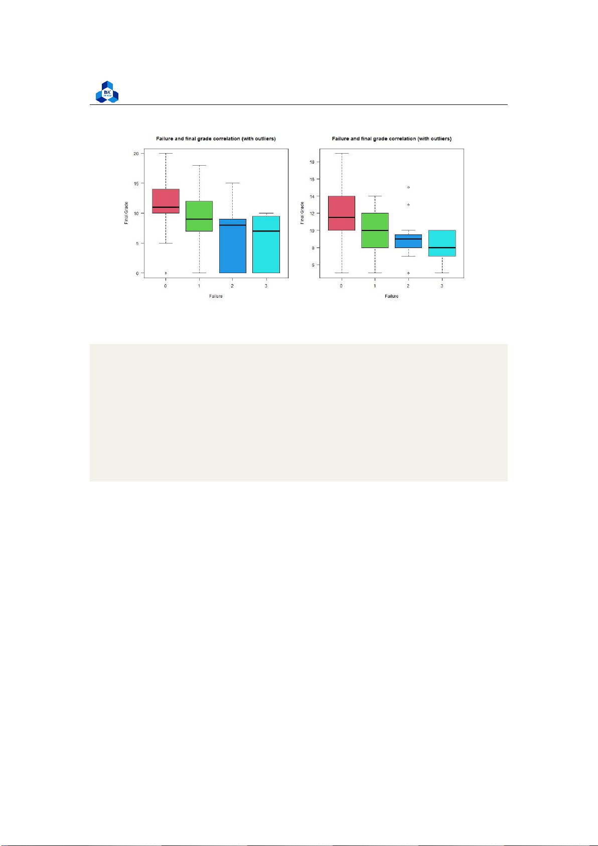
Final grade fo high correlated variables #failures
png(file = "D:/NGUYEN/DAI HOC/Book/Semester 4/PROBABILITY AND STATISTICS/Rlab/
failures.png",width=1000,height=500) par(mfrow=c(1,2))
boxplot(cleaned_grade$G3 ~ cleaned_grade$failures, main = "Failure and
final grade correlation (with outliers)", xlab = "Failure", ylab ="Final Grade", col = 2:8, las =1)
boxplot(no_outliers_data$G3 ~ no_outliers_data$failures, main = "Failure
and final grade correlation (with outliers)", xlab = "Failure", ylab ="Final Grade", col = 2:8, las =1) dev.off() 1 2 3 4 5 6 7 8 9 10 11 12
Listing 18: Final grade on failures scipts lOMoARcPSD| 36991220
University of Technology, Ho Chi Minh City
Faculty of Applied Mathematics
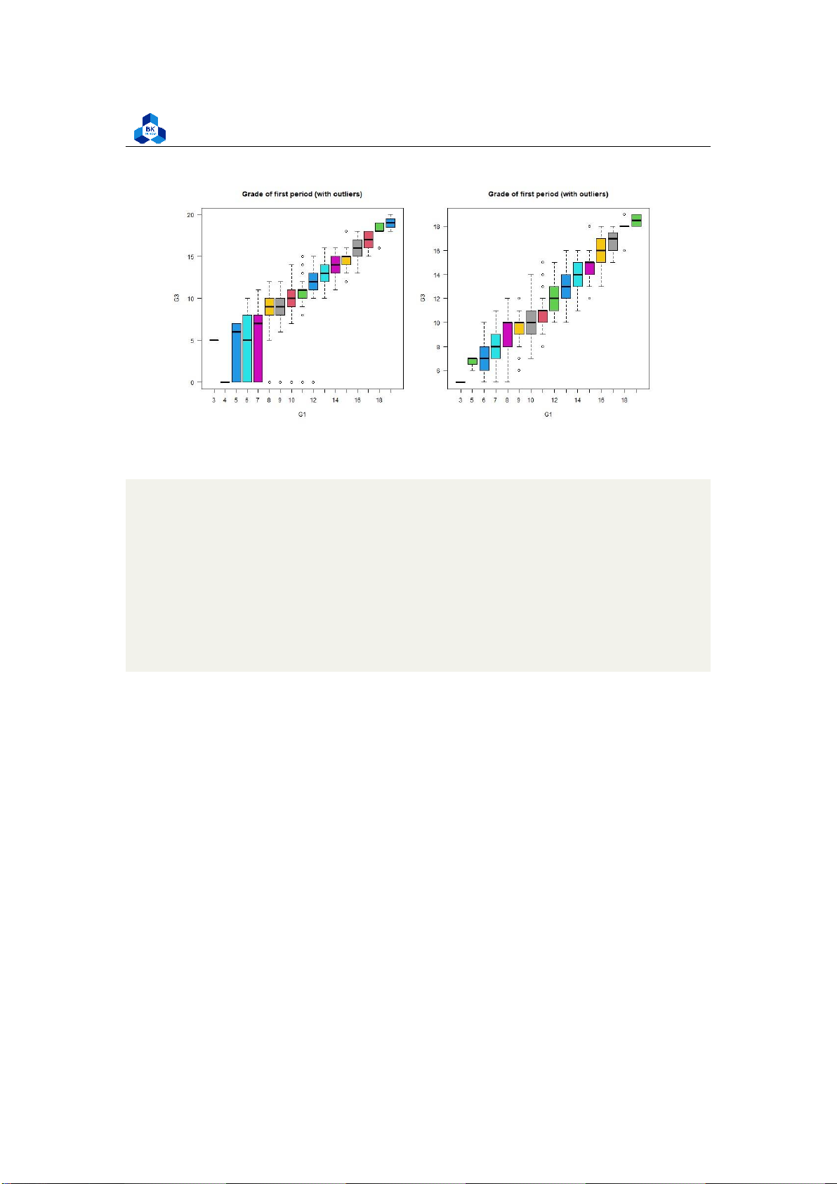
Figure 16: Final grade for Failures ##G1
png(file = "D:/NGUYEN/DAI HOC/Book/Semester 4/PROBABILITY AND STATISTICS/Rlab/
boxplot_G1.png",width=1000,height=500) par(mfrow=c(1,2))
boxplot(cleaned_grade$G3 ~ cleaned_grade$G1, main = "Grade
of first period (with outliers)", xlab = "G1", ylab ="G3", col = 2:8, las =1)
boxplot(no_outliers_data$G3 ~ no_outliers_data$G1, main =
"Grade of first period (with outliers)", xlab = "G1", ylab ="G3", col = 2:8, las =1) dev.off() 1 2 3 4 5 6 7 8 9 10 11 12
Listing 19: Final grade on G1 scripts lOMoARcPSD| 36991220
University of Technology, Ho Chi Minh City
Faculty of Applied Mathematics Figure 17: Final grade for G1 ##G2
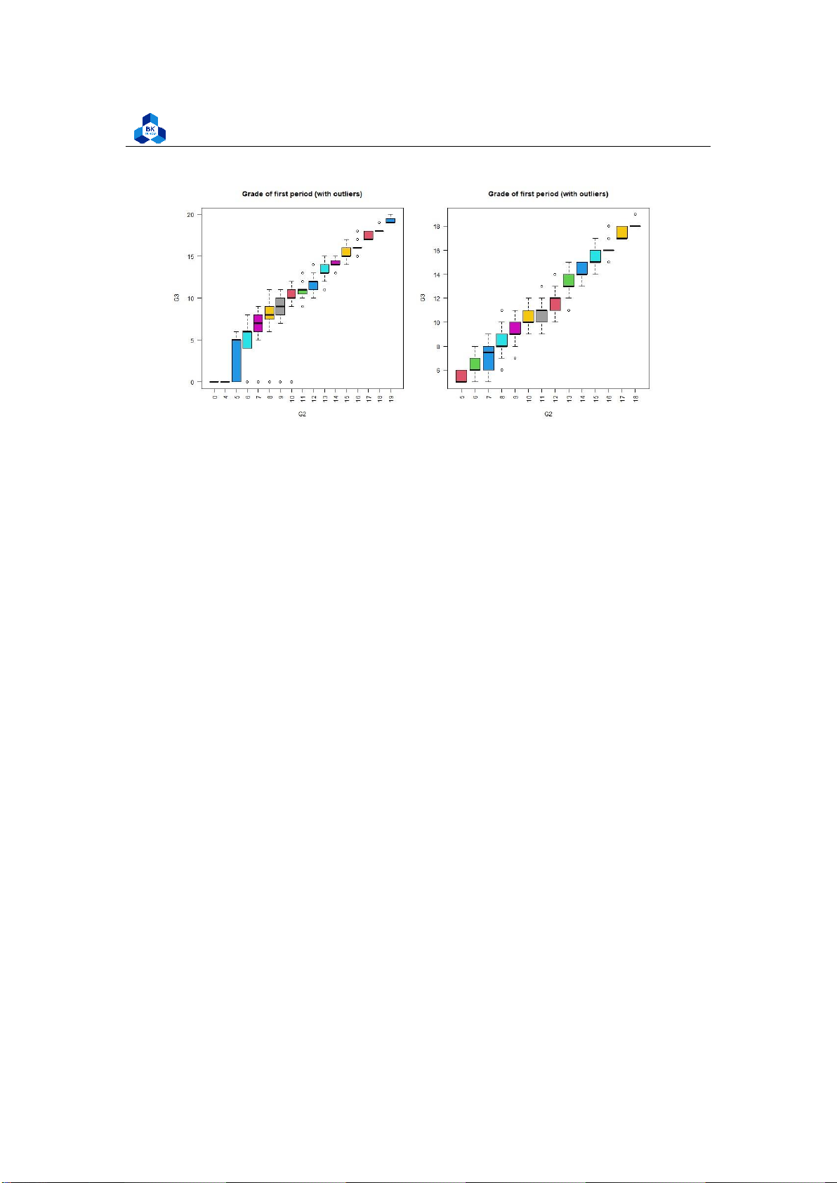
png(file = "D:/NGUYEN/DAI HOC/Book/Semester 4/PROBABILITY AND STATISTICS/Rlab/
boxplot_G2.png",width=1000,height=500) par(mfrow=c(1,2))
boxplot(cleaned_grade$G3 ~ cleaned_grade$G2, main = "Grade
of first period (with outliers)", xlab = "G2", ylab ="G3", col = 2:8, las =2)
boxplot(no_outliers_data$G3 ~ no_outliers_data$G2, main =
"Grade of first period (with outliers)", xlab = "G2", ylab ="G3", col = 2:8, las =2) dev.off() 1 2 3 4 5 6 7 8 9 10 11 12
Listing 20: Final grade on G2 scripts lOMoARcPSD| 36991220
University of Technology, Ho Chi Minh City
Faculty of Applied Mathematics Figure 18: Final grade for G2
As the correlation between these categorical variables with the final score is strongly high, we can
clearly observe tendencies when look at these box plots. In particular, the categorical variables G1
and G2 with no outliers seem to follow linear relationships with final score G3. Also, data with no
outliers depicts more consistently and accurately the trend of correlation. 3.5
Linear Regression Model 3.5.1
Simple Linear Regression 3.5.1.a
Assumption Requirements
As mentioned in the theory topic, there are four assumptions associated with a linear regression model:
1. Linearity: The relationship between X and the mean of Y is linear.
2. Homoscedasticity: The variance of residual is the same for any value of X.
3. Independence: Observations are independent of each other.
4. Normality: For any fixed value of X, Y is normally distributed.
In this part, we consider simple linear regression. Therefore, only one categorical variable is
evaluated and independence of observations is assumed. As discussed on above section, the linear
regression model requires categorical variables to be highly correlated with dependent variable
(>= 0.8), hence we choose G1 and G2 are independent variables to evaluate in this section.
About the normality check, we can use plot the histogram of no outlier data to observe: lOMoARcPSD| 36991220
University of Technology, Ho Chi Minh City
Faculty of Applied Mathematics ##normality check
png(file = "D:/NGUYEN/DAI HOC/Book/Semester 4/PROBABILITY AND STATISTICS/Rlab/
normcheck.png", width = 1000, height = 400) par(mfrow=c(1,2))
hist(no_outliers_data$G1,main="G1", xlab="", col="cyan")
hist(no_outliers_data$G2,main="G2", xlab="", col="cyan") dev.off() 1 2 3 4 5 6 7 8
Listing 21: Normality histogram
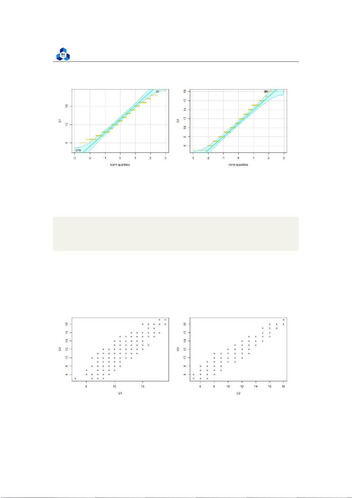
Figure 19: Normality Histogram
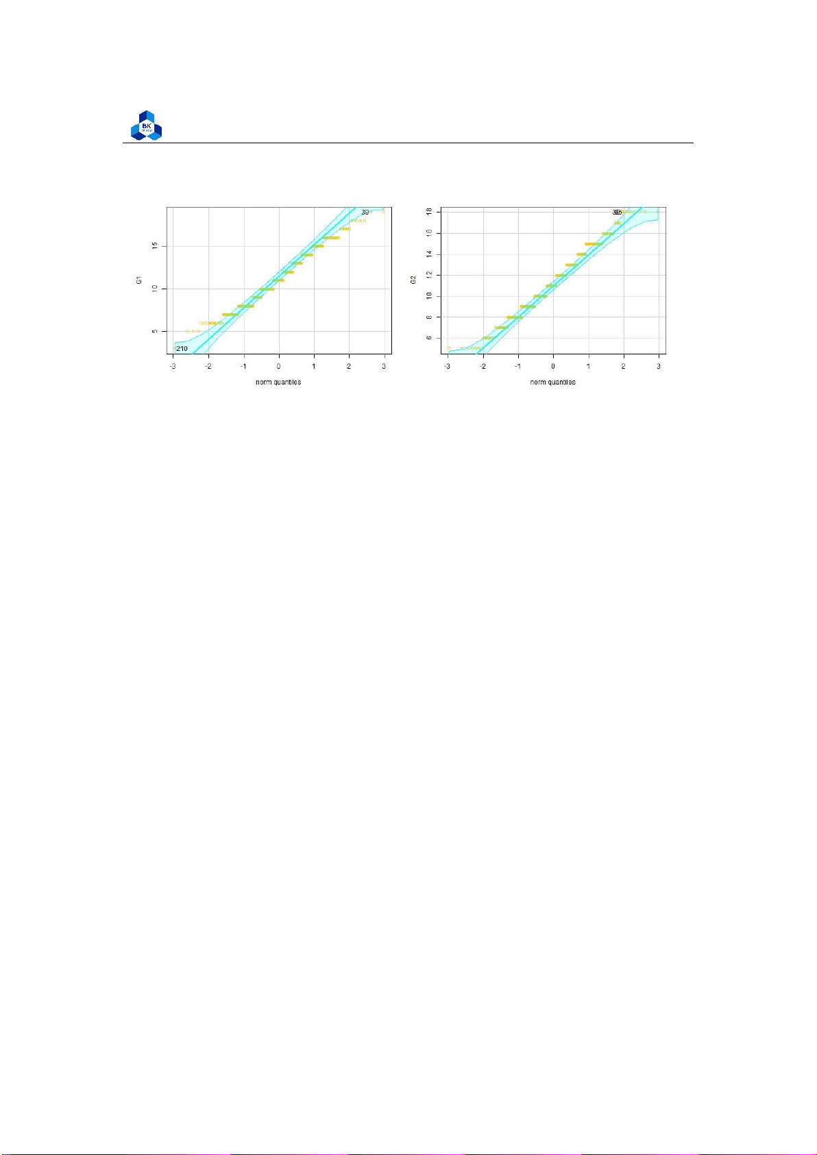
Besides, we can also use Q-Q plot method to draws the correlation between a given sample and the
normal distribution. A 45-degree reference line is also plotted.
png(file = "D:/NGUYEN/DAI HOC/Book/Semester 4/PROBABILITY AND STATISTICS/Rlab/
qqplot.png", width = 1000, height = 400) par(mfrow=c(1,2))
qqPlot(no_outliers_data$G1, ylab="G1",col = "#f5cb11", col.lines = "cyan")
qqPlot(no_outliers_data$G2, ylab="G2",col = "#f5cb11", col.lines = "cyan") dev.off() 1 2 3 4 5 Listing 22: Q-Q plot scripts lOMoARcPSD| 36991220
University of Technology, Ho Chi Minh City
Faculty of Applied Mathematics
Figure 20: Q-Q plot of categorical variables
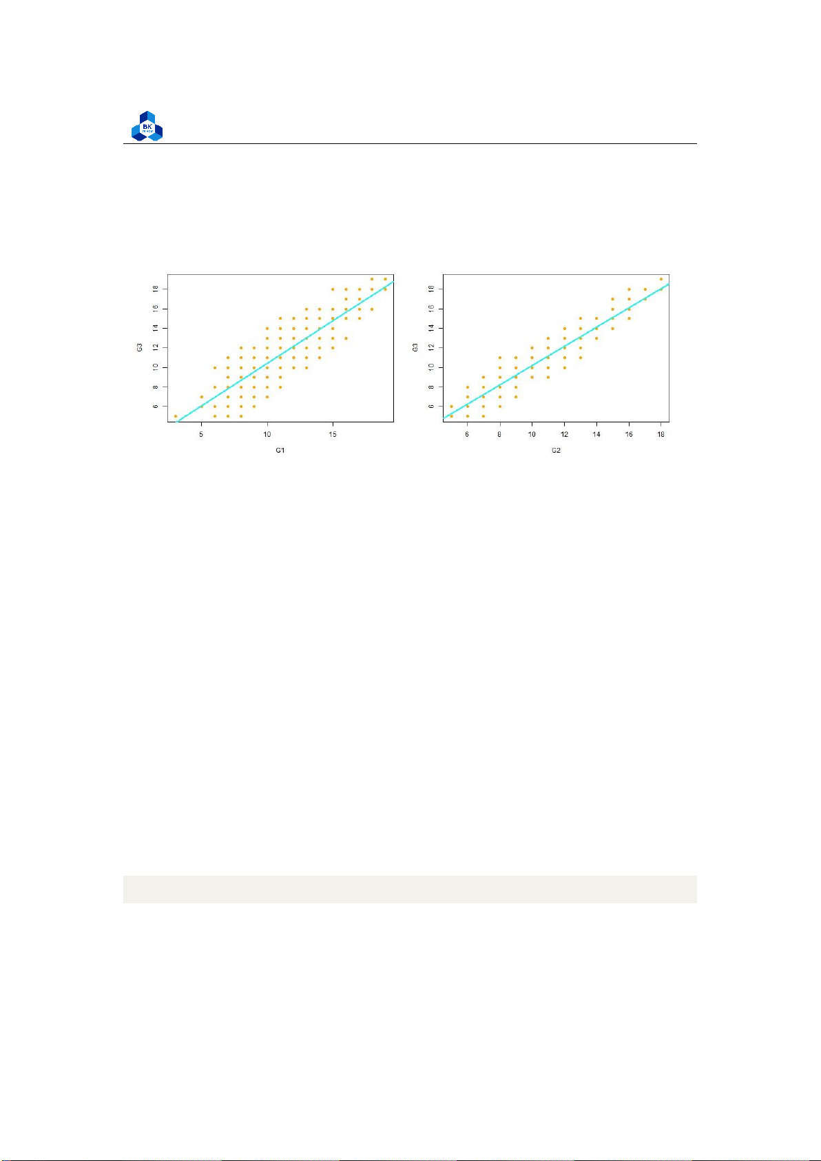
The relationship between the independent and dependent variable must be linear. We can test this
visually with a scatter plot to see if the distribution of data points could be described with a straight line.
png(file = "D:/NGUYEN/DAI HOC/Book/Semester 4/PROBABILITY AND STATISTICS/Rlab/
linearity.png", width = 1000, height = 400) par(mfrow=c(1,2))
plot(G3 ~ G1, data = no_outliers_data) plot(G3
~ G2, data = no_outliers_data) dev.off() 1 2 3 4 5 Listing 23: Linearity Script Figure 21: Linearity Check lOMoARcPSD| 36991220
University of Technology, Ho Chi Minh City
Faculty of Applied Mathematics
The relationship looks roughly linear, so we can proceed with the linear model. The last thing is
homoscedasticity, this means that the prediction error does not change significantly over the range
of prediction of the model. We can test this assumption later, after fitting the linear model. 3.5.1.b
Perform the linear regression analysis
We will analyze if there is a linear relationship between G1, G2 with G3 in our data. To perform a
simple linear regression analysis and check the results, we need to run two lines of code. The first
line of code makes the linear model, and the second line prints out the summary of the model:
simp_model_G1 <- lm(G3 ~ G1, data = no_outliers_data)
simp_model_G2 <- lm(G3 ~ G2, data = no_outliers_data)
summary(simp_model_G1) summary(simp_model_G2) 1 2 3 4
Listing 24: Linear Model script
Call: lm(formula = G3 ~ G1, data = no_outliers_data) Residuals: Min 1Q Median 3Q Max
-3.7139 -1.0308 -0.1472 1.0196 3.6859 Coefficients:
Estimate Std. Error t value Pr(>|t|) (Intercept) 1.77988 0.29772 5.978 5.88e-09 *** G1 0.86675 0.02551 33.977 < 2e-16 *** --- Signif. codes: 0 *** 0.001 ** 0.01 * 0.05 . 0.1 1
Residual standard error: 1.452 on 328 degrees of freedom
Multiple R-squared: 0.7787, Adjusted R-squared: 0.7781 F-
statistic: 1154 on 1 and 328 DF, p-value: < 2.2e-16 > summary(simp_model_G2) Call: 1 2 3 4 5 6 7 8 9 10 11 12 13 14 15 16 17 lOMoARcPSD| 36991220
University of Technology, Ho Chi Minh City
Faculty of Applied Mathematics 18 19 20
lm(formula = G3 ~ G2, data = no_outliers_data) Residuals: Min 1Q Median 3Q Max
-2.2506 -0.2299 -0.1515 0.7825 2.7659 Coefficients:
Estimate Std. Error t value Pr(>|t|) (Intercept) 0.36625 0.18121 2.021 0.0441 * G2 0.98348 0.01544 63.704 <2e-16 *** --- Signif. codes: 0 *** 0.001 ** 0.01 * 0.05
Residual standard error: 0.844 on 328 degrees of freedom
Multiple R-squared: 0.9252, Adjusted R-squared: 0.925
F-statistic: 4058 on 1 and 328 DF, p-value: < 2.2e-16 . 0.1 1 21 22 23 24 25 26 27 28 29 30 31 32 33 34 35 36 37
Listing 25: Linear Model Summary
We have already obtained the data of these linear regression model. The Coefficients section shows:
1. The estimates Estimate for the model parameters - the value of the y-intercept (in this case
1.77988 and 0.36625) and the estimated effect of G1 and G2 (0.86675 and 0.98348)
2. The standard error of the estimated values Std.Error
3. The test statistic (t-value)
4. The p value Pr(> |t|), aka the probability of finding the given t statistic if the null hypothesis of no relationship were true.
The final three lines are model diagnostics – the most important thing to note is the p value (here
it is 2.2e-16, or almost zero), which will indicate whether the model fits the data well. lOMoARcPSD| 36991220
University of Technology, Ho Chi Minh City
Faculty of Applied Mathematics
From these results, we can say that there is a significant positive relationship between G1 and
G2 to G3,with the 0.86675-unit and 0.98348-unit increase in final score G3 for every unit increase
in the categorical variables G1 and G2.
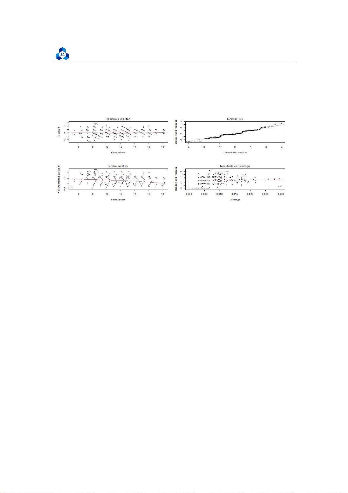
Before proceeding with data visualization, we should make sure that our models fit the
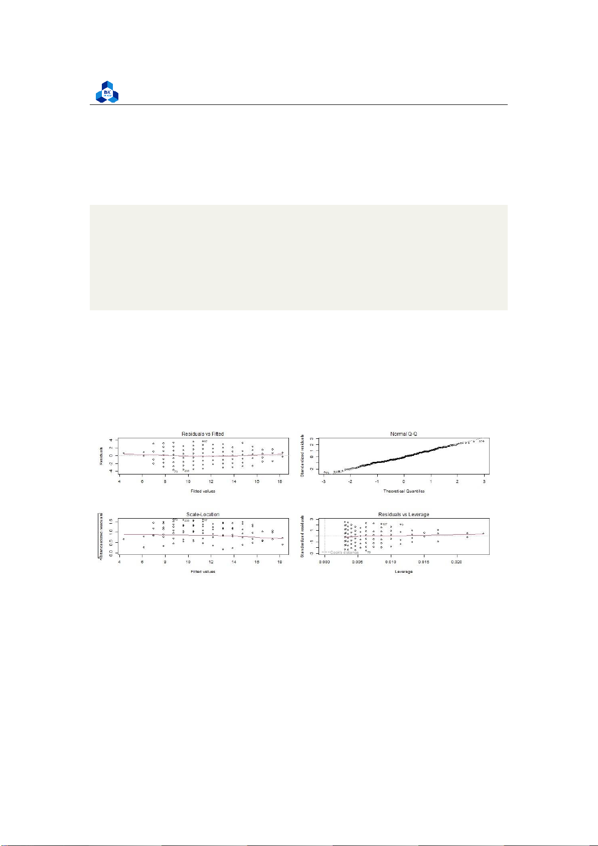
homoscedasticity assumption of the linear model. We can use generated model to identify the data for each plot:
png(file = "D:/NGUYEN/DAI HOC/Book/Semester 4/PROBABILITY AND STATISTICS/Rlab/g1_
homo_check.png", width = 1000, height = 400) par(mfrow=c(2,2)) plot(simp_model_G1) dev.off()
png(file = "D:/NGUYEN/DAI HOC/Book/Semester 4/PROBABILITY AND STATISTICS/Rlab/g2_
homo_check.png", width = 1000, height = 400) par(mfrow=c(2,2)) plot(simp_model_G2) dev.off() 1 2 3 4 5 6 7 8 9
Figure 22: Homoscedasticity check lOMoARcPSD| 36991220
University of Technology, Ho Chi Minh City
Faculty of Applied Mathematics
Figure 23: Homoscedasticity check
Residuals are the unexplained variance. They are not exactly the same as model error, but they are
calculated from it, so seeing a bias in the residuals would also indicate a bias in the error. The most
important thing to look for is that the red lines representing the mean of the residuals are all
basically horizontal and centered around zero. This means there are no outliers or biases in the
data that would make a linear regression invalid.
In the Normal Q-Q plot in the top right, we can see that the real residuals from our model form an
almost perfectly one-to-one line with the theoretical residuals from a perfect model. Based on
these residuals, we can say that our model meets the assumption of homoscedasticity. 3.5.1.c Result
We obtained the most suitable fitted line, now we are able to give out some prediction about the
data. To be more specific, given the score of the second exam from a student, we can approximately
determine his/her score at the final exam. Before we do so, we can have an observation of our fitted linear model: #Plot
g1.model <- coef(simp_model_G1) g2.model <- coef(simp_model_G2)
png(file = "D:/NGUYEN/DAI HOC/Book/Semester 4/PROBABILITY AND STATISTICS/Rlab/
simlinear.png", width = 1000, height = 400) par(mfrow=c(1,2))
plot(G3 ~ G1, data = no_outliers_data, col = "orange", pch = 20, cex = 1.5)
abline(a=g1.model[1], b= g1.model[2], col = "cyan", lwd = 2)
plot(G3 ~ G2, data = no_outliers_data, col = "orange", pch = 20, cex = 1.5)
abline(a=g2.model[1], b= g2.model[2], col = "cyan", lwd = 2) dev.off() 1 2 3 4 5 6 7 8 lOMoARcPSD| 36991220
University of Technology, Ho Chi Minh City
Faculty of Applied Mathematics 9 10 11
Listing 26: Linear model plot script
Figure 24: Linear model visualization 3.5.2
Multiple Linear Regression
In this section, we will consider the variation of G3 base on multiple variables. 3.5.2.a
Assumption Requirements
For Linearity and Normality, we have discussed about these in simple linear regression model.
Therefore, we come to the validation of independence for categorical variables as now final score
G3 is not considered just with single independent variables, but with multi-variables. As we see,
only G1 and G2 are highly correlated with G3, so we can only use these as categorical variables to evaluate tendency of G3.
There is one problem is that, the correlation between G1 and G2 is also typically high, which means
it could be a close relationship between these variables. However, we will ignore this and assume
that they are independent to evaluate the final score. Homoscedasticity will be checked after we
perform the linear regression model. 3.5.2.b
Perform the linear regression analysis
In this section, we simply do the same as simple model. So far, the model in R studio will have more
coefficient variables. Let consider if there is a linear relationship between G1, G2 and G3 in our data.
To test the relationship, we first fit a linear model with these independent and dependent variables:
model <- lm(G3 ~ G1 + G2, data=no_outliers_data) summary(model) 1 2
Listing 27: Multi-variable linear regression lOMoARcPSD| 36991220
University of Technology, Ho Chi Minh City
Faculty of Applied Mathematics Call:
lm(formula = G3 ~ G1 + G2, data = no_outliers_dat a) Residuals: Min 1Q Median 3Q Max
-2.2283 -0.3310 -0.1363 0.6778 2.7804 Coefficients:
Estimate Std. Error t value Pr(>|t|) (Intercept) 0.28965 0.17971 1.612 0.107982 G1 0.11141 0.03253 3.425 0.000692 *** G2 0.87983 0.03386 25.986 < 2e-16 *** --- . 0.1 1 Signif. codes: 0 *** 0.001 ** 0.01 * 0.05
Residual standard error: 0.8305 on 327 degrees of freedom
Multiple R-squared: 0.9278, Adjusted R-squared: 0.9274
F-statistic: 2101 on 2 and 327 DF, p-value: < 2.2e-16 1 2 3 4 5 6 7 8 9 10 11 12 13 14 15 16 17 18
Listing 28: Multi-variable linear regression model
The estimated effect of G1 on G3 is 0.11141, while the G2 affects 0.87983 (typically higher). This
means that for every 1% increase in G1, there is a correlated 0.1% increase in in G3 and the same
of G2 does nearly 0.9% increase in G3
The standard errors for these regression coefficients are very small, and also the t value are very
large. The p values reflect these small errors and large t statistics. For both parameters, there is
almost zero probability that this effect is due to chance. It means that these data relationships are very close.
Further, before proceeding with data visualization, we should make sure that our models fit the
homoscedasticity assumption of the linear model. Again, we should check that our model is actually
a good fit for the data, and that we don’t have large variation in the model error.
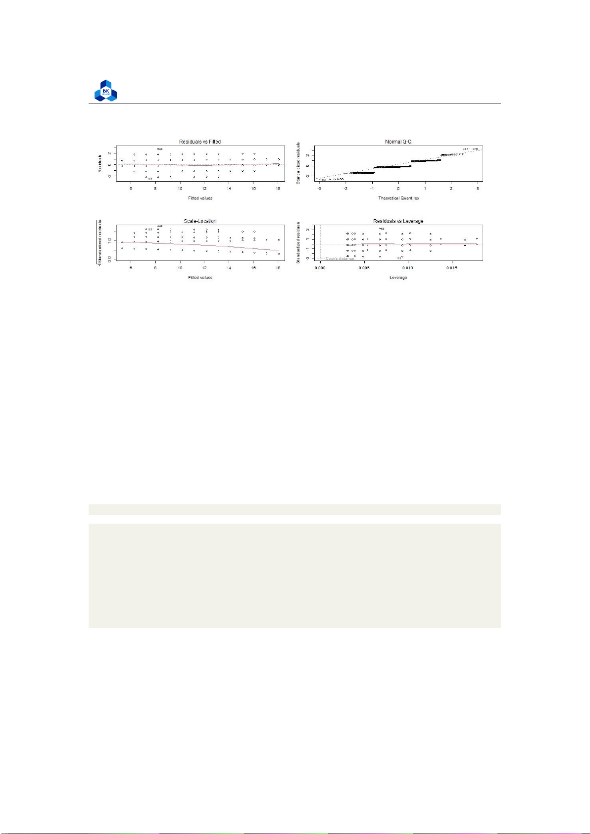
png(file = "D:/NGUYEN/DAI HOC/Book/Semester 4/PROBABILITY AND STATISTICS/Rlab/mul_
homo_check.png", width = 1000, height = 400) par(mfrow=c(2,2)) plot(model) dev.off() 1 lOMoARcPSD| 36991220
University of Technology, Ho Chi Minh City
Faculty of Applied Mathematics 2 3 4
Listing 29: Homoscedasticity check
Figure 25: Multiple-variable Homoscedasticity check
As with our simple regression, the residuals show no bias, so we can say our model fits the
assumption of homoscedasticity. 3.5.2.c Result
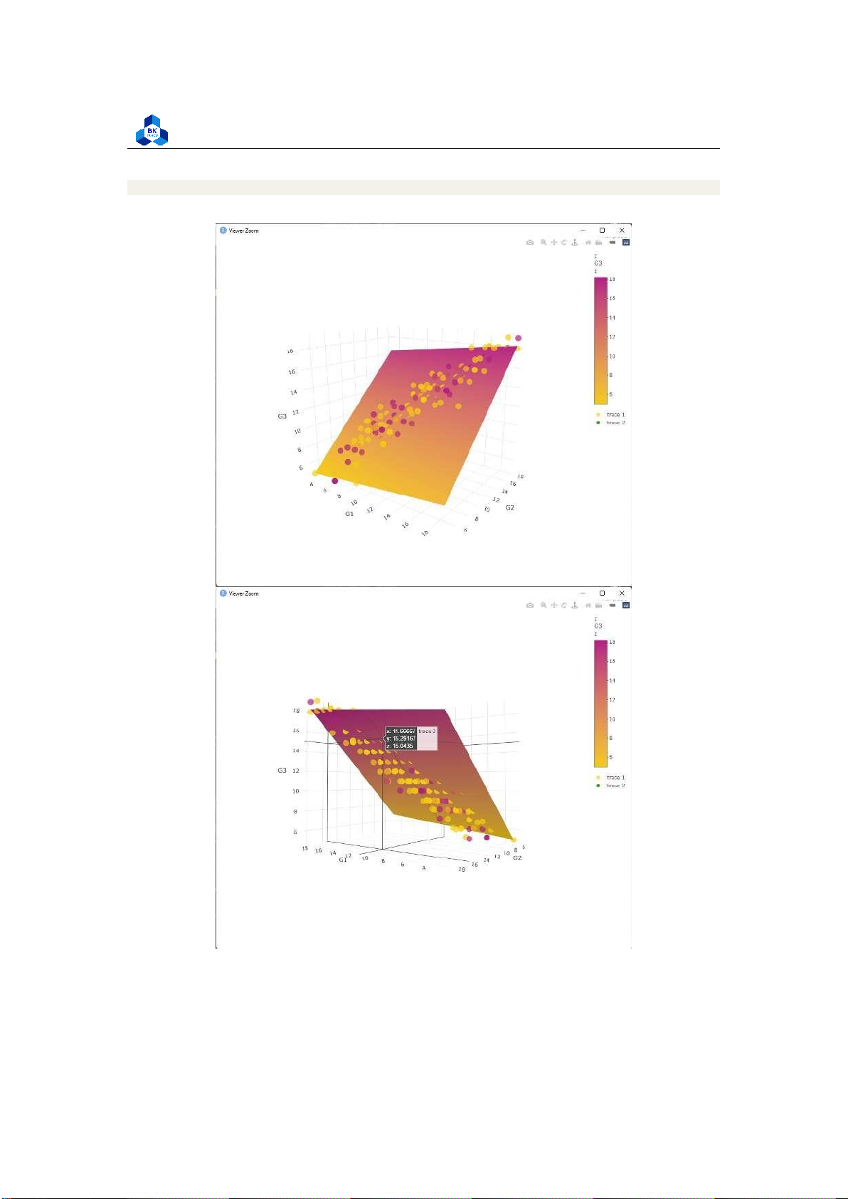
Next, we can plot the data and the regression line from our linear regression model so that the
results can be shared. In this part, we will combine two independent variables G1 and G2 into the
same coordinate to visualize G3: lOMoARcPSD| 36991220
University of Technology, Ho Chi Minh City
Faculty of Applied Mathematics #Plane setting cf.model <- coef(model)
x.seq <- seq(min(no_outliers_data$G1), max(no_outliers_data$G1), length.out = 25)
y.seq <- seq(min(no_outliers_data$G2), max(no_outliers_data$G2), length.out = 25) z <-
t(outer(x.seq, y.seq, function(x,y) cf.model[1] + cf.model[2]*x + cf.model[3] *y)) #Plot plane #color setting x <- rnorm(400)>0.5
cols <- c("#f5cb11", "#b31d83") cols <- cols[x+1] #plot
fig <-plot_ly(x=~x.seq, y=~y.seq, z=~z, colors = c("#f5cb11", "#b31d83"),type="surface") #Plot trace
fig <- fig %>% add_trace(data = no_outliers_data, x = ~G1, y = ~G2, z = ~G3, type=
"scatter3d", marker = list(color=cols, opacity=0.7, symbol=105))
fig <- fig %>% add_markers()
fig <- fig %>% layout(scene = list(xaxis = list(title = ’G1’), yaxis =
list(title = ’G2’), zaxis = list(title = ’G3’)), annotations = list( x = 1.13, y = 1.05, text = ’Final grade’, xref = ’G1’, yref = ’G2’, showarrow = FALSE )) 1 2 3 4 5 6 7 8 9 10 11 12 13 14 15 16 17 18 19 20 21 22 23 24 25 26 27 28 29 lOMoARcPSD| 36991220
University of Technology, Ho Chi Minh City
Faculty of Applied Mathematics fig 30
Figure 26: Multiple Linear Regression Visualization lOMoARcPSD| 36991220
University of Technology, Ho Chi Minh City
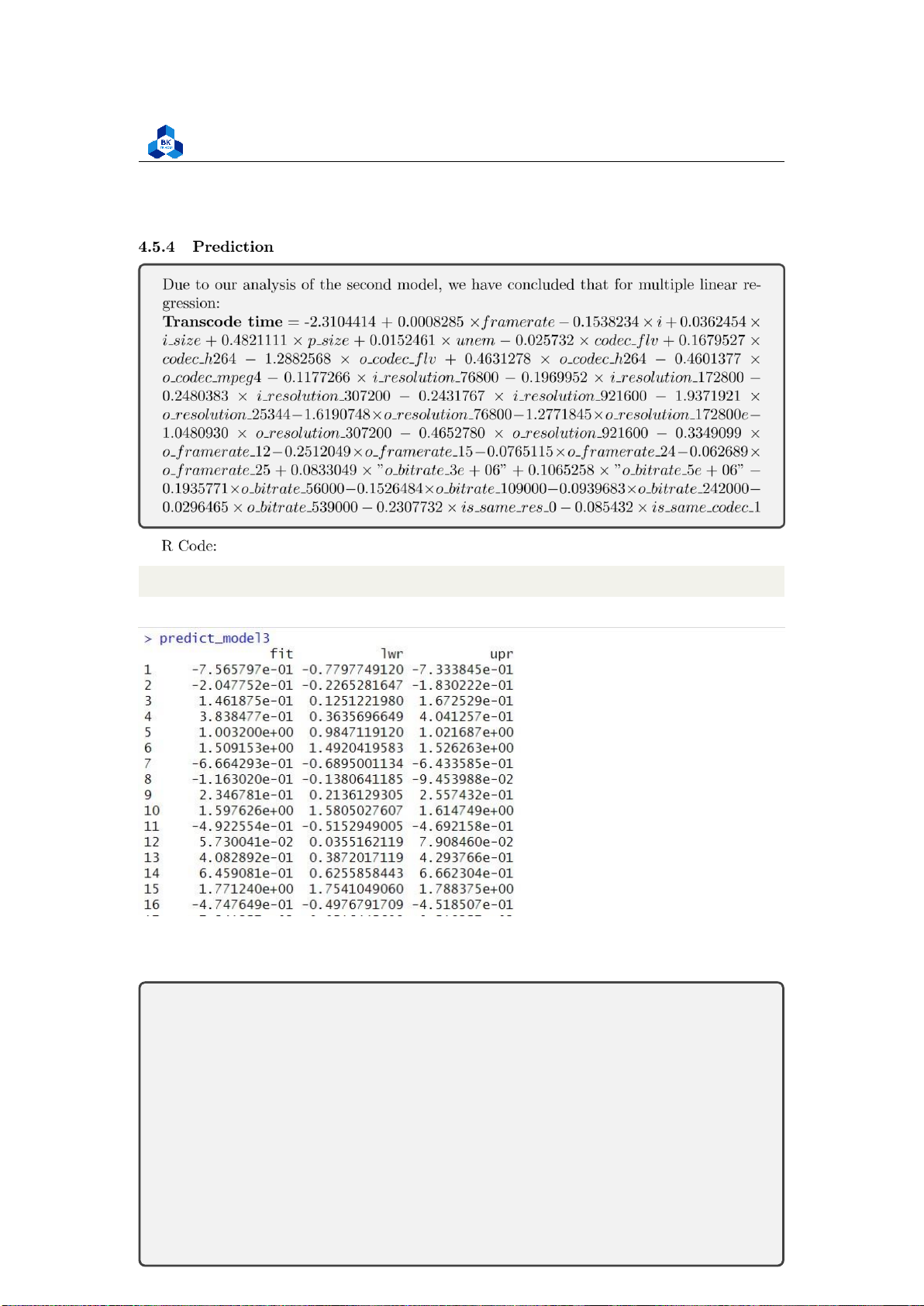
Faculty of Applied Mathematics 3.5.2.d Prediction
With the given fitted line, we are able to predict values. But it is very special, that is: Base on the
model we built, we just need only the score of the 1st and 2nd exams to predict the last exam (with
the fitted curve) without the other attributes.
Duetoouranalysis,wehaveconcludethat,forsimplelinearregression:
• IfwechooseG1tobecategoricalvariablethen:
G 3=1 . 77988+0 . 86675 × G 1
• IfwechooseG1tobecategoricalvariablethen:
G 3=0 . 36625+0 . 98348 × G 2
Andformultiplelinearregression:
G 3=0 . 28965+0 . 11141 × G 1+0 . 87983 × G 2
To understand the application of Linear Regression Model, let us walk through some example:
Example 1 A student achieve 9 score in the first examination (G1) and 10 score in the second
examination (G2). Predict his final score (G3).
In order to examine the prediction score, we implement a function that helps us to calculate
predictions in many ways and filter the score value in our data sheet to compare with the prediction value.
##########PREDICTION example <- function(a,b){ e1 = 1.77988
+ 0.86675*a e2 = 0.36625 + 0.98348*b e3 = 0.28965 +
0.11141*a + 0.87983*b cat("Expected final score for variable
G1:",e1) cat("\nExpected final score for variable G2:",e2)
cat("\nExpected final score for multiple variable:",e3) cat("\n")
filter_data<-subset(no_outliers_data, G1 == a & G2 == b) filter_data } 1 2 3 4 5 6 7 8 9 10 11 12
Listing 30: Example function script
For example, to make a prediction for this example, we can call the Example function with arguments G1=9 and G2=10: lOMoARcPSD| 36991220
University of Technology, Ho Chi Minh City
Faculty of Applied Mathematics > example(9,10)
Expected final score for variable G1: 9.58063
Expected final score for variable G2: 10.20105
Expected final score for multiple variable: 10.09064 sex
age studytime failures higher absences G1 G2 G3
59 1 15 2 0 1 2 9 10 9 85 0 15 2 0 1 2 9 10 10 220 0 17 3
0 1 4 9 10 10 318 0 18 3 0 1 9 9 10 9 340 0 17 2 0 1 4 9 10 10 > 1 2 3 4 5 6 7 8 9 10 11
As we can see, the prediction value is very close to all the final score (G3) in the data sheet. We can
try for some other value. Here is the example of G1 = 11 and G2 = 10: > example(11,10)
Expected final score for variable G1: 11.31413
Expected final score for variable G2: 10.20105
Expected final score for multiple variable: 10.31346 sex
age studytime failures higher absences G1 G2 G3
82 1 15 3 0 1 4 11 10 11 89 1 16 2 1 1 12 11 10 10 94 0 16
2 0 1 0 11 10 10 328 1 17 1 0 1 8 11 10 10 345 0 18 3 0 1 4 11 10 10 369 0 18 1 0 1 0 11 10 10 1 2 3 4 5 6 7 8 9 10 11
Let consider some another examples: lOMoARcPSD| 36991220
University of Technology, Ho Chi Minh City
Faculty of Applied Mathematics > example(12,15)
Expected final score for variable G1: 12.18088
Expected final score for variable G2: 15.11845
Expected final score for multiple variable: 14.82402 sex
age studytime failures higher absences G1 G2 G3 22 1 15 1 0 1 0 12 15 15 > example(14,16)
Expected final score for variable G1: 13.91438
Expected final score for variable G2: 16.10193
Expected final score for multiple variable: 15.92667 sex
age studytime failures higher absences G1 G2 G3
15 1 15 3 0 1 0 14 16 16 392 1 17 1 0 1 3 14 16 16 > example(13,15)
Expected final score for variable G1: 13.04763
Expected final score for variable G2: 15.11845
Expected final score for multiple variable: 14.93543 sex
age studytime failures higher absences G1 G2 G3
71 1 16 4 0 1 0 13 15 15 172 1 16 2 0 1 2 13 15 16 250 1 16 1 0 1 0 13 15 15 349 0 17 3 0 1 0 13 15 15 > example(14,15)
Expected final score for variable G1: 13.91438
Expected final score for variable G2: 15.11845
Expected final score for multiple variable: 15.04684 sex
age studytime failures higher absences G1 G2 G3 10 1 15 2 0 1 0 14 15 15 57 0 15 2 0 1 0 14 15 15 58
1 15 2 0 1 4 14 15 15 110 0 16 3 0 1 4 14 15 16 168 0 16 2 0 1 0 14 15 16 196 0 17 2 0 1 0 14 15 15 216 0 17 2 0 1 2 14 15 15 327 1 17 1 0 1 3 14 15 16 1 2 3 4 5 6 7 8 9 10 11 12 13 14 15 16 17 18 19 20 21 22 23 24 lOMoARcPSD| 36991220
University of Technology, Ho Chi Minh City
Faculty of Applied Mathematics 25 26 27 28 29 30 31 32 33 34 35 36 37 38
In these example, we can observe that the prediction method base on G2 and multi-variable are
much more accurate than the one base on G1. This can be explained due to the correlation heat
map, where correlated figure of G2 on G3 is significantly higher than the others.
Discussion: We can acknowledge that, the content of the final exam is almost close to our
predictions, especially two later methods. However, we also admit that there are tiny
differences between our prediction and the final results. This can be lead by some other
attributes. Normally, a student’s performance sometimes depends on his/her study time,
absence or maybe failure as well. However, they may not connect to each other in a linear
relationship. Therefore, it is expensive to evaluate them with a perfect accuracy. 3.5.2.e
Conclusion on exercise 1
Throughout this Exercise, we are able to build up an Linear Regression model as well as evaluating
how well the model is representing relationship between variables. And it’s important to get along
with semantic and logical aspects when analyzing data set to make sure that we are understanding
well and making good action on current problem. 4 Activity 2 4.1 Dataset Overview
In accordance with the instructions, each group should study a dataset of the same faculty of the
members. Therefore, we would like to choose the data of online video transcoding time on a social
platform (Youtube) as the dataset for this activity. The aforementioned dataset can be accessed at:
Online Video Characteristics and Transcoding Time Dataset
This dataset actually consists of two main datasets - youtube videos.tsv and transcoding
measurement.tsv, covering the Informations of the transcoded videos and the specification in the
transcoding process, respectively. The study in this activity is mainly focused on the online
transcoding process, which is contained in transcoding measurement.tsv. This dataset contains 20
attributes (1 goal field, 1 non-predictive and the rest are predictive). Some notable attributes are:
• Transcodedtime: The time needed to transcode video (target variable). • Duration (s). lOMoARcPSD| 36991220
University of Technology, Ho Chi Minh City
Faculty of Applied Mathematics
• Codec: The input/output codec specification.
• Width,Height (pixels).
• Frame: Number of frames in the video.
• Umem: Total codec allocated memory for transcoding.
The other attributes will be discussed further on to gain more information about them and exclude or combine some if necessary. 4.2 Import Data
Firstly, we include a set of library required for future analysis to the source code (listing 31. library(readr) library(ggcorrplot) library(corrr) library(corrplot) library(data.table) library(summarytools) library(dplyr) library("ggpubr") library("ggplot2") library("GGally")
library(MASS) library(nortest) 1 2 3 4 5 6 7 8 9 10 11 12
Listing 31: List of library used
After that, the dataset can be imported and assigned to a dataframe, the main object that we will
work on for the remaining parts of the activity (listing 32):
#Reading data from source file
data <- read_tsv("transcoding_mesurment.tsv") 1 2
Listing 32: Scripts to import data to a data frame 4.3 Data Cleaning
Firstly, We check for NA values present in the data. If the number of NA values is significant, we
have to find a method to replace malfunctioned values in order to maintain the sample size,
otherwise we can safely remove them without affecting the dataset. From the result in listing 33,
this dataset is clean from NA values, so no work needs to be done. sum(is.na(data)) [1] 0 lOMoARcPSD| 36991220
University of Technology, Ho Chi Minh City
Faculty of Applied Mathematics 1 2
Listing 33: Counting NA values
After that, we remove the non-predictive columns - those that provide no statistical value, such as
the identify number, unrelated information, etc. These attributes should be cleaned up to enhance
the performance of future studies and avoid wasting resources. In this dataset, the id column is the only non-predictive one: transcodeData$id <- NULL 1
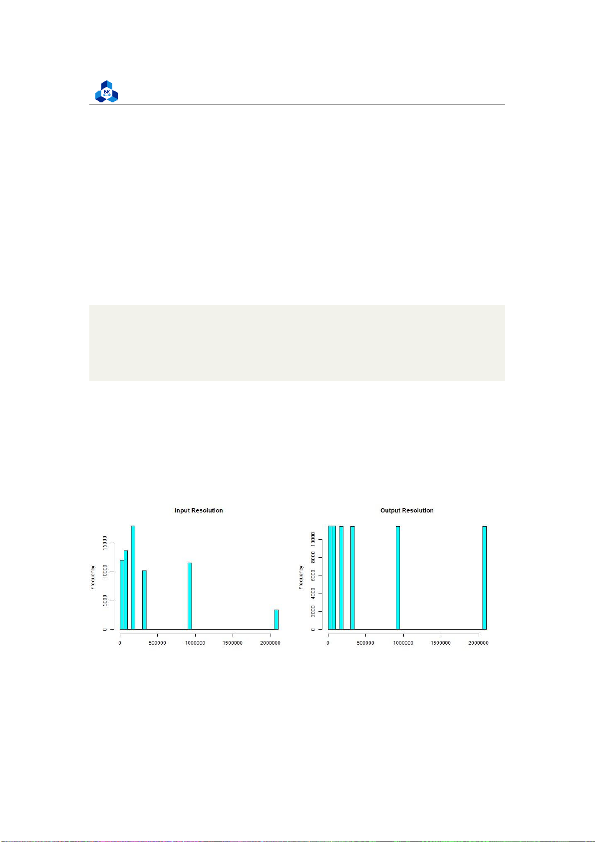
We also notice that the dataset has four fields: width,heigth,o width and o height, which stand for
the Input and Output width, height. We would like to combine these fields into a more coherent
variable - resolution. Resolution is much more comprehensible an accessible regarding the videos
transcoding scheme (i.e. When using or creating videos, users are familiar with and concerned
about resolution than width or height alone).
Firstly, we calculate the Input and Output resolution of each video and add it to the dataset by the command:
transcodeData$i_resolution <- as.numeric(transcodeData$i_resolution)
transcodeData$o_resolution <- as.numeric(transcodeData$o_resolution) 1 2
To ensure that our conversion does no harm to the statistical study, we proceed to check whether
the videos with the same input and output have the same dimensional ratio or not (the ratio width:
height), which means if a video has its resolution unchanged after transcoded, it has to have the
same width and height, otherwise the ratio has been modified. The result of the process (Figure 27) after executing the command:
transcodeData$is_same_res <- ifelse(transcodeData$i_resolution == transcodeData$o_ resolution, 1, 0)
sum(transcodeData$is_same_res == 1) sum(transcodeData$is_same_res == 1
& transcodeData$width == transcodeData$o_width) 1 2 3 4 5
Figure 27: Dimensional Ratio testing
The numbers are equal, which implies that we can safely remove the fields: lOMoARcPSD| 36991220
University of Technology, Ho Chi Minh City
Faculty of Applied Mathematics
transcodeData$width <- NULL transcodeData$height
<- NULL transcodeData$o_width <- NULL
transcodeData$o_height <- NULL 1 2 3 4 4.4 Data Visualization 4.4.1 Descriptive Statistics
We can utilize the built-in summary tool to have a general view at the dataset. The descr method
in R helps show descriptive statistics (including the mean, median, degree of standard deviation,
maximum and minimum value, etc.) of our dataset. Executing the commands below gives us the
result in Figure 28 and Figure 29.
descr(as.data.frame(transcodeData), transpose = TRUE, stats = c(’mean’, ’sd’, ’min ’,
’max’, ’med’, ’Q1’, ’IQR’, ’Q3’)) 1
As the figure illustrated, the b size (size in memory of b-frame in the video) can be confirmed to
have no meaning to the study, since its value are all zeros. Furthermore, as the dataset description
suggests, b size is the total size of all b-frames, so the amount of b-frames in a video clearly doesn’t
affect its transcoding time either. Therefore, we can safely eliminate b size and b from the dataset at once: transcodeData$b <- NULL
transcodeData$b_size <- NULL 1 2 4.4.2 Histogram
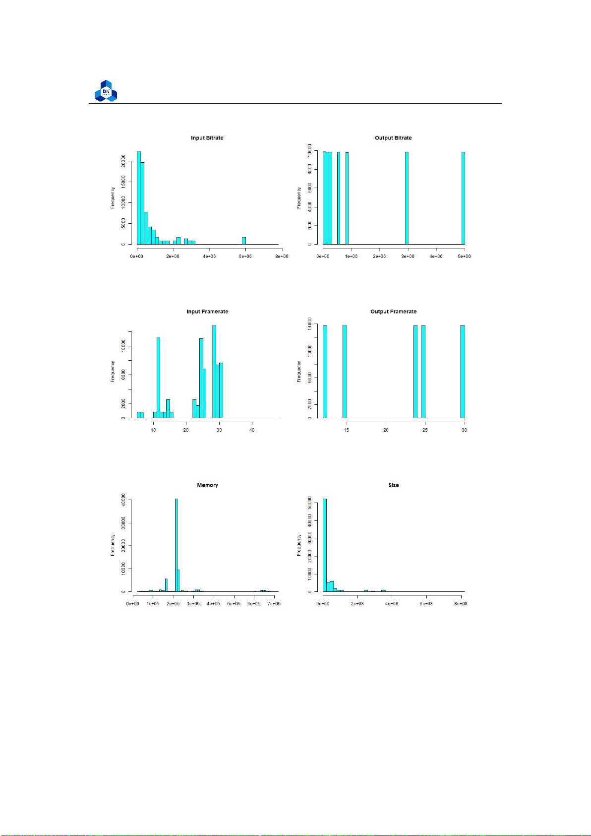
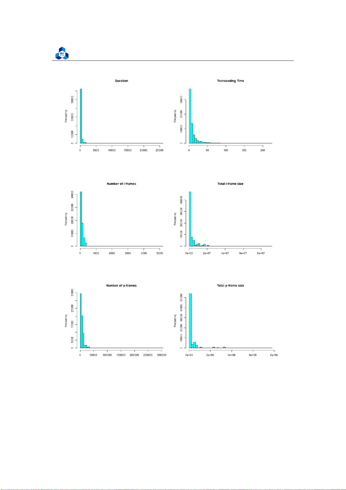
We can further visualize the quantitative traits of this dataset by conducting histogram plot (Figure
30-37). The program’s commands are described in listing 34:
png("hist_1.png", width = 1000, height = 800) par(mfrow=c(2,2))
hist(transcodeData$i_resolution,main="Input Resolution",
xlab="", col="cyan", breaks=50) 1 2 3 4 lOMoARcPSD| 36991220
University of Technology, Ho Chi Minh City
Faculty of Applied Mathematics
Figure 28: Descriptive Statistics
Figure 29: Descriptive Statistics (Continued)
hist(transcodeData$o_resolution,main="Output Resolution",
xlab="", col="cyan", breaks=50)
hist(transcodeData$duration,main="Duration", xlab="", col="cyan", breaks=50)
hist(transcodeData$Transcode_time,main="Transcoding Time",
xlab="", col="cyan", breaks=50) dev.off()
png("hist_2.png", width = 1000, height = 800) par(mfrow=c(2,2))
hist(transcodeData$bitrate,main="Input Bitrate", xlab="", col="cyan", breaks=50)
hist(transcodeData$o_bitrate,main="Output Bitrate", xlab="", col="cyan", breaks=50)
hist(transcodeData$framerate,main="Input Framerate", xlab="", col="cyan", breaks=50)
hist(transcodeData$o_framerate,main="Output Framerate",
xlab="", col="cyan", breaks=50) dev.off() lOMoARcPSD| 36991220
University of Technology, Ho Chi Minh City
Faculty of Applied Mathematics 5 6 7 8 9 10 11 12 13 14 15 16 17 18 19 20 21 22
png("hist_3.png", width = 1000, height = 400) par(mfrow=c(1,2))
hist(transcodeData$umem,main="Memory", xlab="", col="cyan", breaks=50)
hist(transcodeData$size,main="Size", xlab="", col="cyan", breaks=50) dev.off() 23 24 25 26 27 28 29 30 31
Listing 34: Scripts to plot histograms
Figure 30: Histogram Plot Result [1] lOMoARcPSD| 36991220
University of Technology, Ho Chi Minh City
Faculty of Applied Mathematics
Figure 31: Histogram Plot Result [2]
Figure 32: Histogram Plot Result [3]
Figure 33: Histogram Plot Result [4] lOMoARcPSD| 36991220
University of Technology, Ho Chi Minh City
Faculty of Applied Mathematics
Figure 34: Histogram Plot Result [5]
Figure 35: Histogram Plot Result [6]
Figure 36: Histogram Plot Result [7] lOMoARcPSD| 36991220
University of Technology, Ho Chi Minh City
Faculty of Applied Mathematics
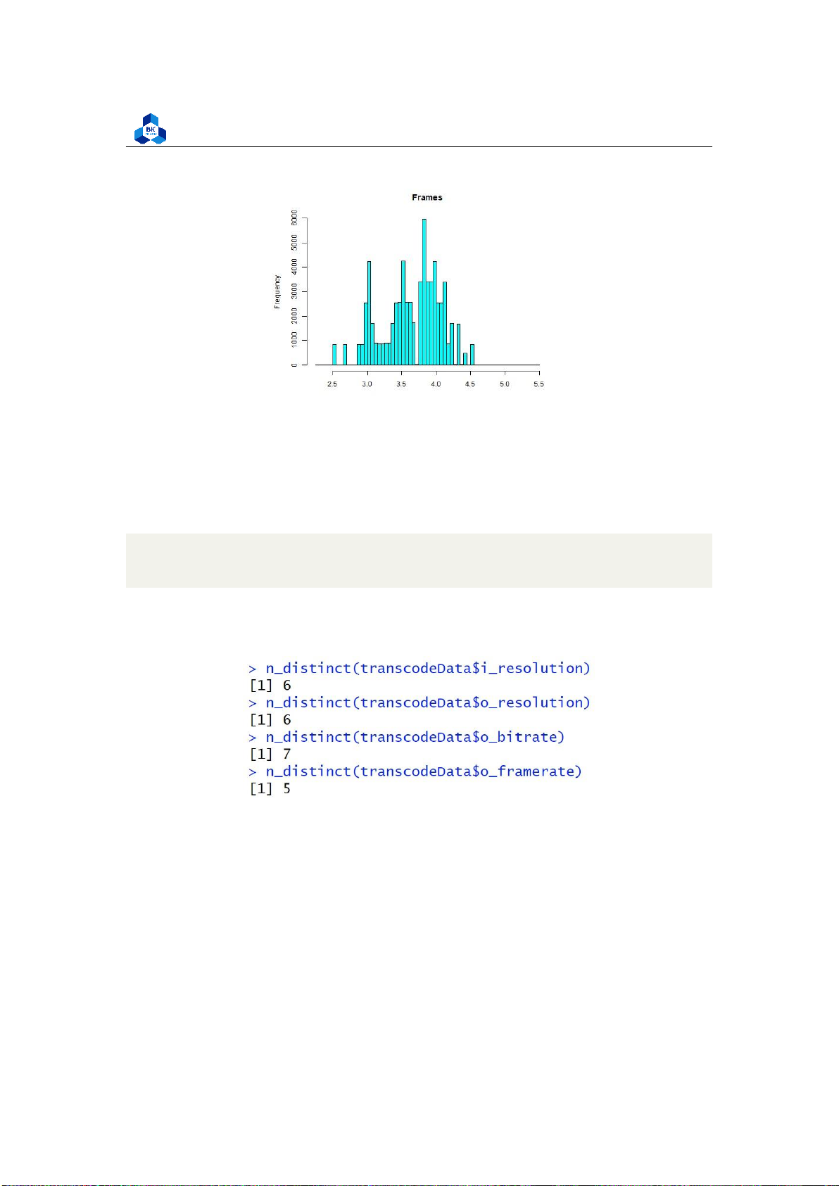
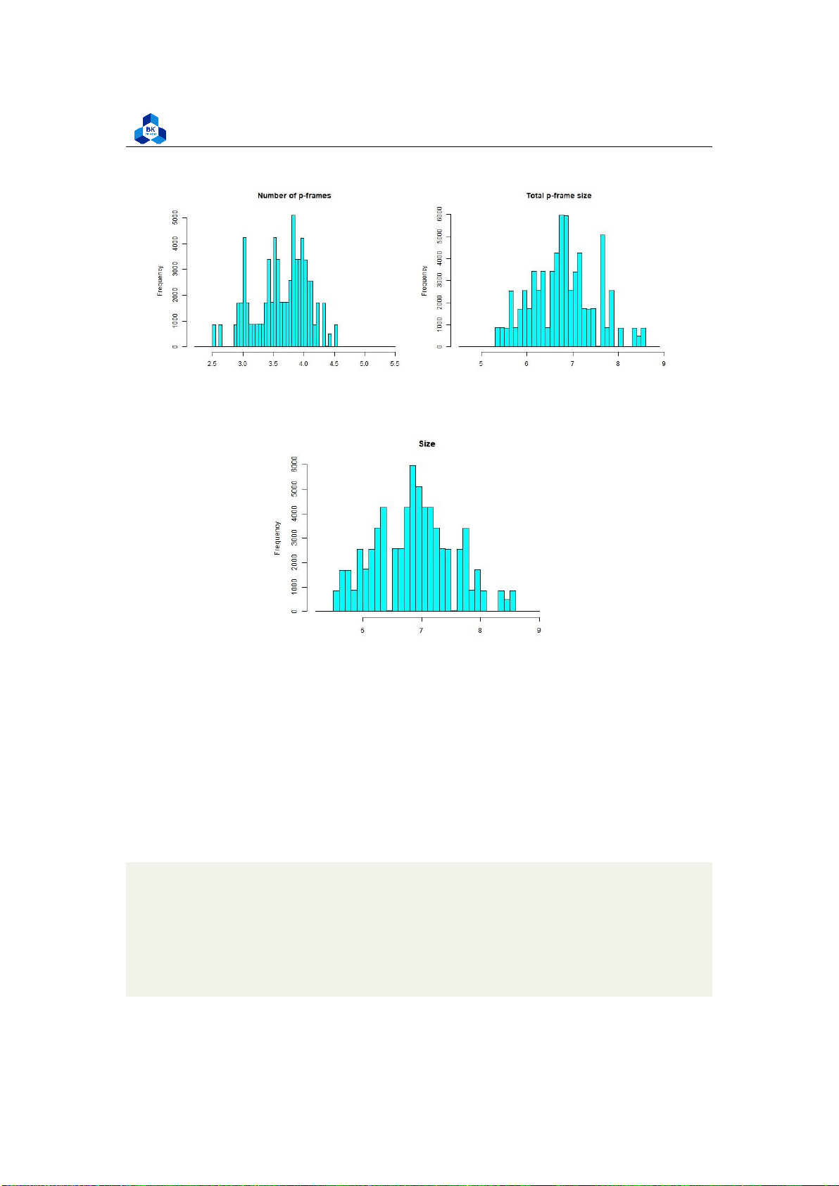
Figure 37: Histogram Plot Result [8] 4.4.2.a Discrete Variables
Several fields from the histogram result, namely InputResolution, OutputResolution, OutputBitrate and
OutputFramerate are illustrated to have distant values, and we based on that to conduct a test to count
their number of distinct values by executing the following code:
n_distinct(transcodeData$i_resolution)
n_distinct(transcodeData$o_resolution) n_distinct(transcodeData$o_bitrate)
n_distinct(transcodeData$o_framerate) 1 2 3 4
Figure 38: Counting unique values on some fields
Surprisingly, the result seen in Figure 38 suggests that these fields has few unique values (less
than 10) which makes them much more similar to discrete variables rather than continuous ones.
This result stems from the fact that, at the time, there is only a handful of video encoding software,
giving out a limited number of resolution, bitrate, and framerate. Additionally, since the data are
collected from one platform (Youtube), it is likely that such a platform only accepts videos with the
pre-determined specification due to its policy.
Therefore, to enhance our future predictions, we will later transform these fields into categorical
variables and dummy variables for future usages (before applying regression, testing, ...). lOMoARcPSD| 36991220
University of Technology, Ho Chi Minh City
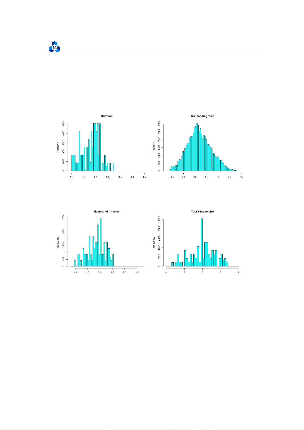
Faculty of Applied Mathematics 4.4.2.b Skewness
Most of the other fields are heavily left-skewed. Hence, to have a better visualization,
transformations can be made to these variables. We demonstrate a transformation using the log
function in R to examine some of the above fields. However, this transformation scheme is not
ideal, as it is only used for demonstration. More refined transformations require another algorithm
and tool to perform, which is later conducted in Regression Section (4.5). The transformed
Histogram plots are illustrated in Figure 39 - 42.
png("hist_5a.png", width = 1000, height = 400) par(mfrow=c(1,2))
hist(log10(transcodeData$duration),main="Duration", xlab="", col="cyan", breaks=50)
hist(log10(transcodeData$Transcode_time),main="Transcoding Time",
xlab="", col="cyan", breaks=50) dev.off()
png("hist_6a.png", width = 1000, height = 400) par(mfrow=c(1,2))
hist(log10(transcodeData$i),main="Number of i-frames", xlab="", col="cyan", breaks=50)
hist(log10(transcodeData$i_size),main="Total i-frame size", xlab="", col="cyan", breaks=50) 1 2 3 4 5 6 7 8 9 10 11 12 13 dev.off()
png("hist_7a.png", width = 1000, height = 400) par(mfrow=c(1,2))
hist(log10(transcodeData$p),main="Number of p-frames", xlab="", col="cyan", breaks=50)
hist(log10(transcodeData$p_size),main="Total p-frame size",
xlab="", col="cyan", breaks=50) dev.off()
png("hist_size_transformed.png", width = 500, height = 400) par(mfrow=c(1,1))
hist(log10(transcodeData$size),main="Size", xlab="", col="cyan", breaks=50) dev.off() 14 15 16 17 18 19 20 21 lOMoARcPSD| 36991220
University of Technology, Ho Chi Minh City
Faculty of Applied Mathematics 22 23 24 25 26 27 28 29
Figure 39: Histogram Transformed Plot Result [1]
Figure 40: Histogram Transformed Plot Result [2] lOMoARcPSD| 36991220
University of Technology, Ho Chi Minh City
Faculty of Applied Mathematics
Figure 41: Histogram Transformed Plot Result [3]
Figure 42: Histogram Transformed Plot Result [4]
The new plots give out more information, especially the Histogram of Transcoding Time is
close to a normal distribution, while the rest are significantly enhanced, although they still have some fluctuations. 4.4.3
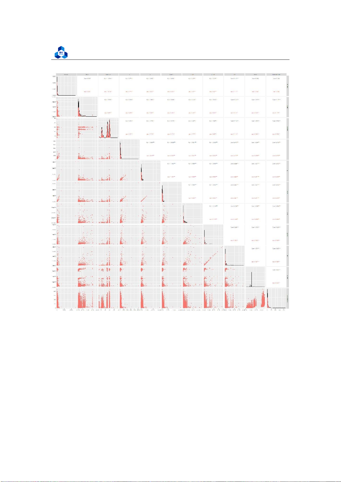
Pair Plot and Correlation Heatmap
We continue to plot the Pairs Scatter Plot to study the linear relationship (if there is any) among
the variables (Figure 43). The correlation plot can be achieved by the code:
# Get a copy of the original dataset scatterDF <-
subset(transcodeData, select = -c(codec, o_codec, i_resolution, o_resolution, is_same_res, is_same_codec, o_framerate, o_bitrate)) 1 lOMoARcPSD| 36991220
University of Technology, Ho Chi Minh City
Faculty of Applied Mathematics 2 3 4 5 6 7 8 9 10 11
scatterDF <- scatterDF %>% select(-Transcode_time, Transcode_time)
png("pairs_plot_new.png", width = 2000, height = 2000)
ggpairs(scatterDF, mapping = ggplot2::aes(color = "sex")) dev.off() 12 13 14 15 16 lOMoARcPSD| 36991220
University of Technology, Ho Chi Minh City
Faculty of Applied Mathematics Figure 43: Scatter Plot
The results strongly dictate that there are multiple correlated groups, in which frames is highly
correlated with p and the same relationship applies with size and p size, while the majority of the
rest also shares some linear similarity, but are not of high correlation values as the mentioned two.
This result is plausible when taking into account that in video architecture, frames and size (in
memory) are usually related (more frames means more pictures in a video, which lOMoARcPSD| 36991220
University of Technology, Ho Chi Minh City
Faculty of Applied Mathematics
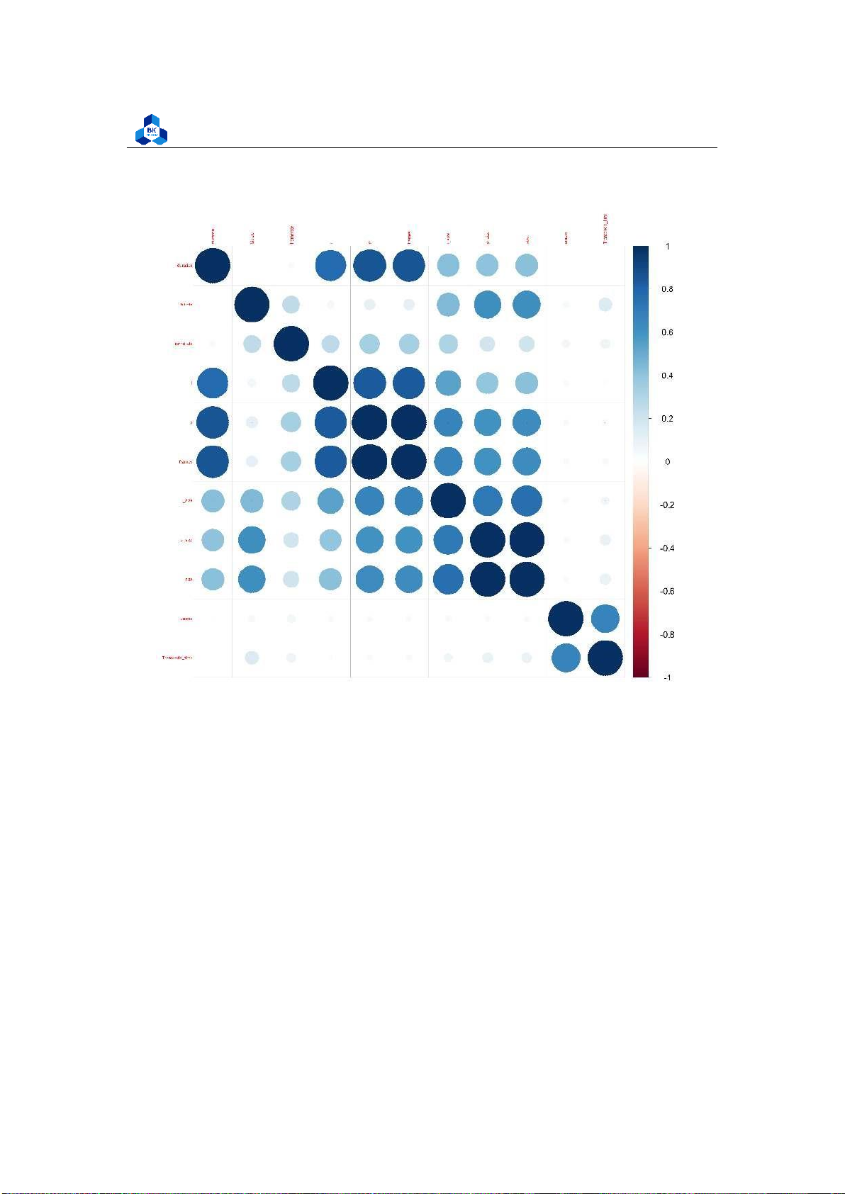
Figure 44: Correlation Heatmap
consequently takes up more memory).
The TranscodeTime is not correlated with any variable but it is slightly correlated with the umem
(Memory allocated to the process). This suggests that if the system gives more resources to the
transcoder, it can speed up the transcoding process to some extent. 4.4.4 Box Plot
We will further analyze the transcode time taken based on multiple categorical variables by using
Box Plot models. Throughout the plotting, some results are overpopulated with outliers, so we will
generate another dataset (Figure 45) without outliers and run both scenarios for a better
comparison. As in the scripts, we use the formula ?? lOMoARcPSD| 36991220
University of Technology, Ho Chi Minh City
Faculty of Applied Mathematics
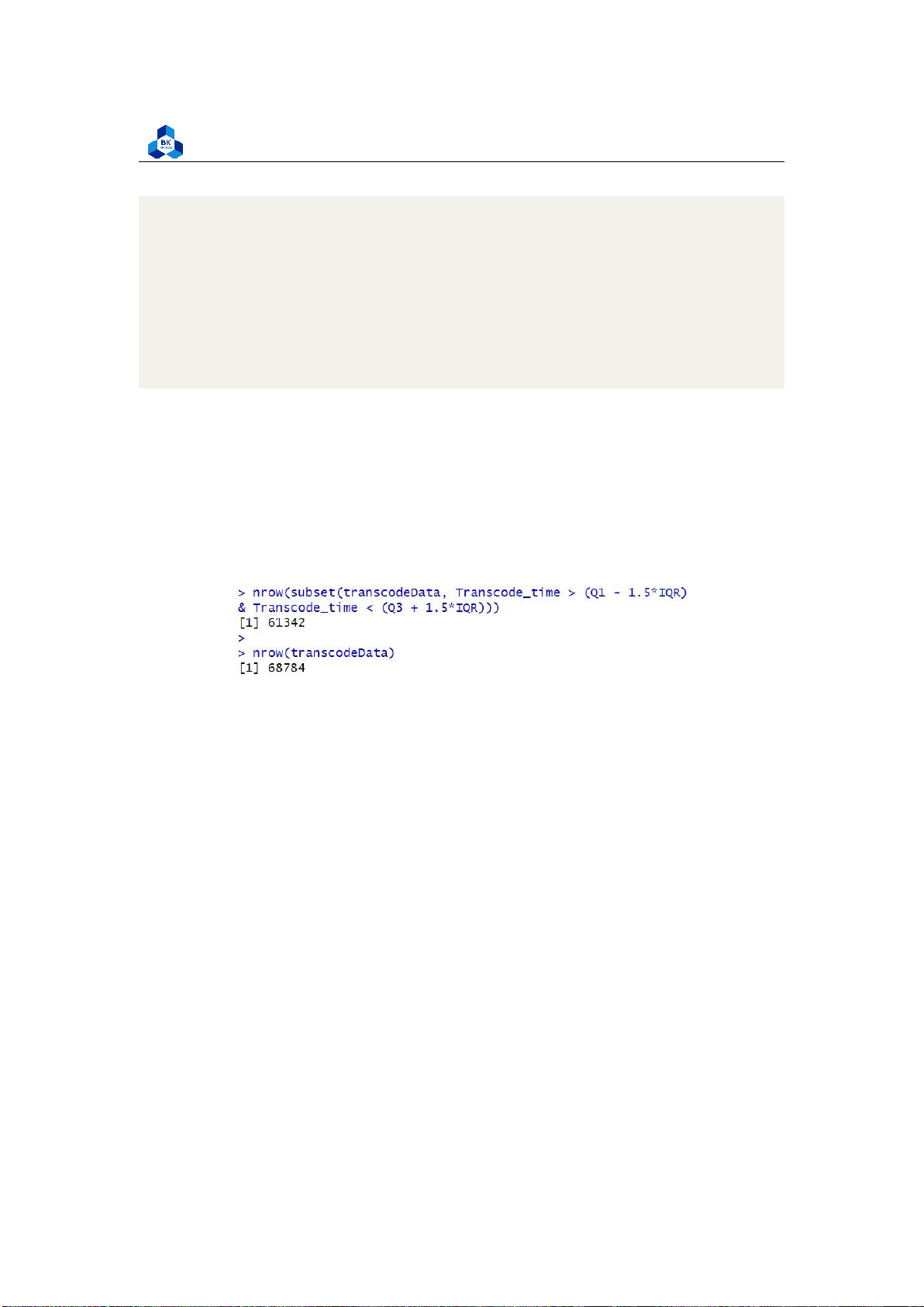
# Create a DF without outliers
Q1 <- quantile(transcodeData$Transcode_time, .25)
Q3 <- quantile(transcodeData$Transcode_time, .75) IQR
<- IQR(transcodeData$Transcode_time)
nrow(subset(transcodeData, Transcode_time > (Q1 - 1.5*IQR) & Transcode_time < (Q3 +
1.5*IQR))) nrow(transcodeData)
box_no_outliers <- subset(transcodeData, transcodeData$Transcode_time > (Q1
- 1.5*IQR) & transcodeData$Transcode_time < (Q3 + 1.5*IQR)) 1 2 3 4 5 6 7 8 9 10 11 12
Figure 45: Comparision in number of entries before and after removing outliers lOMoARcPSD| 36991220
University of Technology, Ho Chi Minh City
Faculty of Applied Mathematics 4.4.4.a
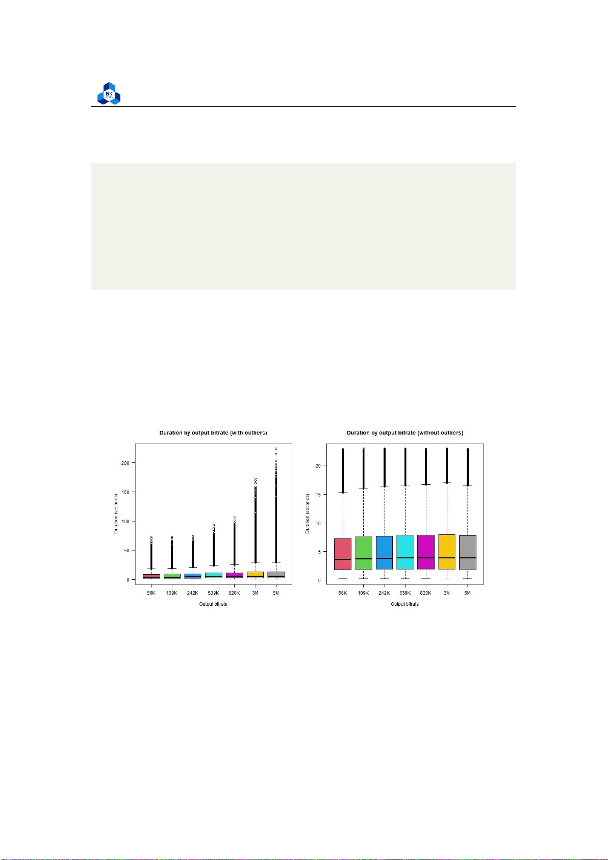
Transcode time for Output Bitrate and Framerate Output Bitrate:
png("boxplot_o_br.png", width = 1000, height = 500) par(mfrow=c(1,2))
boxplot(transcodeData$Transcode_time ~ transcodeData$o_bitrate,
main = "Duration by output bitrate (with outliers)", xlab =
"Output bitrate", ylab = "Duration (seconds)", names = c("56K",
"109K", "242K", "539K", "820K", "3M", "5M"), col = 2:8, las = 1)
boxplot(box_no_outliers$Transcode_time ~ box_no_outliers$o_bitrate,
main = "Duration by output bitrate (without outliers)", xlab =
"Output bitrate", ylab = "Duration (seconds)", names = c("56K",
"109K", "242K", "539K", "820K", "3M", "5M"), col = 2:8, las = 1) dev.off() 1 2 3 4 5 6 7 8 9 10 11 12 13
Figure 46: Box Plot Output Bitrate Output Framerate: lOMoARcPSD| 36991220
University of Technology, Ho Chi Minh City
Faculty of Applied Mathematics
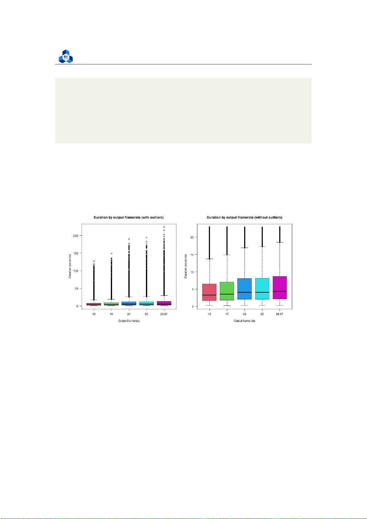
png("boxplot_o_fr.png", width = 1000, height = 500) par(mfrow=c(1,2))
boxplot(transcodeData$Transcode_time ~ transcodeData$o_framerate,
main = "Duration by output framerate (with outliers)",
xlab = "Output framerate", ylab = "Duration (seconds)", col = 2:8, las = 1)
boxplot(box_no_outliers$Transcode_time ~ box_no_outliers$o_framerate,
main = "Duration by output framerate (without outliers)",
xlab = "Output framerate", ylab = "Duration (seconds)", col = 2:8, las = 1) dev.off() 1 2 3 4 5 6 7 8 9 10 11
Figure 47: Box Plot Output Framerate
Both of these attributes yield a result having not much a difference amongst the factor, so it suggests
that these attributes don’t affect the target variable. Further regression studies are required in
order to come to a conclusion.
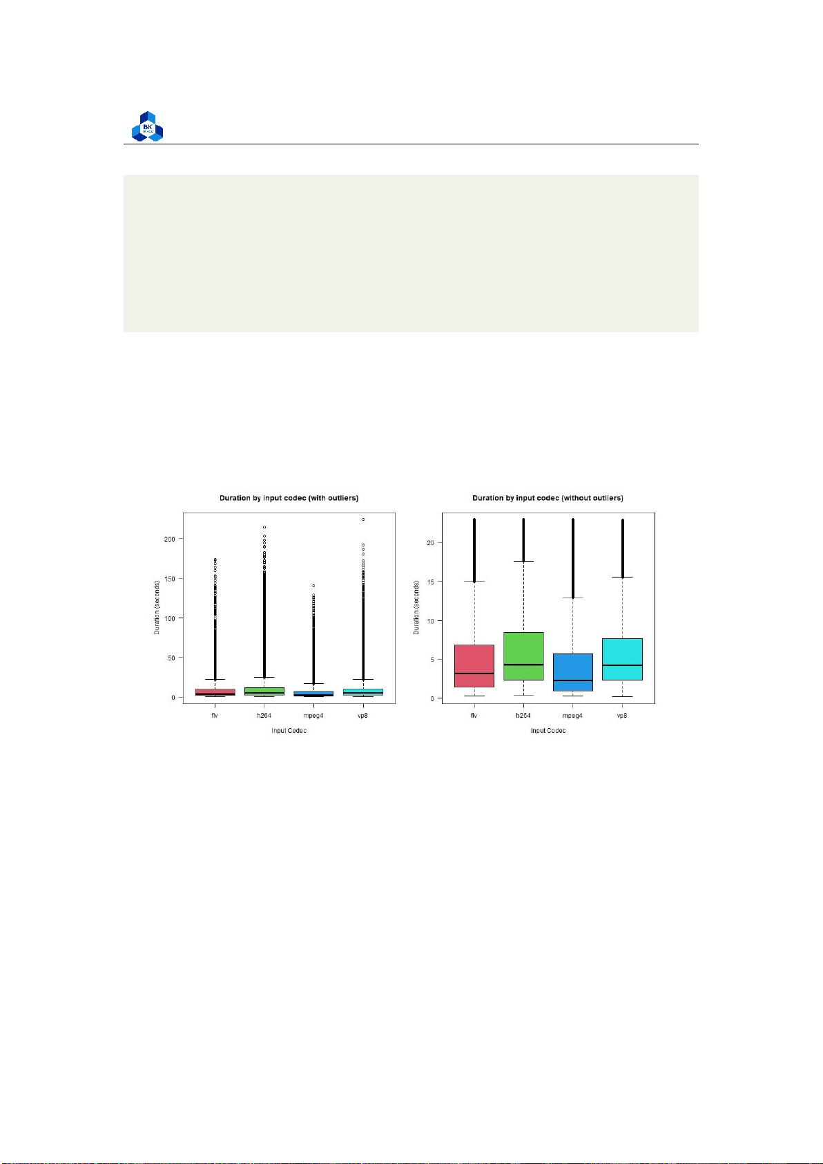
4.4.4.b Transcode time for Codec type
For types of input codec (Figure 48): lOMoARcPSD| 36991220
University of Technology, Ho Chi Minh City
Faculty of Applied Mathematics
png("boxplot_i_codec.png", width = 1000, height = 500) par(mfrow=c(1,2))
boxplot(transcodeData$Transcode_time ~ transcodeData$codec,
main = "Duration by input codec (with outliers)", xlab =
"Input Codec", ylab = "Duration (seconds)", col = 2:8, las = 1)
boxplot(box_no_outliers$Transcode_time ~ box_no_outliers$codec,
main = "Duration by input codec (without outliers)", xlab
= "Input Codec", ylab = "Duration (seconds)", col = 2:8, las = 1) dev.off() 1 2 3 4 5 6 7 8 9 10 11
Figure 48: Box Plot Input Codec
There is a slight difference in the median of transcode time among the input codec type, although
they all share a similar interquartile range, suggesting that the input codec affects our transcode
time to some extent, but not very visible. Videos with h264 and vp8 codec transcode are slightly
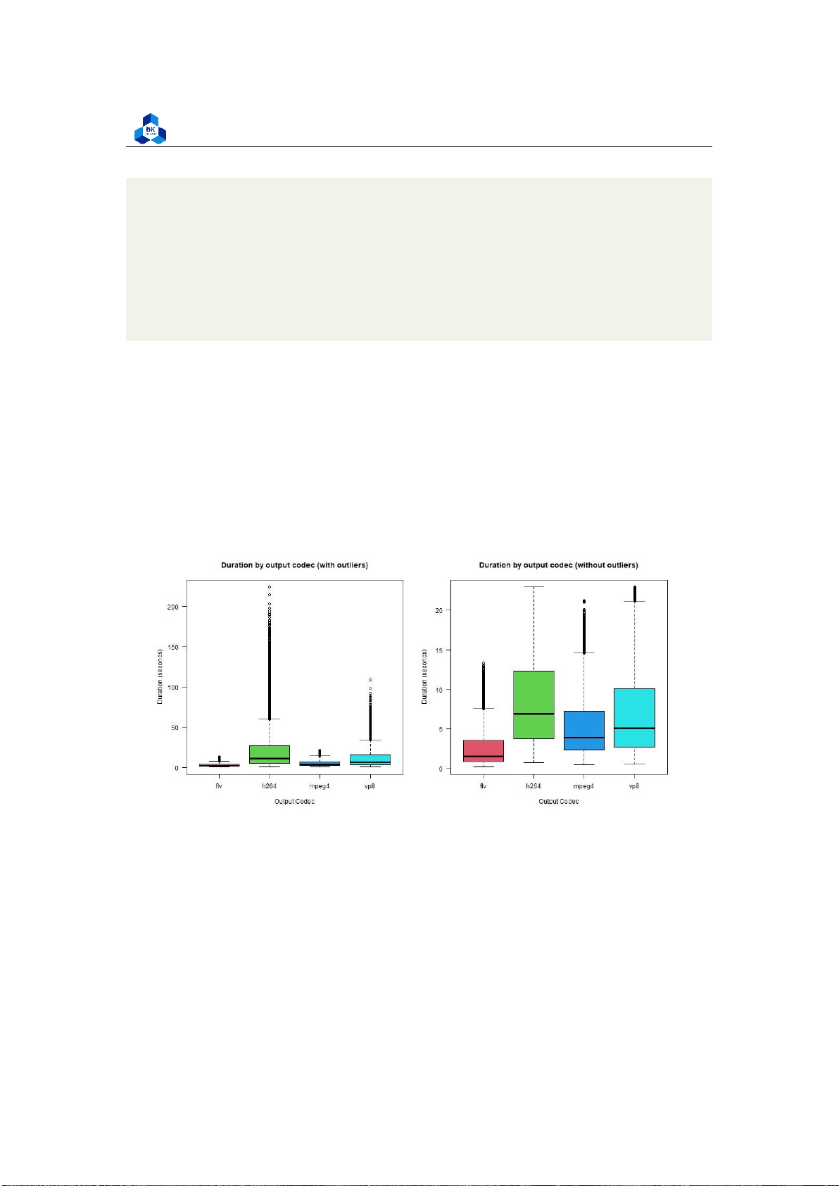
longer than those with flv and mpeg4. For types of output codec (Figure 49): lOMoARcPSD| 36991220
University of Technology, Ho Chi Minh City
Faculty of Applied Mathematics
png("boxplot_o_codec.png", width = 1000, height = 500) par(mfrow=c(1,2))
boxplot(transcodeData$Transcode_time ~ transcodeData$o_codec,
main = "Duration by output codec (with outliers)", xlab
= "Output Codec", ylab = "Duration (seconds)", col = 2:8, las = 1)
boxplot(box_no_outliers$Transcode_time ~ box_no_outliers$o_codec,
main = "Duration by output codec (without outliers)",
xlab = "Output Codec", ylab = "Duration (seconds)", col = 2:8, las = 1) dev.off() 1 2 3 4 5 6 7 8 9 10 11
The differences become more observable in the output codec plot. Therefore it implies that the
output codec type plays a more significant role than the input one. Videos in the flv codec take the
least time to transcode (lowest median) and have the most consistent output (small
Figure 49: Box Plot Output Codec
interquartile range). The other three codecs require more time to transcode, where h264 is the
longest and most inconsistent (varied values in the interquartile range).
4.4.4.c Transcode time for Resolution
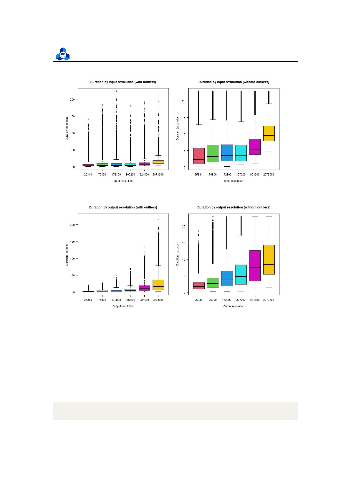
For types of input resolution (Figure 50): lOMoARcPSD| 36991220
University of Technology, Ho Chi Minh City
Faculty of Applied Mathematics
png("boxplot_i_res.png", width = 1000, height = 500) par(mfrow=c(1,2))
boxplot(transcodeData$Transcode_time ~ transcodeData$i_resolution,
main = "Duration by input resolution (with outliers)",
xlab = "Input resolution", ylab = "Duration (seconds)", col = 2:8, las = 1)
boxplot(box_no_outliers$Transcode_time ~ box_no_outliers$i_resolution,
main = "Duration by input resolution (without outliers)",
xlab = "Input resolution", ylab = "Duration (seconds)", col = 2:8, las = 1) dev.off() 1 2 3 4 5 6 7 8 9 10 11
For types of output resolution (Figure 51):
png("boxplot_o_res.png", width = 1000, height = 500) par(mfrow=c(1,2))
boxplot(transcodeData$Transcode_time ~ transcodeData$o_resolution,
main = "Duration by output resolution (with outliers)",
xlab = "Output resolution", ylab = "Duration (seconds)", col = 2:8, las = 1)
boxplot(box_no_outliers$Transcode_time ~ box_no_outliers$o_resolution,
main = "Duration by output resolution (without outliers)",
xlab = "Output resolution", ylab = "Duration (seconds)", col = 2:8, las = 1) dev.off() 1 2 3 4 5 6 7 8 9 10 11
There are some differences between the groups, and they become more obvious in the output
resolution result. Small resolution videos tend to take less time than larger ones, but are more
consistent (smaller interquartile range). lOMoARcPSD| 36991220
University of Technology, Ho Chi Minh City
Faculty of Applied Mathematics
Figure 50: Box Plot Input Resolution
Figure 51: Box Plot Output Resolution 4.4.5 Distribution Testing
We would like to examine the trait of each attribute in the dataset to determine their distribution
for further studies. Amongst that, the distribution of an attribute greatly determines our choice of
tools in the future, such as ANOVA testing, Regression, and so on. Only when the attributes
distribute in a normal fashion (normal distribution) can the above tools be taken into use. To study
the distribution of a variable in accordance to the target variable, the Anderson - Darling
normality test and Q-Q Plot technique can be used. The ad.test() method including in the
nortest library provides us the tool needed to perform the test (see listing 35.
tmpDF <- subset(transcodeData, select = -c(codec, o_codec, i_resolution, 1 lOMoARcPSD| 36991220
University of Technology, Ho Chi Minh City
Faculty of Applied Mathematics 2 o_resolution, is_same_res, is_same_codec, o_framerate, o_bitrate))
# We implement a function to speed up the task
norm_check <- function(name) { tmp <-
subset(tmpDF, select = c(name))
# tmp$Transcode_time <- tmpDF$Transcode_time # tmp
qqnorm(tmp[[name]], main = paste("Normal Q-Q Plot of ", name)) qqline(tmp[[name]], col = ’magenta’) ad.test(tmp[[name]]) }
png("qq_plot_1.png", width = 1000, height = 1000)
par(mfrow=c(3,3)) norm_check("duration")
norm_check("bitrate") norm_check("framerate")
norm_check("i") norm_check("p")
norm_check("frames") norm_check("i_size")
norm_check("p_size") norm_check("size") dev.off() 3 4 5 6 7 8 9 10 11 12 13 14 15 16 17 18 19 20 21 22 23 24 25 26 27 28 29 30
Listing 35: Scripts to run Anderson-Darling test
The result displayed in Figure 52 depicted how close the current distribution of the data is from
each attribute. Almost all of them have a highly positive skew, where the plot resembles an upward lOMoARcPSD| 36991220
University of Technology, Ho Chi Minh City
Faculty of Applied Mathematics
graph, which means the low value (compare with the mean) is abundant. On the right tail of the
plots, there is a clear departure from the straight line, which represents the normal distribution
line. There are some gaps in values in some of the plots, or the values are spread out much more
than supposed, making the plots jagged.
Therefore, it can be concluded that the current data does not follow a normal distribution. However,
transformation techniques can be done to alleviate the effect of non-normality, which are implemented in Section 4.5. 4.5
Linear Regression Model 4.5.1 Transforming Data
As mentioned in the subsection 4.4.5, the current data does not distribute normally, and in order to
change that a transformation technique called Box Cox Transformation is applied. The R code for
the transformation is presented as follows:
tmpDF <- subset(transcodeData, select = -c(codec, o_codec, i_resolution, o_resolution, o_framerate, o_bitrate, is_same_res, is_same_codec))
#Normality transforming for (item in colnames(tmpDF)) {
b <- boxcox( lm(transcodeData[[item]] ~ 1 ) ) 1 2 3 4 5 6 7 8 9 10 11 lOMoARcPSD| 36991220
University of Technology, Ho Chi Minh City
Faculty of Applied Mathematics Figure 52: QQ Plot Result
lambda <- b$x[which.max(b$y)]
transcodeData[[item]] <- ((transcodeData[[item]])^lambda-1)/lambda } 12 13 14
Listing 36: Transforming Data using boxcox in R 4.5.2
Creating dummy variables
In our dataset, there are 2 main kinds of data: Numeric and Categorical. However, after analyzing
some of the numeric data variables, we recognized the fact that i resolution, o resolution, o
framerate, o bitrate don’t have large ranges of values. The code to verify that as well as the results are as follows: lOMoARcPSD| 36991220
University of Technology, Ho Chi Minh City
Faculty of Applied Mathematics
> length(unique(transcodeData$i_resolution)) [1] 6
> length(unique(transcodeData$o_resolution)) [1] 6
> length(unique(transcodeData$o_framerate)) [1] 5
> length(unique(transcodeData$o_bitrate)) 1 2 3 4 5 6 [1] 7 7 8
Listing 37: checking number of unique values and results
Due to a small range of unique values, the abovementioned variables shall also be treated as
categorical variables, similar to codec, o codec, is same res, is same codec.
Before going into fitting a linear regression model to our data, we need to create dummy variables
from the categorical ones from the dataset.
A dummy variable is a type of variable that we create in regression analysis so that we can
represent a categorical variable as a numerical variable that takes on one of two values: zero or one.
#Dummy transcodeData.2 <- dummy_cols(transcodeData,select_columns = c(’codec’, ’o_codec’, ’i_resolution’, ’o_resolution’, ’o_framerate’,
’o_bitrate’) ,remove_selected_columns = TRUE) 1 2 3 4 5 6 7 8
Listing 38: Dummy variable from categorical variables
There is also one thing that needs to take into consideration is the Dummy Variable Trap(causes
Perfect Multicollinearity), which happens when The number of dummy variables created is equal to
k-1 where k is the number of different values that the categorical variable can take on. In order to
solve this problem, we can just simply create a test model to see which dummy columns get NA value and just remove them. lOMoARcPSD| 36991220
University of Technology, Ho Chi Minh City
Faculty of Applied Mathematics
testModel <- lm(Transcode_time ~ . ,data = transcodeData.2) 1 Listing 39: Test Model
Coefficients: (7 not defined because of singularities)
Estimate Std. Error t value Pr(>|t|)
(Intercept) -2.402e-01 6.240e-02 -3.850 0.000118 *** framerate
6.115e-04 1.537e-05 39.785 < 2e-16 *** i -6.952e-02 2.439e-03 -28.500
< 2e-16 *** i_size -7.959e-03 1.381e-03 -5.762 8.34e-09 *** p_size
3.769e-01 4.680e-03 80.520 < 2e-16 *** umem 1.310e-02 8.486e-04
15.442 < 2e-16 *** is_same_codec -8.422e-02 3.545e-03 -23.760 < 2e-
16 *** is_same_res -2.295e-01 3.971e-03 -57.796 < 2e-16 *** codec_flv
-2.792e-02 7.012e-03 -3.981 6.86e-05 *** codec_h264 1.277e-01 3.844e-
03 33.209 < 2e-16 *** codec_mpeg4 -7.114e-01 1.550e-02 -45.896 < 2e- 16 *** codec_vp8 NA NA NA NA o_codec_flv
-1.287e+00 4.184e-03 -307.670 < 2e-16 *** o_codec_h264
4.668e-01 4.441e-03 105.114 < 2e-16 ***
o_codec_mpeg4 -4.607e-01 4.140e-03 -111.282 < 2e-16 *** o_codec_vp8 NA NA NA NA i_resolution_25344 NA NA NA NA i_resolution_76800
-5.956e-01 1.205e-02 -49.442 < 2e-16 ***
i_resolution_172800 -5.933e-01 1.035e-02 -57.302 < 2e-16 ***
i_resolution_307200 -5.809e-01 9.679e-03 -60.016 < 2e-16 *** 1 2 3 4 5 6 7 8 9 10 11 12 13 14 15 16 17 18 19 20 21 22 lOMoARcPSD| 36991220
University of Technology, Ho Chi Minh City
Faculty of Applied Mathematics
i_resolution_921600 -3.969e-01 7.738e-03 -51.301 < 2e-16 *** i_resolution_2073600 NA NA NA NA o_resolution_25344
-1.938e+00 5.327e-03 -363.762 < 2e-16 *** o_resolution_76800
-1.622e+00 5.326e-03 -304.611 < 2e-16 *** o_resolution_172800 -1.279e+00
5.365e-03 -238.391 < 2e-16 *** o_resolution_307200 -1.053e+00 5.307e-03 -198.512 <
2e-16 *** o_resolution_921600 -4.666e-01 5.186e-03 -89.966 < 2e-16 *** o_resolution_2073600 NA NA NA NA
o_framerate_12 -3.379e-01 4.625e-03 -73.058 < 2e-16 *** o_framerate_15 -
2.530e-01 4.621e-03 -54.759 < 2e-16 *** o_framerate_24 -7.803e-02 4.628e-03 -
16.862 < 2e-16 *** o_framerate_25
-6.609e-02 4.628e-03 -14.280 < 2e-16 *** o_framerate_29.97 NA NA NA NA ‘o_bitrate_3e+06‘ 8.563e-02 5.477e-03 15.634 < 2e-16 *** ‘o_bitrate_5e+06‘ 1.053e-01 5.470e-03
19.252 < 2e-16 *** o_bitrate_56000
-1.943e-01 5.471e-03 -35.521 < 2e-16 *** o_bitrate_109000 -1.527e-01
5.475e-03 -27.891 < 2e-16 *** o_bitrate_242000
-9.284e-02 5.484e-03 -16.928 < 2e-16 *** o_bitrate_539000
-2.713e-02 5.488e-03 -4.944 7.69e-07 *** o_bitrate_820000 NA NA NA NA 23 24 25 26 27 28 29 30 31 32 33 34 35 36 37 38 39 40 41 42
Listing 40: Coefficient table of Test Model
Base off Listing 40, we move on to remove the columns with NA values:
transcodeData.2$codec_vp8 <- NULL transcodeData.2$o_codec_vp8
<- NULL transcodeData.2$i_resolution_25344 <- NULL
transcodeData.2$i_resolution_2073600 <- NULL
transcodeData.2$o_resolution_2073600 <- NULL
transcodeData.2$o_framerate_29.97 <- NULL
transcodeData.2$o_bitrate_820000 <- NULL 1 2 3 4 5 6 7
Listing 41: removing dummies causing Perfect Multicollinearity lOMoARcPSD| 36991220
University of Technology, Ho Chi Minh City
Faculty of Applied Mathematics 4.5.3
Fitting linear regression model 4.5.3.a Model 1
The first model estimates the transcoding time of youtube videos based on all other variables in the
data set (input & output characteristics as well as memory resource requirements while
transcoding videos to different but valid formats)
firstModel <- lm(Transcode_time ~ . ,data = transcodeData.2) 1 Listing 42: Model 1 code Coefficients:
Estimate Std. Error t value Pr(>|t|) (Intercept)
-1.201e+00 1.188e-01 -10.110 < 2e-16 *** transcodeData.2$duration 9.424e-02 1.867e-02 5.049 4.46e-07 *** transcodeData.2$bitrate 4.929e-01 5.346e-02 9.219 < 2e-16 *** transcodeData.2$framerate 6.435e-04 3.625e-05 17.750 < 2e-16 *** transcodeData.2$i -9.160e-03 4.869e-03 -1.881 0.059936 . transcodeData.2$p -1.186e-01 2.289e-02 -5.181 2.21e-07 *** transcodeData.2$frames 1.039e-01 2.322e-02 4.477 7.58e-06 *** transcodeData.2$i_size
-1.933e-02 1.794e-03 -10.773 < 2e-16 *** transcodeData.2$p_size 1.780e-01 1.669e-02 10.664 < 2e-16 *** transcodeData.2$size -1.391e-01 3.707e-02 -3.752 0.000176 *** transcodeData.2$umem 1.358e-02 8.412e-04 16.142 < 2e-16 *** transcodeData.2$codec_flv
-1.326e-01 9.406e-03 -14.100 < 2e-16 *** 1 2 3 4 5 6 7 8 9 10 11 12 13 14 lOMoARcPSD| 36991220
University of Technology, Ho Chi Minh City
Faculty of Applied Mathematics transcodeData.2$codec_h264 1.866e-02 7.654e-03 2.438 0.014765 * transcodeData.2$codec_mpeg4
-6.542e-01 1.683e-02 -38.867 < 2e-16 *** transcodeData.2$o_codec_flv
-1.287e+00 4.159e-03 -309.416 < 2e-16 *** transcodeData.2$o_codec_h264
4.680e-01 4.419e-03 105.921 < 2e-16 *** transcodeData.2$o_codec_mpeg4
-4.608e-01 4.117e-03 -111.925 < 2e-16 ***
transcodeData.2$i_resolution_76800 -5.191e-01 1.418e-02 -36.613 < 2e-16 ***
transcodeData.2$i_resolution_172800 -5.388e-01 1.216e-02 -44.321 < 2e-16 ***
transcodeData.2$i_resolution_307200 -5.484e-01 1.067e-02 -51.375 < 2e-16 ***
transcodeData.2$i_resolution_921600 -3.740e-01 8.781e-03 -42.599 < 2e-16 ***
transcodeData.2$o_resolution_25344 -1.934e+00 5.300e-03 -364.938 < 2e-16 ***
transcodeData.2$o_resolution_76800 -1.622e+00 5.309e-03 -305.528 < 2e-16 ***
transcodeData.2$o_resolution_172800 -1.281e+00 5.340e-03 -239.879 < 2e-16 ***
transcodeData.2$o_resolution_307200 -1.054e+00 5.278e-03 -199.672 < 2e-16 ***
transcodeData.2$o_resolution_921600 -4.621e-01 5.156e-03 -89.636 < 2e-16 ***
transcodeData.2$o_framerate_12
-3.366e-01 4.591e-03 -73.304 < 2e-16 ***
transcodeData.2$o_framerate_15
-2.522e-01 4.603e-03 -54.793 < 2e-16 ***
transcodeData.2$o_framerate_24
-7.742e-02 4.599e-03 -16.836 < 2e-16 ***
transcodeData.2$o_framerate_25
-6.016e-02 4.591e-03 -13.104 < 2e-16 ***
transcodeData.2$"o_bitrate_3e+06" 8.465e-02 5.437e-03 15.567 < 2e-16 ***
transcodeData.2$"o_bitrate_5e+06" 1.008e-01 5.449e-03 18.509 < 2e-16 ***
transcodeData.2$o_bitrate_56000
-1.988e-01 5.449e-03 -36.483 < 2e-16 ***
transcodeData.2$o_bitrate_109000
-1.517e-01 5.453e-03 -27.814 < 2e-16 ***
transcodeData.2$o_bitrate_242000
-9.841e-02 5.455e-03 -18.040 < 2e-16 ***
transcodeData.2$o_bitrate_539000 -3.351e-02 5.449e-03 -6.150 7.81e-10 *** transcodeData.2$is_same_res
-2.329e-01 3.952e-03 -58.937 < 2e-16 *** transcodeData.2$is_same_codec
-8.531e-02 3.530e-03 -24.169 < 2e-16 *** lOMoARcPSD| 36991220
University of Technology, Ho Chi Minh City
Faculty of Applied Mathematics --- 1 Signif. codes: 0 *** 0.001 ** 0.01 * 0.05 . 0.1
Residual standard error: 0.3412 on 54990 degrees of freedom Multiple R-
squared: 0.8998, Adjusted R-squared: 0.8997
F-statistic: 1.335e+04 on 37 and 54990 DF, p-value: < 2.2e-16 15 16 17 18 19 20 21 22 23 24 25 26 27 28 29 30 31 32 33 34 35 36 37 38 39 40 41 42 43 44 45 46
Listing 43: Coefficient table of Model 1
Figure 53: Multicollinearity test of Model 1
As in Listing 43 has shown, Model 1 has the R-squared of 0.8998 and the p-value is less than 0.05,
also non of any variable’s p-values are greater than 0.05, thus, statistically significant. However, the lOMoARcPSD| 36991220
University of Technology, Ho Chi Minh City
Faculty of Applied Mathematics
multicollinearity test result (figure 53) doesn’t turn out to be as good as we see some significantly
high values from the test, which indicates that we should eliminate some columns. 4.5.3.b Model 2
Model 2 removes some columns that have high values in the multicollinearity test (figure 53), which
are: duration, bitrate, p, frames, and size.
secondModel <- lm(Transcode_time ~ . -duration -bitrate -p - frames -size ,data = transcodeData.2) 1 Listing 44: Model 2 code lOMoARcPSD| 36991220
University of Technology, Ho Chi Minh City
Faculty of Applied Mathematics Coefficients:
Estimate Std. Error t value Pr(>|t|) (Intercept)
-2.3104414 0.0447732 -51.603 < 2e-16 *** transcodeData.2$framerate 0.0008285 0.0000148 55.972 < 2e-16 *** transcodeData.2$i
-0.1538234 0.0016380 -93.911 < 2e-16 *** transcodeData.2$i_size 0.0362454 0.0009866 36.739 < 2e-16 *** transcodeData.2$p_size
0.4821111 0.0042219 114.194 < 2e-16 *** transcodeData.2$umem 0.0152461 0.0008630 17.667 < 2e-16 *** transcodeData.2$codec_flv -0.0257321 0.0071011 -3.624 0.000291 *** transcodeData.2$codec_h264 0.1679527 0.0038201 43.965 < 2e-16 *** transcodeData.2$o_codec_flv
-1.2882568 0.0042635 -302.163 < 2e-16 *** transcodeData.2$o_codec_h264
0.4631278 0.0045338 102.150 < 2e-16 *** transcodeData.2$o_codec_mpeg4
-0.4601377 0.0042206 -109.023 < 2e-16 ***
transcodeData.2$i_resolution_76800 -0.1177266 0.0063627 -18.503 < 2e-16 ***
transcodeData.2$i_resolution_172800 -0.1969952 0.0058771 -33.519 < 2e-16 ***
transcodeData.2$i_resolution_307200 -0.2480383 0.0065103 -38.099 < 2e-16 ***
transcodeData.2$i_resolution_921600 -0.2431767 0.0071373 -34.071 < 2e-16 ***
transcodeData.2$o_resolution_25344 -1.9371921 0.0054347 -356.452 < 2e-16 ***
transcodeData.2$o_resolution_76800 -1.6190748 0.0054465 -297.270 < 2e-16 ***
transcodeData.2$o_resolution_172800 -1.2771845 0.0054746 -233.293 < 2e-16 ***
transcodeData.2$o_resolution_307200 -1.0480930 0.0054149 -193.558 < 2e-16 ***
transcodeData.2$o_resolution_921600 -0.4652780 0.0052768 -88.174 < 2e-16 ***
transcodeData.2$o_framerate_12
-0.3349099 0.0047203 -70.951 < 2e-16 ***
transcodeData.2$o_framerate_15
-0.2512049 0.0047133 -53.297 < 2e-16 ***
transcodeData.2$o_framerate_24
-0.0765115 0.0047210 -16.207 < 2e-16 ***
transcodeData.2$o_framerate_25
-0.0626897 0.0047144 -13.297 < 2e-16 ***
transcodeData.2$"o_bitrate_3e+06" 0.0833049 0.0055897 14.903 < 2e-16 *** lOMoARcPSD| 36991220
University of Technology, Ho Chi Minh City
Faculty of Applied Mathematics
transcodeData.2$"o_bitrate_5e+06" 0.1065258 0.0055710 19.121 < 2e-16 ***
transcodeData.2$o_bitrate_56000
-0.1935771 0.0055819 -34.679 < 2e-16 ***
transcodeData.2$o_bitrate_109000
-0.1526484 0.0055838 -27.338 < 2e-16 ***
transcodeData.2$o_bitrate_242000
-0.0939683 0.0055819 -16.835 < 2e-16 ***
transcodeData.2$o_bitrate_539000 -0.0296465 0.0055758 -5.317 1.06e-07 *** transcodeData.2$is_same_res
-0.2307732 0.0040522 -56.951 < 2e-16 *** transcodeData.2$is_same_codec
-0.0854325 0.0036153 -23.631 < 2e-16 *** --- 1 Signif. codes: 0 *** 0.001 ** 0.01 * 0.05 . 0.1
Residual standard error: 0.3497 on 54996 degrees of freedom Multiple R-
squared: 0.8945, Adjusted R-squared: 0.8944
F-statistic: 1.504e+04 on 31 and 54996 DF, p-value: < 2.2e-16 1 2 3 4 5 6 7 8 9 10 11 12 13 14 15 16 17 18 19 20 21 22 23 24 25 26 27 28 29 30 31 32 33 34 35 36 37 38 lOMoARcPSD| 36991220
University of Technology, Ho Chi Minh City
Faculty of Applied Mathematics 39 40
Listing 45: Coefficient table of Model 2
Model 2, similar to Model 1, has a high R-squared value (0.8945) with all the variables used in the
model being statistically significant (Pr(> |t|) < 0.05). The multicollinearity test also returns a much
more positive result (Listing 54) with the values of all variables less than 5 except i size (5.988907)
so it can be accepted that this model has passed the multicollinearity test and so this model is
selected to conduct further research.
To test the assumptions of regression models, the residual analyst’s plot is used:
Figure 54: Multicollinearity test of Model 2 par(mfrow=c(2,2)) plot(secondModel,which = 1:4) 1 2 lOMoARcPSD| 36991220
University of Technology, Ho Chi Minh City
Faculty of Applied Mathematics
Figure 55: Residual analysts plot
From Figure 55, four reviews and conclusions could be made:
• The first graph (Residuals vs Fitted) shows that the red line although not completely linear,
yet doesn’t seem to be very curvy so we can assume that the assumption of linearity is satisfied.
• The second graph (Normal Q-Q) allows us to examine the assumption about the normal
distribution of errors. The residuals, however, do not lie in a straight line (offside tails,
especially the tail on the right-hand side) which means the condition about normal
distribution is not satisfied.
• The third graph (Scale - Location) and also the first graph can be examined to check the
assumption of constant variances of errors. If the red line on the graph is a horizontal line
and residuals distributed evenly around this line, this assumption is satisfied. Unfortunately,
there is still a violation of the condition spotted from the graph, yet this violation is rather
small and can still be accepted at certain levels. lOMoARcPSD| 36991220
University of Technology, Ho Chi Minh City
Faculty of Applied Mathematics
• The fourth graph(Cook’s distance) shows some outliers indicating spots having influential observations.
predict_model2 = predict(secondModel,testData,interval="confidence") predict_model2 1 2 Figure 56: Prediction
Example: A video has 6.291423 duration, 7.981048 bitrate, 71.5 framerate, 4.198528 i,
15.38132 p, 15.44754 frames, 15.78237 i size, 9.273812 p size, 11.96641 size, 22.10211
umem, 1 (codec mpeg4, o codec mpeg4, i resolution 25344, o resolution 25344, o framerate
12, o bitrate 56000, is same res 1, is same codec 1) and 0 for the remaining attributes.
Predict the transcoding time for this video.
• The actual transcoding time is -0.498402183. lOMoARcPSD| 36991220
University of Technology, Ho Chi Minh City
Faculty of Applied Mathematics
• The confidence interval for predicted transcoding time (which is the first prediction in Figure
51): (-0.7797749120,-0.7333845).
Explanation: We admit tiny differences exist between our prediction and the actual results.
This can be led by some other attributes which may not be mentioned in the model.
Therefore, it is expensive to evaluate them with perfect accuracy so we give a confidence
interval for each prediction at the significant level α = 5%. 4.6 Conclusion
Compared to the first model, the second one has a slightly lower Coefficient of Determination (R).
However, based on the fact that model two has eliminated high multicollinearity test values, thus
making its predictions more stable and reliable. Therefore, the second model is more suitable for this dataset. References
[1] Peter Dalgaard, Introductory Statistic with R. Springer, 2008.
[2] Douglas C. Montgomery, Applied Statistics and Probability for Engineers, 2014.
Tài liệu liên quan:
-

Tổng hợp đề thi & lời giải chi tiết môn Xác suất thống kê | Trường Đại học Bách khoa - Đại học Quốc gia Thành phố Hồ Chí Minh
51 26 -

Bài tập lớn môn Xác suất thống kê đề tài số 5 về Bộ dữ liệu “Appliances energy prediction Data Set”
450 225 -

Báo cáo bài tập lớn môn Xác suất thống kê đề tài "Xử lý ảnh xám áp dụng mã hóa Huffman để nén dữ liệu ảnh xám"
444 222 -

Báo cáo bài tập lớn môn Xác suất thống kê với yêu cầu "Thống kê mô tả dành cho việc chơi game thường ngày của sinh viên Bách khoa" | Đại học Bách khoa Thành phố Hồ Chí Minh
500 250