
CSE442_Scalability| Bài giảng môn quản trị dữ liệu và trực quan hóa| Trường Đại học Bách Khoa Hà Nội

Varieties of “big data”…

Thông tin:
135 trang 3 tháng trước

Bình luận

Vui lòng đăng nhập hoặc đăng ký để gửi bình luận.

CSE442_Scalability| Bài giảng môn quản trị dữ liệu và trực quan hóa| Trường Đại học Bách Khoa Hà Nội

Varieties of “big data”…

28 14 lượt tải Tải xuống
CSE 442 - Data Visualization
Scalable Visualization
Jeffrey Heer University of Washington
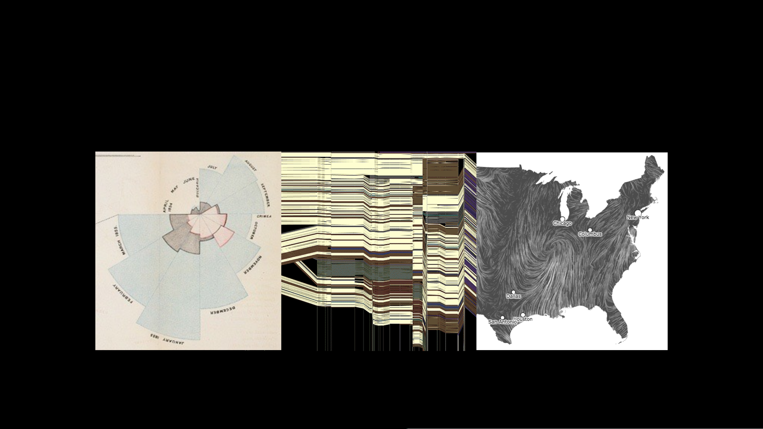
Varieties of “big data
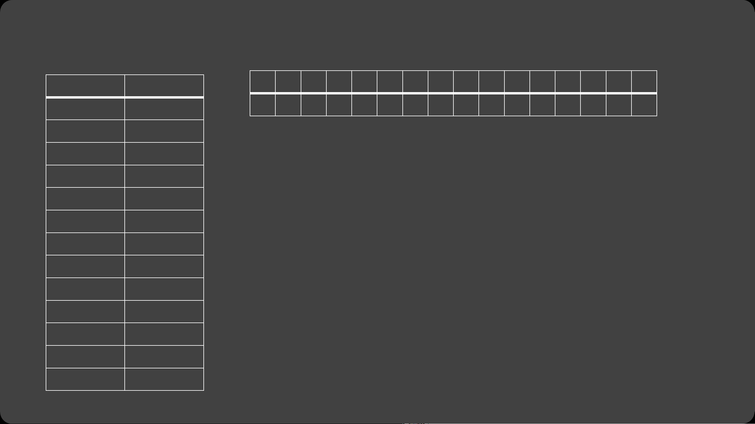
Tall Data
Lots of records
Large DBs have petabytes or more
(but median DB still fits in RAM!)
How to manage?
Parallel data processing
Reduction: Filter, aggregate
Sample or approximate
Not just about systems. Consider
perceptual / cognitive scalability.
Tall Data
Wide data
Lots of variables (100s-1000s…)
Select relevant subset
Dimensionality reduction
Statistical methods can suggest
and order related variables
Requires human judgment
Tall Data
Wide data
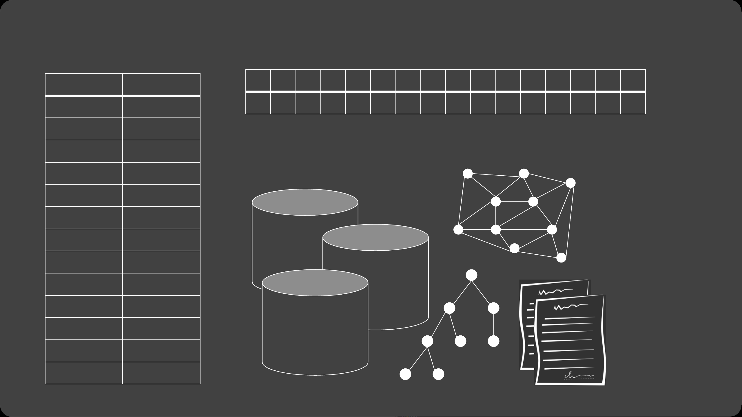
Diverse data
Tall Data
Wide data
Diverse data
How can we visualize and
interact with billion+ record
databases in real-time?
Two Challenges:
1. Effective visual encoding
2. Real-time interaction
Perceptual and interactive
scalability should be limited by the
chosen resolution of the visualized
data, not the number of records.
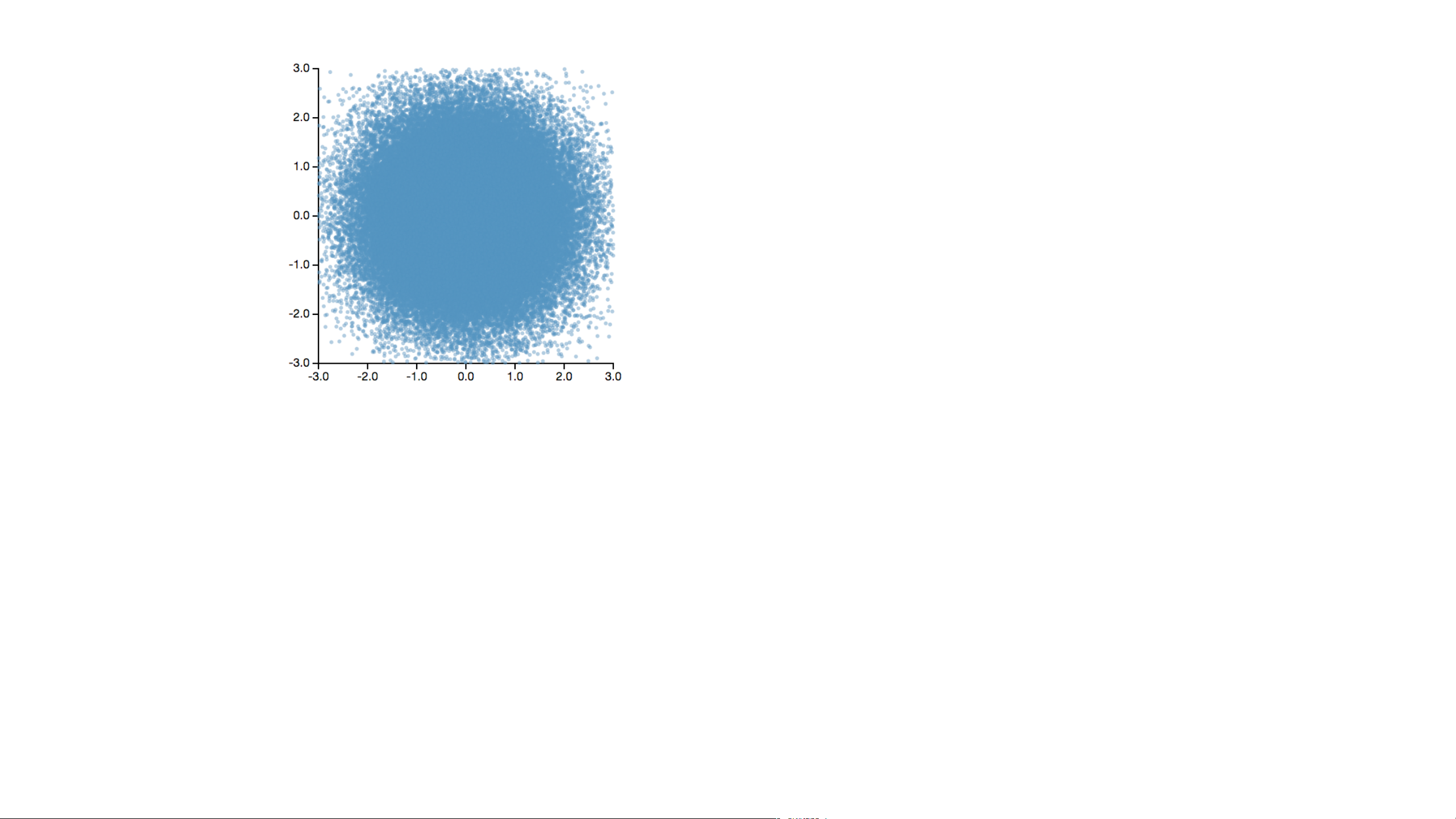
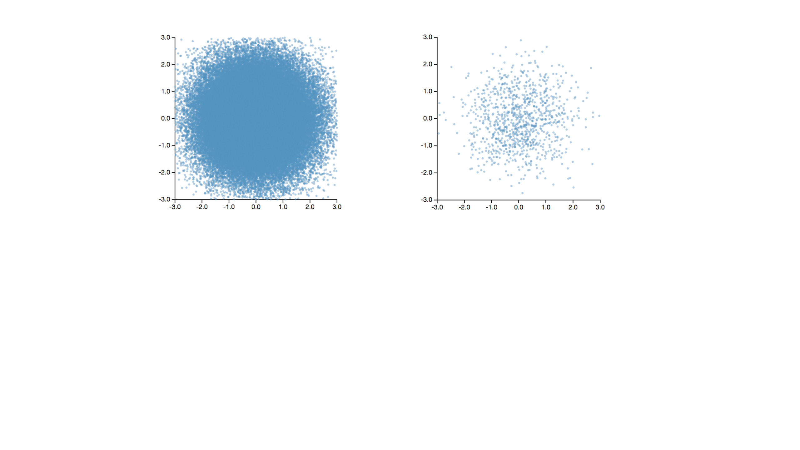
1. Visualizing Large Datasets
Data
Data
Sampling
Data
Sampling
Modeling
Data
Sampling
Modeling
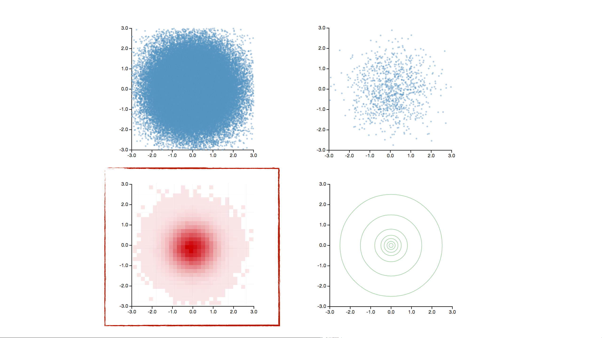
Binning
How to Visualize a Billion+ Records
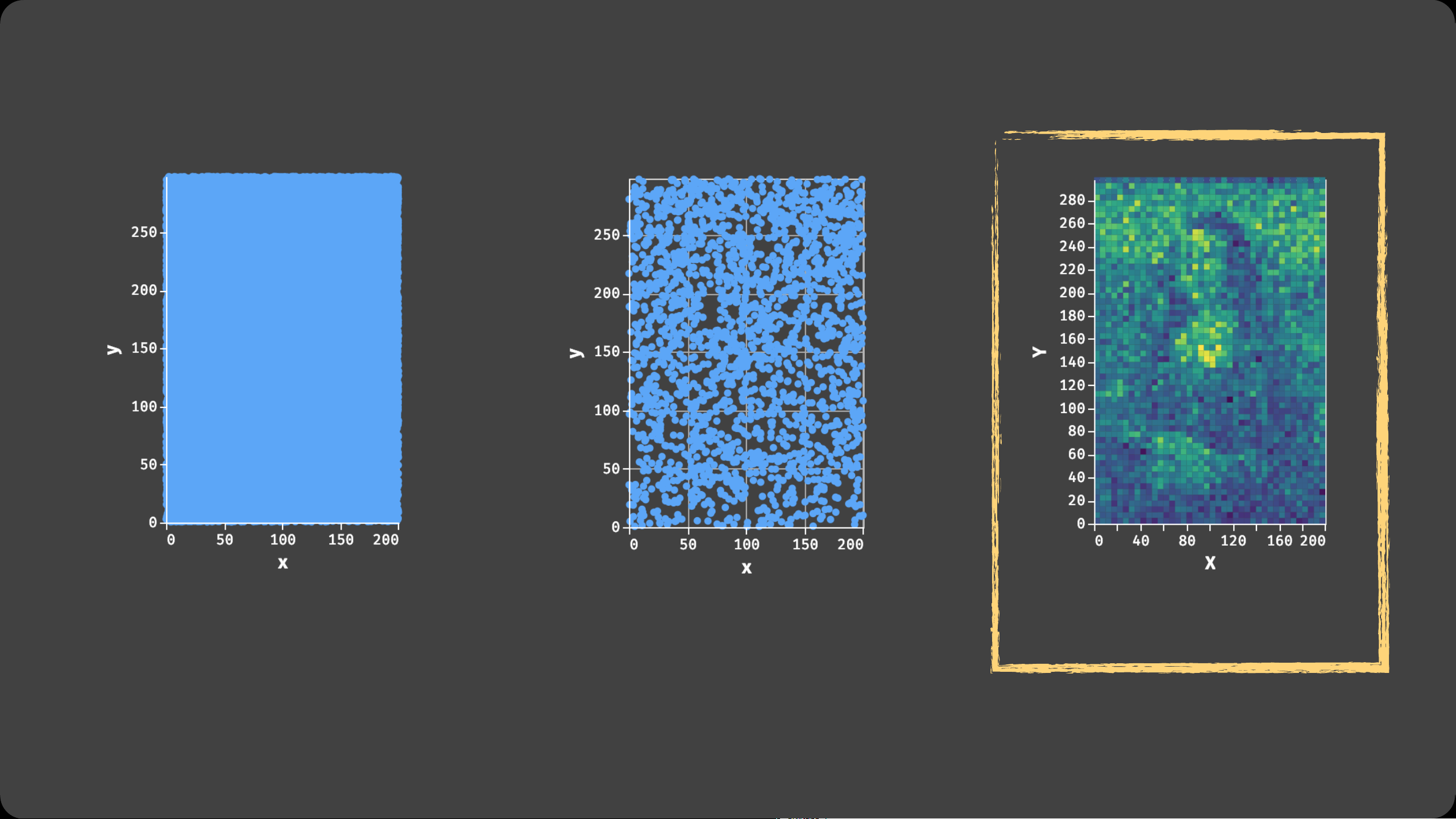
Decouple the visual complexity from the raw data through aggregation.
Data
Sampling
Binned Aggregation
Bin > Aggregate (> Smooth) > Plot
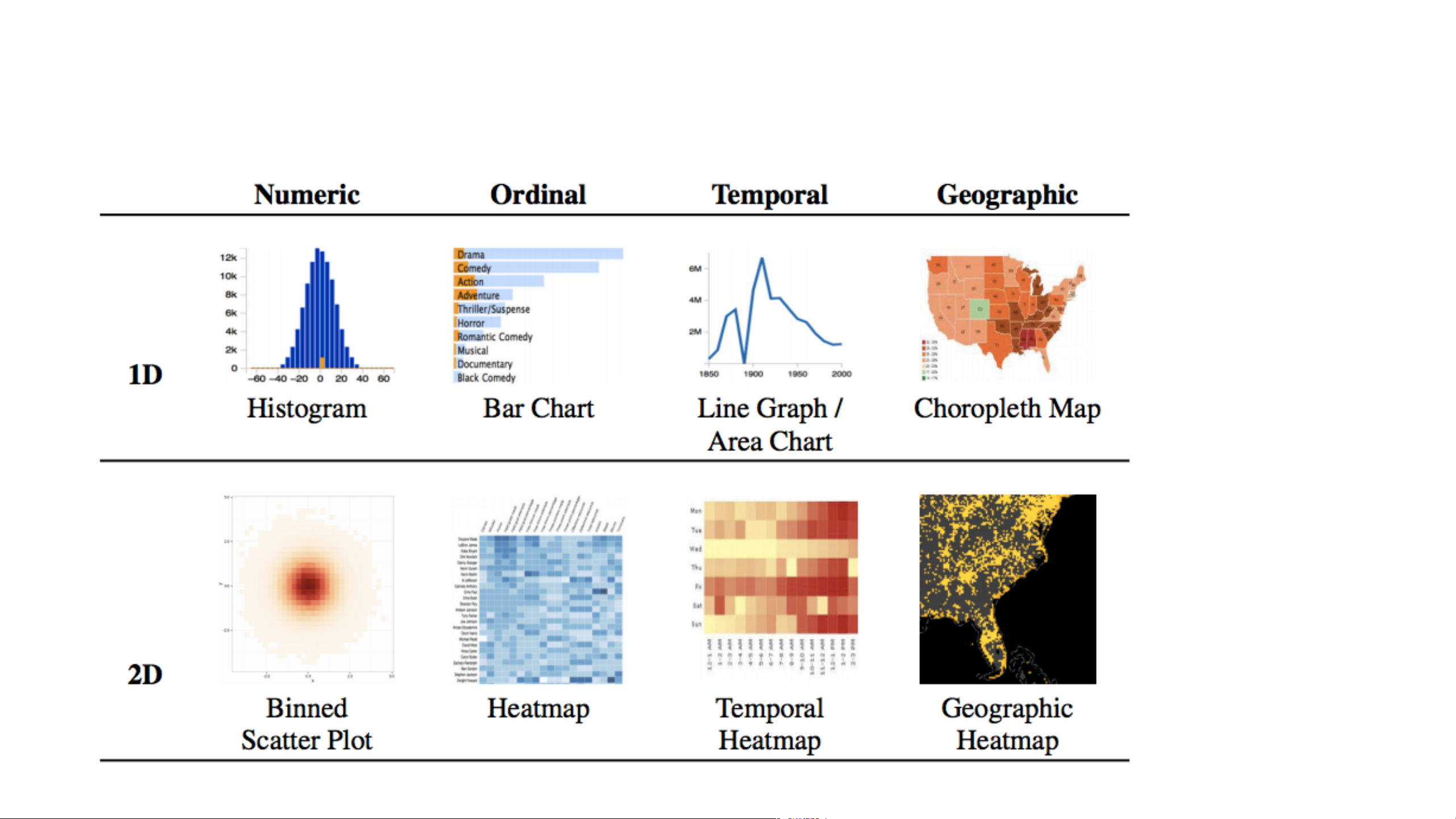
1. Bin Divide data domain into discrete “buckets”
Categories: Already discrete (but watch out for high cardinality)
Numbers: Choose bin intervals (uniform, quantile, ...)
Time: Choose time unit: Hour, Day, Month, etc.
Geo: Bin x, y coordinates after cartographic projection
2. Aggregate Count, Sum, Average, Min, Max, ...
3. Smooth Optional: smooth aggregates [Wickham ’13]
4. Plot Visualize the aggregate values
Binned Plots by Data Type
| 1/135

Preview text:

CSE 442 - Data Visualization Scalable Visualization
Jeffrey Heer University of Washington Varieties of “big data”… Tall Data Lots of records
Large DBs have petabytes or more
(but median DB still fits in RAM!) How to manage?
Parallel data processing
Reduction: Filter, aggregate Sample or approximate
Not just about systems. Consider
perceptual / cognitive scalability. Tall Data Wide data
Lots of variables (100s-1000s…)
Select relevant subset
Dimensionality reduction
Statistical methods can suggest
and order related variables Requires human judgment Tall Data Wide data Diverse data Tall Data Wide data Diverse data How can we visualize and
interact with billion+ record databases in real-time? Two Challenges:
1. Effective visual encoding
2. Real-time interaction
Perceptual and interactive
scalability should be limited by the
chosen resolution of the visualized
data, not the number of records.
1. Visualizing Large Datasets Data Data Sampling Data Sampling Modeling Data Sampling Binning Modeling
How to Visualize a Billion+ Records Data Sampling Binned Aggregation
Decouple the visual complexity from the raw data through aggregation.
Bin > Aggregate (> Smooth) > Plot
1. Bin
Divide data domain into discrete “buckets”
Categories: Already discrete (but watch out for high cardinality)
Numbers: Choose bin intervals (uniform, quantile, ...)
Time: Choose time unit: Hour, Day, Month, etc.
Geo: Bin x, y coordinates after cartographic projection
2. Aggregate Count, Sum, Average, Min, Max, ...
3. Smooth
Optional: smooth aggregates [Wickham ’13]
4. Plot Visualize the aggregate values
Binned Plots by Data Type