




Preview text:
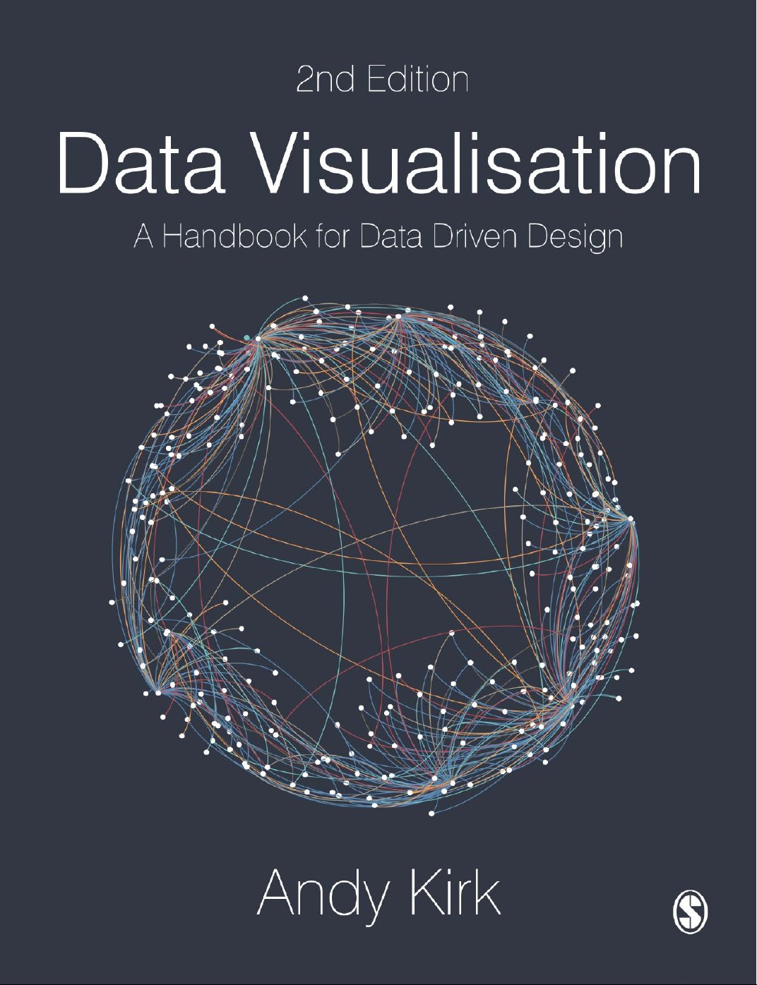
Data Visualisation
Sara Mil er McCune founded SAGE Publishing in 1965 to support
the dissemination of usable knowledge and educate a global
community. SAGE publishes more than 1000 journals and over
800 new books each year, spanning a wide range of subject areas.
Our growing selection of library products includes archives, data,
case studies and video. SAGE remains majority owned by our
founder and after her lifetime will become owned by a charitable
trust that secures the company’s continued independence.
Los Angeles | London | New Delhi | Singapore | Washington DC | Melbourne 2nd Edition Data Visualisation
A Handbook for Data Driven Design Andy Kirk SAGE Publications Ltd © Andy Kirk 2019 1 Oliver’s Yard 55 City Road
First edition published 2016. Reprinted four times in 2016, twice London EC1Y 1SP
in 2017, three times in 2018, and three times in 2019. SAGE Publications Inc.
Apart from any fair dealing for the purposes of research or 2455 Teller Road
private study, or criticism or review, as permitted under the
Thousand Oaks, California 91320
Copyright, Designs and Patents Act, 1988, this publication
may be reproduced, stored or transmitted in any form, or by
SAGE Publications India Pvt Ltd
any means, only with the prior permission in writing of the
B 1/I 1 Mohan Cooperative Industrial Area
publishers, or in the case of reprographic reproduction, in Mathura Road
accordance with the terms of licences issued by the Copyright New Delhi 110 044
Licensing Agency. Enquiries concerning reproduction outside
those terms should be sent to the publishers.
SAGE Publications Asia-Pacific Pte Ltd 3 Church Street #10-04 Samsung Hub Singapore 049483 Editor: Aly Owen
Library of Congress Control Number: 2018964578
Editorial assistant: Lauren Jacobs
Production editor: Ian Antcliff
British Library Cataloguing in Publication data Copyeditor: Neville Hankins Proofreader: Christine Bitten
A catalogue record for this book is available from Indexer: David Rudeforth the British Library
Marketing manager: Susheel Gokarakonda Cover design: Shaun Mercier
Typeset by: C&M Digitals (P) Ltd, Chennai, India Printed in the UK ISBN 978-1-5264-6893-2 ISBN 978-1-5264-6892-5 (pbk)
At SAGE we take sustainability seriously. Most of our products are printed in the UK using responsibly sourced
papers and boards. When we print overseas we ensure sustainable papers are used as measured by the PREPS
grading system. We undertake an annual audit to monitor our sustainability. Contents Acknowledgements vii About the Author ix
Discover Your Textbook’s Online Resources xi Introduction 1 PART A FOUNDATIONS 13
1 Defining Data Visualisation 15
2 The Visualisation Design Process 31
PART B THE HIDDEN THINKING 59 3 Formulating Your Brief 61 4 Working With Data 95
5 Establishing Your Editorial Thinking 119
PART C DEVELOPING YOUR DESIGN SOLUTION 133 6 Data Representation 135 7 Interactivity 203 8 Annotation 231 9 Colour 249 10 Composition 277 Epilogue 295 References 301 Index 303 Acknowledgements
I could not have written this book without the unwavering support of my wonderful wife, Ellie,
and my family. The book is dedicated to my inspirational Dad who sadly passed away before
its publication. I want to acknowledge the contributions of the thousands of data visualisation
practitioners who have created such a wealth of exceptional design work and smart writing. I
have been devouring this for over a decade now and I am constantly inspired by the talents
and minds behind it all. I also want to express my gratitude to the people and organisations
who have granted me permission to reference and showcase their visualisation work in this
book. Sincere thanks to the many people at Sage who have played a role in making this book
grow from the first proposal and now to a second edition. Finally, to you the readers, I am
hugely thankful that you chose to invest in this book. I hope it helps you in your journey to
learning about this super subject. About the Author
Andy Kirk is a freelance data visualisation specialist based in Yorkshire, UK. He is a visualisation
design consultant, training provider, teacher, author, speaker, researcher and editor of the
award-winning website visualisingdata.com.
After graduating from Lancaster University in 1999 with a BSc (hons) in Operational Research,
Andy’s working life began with a variety of business analysis and information management
roles at organisations including CIS Insurance, West Yorkshire Police and the University of Leeds.
He discovered data visualisation in early 2007, when it was lurking somewhat on the fringes of
the Web. Fortunately, the timing of this discovery coincided with his shaping of his Master’s
(MA) degree research proposal, a self-directed research programme that gave him the opportu-
nity to unlock and secure his passion for the subject.
He launched visualisingdata.com to continue the process of discovery and to chart the course
of the increasing popularity of the subject. Over time, this award-winning site has grown to
become a popular reference for followers of the field, offering contemporary discourse, design
techniques and vast collections of visualisation examples and resources.
Andy became a freelance professional in 2011. Since then he has been fortunate to work with
a diverse range of clients across the world, including organisations such as Google, CERN,
Electronic Arts, the EU Council, Hershey and McKinsey. At the time of publication, he will have
delivered over 270 public and private training events in 25 different countries, reaching more
than 6000 delegates. Alongside his busy training schedule, Andy also provides design consul-
tancy, his primary client being the Arsenal FC Performance Team, since 2015.
In addition to his commercial activities, he maintains regular engagements in academia.
Between 2014 and 2015 he was an external consultant on a research project called ‘Seeing
Data’, funded by the Arts & Humanities Research Council and hosted by the University of
Sheffield. This study explored the issues of data visualisation literacy among the general public
and, inter alia, helped to shape an understanding of the human factors that affect visualisation
literacy and the effectiveness of design.
Andy joined the highly respected Maryland Institute College of Art (MICA) as a visiting lecturer
in 2013 teaching a module on the Information Visualisation Master’s Programme through to
2017. From January 2016, he taught a data visualisation module as part of the MSc in Business
Analytics at the Imperial College Business School in London through to 2018. As of May 2019,
Andy has started teaching at University College London (UCL). Discover Your Textbook’s Online Resources
Want more support around understanding and creating data visualisations? Andy Kirk is here to help, offline and on!
Hosted by the author and with resources organized by chapter, the supporting website for this
book has everything you need to explore, practice, and hone your data visualisation skills. •
Explore the field: expand your knowledge and reinforce your learning about working
with data through libraries of further reading, references, and tutorials. •
Try this yourself: revise, reflect, and refine your skill and understanding about the chal-
lenges of working with data through practical exercises. •
See data visualisation in action: get to grips with the nuances and intricacies of work-
ing with data in the real world by navigating instalments of the narrative case study and
seeing an additional extended example of data visualisation in practice. Follow along with
Andy’s video diary of the process and get direct insight into his thought processes, chal-
lenges, mistakes, and decisions along the way. •
Chartmaker directory: access crowd-sourced guidance that aims to answer the crucial
question ‘which tools make which charts?’ with this growing directory of examples and
technical solutions for chart building.
Ready to learn more? Go beyond the book and dive deeper into data visualisation via the rest
of Andy’s website (www.visualisingdata.com), which contains data visualisation tools
and software, links to additional influential further reading, and a blog with monthly
collections of the best data visualisation examples and resources each month. Introduction
The primary challenge one faces when writing a book about data visualisation is to determine
what to leave in and what to leave out. Data visualisation is a big subject. There is no single
book to rule it all because there is no one book that can truly cover it all. Each and every one
of the topics covered by the chapters in this book could (and, in several cases, do) exist as books in their own right.
The secondary challenge when writing a book about data visualisation is to decide how to
weave the content together. Data visualisation is not rocket science; it is not an especially
complicated discipline, though it can be when working on sophisticated topics and with
advanced applications. It is, however, a complex subject. There are lots of things to think about,
many things to do and, of course, things that will need making. Creative and journalistic
sensibilities need to blend harmoniously with analytical and scientific judgement. In one
moment, you might be checking the statistical rigour of an intricate calculation, in the next
deciding which shade of orange most strikingly contrasts with a vibrant blue. The complexity
of data visualisation manifests in how the myriad small ingredients interact, influence and intersect to form a whole.
The decisions I have made when formulating this book’s content have been shaped by my own
process of learning. I have been researching, writing about and practising data visualisation for
over a decade. I believe you only truly learn about your own knowledge of a subject when you
have to explain it and teach it to others. To this extent I have been fortunate to have had
extensive experience designing and delivering commercial training as well as academic teaching.
I believe this book offers an effective and proven pedagogy that successfully translates the
complexities of this subject in a form that is fundamentally useful. I feel well placed to bridge
the gap between the everyday practitioners, who might identify themselves as beginners, and
the superstar talents expanding the potential of data visualisation. I am not going to claim to
belong to the latter cohort, but I have certainly been a novice, taking tentative early steps into
this world. Most of my working hours are spent helping others start their journey. I know what
I would have valued when I started out in this field and this helps inform how I now pass this
on to others in the same position I was several years ago.
There is a large and growing library of fantastic books offering different theoretical and
practical viewpoints on this subject. My aim is to add value to this existing collection by
approaching the subject through the perspective of process. I believe the path to mastering data
visualisation is achieved by making better decisions: namely, effective choices, efficiently made.
I will help you understand what decisions need to be made and give you the confidence to
make the right choices. Before moving on to discuss the book’s intended audience, here are its key aims: 2 DATA VISUALISATION • To
challenge your existing approaches to creating and consuming visualisations. I will
challenge your beliefs about what you consider to be effective or ineffective visualisation. I
will encourage you to eliminate arbitrary choices from your thinking, rely less on taste and
instinct, and become more reasoned in your judgements. • To
enlighten you I will increase your awareness of the possible approaches to visualising
data. This book will broaden your visual vocabulary, giving you a wider and more sophisti-
cated understanding of the contemporary techniques used to express your data visually. • To
equip is to provide you with robust tactics for managing your way through the myriad
options that exist in data visualisation. To help you overcome the burden of choice, an
adaptable framework is offered to help you think for yourself, rather than relying on inflex-
ible rules and narrow instruction. • To
inspire is to open the door to a subject that will stimulate you to elevate your ambition
and broaden your confidence. Developing competency in data visualisation will take time
and will need more than just reading this book. It will require a commitment to embrace
the obstacles that each new data visualisation opportunity poses through practice. It will
require persistence to learn, apply, reflect and improve. Who Is This Book Aimed At?
Anyone who has reason to use quantitative and qualitative methods in their professional or
academic duties will need to grasp the demands of data visualisation. Whether this is a large
part of your duties or just a small part, this book will support your needs.
The primary intended audiences are undergraduates, postgraduates and early-career researchers.
Although aimed at those in the social sciences, the content will be relevant to readers from
across the spectrum of arts and humanities right through to the natural sciences.
This book is intended to offer an accessible route for novices to start their data visualisation
learning journey and, for those already familiar with the basics, the content will hopefully
contribute to refining their capabilities. It is not aimed at experienced or established visualisation
practitioners, though there may be some new perspectives to enrich their thinking: some content
will reinforce existing knowledge, other content might challenge their convictions.
The people who are active in this field come from all backgrounds. Outside academia, data
visualisation has reached the mainstream consciousness in professional and commercial
contexts. An increasing number of professionals and organisations, across all industry types
and sizes, are embracing the importance of getting more value from their data and doing more
with it, for both internal and external benefit. You might be a market researcher, a librarian or
a data analyst looking to enhance your data capabilities. Perhaps you are a skilled graphic
designer or web developer looking to take your portfolio of work into a more data-driven
direction. Maybe you are in a managerial position and though not directly involved in the
creation of visualisation work, you might wish to improve the sophistication of the language
you coordinate or commission others who are. Everyone needs the lens and vocabulary to evaluate work effectively. INTrODUcTION 3
Data visualisation is a genuinely multidisciplinary discipline. Nobody arrives fully formed with
all constituent capabilities. The pre-existing knowledge, skills or experiences which, I think,
reflect the traits needed to get the most out of this book would include: •
Strong numeracy is necessary as well as a familiarity with basic statistics. •
While it is reasonable to assume limited prior knowledge of data visualisation, there should
be a strong desire to want to learn it. The demands of learning a craft like this take time
and effort; the capabilities will need nurturing through ongoing learning and practice.
They are not going to be achieved overnight or acquired alone from reading this book.
Any book that claims to be able magically to inject mastery through just reading it cover to
cover is over-promising and likely to under-deliver. •
The best data visualisers possess inherent curiosity. You should be the type of person who
is naturally disposed to question the world around them. Your instinct for discovering and
sharing answers will be at the heart of this activity. •
There are no expectations of your having any prior familiarity with design principles, but
an appetite to embrace some of the creative aspects presented in this book will heighten the
impact of your work. Time to unleash that suppressed imagination! •
If you are somebody fortunate to possess already a strong creative flair, this book will guide
you through when and crucially when not to tap into this sensibility. You should be willing
to increase the rigour of your analytical decision making and be prepared to have your
creative thinking informed more fundamentally by data rather than just instinct. •
No particular technical skills are required to get value from this book, as I will explain
shortly. But you will ideally have some basic knowledge of spreadsheets and experience of
working with data irrespective of which particular tool.
This is a portable practice involving techniques that are subject-matter agnostic. Throughout
this book you will see a broad array of examples from different industries covering many
different topics. Do not be deterred by any example being about a subject different to your
own area of interest. Look beyond the subject and you will see analytical and design choices
that are just as applicable to you and your work: a line chart showing political forecasts
involves the same thought process as would a line chart showing stock prices changing or
average global temperatures rising. A line chart is a line chart, regardless of the subject matter.
The type of data you are working with is the only legitimate restriction to the design methods
you might employ, not your subject and certainly not traditions in your subject. ‘Waterfall
charts are only for people in finance’, ‘maps are only for cartographers’, ‘Sankey diagrams are
only for engineers’. Enter this subject with an open mind, forget what you believe or have been
told is the normal approach, and your capabilities will be expanded.
Data visualisation is an entirely global community, not the preserve of any geographic region.
Although the English language dominates written discourse, the interest in the subject and
work created from studios through to graphics teams originates everywhere. There are cultural
influences and different flavours in design sensibility around the world which enrich the field
but, otherwise, it is a practice common and accessible to all. 4 DATA VISUALISATION Finding the Balance Handbook vs Manual
The description of this book as a ‘handbook’ positions it as distinct from a tutorial-based man-
ual. It aims to offer conceptual and practical guidance, rather than technical instruction. Think
of it more as a guidebook for a tourist visiting a city than an instruction manual for how to fix a washing machine.
Apart from a small proportion of visualisation work that is created manually, the reliance on
technology to create visualisation work is an inseparable necessity. For many beginners in
visualisation there is an understandable appetite for step-by-step tutorials that help them
immediately to implement their newly acquired techniques.
However, writing about data visualisation through the lens of selected tools is hard, given the
diversity of technical options that exist in the context of such varied skills, access and needs.
The visualisation technology space is characterised by flux. New tools are constantly
emerging to supplement the many that already exist. Some are proprietary, others are open
source; some are easier to learn but do not offer much functionality; others do offer rich
potential but require a great deal of foundation understanding before you even accomplish
your first bar chart. Some tools evolve to keep up with current techniques; they are well
supported by vendors and have thriving user communities, others less so. Some will exist as
long-term options whereas others depreciate. Many have briefly burnt brightly but quickly
become obsolete or have been swallowed up by others higher up the food chain. Tools come and go but the craft remains.
There is a role for all book types and a need for more than one to acquire true competency in
a subject. Different people want different sources of insight at different stages in their
development. If you are seeking a text that provides instructive tutorials, you will learn from
this how to accomplish technical developments in a given technology. However, if you only
read tutorial-based books, you will likely fall short in the fundamental critical thinking that will
be needed to harness data visualisation as a skill.
I believe a practical, rather than technical, text focusing on the underlying craft of data
visualisation through a tool-agnostic approach offers the most effective guide to help people learn this subject.
The content of this book will be relevant to readers regardless of their technical knowledge and
experience. The focus will be to take your critical thinking towards a detailed, fully reasoned
design specification – a declaration of intent of what you want to develop. Think of the
distinction as similar to that between architecture (design specification) and engineering (design execution).
There is a section in Chapter 3 that describes the influence technology has on your work and
the places it will shape your ambitions. Furthermore, among the digital resources offered online
are further profiles of applications, tools and libraries in common use in the field today and a
vast directory of resources offering instructive tutorials. These will help you to apply technically
the critical capabilities you acquire throughout this book. INTrODUcTION 5 Useful vs Beautiful
Another important distinction to make is that this book is not intended to be seen as a beauty
pageant. I love flicking through glossy ‘coffee table’ books as they offer great inspiration, but
often lack substance beyond the evident beauty. This book serves a different purpose to that.
I believe, for a beginner or relative beginner, the most valuable inspiration comes more from
understanding the thinking behind some of the amazing works encountered today, learning
about the decisions that led to their conceptual development.
My desire is to make this the most useful text available, a reference that will spend more time
on your desk than on your bookshelf. To be useful is to be used. I want the pages to be dog-
eared. I want to see scribbles and annotated notes made across its pages and key passages
underlined. I want to see sticky labels peering out above identified pages of note. I want to see
creases where pages have been folded back or a double-page spread that has been weighed
down to keep it open. It will be an elegantly presented and packaged book, but it should not
be something that invites you to look but not touch. Pragmatic vs Theoretical
The content of this book has been formed through years of absorbing knowledge from as
many books as my shelves can hold, generations of academic work, endless web articles,
hundreds of conference talks, personal interactions with the great and the good of the
field, and lots and lots of practice. More accurately, lots and lots of mistakes. What I pres-
ent here is a pragmatic distillation of what I have learned and feel others will benefit from learning too.
It is not a deeply academic or theoretical book. Experienced or especially curious practitioners
may have a desire for deeper theoretical discourse, but that is beyond the intent of this
particular text. You have to draw a line somewhere to determine the depth you can reasonably
explore about a given topic. Take the science of visual perception, for example, arguably the
subject’s foundation. There is no value in replicating or attempting to better what has already
been covered by other books in greater quality than I could achieve.
An important reason for giving greater weight to pragmatism is because of the inherent
imperfections of this subject. Although there is so much important empirical thinking in this
subject, the practical application can sometimes fail to translate beyond the somewhat artificial
context of a research study. Real-world circumstances and the strong influence of human
factors can easily distort the significance of otherwise robust concepts.
Critical thinking will be the watchword, equipping you with the independence of thought
to decide rationally for yourself which solutions best fit your context, your data,
your message and your audience. To accomplish this, you will need to develop an
appreciation of all the options available to you (the different things you could do) and a
reliable approach for critically determining what choices you should make (the things you
will do and why). 6 DATA VISUALISATION Contemporary vs Historical
I have huge respect for the ancestors of this field, the dominant names who, despite primitive
means, pioneered new concepts in the visual display of statistics to shape the foundations of
the field being practised today. The field’s lineage is decorated by pioneers such as William
Playfair, W. E. B. Du Bois, Florence Nightingale and John Snow, to name but a few. To many
beginners in the field, the historical context of this subject is of huge interest. However, this
kind of content has already been covered by plenty of other book and article authors.
I do not want to bloat this book with the unnecessary reprising of topics that have been covered
at length elsewhere. I am not going to spend time attempting to enlighten you about how we
live in the age of ‘Big Data’ and how occupations related to data are or will be the ‘sexiest jobs’
of our time. The former is no longer news, the latter claim emerged from a single source. There
is more valuable and useful content I want you to focus your time on.
The subject matter, the ideas and the practices presented here will hopefully not date a great
deal. Of course, many of the graphic examples included in the book will be surpassed by newer
work demonstrating similar concepts as the field continues to develop. However, their worth
as exhibits of a particular perspective covered in the text should prove timeless. As time passes
there will be new techniques, new concepts and new, empirically evidenced rules. There will be
new thought-leaders, new sources of reference and new visualisers to draw insight from. Things
that prove a manual burden now may become seamlessly automated in the near future. That is
the nature of a fast-growing field. Analysis vs Communication
A further distinction to make concerns the subtle but critical difference between visualisation
used for analysing data and visualisation used for communicating data.
Before a visualiser can confidently decide what to communicate to others, he or she needs to
have developed an intimate understanding of the qualities and potential of the data. In certain
contexts, this might only be achieved through exploratory data analysis. Here, the visualiser
and the viewer are the same person. Through visual exploration, interrogations of the data can
be conducted to learn about its qualities and to unearth confirmatory or enlightening
discoveries about what insights exist.
Visualisation for analysis is part of the journey towards creating visualisation for
communication, but the techniques used for visual analysis do not have to be visually
polished or necessarily appealing. They are only serving the purpose of helping you truly
to learn about your data. When a data visualisation is being created to communicate to
others, many careful considerations come into play about the requirements and interests of
the intended audience. This influences many design decisions that do not exist alone with visual analysis.
For the scope of this book the content is weighted more towards methods and concerns about
communicating data visually to others. If your role is concerned more with techniques for INTrODUcTION 7
exploratory analysis rather than visual communication, you will likely require a deeper
treatment of the topic than this book can reasonably offer.
Another matter to touch on here concerns the coverage of statistics, or lack thereof. For many
people, statistics can be a difficult topic to grasp. Even for those who are relatively numerate
and comfortable working with simple statistical methods, it is quite easy to become rusty
without frequent practice. The fear of making errors with intricate statistical calculations
depresses confidence and a vicious circle begins.
You cannot avoid the need to use some statistical techniques if you are going to work with data.
I will describe some of the most relevant statistical techniques in Chapter 4, at the point in your
thinking where they are most applicable. However, I do believe the range and level of statistical
techniques most people will need to employ on most of their visualisation tasks can be
overstated. I know there will be exceptions, and a significant minority will be exposed to
requiring advanced statistical thinking in their work.
It all depends, of course. In my experience, however, the majority of data visualisation
challenges will generally involve relatively straightforward univariate and bivariate statistical
techniques to describe data. Univariate techniques help you to understand the shape, size and
range of a single variable of data, such as determining the minimum, maximum and average
height of a group of people. Bivariate techniques are used to observe possible relationships
between two different variables. For example, you might look at the relationship between gross
domestic product and medal success for countries competing at the Olympics. You may also
encounter visualisation challenges that require a basic understanding of probabilities to assist
with forecasting risk or modelling uncertainty.
The more advanced applications of statistics will be required when working with larger
complicated datasets, where multivariate techniques are employed simultaneously to model the
significance of relationships between multiple variables. Above and beyond that, you are
moving towards advanced statistical modelling and algorithm design.
Though it may seem unsatisfactory to offer little coverage of this topic, there is no value in
reinventing the wheel. There are hundreds of existing books better placed to offer the depth
you might need. That statistics is such a prolific and vast field in itself further demonstrates
how deeply multidisciplinary a field visualisation truly is. Chapter Contents
The book is organised into three main parts (A, B and C) comprising ten chapters and an
Epilogue. Each chapter opens with a preview of the content to be covered and closes with a
summary of the most salient learning points to emerge. There are collections of further
resources available online to substantiate the learning from each chapter.
For most readers, especially beginners, it is recommended that you start from the beginning
and proceed through each chapter as presented. For those setting out to begin working on their
own visualisation, you might jump straight into Chapters 2–5 to ensure you are fully prepared
