

Preview text:
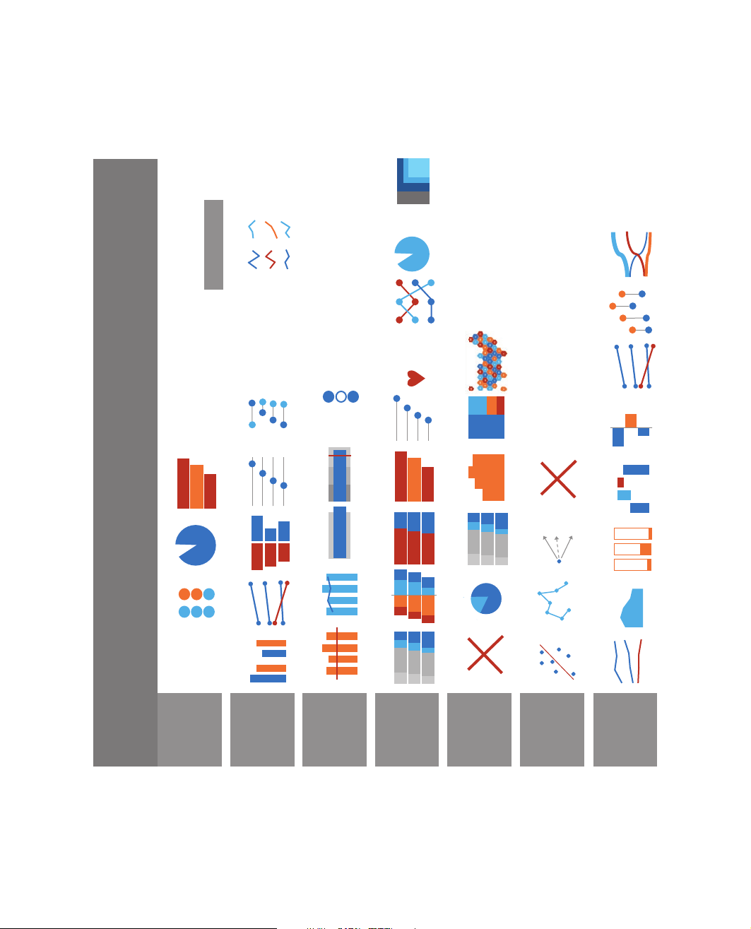
d Neste d # 65% love you Of this 88%, Pie w/ Small Multiples Sankey It’s Complicate Bump Chart Vertical Dots s % their job Map 45 Number & Icon Slopegraph r A B C Lollipop Dumbbell Dots Metric Metric Metric Tree Map Indicator Dots e Deviation Ba l Dot Plot Bullet Chart Histogram Bar/Column Bar/Column r Don’t Visualiz Waterfal r A B C Draw It
Chart Chooser Pie/Donut Back-to-Back Stacked Ba Overlapping Ba Aggregated Bar Stacked Column y o d ve Arra Comb rea Icon Slopegraph Pie/Donut Diverging Bar Connecte e r % t eA Lin Big Number 23 Side by Side Benchmark Line Stacked Ba Don’t Visualiz Scatterplo t k
Quantitati When a Single Number Is Important How 2 + Numbers Are Alike or No How We Are Better than a Bench- mar What the Survey Says When There Are Parts of a Whole How This Changes When That Does How Things Changed Over Time Effective Data Visualization Second Edition
Sara Mil er McCune founded SAGE Publishing in 1965 to support
the dissemination of usable knowledge and educate a global
community. SAGE publishes more than 1000 journals and over
800 new books each year, spanning a wide range of subject areas.
Our growing selection of library products includes archives, data,
case studies and video. SAGE remains majority owned by our
founder and after her lifetime will become owned by a charitable
trust that secures the company’s continued independence.
Los Angeles | London | New Delhi | Singapore | Washington DC | Melbourne Effective Data Visualization The Right Chart for the Right Data Second Edition Stephanie D. H. Evergreen
Evergreen Data & Evaluation, LLC FOR INFORMATION:
Copyright © 2020 by SAGE Publications, Inc.
All rights reserved. Except as permitted by U.S. copyright SAGE Publications, Inc.
law, no part of this work may be reproduced or distributed in 2455 Teller Road
any form or by any means, or stored in a database or retrieval
Thousand Oaks, California 91320
system, without permission in writing from the publisher. E-mail: order@sagepub.com
All third party trademarks referenced or depicted herein
are included solely for the purpose of illustration and are SAGE Publications Ltd.
the property of their respective owners. Reference to these 1 Oliver’s Yard
trademarks in no way indicates any relationship with, or 55 City Road
endorsement by, the trademark owner. London, EC1Y 1SP United Kingdom
SAGE Publications India Pvt. Ltd.
Printed in the United States of America
B 1/I 1 Mohan Cooperative Industrial Area
Mathura Road, New Delhi 110 044
This book is printed on acid-free paper. India
Library of Congress Cataloging-in-Publication Data
SAGE Publications Asia-Pacific Pte. Ltd.
Names: Evergreen, Stephanie D. H., author. 18 Cross Street #10–10/11/12
Title: Effective data visualization : the right chart for the right China Square Central
data / Stephanie D. H. Evergreen. Singapore 048423
Description: Second edition. | Thousand Oaks : Sage, [2020] |
Includes bibliographical references and index.
Identifiers: LCCN 2018058818 | ISBN 9781544350882 (paperback : alk. paper)
Subjects: LCSH: Visual communication. | Charts, diagrams, etc. |
Presentation graphics software. | Graphic design (Typography) | Information visualization.
Classification: LCC P93.5 .E937 2019 | DDC 302.23—dc23
LC record available at https://lccn.loc.gov/2018058818
Acquisitions Editor: Helen Salmon
Editorial Assistant: Megan O’Heffernan
Marketing Manager: Shari Countryman
Production Editor: Veronica Stapleton Hooper Copy Editor: Rachel Keith
Typesetter: C&M Digitals (P) Ltd. Proofreader: Dennis Webb Indexer: Beth Nauman-Montana Cover Designer: Scott Van Atta
19 20 21 22 23 10 9 8 7 6 5 4 3 2 1 /// BRIEF CONTENTS PREFACE xv ACKNOWLEDGMENTS xvii ABOUT THE AUTHOR xix
Chapter 1. Our Backbone: Why We Visualize 1
Chapter 2. When a Single Number Is Important: Showing
Mean, Frequency, and Measures of Variability 15
Chapter 3. How Two or More Numbers Are Alike or
Different: Visualizing Comparisons 49
Chapter 4. How We Are Better or Worse Than a Benchmark:
Displaying Relative Performance 89
Chapter 5. What the Survey Says: Showing Likert, Ranking,
Check-All-That-Apply, and More 129
Chapter 6. When There Are Parts of a Whole: Visualizing Beyond the Pie Chart 171
Chapter 7. How This Thing Changes When That Thing
Does: Communicating Correlation and Regression 193
Chapter 8. When the Words Have the Meaning: Visualizing Qualitative Data 207
Chapter 9. How Things Changed Over Time: Depicting Trends 257
Chapter 10. Reporting Out: Sharing Your Data With the World 293
Chapter 11. It’s About More Than the Buttons 311 INDEX 325 /// DETAILED CONTENTS PREFACE xv ACKNOWLEDGMENTS xvii ABOUT THE AUTHOR xix
Chapter 1. Our Backbone: Why We Visualize 1 Why We Visualize 1 When Visualization Is Harmful 5 Which Chart Type Is Best? 6 Tell a Story With Data 8 How to Use This Book 9 Exercises 11 Resources 12 References 12
Chapter 2. When a Single Number Is Important: Showing Mean,
Frequency, and Measures of Variability 15
What Stories Can Be Told With a Single Number? 16
How Can I Visualize a Single Number? 17 Single Large Number 17 Icon Array 18 Waffle Chart 19 Pictogram 26 Donut or Pie Graph 32
Why Circles Can Be Challenging 35 Bar Graph 36
How Can I Show Measures of Variability? 39
Translating Scientific Jargon for a Lay Audience 43 Exercises 46 Resources 46 References 46
Chapter 3. How Two or More Numbers Are Alike or Different:
Visualizing Comparisons 49
What Stories Can Be Told About How Two or More Numbers Are Alike or Different? 50
How Can I Visualize How Two or More Numbers Are Alike or Different? 51 Side-by-Side Column 51 Slopegraph 52 Back-to-Back Bars 61
Solution 1: Two Separate Bar Graphs 61
Exporting the Graph out of Excel 66
Solution 2: Secret Buffer Data 66 Dot Plot 71 Dumbbell Dot Plot 79 Small Multiples 83 Exercises 87 Resources 88 References 88
Chapter 4. How We Are Better or Worse Than a Benchmark:
Displaying Relative Performance 89
What Stories Can Be Told About How We Are Better or Worse Than a Benchmark? 90
How Can I Visualize How We Are Better or Worse Than a Benchmark? 91 Benchmark Line 91 Combo Chart 94 Can I Add a Second Line? 94 Overlapping Bars 96
An Overlapping Variation: Data Bars 101 Bul et Graph 105
The Easier Way: Vertical Bullets 106
The Harder Way: Horizontal Bullets 111 Indicator Dots 116 Benchmarks Inside Sparklines 123 Exercises 126 Resources 126 References 127
Chapter 5. What the Survey Says: Showing Likert, Ranking,
Check-All-That-Apply, and More 129
What Stories Can Be Told About What the Survey Says? 131
How Can I Visualize What the Survey Says? 131 Rating 131 Stacked Bar 132 Small Multiples 135 Diverging Stacked Bar 138 What About Neutral? 142 Aggregated Stacked Bar 143
Changing the Wording of the Survey 145 Ranking 146 Column Graph 146 The Lol ipop Variation 149 Large Number With Icon 157 Bump Chart 158 Branching 161 Annotated Graph 161 Nested Area Graph 162
Visualizing Not Applicable or Missing Data 165
Note Small Consistent Missing Data 165
Add Sample Size for Large Consistent Missing Data 165
Add a Graph on the Side for Large Inconsistent Missing Data 167 Exercises 169 Resources 170 References 170
Chapter 6. When There Are Parts of a Whole: Visualizing Beyond the Pie Chart 171
What Stories Can Be Told When There Are Parts of a Whole? 172
How Can I Visualize the Parts of a Whole? 173
Don’t Visualize at Al 173 Pie Charts Done Right 174 100% Stacked Bar 176 Histogram 179 Treemap 180 Map 184 Choropleth Map 184 Editable Map in PowerPoint 185 Tile and Hex Choropleth Map 187 Exercises 191 Resources 192 References 192
Chapter 7. How This Thing Changes When That Thing Does:
Communicating Correlation and Regression 193
What Stories Can Be Told About How This Thing Changes When That Thing Does? 194
How Can I Visualize How This Thing Changes When That Thing Does? 194 Scatterplot 195 Connected Scatterplot 199 Diagram 202
Don’t Visualize It at Al 204 Exercises 205 Resources 205 References 206
Chapter 8. When the Words Have the Meaning: Visualizing Qualitative Data 207 With Jennifer Lyons
What Stories Can Be Told When the Words Have the Meaning? 209
How Can I Visualize When the Words Have the Meaning? 210
Pure Qualitative: Highlight a Word 210 Bolded Words 210 Quote and Pic 211 Cal out Box 212 Pictures Are Worth $1,000 213
Pure Qualitative: Thematic Analysis 214 Change Photos 214 Network Map 216 Diagram 219 Timeline 223 Journey Map 225
Some Quantification: Highlight a Word 228 Word Clouds 228
Some Quantification: Thematic Analysis 231 Icons and Color Coding 231 Spectrum Display 232 Heat Map 237 Harvey Bal s 237 Histomap 240 Bubble Chart 246 Gauge Diagram 246 Venn Diagram 252 Exercises 253 Resources 254 References 254
Chapter 9. How Things Changed Over Time: Depicting Trends 257
What Stories Can Be Told About How Things Changed Over Time? 258
How Can I Visualize How Things Changed Over Time? 259
Your Old Friend, the Line Graph 259 Area Graph 262
Does the Y-Axis Have to Start at Zero? 266 Stacked Column 266
How Can I Show That Down Is Good? 270 Waterfall Chart 272 Deviation Bar 276
Vertical Dumbbell Dot Plot 282
Slopegraph (as a Macro) 285 Sankey 288 Exercises 290 Resources 290 References 290
Chapter 10. Reporting Out: Sharing Your Data With the World 293 Static Visuals 293 Screenshot Software 294 Social Media Sizes 295 Linked Files 295 Interactive Dashboards 298
Flat Versus Summary Table 299 Pivot Tables 302 View the Relevant Data 304 Publish the Dashboard 308 Exercises 309 Resources 310 References 310
Chapter 11. It’s About More Than the Buttons 311
Dot Plots Generate Healthcare Pioneers 311
Clearly Labeled Line Graphs Streamline Decisions at a Fortune 500 313
Diverging Stacked Bars Make for Community Leaders in the Midwest 315
Icons Support Informed Policymaking 318
Building a Culture of Effective Data Visualization 320 Acknowledge Fears 321 Communicate Importance 321 Make It Easy 322 Celebrate 323 Exercises 323 Resources 323 References 324 INDEX 325 /// PREFACE
The moment you publish a book that is based on software, you accept the fact
that some of the content is already obsolete and that a second edition is inev-
itable. This was actually a genius move on my part.
But this edition of Effective Data Visualization contains a lot more than updated
screenshots of Excel. Hang on tight—I included nine entirely new quantitative
graphs: overlapping bars (the number-one graph I recommend to the compa-
nies I consult), vertical dumbbell dot plots (my number-two most recommended
graph), waffle charts, pictographs, bump charts, connected scatterplots, water-
falls, tile maps, and combination charts with target lines. Oh my gosh, you are
going to learn so much. Of course, the quantitative chart chooser printed on the
inside front cover has been updated to reflect these additions so you have a handy reference guide.
Did you look at the inside back cover too? This edition features a qualitative
chart chooser as well. In fact, the entire qualitative chapter was scrapped and
overhauled. We have packed over a dozen ways to visualize qualitative data into
this chapter. You are going to be introduced to compelling ways to show quali-
tative data that you probably haven’t seen before, including journey maps, histo-
maps, and spectrum displays. As with the rest of the lessons in this book, you
won’t need anything beyond Excel and PowerPoint to recreate these qualitative
visuals. Qualitative data visualization may not be as well developed as the field of
quantitative viz, but this chapter and the accompanying chart chooser are steps in that direction.
Even with all the new content to learn from, you’ll want to review your favorites,
because I’ve updated and simplified the directions, saving you valuable time you
can put toward other ways you save the world. I’ve also packed each chapter with
more support from peer-reviewed research around human perception, cognition,
psychology, and data visualization so that you can have more confidence trying
out new graph types. Be sure to download the updated sample data set from this
book’s associated website (https://stephanieevergreen.com/books/) so you can
build amazing visuals right alongside me.
Oh, one more edition addition: Every image is now in full color. Color should
make it approximately a million times easier to make sure your screen matches my
screenshots. Easy, impactful dataviz. Does it get any better? xv
See you out at a workshop, a keynote, or at least in a third edition,
Catch up with Dr. Evergreen on Twitter or Instagram, both @evergreendata.
Stephanie Evergreen, PhD
Kalamazoo, Michigan, USA, and in an airplane somewhere
xvi ■ Effective Data Visualization /// ACKNOWLEDGMENTS
At the end of a productive day of workshopping with a U.S. federal agency, I
was trying desperately to get out of their highly secure complex and to my
train before it left the station. I had called a car, but we had a hard time finding
each other in the maze of buildings and security gates. When we finally landed in
the same place at the same time, I politely asked him to step on it. The map said
our trip would take 27 minutes, but my train was going to leave in 19. He hit the
gas and I said a little prayer to the travel gods, silently promising that I would
dedicate this book to this driver if he got me there on time. He took an alternate
route and dropped me at the train station two full minutes ahead of departure. This book is for you, Karim.
This is my life now, sprinting from company to company, helping them use data
to save the world. I love it, even if I have made that silent promise to add people to
this book’s acknowledgments hundreds of times as we’ve fought traffic or weather
delays, all while trying to type these pages. Wherever I go, I have had massive
support from the people in the service industry, who so often go underappreciated
but did so much to make sure my needs were taken care of and I could just write.
This book is for the airline stewards, bartenders, baristas, bed-and-breakfast man-
agers, servers, and cabbies who made my life easier.
Similarly, this book is for my parents and friends and family who have cooked
meals and taken wonderful care of my son and generally made it possible for me
to squirrel away in a room between travel stops with my laptop and some data. I’m
also so happy that Jennifer Lyons has joined me as coauthor of Chapter 8.
As always, I’m ever grateful for the support of my colleagues at SAGE, Megan
O’Heffernan and Helen Salmon, as well as the input from generous peer reviewers:
David Boyns, California State University at Northridge
Thomas Cappaert, Rocky Mountain University of Health Professions
Michael G. Elasmar, Boston University
John O. Elliott, The Ohio State University and Ohio Health Research Institute
Brian Frederick, Bridgewater State University
David Han, University of Texas at San Antonio xvii
Daniel Hawes, Kent State University
Mindy Hightower King, Indiana University
Kamir Kouzekanani, Texas A&M University–Corpus Christi
Jodi F. Paroff, NYU Robert F. Wagner Graduate School of Public Service
Shun-Yung Kevin Wang, University of South Florida–St. Petersburg
Finally, my stellar clients and colleagues contributed their own (often bad—
but then improved!) work for public scrutiny, and that is hard and brave and I’m grateful.
xviii ■ Effective Data Visualization
