Tableau Visual Guideline - Tài liệu tham khảo | Đại học Hoa Sen

Tableau Visual Guideline - Tài liệu tham khảo | Đại học Hoa Sen và thông tin bổ ích giúp sinh viên tham khảo, ôn luyện và phục vụ nhu cầu học tập của mình cụ thể là có định hướng, ôn tập, nắm vững kiến thức môn học và làm bài tốt trong những bài kiểm tra, bài tiểu luận, bài tập kết thúc học phần, từ đó học tập tốt và có kết quả cao cũng như có thể vận dụng tốt những kiến thức mình đã học.

Môn:

data analysis 13 tài liệu

Trường:

Đại học Hoa Sen 4.8 K tài liệu

Thông tin:
31 trang 2 tháng trước

Bình luận

Vui lòng đăng nhập hoặc đăng ký để gửi bình luận.

Tableau Visual Guideline - Tài liệu tham khảo | Đại học Hoa Sen

Tableau Visual Guideline - Tài liệu tham khảo | Đại học Hoa Sen và thông tin bổ ích giúp sinh viên tham khảo, ôn luyện và phục vụ nhu cầu học tập của mình cụ thể là có định hướng, ôn tập, nắm vững kiến thức môn học và làm bài tốt trong những bài kiểm tra, bài tiểu luận, bài tập kết thúc học phần, từ đó học tập tốt và có kết quả cao cũng như có thể vận dụng tốt những kiến thức mình đã học.

29 15 lượt tải Tải xuống
Tableau Visual Guidebook
simple techniques for making
every visualization useful and b eautiful
Contents
Ask Your Viz A Question .........................................................2
Perfecting The Big Picture ......................................................3
What’s the best view? ...........................................................3
The power of the dashboard ................................................4
Orienting your views intuitively ...........................................7
Pie charts where to and where NOT to use them ...........9
Sizing: Making sure your viz is visible ...............................10
Emphasize the most important data .................................12
Make It Interactive .................................................................13
Highlighting your best work ...............................................16
Quick Filters: give the wheel to your users .......................16
Actions Major League filtering .......................................18
Hyperlinking and using the power of the web..................20
Formatting: Making Your Viz Shine .....................................21
Color TV looks better than black and white.
So do color vizes .................................................................21
Fonts: Can you read this? ...................................................22
Tooltips tell the story ..........................................................22
Make intelligent axes
or you’ll just have pretty rectangles ..................................23
Labeling your viz in all the right places .............................24
Testing Your Masterpiece .....................................................25
Don’t let your actions get you into trouble .......................25
Highlighting hijinks ..............................................................25
Wait! Before You Publish… ..................................................26
© 2010 Tableau Soft ware, Incorporated.
You made a viz! Congratulations, you are part of a small
but growing group taking advantage of the power of
visualization. However, going from good visualizations to
great visualizations takes time, patience and attention to
detail. Luckily, we have compiled a short but important list
of techniques to get you started happy vizzing!
Note: This document does not explain basic steps for building
a viz, we assume you know how to do that. Rather this
document explains tips for making your viz more effective.
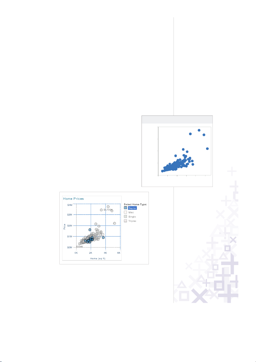
Good visualization
Great visualization
Home ( ft)sq
0K 1K 2K 3K 4K 5K
$0K
$1,000K
$2,000K
$3,000K
$4,000K
Price
Home Prices
1
© 2010 Tableau Soft ware, Incorporated.
Ask Your Viz A Question
What are you trying to say? The single most important thing
you can do to make a great viz is to know what you’re trying
to say. With the drag-and-drop flexibility of Tableau, anyone
can get lost in a world of scatter plots and geocoding. It is
vital that your visualization has a purpose. All of the maps,
charts, and cross-tabs you create should work together to
fulfill that purpose.
How do you know if your viz has a purpose? Well, ask it a
question to find out. You don’t literally have to interrogate
your screen, but click around and view it for a while. What
answers do you find? What other questions does it inspire?
What conversations will it start? The point is that your
viewers should be taking something away from their time
with your viz.
Here’s how you ask your viz a question:
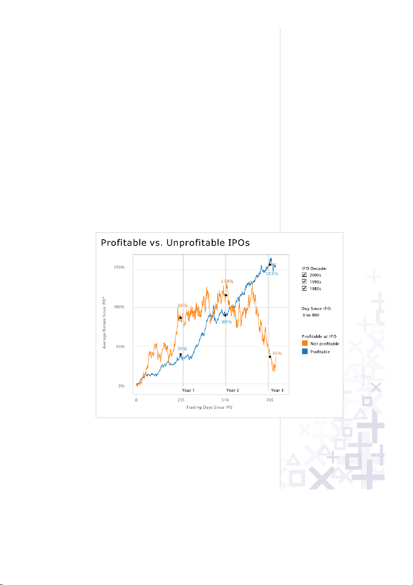
Q: Does profitability at IPO affect stock performance?
A: You bet it does!
Q: OK fine, but if you remove all of those crazy IPOs from
the 1990s, does it change?
A: Yes, but not as much as you might think.
2
© 2010 Tableau Soft ware, Incorporated.
Perfecting The Big Picture
Whether or not your viz tells a story (though especially if
it doesn’t!), you should evaluate whether you’re using the
best kind of visualizations for the analysis that you are doing.
Furthermore, you’ll want to avoid bad views. Tableau
provides a good set of defaults that will help you create good
visualizations, but at the end of the day a human perspective
is needed to polish a viz to perfection. Here are some things
to keep in mind:
What’s the best view?
Although most data can be presented effectively in several
different formats, there are some sets that you will want to
visualize in a certain format most of the time:
•Whenyouareshowinga change over time, you should
probably use a time series (a line chart with time on the
columns shelf)
•Whenyouareshowingwhere something is, use a map.
However, maps are often best used with another chart
detailing what the map displays, like a bar chart sorted
from greatest to least.
•Whenyouareshowingthehighest or use a lowest value
bar chart.
3
© 2010 Tableau Soft ware, Incorporated.
4
© 2010 Tableau Soft ware, Incorporated.
The power of the dashboard
A Tableau dashboard is a collection of several related
visualizations shown on a single page, usually tied together
through interactivity. (See Make it Interactive below.)
Dashboards increase the analytical power of your viz by
allowing multiple perspectives on your dataset in the same
location. They can also be used to combine multiple types
of data into a single location. When designing a dashboard
it’s important to to ensure it is accessible structure it properly
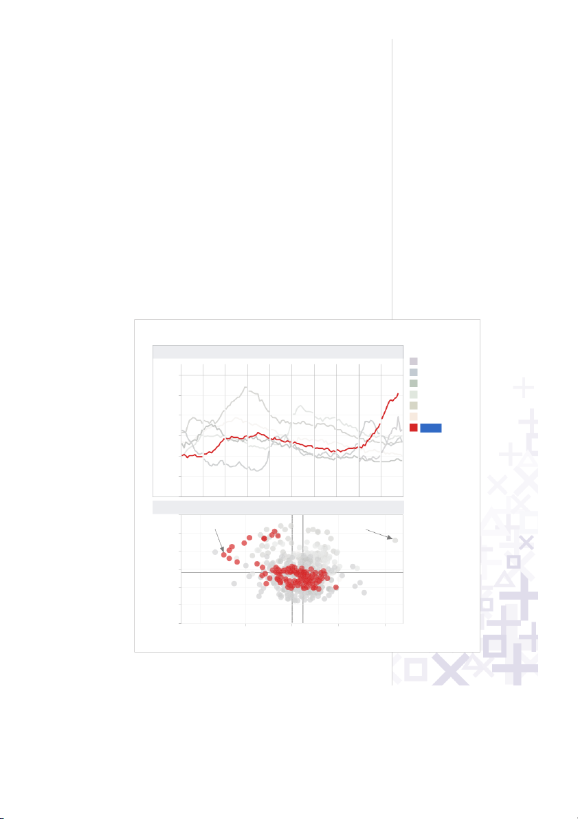
to your audience. For example, the dashboard below is an
example of interactive complementary views combined to
tell a single story.
Note: We refer to the entire dashboard a viz and each
individual pane in the dashboard as a view. For example,
“Month over Month” is a view, which is part of the “60 Years
of Unemployment” viz.
60 Years of Unemplo entym
e
Source: f Bureau o
Labor Statistics
-1,000K -500K 0K 500K 1,000K
Change in Employ ntme from Prior Month
0%
2%
4%
6%
8%
10%
12%
Un mployment
Average= 5.6%
Average= 116K
S eptem b er 1983J anuary 2009
Month over M hont
---0 ---1 ---2 ---3 ---4 ---5 ---6 ---7 ---8 ---9
0%
2%
4%
6%
8%
10%
12%
Unemployment
High ghli t Dec ad e :
1940's
1950's
1960's
1970's
1980's
1990's
2000's
Unemployment by Decade and Year
5
© 2010 Tableau Soft ware, Incorporated.
Major Guidelines
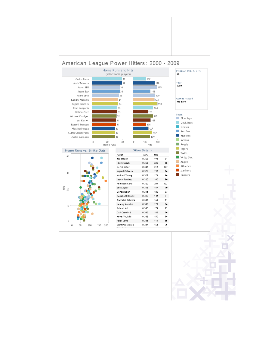
•Placethemostimportantviewinthetoportopleft.
Generally, when looking at a dashboard, your eye is first
drawn to the upper left corner. In this viz the Home Runs
and Hits view is used to filter the remaining views, so it’s
positioned above everything else.
6
© 2010 Tableau Soft ware, Incorporated.
•Group filters and legends (using a
layout container) to the right or
bottom of your viz. If you have
filters and legends that refer to similar values, format
the layout container to have a border to increase the
connection between them. For example, the Position,
Year, and Games Played filters all refer to individual
player statistics. The light border around these filters
adds a subtle visual queue that they are related.
•Ifyourvizhaschainedinteractivity(firstviewfiltersthe
next view which filters the last view), structure them top
to bottom and left to right so that the final view to be
filtered is on the bottom, or bottom right. For example,
because the Home Runs and Hits view filters the others
it makes sense it would be first.
•Positionlegendsontherighthandsideoftheviewthey
describe unless circumstances necessitate them being
placed elsewhere. No matter what, make it clear which
views your legends apply to.
•Speakingofcolor,avoidingusingmultiplecolorschemes
per dashboard unless there are natural and independent
color schemes in your data. If you are using multiple
schemes, try using the Purple-Gray, Blue-Red and Green-
Orange schemes.
•Generally,keep your dashboards to 2 or 3 views. When
you add too many views the big picture can get lost and it
becomes difficult to understand. Remember, you can use
multiple dashboards to tell one story!
7
© 2010 Tableau Soft ware, Incorporated.
Orienting your views intuitively
Sometimes, simple changes can go a very long way
to making your visualizations easy to interact with.
For example, take a look at the view below:
Po Pl Yesitio n / ayer / ar
1B
Pujols, Albert
Fielder, Prince
Gonzalez,
Adrian
Howard, Ryan
Sandoval,
Pablo
3B
Sandoval,
Pablo
2007
2008
2009
2010
2007
2008
2009
2010
2007
2008
2009
2010
2007
2008
2009
2010
2007
2008
2009
2010
2007
2008
2009
2010
0.0
1.0
2.0
3.0
4.0
5.0
6.0
7.0
8.0
9.0
10.0
11.0
12.0
Sum of RC/27
11.0
10.6
11.8
8.4
9.4
9.1
6.7
9.0
8.4
7.7
6.1
6.5
7.3
7.5
6.3
8.0
7.3
8.1
7.3
8.1
2007
2008
2009
2010
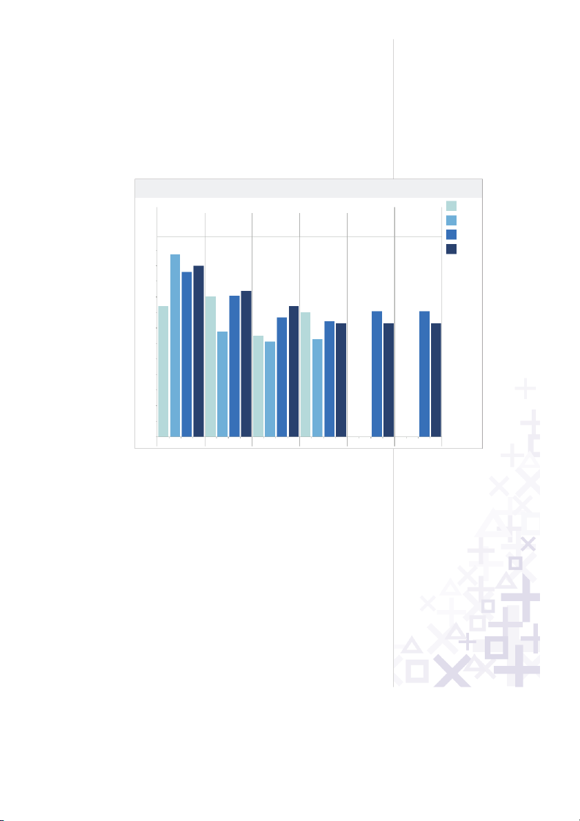
RC/27 Values and 2010 Projections for All NL Position Players
8
© 2010 Tableau Soft ware, Incorporated.
Did you find it difficult to read? All of the labels are vertically
oriented, which is generally difficult to read. If you find yourself
with a view that has long labels that only fit vertically, try
rotating the view. You can quickly swap the fields on the
Rows and Columns shelves using the Swap toolbar button.
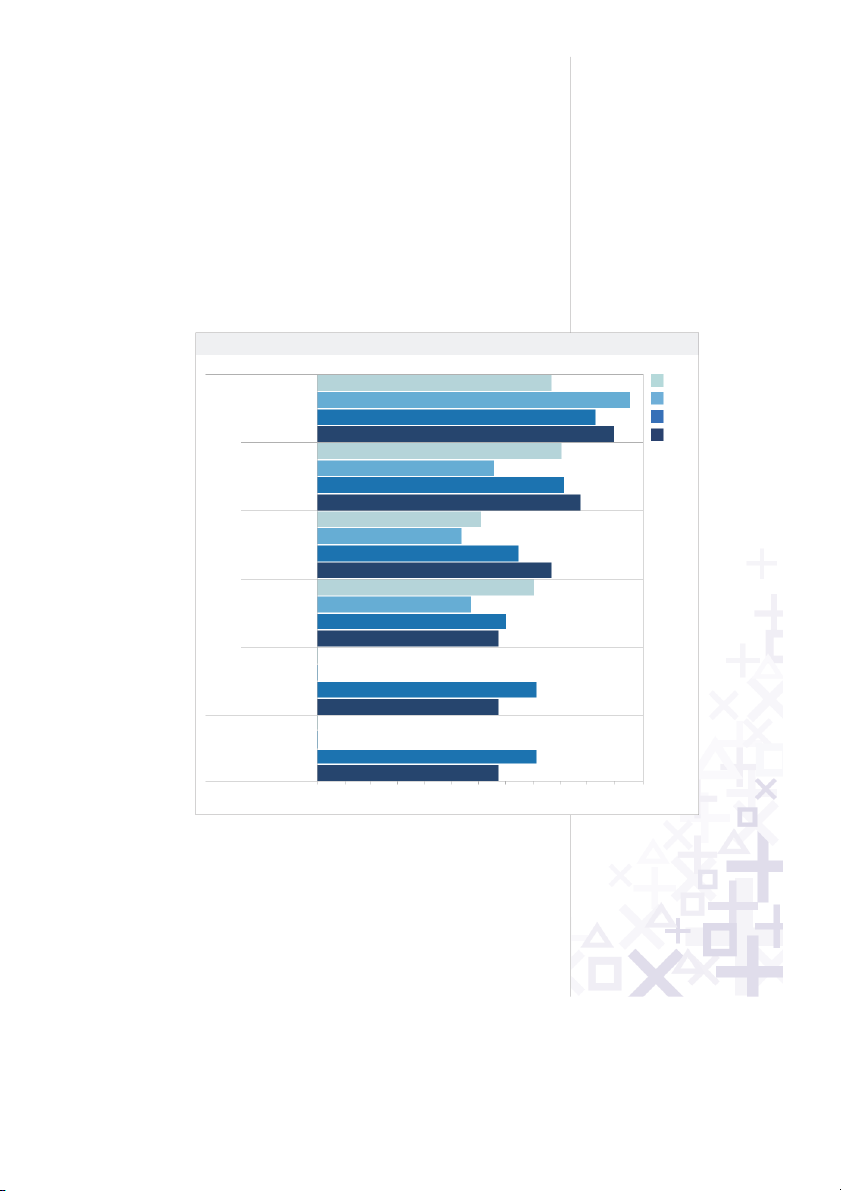
The same view is shown below only this time with a
horizontal orientation. The simple change makes things
a lot easier to read and make comparisons.
RC/27 Values and 2010 Projections for All NL Position Players
2007
2008
2009
2010
Position Player Year
0.0 1.0 2.0 3.0 4.0 5.0 6.0 7.0 8.0 9.0 10.0 11.0 12.0
Sum of RC/27
1B
Pujols, Albert
2007
2008
2009
2010
Fielder,
Prince
2007
2008
2009
2010
Gonzalez,
Adri an
2007
2008
2009
2010
Howa
rd, Ry an
2007
2008
2009
2010
Sandoval,
Pablo
2007
2008
2009
2010
3B
Sandoval,
Pablo
2007
2008
2009
2010
11.0
10.6
11.8
8.4
9.4
9.1
6.7
9.0
8.4
7.7
6.1
6.5
7.3
7.5
6.3
8.0
7.3
8.1
7.3
8.1
| 1/31

Preview text:

Tableau Visual G uidebo ok
simple te chnique s fo r makin g
eve r y vi su aliz ati on u s e ful a nd b e aut if ul Contents
Ask Your Viz A Question .........................................................2
Perfecting The Big Picture ......................................................3
What’s the best view? ...........................................................3
The power of the dashboard ................................................4
Orienting your views intuitively ...........................................7
Pie charts — where to and where NOT to use them ...........9
Sizing: Making sure your viz is visible ...............................10
Emphasize the most important data .................................12
Make It Interactive .................................................................13
Highlighting your best work ...............................................16
Quick Filters: give the wheel to your users .......................16
Actions — Major League filtering .......................................18
Hyperlinking and using the power of the web..................20
Formatting: Making Your Viz Shine .....................................21
Color TV looks better than black and white.
So do color vizes .................................................................21
Fonts: Can you read this? ...................................................22
Tooltips tell the story ..........................................................22 Make intelligent axes
or you’ll just have pretty rectangles ..................................23
Labeling your viz in all the right places .............................24
Testing Your Masterpiece .....................................................25
Don’t let your actions get you into trouble .......................25
Highlighting hijinks ..............................................................25
Wait! Before You Publish… ..................................................26
© 2010 Tableau Software, Incorporated.
You made a viz! Congratulations, you are part of a small
but growing group taking advantage of the power of
visualization. However, going from good visualizations to
great visualizations takes time, patience and attention to
detail. Luckily, we have compiled a short but important list
of techniques to get you started — happy vizzing!
Note: This document does not explain basic steps for building
a viz, we assume you know how to do that. Rather this
document explains tips for making your viz more effective. Good visualization Home Prices $4,000K $3,000K e ric $2,000K P $1,000K $0K 0K 1K 2K 3K 4K 5K Home (sq ft) Great visualization
© 2010 Tableau Software, Incorporated. 1 Ask Your Viz A Question
What are you trying to say? The single most important thing
you can do to make a great viz is to know what you’re trying
to say. With the drag-and-drop flexibility of Tableau, anyone
can get lost in a world of scatter plots and geocoding. It is
vital that your visualization has a purpose. All of the maps,
charts, and cross-tabs you create should work together to fulfill that purpose.
How do you know if your viz has a purpose? Well, ask it a
question to find out. You don’t literally have to interrogate
your screen, but click around and view it for a while. What
answers do you find? What other questions does it inspire?
What conversations will it start? The point is that your
viewers should be taking something away from their time with your viz.
Here’s how you ask your viz a question:
Q: Does profitability at IPO affect stock performance? A: You bet it does!
Q: OK fine, but if you remove all of those crazy IPOs from the 1990s, does it change?
A: Yes, but not as much as you might think.
© 2010 Tableau Software, Incorporated. 2 Perfecting The Big Picture
Whether or not your viz tells a story (though especially if
it doesn’t!), you should evaluate whether you’re using the
best kind of visualizations for the analysis that you are doing.
Furthermore, you’ll want to avoid bad views. Tableau
provides a good set of defaults that will help you create good
visualizations, but at the end of the day a human perspective
is needed to polish a viz to perfection. Here are some things to keep in mind: What’s the best view?
Although most data can be presented effectively in several
different formats, there are some sets that you will want to
visualize in a certain format most of the time:
• When you are showing a change over time, you should
probably use a time series (a line chart with time on the columns shelf)
• When you are showing where something is, use a map.
However, maps are often best used with another chart
detailing what the map displays, like a bar chart sorted from greatest to least.
• When you are showing the highest or lowest valu e use a bar chart.
© 2010 Tableau Software, Incorporated. 3 The power of the dashboard
A Tableau dashboard is a collection of several related
visualizations shown on a single page, usually tied together
through interactivity. (See Make it Interactive below.)
Dashboards increase the analytical power of your viz by
allowing multiple perspectives on your dataset in the same
location. They can also be used to combine multiple types
of data into a single location. When designing a dashboard
it’s important to structure it properl y to ensure it is accessible
to your audience. For example, the dashboard below is an
example of interactive complementary views combined to tell a single story.
Note: We refer to the entire dashboard a viz and each
individual pane in the dashboard as a view. For example,
“Month over Month” is a view, which is part of the “60 Years of Unemployment” viz. 60 Years of Unemployment
Unemployment by Decade and Year Highlight Dec ade: 1940's ---0 ---1 ---2 ---3 ---4 ---5 ---6 ---7 ---8 ---9 1950's 12% 1960's 10% 1970's 1980's t 8% n 1990's e m y 2000's lo 6% p m e n U 4% 2% 0% Month over Mon h t 12% J anuary 2009 S eptem ber 1983 10% t n 8% e m y lo p 6% Average= 5.6% m enU 4% 2% 0% Average= 116K -1,000K -500K 0K 500K 1,000K Source: Bureau of Chan ge in Employm n e t from Prior Month Labor Statistics
© 2010 Tableau Software, Incorporated. 4 Major Guidelines
• Place the most important view in the top or top left.
Generally, when looking at a dashboard, your eye is first
drawn to the upper left corner. In this viz the Home Runs
and Hits view is used to filter the remaining views, so it’s
positioned above everything else.
© 2010 Tableau Software, Incorporated. 5
• Group filters and legends (using a
layout container) to the right or
bottom of your viz. If you have
filters and legends that refer to similar values, format
the layout container to have a border to increase the
connection between them. For example, the Position,
Year, and Games Played filters all refer to individual
player statistics. The light border around these filters
adds a subtle visual queue that they are related.
• If your viz has chained interactivity (first view filters the
next view which filters the last view), structure them top
to bottom and left to right so that the final view to be
filtered is on the bottom, or bottom right. For example,
because the Home Runs and Hits view filters the others
it makes sense it would be first.
• Position legends on the right hand side of the view they
describe unless circumstances necessitate them being
placed elsewhere. No matter what, make it clear which views your legends apply to.
• Speaking of color, avoiding using multiple color schemes
per dashboard unless there are natural and independent
color schemes in your data. If you are using multiple
schemes, try using the Purple-Gray, Blue-Red and Green- Orange schemes.
• Generally, keep your dashboards to 2 or 3 views. When
you add too many views the big picture can get lost and it
becomes difficult to understand. Remember, you can use
multiple dashboards to tell one story!
© 2010 Tableau Software, Incorporated. 6
Orienting your views intuitively
Sometimes, simple changes can go a very long way
to making your visualizations easy to interact with.
For example, take a look at the view below:
RC/27 Values and 2010 Projections for All NL Position Players Position / Player / Year 2007 1B 3B rt e n e c a y l, l, lb z, rin a a le n v lo v lo 2008 , A , R o o za ria d b d b ls r, P n d rd n a n a jo e o A a a P a P u ld G w S S P ie o F H 2009 .8 12.0 1 2010 1 .0 1 11.0 1 .6 0 1 10.0 .4 9 .1 .0 9 9 9.0 .4 .4 8 8 .0 .1 .1 8 8 8 8.0 .7 7 .5 7 .3 .3 .3 7 7 7 7 7.0 .7 /2 6 C .5 6 .3 f R 6 o .1 6 m u 6.0 S 5.0 4.0 3.0 2.0 1.0 0.0 7 8 9 0 7 8 9 0 7 8 9 0 7 8 9 0 7 8 9 0 7 8 9 0 0 0 0 1 0 0 0 1 0 0 0 1 0 0 0 1 0 0 0 1 0 0 0 1 0 0 0 0 0 0 0 0 0 0 0 0 0 0 0 0 0 0 0 0 0 0 0 0 2 2 2 2 2 2 2 2 2 2 2 2 2 2 2 2 2 2 2 2 2 2 2 2
© 2010 Tableau Software, Incorporated. 7
Did you find it difficult to read? All of the labels are vertically
oriented, which is generally difficult to read. If you find yourself
with a view that has long labels that only fit vertically, try
rotating the view. You can quickly swap the fields on the
Rows and Columns shelves using the Swap toolbar button.
The same view is shown below only this time with a
horizontal orientation. The simple change makes things
a lot easier to read and make comparisons.
RC/27 Values and 2010 Projections for All NL Position Players Position Player Year 8.4 2007 1B Pujo ls, Albert 2007 2008 11.8 2008 2009 10.6 2009 2010 11.0 2010 Fielder, 2007 9.0 Prince 2008 6.7 2009 9.1 2010 9.4 Gonzalez, 2007 6.5 Adri an 2008 6.1 2009 7.7 2010 8.4 Howard, Ryan 2007 8.0 2008 6.3 2009 7.5 2010 7.3 Sandoval, 2007 Pablo 2008 2009 8.1 2010 7.3 3B Sandoval, 2007 Pablo 2008 2009 8.1 2010 7.3 0.0 1.0 2.0 3.0 4.0 5.0 6.0 7.0 8.0 9.0 10.0 11.0 12.0 Sum of RC/27
© 2010 Tableau Software, Incorporated. 8