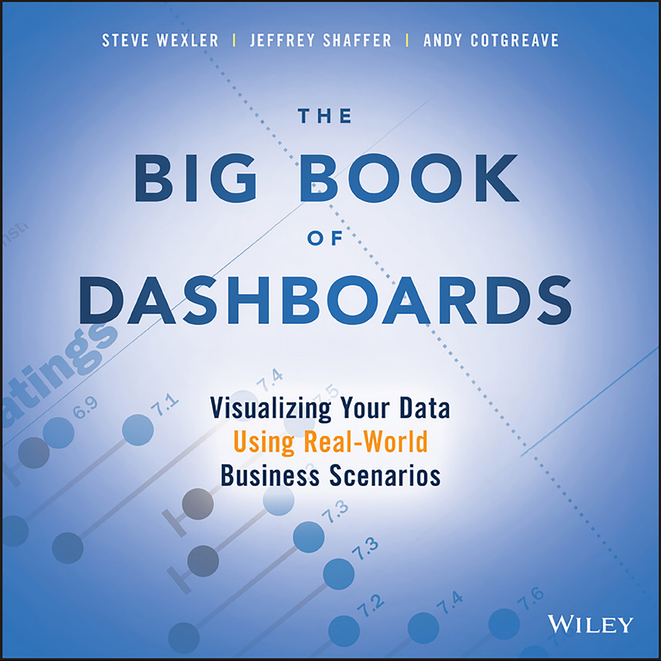
The Big Book of Dashboards| Giáo trình quản trị dữ liệu và trực quan hóa| Trường Đại học Bách Khoa Hà Nội

We wrote The Big Book of Dashboards for anyone tasked with building or overseeing the development of business dashboards. Over the past decade, count-less people have approached us after training sessions, seminars, or consultations, shown us their data, and asked: “What would be a really good way to show this?”

Thông tin:
451 trang 3 tháng trước

Bình luận

Vui lòng đăng nhập hoặc đăng ký để gửi bình luận.

The Big Book of Dashboards| Giáo trình quản trị dữ liệu và trực quan hóa| Trường Đại học Bách Khoa Hà Nội

We wrote The Big Book of Dashboards for anyone tasked with building or overseeing the development of business dashboards. Over the past decade, count-less people have approached us after training sessions, seminars, or consultations, shown us their data, and asked: “What would be a really good way to show this?”

27 14 lượt tải Tải xuống
THE
BIG BOOK
OF
DASHBOARDS
THE
BIG BOOK
OF
DASHBOARDS
Visualizing Your Data
Using Real-World
Business Scenarios
STEVE WEXLER
|
JEFFREY SHAFFER
|
ANDY COTGREAVE
Cover image: Course Metrics Dashboard by Jeffrey Shaffer
Cover design: Wiley
Copyright © 2017 by Steve Wexler, Jeffrey Shaffer, and Andy Cotgreave. All rights reserved.
Published by John Wiley & Sons, Inc., Hoboken, New Jersey.
Published simultaneously in Canada.
No part of this publication may be reproduced, stored in a retrieval system, or transmitted
in any form or by any means, electronic, mechanical, photocopying, recording, scanning,
or otherwise, except as permitted under Section 107 or 108 of the 1976 United States
Copyright Act, without either the prior written permission of the Publisher, or authorization
through payment of the appropriate per-copy fee to the Copyright Clearance Center, Inc.,
222 Rosewood Drive, Danvers, MA 01923, (978) 750-8400, fax (978) 646-8600, or on the
Web at www.copyright.com. Requests to the Publisher for permission should be addressed to
the Permissions Department, John Wiley & Sons, Inc., 111 River Street, Hoboken, NJ 07030,
(201) 748-6011, fax (201) 748-6008, or online at http://www.wiley.com/go/permissions.
Limit of Liability/Disclaimer of Warranty: While the publisher and author have used their best
efforts in preparing this book, they make no representations or warranties with respect to the
accuracy or completeness of the contents of this book and specically disclaim any implied
warranties of merchantability or tness for a particular purpose. No warranty may be created
or extended by sales representatives or written sales materials. The advice and strategies
contained herein may not be suitable for your situation. You should consult with a professional
where appropriate. Neither the publisher nor author shall be liable for any loss of prot or any
other commercial damages, including but not limited to special, incidental, consequential, or
other damages.
For general information on our other products and services or for technical support, please
contact our Customer Care Department within the United States at (800) 762-2974, outside the
United States at (317) 572-3993 or fax (317) 572-4002.
Wiley publishes in a variety of print and electronic formats and by print-on-demand. Some
material included with standard print versions of this book may not be included in e-books or
in print-on-demand. If this book refers to media such as a CD or DVD that is not included in the
version you purchased, you may download this material at http://booksupport.wiley.com. For
more information about Wiley products, visit www.wiley.com.
A catalog record for this book is available from the Library of Congress.
ISBN 978-1-119-28271-6 (Paperback)
ISBN 978-1-119-28278-5 (ePDF)
ISBN 978-1-119-28273-0 (ePub)
ISBN 978-1-119-28308-9 (obook)
Printed in the United States of America.
10 9 8 7 6 5 4 3 2 1
v
Contents
Acknowledgments vii
About the Authors ix
Introduction xi
PART I A STRONG FOUNDATION
Chapter 1 Data Visualization: A Primer 2
PART II THE SCENARIOS
Chapter 2 Course Metrics Dashboard 38
Chapter 3 Comparing Individual Performance with Peers 48
Chapter 4 What-If Analysis: Wage Increase Ramications 62
Chapter 5 Executive Sales Dashboard 70
Chapter 6 Ranking by Now, Comparing with Then 80
Chapter 7 Are We on Pace to Reach Our Goals? 92
Chapter 8 Multiple Key Performance Metrics 98
Chapter 9 Power Plant Operations Monitoring 106
Chapter 10 Showing Year-to-Date and Year-over-Year at the
Same Time 118
Chapter 11 Premier League Player Performance Metrics 130
Chapter 12 RBS 6 Nations Championship Match Performance
Analysis 138
Chapter 13 Web Analytics 146
Chapter 14 Patient History Analysis of Recent Hospital Admissions 156
Chapter 15 Hospitality Dashboard for Hotel Management 164
Chapter 16 Sentiment Analysis: Showing Overall Distribution 174
Chapter 17 Showing Sentiment with Net Promoter Score 186
Chapter 18 Server Process Monitoring 202
Chapter 19 Big Mac Index 210
Chapter 20 Complaints Dashboard 224
Chapter 21 Hospital Operating Room Utilization 236
Chapter 22 Showing Rank and Magnitude 246
Chapter 23 Measuring Claims across Multiple Measures and
Dimensions 258
Chapter 24 Showing Churn or Turnover 268
Chapter 25 Showing Actual versus Potential Utilization 282
Chapter 26 Health Care Provider Productivity Monitoring 294
Chapter 27 Telecom Operator Executive Dashboard 306
Chapter 28 Economy at a Glance 316
Chapter 29 Call Center 328
PART III SUCCEEDING IN THE REAL WORLD
Chapter 30 Want to Engage People? Make Your Dashboards
Personal 338
Chapter 31 Visualizing Time 352
Chapter 32 Beware the Dead-End Dashboard 382
Chapter 33 The Allure of Red and Green 390
Chapter 34 The Allure of Pies and Donuts 396
Chapter 35 Clouds and Bubbles 404
Chapter 36 A Journey into the Unknown 410
Glossary 419
Bibliography 423
Index 425
vi Contents
vii
Acknowledgments
From the three of us
Stephen Few, whose books have made a profound
and lasting impression on us.
Alberto Cairo for his invaluable feedback and for his
leadership in the data visualization community.
Our technical reviewers greatly improved our rst
drafts. Thanks to Troy Magennis, Andy Kirk, Jon
Schwabish, Ariel Pohoryles, Trudy Weiss Craig,
Michael Fry, Andy Kriebel, and a special thanks to
Cole Nussbaumer Knaic for introducing us to the
Wiley team and who went far beyond our expecta-
tions with her detailed edits and comments.
All the contributors to this book gave signicant time
to tweak their dashboards according to our requests.
We thank you for allowing us to include your work in
the book. 
Thanks, also, to Mark Boone, KK Molugu, Eric Duell,
Chris DeMartini, and Bob Filbin for their efforts.
Our stellar team at Wiley: acquisitions editor Bill Fal-
loon for ghting so hard on our behalf; editor Christina
Verigan for her deft reworking and invaluable help
optimizing ow; senior production editor Samantha
Hartley for overseeing the daunting process of making
this book a beautiful, tangible thing; copy editor Debra
Manette for such detailed editing and insights; proof-
reader Hope Breeman for her meticulous proof check;
the team at WordCo for a comprehensive index and
marketing manager Heather Dunphy for her excep-
tional expertise in connecting author with audience.
From Steve
My wife, Laura, and my daughters, Janine and Diana,
for the never-ending support and love.
Ira Handler and Brad Epstein, whose friendship,
encouragement, and example have been a godsend
for the past dozen years.
Joe Mako, who has always been willing to help me
with “the difcult stuff” and provided much needed
encouragement when I was starting out.
The Princeton University Triangle Club, where I learned
how to bring talented people together to make won-
derful things. Without my experiences there I don’t
know if I would have had the insight and ability to
recruit my fellow authors.
Jeff and Andy, who not only made the book way
better than it would have been had I tackled it on
my own, but for providing me with one of the most
rewarding and enriching experiences of my career.
Your abilities, candor, humor, grit, patience, impa-
tience, thoughtfulness, and leadership made for a
remarkable ride.
From Andy
I would like to thank Steve and Jeff for approaching
me to join this project. I’d been procrastinating on
writing a book for many years, and the opportunity
to work with two passionate, skilled leaders was the
trigger I needed to get going. I would like to thank
them both for many hours of constructive debate
(argument?) over the rights and wrongs of all aspects
of dashboards and data visualization. It has been an
enriching experience.
viii Acknowledgments
Finally, to Liz, my wife, and my daughters, Beatrice
and Lucy. Thank you for your support and the free-
dom to abandon you all on weekends, mornings, and
evenings in order to compete this project. I could not
have done it without you.
From Jeff
Thank you, Steve and Andy. It was a pleasure working
with you guys. I will miss the collaboration, especially
our many hours of discussion about data visualization
and dashboard design. 
A special thank you to Mary, my wife, and to Nina and
Elle, my twin daughters, for sacricing lots of family time
over many long nights and weekends. I would not have
been able to complete this project without your support.
ix
About the Authors
Steve Wexler has worked with ADP, Gallup, Deloitte,
Convergys, Consumer Reports, The Economist,
ConEd, D&B, Marist, Tradeweb, Tiffany, McKinsey
& Company, and many other organizations to help
them understand and visualize their data. Steve is a
Tableau Zen Master, Iron Viz Champion, and Tableau
Training Partner.
His presentations and training classes combine an
extraordinary level of product mastery with the real-
world experience gained through developing thou-
sands of visualizations for dozens of clients. In addition
to his recognized expertise in data visualization and
Tableau, Steve has decades of experience as a suc-
cessful instructor in all areas of computer-based tech-
nology. Steve has taught thousands of people in both
large and small organizations and is known for con-
ducting his seminars with clarity, patience, and humor.
Website: DataRevelations.com
Jeffrey A. Shaffer is Vice President of Information
Technology and Analytics at Recovery Decision Sci-
ence and Unifund. He is also Adjunct Professor at
the University of Cincinnati, where he teaches Data
Visualization and was named the 2016 Outstanding
Adjunct Professor of the Year.
He is a regular speaker on the topic of data visualization,
data mining, and Tableau training at conferences,
symposiums, workshops, universities, and corporate
training programs. He is a Tableau Zen Master, and
was the winner of the 2014 Tableau Quantied Self
Visualization Contest, which led him to compete in
the 2014 Tableau Iron Viz Contest. His data visual-
ization blog was on the shortlist for the 2016 Kantar
Information is Beautiful Awards for Data Visualiza-
tion Websites.
Website: DataPlusScience.com
Andy Cotgreave is Technical Evangelist at Tableau
Software. He has over 10 years’ experience in data
visualization and business intelligence, rst honing
his skills as an analyst at the University of Oxford.
Since joining Tableau in 2011, he has helped and
inspired thousands of people with technical advice
and ideas on how to build a data-driven culture in
a business.
In 2016 he ran the MakeoverMonday (http://www
.makeovermonday.co.uk/) project with Andy Kriebel,
a social data project which saw over 500 people
make 3,000 visualizations in one year. The proj-
ect received an honourable mention in the Dataviz
Project category of the 2016 Kantar Information is
Beautiful Awards.
Andy has spoken at conferences around the world,
including SXSW, Visualized, and Tableau’s customer
conferences. He writes a column for Computerworld,
x About the Authors
Living with Data (http://www.computerworld.com/
blog/living-data/), as well as maintaining his own
blog, GravyAnecdote.com.
Website: GravyAnecdote.com
xi
Introduction
We wrote The Big Book of Dashboards for anyone
tasked with building or overseeing the development
of business dashboards. Over the past decade, count-
less people have approached us after training sessions,
seminars, or consultations, shown us their data, and
asked: “What would be a really good way to show this?”
These people faced a specic business predicament
(what we call a “scenario”) and wanted guidance on
how to best address it with a dashboard. In reviewing
dozens of books about data visualization, we were sur-
prised that, while they contained wonderful examples
showing why a line chart often works best for time-
series data and why a bar chart is almost always better
than a pie chart, none of them matched great dash-
boards with real-world business cases. After pooling
our experience and enormous collection of dash-
boards, we decided to write our own book.
How This Book Is Different
This book is not about the fundamentals of data visu-
alization. That has been done in depth by many amaz-
ing authors. We want to focus on proven, real-world
examples and why they succeed.
However, if this is your rst book about the topic
of data visualization, we do provide a primer in
Part I with everything you need to know to under-
stand how the charts in the scenarios work. We also
dearly hope it whets your appetite for more, which
is why this section nishes with our recommended
further reading.
How This Book Is Organized
The book is organized into three parts.
Part I: A Strong Foundation. This part covers the
fundamentals of data visualization and provides
our crash course on the foundational elements
that give you the vocabulary you need to explore
and understand the scenarios.
Part II: The Scenarios. This is the heart of the book,
where we describe dozens of different business
scenarios and then present a dashboard that
“solves” the challenges presented in those
scenarios.
Part III: Succeeding in the Real World. The
chapters in this part address problems we’ve
encountered and anticipate you may encounter
as well. With these chapters—distilled from
decades of real-world experience—we hope to
make your journey quite a bit easier and a lot
more enjoyable.
How to Use This Book
We encourage you to look through the book to nd
a scenario that most closely matches what you are
tasked with visualizing. Although there might not be
an exact match, our goal is to present enough sce-
narios that you can nd something that will address
your needs. The internal conversation in your head
might go like this:
“Although my data isn’t exactly the same as what’s in
this scenario, it’s close enough, and this dashboard
really does a great job of helping me and others see
and understand that data. I think we should use this
approach for our project as well.”
For each scenario we present the entire dashboard at
the beginning of the chapter, then explore how indi-
vidual components work and contribute to the whole.
By organizing the book based on these scenarios and
offering practical and effective visualization exam-
ples, we hope to make The Big Book of Dashboards
a trusted resource that you open when you need to
build an effective business dashboard. To ensure you
get the most out of these examples, we have included
a visual glossary at the back of this book. If you come
across an unfamiliar term, such as “sparkline,” you
can look it up and see an illustration.
We also encourage you to spend time with all the
scenarios and the proposed solutions as there may
be some elements of a seemingly irrelevant scenario
that may apply to your own needs.
For example, Chapter 11 shows a dashboard used by
a team in the English Premier League to help players
understand their performance. Your data might have
nothing to do with sports, but the dashboard is a
great example of showing current and historical per-
formance. (See Figure I.1.) That might be something
you have to do with your data. Plus, if you skip one
scenario, you might miss a great example of the exact
chart you need for your own solution.
We also encourage you to browse the book for moti-
vation. Although a scenario may not be a perfect
match, the thought process and chart choices may
inspire you.
Succeeding in the Real World
In addition to the scenarios, an entire section of
the book is devoted to addressing many practi-
cal and psychological factors you will encounter in
your work. It’s great to have theory- and evidenced-
based research at your disposal, but what will you
do when somebody asks you to make your dash-
board “cooler” by adding packed bubbles and
donut charts?
The three of us have a combined 30-plus years of hands-
on experience helping people in hundreds of organiza-
tions build effective visualizations. We have fought (and
sometimes lost) many “best practices” battles. But by
having endured these struggles, we bring an uncom-
mon empathy to the readers of thisbook.
We recognize that at times readers will be asked to
create dashboards and charts that exemplify bad
practice. For example, a client or a department head
may stipulate using a particular combination of col-
ors or demand a chart type that is against evidence-
based data visualization best practices.
We hear you. We’ve been there.
xii Introduction
Succeeding in the Real World xiii
10
6
7
7
13
7
6
5
6
7
3
8
1
10
8
10
8
10
8
9
8
14
924m
385m
168
151
47
37s
17
10,967m
10
9.4m/s
1,308m
PLAYER
RANK
MATCH
TOTAL
PREVIOUS 5 REST OF SEASON
TEAM
RANK
Total
Distance
HI Run
Distance
Num HI
Runs
HS Run
Distance
Num HS
Runs
Sprint
Distance
Num
Sprints
High
Accels.
High
Decels.
Top
Speed
Recovery
Time
17 21Match Match
95 mins
LIVERPOOL vs MANCHESTER UTD
ANDY SINGLETON
18 May 2016
< BELOW AVERAGE ABOVE AVERAGE >
FIGURE I.1 A player summary from an English Premier
League Club
(Note: Fake data is used.)
A
lthough the dashboard in Figure I.1
pertains to sports, the techniques are
universal. Here the latest event is in yellow, the
ve most recent events are in red, and older
events are in a muted gray. Brilliant.
We’ve faced many of the hurdles you will encounter
and the concepts you will grapple with in your attempt
to build dashboards that are informative, enlighten-
ing, and engaging. The essays in this section will help
smooth the way for you by offering suggestions and
alternatives for these issues.
What to Do and What Not to Do
Although the book is an attempt to celebrate good
examples, we’ll also show plenty of bad examples.
We guarantee you will see this kind of work out in the
wild, and you may even be asked to emulate it. We
mark these “bad” examples with the cat icon shown
in Figure I.2 so that you don’t have to read the sur-
rounding text to determine if the chart is something
you should emulate or something you should avoid.
FIGURE I.2 If you see this icon, it means don’t make a
chart like this one.
Illustration by Eric Kim
What Is a Dashboard?
Ask 10 people who build business dashboards
to dene a dashboard and you will probably get
10 different denitions. For the purpose of this book,
our denition is as follows:
A
dashboard is a visual display of data
used tomonitor conditions and/or
facilitateunderstanding.
This is a broad denition, and it means that we
would consider all of the examples listed below to
be dashboards:
•
An interactive display that allows people to explore
worker compensation claims by region, industry,
and body part
•
A PDF showing key measures that gets e-mailed
to an executive every Monday morning
•
A large wall-mounted screen that shows support
center statistics in real time
•
A mobile application that allows sales managers to
review performance across different regions and
compare year-to-date sales for the current year
with the previous year
Even if you don’t consider every example in this book
a true dashboard, we think you will nd the discus-
sion and analysis around each of the scenarios help-
ful in building your solutions. Indeed, we can debate
the denition until we are blue in the face, but that
would be a horrible waste of effort as it simply isn’t that
important. What is important—make that essential
is understanding how to combine different elements
(e.g., charts, text, legends, lters, etc.) into a cohesive
and coordinated whole that allows people to see and
understand their data.
xiv Introduction
Final Thought: There Are No Perfect Dashboards xv
Final Thought: There Are
No Perfect Dashboards
You will not nd any perfect dashboards in this book.
In our opinion, there is no such thing as a perfect
dashboard. You will never nd one perfect collection
of charts that ideally suits every person who may
encounter it. But, although they may not be perfect,
the dashboards we showcase in the book successfully
help people see and understand data in the real world.
The dashboards we chose all have this in common:
Each one demonstrates some great ideas in a way
that is relevant to the people who need to understand
them. In short, they all serve the end users. Would
we change some of the dashboards? Of course we
would, and we weigh in on what we would change in
the author commentary at the end of each scenario.
Sometimes we think a chart choice isn’t ideal; other
times, the layout isn’t quite right; and in some cases,
the interactivity is clunky or difcult. What we rec-
ognize is that every set of eyes on a dashboard will
judge the work differently, which is something you
also should keep in mind. Where you see perfection,
others might see room for improvement. The chal-
lenge all the dashboard designers in this book have
faced is balancing a dashboard’s presentation and
objectives with time and efciency. It’s not an easy
spot to hit, but with this book we hope to make it
easier for you.
Steve Wexler
Jeffrey Shaffer
Andy Cotgreave
A STRONG
FOUNDATION
PART I
2
Chapter 1
Data Visualization:
A Primer
| 1/451

Preview text:

The Big Book of DashBoarDs The Big Book of DashBoarDs Visualizing Your Data Using Real-World Business Scenarios
Steve Wexler | Jeffrey Shaffer | andy Cotgreave
Cover image: Course Metrics Dashboard by Jeffrey Shaffer Cover design: Wiley
Copyright © 2017 by Steve Wexler, Jeffrey Shaffer, and Andy Cotgreave. All rights reserved.
Published by John Wiley & Sons, Inc., Hoboken, New Jersey.
Published simultaneously in Canada.
No part of this publication may be reproduced, stored in a retrieval system, or transmitted
in any form or by any means, electronic, mechanical, photocopying, recording, scanning,
or otherwise, except as permitted under Section 107 or 108 of the 1976 United States
Copyright Act, without either the prior written permission of the Publisher, or authorization
through payment of the appropriate per-copy fee to the Copyright Clearance Center, Inc.,
222 Rosewood Drive, Danvers, MA 01923, (978) 750-8400, fax (978) 646-8600, or on the
Web at www.copyright.com. Requests to the Publisher for permission should be addressed to
the Permissions Department, John Wiley & Sons, Inc., 111 River Street, Hoboken, NJ 07030,
(201) 748-6011, fax (201) 748-6008, or online at http://www.wiley.com/go/permissions.
Limit of Liability/Disclaimer of Warranty: While the publisher and author have used their best
efforts in preparing this book, they make no representations or warranties with respect to the
accuracy or completeness of the contents of this book and specifically disclaim any implied
warranties of merchantability or fitness for a particular purpose. No warranty may be created
or extended by sales representatives or written sales materials. The advice and strategies
contained herein may not be suitable for your situation. You should consult with a professional
where appropriate. Neither the publisher nor author shall be liable for any loss of profit or any
other commercial damages, including but not limited to special, incidental, consequential, or other damages.
For general information on our other products and services or for technical support, please
contact our Customer Care Department within the United States at (800) 762-2974, outside the
United States at (317) 572-3993 or fax (317) 572-4002.
Wiley publishes in a variety of print and electronic formats and by print-on-demand. Some
material included with standard print versions of this book may not be included in e-books or
in print-on-demand. If this book refers to media such as a CD or DVD that is not included in the
version you purchased, you may download this material at http://booksupport.wiley.com. For
more information about Wiley products, visit www.wiley.com.
A catalog record for this book is available from the Library of Congress.
ISBN 978-1-119-28271-6 (Paperback) ISBN 978-1-119-28278-5 (ePDF) ISBN 978-1-119-28273-0 (ePub) ISBN 978-1-119-28308-9 (obook)
Printed in the United States of America. 10 9 8 7 6 5 4 3 2 1 Contents Acknowledgments vii About the Authors ix Introduction xi PArT I A STrong foundATIon
Chapter 1 data Visualization: A Primer 2 PArT II The SCenArIoS
Chapter 2 Course Metrics dashboard 38
Chapter 3 Comparing Individual Performance with Peers 48
Chapter 4 What-If Analysis: Wage Increase ramifications 62
Chapter 5 executive Sales dashboard 70
Chapter 6 ranking by now, Comparing with Then 80
Chapter 7 Are We on Pace to reach our goals? 92
Chapter 8 Multiple Key Performance Metrics 98
Chapter 9 Power Plant operations Monitoring 106
Chapter 10 Showing Year-to-date and Year-over-Year at the Same Time 118
Chapter 11 Premier League Player Performance Metrics 130
Chapter 12 rBS 6 nations Championship Match Performance Analysis 138 Chapter 13 Web Analytics 146
Chapter 14 Patient history Analysis of recent hospital Admissions 156 v vi Contents
Chapter 15 hospitality dashboard for hotel Management 164
Chapter 16 Sentiment Analysis: Showing overall distribution 174
Chapter 17 Showing Sentiment with net Promoter Score 186
Chapter 18 Server Process Monitoring 202 Chapter 19 Big Mac Index 210
Chapter 20 Complaints dashboard 224
Chapter 21 hospital operating room utilization 236
Chapter 22 Showing rank and Magnitude 246
Chapter 23 Measuring Claims across Multiple Measures and dimensions 258
Chapter 24 Showing Churn or Turnover 268
Chapter 25 Showing Actual versus Potential utilization 282
Chapter 26 health Care Provider Productivity Monitoring 294
Chapter 27 Telecom operator executive dashboard 306
Chapter 28 economy at a glance 316 Chapter 29 Call Center 328
PArT III SuCCeedIng In The reAL WorLd
Chapter 30 Want to engage People? Make Your dashboards Personal 338 Chapter 31 Visualizing Time 352
Chapter 32 Beware the dead-end dashboard 382
Chapter 33 The Allure of red and green 390
Chapter 34 The Allure of Pies and donuts 396 Chapter 35 Clouds and Bubbles 404
Chapter 36 A Journey into the unknown 410 glossary 419 Bibliography 423 Index 425 Acknowledgments from the three of us
Hartley for overseeing the daunting process of making
this book a beautiful, tangible thing; copy editor Debra
Stephen Few, whose books have made a profound
Manette for such detailed editing and insights; proof- and lasting impression on us.
reader Hope Breeman for her meticulous proof check;
the team at WordCo for a comprehensive index and
Alberto Cairo for his invaluable feedback and for his
marketing manager Heather Dunphy for her excep-
leadership in the data visualization community.
tional expertise in connecting author with audience.
Our technical reviewers greatly improved our first from Steve
drafts. Thanks to Troy Magennis, Andy Kirk, Jon
Schwabish, Ariel Pohoryles, Trudy Weiss Craig, My wife, Laura, and my daughters, Janine and Diana,
Michael Fry, Andy Kriebel, and a special thanks to for the never-ending support and love.
Cole Nussbaumer Knaflic for introducing us to the Ira Handler and Brad Epstein, whose friendship,
Wiley team and who went far beyond our expecta-
encouragement, and example have been a godsend
tions with her detailed edits and comments. for the past dozen years.
All the contributors to this book gave significant time
Joe Mako, who has always been willing to help me
to tweak their dashboards according to our requests.
with “the difficult stuff” and provided much needed
We thank you for allowing us to include your work in
encouragement when I was starting out. the book.
The Princeton University Triangle Club, where I learned
Thanks, also, to Mark Boone, KK Molugu, Eric Duell,
how to bring talented people together to make won-
Chris DeMartini, and Bob Filbin for their efforts.
derful things. Without my experiences there I don’t
know if I would have had the insight and ability to
Our stellar team at Wiley: acquisitions editor Bill Fal- recruit my fellow authors.
loon for fighting so hard on our behalf; editor Christina
Verigan for her deft reworking and invaluable help Jeff and Andy, who not only made the book way
optimizing flow; senior production editor Samantha better than it would have been had I tackled it on vii viii Acknowledgments
my own, but for providing me with one of the most
Finally, to Liz, my wife, and my daughters, Beatrice
rewarding and enriching experiences of my career. and Lucy. Thank you for your support and the free-
Your abilities, candor, humor, grit, patience, impa-
dom to abandon you all on weekends, mornings, and
tience, thoughtfulness, and leadership made for a evenings in order to compete this project. I could not remarkable ride. have done it without you. from andy from Jeff
I would like to thank Steve and Jeff for approaching
Thank you, Steve and Andy. It was a pleasure working
me to join this project. I’d been procrastinating on with you guys. I will miss the collaboration, especially
writing a book for many years, and the opportunity
our many hours of discussion about data visualization
to work with two passionate, skilled leaders was the and dashboard design.
trigger I needed to get going. I would like to thank
them both for many hours of constructive debate A special thank you to Mary, my wife, and to Nina and
(argument?) over the rights and wrongs of all aspects
Elle, my twin daughters, for sacrificing lots of family time
of dashboards and data visualization. It has been an
over many long nights and weekends. I would not have enriching experience.
been able to complete this project without your support. About the Authors
steve Wexler has worked with ADP, Gallup, Deloitte,
He is a regular speaker on the topic of data visualization,
Convergys, Consumer Reports, The Economist,
data mining, and Tableau training at conferences,
ConEd, D&B, Marist, Tradeweb, Tiffany, McKinsey symposiums, workshops, universities, and corporate
& Company, and many other organizations to help training programs. He is a Tableau Zen Master, and
them understand and visualize their data. Steve is a
was the winner of the 2014 Tableau Quantified Self
Tableau Zen Master, Iron Viz Champion, and Tableau
Visualization Contest, which led him to compete in Training Partner.
the 2014 Tableau Iron Viz Contest. His data visual-
ization blog was on the shortlist for the 2016 Kantar
His presentations and training classes combine an Information is Beautiful Awards for Data Visualiza-
extraordinary level of product mastery with the real- tion Websites.
world experience gained through developing thou-
sands of visualizations for dozens of clients. In addition Website: DataPlusScience.com
to his recognized expertise in data visualization and
Tableau, Steve has decades of experience as a suc-
andy Cotgreave is Technical Evangelist at Tableau
cessful instructor in all areas of computer-based tech-
Software. He has over 10 years’ experience in data
nology. Steve has taught thousands of people in both
visualization and business intelligence, first honing
large and small organizations and is known for con-
his skills as an analyst at the University of Oxford.
ducting his seminars with clarity, patience, and humor.
Since joining Tableau in 2011, he has helped and
inspired thousands of people with technical advice Website: DataRevelations.com
and ideas on how to build a data-driven culture in a business.
Jeffrey a. shaffer is Vice President of Information
Technology and Analytics at Recovery Decision Sci-
In 2016 he ran the MakeoverMonday (http://www
ence and Unifund. He is also Adjunct Professor at .makeovermonday.co.uk/) project with Andy Kriebel,
the University of Cincinnati, where he teaches Data
a social data project which saw over 500 people
Visualization and was named the 2016 Outstanding
make 3,000 visualizations in one year. The proj- Adjunct Professor of the Year.
ect received an honourable mention in the Dataviz ix x About the Authors
Project category of the 2016 Kantar Information is Living with Data (http://www.computerworld.com/ Beautiful Awards.
blog/living-data/), as well as maintaining his own blog, GravyAnecdote.com.
Andy has spoken at conferences around the world,
including SXSW, Visualized, and Tableau’s customer Website: GravyAnecdote.com
conferences. He writes a column for Computerworld, Introduction
We wrote The Big Book of Dashboards for anyone Part I with everything you need to know to under-
tasked with building or overseeing the development stand how the charts in the scenarios work. We also
of business dashboards. Over the past decade, count-
dearly hope it whets your appetite for more, which
less people have approached us after training sessions,
is why this section finishes with our recommended
seminars, or consultations, shown us their data, and further reading.
asked: “What would be a really good way to show this?” how this Book Is organized
These people faced a specific business predicament
(what we call a “scenario”) and wanted guidance on
The book is organized into three parts.
how to best address it with a dashboard. In reviewing
dozens of books about data visualization, we were sur-
Part i: a strong Foundation. This part covers the
prised that, while they contained wonderful examples
fundamentals of data visualization and provides
showing why a line chart often works best for time-
our crash course on the foundational elements
series data and why a bar chart is almost always better
that give you the vocabulary you need to explore
than a pie chart, none of them matched great dash- and understand the scenarios.
boards with real-world business cases. After pooling
Part ii: The scenarios. This is the heart of the book,
our experience and enormous collection of dash-
where we describe dozens of different business
boards, we decided to write our own book.
scenarios and then present a dashboard that
“solves” the challenges presented in those how this Book Is different scenarios.
This book is not about the fundamentals of data visu-
Part iii: succeeding in the real World. The
alization. That has been done in depth by many amaz-
chapters in this part address problems we’ve
ing authors. We want to focus on proven, real-world
encountered and anticipate you may encounter
examples and why they succeed.
as well. With these chapters—distilled from
decades of real-world experience—we hope to
However, if this is your first book about the topic
make your journey quite a bit easier and a lot
of data visualization, we do provide a primer in more enjoyable. xi xii Introduction how to Use this Book
nothing to do with sports, but the dashboard is a
great example of showing current and historical per-
We encourage you to look through the book to find
formance. (See Figure I.1.) That might be something
a scenario that most closely matches what you are you have to do with your data. Plus, if you skip one
tasked with visualizing. Although there might not be
scenario, you might miss a great example of the exact
an exact match, our goal is to present enough sce-
chart you need for your own solution.
narios that you can find something that will address
your needs. The internal conversation in your head
We also encourage you to browse the book for moti- might go like this:
vation. Although a scenario may not be a perfect
match, the thought process and chart choices may
“Although my data isn’t exactly the same as what’s in inspire you.
this scenario, it’s close enough, and this dashboard
really does a great job of helping me and others see
Succeeding in the real World
and understand that data. I think we should use this
approach for our project as well.”

In addition to the scenarios, an entire section of
the book is devoted to addressing many practi-
For each scenario we present the entire dashboard at
cal and psychological factors you will encounter in
the beginning of the chapter, then explore how indi-
your work. It’s great to have theory- and evidenced-
vidual components work and contribute to the whole.
based research at your disposal, but what will you
do when somebody asks you to make your dash-
By organizing the book based on these scenarios and
board “cooler” by adding packed bubbles and
offering practical and effective visualization exam- donut charts?
ples, we hope to make The Big Book of Dashboards
a trusted resource that you open when you need to
The three of us have a combined 30-plus years of hands-
build an effective business dashboard. To ensure you
on experience helping people in hundreds of organiza-
get the most out of these examples, we have included
tions build effective visualizations. We have fought (and
a visual glossary at the back of this book. If you come
sometimes lost) many “best practices” battles. But by
across an unfamiliar term, such as “sparkline,” you having endured these struggles, we bring an uncom-
can look it up and see an illustration.
mon empathy to the readers of this book.
We also encourage you to spend time with all the We recognize that at times readers will be asked to
scenarios and the proposed solutions as there may
create dashboards and charts that exemplify bad
be some elements of a seemingly irrelevant scenario
practice. For example, a client or a department head
that may apply to your own needs.
may stipulate using a particular combination of col-
ors or demand a chart type that is against evidence-
For example, Chapter 11 shows a dashboard used by
based data visualization best practices.
a team in the English Premier League to help players
understand their performance. Your data might have
We hear you. We’ve been there. Succeeding in the real World xiii
andy SIngleton lIverPool vs ManCheSter Utd 18 May 2016
although the dashboard in Figure I.1 MatCh Player teaM
pertains to sports, the techniques are PrevIoUS 5 reSt of SeaSon total ranK ranK 95 mins 17 Match 21 Match < BeloW average aBove average >
universal. Here the latest event is in yellow, the total 10,967m 14 3 distance
five most recent events are in red, and older
events are in a muted gray. Brilliant. hI run 1,308m 8 7 distance num hI 151 9 6 runs hS run 924m 8 5 distance num hS 168 10 6 runs Sprint 385m 8 7 distance num 47 10 13 Sprints high 17 8 7 accels. high 10 10 7 decels. top 9.4m/s 1 6 Speed recovery 37s 8 10 time
Figure i.1 A player summary from an English Premier League Club (Note: Fake data is used.) xiv Introduction
We’ve faced many of the hurdles you will encounter
10 different definitions. For the purpose of this book,
and the concepts you will grapple with in your attempt our definition is as follows:
to build dashboards that are informative, enlighten-
ing, and engaging. The essays in this section will help
smooth the way for you by offering suggestions and
a dashboard is a visual display of data
used to monitor conditions and/or alternatives for these issues. facilitate understanding.
What to do and What Not to do
This is a broad definition, and it means that we
Although the book is an attempt to celebrate good
would consider all of the examples listed below to
examples, we’ll also show plenty of bad examples. be dashboards:
We guarantee you will see this kind of work out in the
wild, and you may even be asked to emulate it. We
• An interactive display that allows people to explore
mark these “bad” examples with the cat icon shown
worker compensation claims by region, industry,
in Figure I.2 so that you don’t have to read the sur- and body part
rounding text to determine if the chart is something
you should emulate or something you should avoid.
• A PDF showing key measures that gets e-mailed
to an executive every Monday morning
• A large wall-mounted screen that shows support center statistics in real time
• A mobile application that allows sales managers to
review performance across different regions and
compare year-to-date sales for the current year with the previous year
Even if you don’t consider every example in this book
a true dashboard, we think you will find the discus-
sion and analysis around each of the scenarios help-
Figure i.2 If you see this icon, it means don’t make a
ful in building your solutions. Indeed, we can debate chart like this one.
the definition until we are blue in the face, but that
would be a horrible waste of effort as it simply isn’t that Illustration by Eric Kim
important. What is important—make that essential— What Is a dashboard?
is understanding how to combine different elements
(e.g., charts, text, legends, filters, etc.) into a cohesive
Ask 10 people who build business dashboards and coordinated whole that allows people to see and
to define a dashboard and you will probably get understand their data.
final Thought: There Are no Perfect dashboards xv final thought: there are
the author commentary at the end of each scenario. no Perfect dashboards
Sometimes we think a chart choice isn’t ideal; other
times, the layout isn’t quite right; and in some cases,
You will not find any perfect dashboards in this book.
the interactivity is clunky or difficult. What we rec-
ognize is that every set of eyes on a dashboard will
In our opinion, there is no such thing as a perfect judge the work differently, which is something you
dashboard. You will never find one perfect collection
also should keep in mind. Where you see perfection,
of charts that ideally suits every person who may others might see room for improvement. The chal-
encounter it. But, although they may not be perfect,
lenge all the dashboard designers in this book have
the dashboards we showcase in the book successfully
faced is balancing a dashboard’s presentation and
help people see and understand data in the real world.
objectives with time and efficiency. It’s not an easy
spot to hit, but with this book we hope to make it
The dashboards we chose all have this in common: easier for you.
Each one demonstrates some great ideas in a way
that is relevant to the people who need to understand Steve Wexler
them. In short, they all serve the end users. Would
we change some of the dashboards? Of course we Jeffrey Shaffer
would, and we weigh in on what we would change in Andy Cotgreave PArT I A STrong foundATIon Chapter 1 data Visualization: A Primer 2