Vitolo Copperplate Book 2017 - Tài liệu tham khảo | Đại học Hoa Sen
và thông tin bổ ích giúp sinh viên tham khảo, ôn luyện và phục vụ nhu cầu học tập của mình cụ thể là có định hướng, ôn tập, nắm vững kiến thức môn học và làm bài tốt trong những bài kiểm tra, bài tiểu luận, bài tập kết thúc học phần, từ đó học tập tốt và có kết quả
Môn: Kinh tế quản trị, Quản trị kinh doanh (TV181) 476 tài liệu
Trường: Trường Đại học Hoa Sen 5.3 K tài liệu
Tác giả:


Preview text:
Learn to Write
Script in the Copperplate Style© With Dr. Joseph M. Vitolo http://www.zanerian.com
©The contents and images contained in this Book may not be used without the consent of the author. 2" " Dedication
This book is dedicated to my Mother and Father, Anna and Joseph Vitolo for their
unwavering love and support throughout my entire life. Everything I am and have
achieved in my life I owe to them. 3" " Author’s Bio:
Dr. Joseph M. Vitolo is the owner/webmaster for both Zanerian.com and The Ornamental
Penmanship Group on Yahoo. In addition, he is the founder of IAMPETH.com. Dr. Vitolo
spends most of his spare time studying and promoting the history and art of ornamental and
plain cursive penmanship. An expert Engrosser’s script (commonly called Copperplate)
and an active member of The International Association of Master Penmen, Engrossers and
Teachers of Handwriting (IAMPETH) he has published more than sixty articles on
penmanship/script and lectures extensively around the country on topics ranging from
science to dentistry to calligraphy. He holds two doctorates: one in Dentistry and a Ph.D. in
Biochemistry. Dr. Vitolo is currently the Associate Dean for Academic Affairs for The
Dental College of Georgia at Augusta University.
A note from the author: For anyone that feels my
free instructional materials have helped them on their
calligraphic journey I have just one request, please ‘Pay It Forward’. 4" " Table of Contents
Workshop Handout with Original Instructional Exemplars 6 Chapter 1
An Introduction to Understanding Styles of Script 11 2
Script in the Copperplate Style ‘Getting Started’ 15 3 The Oblique Penholder 19
§ Adjusting Your Premium Oblique Penholder 21
§ The Proper Positioning of Pen and Paper 25 4 All about Pen Points (Nibs) 28 5
The Lowercase Fundamental Forms 31 6
Lowercase Group I Letters (c, e, o, s, a, d, g, q) 35 7
Lowercase Group II Letters (i, u, w, t, j, l, f, k) 37 8
Lowercase Group III Letters (v, x, r, m, n) 40 9
Lowercase Group IV Letters (b, h, y, z, p) 42 10 The Uppercase Letters 46 § The Letters B, P and R 46 § The Letters F and T 49 § The Letters U, Y and X 50 § The Letter D 51, 75 § The Letters O and Q 52 § The Letter E 53, 77 § The Letter C 54 § The Letters G, L and S 55 § The Letters H and K 56 § The Letters V and W 57 § The Letter Z 58 § The Letters I and J 59 § The Letter A 61 § The Letter M 62 § The Letter N 63, 76 11
Basic Concepts in Letterform Analysis 64 12
Letterform Analysis: ‘The Fundamental Oval’ 67 5" " Table of Contents (continued) Chapter 13
Letterform Analysis: ‘The Symmetry of Curves’ 70 14
Letterform Analysis: ‘The Descender Stem Loop and the Baseline Crossing’ 72 15
Letterform Analysis: ‘The Key of D’ 75 16
Letterform Analysis: “The Slant on N’ 76 17
Letterform Analysis: ‘The Leaning Tower of E' 77 18
Advanced Concepts in Copperplate ‘Needle Stitch Script’ 80 19
Advanced Concepts in Copperplate ‘Gilded Script’ 83 20 Copperplate Numerals 85 References 86 6" " Copperplate Workshop: Handout
*Original exemplars penned by Dr. Joseph M. Vitolo
PLEASE NOTE: For the purposes of this workshop I will use the terms
Copperplate and Engrosser’s script interchangeably. The Exemplars 7" " " " Group&2& " Group&3& " Group&4& 8" " 9" "
Fundamental Forms: Upper Case Letters Upper Case B, P, R
& & & & 1& & & & & & & & & & & & & & & & & & & & & & & & & & 3& & & +& 2& 5&
& & & 8&&&&&& &&&&& &&&&& &&9& &&&&& &&&&& &&&& 10&&& &&&& 14& 12& Upper Case F, T Upper Case U, Y, X +& +" or" or" Upper Case D (a Upper Case O, Q transitional form) +&
Upper Case E (first oval transitional
Upper Case C (second transitional form) form) +& 10" " Upper Case G, L, S Upper Case H, K +& +& +" +" Upper Case V, W Upper Case Z +" +" +" +" Upper Case I, J Upper Case A +" +" +" Upper Case M Upper Case N +" +" 11" "
Chapter 1: An Introduction to Understanding Styles of Script
In this chapter we will examine the various styl s
e of pointed pen script and the somet m
i es-confusing terminology that apply. The samples provided in the reference
image should allow you to visually compare and contrast the different styles of script.
In the United States, the Copperplate style of script i
s a very popular form of pointed pen
calligraphy. It adorns many of the wedding invitations that calligraphers are commissioned
to pen. The modern usage of the term Copperplate applies t o severa l style s o f shaded
script. Therefore, we will use it as a starting point for this discussion. Historically, Copperplate wa
s the term applied to the English roundhand scrip so wonderfully represente d i n Bickham's T e
h Universal Penman. This monumental work
displays the roundhand script from some of the finest historical English writing masters
engraved for printing. Sample 1, originally penned by English writing master Joseph
Champion, Sr. (1709-1765) was included in Bickham’s book. The specimen illustrates the
beautiful flowing shaded letterforms based on oval
s that typify this style of script. It is
ironic that English roundhand should start off a discussion on pointed pen script since it was not a pointed pen f rm. o
Instead it was executed using a quill pen. Furthermore, we
know from Bickham’s The Young Clerk's Assistant that, contrary to popular belief, the
quill was cut to a narrow broad edge and not sharply pointed. Yet these historic letterf rm o s
are the basis of the modern ‘Copperplate style’ of calligraphy.
The handwritten specimens of English roundhand were engrave d for printin g purposes
onto a ‘copper plate’ by a master engraver Intaglio printin . g A book like Bickha 's m T e h
Universal Penman would have originally been printed using this method. Therefore, the
eventual use of the term Copperplate for this form of script should not be hard to fathom.
Modern Copperplate instructional manuals emulate these letters using a pointed flexibl e steel pen.
The earliest usage of the word ‘Copperplate’ applied to English roundhand that I have come across can b e foun d in Sir Ambros
e Heal’s monumental 1931 publicatio n entitled,
The English Writing-Masters and Their Copy-Books 1570-1800. However, usage of the
term likely predates this publication. It should b e not d e that there wer e severa l variant s
of English roundhand script including a les s ornate les
s shaded hand that was used for day-to- day correspondence. The next call graphic i style we will examine i
s Engrosser’s script. This f rm o of script is
similar in appearance to English roundhand; however, looks can be deceiving. Several
historical terms correctly apply to the script shown i n Sampl e 2 (penned by th e author).
These include Engrosser’s’ script, Engraver's script an d roundhand . Since thi s styl e of
script was used extensively f r
o the calligraphic embellishment of documents, known a s
‘engrossing’, the term Engrosser's script was applied. Fo r the purpo e s of thi s discussio n I
will use the term Engrosser's script when referring to this call g i raphic style. 12" "
The progenitor hand for Engrosser’s script was th
e previously described English
roundhand. For this reason, the term 'roundhand' is sometimes used to describe this style.
However, unlike traditional English roundhand, Engrosser's script i s not a form of
handwriting. In fact, Engrosser's script has been more accurately described as the
equivalent of engraving on paper. It developed as an at empt t to simulate the exacting
roundhand letterforms used by engravers. Hence, the term Engraver's script was also used to describ e this form o
f script . The oval-based letterforms are literally draw n using a pointed fl xible e steel nib such a s the legenda y
r Gillott 303 and a series of inter upted r
strokes that are loosely analogous to the ductus in text lettering. Consider that the capital
‘S’ seen in the word ‘Script’ (see S mple a
2) was executed in four separate strokes.
Therefore, a fundamental difference between traditional English roundhand (Copperplate)
and Engrosser’s script rests in the execution of the let ers, t i.e. handwritin g versus drawing, respectively.
Next, we come to a uniquely American form of cursive handwriting called Spencerian
Script. Sample 3A, penned by Platt R. Spencer, Sr. is representative of this hand.
Developed in the first half of the 19th century by PR Spencer, Sr. as a shaded form of
cursive handwriting, it was based on the graceful ovals and curvatures he observed in
nature. Of course, the name Spencerian derives from the originator of the hand, Spencer.
The lowercase letters are typically delicate in appearance and less shaded than the forms of
script previously mentioned. Prior to Spencer’s contribution, handwriting in America was
based on an English roundhand style as typified in the American instructional books of the
time like Jenkins’ The Art of Writing. The emergence of Spencerian script would usher in
the ‘Golden Age’ of ornamental penmanship in the United States. This period would
extend through the early portion of the 20th century.
Spencerian script, in its original form was executed with a quill pen. The eventual
availability in the mid-late 1800’s of high quality steel pens together with the skill of
properly trained penmen, both men and women, would lead to a further refinement of the
basic hand by those who came after Spencer. A good example of this refinement can be
seen in Sample 3B penned by master penman Earl A. Lupfer (1890-1974), former Principal
of The Zanerian College. There were several forms of Spencerian script including more
ornate styles, a delicate ‘ladies’ hand, a more rapid monoline style as well as others.
Eventually, the artistic ability of the penman together with high quality steel nibs like the
legendary Gillott Principality, the development of the oblique penholder, smoother papers
and legendary ink formulations such as Arnold’s Writing Fluid would combine to
embellish the basic Spencerian letterforms into a dramatic variant called Ornamental
Script. A wonderful example of this script, penned by master penman HP Behrensmeyer
(1868-1948) is shown in Sample 4. Ornamental script can be thought of as a stylized form
of Spencerian script. Added to the basic Spencerian letterforms are beautiful swirls and
curls that followed rules of symmetry along with dramatic shades opposing almost invisible hairlines. 13" "
Is it or is it not handwriting? The short answer to that question is ‘yes’ it is still
handwriting. However, Ornamental script represents a Spencerian form that floats
gracefully between the realms of handwriting and art. Hence, the term ‘Artistic’ writing
was also used to describe this hand. It is interesting to note that Spencerian script and
Ornamental penmanship are undergoing something of a renaissance due primarily to the
efforts of master penman Michael R. Sull. The script has even found a foothold in
England due to the efforts of master penman Brian Walker.
The various styles of script were not always used exclusively of each other. In fact, it was a
common practice to use Spencerian/Ornamental capital letters in combination with
Engrosser’s script lowercase letterforms to great advantage. This makes it difficult to
classify specimens from past masters into neat categories.
The final style we will examine is Business penmanship, also called plain penmanship. It is
should be noted that both English roundhand and Spencerian script were successfully
employed business hands. However, the style we will be focusing on was developed in the
late 1800’s for teaching in business colleges and eventually in grade schools. Sample 5,
penned by master penman EC Mills (1872-1962), is a fine example of this monoline
cursive hand. Business penmanship is essentially a non-shaded form of cursive handwriting
that evolved after the development of Spencerian script. Since the style did not require
shading, a flexible pen was not needed. Modern practitioners of the hand can easily use
either a fountain pen or a ballpoint pen to equal effectiveness. I am certain that many
calligraphers will remember being taught a version of plain penmanship such as The
Palmer Method or the Zaner-Bloser Method of writing in school.
Hopefully, you should now have a better idea of the basic styles of pointed pen script and
the terminology used to describe them. In the next installment we will examine the
implements used for shaded script in the Copperplate style. Specifically, the oblique
penholder/pointed flexible steel nib and the reasons why they are useful for shaded script styles. "
PLEASE NOTE: For the purposes of this workshop I will use the terms
Copperplate and Engrosser’s script interchangeably. 14" " 15" "
Chapter 2: Script in the Copperplate Style ‘Getting Started’
Video Link: http://youtu.be/gThsMDBtgq0
In this Chapter I would like to address the topic of getting started writing script in the
Copperplate Style. I will cover pen points (nibs), inks, paper, penholders , guideline s and where to find instruction. The first tool needed i
s a good penholder (Figure 1). For the right-handed calligrapher,
using an oblique penholder will be helpful for the reasons covered in detail in Chapter 3.
For modern penholder choices please visit the oblique Penholder Gallery on Zanerian.com.
Figure 1. The Paper & Ink Arts ‘Fully Adjustable oblique penholder’ The next it m e
and perhaps the most critical is the nib (Figure 2A). The nib must have a
sufficiently flexible point to allow for the formation of shaded down strokes by applying
downward pressure to the pen. It should also be sharp enough t o allo w fo r fin e hairline s to
contrast the shades. An example of such a nib i
s the Leonardt Principal. While i t is
generally acknowledge that modern nibs are not a s good a
s their vintage counterparts, there
are still very serviceable modern nibs available. These include: - Leonardt Principal
- Gillott 303 (Sharp), 1068A (stif ) f - Hunt 22b, 56
Those lucky enough to come across vintage nibs should keep their eyes open for and of the following:
-Gillott: Principality, 303, 404, 604EF
-Esterbrook: A1, 356, 357, 358 -Spencerian: 1, 2, 5 -Zanerian: FineWriter This list i
s by no means complete but it should serv e a s a st rting a point. A good place to locate vintage nibs i
s eBay. However, the prices are another matter. Most notably a single
box (144 nibs) of Gillott Principalities recently sol
d on eBay for nearly $2,000. This same
box when manufactured almost a century ago sold for $1.75.
I would like to discuss how to prepare a new nib for ink (Figure 2). New nibs, whether
vintage or modern, are coated to prevent oxidation (rust) of the metal. This coating tends to 16" "
repel ink making the ink bead up (Figure 2B) rather than coating the nib and needs to be removed.
Figure 2. Preparing a new nib to accept ink.
There are several approaches to nib preparation. These include quickly flaming the nib and the us e o f solvents. Each of these t
me hods presents potential problems. For example,
flaming the nib with a match can al er t the tem e p r of the meta . l The end result would be to
alter the flexibility of the nib itself. This i
espec ally important to consider when preparing
expensive and hard-to-find vintage nibs l ke i the Gillott Principality
or the 303. Furthermore, the use of solvents such as a etone c or a monia m instead of
flame can work; however , noxiou s fume s an d potentiall y carcinogeni c material s (in th e cas e of some solvents ) are b est avoided .
It has been said that the penmen of old would simply pop a new nib into their mouth and
suck on it to get i tready for ink. A s a dentist ,I consider th s
i a bad idea .A very simple but
effective method uses a dry Q-Tip with a small dab of ordinary toothpaste. Gently scrub
the new nib in ONE direction starting from the end opposite the point and stroking towards
the point. Use a light touch and be sure to treat both to p (con ex v side) an d undersid e
(concave side) of the nib. Modern dental abrasives will not harm the nib but will
effectively remove the nib’s protective coating. 17" "
Once the nib is thoroughly washed and dried place i tinto the oblique holder using a tissue
being careful not to touch the nib with your fingers since finger oil will repel the ink.
Please refer to my previous Chapter that discus e s s in detail how to pla e c the nib into the
oblique penholder and align it. Once inserted, moisten a paper towel with saliva and wipe
down the nib top and underside and allow it to dry for a minute or two. The saliva will
actually coat the metal with a protein pellicl
e that helps to render the meta l hydrophilic
(fluid-loving). The ink should now adhere without any problem. Lastly, be sure the eyelet
is cover after dipping the nib in the ink. A properly inked nib i shown s in Figure 2C.
The next item we must consider is th e ink . I n pointe d p n e work, the ink can be a very
critical factor. More importantly to those scribes familiar with text lettering, inks sufficient
for broad pen work may not work well with the flexible pointed pen. If the ink i s too thin,
it will not allow shade formation. If too thick, it will not flow off the pen. Inks can be
thinned (usually with water) or thickened (usually wit h g m u Arabic) dependin g o n th e ink
formulation. This can be tricky to reproduce from batch to batch. Preparations of stick inks
or gouache can be used if diluted to the proper consistency. Don't be afraid to experiment.
At this point you’re probably thinking, 'Ok Joe, what i
s the proper ink consistency?"
Luckily, there are modern inks that are ready to go 'right out of the bottle'. This means they
are formulated with the right consis e
t ncy or viscosity. These inks include McCaffery's
Penman's Inks (all colors), Blot's Iron Gall Ink, Walker's Copperplate Inks and Norton's Walnut Drawing Inks
These inks will give you a good ide
a of the ink consistency necessary to produce fine script. In general , th e faster the pe n stroke, th e thinne
r the ink should be. Past masters of
ornamental script wrote with a speed and snap tha tnecessitated the use of lower viscosity (thinner) inks. There are les s than a single handful o f pen artist s practicin g today who
utilize/mastered that particular style of writing. The inks mentioned above are ideally
formulated for the modern styles of script in the Copperplate style.
All of these carefully select d e it ms e
will be of no avail if the paper won't accommodate the
style. The broad pen can be used on a wide variety of surface textures. The pointed pen is
much more finicky. Suitable paper characteristics include resistance to ink bleed from
thinner inks. Meaning the paper has been properl y sized .Smo thness o of the surface is a so l
important. It should be noted that the paper should not be too glossy. A little bit o f toot h is
desirable but not too much .Usin g a sharp nib like a Gillo t
t 303, modern or vintage, on a
rough paper can be a nightmare. Suitable practic
e paper that I personally use i s Rhodia
blank paper. Once again, experiment and find what works for you.
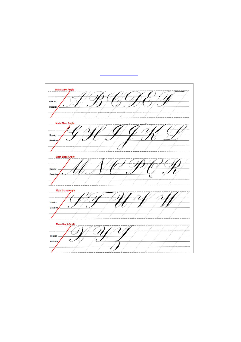
I highly recommend that you practice using a grid designed for this style of script. Line
spacing should be between 3/8" and 1/2" with regularly spaced slant angles of between
52-55 degrees. The sample of my script shown in Figure 3 illustrate s how these line s are used. The lowercase lette r height (Figure 3A) i
s defined by the header and base lines that
are bordered by two ascender space s and two descender spaces a s indicated in the figure.
As a general rule, capital let ers t l ke i
'B' are approximately three times the lowercase letter
height; however, the capital ‘J’ extends al ost five full spaces (Figure 3B m ). 18" "
Figure 3. The proper use of guidelines for script.
Video Link: http://youtu.be/eL_B5diIVA4
For those with web access ,guidelines are availabl
e free for downloading on zanerian.com
that can be printed directly onto your practice paper or used under a lightweight paper (24
lb. or less). For the novice, they provide a sense of the letter proportions neede d for fin e script w ork.
Figure 4. Script in the Copperplate style with offhand flourishing penned by the author. " 19" "
Chapter 3: The Oblique Penholder
Video Link: http://youtu.be/6khmcrekXDo Writing scr pt
i in the Copperplate style usin g a flexible point d e can be a daunting task. One
of the reasons for this difficulty i
s using an oddly shaped pen staff known a s the oblique
penholder (Figure 1A, pen made by Michael Sull). For the novice this 'tool' can seem a s
mystical as a wizard's staff. In fact, the oblique penholder aided the development of the
modern day Copperplate styles of script. Unfortunately, a poor quality or improperly adjusted oblique penholde r ha s caused man y a calligrapher t o giv e u p on the pointed pe n style or great y
l limited their progress. In this chapte r I wil l ‘tr ’ y to demystify the obliqu e penholder an d explai n wh y it i
s so successfully used for script writing.
Let us first examine what happens when pressure is applied to a flexible steel e p n (nib). It
should be noted that al lshades are formed using down strokes of the pen. As your hand
exerts downward pressure on a flexible nib such as the Gillott 303, both the left and right
nib tines will spread apart l ying a down more ink to creat
e a shade (Figures 1B, 1C). I will
refer to the width of a shade a
s heft. Increase or decrease the pressure and you increase or
decrease the heft of the shade accordingly. Figure 1
In addition, the overall slant angle of the let e
t rs can vary from ~45˚-55˚ or more dependin g upon th e styl
e of script and personal preference. Th e tw o factors, shading and slant angle,
combine to give rise to problems whe n a right-handed calligraphe r attempt s to write shaded script using a flexible ni b an a d straigh tpe n staff . 20" " Walt Disney once said, " very E
line has two edges." This sta ement t i s especially important when
considering a shaded line of significant heft. When a right-handed calligrapher uses a straight penholder and att mpts e
to write script a tthe angles mentioned above a curious thing happens.
As the nib tines spread and the pen moves across the paper, the right nib tine will t nd e to drag
across the paper leaving a ragged edg e o n th e right sid e o f th e shad e (Figure 1B). This happens
because the long axis of the nib i far s
off the main slant angl of the shaded stroke. e
It should be noted that this 'ragged edge' is not necessarily a negative since France's Jean Larcher uses this ragge
d edge to grea t effect in his wonderful script. Many left-handed
calligraphers do not face this issue when using a straight penholder since their pen position
usually, but not always, accommodates the slant angle. However, it i s worth noting that most
'lefties' that I know who are very proficient in script use an oblique penholder, including
master penman John DeCollibus of Southboro, MA.
In order to get both nib tines to move smoothly over the length of the shade, the long axis of the
nib should be on or very close to the main slant angle of the shade (Figure 1C). There are a
few ways to accomplish this. One way to properly align the nib tines would be to use a straight
penholder and modify your hand and/or the paper position to facilitate making a smooth shade.
I do not recommend this approach since this will place your hand in a very awkward writing position.
A better approach is to mechanically angle the nib relative to the pen staff. Thi s coul d be
accomplished in one of two ways. First, nib manufacturers such a s Gillott produced a flexible
steel nib with an elbow bend for use in a straight penholder (Figure 1D). Thes e 'Elbow' nibs
have been used effectively by many calligraphers. However, they do not allow adjustment of the
pen angle relative to the pen staff to accommodate an individual's personal writing style.
The solution, and the approach embraced by past masters of the pointed pen, was to modify the pen staf
f itself with an obliquely positioned flange (Figures 1A and 1C). The flange usually
made of metal, positions the entire nib a ta n offse tan l
g e relative to the long axis of the pen staff. This el minated i the dragging o f the righ t nib tine acros s th
e paper. Smooth edged shades were
now possible since the nib is o n or closel
y approaching the slant of the shaded stroke (Figure
1C). The earliest patent I have seen on thi
s important tool was from England by Morden and Brockedon in 1831 (Sull).
The placement of the nib in the flange is also important. The nib should be inserted into the
flange so that the very tip of the nib is in line with the long axis of the staff of the pen as show n by th e dotted lin e i n Figure 1E. While so e
m pen artists may prefer slight variations, a nib that a h s its tip e position d too a
f r off the indicated dotted line in Figure 1E will feel unbalanced when writing.
The following pen holder adjustments that I will discuss here are ac ommodations c to the
modern day pen grip. The penmen/calligraphers of the golden age of American ornamental
penmanship were taught to hold their pens in a different fashion. However, that subject is
beyond the scope of this book.
Tài liệu liên quan:
-
Thực trạng và giải pháp mở rộng hoạt động cho vay cá nhân tại Vietcombank Tân Bình
36 18 -
Đề tài: “Lập kế hoạch marketing cho dự án Asian Lake View” - Tài liệu tham khảo | Đại học Hoa Sen
273 137 -
2 Achoo Baocao Damkt 2131MK ECON847 - Tài liệu tham khảo | Đại học Hoa Sen
261 131 -
Tìm hiểu về cấu trúc email - Tài liệu tham khảo | Đại học Hoa Sen
326 163 -

Bài tập ôn tập thi lần 3 năm 2022 p2 - Tài liệu tham khảo | Đại học Hoa Sen
281 141