

Preview text:
Art Fundamentals Chapter 01: Composition Art Fundamentals Article: Chapter 01 - Composition Software used: Photoshop
Composition is the first word on the best
artists’ lips when they start an image. But
what is composition? It’s basically the layout
of elements and a visual vocabulary that
leads your eyes around an image and makes
it interesting. It’s the first crucial step in
making your image interesting from the get
go. No detail, fancy colors, lighting or action
will substitute composition. Even though
composition theory has rules that have been
used for hundreds of years, you can always
find new and interesting ways to apply them to
your compositions. Try to think outside of the
box. I’m going to take you through a quick guide
into composition and see where it leads us, and
what we discover along the way.
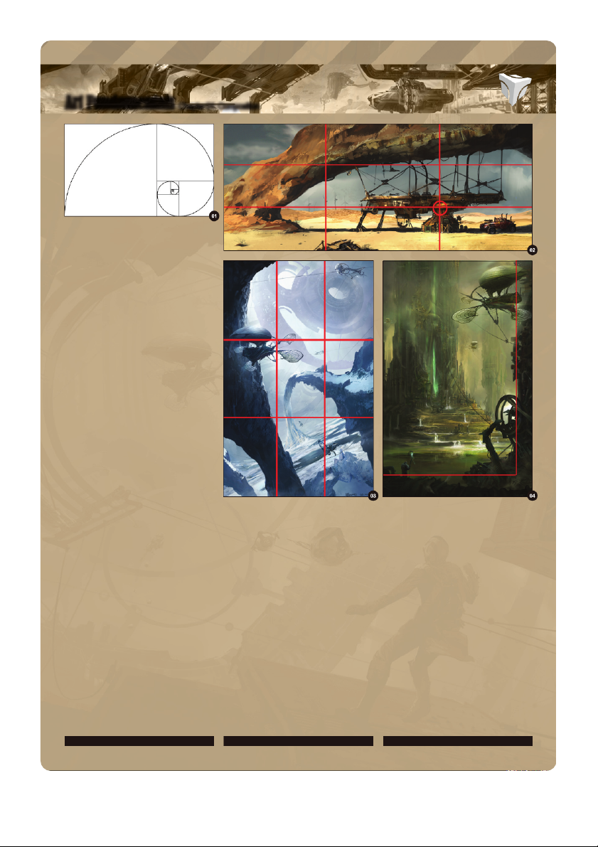
The Ancient Greeks used the golden rectangle
You can see the main focal point is the building
stand out even though they may not be near a
that had divine proportions .The golden
(A). Then I added secondary focus points power point.
rectangle is a rectangle that has sides which
near the converging lines: the windmill farm
are approximately at a ratio of 1:1.618. By using
in the far background (D) and the actual rock
Contrast can be achieved in many ways. The
these proportions you get a very balanced and
structure, which has a great deal of importance
easiest is light and dark, followed by material
pleasing composition, with a strong focal point.
in the concept and which runs along two other
contrast, contrast of hue or saturation, tension or
The divine proportions appear in many life intersections (B and C).
balance and contrast of shapes, round or square
forms, including humans (Fig.01).
etc. In Fig.03 I kept the ship and huge structure
If you have a vertical frame, the rule of thirds
close to the power points because, from a story
Derived from the golden rectangle is the Rule of
can also be applied. In the image “Queen of
standpoint, it was very important to show the
Thirds, which was adapted to cope with a wider
Candasce” I placed the flying ship very close to
direct connection between them. Then for the
range of aspect ratios. By dividing you frame the converging line (Fig.03).
lower power points I left the environment where
into three equal parts from each side you create the action takes place.
four power points where the lines intersect each
Your main focal point should not always be
other (Fig.02). For example, the image “Under A
on the intersection of the power lines. When
Another easy trick I used in this image, which
Rock” uses the principles of the rule of thirds, by
considering your composition remember that
can be used for any aspect ratio, is provide
having the converging lines create focal points.
contrast is important. It helps you to make areas
a big foreground. Because we are used to www.3dtotal.com page 5 Chapter 01
Chapter 01: Composition Art Fundamentals
reading from left to right, this pulls the viewer in
and leads the eye more easily into the image
providing a grounding point for the whole frame.
This leads to another simple composition trick,
which can result in very beautiful images and
that is very commonly used on book covers
(Fig.04). It’s based on having a frame for your
image - in this case a big L - that leaves the
rest of the image in focus and easy to see. It’s
a great and easy way to make things stand out
and can help give monumentality to your image.
When using this rule, make sure you don’t fall
into a trap and follow it exactly. This can make
your images boring and dull. Keep to the grid at
first, but get rid of it as soon as possible so you
don’t start to repeat a few generic compositions.
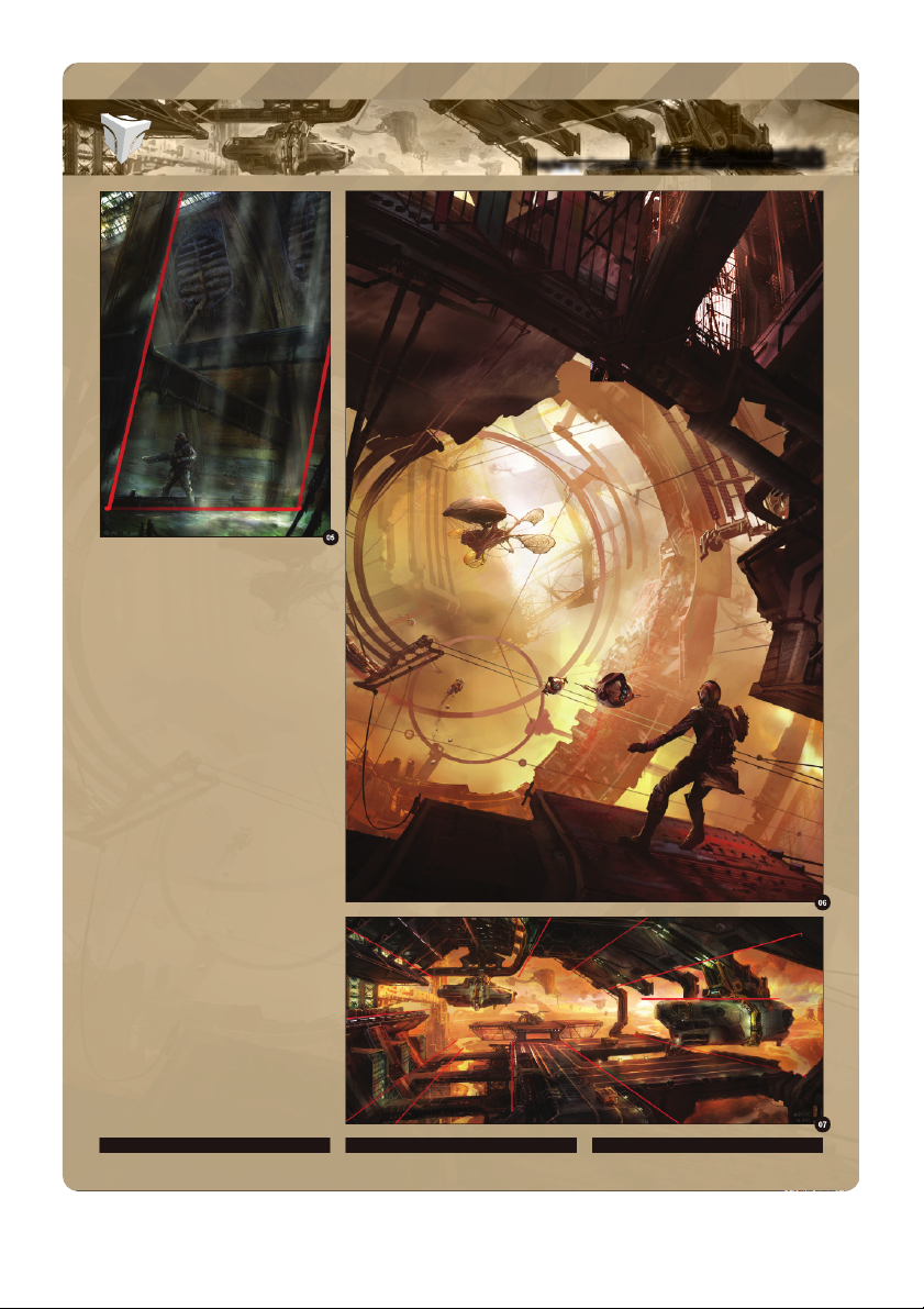
In composition even a small change can have
a great effect on the final image. Changes
such as tilting your horizon line are a great way
of making your image look more dynamic. In
Fig.05 – 06 the story was all about suspense,
thrills and action. So tilting the horizon made
all the difference; it adds more narrative to the
image and depicts drama and action, which gets
different reactions from the viewer. www.3dtotal.com page 6 Chapter 01
Art Fundamentals Chapter 01: Composition
Simple compositions can sometimes be the
most effective. Sometimes less is more (Fig.07).
For example you can use your perspective to
lead the viewer into the picture and directly to
your focal point. Now the power lines are your
perspective lines. Use whatever objects you
have in your scene to point at the focal point.
You can also use a technique used in films,
paintings and photography vignetting, which is
basically darkening the edges and corners of
your image so that the eye doesn’t escape. It’s
very effective when dealing with quick sketches among other things.
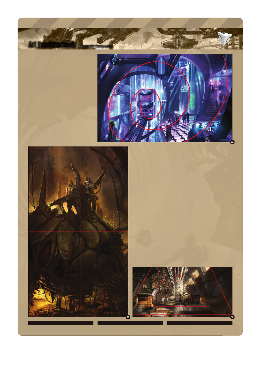
Another quick and effective composition
technique is basically having your image layout
follow certain shapes, like a circle, cross, square, triangle, oval etc. By
repeating those shapes to create a rhythm and a hierarchy in your image,
it holds your eye inside those shapes and leads it more directly to a payoff spot.
In Fig.08 I used ovals to create a spiraling effect leading to the train, which
is the focal point of the image, but I made sure I included the train stop as
well. It made the image more dynamic and gave a sense of movement to the train.
For Fig.09 I used a composition technique that is very common in the
work of Frank Frazetta and that is basically a cross, with the hero on top of
a pile. Placing the camera so it is looking up at the victorious heroes helps
to convey the story better. Even though the composition might seem split
by the wreckage between them, it’s because this was part of the story - to show tension between them.
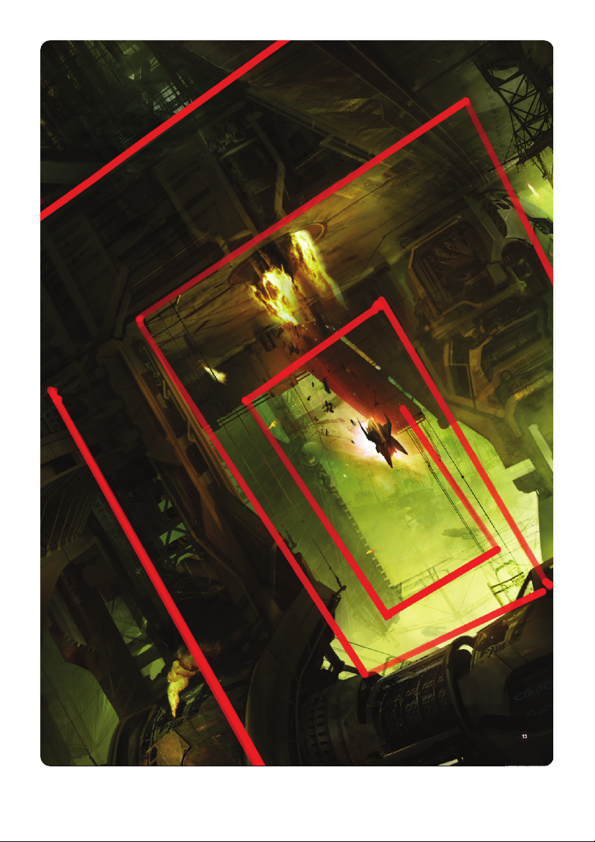
This was actually a tutorial for 2DArtist, using a 3D base to paint
over. Here I used a combination of the implied shapes, triangles and
perspective. They keep the eye flowing along their edges very nicely until
the payoff spot at the end of the hangar (Fig.10). www.3dtotal.com page 7 Chapter 01
Chapter 01: Composition Art Fundamentals
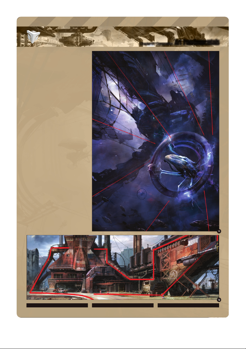
This image uses radial power lines converging
to one point, which makes the image menacing
and intimidating (Fig.1 ). For storytelling 1
purposes I brought in a circle shape, which
becomes the second read and contrasts
the hard edges of the huge structure in the background.
These are a few of the rules of composition.
Don’t be afraid to change them. For me,
composition is something very organic and
with practice it becomes more intuitive. As a
self-taught artist I use my intuition and natural
observations, and bring them into my work. I
start my images with basic principles like having
my image framed, having objects point at my
focal point and using contrast for the payoffs,
and along the way I gather a few more tricks
and methods that make me want to explore
composition beyond the usual rules. I’m not a
good rule follower so, at the moment, I’m trying
to give my compositions a continuous flow, and
lead the eye throughout the image, in a guided
tour if you wish, to discover light, color, details,
action and loads of personal elements that I put
into my images (Fig.12 – 13).
I hope you have enjoyed reading this. Ioan Dumitrescu
For more information please visit:
http://jonone.cgsociety.org/gallery/ Or contact them at: jononespo@yahoo.com www.3dtotal.com page 8 Chapter 01
