HarmonyHub Overview: Digital Innovation & Design Elements Guide môn Marketing căn bản | Trường đại học Mở Hà Nội
Short Description: HarmonyHub is a digital platform designed tobring a seamless and harmonious experience to users. Whether it's managing tasks, connecting with others, or exploring new possibilities, HarmonyHub strives to simplify and elevate the digital experience.Tài liệu giúp bạn tham khảo ôn tập và đạt kết quả cao. Mời bạn đọc đón xem!
Môn: Marketing căn bản (MCB1) 145 tài liệu
Trường: Viện Đại học Mở Hà Nội 1.7 K tài liệu
Tác giả:
Preview text:
lOMoAR cPSD| 47708777
Page 1: Product Overview
HarmonyHub: Rede 昀椀 ning Digital Harmony
Short Description: HarmonyHub is a digital platform designed to bring a seamless
and harmonious experience to users. Whether it's managing tasks, connecting with
others, or exploring new possibilities, HarmonyHub strives to simplify and elevate the digital experience.
Tagline: "Where Harmony Meets Technology."
Main Activity/Function: HarmonyHub serves as a multifunctional hub, facilitating
tasks such as task management, social connectivity, and exploration of curated
content. The aim is to create a uni 昀椀 ed and visually pleasing user experience. Page 2: Mood Board
[ Include the mood board created in Week 2]
Page 3: Pattern Library
Buttons with Text Label (Four States): 1. Default State: •
Rounded coral button with gold text. • Text color: Gold. • Background color: Coral. lOMoAR cPSD| 47708777 2. Hover State: •
Slight increase in button size and a subtle shadow. • Text color changes to white. •
Background color intensi 昀椀 es slightly.
3. Active/Clicked State: • Retains hover state changes. •
Button appears pressed with a darker shadow. Gives a tactile feel. 4. Disabled State: •
Grayed-out button with reduced opacity. •
No hover or click interactions. • Conveys a disabled state. Image-Based Icons: 1. Heart Icon: •
Soft pastel pink heart with rounded edges. Represents liking or favoriting. 2. Explore Icon: •
Telescope icon with a gradient from mint green to sky blue. •
Represents exploration or discovery.
3. Noti 昀椀 cation Icon: •
Bell icon in rose gold with a subtle glow. Indicates new noti 昀椀 cations. 4. Settings Icon: •
Gear icon in a soft gray with gold accents. •
Represents settings or con 昀椀 gurations.
Other Design Patterns/Interface Elements: 5. Navigation Buttons: •
Transparent background with a gradient. •
Soft pastel color icons for navigation. Dynamic transition between buttons. 6. Slider: •
Horizontal slider with a mint green track. •
Circular thumb in coral for interaction. Smooth transition and feedback.
7. Con 昀椀 rmation Dialog: lOMoAR cPSD| 47708777 •
Modal window with a semi-transparent background. •
Con 昀椀 rmation text in gold with coral buttons. Cancel button in gray for consistency. 8. Toggle Switch: • Rounded switch in mint green. • Soft animation when toggling. •
Visual indication of on/o 昀昀 state.
This pattern library is designed to maintain consistency across various interface
elements, ensuring a visually cohesive and userfriendly experience within the HarmonyHub digital platform.
Tài liệu liên quan:
-
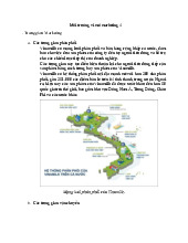
Chương 3 Môi trường Marketing môn Marketing căn bản | Trường đại học Mở Hà Nội
219 110 -
Tìm hiểu về Môi trường Vi mô Marketing & Phân phối của Vinamilk môn Marketing căn bản | Trường đại học Mở Hà Nội
197 99 -
Ngân hàng câu hỏi ôn thi môn Marketing căn bản | Trường đại học Mở Hà Nội
229 115 -
Marketing Định Hướng Bán Hàng: Chiến Lược Để Thuyết Phục Khách Hàng môn Marketing căn bản | Trường đại học Mở Hà Nội
172 86 -
Viral Marketing - MKTCB: Chiến Lược và Đặc Điểm Thực Hiện môn Marketing căn bản | Trường đại học Mở Hà Nội
167 84