Tài liệu ôn tập Quản trị kinh doanh | Trường Đại học Kinh tế, Đại học Huế
Tài liệu ôn tập Quản trị kinh doanh | Trường Đại học Kinh tế, Đại học Huế được sưu tầm và soạn thảo dưới dạng file PDF để gửi tới các bạn sinh viên cùng tham khảo, ôn tập đầy đủ kiến thức, chuẩn bị cho các buổi học thật tốt. Mời bạn đọc đón xem!
Môn: Quản trị kinh doanh (B00A01) 40 tài liệu
Trường: Trường Đại học Kinh tế, Đại học Huế 145 tài liệu
Tác giả:


Preview text:
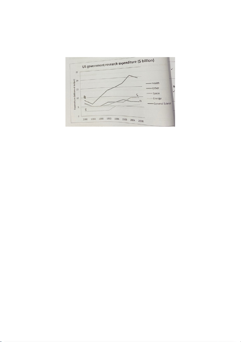
1. The graph below gives information about U.S. government spending on
research between 1980 and 2008
The line chart illustrates the amount of the US government expenditure on research in
four categories from 1980 to 2008.
Overall, it is clear that the US government spent the largest amount of money on
research into Genneral Science while the least amount of money was spent on researching Energy.
Starting at 8 billions of dollar in 1980, the government spending on General Science,
was the highest point at 8 billion of dollars, witnessed a signifiant fall to 6 billion of
dollar in 1984 before growing dramatically and reaching a peak to about 21 billion of
dollars in the next 20 years, however, the figure dropped agian to 19 billion of dollars
in the last year examined. In contrast, during a 12-year period from 1980, the figure
for Renewable remained unchanged at 2.5 billion before being double more than in
1996, and then rose gradually to roughly 6 billion in the end period.
Looking at two industries remain, starting at about 6 billion, after fluctuating
significantly in the spending of Space an the Other in the next 24 years, the figure of
Space stayed unchanged at about 9 billion from 2004 till the end. While the
expenditure on the Other has similar trend in the first 24 years, the figure fell slightly to 6 billion.
From 1980 to 2008, the line chart depicts the amount of money spent by the US
government on research in four areas.
Overall, it is obvious that the US government spent the most money on research
into General Science and the least money on research into Energy.
Starting at 8 billions of dollars in 1980, government spending on General Science
saw a significant drop to 6 billions of dollars in 1984 before growing dramatically
and reaching a peak of about 21 billions of dollars in the next 20 years, before
dropping again to 19 billions of dollars in the last year examined. In comparison,
throughout a 12-year period beginning in 1980, the figure for Renewable stayed
constant at 2.5 billion until increasing to treble what it was in 1996, and then
gradually rising to over 6 billion at the end.
Looking at two remaining industries, starting at about 6 billion, after shifting
greatly in the spending of one and the other over the following 24 years, the
figure of Space remained constant at around 9 billion from 2004 until the end.
While spending on Other followed a similar pattern in the first 24 years, the total
declined somewhat to $6 billion.
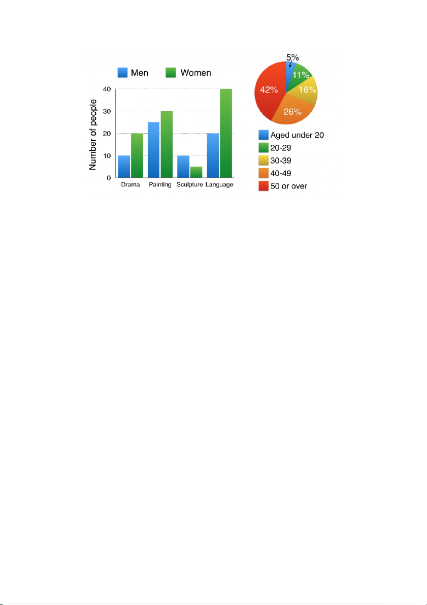
2. The bar chart below shows the numbers of men and women attending various
evening courses at an adult education centre in the year 2009.
The bar chart depicts the number of male and female students joining to four different
evening classes at an adult school center in 2009, while the pie chart illustrates the ages of these participants.
Overall, it is clear that women experienced the highest participations while the ages
from 50 or over was the most occupied.
As you can be seen from the chart, the number of female learners took part in the
drama and the language courses (20 and 40, respectively) was double more than the
male figure. By contrast, the Scuplture was the only class that the number of men
students was higher than that women figures, which was a hatf of 10 the guys. The
painting course witness the highest male figure at 35, which was less than by 5 their counterparts.
Looking at the pie chart, the total learners from 40 or over was 68%, which was
occupied more than a hatf, meaning from the middle-age people tended to join
evening classes. To specific, the age group from 40 to 49 at 26 % was 10% more than
the 30 to 39 age group, and was more than 21% the aged under 20. While the figure
for 50 or over was roughly 4 times more than the 20 to 29 age group.
XEM LẠI PHẦN MỞ BÀI VA OVERALL VIẾT NHƯ SHIT ^^^^
The bar chart shows the number of male and female students who enrolled in
four different evening sessions at an adult education facility in 2009, while the pie
chart shows the figure for the participant aged categories.
Overall, women had the greatest involvement rates, while people aged 50 and up
were dominant percentages of the learners.
As seen in the graph, the number of female students enrolled in drama and
language courses (20 and 40, respectively) was double that of male students. In
contrast, Scuplture was the only class where the number of male students
outnumbered the number of female students by a factor of ten. The highest male
figure in the painting course was 35, which was 5 less than their counterparts.
According to the pie chart, the total number of learners aged 40 and more was
68%, which was filled by more than a hatf, indicating that individuals in middle
age and older tended to attend evening sessions.
To be more exact, the age group of 40 to 49 was 26%, which was 10% more than
the 30 to 39 age group and 21% more than the under-20 age group. While the
ratio for those aged 50 and over was about four times that of those aged 20 to 29.
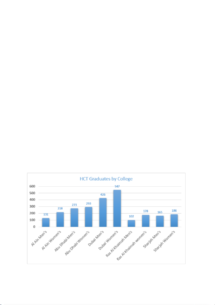
3. The chart below shows the Higher Colleges of Technology graduates in the UAE
The bar chart depicts the number of male and female students graduating from Higher
Colleges of Technology in five different locations of the UAE.
Overall, it is obvious that female students completed their graduation courses more
than male students; the largest disparity was the number of students graduating in Dubai.
The most outstanding feature of the graph is female graduates outnumber male
graduates in all the colleges. To specific, the largest number of graduates in Dubai
were 426 males and 547 females. The figure was roughly four times that of male
students in Al Ain and Ras Al Khaimah, and approximately three times that of female
students in Al Ain and Ras Al Khaimah, respectively.
Looking at the figure more closely, it appeared that the second and third most popular
cities among females were Abu Dhabi (293 and 186, respectively), which had around
20 more individuals than the guys.
The bar chart illustrates the number of male and female students who graduated
from Higher Colleges of Technology in five distinct UAE locations.
Overall, female students graduated at a higher rate than male students; the
biggest differential was the number of students graduating in Dubai.
The graph's most striking aspect is that female grads exceed male graduates
across all colleges. In Dubai, the highest number of graduates were 426 males
and 547 girls. The figure was almost four times that of male students in Al Ain
and Ras Al Khaimah, respectively, and roughly three times that of female
students in Al Ain and Ras Al Khaimah.
When the data was examined more extensively, it was discovered that the second
and third most popular cities among females were Abu Dhabi (293 and 186,
respectively), which had around 20 more people than the men.
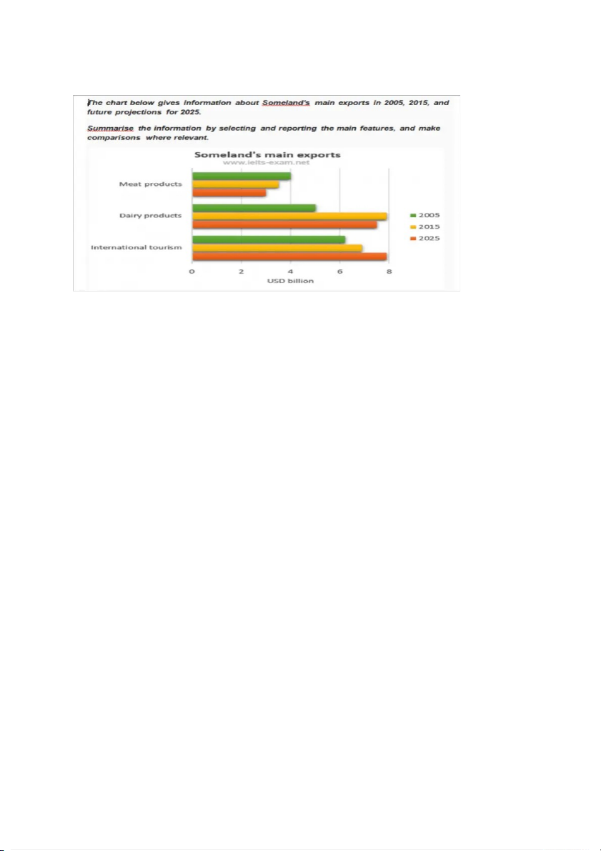
4. Someland’s main exports in 2005, 2015, and future projections for 2025
The bar chart displays Someland's revenue from three key characteristics in 2005,
2015, and future forecasts for 2025.
Overall, dairy goods and overseas tourists generated far more money than meat items.
As can be seen from the graph, none of the previous two years' meat products were
greater than 4 billion, whereas two categories remained twice that level. Standing at 4
billion in 2005, meat products fell significantly to 3.7 million USD, whereas dairy
products increased significantly, reaching a peak of almost 8 billion in 2015. On the
contrary, foreign tourism climbed steadily from 6 billion in 2005 to around 1 million in 2015.
Figures for meat and dairy products will be somewhat lower in 2025, at 3 billion and
7.5 billion, respectively. While foreign tourist income is predicted to expand
significantly and peak at $8 billion, making it the most prominent characteristic exported in Someland.
The bar chart depicts Someland's revenue in 2005, 2015, and projected
predictions for 2025 based on three main variables.
Overall, dairy products and foreign tourists earned significantly more money than meat products.
As seen in the graph, none of the preceding two years' meat products exceeded 4
billion, while two categories remained double that size. Meat goods declined
dramatically from 4 billion USD in 2005 to 3.7 million USD in 2015, but dairy
products climbed greatly, reaching a peak of over 8 billion USD in 2015. Foreign
tourism, on the other hand, has consistently increased from 6 billion in 2005 to
about 1 million in 2015.
Meat and dairy product figures will be somewhat lower in 2025, at 3 billion and
7.5 billion, respectively. While international tourist income is expected to grow
greatly and peak at $8 billion, it is the most notable feature exported from Someland.
Tài liệu liên quan:
-
Đàm phán trong kinh doanh - Quản trị kinh doanh | Trường Đại học Kinh tế, Đại học Huế
613 307 -

Đề cương ôn tập - Quản trị kinh doanh | Trường Đại học Kinh tế, Đại học Huế
860 430 -

Lộ trình chung của content Marketing - Quản trị kinh doanh | Trường Đại học Kinh tế, Đại học Huế
233 117 -
Mô hình Aisas quản trị chiến lược - Quản trị kinh doanh | Trường Đại học Kinh tế, Đại học Huế
301 151 -

Đề cương khởi sự doanh nghiệp - Quản trị kinh doanh | Trường Đại học Kinh tế, Đại học Huế
1.3 K 669