Chapter 15 - Poverty and Economic Inequality Analysis | Microeconomics | Trường Đại học Quốc tế, Đại học Quốc gia Thành phố Hồ Chí Minh
In September 2011, a group of protesters gathered in Zuccotti Park in New York City to decry what they perceived as increasing social and economic inequality in the United States. Calling their protest “Occupy Wall Street,” they argued that the concentration of wealth among the richest 1% in the United States was both economically unsustainable and inequitable, and needed to be changed. The protest then spread to other major cities, and the Occupy movement was born. Tài liệu được sưu tầm và soạn thảo dưới dạng file PDF để gửi tới các bạn cùng tham khảo, ôn tập đầy đủ kiến thức, chuẩn bị cho các buổi học thật tốt. Mời bạn đọc đón xem!
Môn: Microeconomics 483 tài liệu
Trường: Trường Đại học Quốc tế, Đại học Quốc gia Thành phố Hồ Chí Minh 1.8 K tài liệu
Tác giả:


Preview text:
Poverty and Economic Inequality 15
FIGURE 15.1 Occupying Wall Street On September 17, 2011, Occupy Wall Street began in New York City’s Wall
Street financial district. (Credit: modification of “Occupy Wall Street Day 2 2011 Shankbone” by David Shankbone/
Flickr Creative Commons, CC BY 2.0) CHAPTER OBJECTIVES
In this chapter, you will learn about: • Drawing the Poverty Line • The Poverty Trap • The Safety Net
• Income Inequality: Measurement and Causes
• Government Policies to Reduce Income Inequality
Introduction to Poverty and Economic Inequality BRING IT HOME Occupy Wall Street
In September 2011, a group of protesters gathered in Zuccotti Park in New York City to decry what they perceived
as increasing social and economic inequality in the United States. Calling their protest “Occupy Wall Street,” they
argued that the concentration of wealth among the richest 1% in the United States was both economically
unsustainable and inequitable, and needed to be changed. The protest then spread to other major cities, and the Occupy movement was born.
Why were people so upset? How much wealth is concentrated among the top 1% in our society? How did they
acquire so much wealth? These are very real, very important questions in the United States now, and this chapter on
poverty and economic inequality will help us address the causes behind this sentiment. 360
15 • Poverty and Economic Inequality
The labor markets that determine the pay that workers receive do not take into account how much income a
family needs for food, shelter, clothing, and health care. Market forces do not worry about what happens to
families when a major local employer goes out of business. Market forces do not take time to contemplate
whether those who are earning higher incomes should pay an even higher share of taxes.
However, labor markets do create considerable income inequalities. In 2020, the median American household
income was $67,521 (the median is the level where half of all families had more than that level and half had
less). For family households, the median was $86,372; for non-family households, it was $40,464. The Census
Bureau also reported that in 2020, there were 37.2 million people living in poverty, representing 11.4% of the
population. Think about a family of three—perhaps a single mother with two children—attempting to pay for
the basics of life on perhaps $17,916 per year. After paying for rent, healthcare, clothing, and transportation,
such a family might have $6,000 to spend on food. Spread over 365 days, the food budget for the entire family
would be about $17 per day. To put this in perspective, most cities have restaurants where $17 will buy you an appetizer for one.
This chapter explores how the U.S. government defines poverty, the balance between assisting the poor
without discouraging work, and how federal antipoverty programs work. It also discusses income
inequality—how economists measure inequality, why inequality has changed in recent decades, the range of
possible government policies to reduce inequality, and the danger of a tradeoff that too great a reduction in
inequality may reduce incentives for producing output.
15.1 Drawing the Poverty Line LEARNING OBJECTIVES
By the end of this section, you will be able to:
• Explain economic inequality and how the poverty line is determined
• Analyze the U.S. poverty rate over time, noting its prevalence among different groups of citizens
Comparisons of high and low incomes raise two different issues: economic inequality and . poverty Poverty is
measured by the number of people who fall below a certain level of income—called the poverty line—that
defines the income one needs for a basic standard of living. Income inequality compares the share of the total
income (or wealth) in society that different groups receive. For example, one of numerous ways to look at
income inequality is to compare the share of income that the top 10% receive to the share of income that the bottom 10% receive.
In the United States, the official definition of the poverty line traces back to a single person: Mollie Orshansky.
In 1963, Orshansky, who was working for the Social Security Administration, published an article called
“Children of the Poor” in a highly useful and dry-as-dust publication called the Social Security Bulletin .
Orshansky’s idea was to define a poverty line based on the cost of a healthy diet.
Her previous job had been at the U.S. Department of Agriculture, where she had worked in an agency called the
Bureau of Home Economics and Human Nutrition. One task of this bureau had been to calculate how much it
would cost to feed a nutritionally adequate diet to a family. Orshansky found that the average family spent one-
third of its income on food. She then proposed that the poverty line be the amount one requires to buy a
nutritionally adequate diet, given the size of the family, multiplied by three.
The current U.S. poverty line is essentially the same as the Orshansky poverty line, although the government
adjusts the dollar amounts to represent the same buying power over time. The U.S. poverty line in 2021 ranged
from $12,880 for a single individual to $26,500 for a household of four people.
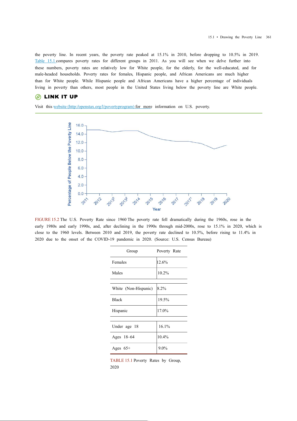
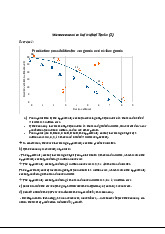
Figure 15.2 shows the U.S. poverty rate over time; that is, the percentage of the population below the poverty
line in any given year. The poverty rate declined through the 1960s, rose in the early 1980s and early 1990s,
but seems to have been slightly lower since the mid-1990s. However, in no year in the last six decades has the
poverty rate been less than 10.5% of the U.S. population—that is, at best almost one American in nine is below
Access for free at openstax.org
15.1 • Drawing the Poverty Line 361
the poverty line. In recent years, the poverty rate peaked at 15.1% in 2010, before dropping to 10.5% in 2019.
Table 15.1 compares poverty rates for different groups in 2011. As you will see when we delve further into
these numbers, poverty rates are relatively low for White people, for the elderly, for the well-educated, and for
male-headed households. Poverty rates for females, Hispanic people, and African Americans are much higher
than for White people. While Hispanic people and African Americans have a higher percentage of individuals
living in poverty than others, most people in the United States living below the poverty line are White people. LINK IT UP
Visit this website (http://openstax.org/l/povertyprogram) for more information on U.S. poverty.
FIGURE 15.2 The U.S. Poverty Rate since 1960 The poverty rate fell dramatically during the 1960s, rose in the
early 1980s and early 1990s, and, after declining in the 1990s through mid-2000s, rose to 15.1% in 2020, which is
close to the 1960 levels. Between 2010 and 2019, the poverty rate declined to 10.5%, before rising to 11.4% in
2020 due to the onset of the COVID-19 pandemic in 2020. (Source: U.S. Census Bureau) Group Poverty Rate Females 12.6% Males 10.2% White (Non-Hispanic) 8.2% Black 19.5% Hispanic 17.0% Under age 18 16.1% Ages 18–64 10.4% Ages 65+ 9.0%
TABLE 15.1 Poverty Rates by Group, 2020 362
15 • Poverty and Economic Inequality
The concept of a poverty line raises many tricky questions. In a vast country like the United States, should
there be a national poverty line? After all, according to the Federal Register, the median household income for
a family of four was $109,113 in New Jersey and $59,701 in Mississippi in 2017, and prices of some basic
goods like housing are quite different between states. The poverty line is based on cash income, which means
it does not account for government programs that provide non-cash assistance such as Medicaid (health care
for low-income individuals and families) and food aid. Also, low-income families can qualify for federal
housing assistance. (We will discuss these and other government aid programs in detail later in this chapter.)
Should the government adjust the poverty line to account for the value of such programs? Many economists
and policymakers wonder whether we should rethink the concept of what poverty means in the twenty-first
century. The following Clear It Up feature explains the poverty lines set by the World Bank for low-income countries around the world. CLEAR IT UP
How do economists measure poverty in low-income countries?
The World Bank sets two poverty lines for low-income countries around the world. One poverty line is set at an
income of $1.90/day per person. The other is at $3.20/day. By comparison, the U.S. 2015 poverty line of $20,090
annually for a family of three works out to $18.35 per person per day.
Clearly, many people around the world are far poorer than Americans, as Table 15.2 shows. China and India both
have more than a billion people; Nigeria is the most populous country in Africa; and Egypt is the most populous
country in the Middle East. In all four of those countries, in the mid-2000s, a substantial share of the population
subsisted on less than $2/day. About half the world lives on less than $2.50 a day, and 80 percent of the world lives
on less than $10 per day. (Of course, the cost of food, clothing, and shelter in those countries can be very different
from those costs in the United States, so the $2 and $2.50 figures may mean greater purchasing power than they would in the United States.)
Percentage of Population with Income Less
Percentage of Population with Income Less Country Year Than $1.90/Day/Person Than $3.20/Day/Person Brazil 2019 4.6% 9.1% China 2017 0.5% 5.4% Egypt 2017 3.8% 28.9% India 2011 22.5% 61.7% Mexico 2018 1.7% 6.5% Nigeria 2018 39.1% 71.0%
TABLE 15.2 Poverty Lines for Low-Income Countries, mid-2000s (Source: https://datatopics.worldbank.org/world-
development-indicators/themes/poverty-and-inequality.html)
Any poverty line will be somewhat arbitrary, and it is useful to have a poverty line whose basic definition does
not change much over time. If Congress voted every few years to redefine poverty, then it would be difficult to
compare rates over time. After all, would a lower poverty rate change the definition, or is it the case that people
were actually better off? Government statisticians at the U.S. Census Bureau have ongoing research programs
to address questions like these.
Access for free at openstax.org
15.2 • The Poverty Trap 363
15.2 The Poverty Trap LEARNING OBJECTIVES
By the end of this section, you will be able to:
• Explain the poverty trap, noting how government programs impact it
• Identify potential issues in government programs that seek to reduce poverty
• Calculate a budget constraint line that represents the poverty trap
Can you give people too much help, or the wrong kind of help? When people are provided with food, shelter,
healthcare, income, and other necessities, assistance may reduce their incentive to work, particularly if their
work is likely to offer low wages and reduce government assistance. Consider a program to fight poverty that
works in this reasonable-sounding manner: the government provides assistance to the those who need it, but
as the recipients earn income to support themselves, the government reduces the level of assistance it
provides. With such a program, every time a person earns $100, they lose $100 in government support. As a
result, the person experiences no net gain for working. Economists call this problem the poverty trap.
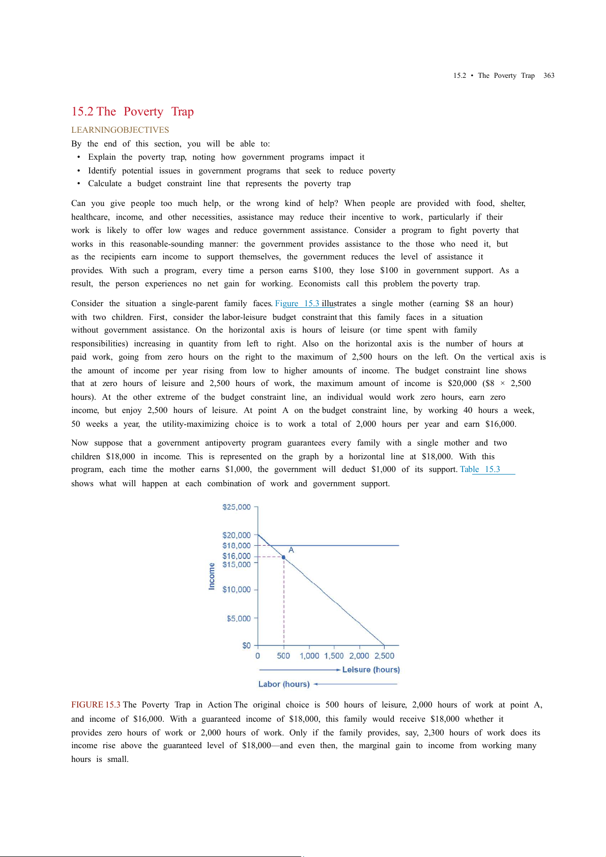
Consider the situation a single-parent family faces. Figure 15.3 illustrates a single mother (earning $8 an hour)
with two children. First, consider the labor-leisure budget constraint that this family faces in a situation
without government assistance. On the horizontal axis is hours of leisure (or time spent with family
responsibilities) increasing in quantity from left to right. Also on the horizontal axis is the number of hours at
paid work, going from zero hours on the right to the maximum of 2,500 hours on the left. On the vertical axis is
the amount of income per year rising from low to higher amounts of income. The budget constraint line shows
that at zero hours of leisure and 2,500 hours of work, the maximum amount of income is $20,000 ($8 × 2,500
hours). At the other extreme of the budget constraint line, an individual would work zero hours, earn zero
income, but enjoy 2,500 hours of leisure. At point A on the budget constraint line, by working 40 hours a week,
50 weeks a year, the utility-maximizing choice is to work a total of 2,000 hours per year and earn $16,000.
Now suppose that a government antipoverty program guarantees every family with a single mother and two
children $18,000 in income. This is represented on the graph by a horizontal line at $18,000. With this
program, each time the mother earns $1,000, the government will deduct $1,000 of its support. Table 15.3
shows what will happen at each combination of work and government support.
FIGURE 15.3 The Poverty Trap in Action The original choice is 500 hours of leisure, 2,000 hours of work at point A,
and income of $16,000. With a guaranteed income of $18,000, this family would receive $18,000 whether it
provides zero hours of work or 2,000 hours of work. Only if the family provides, say, 2,300 hours of work does its
income rise above the guaranteed level of $18,000—and even then, the marginal gain to income from working many hours is small. 364
15 • Poverty and Economic Inequality
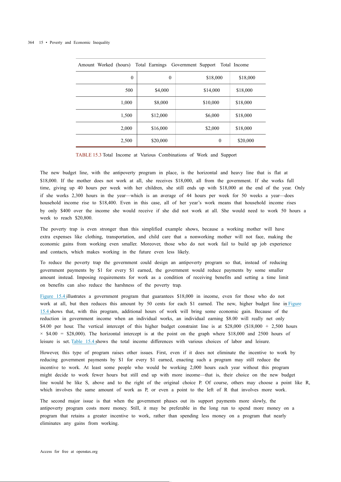
Amount Worked (hours) Total Earnings Government Support Total Income 0 0 $18,000 $18,000 500 $4,000 $14,000 $18,000 1,000 $8,000 $10,000 $18,000 1,500 $12,000 $6,000 $18,000 2,000 $16,000 $2,000 $18,000 2,500 $20,000 0 $20,000
TABLE 15.3 Total Income at Various Combinations of Work and Support
The new budget line, with the antipoverty program in place, is the horizontal and heavy line that is flat at
$18,000. If the mother does not work at all, she receives $18,000, all from the government. If she works full
time, giving up 40 hours per week with her children, she still ends up with $18,000 at the end of the year. Only
if she works 2,300 hours in the year—which is an average of 44 hours per week for 50 weeks a year—does
household income rise to $18,400. Even in this case, all of her year’s work means that household income rises
by only $400 over the income she would receive if she did not work at all. She would need to work 50 hours a week to reach $20,800.
The poverty trap is even stronger than this simplified example shows, because a working mother will have
extra expenses like clothing, transportation, and child care that a nonworking mother will not face, making the
economic gains from working even smaller. Moreover, those who do not work fail to build up job experience
and contacts, which makes working in the future even less likely.
To reduce the poverty trap the government could design an antipoverty program so that, instead of reducing
government payments by $1 for every $1 earned, the government would reduce payments by some smaller
amount instead. Imposing requirements for work as a condition of receiving benefits and setting a time limit
on benefits can also reduce the harshness of the poverty trap.
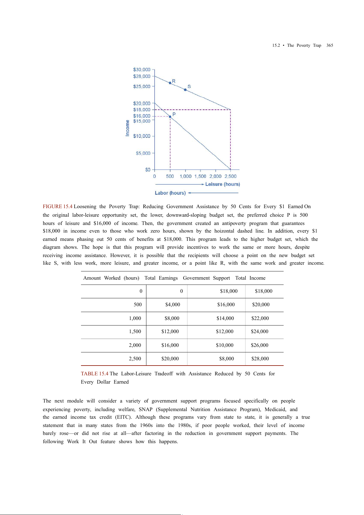
Figure 15.4 illustrates a government program that guarantees $18,000 in income, even for those who do not
work at all, but then reduces this amount by 50 cents for each $1 earned. The new, higher budget line in Figure
15.4 shows that, with this program, additional hours of work will bring some economic gain. Because of the
reduction in government income when an individual works, an individual earning $8.00 will really net only
$4.00 per hour. The vertical intercept of this higher budget constraint line is at $28,000 ($18,000 + 2,500 hours
× $4.00 = $28,000). The horizontal intercept is at the point on the graph where $18,000 and 2500 hours of
leisure is set. Table 15.4 shows the total income differences with various choices of labor and leisure.
However, this type of program raises other issues. First, even if it does not eliminate the incentive to work by
reducing government payments by $1 for every $1 earned, enacting such a program may still reduce the
incentive to work. At least some people who would be working 2,000 hours each year without this program
might decide to work fewer hours but still end up with more income—that is, their choice on the new budget
line would be like S, above and to the right of the original choice P. Of course, others may choose a point like R,
which involves the same amount of work as P, or even a point to the left of R that involves more work.
The second major issue is that when the government phases out its support payments more slowly, the
antipoverty program costs more money. Still, it may be preferable in the long run to spend more money on a
program that retains a greater incentive to work, rather than spending less money on a program that nearly
eliminates any gains from working.
Access for free at openstax.org
15.2 • The Poverty Trap 365
FIGURE 15.4 Loosening the Poverty Trap: Reducing Government Assistance by 50 Cents for Every $1 Earned On
the original labor-leisure opportunity set, the lower, downward-sloping budget set, the preferred choice P is 500
hours of leisure and $16,000 of income. Then, the government created an antipoverty program that guarantees
$18,000 in income even to those who work zero hours, shown by the hoizontal dashed line. In addition, every $1
earned means phasing out 50 cents of benefits at $18,000. This program leads to the higher budget set, which the
diagram shows. The hope is that this program will provide incentives to work the same or more hours, despite
receiving income assistance. However, it is possible that the recipients will choose a point on the new budget set
like S, with less work, more leisure, and greater income, or a point like R, with the same work and greater income.
Amount Worked (hours) Total Earnings Government Support Total Income 0 0 $18,000 $18,000 500 $4,000 $16,000 $20,000 1,000 $8,000 $14,000 $22,000 1,500 $12,000 $12,000 $24,000 2,000 $16,000 $10,000 $26,000 2,500 $20,000 $8,000 $28,000
TABLE 15.4 The Labor-Leisure Tradeoff with Assistance Reduced by 50 Cents for Every Dollar Earned
The next module will consider a variety of government support programs focused specifically on people
experiencing poverty, including welfare, SNAP (Supplemental Nutrition Assistance Program), Medicaid, and
the earned income tax credit (EITC). Although these programs vary from state to state, it is generally a true
statement that in many states from the 1960s into the 1980s, if poor people worked, their level of income
barely rose—or did not rise at all—after factoring in the reduction in government support payments. The
following Work It Out feature shows how this happens. 366
15 • Poverty and Economic Inequality
15.3 The Safety Net LEARNING OBJECTIVES
By the end of this section, you will be able to:
• Identify the antipoverty government programs that comprise the safety net
• Explain the safety net programs' primary goals and how these programs have changed over time
• Discuss the complexities of these safety net programs and why they can be controversial
The U.S. government has implemented a number of programs to assist those below the poverty line and those
who have incomes just above the poverty line. Such programs are called the safety net, to recognize that they
offer some protection for those who find themselves without jobs or income.
Temporary Assistance for Needy Families
From the Great Depression until 1996, the United States’ most visible antipoverty program was Aid to Families
with Dependent Children (AFDC), which provided cash payments to mothers with children who were below the
poverty line. Many just called this program “welfare.” In 1996, Congress passed and President Bill Clinton
signed into law the Personal Responsibility and Work Opportunity Reconciliation Act, more commonly called
the “welfare reform act.” The new law replaced AFDC with Temporary Assistance for Needy Families (TANF). LINK IT UP
Visit this website (http://openstax.org/l/Clinton_speech) to watch a video of President Bill Clinton’s Welfare Reform speech.
TANF brought several dramatic changes in how welfare operated. Under the old AFDC program, states set the
level of welfare benefits that they would pay to people experiencing poverty, and the federal government
guaranteed it would chip in some of the money as well. The federal government’s welfare spending would rise
or fall depending on the number of people in need, and on how each state set its own welfare contribution.
Under TANF, however, the federal government gives a fixed amount of money to each state. The state can then
use the money for almost any program with an antipoverty component: for example, the state might use the
money to give funds to families with low income, or to reduce teenage pregnancy, or even to raise the high
school graduation rate. However, the federal government imposed two key requirements. First, if states are to
keep receiving the TANF grants, they must impose work requirements so that most of those receiving TANF
benefits are working (or attending school). Second, no one can receive TANF benefits with federal money for
more than a total of five years over their lifetime. The old AFDC program had no such work requirements or time limits.
TANF attempts to avoid the poverty trap by requiring that welfare recipients work and by limiting the length of
time they can receive benefits. In its first few years, the program was quite successful. The number of families
receiving payments in 1995, the last year of AFDC, was 4.8 million. November 2020, according to the
Congressional Research Service, the number of families receiving payments under TANF was 1.0 million—a decline of nearly 80%.
TANF benefits to poor families vary considerably across states. For example, again according to the
Congressional Research Service, in July 2020 the highest monthly payment in New Hampshire to a single
mother with one child was $862, while in Mississippi the highest monthly payment to that family was $146. In
part, these payments reflect differences in states’ cost of living. As reported by the Department of Health and
Human Services, in 1995 total spending on TANF was approximately $19 billion. Spending increased yearly
through 2001, then it was roughly flat at approximately $26 billion until 2005, then it increased again through
2010, where it peaked at nearly $35 billion. It then decreased again to around $30 billion in 2020. When you
take into account the effects of inflation, the decline is even greater. Moreover, there seemed little evidence that
families were suffering a reduced standard of living as a result of TANF—although, on the other side, there was
Access for free at openstax.org
15.3 • The Safety Net 367
not much evidence that families had greatly improved their total levels of income, either.
The Earned Income Tax Credit (EITC)
The earned income tax credit (EITC), first passed in 1975, is a method of assisting the working poor through
the tax system. The EITC is one of the largest assistance program for low-income groups, and as of December
2021, about 25 million eligible workers and families received about $60 billion in EITC. For the 2021 tax year,
the earned income credit ranges from $1,502 to $6,728 depending on tax-filing status, income, and number of
children. The average amount of EITC received nationwide was about $2,411. In 2021, for example, a single
parent with two children would have received a tax credit of $5,980 up to a modest income level. The amount
of the tax break increases with the amount of income earned, up to a point. The earned income tax credit has
often been popular with both economists and the general public because of the way it effectively increases the payment received for work.
What about the danger of the poverty trap that every additional $1 earned will reduce government support
payments by close to $1? To minimize this problem, the earned income tax credit is phased out slowly. For
example, according to the Tax Policy Center, for a single-parent family with two children in 2013, the credit is
not reduced at all (but neither is it increased) as earnings rise from $13,430 to $17,530. Then, for every $1
earned above $17,530, the amount received from the credit is reduced by 21.06 cents, until the credit phases
out completely at an income level of $46,227.
Figure 15.5 illustrates that the earned income tax credits, child tax credits, and the TANF program all cost the
federal government money—either in direct outlays or in loss of tax revenues. CTC stands for the government
tax cuts for the child tax credit.
FIGURE 15.5 Real Federal Spending on CTC, EITC, and TANF, 1975–2016 EITC increased from under $10 billion in
the late 1980s to almost $42 billion in 2000 and to over $61 billion in 2016, far exceeding estimated 2016 outlays
in the CTC (Child Tax Credits) and TANF of over $25 billion and $18 billion, respectively. (Source: Office of Management and Budget)
In recent years, the EITC has become a hugely expensive government program for providing income
assistance to people below or near the poverty line, costing about $60 billion in 2021. In that year, the EITC
provided benefits to about 25 million families and individuals and, on average, is worth about $2,411 per
family (with children), according to the Tax Policy Center. One reason that the TANF law worked as well as it
did is that the government greatly expanded EITC in the late 1980s and again in the early 1990s, which
increased the returns to work for low-income Americans. 368
15 • Poverty and Economic Inequality
Supplemental Nutrition Assistance Program (SNAP)
Often called “food stamps,” Supplemental Nutrition Assistance Program (SNAP) is a federally funded
program, started in 1964, in which each month people receive a card like a debit card that they can use to buy
food. The amount of food aid for which a household is eligible varies by income, number of children, and other
factors but, in general, households are expected to spend about 30% of their own net income on food, and if
30% of their net income is not enough to purchase a nutritionally adequate diet, then those households are eligible for SNAP.
SNAP can contribute to the poverty trap. For every $100 earned, the government assumes that a family can
spend $30 more for food, and thus reduces its eligibility for food aid by $30. This decreased benefit is not a
complete disincentive to work—but combined with how other programs reduce benefits as income increases, it
adds to the problem. SNAP, however, does try to address the poverty trap with its own set of work requirements and time limits.
Why give debit cards and not just cash? Part of the political support for SNAP comes from a belief that since
recipients must spend the the cards on food, they cannot “waste” them on other forms of consumption. From
an economic point of view, however, the belief that cards must increase spending on food seems wrong-
headed. After all, say that a family is spending $2,500 per year on food, and then it starts receiving $1,000 per
year in SNAP aid. The family might react by spending $3,500 per year on food (income plus aid), or it might
react by continuing to spend $2,500 per year on food, but use the $1,000 in food aid to free up $1,000 that it
can now spend on other goods. Thus, it is reasonable to think of SNAP cards as an alternative method, along
with TANF and the earned income tax credit, of transferring income to those working but still experiencing poverty.
Anyone eligible for TANF is also eligible for SNAP, although states can expand eligibility for food aid if they
wish to do so. In some states, where TANF welfare spending is relatively low, a poor family may receive more in
support from SNAP than from TANF. In 2021, about 41.5 million people received food aid with total benefits of
just over $108 billion, which is an average monthly benefit of about $287 per person per month. SNAP
participation increased by 70% between 2007 and 2011, from 26.6 million participants to 45 million.
According to the Congressional Budget Office, the 2008-2009 Great Recession and rising food prices caused
this dramatic rise in participation. Likewise, between 2019 and 2021, the number of participants in SNAP
increased by 5.8 million, the amount per person increased by 67%, and total benefits nearly doubled as a
consequence of the sharp recession due to the onset of the COVID-19 pandemic in early 2020.
The federal government deploys a range of income security programs that it funds through departments such
as Health and Human Services, Agriculture, and Housing and Urban Development (HUD) (see Figure 15.6).
According to the Office of Management and Budget, collectively, these three departments provided an
estimated $62 billion of aid through programs such as supplemental feeding programs for women and
children, subsidized housing, and energy assistance. The federal government also transfers funds to
individual states through special grant programs.
Access for free at openstax.org
15.3 • The Safety Net 369
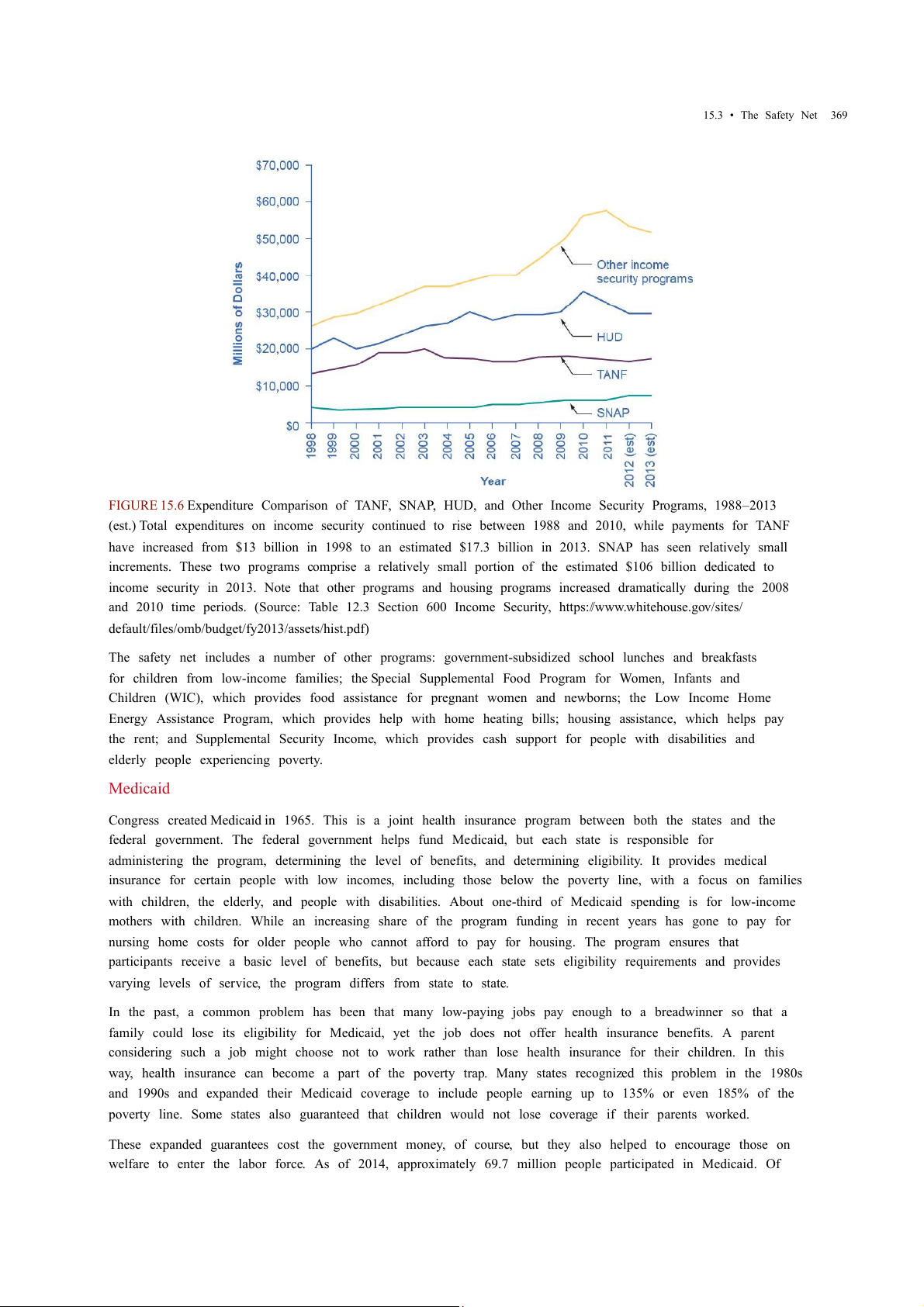
FIGURE 15.6 Expenditure Comparison of TANF, SNAP, HUD, and Other Income Security Programs, 1988–2013
(est.) Total expenditures on income security continued to rise between 1988 and 2010, while payments for TANF
have increased from $13 billion in 1998 to an estimated $17.3 billion in 2013. SNAP has seen relatively small
increments. These two programs comprise a relatively small portion of the estimated $106 billion dedicated to
income security in 2013. Note that other programs and housing programs increased dramatically during the 2008
and 2010 time periods. (Source: Table 12.3 Section 600 Income Security, https://www.whitehouse.gov/sites/
default/files/omb/budget/fy2013/assets/hist.pdf)
The safety net includes a number of other programs: government-subsidized school lunches and breakfasts
for children from low-income families; the Special Supplemental Food Program for Women, Infants and
Children (WIC), which provides food assistance for pregnant women and newborns; the Low Income Home
Energy Assistance Program, which provides help with home heating bills; housing assistance, which helps pay
the rent; and Supplemental Security Income, which provides cash support for people with disabilities and
elderly people experiencing poverty. Medicaid
Congress created Medicaid in 1965. This is a joint health insurance program between both the states and the
federal government. The federal government helps fund Medicaid, but each state is responsible for
administering the program, determining the level of benefits, and determining eligibility. It provides medical
insurance for certain people with low incomes, including those below the poverty line, with a focus on families
with children, the elderly, and people with disabilities. About one-third of Medicaid spending is for low-income
mothers with children. While an increasing share of the program funding in recent years has gone to pay for
nursing home costs for older people who cannot afford to pay for housing. The program ensures that
participants receive a basic level of benefits, but because each state sets eligibility requirements and provides
varying levels of service, the program differs from state to state.
In the past, a common problem has been that many low-paying jobs pay enough to a breadwinner so that a
family could lose its eligibility for Medicaid, yet the job does not offer health insurance benefits. A parent
considering such a job might choose not to work rather than lose health insurance for their children. In this
way, health insurance can become a part of the poverty trap. Many states recognized this problem in the 1980s
and 1990s and expanded their Medicaid coverage to include people earning up to 135% or even 185% of the
poverty line. Some states also guaranteed that children would not lose coverage if their parents worked.
These expanded guarantees cost the government money, of course, but they also helped to encourage those on
welfare to enter the labor force. As of 2014, approximately 69.7 million people participated in Medicaid. Of 370
15 • Poverty and Economic Inequality
those enrolled, almost half are children. Healthcare expenditures, however, are highest for the elderly
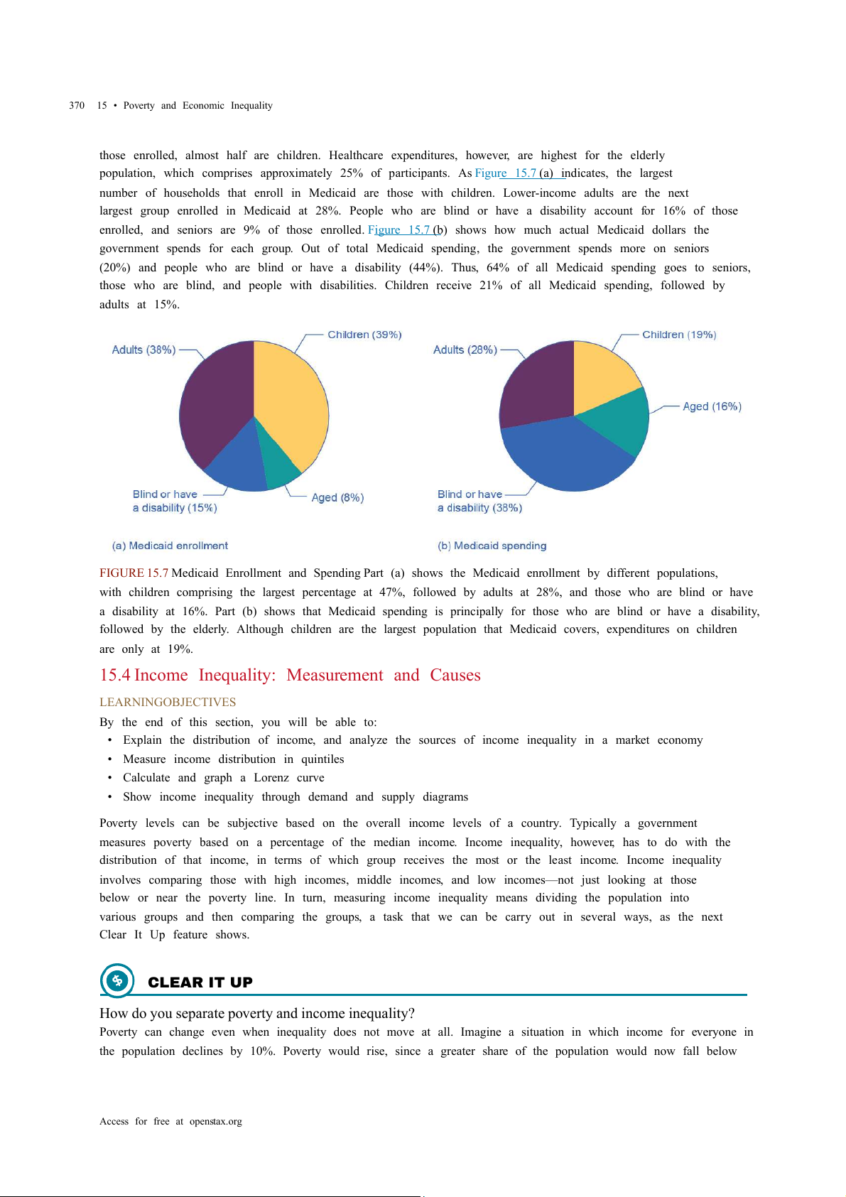
population, which comprises approximately 25% of participants. As Figure 15.7 (a) indicates, the largest
number of households that enroll in Medicaid are those with children. Lower-income adults are the next
largest group enrolled in Medicaid at 28%. People who are blind or have a disability account for 16% of those
enrolled, and seniors are 9% of those enrolled. Figure 15.7 (b) shows how much actual Medicaid dollars the
government spends for each group. Out of total Medicaid spending, the government spends more on seniors
(20%) and people who are blind or have a disability (44%). Thus, 64% of all Medicaid spending goes to seniors,
those who are blind, and people with disabilities. Children receive 21% of all Medicaid spending, followed by adults at 15%.
FIGURE 15.7 Medicaid Enrollment and Spending Part (a) shows the Medicaid enrollment by different populations,
with children comprising the largest percentage at 47%, followed by adults at 28%, and those who are blind or have
a disability at 16%. Part (b) shows that Medicaid spending is principally for those who are blind or have a disability,
followed by the elderly. Although children are the largest population that Medicaid covers, expenditures on children are only at 19%.
15.4 Income Inequality: Measurement and Causes LEARNING OBJECTIVES
By the end of this section, you will be able to:
• Explain the distribution of income, and analyze the sources of income inequality in a market economy
• Measure income distribution in quintiles
• Calculate and graph a Lorenz curve
• Show income inequality through demand and supply diagrams
Poverty levels can be subjective based on the overall income levels of a country. Typically a government
measures poverty based on a percentage of the median income. Income inequality, however, has to do with the
distribution of that income, in terms of which group receives the most or the least income. Income inequality
involves comparing those with high incomes, middle incomes, and low incomes—not just looking at those
below or near the poverty line. In turn, measuring income inequality means dividing the population into
various groups and then comparing the groups, a task that we can be carry out in several ways, as the next Clear It Up feature shows. CLEAR IT UP
How do you separate poverty and income inequality?
Poverty can change even when inequality does not move at all. Imagine a situation in which income for everyone in
the population declines by 10%. Poverty would rise, since a greater share of the population would now fall below
Access for free at openstax.org
15.4 • Income Inequality: Measurement and Causes 371
the poverty line. However, inequality would be the same, because everyone suffered the same proportional loss.
Conversely, a general rise in income levels over time would keep inequality the same, but reduce poverty.
It is also possible for income inequality to change without affecting the poverty rate. Imagine a situation in which a
large number of people who already have high incomes increase their incomes by even more. Inequality would rise
as a result—but the number of people below the poverty line would remain unchanged.
Why did inequality of household income increase in the United States in recent decades? A trend toward
greater income inequality has occurred in many countries around the world, although the effect has been
more powerful in the U.S. economy. Economists have focused their explanations for the increasing inequality
on two factors that changed more or less continually from the 1970s into the 2000s. One set of explanations
focuses on the changing shape of American households. The other focuses on greater inequality of wages, what
some economists call “winner take all” labor markets. We will begin with how we measure inequality, and then
consider the explanations for growing inequality in the United States.
Measuring Income Distribution by Quintiles
One common way of measuring income inequality is to rank all households by income, from lowest to highest,
and then to divide all households into five groups with equal numbers of people, known as quintiles. This
calculation allows for measuring the distribution of income among the five groups compared to the total. The
first quintile is the lowest fifth or 20%, the second quintile is the next lowest, and so on. We can measure
income inequality by comparing what share of the total income each quintile earns.
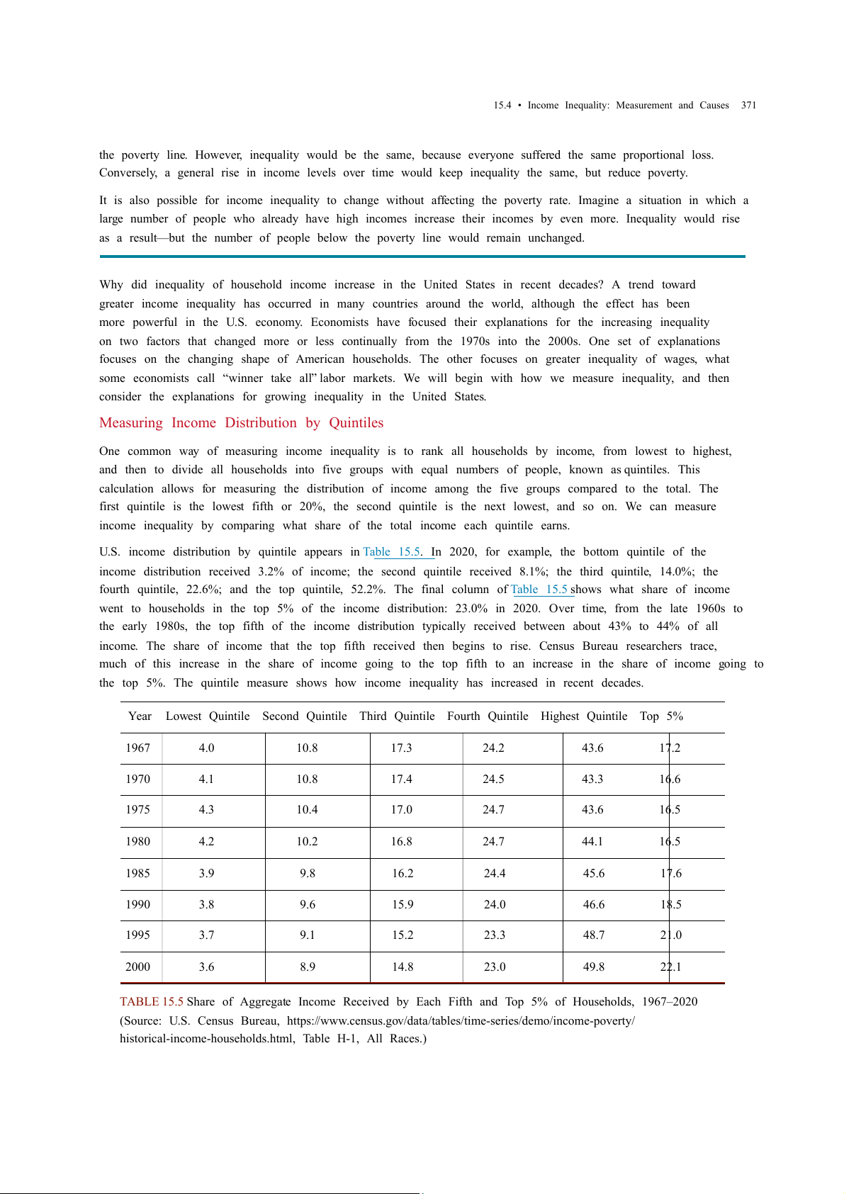
U.S. income distribution by quintile appears in Table 15.5. In 2020, for example, the bottom quintile of the
income distribution received 3.2% of income; the second quintile received 8.1%; the third quintile, 14.0%; the
fourth quintile, 22.6%; and the top quintile, 52.2%. The final column of Table 15.5 shows what share of income
went to households in the top 5% of the income distribution: 23.0% in 2020. Over time, from the late 1960s to
the early 1980s, the top fifth of the income distribution typically received between about 43% to 44% of all
income. The share of income that the top fifth received then begins to rise. Census Bureau researchers trace,
much of this increase in the share of income going to the top fifth to an increase in the share of income going to
the top 5%. The quintile measure shows how income inequality has increased in recent decades. Year
Lowest Quintile Second Quintile Third Quintile Fourth Quintile Highest Quintile Top 5% 1967 4.0 10.8 17.3 24.2 43.6 17.2 1970 4.1 10.8 17.4 24.5 43.3 16.6 1975 4.3 10.4 17.0 24.7 43.6 16.5 1980 4.2 10.2 16.8 24.7 44.1 16.5 1985 3.9 9.8 16.2 24.4 45.6 17.6 1990 3.8 9.6 15.9 24.0 46.6 18.5 1995 3.7 9.1 15.2 23.3 48.7 21.0 2000 3.6 8.9 14.8 23.0 49.8 22.1
TABLE 15.5 Share of Aggregate Income Received by Each Fifth and Top 5% of Households, 1967–2020
(Source: U.S. Census Bureau, https://www.census.gov/data/tables/time-series/demo/income-poverty/
historical-income-households.html, Table H-1, All Races.) 372
15 • Poverty and Economic Inequality Year
Lowest Quintile Second Quintile Third Quintile Fourth Quintile Highest Quintile Top 5% 2005 3.4 8.6 14.6 23.0 50.4 22.2 2010 3.3 8.5 14.6 23.4 50.3 21.3 2015 3.1 8.2 14.3 23.2 51.1 22.1 2020 3.0 8.1 14.0 22.6 52.2 23.0
TABLE 15.5 Share of Aggregate Income Received by Each Fifth and Top 5% of Households, 1967–2020
(Source: U.S. Census Bureau, https://www.census.gov/data/tables/time-series/demo/income-poverty/
historical-income-households.html, Table H-1, All Races.)
It can also be useful to divide the income distribution in ways other than quintiles; for example, into tenths or
even into percentiles (that is, hundredths). A more detailed breakdown can provide additional insights. For
example, the last column of Table 15.5 shows the income received by the top 5% of the income distribution.
Between 1980 and 2020, the share of income going to the top 5% increased by 6.5 percentage points (from
16.5% in 1980 to 23.0% in 2020). From 1980 to 2020 the share of income going to the top quintile increased by
8.1 percentage points (from 44.1% in 1980 to 52.2% in 2013). Thus, the top 20% of householders (the fifth
quintile) received over half (51%) of all the income in the United States in 2020. Lorenz Curve
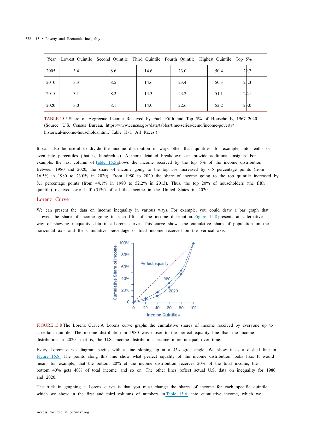
We can present the data on income inequality in various ways. For example, you could draw a bar graph that
showed the share of income going to each fifth of the income distribution. Figure 15.8 presents an alternative
way of showing inequality data in a Lorenz curve. This curve shows the cumulative share of population on the
horizontal axis and the cumulative percentage of total income received on the vertical axis.
FIGURE 15.8 The Lorenz Curve A Lorenz curve graphs the cumulative shares of income received by everyone up to
a certain quintile. The income distribution in 1980 was closer to the perfect equality line than the income
distribution in 2020—that is, the U.S. income distribution became more unequal over time.
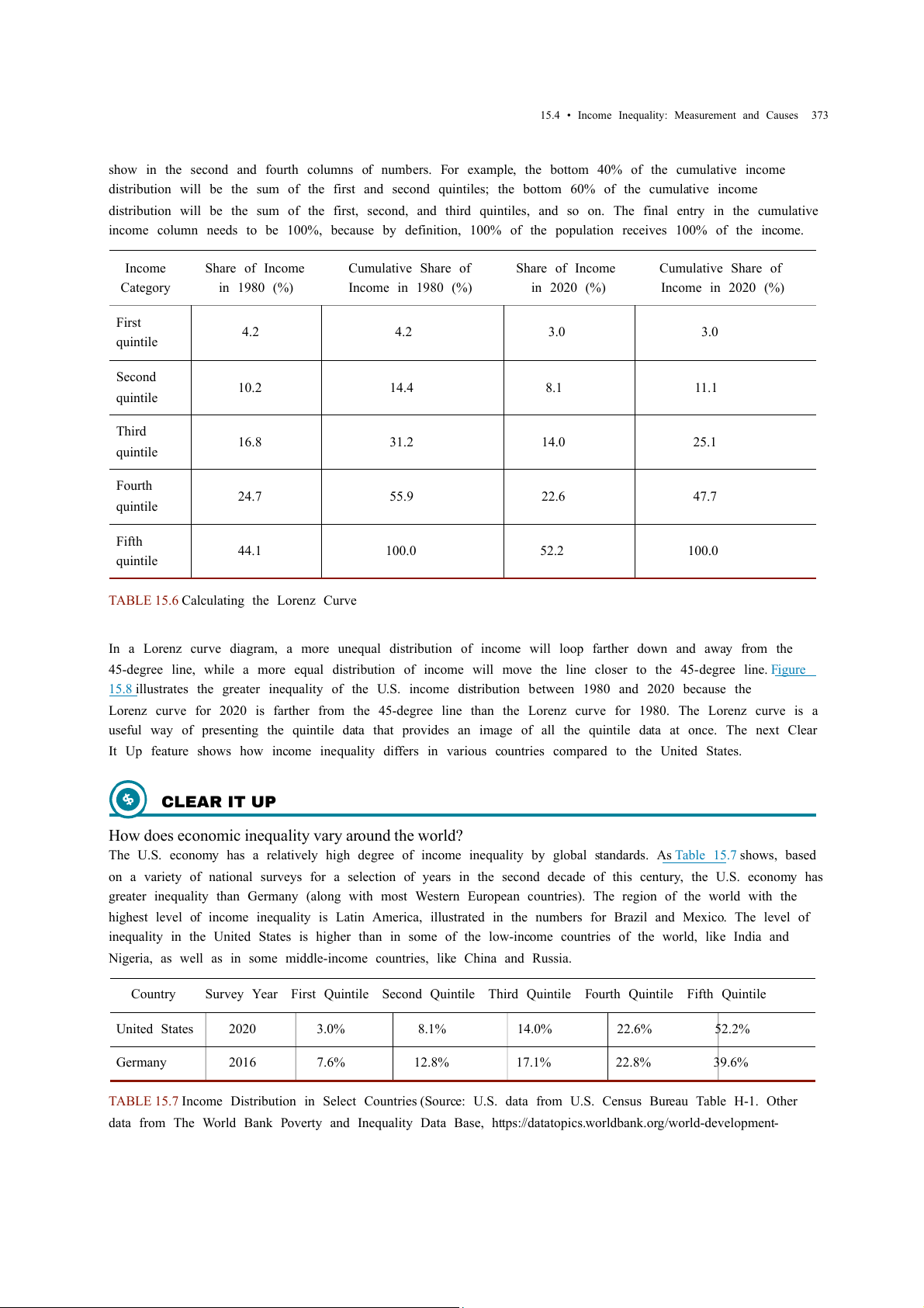
Every Lorenz curve diagram begins with a line sloping up at a 45-degree angle. We show it as a dashed line in
Figure 15.8. The points along this line show what perfect equality of the income distribution looks like. It would
mean, for example, that the bottom 20% of the income distribution receives 20% of the total income, the
bottom 40% gets 40% of total income, and so on. The other lines reflect actual U.S. data on inequality for 1980 and 2020.
The trick in graphing a Lorenz curve is that you must change the shares of income for each specific quintile,
which we show in the first and third columns of numbers in Table 15.6, into cumulative income, which we
Access for free at openstax.org
15.4 • Income Inequality: Measurement and Causes 373
show in the second and fourth columns of numbers. For example, the bottom 40% of the cumulative income
distribution will be the sum of the first and second quintiles; the bottom 60% of the cumulative income
distribution will be the sum of the first, second, and third quintiles, and so on. The final entry in the cumulative
income column needs to be 100%, because by definition, 100% of the population receives 100% of the income. Income Share of Income
Cumulative Share of Share of Income
Cumulative Share of Category in 1980 (%)
Income in 1980 (%) in 2020 (%)
Income in 2020 (%) First 4.2 4.2 3.0 3.0 quintile Second 10.2 14.4 8.1 11.1 quintile Third 16.8 31.2 14.0 25.1 quintile Fourth 24.7 55.9 22.6 47.7 quintile Fifth 44.1 100.0 52.2 100.0 quintile
TABLE 15.6 Calculating the Lorenz Curve
In a Lorenz curve diagram, a more unequal distribution of income will loop farther down and away from the
45-degree line, while a more equal distribution of income will move the line closer to the 45-degree line. Figure
15.8 illustrates the greater inequality of the U.S. income distribution between 1980 and 2020 because the
Lorenz curve for 2020 is farther from the 45-degree line than the Lorenz curve for 1980. The Lorenz curve is a
useful way of presenting the quintile data that provides an image of all the quintile data at once. The next Clear
It Up feature shows how income inequality differs in various countries compared to the United States. CLEAR IT UP
How does economic inequality vary around the world?
The U.S. economy has a relatively high degree of income inequality by global standards. As Table 15.7 shows, based
on a variety of national surveys for a selection of years in the second decade of this century, the U.S. economy has
greater inequality than Germany (along with most Western European countries). The region of the world with the
highest level of income inequality is Latin America, illustrated in the numbers for Brazil and Mexico. The level of
inequality in the United States is higher than in some of the low-income countries of the world, like India and
Nigeria, as well as in some middle-income countries, like China and Russia. Country
Survey Year First Quintile Second Quintile Third Quintile Fourth Quintile Fifth Quintile United States 2020 3.0% 8.1% 14.0% 22.6% 52.2% Germany 2016 7.6% 12.8% 17.1% 22.8% 39.6%
TABLE 15.7 Income Distribution in Select Countries (Source: U.S. data from U.S. Census Bureau Table H-1. Other
data from The World Bank Poverty and Inequality Data Base, https://datatopics.worldbank.org/world-development- 374
15 • Poverty and Economic Inequality Country
Survey Year First Quintile Second Quintile Third Quintile Fourth Quintile Fifth Quintile Brazil 2019 3.1% 7.4% 12.3% 19.4% 57.8% Mexico 2018 5.4% 9.5% 13.5% 20.0% 51.7% China 2016 6.5% 10.7% 15.3% 22.2% 45.3% India 2011 8.1% 11.7% 15.2% 20.5% 44.4% Russia 2018 7.1% 11.2% 15.2% 21.4% 45.1% Nigeria 2018 7.1% 11.6% 16.2% 22.7% 42.4%
TABLE 15.7 Income Distribution in Select Countries (Source: U.S. data from U.S. Census Bureau Table H-1. Other
data from The World Bank Poverty and Inequality Data Base, https://datatopics.worldbank.org/world-development-
indicators/themes/poverty-and-inequality.html) LINK IT UP
Visit this website (http://openstax.org/l/inequality/) to watch a video of wealth inequality across the world.
Causes of Growing Inequality: The Changing Composition of American Households
In 1970, 41% of married women were in the labor force, but by 2019, according to the Bureau of Labor
Statistics, 58.6% of married women were in the labor force. One result of this trend is that more households
have two earners. Moreover, it has become more common for one high earner to marry another high earner. A
few decades ago, the common pattern featured a man with relatively high earnings, such as an executive or a
doctor, marrying a woman who did not earn as much, like a secretary or a nurse. Often, the woman would leave
paid employment, at least for a few years, to raise a family. However, now doctors are marrying doctors and
executives are marrying executives, and mothers with high-powered careers are often returning to work while
their children are quite young. This pattern of households with two high earners tends to increase the
proportion of high-earning households.
According to data in the National Journal, even as two-earner couples have increased, so have single-parent
households. Of all U.S. families, in 2021, about 23% were headed by single mothers. The poverty rate among
single-parent households tends to be relatively high.
These changes in family structure, including the growth of single-parent families who tend to be at the lower
end of the income distribution, and the growth of two-career high-earner couples near the top end of the
income distribution, account for roughly half of the rise in income inequality across households in recent decades. LINK IT UP
Visit this website (http://openstax.org/l/US_wealth) to watch a video that illustrates the distribution of wealth in the United States.
Causes of Growing Inequality: A Shift in the Distribution of Wages
Another factor behind the rise in U.S. income inequality is that earnings have become less equal since the late
1970s. In particular, the earnings of high-skilled labor relative to low-skilled labor have increased. Winner-
take-all labor markets result from changes in technology, which have increased global demand for
Access for free at openstax.org
15.4 • Income Inequality: Measurement and Causes 375
“stars,”—whether the best CEO, doctor, basketball player, or actor. This global demand pushes salaries far above
productivity differences associated with educational differences. One way to measure this change is to take
workers' earnings with at least a four-year college bachelor’s degree (including those who went on and
completed an advanced degree) and divide them by workers' earnings with only a high school degree. The
result is that those in the 25–34 age bracket with college degrees earned about 1.85 times as much as high
school graduates in 2020, up from 1.59 times in 1995, according to U.S. Census data. Winner-take-all labor
market theory argues that the salary gap between the median and the top 1 percent is not due to educational differences.
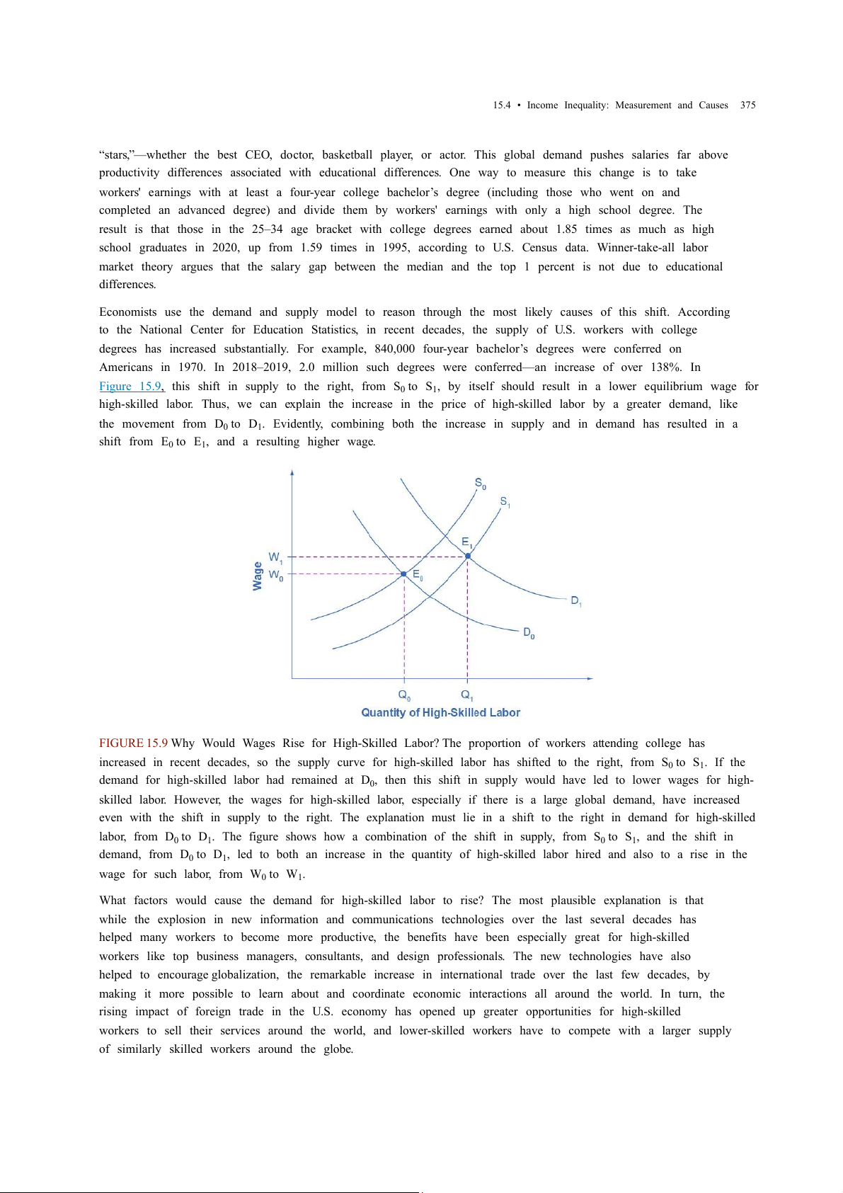
Economists use the demand and supply model to reason through the most likely causes of this shift. According
to the National Center for Education Statistics, in recent decades, the supply of U.S. workers with college
degrees has increased substantially. For example, 840,000 four-year bachelor’s degrees were conferred on
Americans in 1970. In 2018–2019, 2.0 million such degrees were conferred—an increase of over 138%. In
Figure 15.9, this shift in supply to the right, from S0 to S ,
1 by itself should result in a lower equilibrium wage for
high-skilled labor. Thus, we can explain the increase in the price of high-skilled labor by a greater demand, like the movement from D0 to D .
1 Evidently, combining both the increase in supply and in demand has resulted in a shift from E0 to E , 1 and a resulting higher wage.
FIGURE 15.9 Why Would Wages Rise for High-Skilled Labor? The proportion of workers attending college has
increased in recent decades, so the supply curve for high-skilled labor has shifted to the right, from S0 to S . 1 If the
demand for high-skilled labor had remained at D ,
0 then this shift in supply would have led to lower wages for high-
skilled labor. However, the wages for high-skilled labor, especially if there is a large global demand, have increased
even with the shift in supply to the right. The explanation must lie in a shift to the right in demand for high-skilled labor, from D0 to D .
1 The figure shows how a combination of the shift in supply, from S0 to S , 1 and the shift in demand, from D0 to D ,
1 led to both an increase in the quantity of high-skilled labor hired and also to a rise in the
wage for such labor, from W0 to W . 1
What factors would cause the demand for high-skilled labor to rise? The most plausible explanation is that
while the explosion in new information and communications technologies over the last several decades has
helped many workers to become more productive, the benefits have been especially great for high-skilled
workers like top business managers, consultants, and design professionals. The new technologies have also
helped to encourage globalization, the remarkable increase in international trade over the last few decades, by
making it more possible to learn about and coordinate economic interactions all around the world. In turn, the
rising impact of foreign trade in the U.S. economy has opened up greater opportunities for high-skilled
workers to sell their services around the world, and lower-skilled workers have to compete with a larger supply
of similarly skilled workers around the globe. 376
15 • Poverty and Economic Inequality
We can view the market for high-skilled labor as a race between forces of supply and demand. Additional
education and on-the-job training will tend to increase the high-skilled labor supply and to hold down its
relative wage. Conversely, new technology and other economic trends like globalization tend to increase the
demand for high-skilled labor and push up its relative wage. We can view the greater inequality of wages as a
sign that demand for skilled labor is increasing faster than supply. Alternatively, if the supply of lower skilled
workers exceeds the demand, then average wages in the lower quintiles of the income distribution will
decrease. The combination of forces in the high-skilled and low-skilled labor markets leads to increased income disparity.
15.5 Government Policies to Reduce Income Inequality LEARNING OBJECTIVES
By the end of this section, you will be able to:
• Explain the arguments for and against government intervention in a market economy
• Identify beneficial ways to reduce the economic inequality in a society
• Show the tradeoff between incentives and income equality
No society should expect or desire complete equality of income at a given point in time, for a number of
reasons. First, most workers receive relatively low earnings in their first few jobs, higher earnings as they
reach middle age, and then lower earnings after retirement. Thus, a society with people of varying ages will
have a certain amount of income inequality. Second, people’s preferences and desires differ. Some are willing
to work long hours to have income for large houses, fast cars and computers, luxury vacations, and the ability
to support children and grandchildren.
These factors all imply that a snapshot of inequality in a given year does not provide an accurate picture of how
people’s incomes rise and fall over time. Even if we expect some degree of economic inequality at any point in
time, how much inequality should there be? There is also the difference between income and wealth, as the
following Clear It Up feature explains. CLEAR IT UP
How do you measure wealth versus income inequality?
Income is a flow of money received, often measured on a monthly or an annual basis. Wealth is the sum of the
value of all assets, including money in bank accounts, financial investments, a pension fund, and the value of a
home. In calculating wealth, one must subtract all debts, such as debt owed on a home mortgage and on credit
cards. A retired person, for example, may have relatively little income in a given year, other than a pension or Social
Security. However, if that person has saved and invested over time, the person’s accumulated wealth can be quite substantial.
In the United States, the wealth distribution is more unequal than the income distribution, because differences in
income can accumulate over time to make even larger differences in wealth. However, we can measure the degree
of inequality in the wealth distribution with the same tools we use to measure the inequality in the income
distribution, like quintile measurements. Once every three years the Federal Reserve Bank publishes the Survey of
Consumer Finance which reports a collection of data on wealth.
Even if they cannot answer the question of how much inequality is too much, economists can still play an
important role in spelling out policy options and tradeoffs. If a society decides to reduce the level of economic
inequality, it has three main sets of tools: redistribution from those with high incomes to those with low
incomes; trying to assure that a ladder of opportunity is widely available; and a tax on inheritance. Redistribution
Redistribution means taking income from those with higher incomes and providing income to those with
Access for free at openstax.org
15.5 • Government Policies to Reduce Income Inequality 377
lower incomes. Earlier in this chapter, we considered some of the key government policies that provide
support for people experiencing poverty: the welfare program TANF, the earned income tax credit, SNAP, and
Medicaid. If a reduction in inequality is desired, these programs could receive additional funding.
The federal income tax, which is a progressive tax system designed in such a way that the rich pay a higher
percent in income taxes than the poor, funds the programs. Data from household income tax returns in 2018
shows that the top 1% of households had an average income of $1,679,000 per year in pre-tax income and paid
an average federal tax rate of 25.4%. The effective income tax, which is total taxes paid divided by total
income (all sources of income such as wages, profits, interest, rental income, and government transfers such
as veterans’ benefits), was much lower. The effective tax paid by that top 1% of householders paid was 20.4%,
while the bottom two quintiles actually paid negative effective income taxes, because of provisions like the
earned income tax credit. News stories occasionally report on a high-income person who has managed to pay
very little in taxes, but while such individual cases exist, according to the Congressional Budget Office, the
typical pattern is that people with higher incomes pay a higher average share of their income in federal income taxes.
Of course, the fact that some degree of redistribution occurs now through the federal income tax and
government antipoverty programs does not settle the questions of how much redistribution is appropriate, and
whether more redistribution should occur.
The Ladder of Opportunity
Economic inequality is perhaps most troubling when it is not the result of effort or talent, but instead is
determined by the circumstances under which a child grows up. One child attends a well-run grade school and
high school and heads on to college, while parents help out by supporting education and other interests,
paying for college, a first car, and a first house, and offering work connections that lead to internships and jobs.
Another child attends a poorly run grade school, barely makes it through a low-quality high school, does not go
to college, and lacks family and peer support. These two children may be similar in their underlying talents
and in the effort they put forth, but their economic outcomes are likely to be quite different.
Public policy can attempt to build a ladder of opportunities so that, even though all children will never come
from identical families and attend identical schools, each child has a reasonable opportunity to attain an
economic niche in society based on their interests, desires, talents, and efforts. Table 15.8 shows some of those initiatives. Children College Level Adults • Improved day
• Widespread loans and grants for those in
• Opportunities for retraining and acquiring care financial need new skills • Enrichment
• Public support for a range of institutions from • Prohibiting discrimination in job markets programs for
two-year community colleges to large research
and housing on the basis of race, gender, preschoolers universities age, and disability • Improved - - public schools
TABLE 15.8 Public Policy Initiatives 378
15 • Poverty and Economic Inequality Children College Level Adults • After school and community - - activities • Internships and - - apprenticeships
TABLE 15.8 Public Policy Initiatives
Some have called the United States a land of opportunity. Although the general idea of a ladder of opportunity
for all citizens continues to exert a powerful attraction, specifics are often quite controversial. Society can
experiment with a wide variety of proposals for building a ladder of opportunity, especially for those who
otherwise seem likely to start their lives in a disadvantaged position. The government needs to carry out such
policy experiments in a spirit of open-mindedness, because some will succeed while others will not show
positive results or will cost too much to enact on a widespread basis. Inheritance Taxes
There is always a debate about inheritance taxes. It goes like this: Why should people who have worked hard all
their lives and saved up a substantial nest egg not be able to give their money and possessions to their children
and grandchildren? In particular, it would seem un-American if children were unable to inherit a family
business or a family home. Alternatively, many Americans are far more comfortable with inequality resulting
from high-income people who earned their money by starting innovative new companies than they are with
inequality resulting from high-income people who have inherited money from rich parents.
The United States does have an estate tax—that is, a tax imposed on the value of an inheritance—which
suggests a willingness to limit how much wealth one can pass on as an inheritance. However, in 2022 the estate
tax applied only to those leaving inheritances of more than $12.06 million and thus applies to only a tiny
percentage of those with high levels of wealth.
The Tradeoff between Incentives and Income Equality
Government policies to reduce poverty or to encourage economic equality, if carried to extremes, can injure
incentives for economic output. The poverty trap, for example, defines a situation where guaranteeing a
certain level of income can eliminate or reduce the incentive to work. An extremely high degree of
redistribution, with very high taxes on the rich, would be likely to discourage work and entrepreneurship.
Thus, it is common to draw the tradeoff between economic output and equality, as Figure 15.10 (a) shows. In
this formulation, if society wishes a high level of economic output, like point A, it must also accept a high
degree of inequality. Conversely, if society wants a high level of equality, like point B, it must accept a lower
level of economic output because of reduced incentives for production.
This view of the tradeoff between economic output and equality may be too pessimistic, and Figure 15.10 (b)
presents an alternate vision. Here, the tradeoff between economic output and equality first slopes up, in the
vicinity of choice C, suggesting that certain programs might increase both output and economic equality. For
example, the policy of providing free public education has an element of redistribution, since the value of the
public schooling received by children of low-income families is clearly higher than what low-income families
pay in taxes. A well-educated population, however, is also an enormously powerful factor in providing the
skilled workers of tomorrow and helping the economy to grow and expand. In this case, equality and economic
growth may complement each other.
Access for free at openstax.org
Tài liệu liên quan:
-
Price Fluctuations of Masks and Oil in Vietnam | Microeconomics | Trường Đại học Quốc tế, Đại học Quốc gia Thành phố Hồ Chí Minh
2 1 -
Competitive Firm Analysis and Cost Calculations | Microeconomics | Trường Đại học Quốc tế, Đại học Quốc gia Thành phố Hồ Chí Minh
3 2 -
Assignment 9: Monopoly Profit Maximization & DWL Analysis | Microeconomics | Trường Đại học Quốc tế, Đại học Quốc gia Thành phố Hồ Chí Minh
4 2 -
Individual Tasks on Opportunity Costs Analysis | Microeconomics | Trường Đại học Quốc tế, Đại học Quốc gia Thành phố Hồ Chí Minh
4 2 -

Oligopoly and Game Theory Insights | Microeconomics | Trường Đại học Quốc tế, Đại học Quốc gia Thành phố Hồ Chí Minh
5 3