Sác xuất thống kê trong kinh doanh và kinh tế - chapter 3
Cung cấp kiến thức về sác xuất và thống kê
Môn: Kinh doanh quốc tế (International Business) 19 tài liệu
Trường: Trường Đại học Tôn Đức Thắng 4.5 K tài liệu
Tác giả:


Preview text:
Chapter 2.
Descriptive Statistics: Summarizing Data
Summarizing Data - Content
• 2.1 Summarizing Categorical Data
• 2.2 Summarizing Quantitative Data
❖ Categorical data use labels or names to identify categories of like items.
❖ Quantitative data are numerical values that indicate how much or how many. 2
2.1 Summarizing Categorical Data ❖ Frequency Distribution;
❖ Relative Frequency Distribution;
❖ Percent Frequency Distribution; ❖ Bar Chart; ❖ Pie Chart. 3
Frequency Distribution -1
❖ Frequency distribution (Phân phối tần số): is a
table that displays the frequencies for various categories/classes.
❖ The objective is to provide insights about the
data that cannot be quickly obtained by looking only at the original data. 4
Frequency Distribution -2
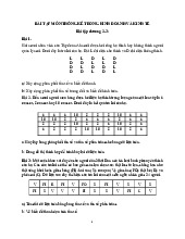
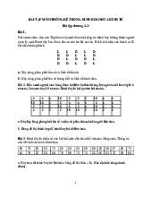
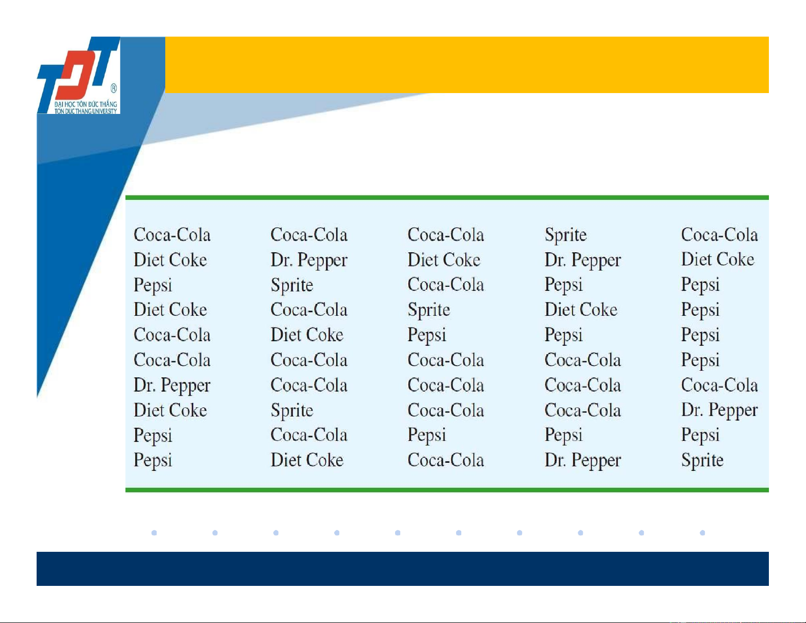
• Example: Data from a sample of 50 Soft Drink Purchases given in the table. 5
Frequency Distribution -3
❖ How to create a frequency distribution for a categorical data?
✓ Step 1: From the original data, determine how many
different categories/classes we have.
➢ Step 2: We list all the categories in the first column. One
category/class is written in a row.
➢ Step 3: For each category, we determine how many times
that category occurs/appears (frequency).
❖ In the last row, we sum up all the frequencies in the second
column. The total number is always equal to the number of observations in the data. 6
Frequency Distribution -4
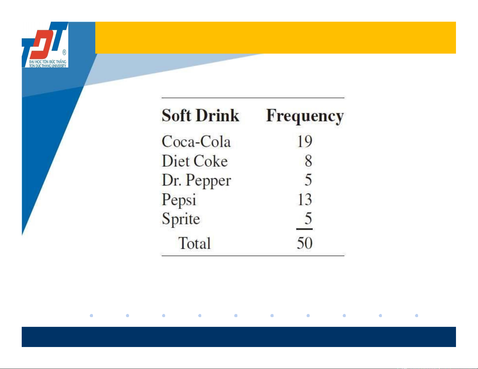
• The following table is called a frequency distribution.
• Frequency Distribution of Soft Drink Purchases.
❖What would you say when you look at this table? 7
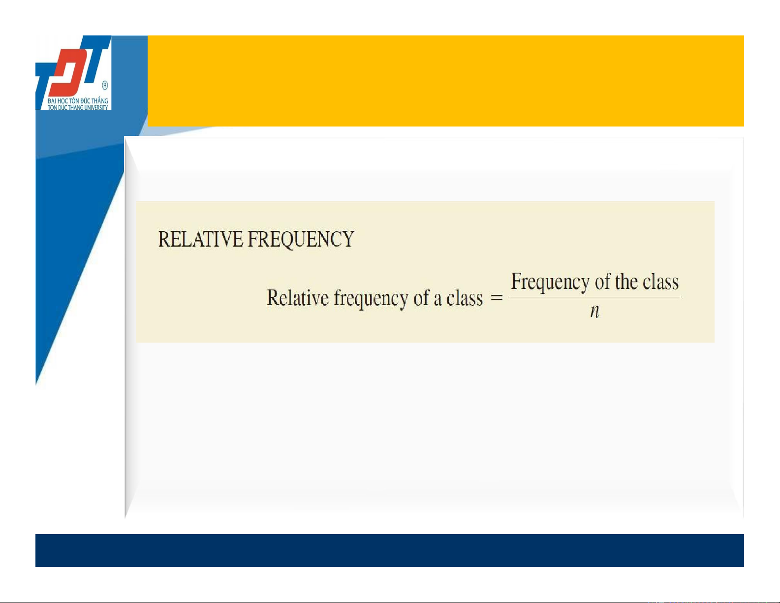
Relative Frequency Distribution
(Phân phối tần số tương đối) -1
❖A relative frequency distribution is a table that lists
the relative frequency for each class...
❖How to make a “relative frequency distribution”?
Step 1: Based on a given frequency table, we create a new
column of “Relative frequency”. 8
Relative Frequency Distribution
(Phân phối tần số tương đối) -2
Step 2: Determine class relative frequencies:
➢ In the last row, we sum up all the relative frequencies in the
column “relative frequency”. The total number is always equal to 1.0. 9
Relative Frequency Distribution
(Phân phối tần số tương đối) -3
Example: Construct a rel. frequency table based on the
following frequency table. Soft drink Frequency Rel. freq Coca-Cola 19 19/50 = 0.38 Diet Coke 8 ? Dr. Pepper 5 ? Pepsi 13 ? Sprite 5 ? Total 50 ? 10
Percent Frequency Distribution
❖ A percent frequency distribution is a tabular that
shows the percent frequency for each class.
❖ The percent frequency of a class is the relative frequency multiplied by 100.. 11
Percent Frequency Distribution
How to make a percent frequency distribution?
❖ Step 1: Based on a relative frequency table, we create a
new column of “percent frequency”.
❖ Step 2: In the column of “percent frequency”, we compute class percent frequencies.
❖ In the column of “percent frequency”, at the last row, we
sum all class percent frequencies. The total number is equal to 100%. 12 Relative Frequency and
Percent Frequency Distribution
• Example: Relative and Percent Frequency Distribution of Soft Drink Purchases Soft drink frequency Rel. freq Percent frequency (%) Coca-Cola 19 0.38 0.38*100 = 38 Diet Coke 8 0.16 ? Dr. Pepper 5 0.10 ? Pepsi 13 0.26 ? Sprite 5 0.10 ? Total 50 1.0 ? 13 Bar chart -1
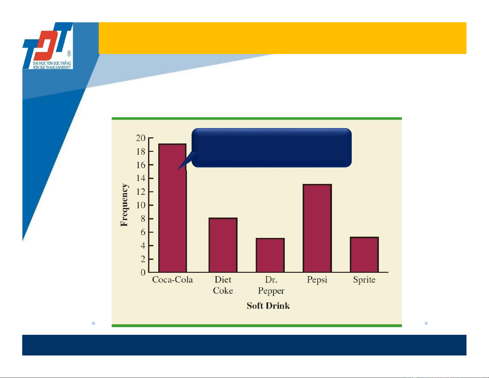
❖ Bar graph/chart -Đồ thị thanh: is used for summarizing categorical data.
❖ A bar chart is a graphic that displays a frequency, relative
frequency, or percent frequency distribution for categorical data.
❖ How to draw a bar chart?
If a frequency, relative frequency, or percent frequency
table is given, then here are steps for drawing a bar graph: 14 Bar chart -2
Step 1: Usually, we present all categories or classes
on the horizontal axis (means X- axis).
Step 2: On the vertical axis, we display all the
corresponding class heights. That means, for each class or
category, we draw a bar with a height that represents the
frequency, relative frequency, or percent frequency of that class.
Step 3: Display the most appropriate name on the X-axis,
the most appropriate name on the vertical axis, and the
appropriate name of bar chart.
The bars are separated to emphasize the fact that each class is a separate category. 15 Bar Chart -3
• Example : Bar Graph of Soft Drink Purchases What is the meaning of this bar? Interpret. 16 Pie chart -1
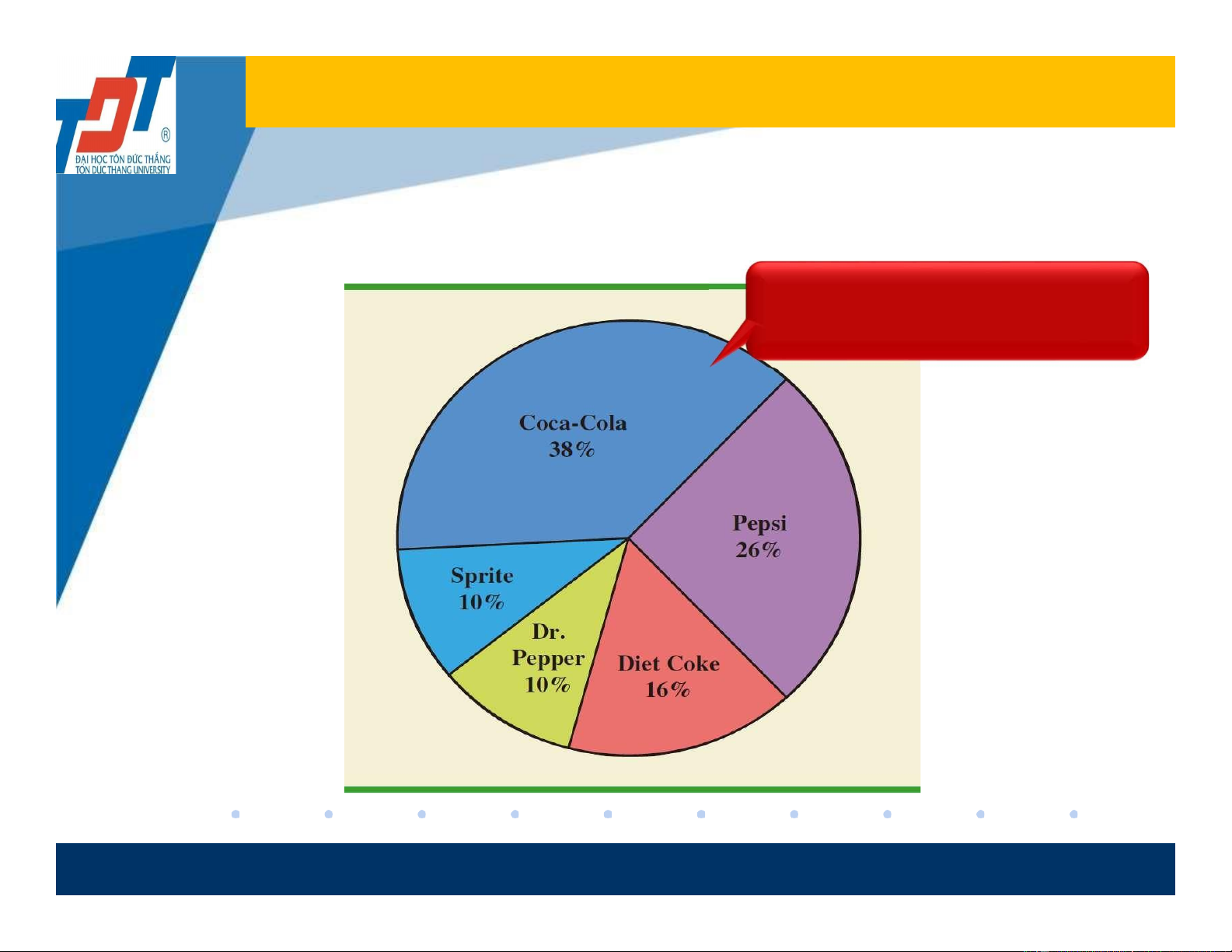
❖ A pie chart is a graphic that presents relative frequency,
or percent frequency distribution for categorical data.
➢ First draw a circle; then use the relative frequencies to
subdivide the circle into sectors that correspond to the
relative frequency for each class. 17 Pie Chart -2
• Example: Pie Chart of Soft Drink Purchases What is the meaning of this slice? Interpret. 18
2.2 Summarizing Quantitative Data
❖ Frequency Distribution, Relative Frequency and
Percent Frequency Distributions.
❖ Cumulative Frequency distribution, Cumulative
Relative Frequency and Cumulative Percent Frequency Distributions. ❖ Histogram.
❖ Stem-and-Leaf plot and boxplot. 19
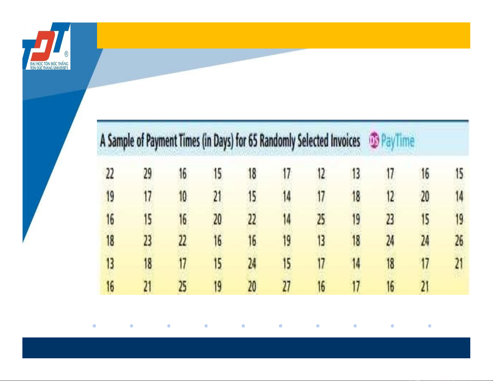
Summarizing Quantitative Data
• Let’s consider the following data:
Payment time for 65 invoices is randomly selected and given in the following table:
❖ What would you say about a distribution trend of payment times? 20